An exhibition by second-year students in the Department of Typography & Graphic Communication
The work featured in this exhibition are posters designed in response to a brief inspired by Project Everyone, a United Nations Global Partner dedicated to promoting the Sustainable Development Goals (also known as the Global Goals). The work aims to inform, engage, and inspire individuals, organisations, and institutions to take meaningful action towards achieving the goals by 2030.
The task
The project to promote the Global Goals was devised and led by tutor Greg Bunbury. Each student was given the task of creating a compelling poster and supporting materials to promote one of the seventeen goals. Their work needed to incorporate graphic, typographic, or illustrative elements, and feature the ‘Halftime’ campaign hashtag #ImagineWinning, as well as project branding and a call-to-action.
The exhibition
The display of twenty-nine posters has been installed in the Department’s exhibition space, grouped under four headings: economy, equality, environment, and well-being. The exhibition was designed by second-year students, Aaron James and Olivia Moors, as part of the Department’s Real Jobs scheme. The exhibition project was supervised by tutors Sara Chapman and Geoff Wyeth with support from Department colleagues. The posters and other exhibition graphics were printed by the University’s Creative and Print Services.
The exhibition has been made possible by a generous award of funding from the University of Reading’s Arts Committee. Following its display in Typography & Graphic Communication, the exhibition will travel to the University’s library foyer where it will be installed for an additional run.
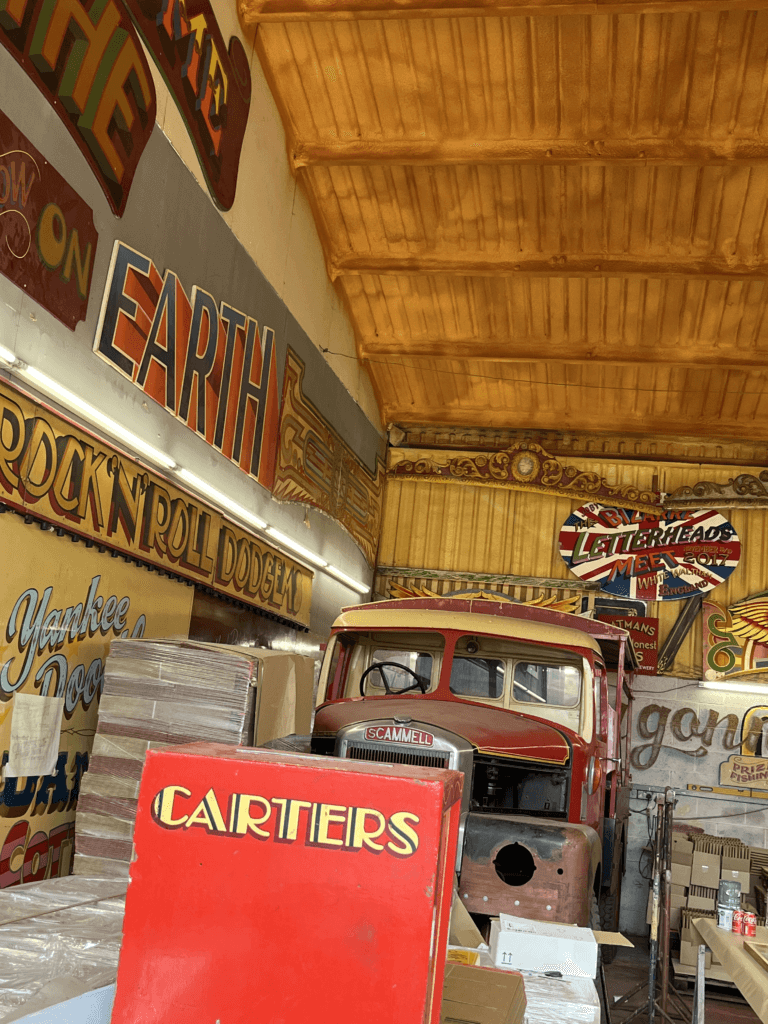
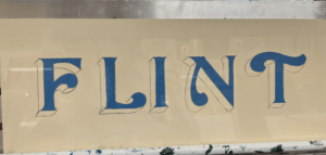
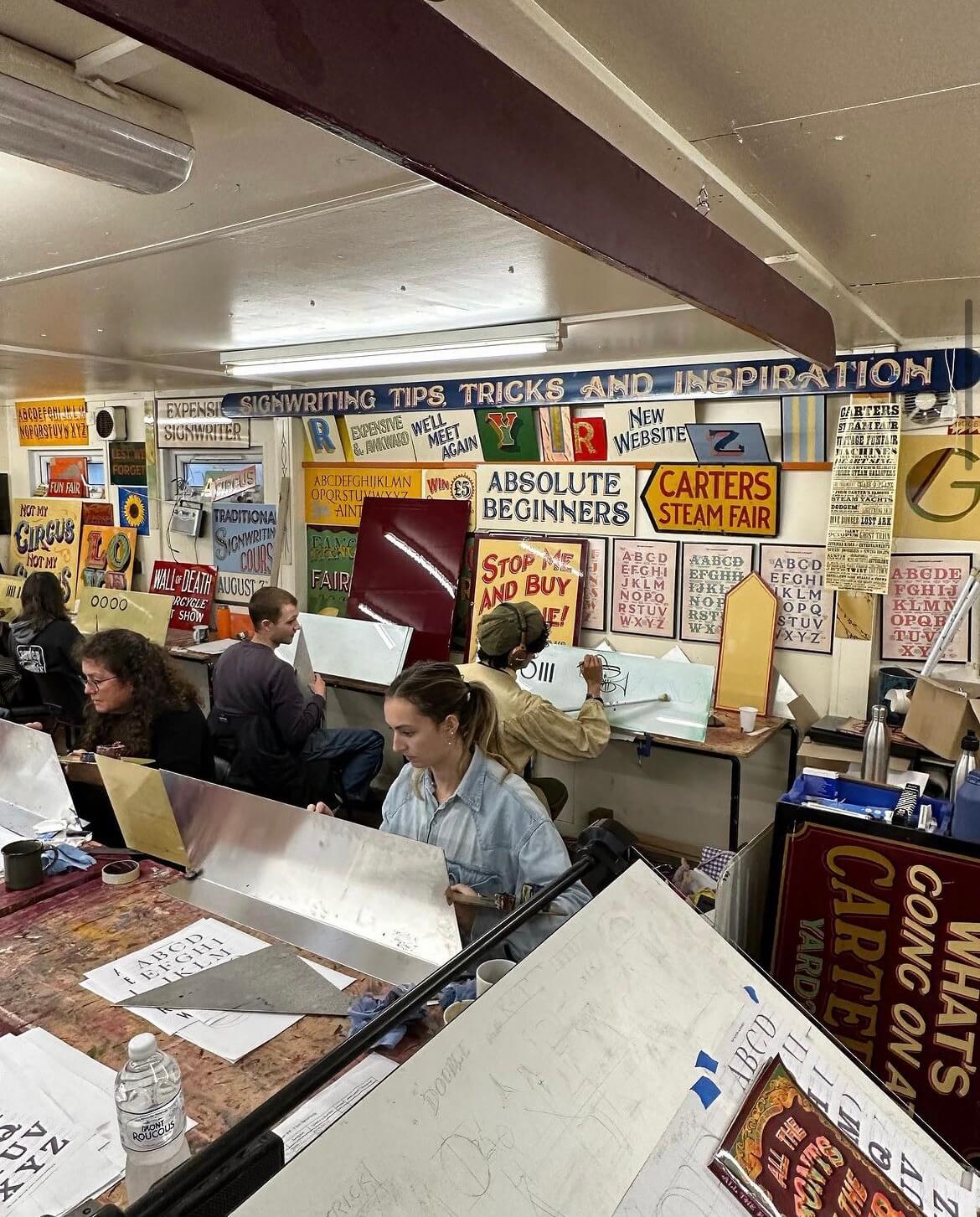
Joby is a signwriter and fairground artist who owns the famous ‘Carter’s Steam Fair’ fairground, which is the largest vintage travelling funfair in the world. Years of experience has led to Joby being one of the world’s leading experts on signwriting, fancy lettering and fairground art. I met Joby during a trip to his workshop for a project and was fascinated by his work, having never been exposed to the world of signwriting before. The precision and artistic skills that Joby possessed to have the ability to create such intricate lettering was amazing to me.
The course
I was lucky enough to receive the opportunity to take part in Joby’s 5 day intensive signwriting course this autumn. This was as a result of coming second place in his contest last year with my fairground-inspired logo redesign for Odeon. The Department offered me a place on his course as a prize using the Typography Student Fund. The course ran from 9am–5pm on Monday through to Friday, giving me 40 hours of teaching and learning with Joby.
Day 1
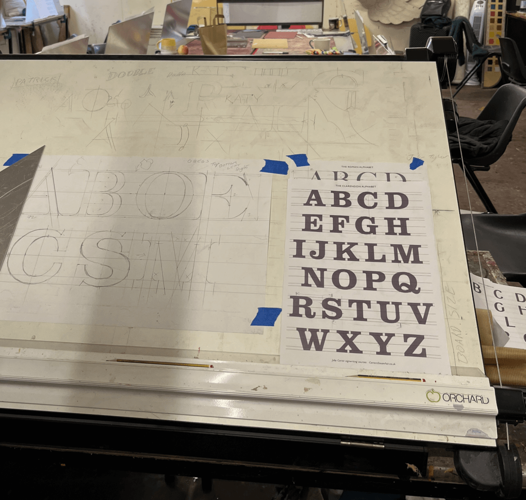
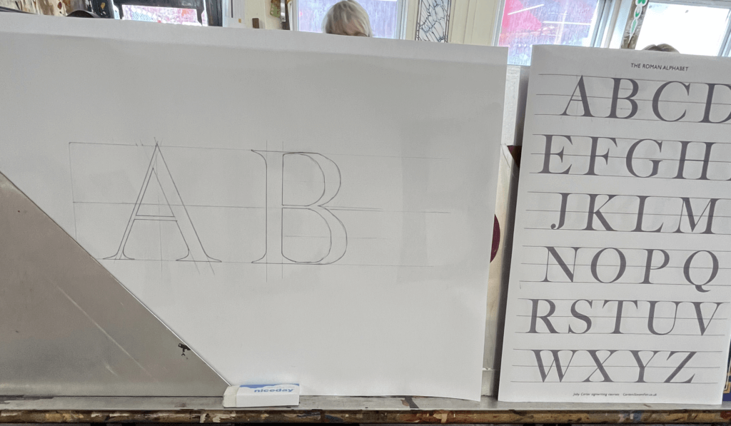
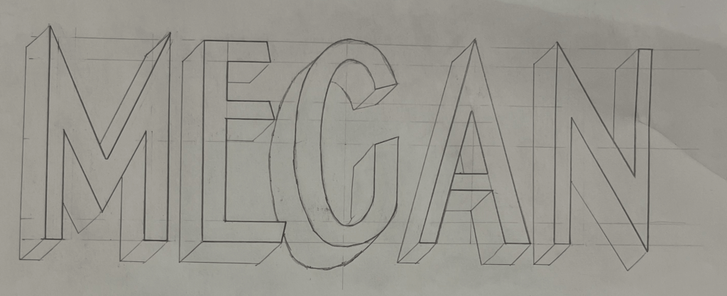
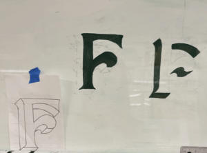
On the first day, we were introduced to the anatomy of roman lettering and the reasoning behind the thin and thick strokes, which mimic the way the brush strokes when painting the letters. We practised precisely drawing letters, copying them from Joby’s examples but accurately measuring each length and angle and scaling them to a bigger size that would be easier to draw at. Having had lots of previous experience in typography from the Department at University, I enjoyed how well I understood the different structures of the letters. We looked at some different typefaces that signwriters commonly use, and again practised drawing these accurately. There was no painting involved on this day as it was all about nailing the shapes of the letters.
Day 2
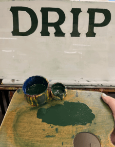
On day 2 we got the paint brushes out. Joby showed us how to prep the brushes and the paint, and the proper way to look after your brushes. We each received a brush, a palette, some dipping pots and a mahl stick. We were shown the specific way to hold the palette in your left hand in addition to the mahl stick, which is used to stabilise your right hand while holding the paint brush. This ensures smooth, straight brush strokes and acts against shaky hands. To begin with, we practised painting rectangles in order to learn to control the brush. Once gaining some confidence, we tried rectangles at a 45 degree angle, and then moved on to circles. Joby showed us the technique of twisting the brush at the start and end of the stroke to get a sharp edge, which seemed difficult at first, but practicing over and over again helped to improve technique. Methods like these are included in Joby’s book ‘Signwriting tips, tricks and inspiration’ which I found really useful to follow. Joby got us to use white spirit to wipe the paint off after each try so that we could reuse the boards over and over again. I then practised drawing out some different fonts, and wrote my name in the Switchback style, which I then transferred onto my board by rubbing charcoal on the back and then drawing over the letters again against the di-bond in order to create a trace of my sketch with the charcoal. I used the same green paint we had been practising with to paint within the lines of the letters as we were asked to use this paint up until the final day when we started our own signs due to the fact that it had a long drying time so that it could be more easily wiped off the practice boards.
Day 3
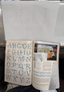
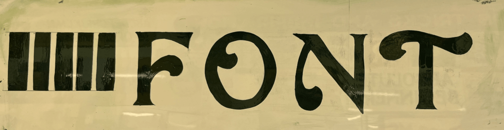
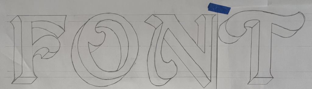
The third day was similar to day 2, and started out consisting of a combination of painting shapes again and sketching out letters. Joby really wanted us to nail letter structure and brush stroke technique before we got stuck into painting letters. One particular style of lettering caught my eye from a sign of Joby’s in the room we were working – it had beautiful curved letters and flourishes. I asked Joby where I could find this font and he revealed that it was a new one he had designed in his new book ‘All the fonts of the fair‘ called Curveside Nouveau. I borrowed a copy of his book so that I was able to analyse and copy the lettering, scaling it up to a bigger size. I once again transferred my drawings on to the di-bond and carefully painted letters to make the word ‘Font’. This combination of letters allowed me to practise drawing different angled letters with variations of flourishes on each one. I painted some other fonts from Joby’s book and found it interesting how many factors influence the appearance of a font and create a different route for your paint brush.
Day 4
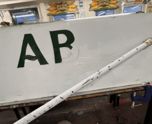
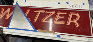
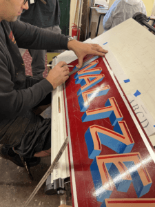
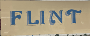
Today, Joby taught us how to create a block to make a letter appear three-dimensional. This technique is often used by traditional signwriters to emphasise letters. Joby’s method allowed us to get the block drawn on accurately without fail. All that was needed was a piece of cardboard cut into the desired width of the block shape, and then with a 45 degree angle cut from corner to corner on one end to the other. This angle is then used to draw a straight line from each point of the face of the letter to create the effect that it has been extended outwards. The block is usually set to the left of the letter as this is often easier than having to block the curves that are often on the right side of the letter, but it comes down to a matter of preference. Joby demonstrated this to us by adding a block on the right hand side to his Waltzer sign. The E and the R are more complicated to do this way, rather than simply having to block their straight edges if it were to the left. This was a compositional choice that Joby decided on, due to the word Waltzer having more empty space on the right edge of the board.
I practised this method by adding blocks to all my previous letter sketches, it was interesting to see how the style of letter affected the shape of the block and influenced the overall appearance of the word.
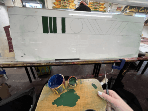
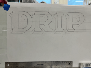
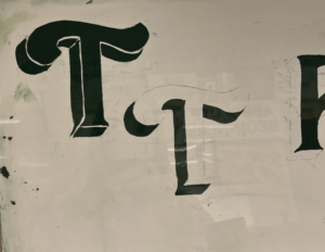
I then practised painting the blocks after sketching them. Joby also showed us the effect of a stepped away block, which I did on the left T. This creates an extra outline around the letter face, which is easy to do, but creates the illusion of an extra effect.
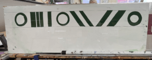
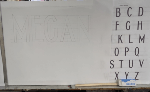
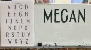
In the afternoon, I began to plan the final design for my sign. I had fallen in love with Joby’s Curveside Nouveau due to the beautiful brush strokes and shapes it created when painted. I found it to be a very fun yet elegant typeface, and I enjoyed painting the subtle curves more than painting rigid letterforms. I originally wanted to paint the name of my village, which is a nine letter word. But for the size of di-bond we were given at 62x25cm, this would be too challenging to fit in. I attempted to condense the font, but due to the thickness of the strokes it was still impossible to be able to paint it at a big enough size. I decided instead to paint my house name, as it was only 5 letters and I would be able to spend more time perfecting and adding blocks and shading. To save time, I used some of the letters that I had already sketched out, drew the additional ones I needed and then cut and taped them together, adjusting the negative space between each letter to create a balanced layout. Here is where a lot of what I learnt about typography at University helped me with my layout choices. Having an L and an I next to one another means that there is a lot of negative space between the letters, so moving these closer together creates the overall illusion that the letters are evenly spaced.
Day 5
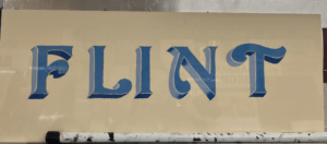
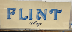
On Friday morning, Joby showed us how to add a shadow to a letter. This helps to bring a letter to life and make it stand out from the background. This was more complicated than adding a block and took time to understand Joby’s demonstration. But I had a go at adding a shadow to some of my previous sketches.
I then started to paint my sign, picking out some shades of blue, that wouldn’t take too long to dry so that I could add layers of block and shading. I started with the face of the letter, then added a stepped back block in a lighter shade of blue for the vertical sections of the block. Once this was dry I used a darker French blue for the horizontal blocks which would be more in shadow. I also added some shading using this blue, to fade some lighter sections into darker parts. Finally, I added some decorative curls within the flourishes of each letter. I then decided to add in the word ‘Cottage’ in a small script copied from Joby’s book, underneath the main word. I painted this in the darkest blue which I used for the flourish curls, to tie everything in together. The script font was difficult to paint as the strokes were so thin, I used a smaller brush to help achieve more accuracy.
If I had had more time, I would have liked to try adding a shadow. However, Joby told me that it was more difficult for signwriters to add a shadow in addition to a block that is stepped back, so this would have been challenging for me. In future I would like to experiment with more bold colour combinations, although I liked the elegance of my blue sign.
Reflection
I thoroughly enjoyed Joby’s course from start to finish and feel as though I learnt a great deal about the world of signwriting and the extensive process involved. Having background knowledge on typography from studying Graphic Communication was a huge help in my understanding of letter anatomy and dealing with spacing. But the process of hand drawing and painting letters has taken my typographic understanding to a whole new level. The act of using a brush to create the curves and the thin and thick strokes of a letter reveals why letters are shaped the way they are, and how they have evolved from the Roman alphabet.
I wish to continue practicing signwriting and the potentially utilise it in a future career. It has become a dying craft since the emergence of graphic design but is a highly skilled and fascinating trade that should be continued and passed down to future generations in order for it to be kept alive. I am so grateful to have been taught by Joby Carter, a highly respected and experienced signwriter who’s passion for the art of hand-painting letters is clear to see. I also want to thank the University and the Typography Student Fund for allowing me to have had this wonderful opportunity that I will forever cherish.
I think it’s important to start off by saying I had no idea how to make tables and grids in InDesign. Other than my limited use in the book design project and making work files, I haven’t used the software before. I was well aware that I’d have to start with the basics, but I’m glad this module gave me a chance to do this.
Software Tutorials
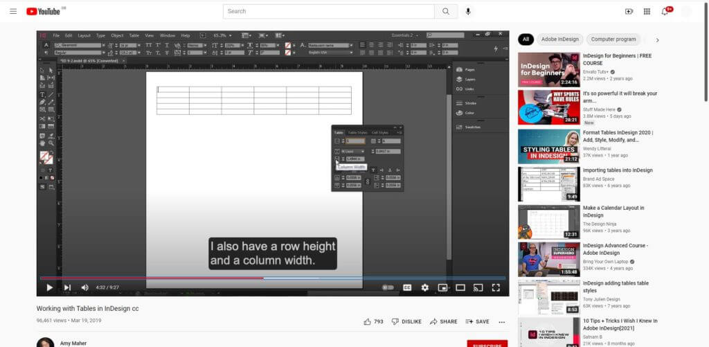
I, therefore, had to begin with the software tutorials, needing this information to progress with this challenge. I began with a YouTube tutorial by Amy Maher, which allowed me to grasp the basic technical aspects involved in grids and tables. This focussed on the foundational skills, a complete beginner’s guide to this tool which was perfect as I currently didn’t know anything about this.
Using my newly-gained knowledge, I opened InDesign to begin this project. I decided quickly that my first design would be an incredibly basic but functional table, making sure that I could adapt this to suit my needs, before moving on to a better designed and more visually appealing design.
Amy Maher’s video ‘Working with Tables in InDesign cc’, showed me the basics of tables in InDesign and how to amend sizes simply.
Design Ideas and Process 1
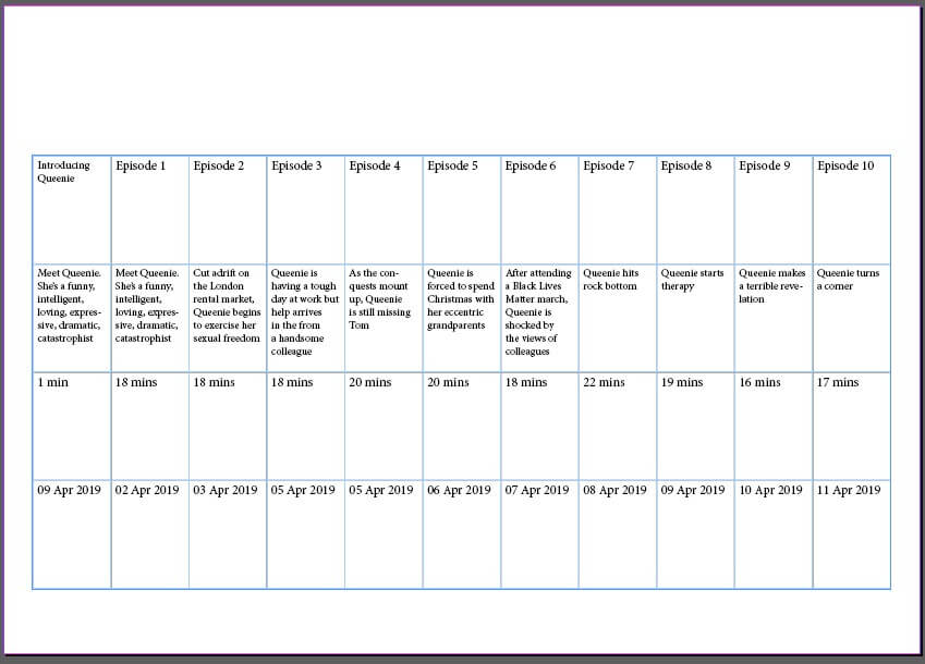
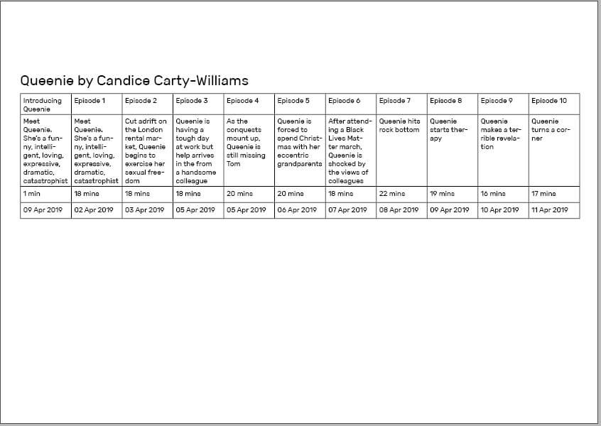
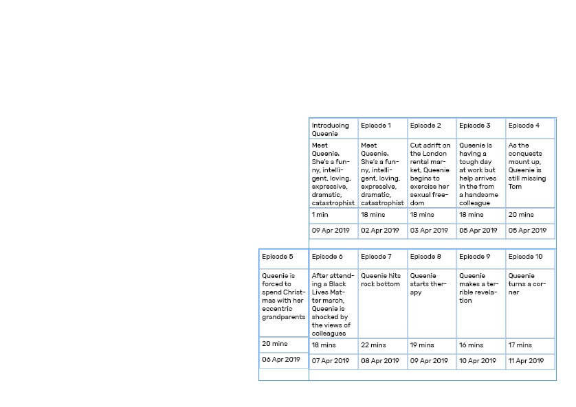
The process of creating a table and adjusting its characteristics to suit my informationMy initial table with consistently sized cells – obviously not appropriate and taking up unnecessary space.
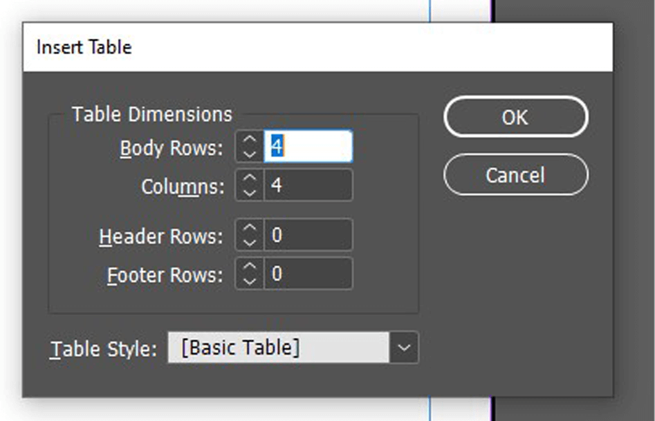
I started by closely following the tutorial – I used the ‘Create Table’ tool to add a table to my page I was then able to specify the specifics, altering the rows and columns to my requirements. I did a simple, linear format for these, not wanting to overcomplicate the design. This tool worked well (other than me needing to add an extra row to the top for the titles), allowing me to input the data into each cell.
As the tutorial said, I was then able to adjust the size of my cells, selecting a row or column to adjust a group at the same time, a quicker and more consistent method. Having done this, my simple table was complete and I was able to move on to the design aspect.
Having adjusted the cell sizes, I then added a title and began to style the page.I then began adding other elements, creating visual hierarchy but attempting to keep the table as the focus.
I placed this table along the bottom of the page, adding text initially to create a clear hierarchy. I used knowledge from the previous terms InDesign class to allocate clear paragraph and character styles, while also knowing more about the alignment and structuring that would benefit my final design.
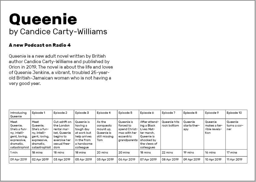
Finally, I added an image of the book and quotations along the right-hand side, allowing a more balanced design to be achieved and having typography and layout separating the different layers of information.
I am happy with this design, clearly a simple beginning, but allowing me to test this tool for the first time and gain more experience in InDesign, both technically with the software and enhancing my skills as a designer through more practice.
My first table design – a relatively simple but conveys the necessary information in a well-structured, visually appealing manner.
Software Tutorial/Article
Coming off the back of that example, I wanted to explore the styling aspect of the table more, breaking the conventional, linear structure. I began looking at articles and resources, finding a post by ScienceEditor about the best practices for table design. This added to the foundational knowledge, informing me of conventions of table design – these included the increased ease of comparing numbers when in columns rather than rows and the benefits of breaking up a long, linear table.
I also had to consult an article when hitting a problem – when having trouble adding a row into the table, I used a blog by Adobe to fix this minor issue.
Design Ideas and Process 2
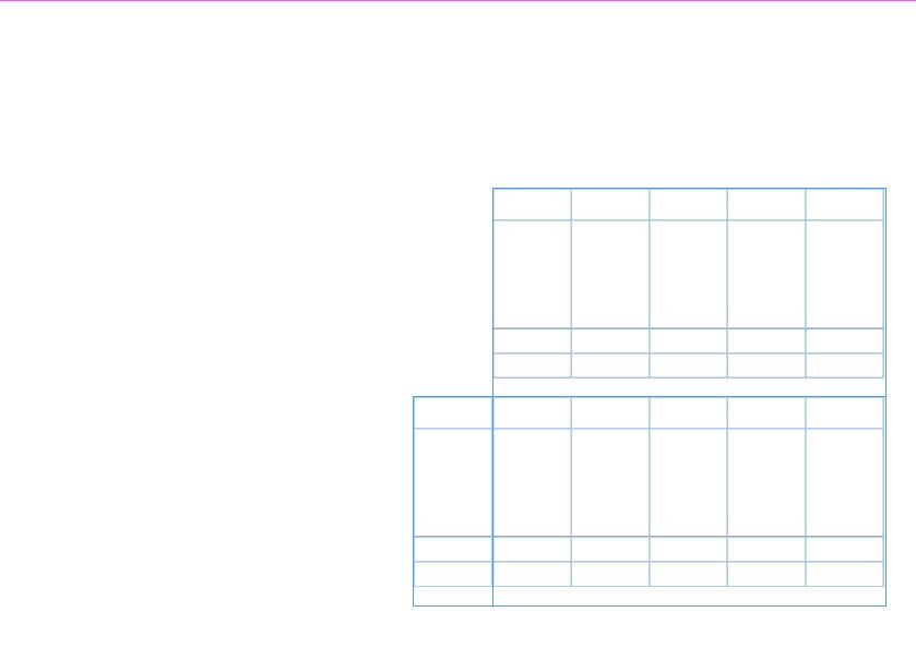
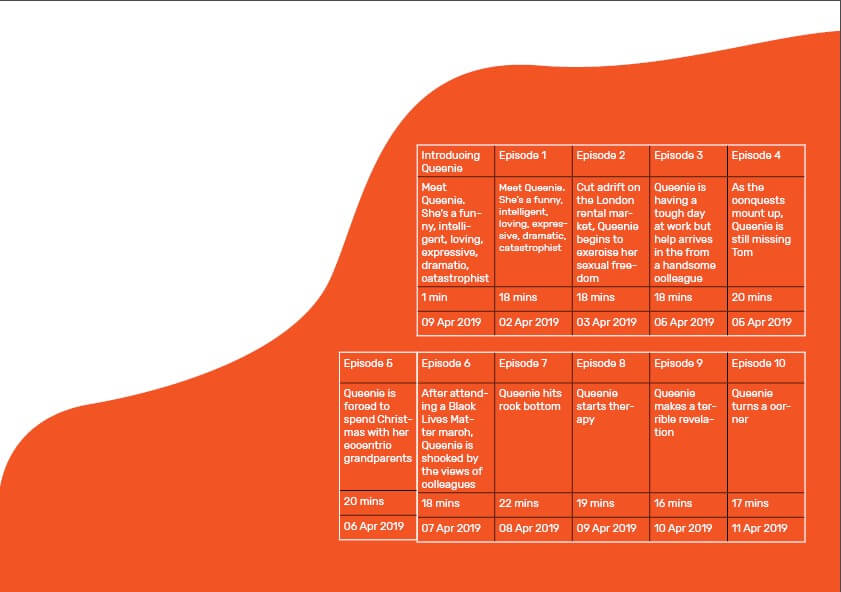
The basic grid structure that my table will follow.The same structure, now with the relevant data filled in.
I began by creating a more visually interesting layout for the table, stacking the two parts on top of one another and right aligning it. I then filled in the same data, ensuring that each entry has a consistent size to the next.
I was much happier with this structure for the information; although not linear, the information is still clear and creates much more interest through this less conventional shaping.
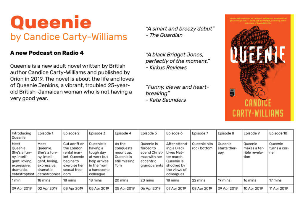
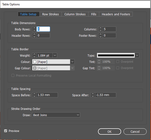
The ‘Table Options’ menu, allows me to adjust the colour and weight of the tableThe result of my styling experiments – a much more engaging appearance with some clear areas to be altered, such as the black lines between the cells.
I added this coloured shape as a background element using the pen tool, looking to make something fluid-like but not overpowering. I used the colour picker to select an orange from the book cover. Looking at this with a black table, I knew I had to invert this to white, the contrast making the table and its data more readable.
However, this was not as easy as I thought – I had to use the ‘Table Options’ menu to adjust the colouring, also allowing me to alter the line weight. The results of this were much more successful, with a clearer contrast helping the table stand out from the background.
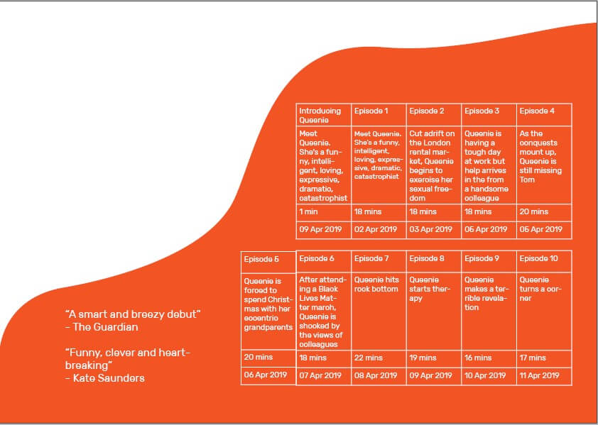
The addition of these reputable quotes helps balance the positive and negative space.The use of colour and font weight helps to create a clear reading structure and a better visual appearance.
Now being happy with the layout and colouring of the table, I moved on to the rest of the design. I began by adding two quotes into the remaining orange space, testing all three and deeming this too much.
I then went on to add the text (sources from the book’s summary) and the title to the top, again using size, font-weight, and spacing to create a structure and deliberate relationship between the levels of information.
Design Resources
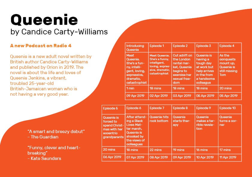
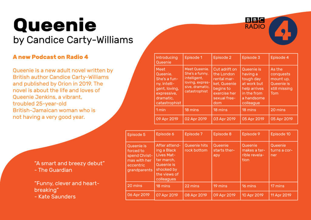
Finally, I added the BBC Radio 4 logo (an online resource) to the design, feeling this provided some visual balance to the design and helped to complete the layout. However, the rest of this design was simple typographic work and shapes created by me, not wanting to overcomplicate the design with external images and resources.
My final design, adding the BBC Radio 4 Logo into the top right, helped to balance the design and make it a more realistic piece of promotional material.
This second design is a better design – visually, the page is much more striking and provides much more interest to a viewer and potential listener. The table itself is much more fun and unconventional layout that helps to draw the eye to this vital information without it dominating the page in size.
Learning Across the Module
I began this project with no knowledge of using grids and tables in InDesign. Although my first attempt was relatively basic (and not without issues), my second design is a visually engaging and effective table, working as an element within a successful and balanced full page. While I am sure there are more nuances to this process, I feel comfortable in creating a table, a skill that will certainly be necessary for later work. I have built up from nothing and am now able to use a brand new tool in InDesign, an integral piece of software I will likely use for the rest of my career.
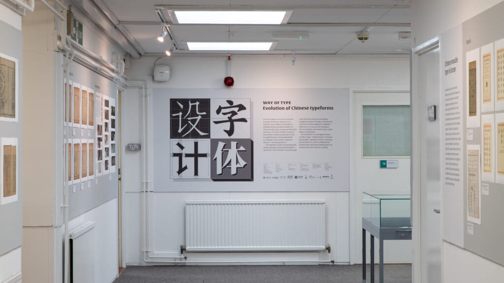
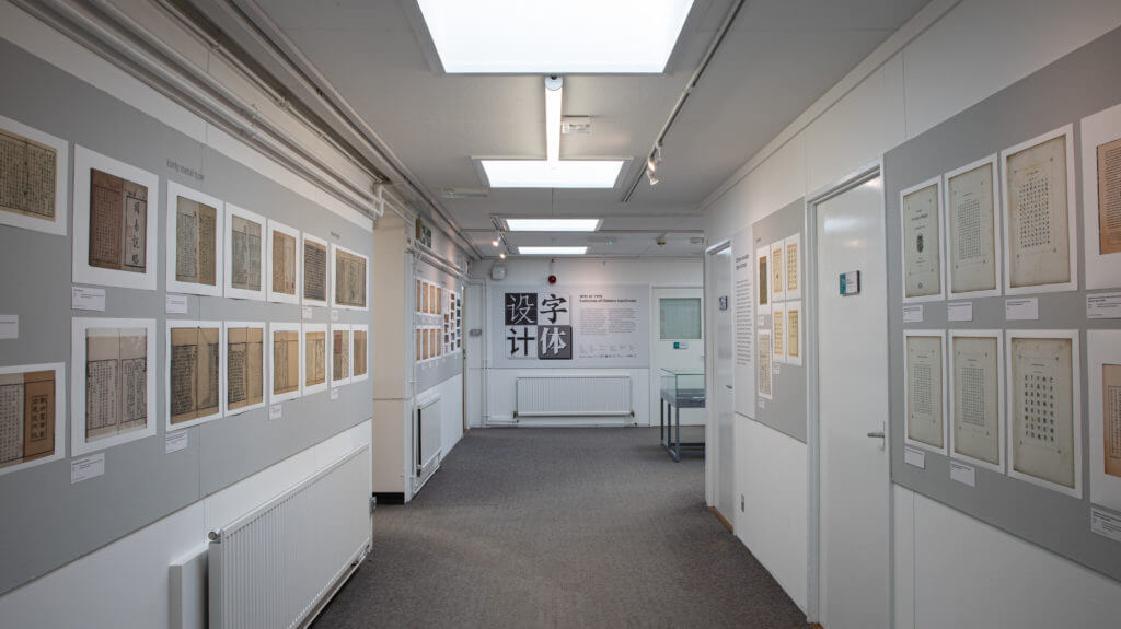
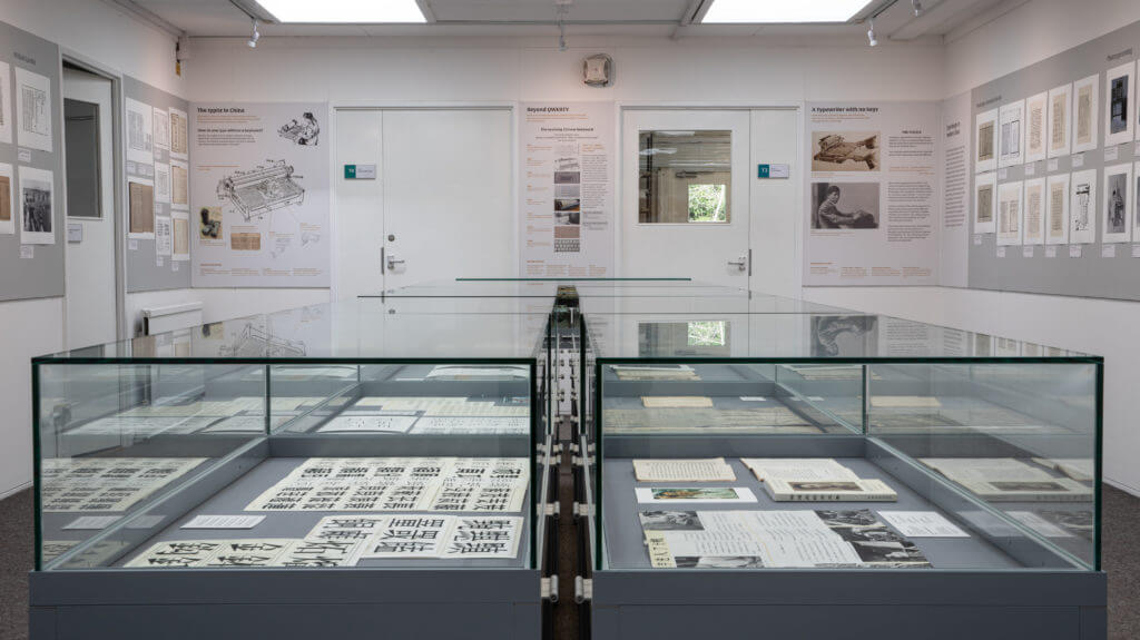
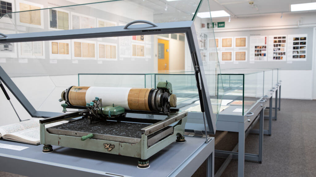
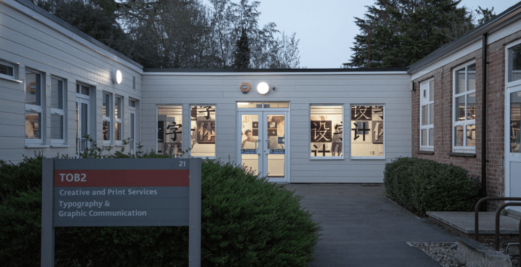
An exhibition in the Department charting the development of Chinese type and type-making technologies.
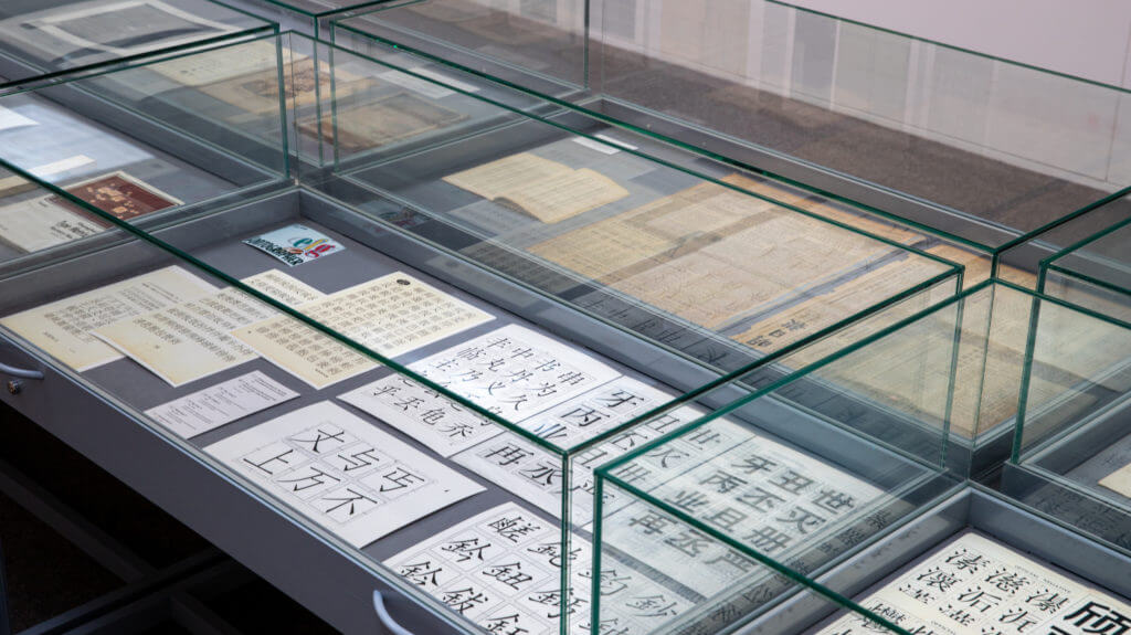
Chinese typeforms are the visual form or shape of Chinese characters in a typeface. They reflect the function of reading Chinese and the aesthetics of Chinese calligraphy. Compared with Latin typefaces, the larger Chinese character set and the complexity and diversity of its typeforms have always presented a challenge to type makers, typeface designers, and typographers.
This exhibition charts the development of type and type-making technologies in China, from the invention of movable type in the eleventh century to the design of digital typefaces of today. It documents the rich variety of Chinese typefaces created in different eras using varied techniques and technologies, presented in high quality digital reproductions.
The exhibition is an abridged version of ‘Way of Type – Modernisation of Chinese typography’, originally curated by Jieqiong Yue and Zhao Liu, and is a collaboration between the University of Reading and the Central Academy of Fine Arts, Beijing. It represents the first exhibition in the UK featuring Chinese typeforms and type design.
Open weekdays, 10 am to 5 pm. Closed bank holidays.
Installation photos
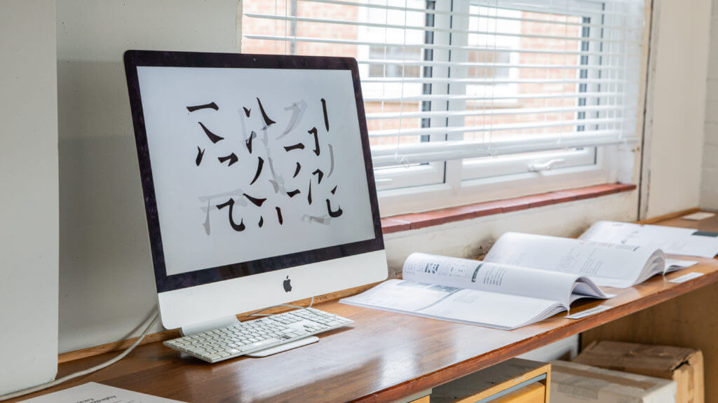
‘Way of type – Evolution of Chinese typeforms’: introduction panel.Main exhibition. Early Chinese movable type (left wall), Chinese movable type in Europe (right wall).Main exhibition. Chinese founts of missionaries (left wall); Chinese typewriter (end wall), based on posters by Thomas Mullaney; Type design in modern China (right wall).Main exhibition. Double Pigeon Chinese typewriter. Donated to the exhibition by Mr Xing Li.Main exhibition. Typeface specimens and font production materials.Contemporary Chinese typography. Typeforms shown on screen and in Chinese-language portfolios.Contemporary Chinese typography. Fifteen-piece puzzle for constructing typeforms.Exhibition window graphics.
Credits
China team Academic chair: Di’an Fan
Curators: Jieqiong Yue, Zhao Liu
Coordinators: Xi Yang, Ping Ju, Liping Du, Yanan Zhang
Assistant designers: Kui Zhu, Yue Chen, Peilin Song, Congyu Zhang, Kushim Jiang, Yangzhi Duan, Tengqi Zhaoxu
UK team Academic chair: Eric Kindel
Curator: Xunchang Cheng
Visual designers: Xicheng Yang, Huati Wulan, Ahmet Berke Demir
Production: Geoff Wyeth
Special thanks Thomas Mullaney, Yiyuan Ma, Li Xing
Texts by Min Wang, Mingyuan Sun, Zhongxiao Cong,
Xunchang Cheng, Guoyan Ji
Guided by China Foreign Languages Publishing Administration
Organisers University of Reading,
Central Academy of Fine Arts,
China Center for International Communication Development
Co-organisers Department of Typography & Graphic Communication
Co-Innovation Center for Art Creation and Research on Silk Road of CAFA
Special thanks Hanyi Fonts,
Arts Committee (University of Reading),
Shenzhen Graphic Design Association,
TypeTogether, LiuZhao Studio
Initial Thoughts On How I Would Attempt The Project
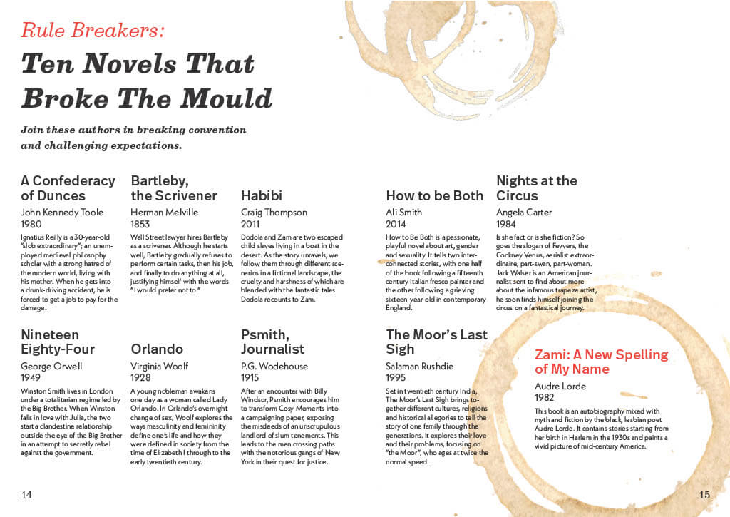
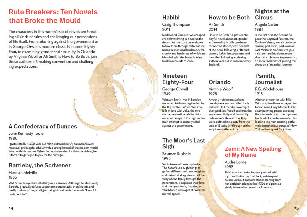
In this task, I was required to create a two page spread for a magazine, promoting the top 10 books for that month (all found on the BBC website). I took inspiration from Swiss design and its use of grid systems to structure my layout. Before I started my design, I opened up an A4 document with facing pages and a bleed of 3mm, as the entire designs purpose is to be printed. I chose to have margins with a 12mm, except for the bottom, which measured 24mm to make allowance for the page number. I chose to have 3 margins on each page, as I knew the information would need to be divided into small sections, therefore it would give me more opportunity to organise the text effectively.
My Final Design
To start with, I needed to create a clear structure through ordering and the hierarchy of text. I have also used different typefaces to separate the heading from the main content, as well as the book title, author/year, and description. This is further helped by the weight and colour of different text, the titles are in bold and I have used red to highlight features such as a really interesting sounding book. I went for a modern layout, with the content leaning more towards the left of the spread. A coffee stain, which I added due to its association with a corner table as they tend to hold books, is also used to highlight one of the summaries for extra emphasis.
Some Other Alternative Layouts
I followed the same grid-style layout for my other designs, as I wanted to see how different I could make each design look while following the same set of “rules”.
Explore, verb: travel through (an unfamiliar area) in order to learn about it
Software Tutorials
Coming into the Spring Term I’ve built on my knowledge and skills in Photoshop, Illustrator, and InDesign. I’ve also met new software along the way, After Effects, Adobe XD, and Premiere Pro.
I have been exploring Photoshop in a more thorough way, rather than just an initial first look. For instance, the clone stamp tool is such a fundamental part to photo editing, but I didn’t even know it existed! Only by this in-depth exploration can I progress from just familiarity to a higher, more professional usage of any software.
Design Ideas and Design Process
Cutting Things Out
I started with the intention to change the background, following along with this given tutorial.
Previously I have used the ‘quick selection tool’, but the tutorial spoke about using the ‘object selection tool’. This was something that I’d never come across before, so I searched up how to use the this tool and came across this tutorial.
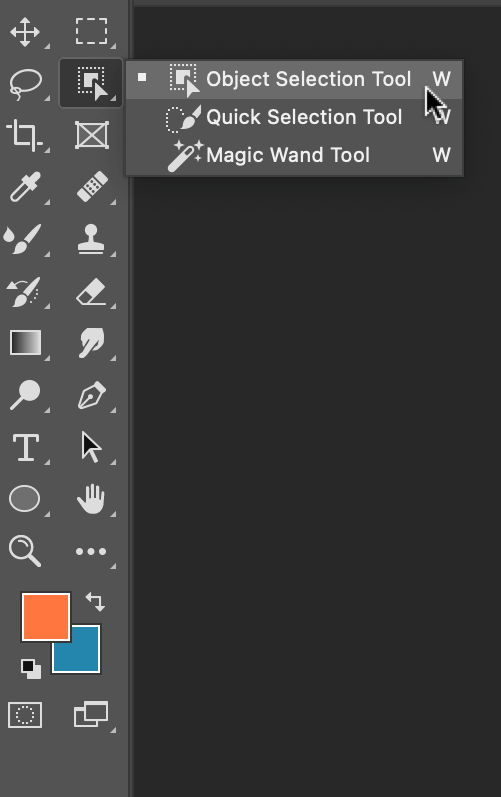
Firstly, I located the ‘object selection tool’, Figure 1, which was in the same place as the other selection tools. With the tool selected, I drew a box around the selected object, Figure 2. The computer then shrinks the line down to a shape it thinks you’re trying to select, Figure 3. This tool was pretty good at selecting most things, but I cleaned this up using the ‘quick selection tool’.
Figure 1Figure 2Figure 3Figure 4Figure 5
By holding down the option key (⌥) you can toggle between adding a section or subtracting a section, Figure 4 & 5.
In the tutorial I was following, it also showed how to change the background to a black & white image. I kept the cut-out flower on another layer and applied the filter to the original image. This effect makes the foreground pop and is something that I would use again for photo manipulation.
Figure 6
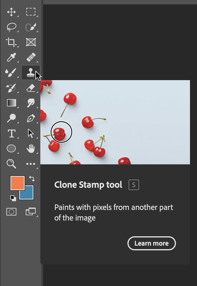
Clone Stamp
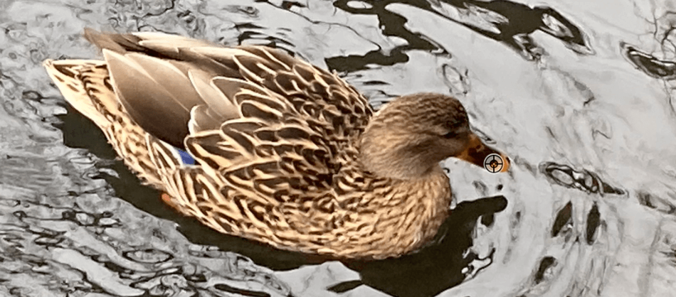
I explored one of the given tutorials, which was a useful introduction to the ‘clone stamp’. It looked like magic, until you understood the logic behind it; of copying similar parts of the photo to erase unwanted sections. I used a photo of some ducks, Figure 7, to begin with.
Figure 7Figure 8
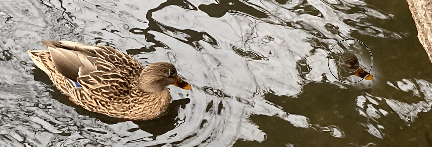
I created a new layer so that the edits could be toggled on and off. The ‘clone tool’, like the ‘object selection tool’, is located on the left-hand toolbar, Figure 8.
Figure 9Figure 10
To choose which part to copy, hold down the option key, and you will notice that the cursor changes to a circle with a cross inside it, Figure 9. The selection is the part of the image which you are copying. When pasting this new selection, a small cross, Figure 10, shows you where this information is being copied from.
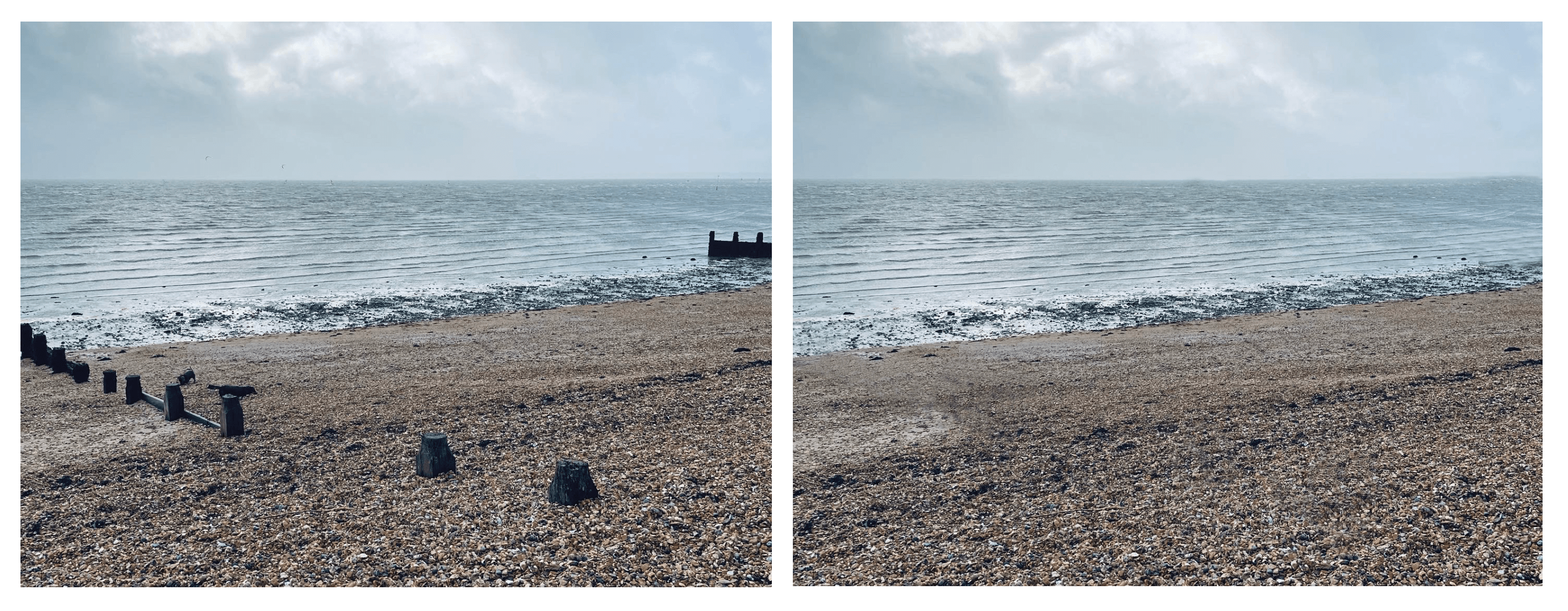
I put this into practice and edited out some unwanted parts of a picture I took at the beach. I removed the dogs and wooden structures by copying other parts of the photo. I think it is successful because it’s done seamlessly, you can’t tell that I’ve copied other parts.
Figure 11
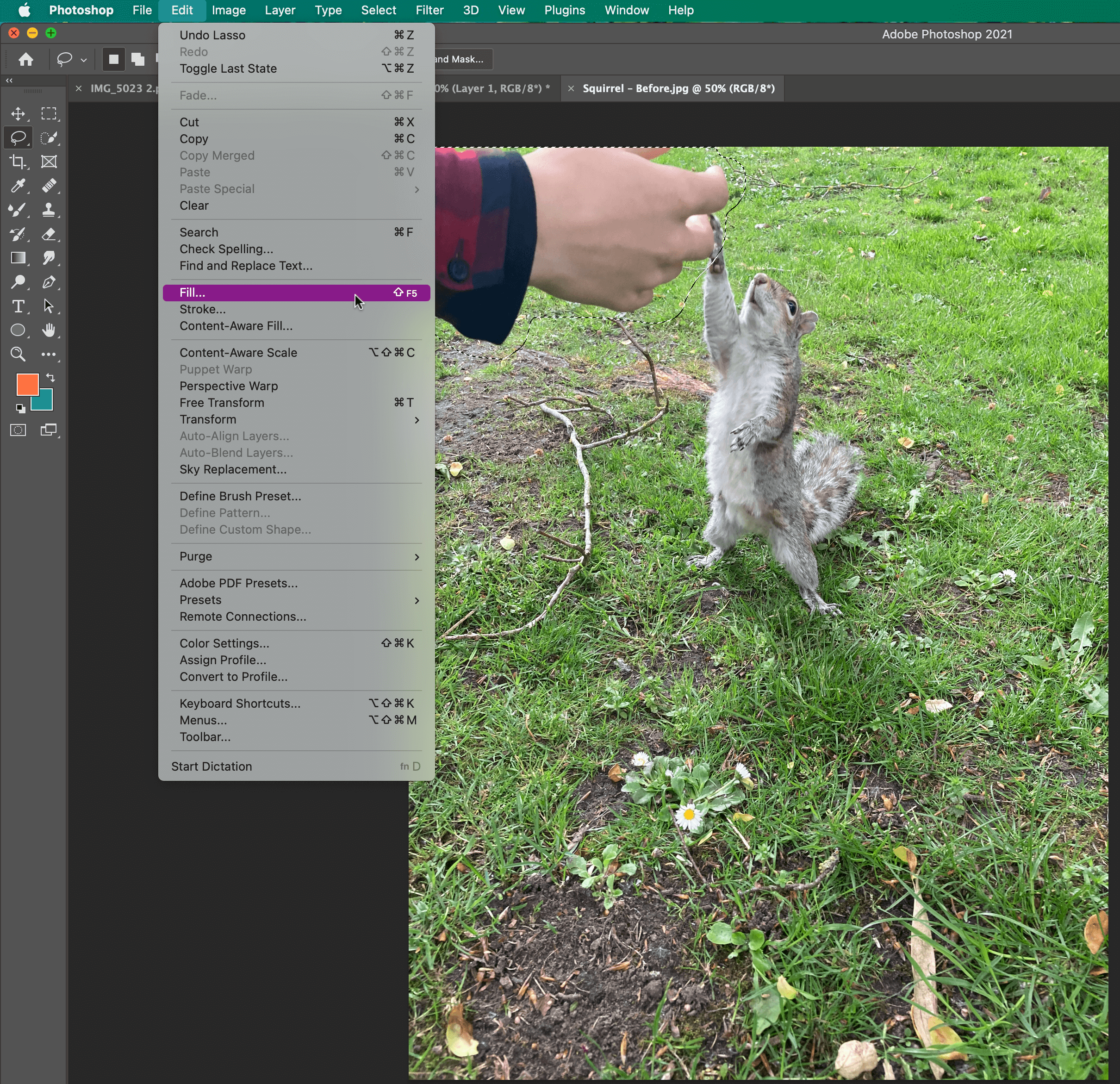
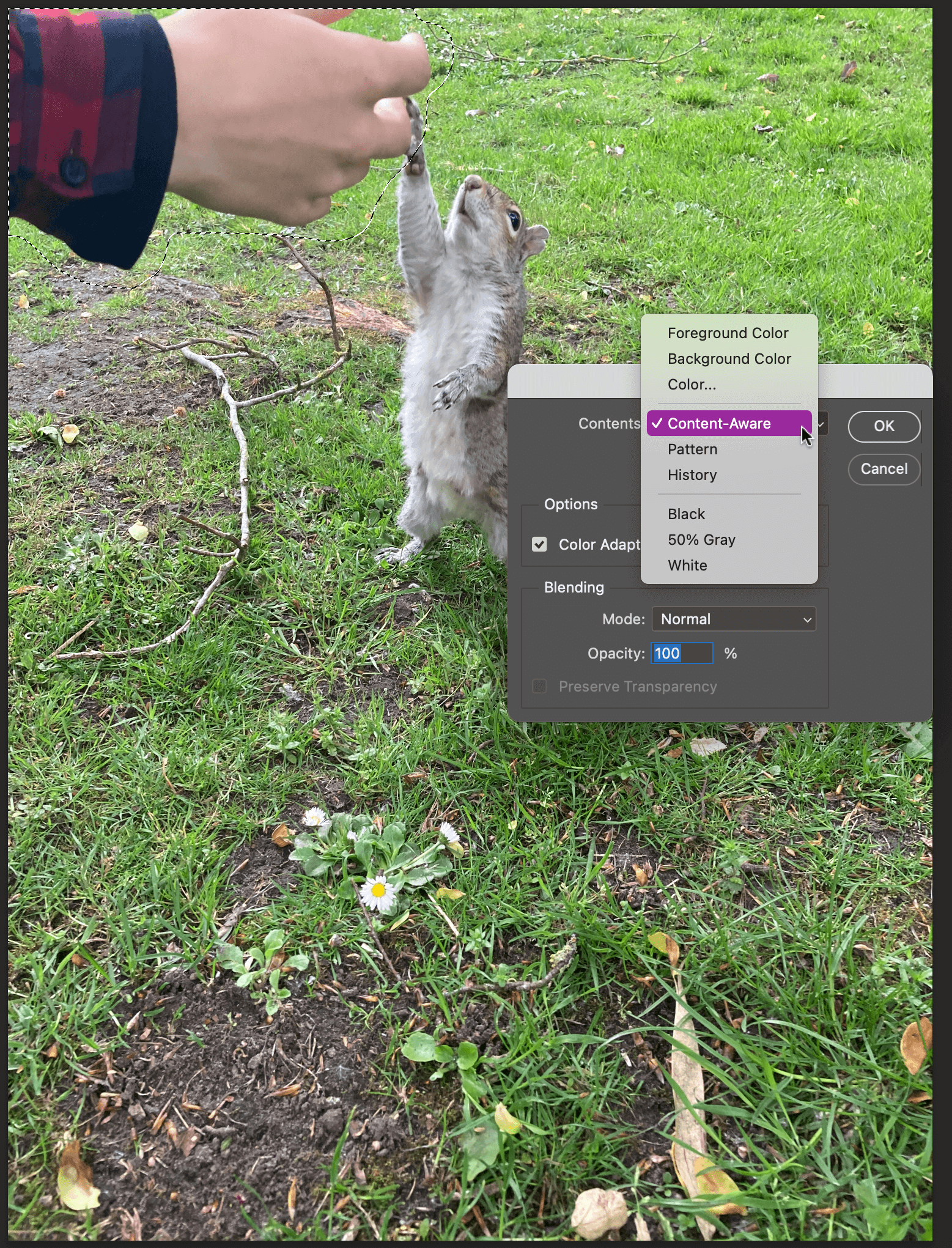
Content-Aware Fill
Figure 12
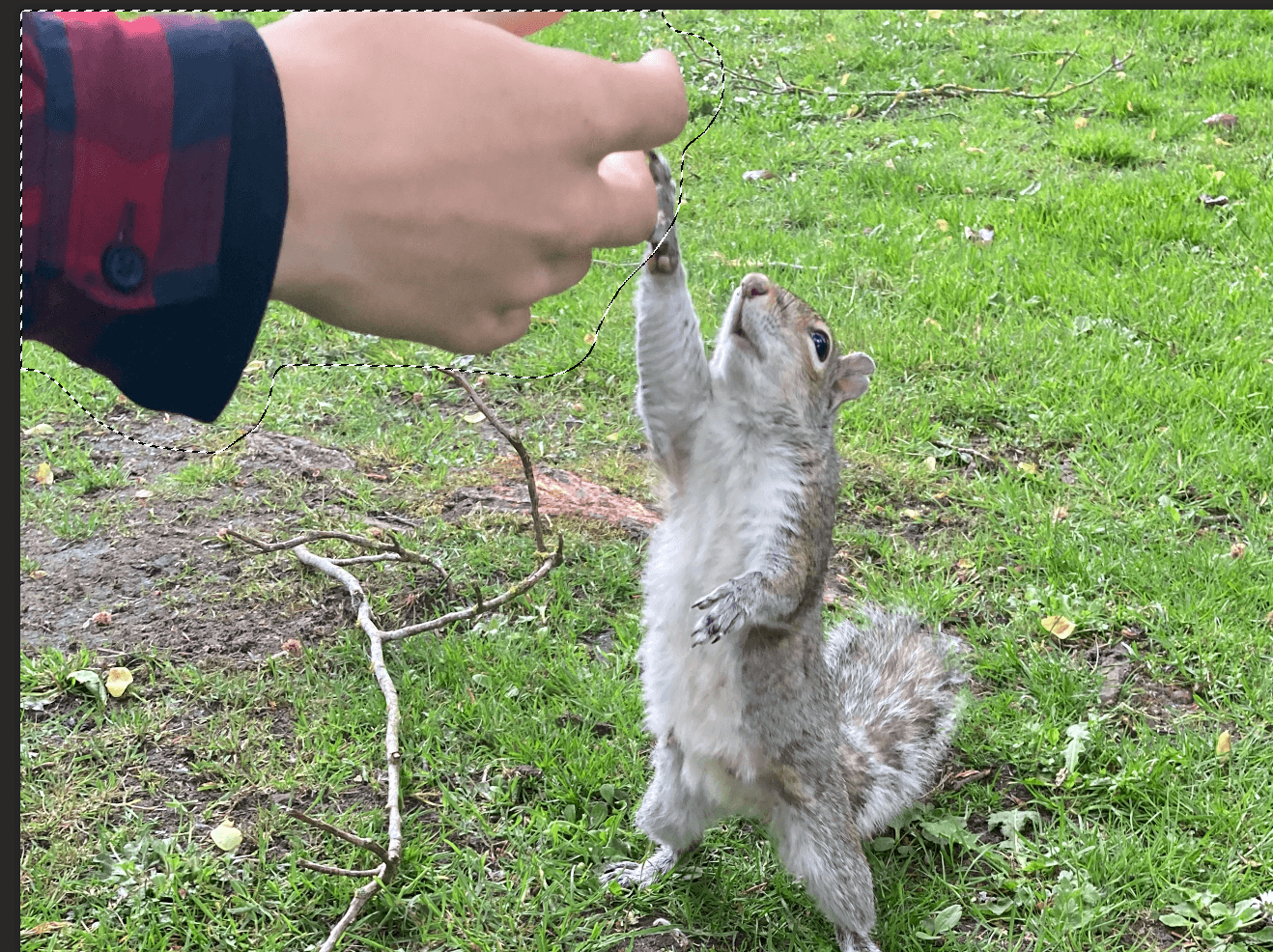
I explored one last tutorial for my third design idea, which was how to remove objects with the ‘content-aware fill tool’. Firstly, use the ‘lasso tool’ to select the part you want to remove, this can be quite loose, in my case, it was the hand, Figure 13. Then locate the fill option, which is in the top menu bar, Figure 14. Choose content-aware fill, Figure 15, and this is the result, Figure 16.
The software does all the thinking about which parts to copy, similar to the steps taken in the clone stamp tool.
Figure 13Figure 14Figure 15
Learning Across the Module
I’ve found this module particularly helpful to my development as a designer and as a professional. I’ve been able to lead this module in ways that have been useful to me, in terms of learning new skills.
The skills that I have learnt across the module include: the clone stamp and content-aware fill in Photoshop, 3D text effects and the envelope warp tool in Illustrator, and making tables in InDesign.
However, the biggest thing I have learnt is how to use new software. This term I have had to learn three completely new software: After Effects, XD, and Premiere Pro. So, you get quite used to the process of accepting scary new software and simply just opening it. Thankfully the Adobe software is all fairly similar, which has made this process easier.
Skills I have improved on this module include: cutting things out in Photoshop, and using the pen tool and creating gradients in Illustrator. Other skills have been using Adobe fonts more, for instance I now know how to search by an image in order to match fonts. Finally, I have been able to build upon my time management and staying on top of the independent tasks, even when no one checks upon it!
Skills to continue to develop:
Two skills that I would like to develop are being able to make screencast and using Adobe XD in a fluent way. Making videos is a fundamental skill, especially in increasingly digital world, and is something that I’d like to build my confidence in.
Design Resources and Articles
In my current design work, I hardly use Photoshop. However, being able to use it to a higher standard would enable me to have a wider skill set. How to get to that stage? A wider exploration of the software, for instance opening up all the menus to see what everything does.
I could do a thorough LinkedIn learning course, which would enable me to learn pretty much everything there is to know about Photoshop. Or I could continue to set myself design challenges, similar to this module, where I carry on with a strict regime of learning new skills. We never stop learning, even more so with software that is constantly changing and adapting.
Amrita Shrilal has been involved in an exciting new collaboration with Bottomline Technologies this past year. Amrita is one of our MA Communication Design Graphic Design Pathway students graduating this week. She’s also a BA Graphic Communication (Hons) alumnus.
Bottomline focuses on transforming complex business payments and processes into simple, smart, and secure systems. They work with financial companies and institutions globally, and are widely recognised as a payment and collections enterprise. They have banking relations with global banks, UK banks and, building societies, growth banks and payment service providers.
Amrita Shrilal (MACD class of 2021)
Amrita has a particular passion for user interface design. To develop experience in user interface design for the financial sector, she undertook a design brief for Bottomline’s Head of UX Design (EMEA), Kellie White and, Senior UX Designer and Reading alum, Matthew Standage for her MA professional practice assignment. Dr Jeanne-Louise Moys, MACD Graphic Design and Information Design Pathway lead, supervised her project.
The brief gave Amrita the opportunity to explore approaches to designing a system that allows customers of different-sized businesses to customise the interface design, of a particular product, to match their brand needs. The challenging aspect of the brief was creating a seamless and easy process of designing elements of pages for customers with different levels of expertise on brand and webpage design. It required her to consider ways of presenting complex information and processes in a more straightforward method for end-users. Her design decisions were supported by her research into UX design, market competitors and the development of personas which helped her understand the user and business needs.
Amrita said: “I enjoyed this project as it was different from all the other UX projects I had done in the bachelor programme. It focused on Business-to-Business (B2B) rather than Business-to-Customers (B2C) which is more complex as you need to consider not just the user’s goals but different types of business capabilities and interests. I had to think about how a particular organisation could utilise or benefit from the features of the system to make their process of designing the web interface a seamless experience.”
The outcome of this project was a prototype of an interface system that allows businesses to brand themselves within Bottomline’s products. It considers different user design needs and attempts to make the process of designing interfaces straightforward to those who are not familiar with design conventions or terminology. Some of the features within the system included editing the colour scheme, text styles and button styles.
Process of uploading the brand logo and ability to view the placement of these elements in different pages.
Reflecting on the project, Amrita said: “the project was a stimulating experience as I had to think about different user perceptions of design elements. I had to constantly ask myself whether it would be easily understood by someone without any design experience. Despite that, I enjoyed the opportunity to collaborate with Bottomline on an ongoing project and it helped develop my understanding of UX/UI design”.
Kellie White said: “Amrita did a fantastic job of taking a complex problem and making it simple, a difficult task to accomplish. She worked well to align to good UX process throughout, from research through to ideation and user testing. I was thrilled with the outcome, she achieved a well thought out design solution and growth in her UX skillset through the experience. Well done Amrita! We look forward to future collaboration with the Department.”
Matthew Standage added: “It was a pleasure to collaborate with Amrita and the Department on a professional practice brief. We were not only impressed with the overall quality of the outcome, but also the thorough research and design thinking that went into the process. One of the common challenges in B2B user-experience is striking the balance between complexity and flexibility. The work Amrita produced solves this problem well, using both visual and interaction design techniques to progressively disclose more advanced options to the user and provide guidance when necessary. We look forward to seeing how we can integrate her work and thinking into future product releases.”
This project is the first collaboration between Bottomline and the Department of Typography & Communication. We look forward to exploring new briefs with them for our postgraduate students to work on in the future.
We also look forward to welcoming Matthew back in January for the two-day “Branding and user experience” workshop that he leads for our MA Graphic Design and Information Design pathway students in the spring term.
This is my photoshop work where I completed the task as per the brief in making 3 Podcast Covers.
Design Ideas and Design Process
Idea 3
This was my first design where I wanted to highlight the use of books because of their importance to typography and graphic communication, and what better way to represent this is using an image of bookshelves. From viewing covers a black and white background with text over the top is an extremely common trend. However, this looked rather busy so I decided to blur the background to put more emphasis on the text but still can tell what the image is.
Idea 2
This is my second design where I wanted to link the topic of the podcast to something that people always look at and relate to. So just like the book idea above, I created this idea using road signs. However, with this design I feel like the sign I created does not look weathered enough.
Idea 3 – Final Idea
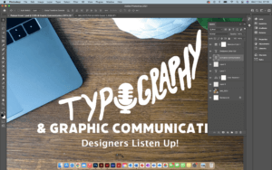
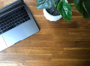
This is my last and final idea and by far my favourite one. Just like the covers above I wanted to make a cover that could relate to a lot of people but because this podcast is of a specific topic, I wanted to really filter down on Designers themselves. So, I decided to take a picture of my desk space because this is where a lot of designers will be sitting to complete their work, even including a MacBook as this is pretty much industry standard. I think by doing this makes listeners more comfortable because it is something they are used to seeing.
Working in layers to create suitable Hierarchy
Cropping & Dragging image across using lasso tool
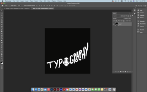
Choosing a font to match the same thickness illustration
Cropping and colour correcting image
Software Tutorials
Because I have some experience in using photoshop, when completing the task, I used existing knowledge of the software and where my knowledge lacked, I would look into alternative means in filling those gaps. I did this mainly by looking at tutorials provided on Blackboard but also venturing through YouTube videos.
The one tutorial I heavily used in one of my podcast covers was because I wanted a desired effect of a weathered or distressed road sign. This was because the text and the boxes used to create the overall cover looked very unnatural to me, so I looked at means to make this more realistic. A lot of the road signs I have seen look weathered, rusty and warn down. This tutorial helped me develop my skills further as it is something used a lot in projects, and it also opened me up to seeing and playing around with filters to change images.
I’d like to improve on cropping and using the likes of the lasso tool to make sections look sharper and crisper. This is because I kept finding additional tags when cropping out images which made the image look blurry and messy. It took multiple attempts for me to be happy with some of my cropping.
Design Resources and Articles
When it came to looking at additional resources around the podcast covers, I mainly looked at various different websites and podcast services/ apps to find what common conventions each cover had. As an avid podcast listener and knowing how to navigate these I found this extremely beneficial as I created a list on what covers had in common. This is the list I created and used throughout my covers:
Minimal/ simple
Use of white (either for background or text)
More illustration than photography or combination of the two
If photography is used it is very specific
Mainly use 3 colours
Square
These really helped me and inspired my designs for my covers.
When previously using Photoshop/Indesign/Illustrator I tended to stick to what I knew producing simple and sometimes boring outcomes. I found these tasks challenging as I knew I wanted to push myself to learn new tools in the software however it was sometimes hard to not give up when something was going wrong.
Postcard 1Screenshot 2
My first design I wanted to try using the clipping mask to create this see through text effect. I layered this onto of lots of images of newspapers as I thought this would show the themes of printing and typography talked about on the podcast (see screenshot 2). It took bit of playing around with to get the perfect balance between the background and the text so that it would still be eligible to read and meant I had to transform and crop the original photoshopped background to make this work.
Postcard 2
Before starting my second design I knew I wanted to try cutting out from different photos on photoshop.
Screenshot 1
By composing this idea with different typography and graphic design elements coming out of a head (as if this is what he is thinking about) would allow me to practice this skill multiple times. I found the smoke in this podcast cover the most challenging. I originally
started by trying to draw the smoke with different colours and blurring this together however after watching some tutorials, I found the most realistic way was to use images of clouds placed into the file (shown in screenshot 1).
postcard 3
My final design started on the inspiration of using an old computer. Originally I wanted things to be coming out of the computer almost as new tabs opening before I chose to incorporate the speech bubbles. I believe this was my least affective design as they are only basic components and mainly used skills that I had developed on my last two covers
Software Tutorials
A helpful tutorial I watched on YouTube explained how to create smoke on photoshop. I found this particular video useful as it talked through three different ways to do this, all of which I tried before deciding which one worked best for me. I chose to import an image of a cloud and use the lasso tool to clip this. I didn’t think about this way before as I wouldn’t have thought to change the levels of the image to create white smoke on a black back compared to a cloud on a blue sky. The tutorial can be found here https://www.youtube.com/watch?v=FIBXXglbYtQ&t=361s
I knew before starting the sticker tasks that illustrator was the one software that I felt the least confident in so before I began I watched different videos on the basics of illustrator, this also helped me understand the terminology such as anchor points for when I watched more specific tutorials. When I first started drawing the microphone on the postcard cover 1, I was struggling with getting the curve of the line smooth so I watched this tutorial (https://www.youtube.com/watch?v=ViKQgIDblr8) which allowed me to realise I was using the wrong anchor points for what I wanted to achieve and I could easily fix this by using the covert tool.
Design Resources and Articles
Before all of my tasks, I would start by looking on Pinterest at other podcast covers or stickers etc to give me a general starting point. This is where I first saw the concept of objects flying out of someones head like in my second podcast cover.
The website https://dribbble.com/stories/2019/08/06/30-creative-examples-of-podcast-cover-art-and-branding was also interesting to me as I could see how the use of colour affected the design. Most of the covers on here were very colourful and eye-catching which inspired me to use more varied colours when design my own such as the use of purple and yellow in my third sticker.
For my first podcast cover, the idea included a lot of emphasis on the typography of the design. I used skills I had already developed from other modules on the course as to how to efficiently alter a type face to produce the best outcome. However designing this cover showed me that there were gaps in my knowledge such as the kerning of the writing which is why I found this article useful to read. https://99designs.co.uk/blog/tips/11-kerning-tips/


 is is using an image of bookshelves. From viewing covers a black and white background with text over the top is an extremely common trend. However, this looked rather busy so I decided to blur the background to put more emphasis on the text but still can tell what the image is.
 ke the book idea above, I created this idea using road signs. However, with this design I feel like the sign I created does not look weathered enough.
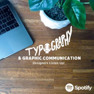 This is my last and final idea and by far my favourite one. Just like the covers above I wanted to make a cover that could relate to a lot of people but because this podcast is of a specific topic, I wanted to really filter down on Designers themselves. So, I decided to take a picture of my desk space because this is where a lot of designers will be sitting to complete their work, even including a MacBook as this is pretty much industry standard. I think by doing this makes listeners more comfortable because it is something they are used to seeing.
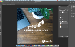


