
Real Job by Matt Perks and Clara Tsang
Making Tables in InDesign – Going ON the Grid
Introduction
I think it’s important to start off by saying I had no idea how to make tables and grids in InDesign. Other than my limited use in the book design project and making work files, I haven’t used the software before. I was well aware that I’d have to start with the basics, but I’m glad this module gave me a chance to do this.
Software Tutorials
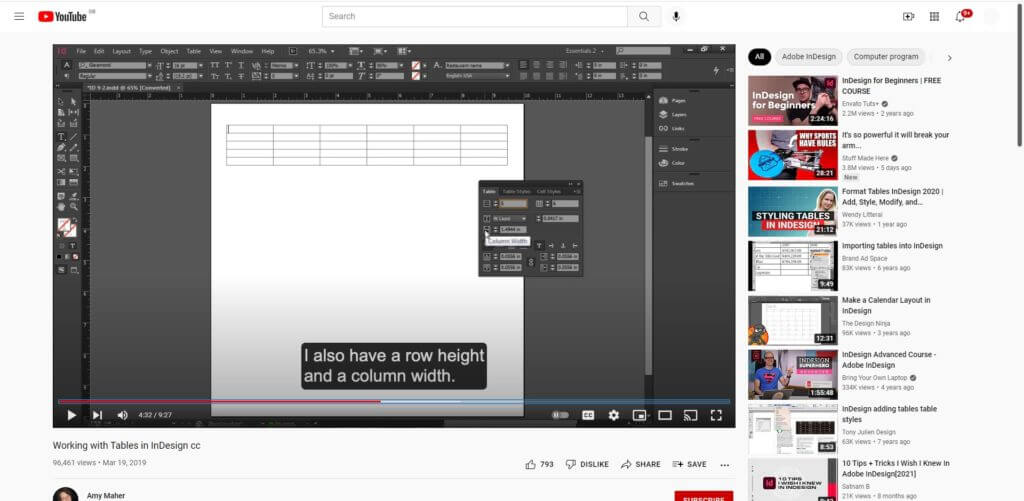
I, therefore, had to begin with the software tutorials, needing this information to progress with this challenge. I began with a YouTube tutorial by Amy Maher, which allowed me to grasp the basic technical aspects involved in grids and tables. This focussed on the foundational skills, a complete beginner’s guide to this tool which was perfect as I currently didn’t know anything about this.
Using my newly-gained knowledge, I opened InDesign to begin this project. I decided quickly that my first design would be an incredibly basic but functional table, making sure that I could adapt this to suit my needs, before moving on to a better designed and more visually appealing design.
Design Ideas and Process 1
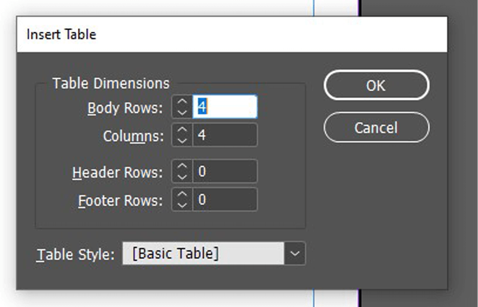
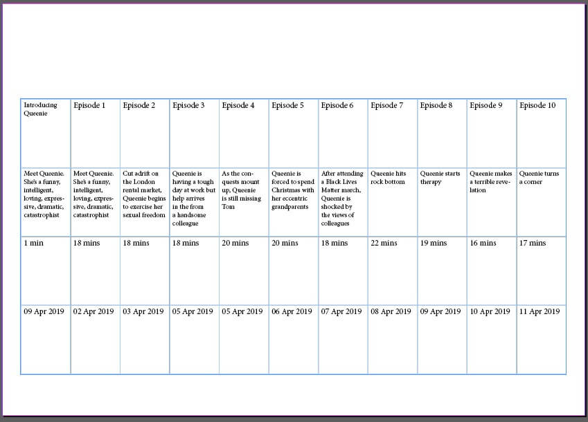
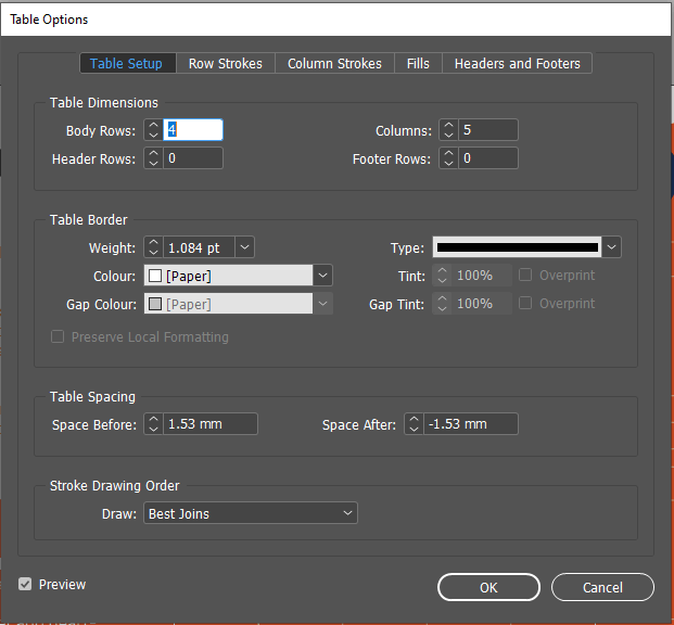
I started by closely following the tutorial – I used the ‘Create Table’ tool to add a table to my page I was then able to specify the specifics, altering the rows and columns to my requirements. I did a simple, linear format for these, not wanting to overcomplicate the design. This tool worked well (other than me needing to add an extra row to the top for the titles), allowing me to input the data into each cell.
As the tutorial said, I was then able to adjust the size of my cells, selecting a row or column to adjust a group at the same time, a quicker and more consistent method. Having done this, my simple table was complete and I was able to move on to the design aspect.
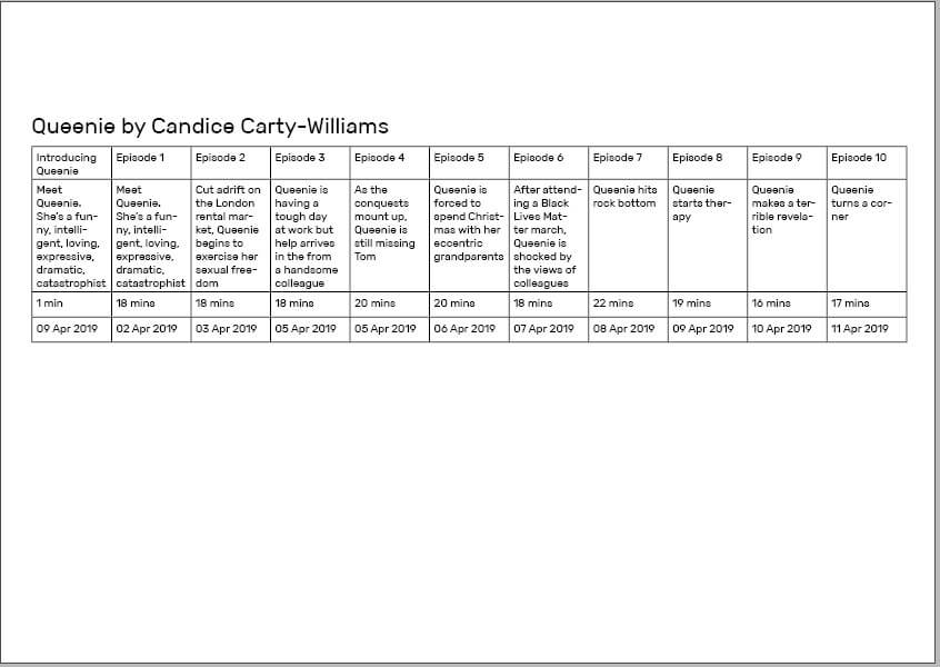
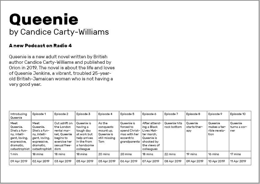
I placed this table along the bottom of the page, adding text initially to create a clear hierarchy. I used knowledge from the previous terms InDesign class to allocate clear paragraph and character styles, while also knowing more about the alignment and structuring that would benefit my final design.
Finally, I added an image of the book and quotations along the right-hand side, allowing a more balanced design to be achieved and having typography and layout separating the different layers of information.
I am happy with this design, clearly a simple beginning, but allowing me to test this tool for the first time and gain more experience in InDesign, both technically with the software and enhancing my skills as a designer through more practice.
Software Tutorial/Article
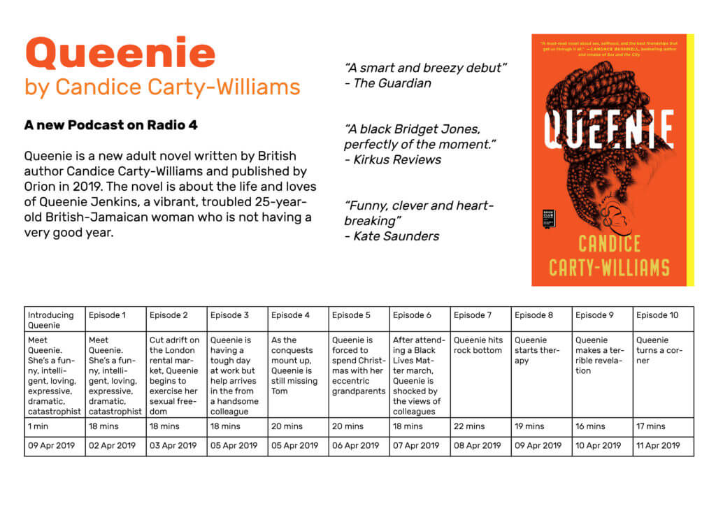
Coming off the back of that example, I wanted to explore the styling aspect of the table more, breaking the conventional, linear structure. I began looking at articles and resources, finding a post by ScienceEditor about the best practices for table design. This added to the foundational knowledge, informing me of conventions of table design – these included the increased ease of comparing numbers when in columns rather than rows and the benefits of breaking up a long, linear table.
I also had to consult an article when hitting a problem – when having trouble adding a row into the table, I used a blog by Adobe to fix this minor issue.
Design Ideas and Process 2
I began by creating a more visually interesting layout for the table, stacking the two parts on top of one another and right aligning it. I then filled in the same data, ensuring that each entry has a consistent size to the next.
I was much happier with this structure for the information; although not linear, the information is still clear and creates much more interest through this less conventional shaping.
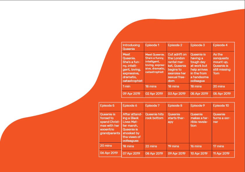
I added this coloured shape as a background element using the pen tool, looking to make something fluid-like but not overpowering. I used the colour picker to select an orange from the book cover. Looking at this with a black table, I knew I had to invert this to white, the contrast making the table and its data more readable.
However, this was not as easy as I thought – I had to use the ‘Table Options’ menu to adjust the colouring, also allowing me to alter the line weight. The results of this were much more successful, with a clearer contrast helping the table stand out from the background.
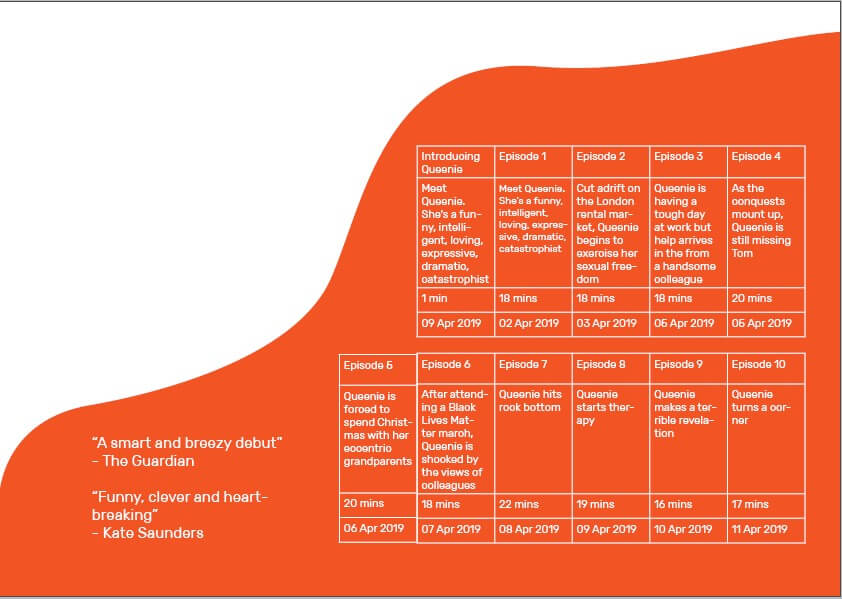
Now being happy with the layout and colouring of the table, I moved on to the rest of the design. I began by adding two quotes into the remaining orange space, testing all three and deeming this too much.
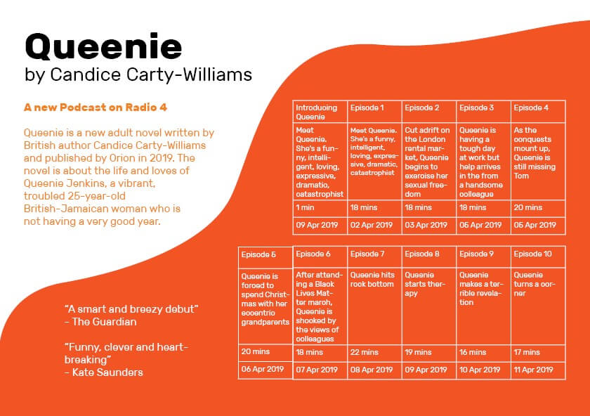
I then went on to add the text (sources from the book’s summary) and the title to the top, again using size, font-weight, and spacing to create a structure and deliberate relationship between the levels of information.
Design Resources
Finally, I added the BBC Radio 4 logo (an online resource) to the design, feeling this provided some visual balance to the design and helped to complete the layout. However, the rest of this design was simple typographic work and shapes created by me, not wanting to overcomplicate the design with external images and resources.
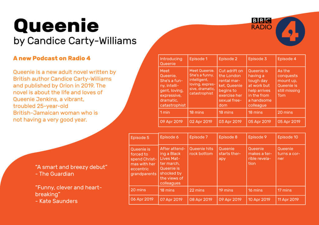
This second design is a better design – visually, the page is much more striking and provides much more interest to a viewer and potential listener. The table itself is much more fun and unconventional layout that helps to draw the eye to this vital information without it dominating the page in size.
Learning Across the Module
I began this project with no knowledge of using grids and tables in InDesign. Although my first attempt was relatively basic (and not without issues), my second design is a visually engaging and effective table, working as an element within a successful and balanced full page. While I am sure there are more nuances to this process, I feel comfortable in creating a table, a skill that will certainly be necessary for later work. I have built up from nothing and am now able to use a brand new tool in InDesign, an integral piece of software I will likely use for the rest of my career.
Carter’s Fairground contest: Legal & General
Overview
This Real Job comes in the form of a contest, something fairly unusual for these briefs. Following a recent social trip to Carter’s Steam fair, a traditional English travelling funfair, members of the department began talking with attraction owner, event organiser and sign-painter Joby Carter. After learning more about his incredible talent and passion for hand painting stunning fairground signs, this competition was developed, giving students an opportunity to experiment with this highly niche style. To me, this seemed like an amazing way of trying a new typographic style, experimenting, and playing with this fun concept.

Brief
The brief of this work was very straightforward – to pick a brand and recreate its logo in the fairground style. While specifications of the deliverables were given, being digital or physical and being a 2000px square, the choice was left to us. Joby stated in the brief that he personally enjoys poking fun of serious topics and making the most of the jovial, light-hearted nature of fairground lettering.
Concept
Immediately having read the brief, I began thinking about the most serious business that I could put a spin on with this decorative, over-the-top lettering style. My mind raced to topics like finance, law and banking which quickly led to Legal & General, a financial services provider that’s been in operation since 1836. The history of this company was really engaging, reminding me of old legal documents, such as those seen below. The typeface used are highly decorative and ornamental, being somewhat like the fairground typefaces linked to the fair, allowing this to marry well, being a suitable and engaging brand to remake in this unique style.

Initial Ideation
Beginning this work, I started sketching different letterforms and concepts for a Legal & General logo, having looked through Joby’s work online for inspiration. I was immediately faced with a challenge – my lack of artistic ability. I typically refrain from sketching and drawing, knowing I am stronger creating things digitally. While eager to move onto Photoshop and Illustrator, I knew the importance of these fast-paced, initial sketches. While many pagers were created, below shows the strongest concepts.

Digitising
Before meeting with Joby, I wanted to refine the better concepts digitally, giving myself a clearer direction going into the imminent feedback session. With my sketches being very rough, this would give a much more blatant presentation of my idea and how it may be executed. I quickly generated these designs, using the umbrella element which I thought was the strongest from this ideation. While the lettering itself was just a standard font, this would be changed later following the feedback.


Meeting Joby Carter
We then had the opportunity to meet Joby Carter, visiting his expansive workshop in Maidenhead. Hearing Joby talk about his work, his process and even watching him hand-paint some lettering was hugely informative for this project and style. The difference between typography and lettering was a really interesting idea mentioned by Joby, with his discussing how different they are treated and how lettering is a largely different skill. While getting masses of inspiration from Joby’s work and enthusiasm, it was clear this was not a skill that could be mastered quickly. I came to the conclusion that, while the hand-made, slightly imperfect appearance is key to the authenticity of this style, I would need to utilise some digital effects and techniques to get close to replicating the skill of professional lettering painters.

Following this event and the following feedback session, I decided to largely restart the concept. Knowing much more about lettering and sign-painting after meeting Joby, I decided to return to ideating, wanting a new concept that was more in line with how hand-painted lettering is constructed and designed.
Secondary Ideation
Going back to square one, I went back to sketching, now having more focus on this style of lettering. These sketches were much closer to what I’d learned about sign writing, providing much more engaging ideas focussed on the letterforms themselves, knowing the rest could come after. Placing the focus on constructing the letters allowed the outcomes of these sketches to being much better foundations for the final outcomes.

Secondary Digitising
For this process, there was much more switching between hand-drawing and digitally creating. Knowing that the imperfect style could only be achieved effectively by hand, I persevered with sketches alongside designing digitally. This allowed me to bring across the more rustic, authentic style of lettering without oversimplifying the designs digitally, using Adobe Illustrator to make things mathematically perfect. This also let me test designs digitally, deciding if the sketches adapt well into a digital space or not. While more time consuming, this meant that the idea I concluded was the best would undoubtably work. After some back and forth, I selected a sketch that was suitable, drawing out the key letters for the brands logo before digitising them. By creating the letterforms by hand, I knew that the end result would have the rich authenticity of hand formed text, but would likely be more challenging and time consuming to create.


I was already much happier with this concept than the previous design – this put much more focus on the lettering, adhering to both the brief and what I learned from Joby, with the careful crafting of the basic letterforms being the key to an effective, successful outcome.
Over this time, there was extensive tweaking and refinement to the characters, with countless iterations being used to mark milestones and save a history of the process to compare changes. The image below illustrates part of this.

Feedback from Baseline Shift
Baseline Shift provided another outlet for feedback on this design. The weekly session happened to be centred around getting advice and tips from various designers in and out of the department, allowing us to get helpful guidance from people new to the project. Wanting to take any opportunity for advice, I presented my current digitised lettering.
The main feedback I got from this was that it wasn’t fun enough. While this was partly down to the colouring, which hadn’t been considered yet, the overall composition was very linear and straight. The various typographers and calligraphers present all agreed that a more dynamic, free flowing structure would benefit this style much more, giving a more organic and fun sense to the letterforms and the overall branding.
I was also advised to use less strict lettering, ensuring duplicates of the same letter aren’t identical. This would allow the type to work better as a full flowing text, the letters adapting to work alongside those before and after. It also provides a much stronger sense of authenticity and a hand-crafted appearance, with each character seeming visually distinctive and individual.

Making Changes and Feedback
Wanting to inject some ‘fun’ into this lettering, I experimented with different layouts, using Joby’s work and other sign-painters works as examples for structuring text. After some quick trials, moving the two lines of text around, I settled on offsetting this and using exaggerated, large first letters. This more stylised appearance is more in-keeping with conventional letter painting conventions, immediately making it more fun and visually inviting. Adding vibrant colours and an offset drop shadow, common features of this genre, also helps quickly make this design feel more in line with the brief’s requirements.

Below are some variations of this concept, simply experimenting with colour combinations and for the main text, drop shadow and background. While still trying alternate background colours, Joby’s use of slightly off-white tiles for his lettering along with its function as a logo encourages me to use a plain white background. From here onwards, I would stick to a solid white background, feeling this had a stronger connection to Joby’s painted lettering.

At the feedback session, where I showed both my original and updated concepts, there was a resounding lean towards the newer concept. The more dynamic, varying design was much more visually interested and had the sign painting-esque appearance. I was given incredibly useful advice on the typographic balancing, and different parts of the letterforms to tweak to give more visual balance. However, I was told again to make the design more fun and inviting, potentially using perspective, distortion or warping to add further excitement.
While the added ampersand completed the logo, finishing the brands name with the simple & symbol, it was suggested that this could match the ornamentation below, adding more consistency to the overall design and making it feel more harmonious and unifying. With this knowledge, I will start making these changes, wanting to try adding a wave or warp stylisation to give the text even more dynamism.
One key takeaway from this stage was the colours – this designs dark green and murky pink complimented each other and the golden yellow ornaments well. I quickly concluded that this colour combination could be the basis for my final outcome, being highly suitable and similar to the wacky but visually pleasing choices of Joby Carter.

Refining the Letterforms and Warping
With this feedback in mind, I began to move forwards with the design. Despite my eagerness to play with the waving and distortion of this lettering, I knew I would have to correct the letterforms themselves before taking it further.
These corrections to the letterforms were very time consuming to alter – having created these letters by hand, these imbalances were much more prominent than having used an existing typeface by a more experienced typographer. But, as emphasised by Joby, a typographer and letter painter are very different professions, and building this type from hand ensures some imperfections and authenticity remains in the final outcome. The quantity of these changes is illustrated in the below images, where the key iterations are shown.

For example, the two ‘A’s are of particular interest. I altered the way the crossbar works on each one, the first having the curved stroke going inside the letter and the second going out. This tweak to the second instance allows much better balance, filling in the negative space and creating more visual engagement between the letters.

After a brief trial of warping the text in Illustrator, I concluded it would be simpler in Photoshop, applying a single wave effect to the whole design before reading the ampersand and ornamentation. Having quickly completing this, I created the drop shadow and a white stroke to separate the main text from this shadow. While beginning by offsetting a pink version of the letterforms beneath the main design, I then connected the two with hand, adding the outline in after. This subtly change made the design feel less artificial and impersonal, with the minor inconsistencies in perspective making the result seem much more personal and in-keeping with this disciple.

While not mentioned much, the ornamentation was something that subtly evolved throughout the design process. From its initial creation, this has been altered and tweaked, both in shape and style. I was advised to make this element have varying widths, looking less uniform and have a more hand-created style similar to the letters themselves.
While this began as a symmetrical component with the ‘EST. 1836’ text in the centre, I began experimenting with an asymmetric structure, creating more visual engagement and helping to account for the lettering’s visual balance. This structural change causes the umbrella to be removed from this element, but I knew it was a feature I wanted to include in the final design. Trialling different strokes and decorative flares (shown below), I found a solution which worked effectively, feeling balanced below the focal lettering.

Final Amendments
During the final feedback session, there were much less tweaks to change (a reassuring sign). The main thing to note was the balance of the hanging ornament. It was said that fitting this ornament into the negative space below the wavey text, the whole concept would feel much more balanced and the two would marry together better. A straight bottom was also advised, helping to ground the flowing text to a horizontal line. This worked well, achieving both and giving a nice sense of visual balance.

I re-added the umbrella element, adjusting its stroke width to better fit the other similarly styled elements. Placing this below the enlarged ‘L’ and alongside the large ‘G’ helped to further balance this concept. It’s place here allowed it to be a relevant visual for the brand without over-complicating or crowding the design. The use of colour also helps keep the lettering distinguished from the ornamentation.

To add a final bit of depth and hand-made authenticity, I added a subtly gradient to the offset drop shadow by hand, allowing for some subtle imperfections. With this desire for a slight rustic feel being key to my design process and choices, I felt it important to continue it in every element.
Final Outcome and Self-Reflection

Looking back at the final deliverable and my process, this has been undoubtably challenging but very rewarding to participate in. This style of design, particularly the hand-made nature, is out of my comfort zone as both a designer and typographer. Particularly when developing initial ideas, I found this Real Job tough. Meeting with Joby Carter was the first step in the right direction, with his knowledge on the subject really helping in each aspect of the following design phases. The continual feedback throughout this work also helped immensely, allowing me to show different ideas and get alternative opinions on work.
While I by no means compare my work to that of talented, trained professionals like Joby, I am happy with my outcome. I believe it achieves the brief well, fitting the style of fairground lettering and appearing hand-made and authentic despite being a digital asset. While this is not what I expected to be doing on a Graphic Communication course, this project has given me an immense appreciation for this disciple and the incredible talent and craftsmanship that goes into making such effortlessly stunning hand-painted lettering.
Letter Shaping and Font Replication
Task 1 – Fill in the Blanks

In the first of two tasks, I was given 4 letters in the font ‘Skolar’ with large portions missing, with me needing to fill in these spaces as accurately as possible. While initially sounding easy, I was surprised at the complexity and difficulty of this task.
I began with the ‘n’, which was missing the top curved portion, as I thought this would be the best starting place to ease myself into the task. I used a 6B to begin sketching a skeleton of the shape before switching to a 2B to define the outlines. While I think this was one of the closest letters to the original, the sizing was still off, making it taller than the actual Skolar lowercase ‘n’.
I then moved on to the ‘e’; I struggled on this one more, not knowing if a serif was present or not. From the remaining parts of the other letters, I could see some of the different possible serifs. However, after trying them and deciding they looked misplaced and visually off-putting, I resulted in a slightly tapered but curved edge. While the right choice for this font, my choice to make the letter closed instead of a more open sweeping stroke makes my letter look visibly different from the real font.

Although going in apprehensively, the ‘d’ was not as challenging as expected. By giving the sketching process time, I was able to slowly build onto the base skeleton lines to create a structure that somewhat matched the given portions of the letters. Upon reflection, the real font is more angular than mine, with the bowl joining onto the stem in a sharper manner. Despite this, I think that the curvature and slight descending nature on the bowl are accurate to the original, making this look like a reasonably close recreation.
The ‘a’, in my opinion, is the furthest from Skolar. In my addition to the given portion of the letter, I did not add the angled stress found in the original. The serif is similarly absent from this, making it noticeably different. I failed to capture the angled nature of the bowl, instead of creating a rounded curve with much less stress. However, with the given part of the letters, there was no real way of me inferring the angle or stress of the font. This task showed me the intricacies of type, helping me to spot subtle ques and motifs that run through the letters while allowing me to apply my sketching and drawing skills to a practical task.
Task 2 – Replicating Entire Letters

The second task was more challenging still; here, we were given six letters within a particular font and had to continue writing other letters of the alphabet, attempting to replicate the font. Now without the assisting portion of the letters, many more of the choices made were based on the other letters and existing knowledge of typography.
Beginning with the letter ‘a’, I presumed this would be a double story letter from the smooth, open strokes and chunky serifs. Looking back at this now, I think that the bowl of the ‘a’ descends too far below the baseline. While the counter is reasonably proportioned for the vertical stress of the letter, it is also apparent that the aperture of the overhanging stroke is too small, making the letter seem closed off. This does not follow the open nature of the example letters, forcing me to not include a serif and making it appear further from the typeface. However, in comparison to the FF Tisa Standard font I was attempting to replicate, I was not too far away from the real letter.
Following this, I then created a lower case ‘c’. The curvature became a challenge here, requiring a smooth curve and a definite decision on the inclusion of a serif. After looking at other letters, specifically the lower case ‘e’, I decided not to include any serifs, keeping the letter more visually simple. While the real letter does have a serif on the upper end of the stroke, I think that my choice was somewhat informed. With both serifs, the glyph looked out of place alongside the other letters, causing me to remove both serifs. The stress and proportional weighting of the lettering was good, but this task has helped me understand where my weak points are and where to continue independent research into typography and lettering.


Finally, with my remaining time, I drew out a lower case ‘b’. Here, I went the opposite direction, adding an upper and lower serif to the design. Although this is present on the lower case ‘d’, the ‘b’ in FF Tisa Standard only features an upper serif. The angled exit stoke of the curved bowl, stressed proportional weighting and slight descending curve are all accurate to the real font. However, the bowl is more squared off in the authentic typeface, with my recreation being too rounded by comparison.
Although these tasks were not flawless by any means, I think the lessons I have learned from completing them have been incredibly valuable. I looked at letterforms to a very minute depth, allowing me to make judgments and observations on minute aspects of the font. I have also been made aware of areas to improve, which I will pursue and try to actively improve within my studies and free time.
Cinema Listings Development and Presentation
Initial Ideation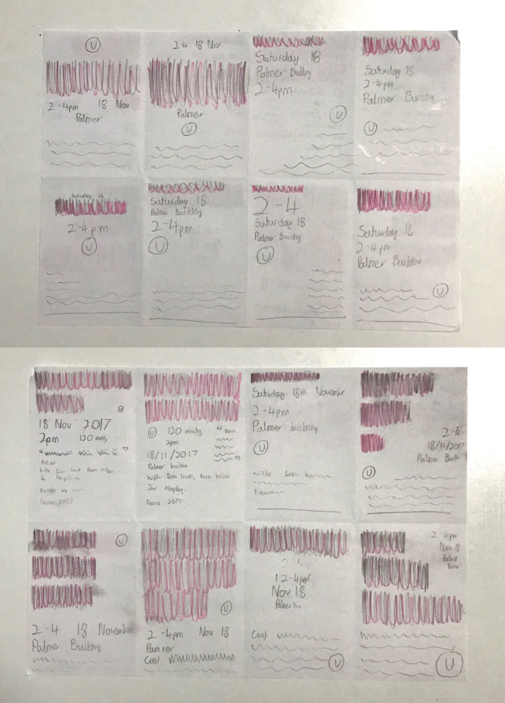
Following the brief being set, I began by quickly sketching designs. It is important to note that my target audience was a father with two young children, so many design choices were influenced by this. I used blocks in place of the main title, writing only the other information to see it in context. This was a purely experimental process intending to generate a range of ideas relatively quickly.
I trialed different positionings of the title mostly, which I shaded in pink for simplicity. The larger texts, while optimal for a typography-based poster, would likely not work in the context of a cinema listing, which must be a vehicle for information. The A5 size limit means that text must be carefully balanced to ensure hierarchy and optimal readability.
Alternatively, when made smaller, the title loses its dominance over the other information. While there are other factors likely more important to a father, such as whether the timing of the film works with the family’s schedule, the conventions of a cinema listing and other users also have to be considered. The film title is typically the largest element in each individual listing, allowing other users to quickly identify a film that interests them.
After reflecting on these ideas, I concluded that the bottom right image on the first page and the top right image on the second page were the two most suitable. These two ideas appeared well-balanced but will be refined in later development.
Idea Refinement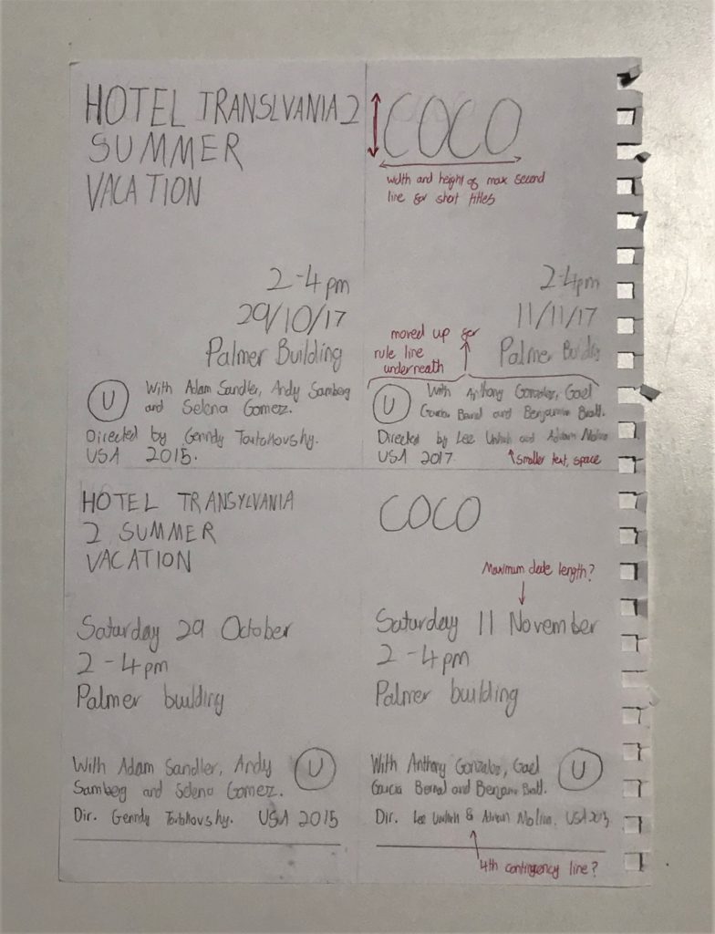
Having decided on the two concepts, I drew these out to a larger scale, now writing the full title out. Although this is more in line with the final piece, the actual refinement would take place within InDesign, so this is simply refining the concept.
I drew the ideas twice, once with the longest title and once with the shortest, allowing me to see the extreme differences this element will need to have, in turn being able to adapt the design to these requirements.
Having done this, I used a red pen to write on notes and adjustments to make when in InDesign. At this point, I decided that shorter, single-line titles could span the height of two lines, believing that this would make the design look more balanced.
I also concluded that, while spacing was important and should be tweaked and adjusted when suitable, a larger font would be optimal. This would make the final printed product clearer, allowing it to be better at its purpose, to communicate information to a potential customer of the cinema.
Having concluded that these ideas would be suitable and refined them slightly on paper, I then had to use InDesign to begin the digital creation of the ideas.
Digital Creation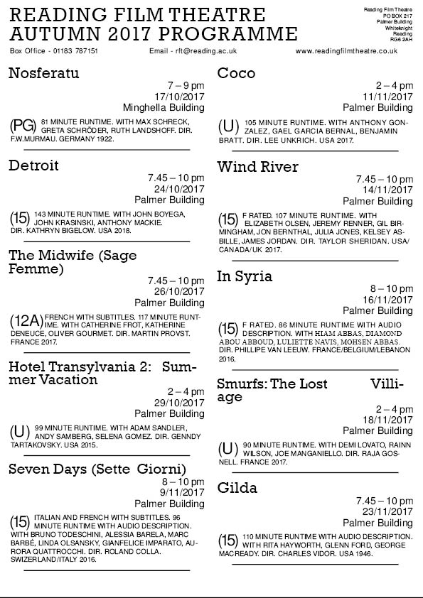
I began with black text, creating a single entry in the structure of my first sketch, using style sheets in order to regulate and standardize the sections. I found this stage complicated and difficult to construct, trying to tweak the paragraph styles to create a successful result. After watching a tutorial video on Drop Caps, I had finished the first entry and was able to quickly apply these styles to the remaining text. I then added the remaining information, including the titles and contact details, which I placed at the top of the page. I adjusted the sizes of these, making the title significantly larger while making the other information smaller, semantically spaced, and arranged to create visually balanced spacing by controlling the negative space around these elements. I realised that smaller titles could not be in a larger font as initially planned, as this made the design look incongruous and visually imbalanced.
Having completed this, I reflected on the design. I decided that the spacing needed work, with the blocks seemingly blending into one. To combat this, I adjusted the spacing more and added rule lines underneath each listing. This helped to define each block of information as separate, differentiating the data and allowing the design to be more visually balanced.
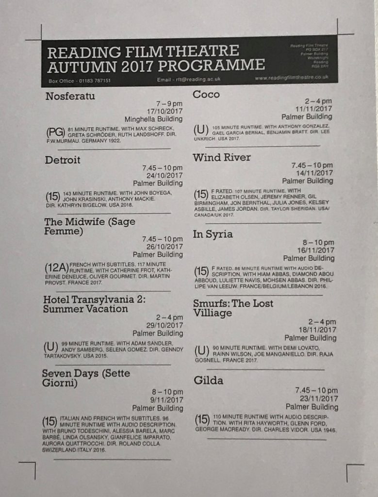 Having created this design, I then added a coloured box to the top of the design. I selected a dark blue, allowing the text to all use the same colours (because, at the time, I thought that white counted as one of the two allocated colours). To allow the text within to be visible, I changed the colour to be white. This created a visual hierarchy, the white text standing out from the thick block of colour.
Completing a basic format, I then printed the design out to scale in black and white. This was a helpful stage within the process, allowing me to better understand and gauge the sizes of the various elements. Looking closely at this printed example, I was able to correct scaling and spacing issues that came up. For example, the smaller metadata was still too big in this example and more spacing would allow the design to seem more clear and visually appealing. I was also able to add more space between the upper listings and the coloured box, balancing the overall look better.
Having made these changes, I was happy with the design. I checked the use of punctuations and hyphens before resaving the design with a new name, allowing me to simply adjust the style sheets on the duplicated document instead of starting from scratch.
Second Design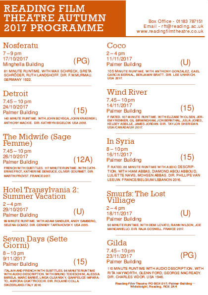
Having stripped this duplicated file back to the basics, I was then able to make adjustments to make the alternate design. I began by adjusting the layouts of each listing, with this being the most important factor to the user. Although other stylistic choices were also necessary, such as changing the typefaces and colour used, I wanted to ensure the concept was visually effective and appropriate at communicating the desired messages. Being able to use the same size font as the previous design was a reassuring sign that this design would be similarly readable and clear to a potential customer.
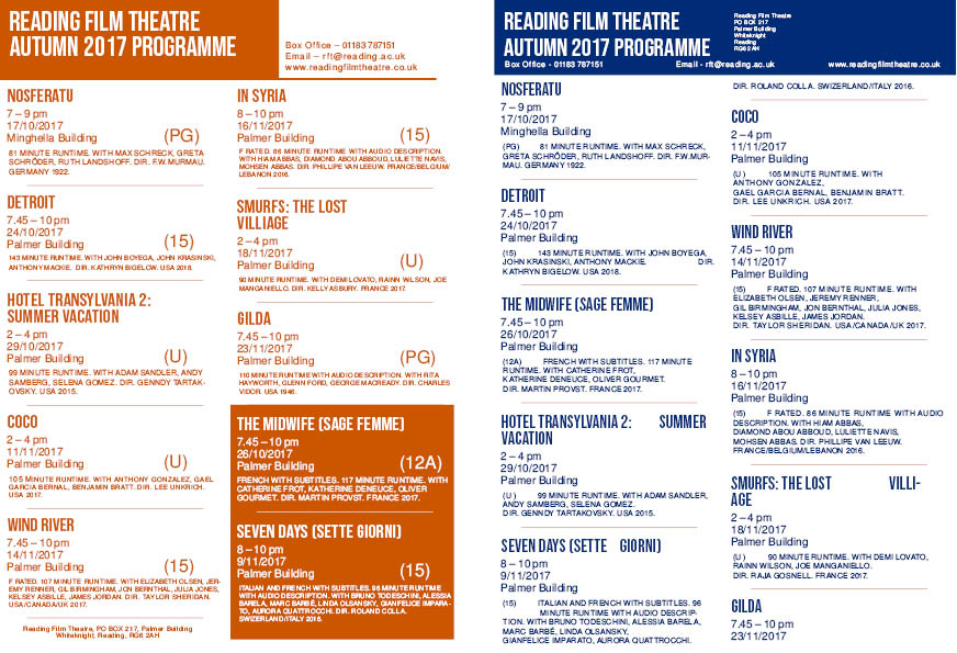
I think that this listing layout, while still somewhat successful for shorter length films, works considerably better on films with longer titles. For example, in the working document on the left, entries like ‘Wind River’ and ‘Nosferatu’ look visually more appealing than ‘Detroit’ and ‘Coco’. This came down to the contrast of line length, with the bigger title standing out more and filling a larger amount of the negative space when the title is longer. Due to this, I increased the kerning of the titles, attempting to increase the horizontal size of these shorter titles, making them more appealing as individual listings.
The dark orange shade I selected for this design was incredibly effective, with both the body text, titles and colour blocks with white inner text looking visually appealing and inviting. Although the previous design’s dark blue was functional, I think that this colour conveys more character and personality, with the blue making the programme feel uninteresting and overly informative. For the target audience, this inviting design is more likely to appear to the children, while remaining clean and sharp in order to be a useful programme of information to the father.
 Having got the layout to something I was happy with, I left the design for 10 minutes before returning to reflect on it with a fresh, more objective viewpoint. I concluded that more visual contrast was needed and, upon seeing the two non-English films, I decided to balance the design better. I did this by moving these two entries to the end of the list, putting a matching coloured box around them and changing the colour to white. With the large block of colour in the top left of the design, which was needed to highlight the products aims and format as a programme, this second box created balance and contrast without interfering with the hierarchy. This also helped to separate films of different languages, assisting clarity and benefiting the user experience.
Having completed this, I again printed the design off in black and white. I was then able to see the design to scale and in context as a printed document. While more changes and tweaks were exposed by this process, I was able to make these amendments at this non-essential stage. I then printed a full-colour copy of the design, bringing it into class for peer assessment.
Peer Assessment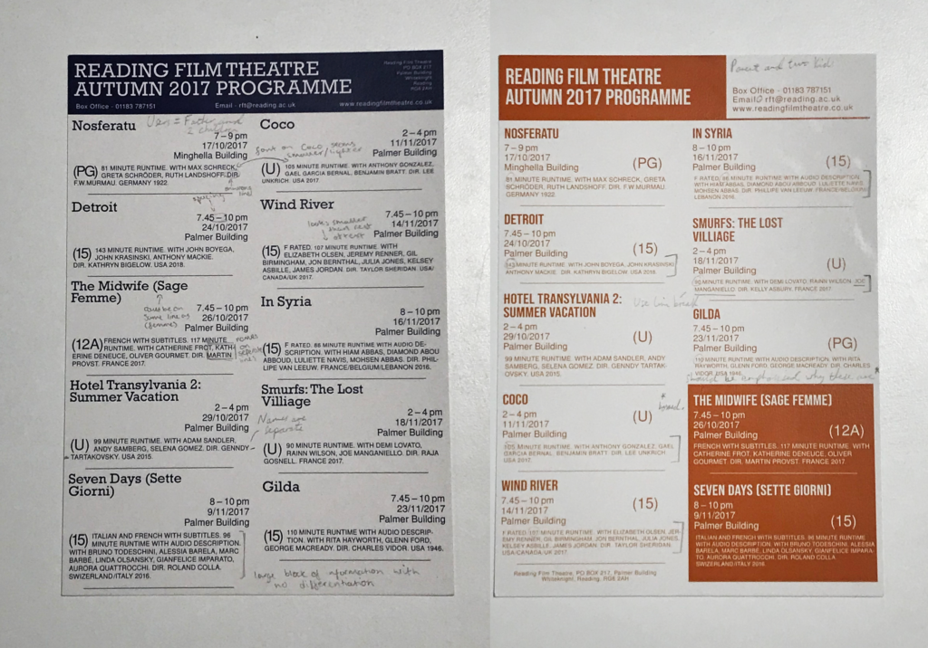
My two programmes were printed on thick paper, almost card like in structure, but with a relatively smooth texture. Although a typical cinema listing would be on glossy paper, I decided that this wouldn’t work for my target audience. For a father with two young children, it is likely that they would want to hold and read this programme, so the final product would need to be somewhat robust to withstand anything that may happen to it.
Having shared this with peers, I had feedback written over the designs. This was a useful process, as I received information and feedback on aspects I hadn’t considered, such as the respect of putting actors’ and directors’ names on a single line.
With this information, I then went back to the last saved files of my respective designs, making necessary adjustments to adhere to this advice. For example, on the first design, the spacing between the dashes when writing times were highlighted as an area for refinement. I was able to alter this, changing the sixth spaces to hair spaces, making the text and the design as a whole look more visually effective, likely helping its purpose as a product to convey information.
Final Designs
Looking at the final designs, I am very happy with the overall outcomes. I think that the dark orange design looks visually better, with the colouring, typefaces and layouts helping this. The box in the bottom right helps to balance the product visually, creating a design that would be successful at communicating this information to the target audience, a father with two young children.
National Theatre Poster
Introduction to the Brief
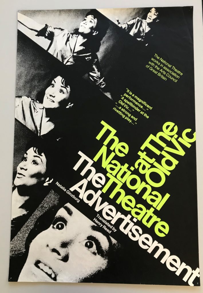
In the lesson with Emma, we looked through a wide sample from the Collections within the department, seeing a vast array of different ephemera. After looking through all of these, I was immediately drawn to the National Theatre poster for ‘The Advertisement’. I found the use of colour and the layout of the text visually interesting, following the modern conventions of a National Theatre poster. Having selected this as my focal item from the collection, I then looked into this piece in more detail, looking for its context and creation specifically.
History and Context
After doing some research into this design, I found that this was a poster for the 1969 London performance of the play ‘The Advertisement’, Henry Reed’s translation of Italian author Natalia Ginzburg’s original piece. The design itself was done by Ken Briggs, a renowned designer and typographer of the 1960s. He became the first of only 5 designers for the National Theatre, coining the unique typographic style and visual identity. However, in the early 1970s, Briggs abandoned this conventional style, placing more emphasis on the individual plays by creating something visually new and fresh for each new design. His modernist, Swiss-style design was often done on short notice, often sometimes in as little as one night. His use of Helvetica, originally through the use of a Letraset, built the foundations for the theatre company’s branding for the years to come.
The photographs used were taken during rehearsals of the play in 1968, featuring images of Joan Plowright as the leading lady, Tessa.
While now highly collectable items, these posters were originally (and ironically) for advertising; These posters would be in varying sizes, placed around London to promote their upcoming shows. The design choices are likely used to reflect this, with the application in places like the London Underground giving a designer very little time to engage and communicate with an audience. Upon researching, I was unable to find much about the creation of this poster. It would have been done by hand, with Briggs being known for his Letraset typefaces, likely meaning a mast copy of this poster was created before being replicated and mass printed. The grainy, textured images would have helped this, meaning that the quality of the images was not lessened by upscaling the poster for different uses.
Colour
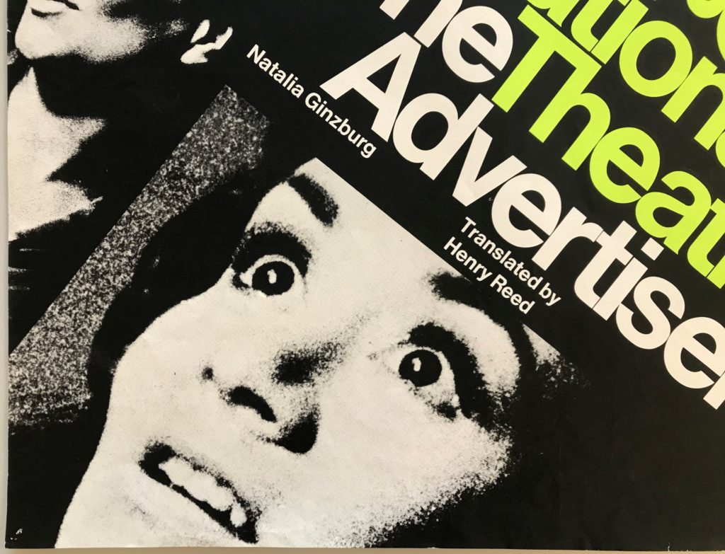 The use of colour within the design appears minimal in an intentionally modernistic manner. The use of a predominantly triadic colour palette allows the design to appear simple and visual hierarchy to be easily created and manipulated to guide a viewers eye. In this design, lime green is used to highlight the words ‘The National Theatre at The Old Vic’. As an already established and credible theatre company, their reputation is something that would likely attract an audience, with the piece being a little known translation of the original Italian play. This allows the poster to achieve its goal more successfully, helping to promote the show with the use of this visual hierarchy. The same green shade is used again on the two blocks of quotation. While also highlighting them to a viewer of the poster, this was more likely used to add visual balance to the overall design, used here to accent and balance the poster.
However, the photographs include an array of monochromatic colours, creating depth and texture within the images. This can be seen within the left image, especially on the nose, which appears to have depth through the use of tonal textures and monochromatic colours. While the dimensions of the face are important, the stylistic application of this allows the images to fit well into the simplistic, modernist design style. Practically, as these were shots from rehearsals, this may also have been used to make the images seem more congruous by removing the background and styling them all in the same way.
Layout/Structure
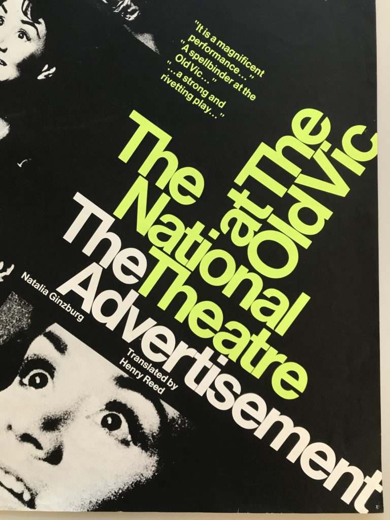 The layout of this poster is visually striking and engaging through the angular text, immediately breaking many conventions of other advertisements and theatre posters. The words ‘The National Theatre’ are positioned centrally on the poster, being the focal aspect and carrying the promotion through their positive reputation.
The incredibly small amount of kerning and leading, a modernistic style choice by Briggs, shows contemporary and unusual nature, again, positive attributes for the experimental and critically acclaimed theatre company. The distance between the text ‘National Theatre’ and ‘The Advertisement’ would usually be visually confusing, but the use of colour helps to distinguish and differentiate these two elements despite their close proximity. The 90 degrees flip for the words ‘at The Old Vic’ created more visual difference and engagement in the design, using the principles of Swiss design in order to captivate and interest a viewer of the poster.
The vast amounts of black negative space around the text allows the images to blend well into the block background colour. In direct contrast to the tightly structured text, this creates a sense of visual balance in the design, helping to not overwhelm a viewer with textual and photographic elements. The space is seen between the two blocks of quotations also helps this idea, giving large amounts of space to these elements, allowing them to accent the main text. The small lettering seen beneath the title of the play, while still relevant, is conveyed as less visually important through the sizing selected, creating visual hierarchy through the size and positioning. While only using two text colours, two sizes and one typeface (likely to create a minimalistic, Swiss-inspired, modernistic appearance), Briggs utilises all three harmoniously in order to create visual balance and hierarchy within the design. The use of layout and negative space only amplifies this, creating a poster that is effective in captivating a viewer, visually stunning through its initial simplicity and modern aesthetic, despite being technically impressive, especially given the hands-on working of Briggs.
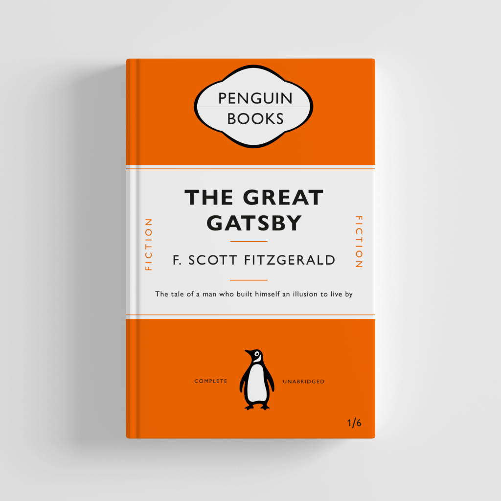
Great Gatsby Penguin Book Cover Design
Replicating any existing design is a challenging process. However, with a limited understanding of InDesign, I was aware that I would likely find this more difficult than usual.
While following the tutorial video, I was quickly discomforted by the differences between InDesign and other Adobe software. While replicating this book design, the most challenging aspect was the paragraph styles. Trying to create specific style sheets for each piece of text was time consuming, but would be useful if the text needed altering in future designs. Similar to previous work in Photoshop, working non-destructively and ensuring that the document is useful for the future is always a beneficial way of working.
I also found the top element challenging to create – the tools were far from the smooth vector graphic software of Illustrator, and I struggled to create the shape. While the final result is similar to that in the original, it is by no means perfect. I intend to use my time in the Skills module to continue working on my InDesign ability, as I am aware this is my weakest package in the Adobe Suite.
Looking at the design in the context of Photoshop Mockup, I think that the replication was pretty successful. As previously stated, the upper most element could do with more work, as smoothing the edges would likely lead to a better result, but I decided that a more complete course on LinkedIn Learning would likely be more beneficial to my later work.
Minimalist Logo Concept
After being set the brief of 10 different themes, I decided to use the theme of New Minimalism. I did some preliminary research into this theme, providing me with a foundation knowledge on the topic.
New Minimalism Interior Design
Following this research, I decided to look for appropriate images. I began on Pintrest, but quickly moved onto Behance, as I found these projects more complete and done with intention. I created a digital mood-board on there, collating ideas that would help to inspire and influence my choices.
https://www.behance.net/collection/188421593/Minimalist-Logos
Next, I complete a round of quick sketches, allowing the swift generation and trial of ideas. This process was very valuable, providing a way of testing concepts and ideas with the ability of easy refinement.
I then moved into Illustrator, allowing me to put together designs with more precision. I began by finding some appropriate fonts, using the Adobe Fonts library to provide a wider range of possibilities. Having compiled these, I began trialing different layouts of text for the design, trying to find the most appropriate for the minimal design focus. While more space would give a more airy and minimal appearance, the focus on functionality seen in the research gave reason to keep the kerning to a minimum. The combination of sans and serif typefaces also interested me, allowing some sense of style and personality to emerge from the logo design. After trialing these, I found a successful combination – the larger serif text allowed hierarchy to be built, with the lower sans serif typeface helping to keep the logo visually balanced.
Wanting to experiment further, I began to create my two initial letters from lines and shapes. While the final design of this, seen on the final page, looks somewhat effective, I thought that it would likely not work within its desired context. While minimalistic, the design conveyed more of the contemporary aspects of type, while being too thin for many of the likely applications of the logo. For this reason, I decided to continue with the first complete logo design, presented on the third page.
Here are the examples of the working document and my two basic design ideas –
Having produced a final idea, I decided to apply it to a Photoshop Mock-up, allowing me to evaluate its success within the context of its use. Similarly, the minimalistic design style links more to the overall design than the individual elements. After finding a very simple Mock-up design, I applied my design just above the central line, drawing a viewers eye to that aspect of the focal image. I then added small text above and below, using the repetition of the sans serif font to create harmony and balance within the design.
With more time, I would likely look at more colour options, only using one to keep the design minimal and clean. However, when reflecting on the design, I think that this works well. The monochromatic colours work well within the context of the Mock-up, and the design is well balanced.
![]()
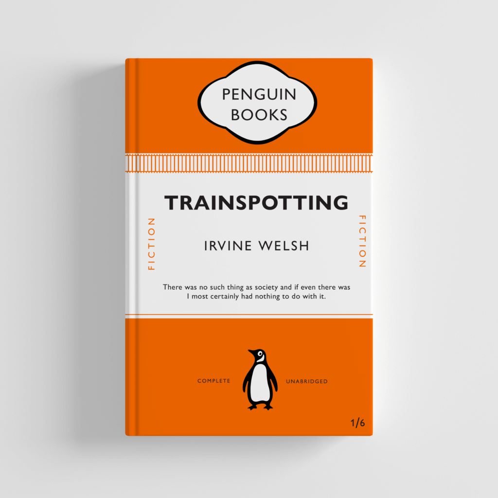
Trainspotting Penguin Book Cover Design
Having replicated the Great Gatsby book cover, I was then tasked with creating another Penguin book cover for another book, which I quickly decided would be Trainspotting.
Not knowing how much to change the original concept, I decided to create two designs – One following the rigid Penguin formula and another more experimental use of the elements.
First, I created the more formulaic design. This was comprised of me adding a train track image along the top edge of the coloured block, using the alignment tools to ensure the shapes were correctly arranged. I adjusted the lower quote, made easier by the paragraph styles used on the previous file. When placing this in context with a Photoshop Mock-up, this works well but, as expected, is pretty unoriginal and not recognizably different to the previous design for The Great Gatsby. While the colour was changed to mirror the colour palette of the films marketing, the similar orange shade made this adjustment barely noticeable.
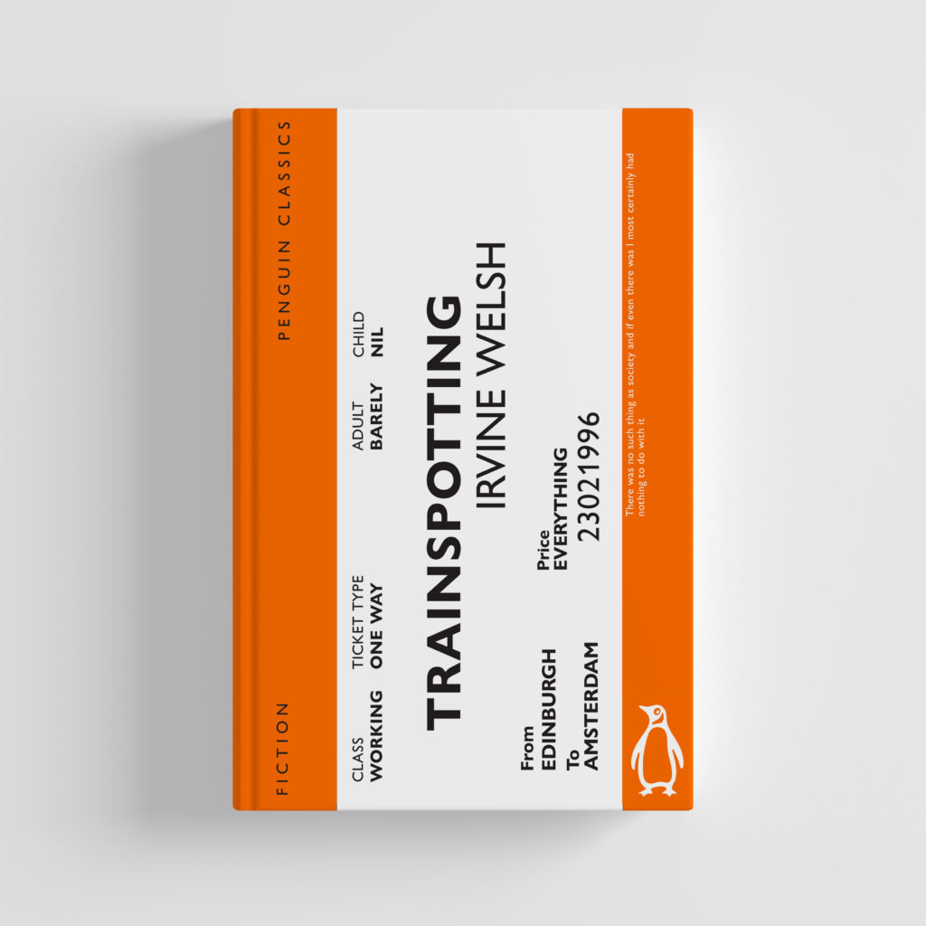
For my more adventurous design, I decided to focus on the imagery of a train, an important symbol as the story ends with the lead protagonist betraying his friends and taking a train to a new life in Amsterdam. Looking at reference images of train tickets, I began to replicate the structure, with the ticket obviously forcing the books cover to be landscape instead of portrait, which would likely allow the book to stand out from other Penguin novels when sold in high street shops. I then added text over the design, mirroring to some degree existing train tickets, while trying to balance the design and create visual hierarchy. The title and author name still needed to be the focus, so I used size and placement in order to direct a viewer’s eye in that direction.
Although this design is more adventurous, it’s deviation from the original means that, for me, I believe this to be the better design. The more creative concept, use of appropriate imagery and subversion of conventions allows this to be more enticing as a viewer of the cover. The design works well as a Photoshop Mock-up, while still featuring the relevant information from the original.
Materials and Context Photography Across Campus
For this ‘Photography In the Environment’ task, I focused primarily on the materials the letters were placed on or made from. I became highly interested in the lettering of the mundane, the everyday lettering that goes largely ignored.
The texture, material and condition of the text was also of interest to me – It was an interesting thought process to consider how the lettering had been constructed and how that linked to it’s purpose or task. For example, the concrete lettering found on the base of an outdoor table tennis table is set deep into the supports in a thick, slab serif type. While having connotations of strength and stability, this also links to the lettering’s function, to communicate the brand name of the objects creator. Due to its intended usage being outside, both the material and method were appropriate.
I then began thinking of the condition of the lettering – The ‘Please Close Lid’ sign, found within the Co-op, was immaculately clean and a clear, sans serif type in an assertive dark red shade. While helping to stand out and communicate the desired message, the cleanliness and visible shine over the letters reflects positively towards the shop as a whole. In contrast, the deteriorated, aged letter H found on a nearby block is clearly old and has been left unattended. The texture of the pain crumbling away, revealing the exposed brick underneath, was very different visually from much of the campus, which tended to all be newer lettering.
Looking back at these photos, the context of the lettering could have been explored further, with different distances allowing both the material and context to be shown optimally in separate shots. However, as in the Fire Exit image, I believe that this wasn’t always necessary, as that image captures both the material and context of the letters reasonably well.