
Task 1 – Fill in the Blanks

In the first of two tasks, I was given 4 letters in the font ‘Skolar’ with large portions missing, with me needing to fill in these spaces as accurately as possible. While initially sounding easy, I was surprised at the complexity and difficulty of this task.
I began with the ‘n’, which was missing the top curved portion, as I thought this would be the best starting place to ease myself into the task. I used a 6B to begin sketching a skeleton of the shape before switching to a 2B to define the outlines. While I think this was one of the closest letters to the original, the sizing was still off, making it taller than the actual Skolar lowercase ‘n’.
I then moved on to the ‘e’; I struggled on this one more, not knowing if a serif was present or not. From the remaining parts of the other letters, I could see some of the different possible serifs. However, after trying them and deciding they looked misplaced and visually off-putting, I resulted in a slightly tapered but curved edge. While the right choice for this font, my choice to make the letter closed instead of a more open sweeping stroke makes my letter look visibly different from the real font.

Although going in apprehensively, the ‘d’ was not as challenging as expected. By giving the sketching process time, I was able to slowly build onto the base skeleton lines to create a structure that somewhat matched the given portions of the letters. Upon reflection, the real font is more angular than mine, with the bowl joining onto the stem in a sharper manner. Despite this, I think that the curvature and slight descending nature on the bowl are accurate to the original, making this look like a reasonably close recreation.
The ‘a’, in my opinion, is the furthest from Skolar. In my addition to the given portion of the letter, I did not add the angled stress found in the original. The serif is similarly absent from this, making it noticeably different. I failed to capture the angled nature of the bowl, instead of creating a rounded curve with much less stress. However, with the given part of the letters, there was no real way of me inferring the angle or stress of the font. This task showed me the intricacies of type, helping me to spot subtle ques and motifs that run through the letters while allowing me to apply my sketching and drawing skills to a practical task.
Task 2 – Replicating Entire Letters

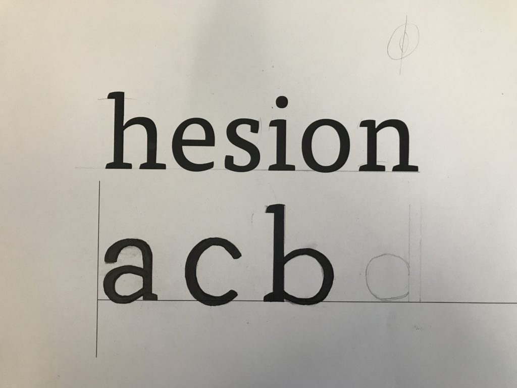
The second task was more challenging still; here, we were given six letters within a particular font and had to continue writing other letters of the alphabet, attempting to replicate the font. Now without the assisting portion of the letters, many more of the choices made were based on the other letters and existing knowledge of typography.
Beginning with the letter ‘a’, I presumed this would be a double story letter from the smooth, open strokes and chunky serifs. Looking back at this now, I think that the bowl of the ‘a’ descends too far below the baseline. While the counter is reasonably proportioned for the vertical stress of the letter, it is also apparent that the aperture of the overhanging stroke is too small, making the letter seem closed off. This does not follow the open nature of the example letters, forcing me to not include a serif and making it appear further from the typeface. However, in comparison to the FF Tisa Standard font I was attempting to replicate, I was not too far away from the real letter.
Following this, I then created a lower case ‘c’. The curvature became a challenge here, requiring a smooth curve and a definite decision on the inclusion of a serif. After looking at other letters, specifically the lower case ‘e’, I decided not to include any serifs, keeping the letter more visually simple. While the real letter does have a serif on the upper end of the stroke, I think that my choice was somewhat informed. With both serifs, the glyph looked out of place alongside the other letters, causing me to remove both serifs. The stress and proportional weighting of the lettering was good, but this task has helped me understand where my weak points are and where to continue independent research into typography and lettering.


Finally, with my remaining time, I drew out a lower case ‘b’. Here, I went the opposite direction, adding an upper and lower serif to the design. Although this is present on the lower case ‘d’, the ‘b’ in FF Tisa Standard only features an upper serif. The angled exit stoke of the curved bowl, stressed proportional weighting and slight descending curve are all accurate to the real font. However, the bowl is more squared off in the authentic typeface, with my recreation being too rounded by comparison.
Although these tasks were not flawless by any means, I think the lessons I have learned from completing them have been incredibly valuable. I looked at letterforms to a very minute depth, allowing me to make judgments and observations on minute aspects of the font. I have also been made aware of areas to improve, which I will pursue and try to actively improve within my studies and free time.