
I found this task was surprisingly difficult compared to how I had assumed it would be after reading the brief. I had thought that I had quite a precise hand for drawing and sketching, but the reality of the project showed me that I was not as detail orientated as I’d thought. There were details within the letters which I did not observe until they were pointed out to me.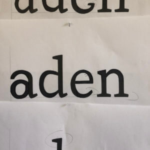
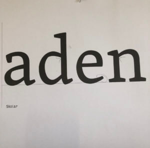
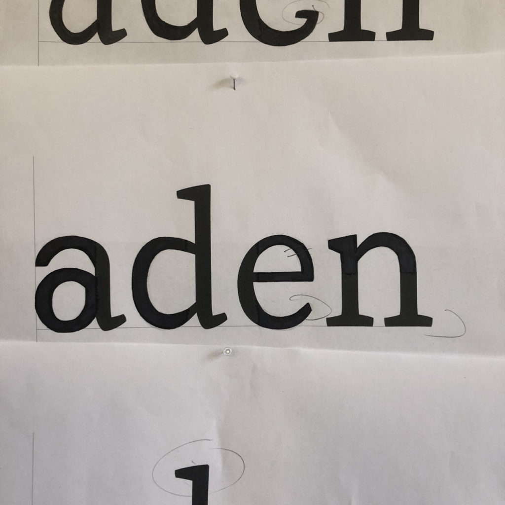
The first task was to fill in the gaps of letter parts of the typeface ‘Skolar’. I feel that I achieved the same style across the majority of areas but on seeing the original font afterwards could see that my ‘a’ was quite far off and some areas are a different weight than to the original.
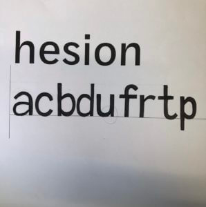
We then were tasked to replicate what we thought the letters of a different font with letters that we’d not seen would look like. I found the rounded parts of the letters the most challenging, but focussed on creating a balanced weight across the letters. I, again, found the ‘a’ the most challenging shape to achieve but found evidence from the letters we were given to create the shapes across the other letters.