
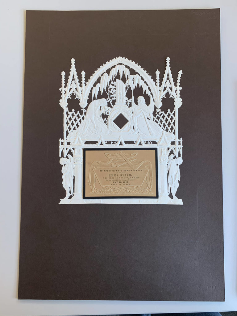
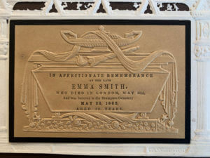
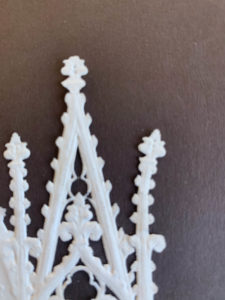
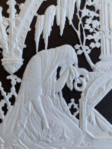
During Emma’s session, we went through all the collections available in the typography department. Amongst all the collections, I was specifically interested in the memorial cards. Memorial cards were used in the Victorian era to demonstrate heartfelt mourning and it was fully expressed through the decorative cards. According to the book, The Encyclopaedia of Ephemera by Maurice Rickards, the memorial cards were ‘commonly 75x115mm’ and ‘relied for much its appeal on the austere extravagence of blind embossing.’ Here, blind embossing refers to the method of creating raised logos or characters without the use of ink and this is evident in this memorial card, as all the text, including the design, is done in blind embossing.
Printing Process
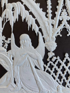
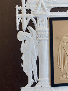
The printing process produced an uncoloured relief image, similar to company seals (The Encyclopaedia of Ephemera, Maurice Rickards). Images of angels, tombs and mourning figures were common elements found amongst these memorial cards to reflect the concept of mourning effectively.
Details and Texture
I was particularly intrigued by this card as its quite simple, with no colour except for in the middle part of the card, where all the text is allocated, yet, at the same time, the piece is a very detailed and sophisticated one. I was also told that this particular card was perhaps made for someone of higher class, thus the intricate details found in it. In terms of texture, I believe the material felt very thin and almost fragile, most probably made out of lace paper, due to the extensive decorations, and being able to create something out of this type of material is very interesting to me.
Lettering Style
In terms of the typeface style, all of the text is in serifs, varying in weight and size, to emphasise on the hierarchy of information to the targeted audience. The text is fully aligned in the centre, making it visually look neat and adjusted, with equal line spacing between each line.
Overall, this was a fun project since we got to see the collections available to us through Emma and have insights into how design has evolved over the years and the different elements that were prevalent during a certain era of design. I personally was able to learn a lot about the hierarchies of information, layouts and the use of colours in design.