Locus Lodi Exhibition

Background

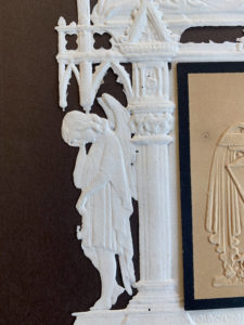
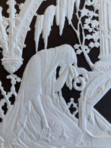
The Ure Museum of Greek Archaeology in the University of Reading had held the exhibition Locus Ludi: Anyone can play! from 5th September – 30th November, showcasing the games played in the ancient world and understanding the educational, societal, and integrative role of play in the past, which is important to understand the present and widen the debate on high tech toys and new forms of sociability. The exhibition’s aim was to show everyone that people of all demographics can engage in playing games and this will be showcased through the exhibition of objects related to various games, ranging from childhood to adulthood. The exhibition aimed to teach the audience about the different games played during the Ludic culture and engage in the interactive activities included in the exhibition and send out the message that everyone enjoys engaging in various games, no matter what age. The exhibition was targeted towards everyone of all demographics as the objects on display range from childbirth to adulthood, as well as including objects related to after death.

Restated Brief

The brief was to design the physical materials for the Locus Ludi: Anyone can play! Exhibition. This included display panels, promotional banner, an online exhibition booklet and educational outreach materials, all of which would be displayed during the exhibition, with the booklet being available online. Most of the details of the deliverables were undecided at this point of the brief and was subject to change during the process of this project, however, having visited the exhibition space in person, it was ready to go forward with drafting ideas.

Deliverables

After discussion with the client on what would work best for each of the deliverables, this is what was decided on:

  • Display panels:
    • To be placed in each display space to inform audience of the collections, an overall summary of the exhibition space.
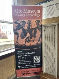
  • 2 promotional banners promoting the exhibition:
    • First one would be a roll up banner, which would be placed in the corridor of the building for promotion.
    • The second one would be at the front entrance of the exhibition room.
  • Information booklet:
    • An interactive PDF file in A4 format.
  • Educational outreach materials:
    • Including information about the games on display

All of the deliverables mentioned above would be submitted to the client in PDF format but was subject to change if needed.

Research

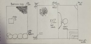
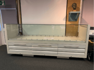
As there was a lack of resources provided during the research stages, there was little research conducted. However, the client had kindly provided us with their house style in terms of typefaces and brand colour, which helped with developing initial ideas for the deliverables. Furthermore, having also paid a visit to the exhibition space to find out the measurements for the display cases, helped with designing the display panels, which would work as supporting materials for the exhibition display items. Research was also limited due to not gaining enough information from the client and poor communication from both sides, leading to months of no work being done from both ends.
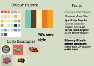
display case for where the museum items were to be displayed
display case for where the second half of museum items were to be displayed

Colour palette

Brand colour chosen for the exhibition

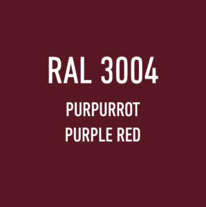
To match the museum’s branding, the client had decided on the colour Purpurrot as the brand colour of the exhibition, as it complimented well with the museum’s branding. Both the HEX code (#691B23) and Pantone code (491 C) was provided, which then helped with developing the deliverables and implementing the branding onto them.

Typefaces

Typefaces used for body text, headings and logo

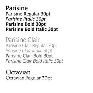
According to the Museum’s house style, Parisine was chosen as the typeface for body text within the family, the regular, italic, bold and bold italic weights were to be used for body and label texts. The bold weight was also to be used for titles and subtitles.


For listings and item numbers on labels, the client had requested that Parisine Clair was to be used and had also provided an example how all of the styles combined would look like when used in designing the panels and banners.

Example of the house style for text copy
The Ure Museum of Greek Archaeology logo

The museum logo was already provided; therefore, it wasn’t needed to create anything new for that, but nonetheless, the client had provided us with the typeface name used in their logo, in case it was needed.

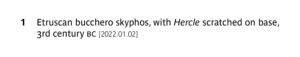
Other important things to consider was that the terms BC and AD when mentioning years were to be used in small caps and that hanging numbers were to be used in body text but lining numbers to be used in object numbers and case numbers. Their house style also indicated that they preferred Italics over quotes for use-mention distinction and use open punctuation for label text.

Design process

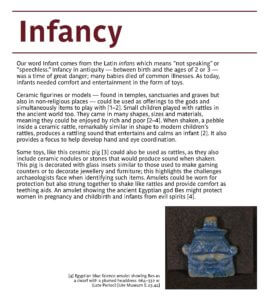
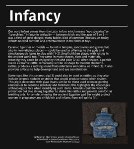
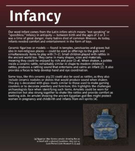
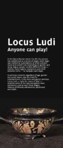
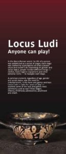
Starting off with designing the display panels first, there was three concepts in total. For the first concept, to keep it simple, the brand colour was used for the headings of each section with lines both on top and bottom of the heading. For the text, the house style’s typeface Parisine was applied. Furthermore, images were added on the display panels to support the body copy within them, with added captions to assist readers in understanding the references used throughout, as well as when they walk around in the exhibition space.

For the second concept, the same layout was kept, except for changing the background to black to try and make the display panels fit into the aesthetics of the display items. The third concept reflected more of the brand colour of the museum with a gradient background of dark red fading into black. All three of these concepts were also applied onto the introductory panels that were to be used in the exhibition space.

Concept 1
Concept 2


Concept 3
Introductory panel concept 1
Introductory panel concept 2
Introductory panel concept 3

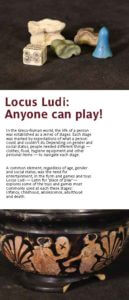
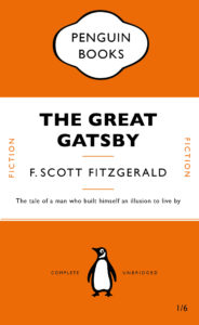
The design for the banner was kept similar to the banner that was on display during the duration of the existing exhibition and therefore the same layout was used. Modifications for the banner were made based on feedback from my supervisor, including a layout idea suggested by my supervisor himself. The main focus of the banner was information about the exhibition itself, so I tried to emphasise that by using different typesizes and weights to create hierarchy between the sets of information on the banner and balance it out with images related to the exhibition.

Version 1
Version 2
Version 3
Version 4
Layout suggestion by supervisor
Banner of the exhibition that was open during the process of this Real Job


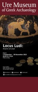
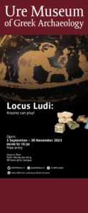
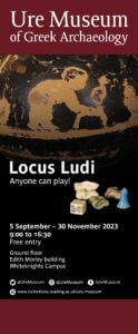
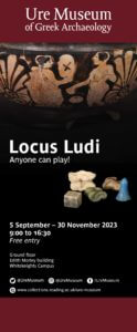
The design suggested by my supervisor focused on using one image to bring impact to the banner. He suggested making the Ure Museum of Greek Archaelogy logo smaller to avoid attention to it. The aim of this layout was to make the title more. As mentioned in one of his feedbacks: “In general the design lacks impact. Partly because nothing is really big, and partly because there isn’t a lot of space. You can achieve this by making more of the good image and dropping the other one. If not and it has to be small, you could try making Locus Ludi bigger – it could be across two lines in caps.”

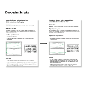
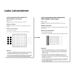
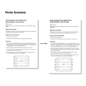
For the educational outreach materials, nothing much was done for it as the client had requested it to be a typical A4 sheet of paper of game rules and instructions and therefore, I only designed A4 sheets containing the game rules and added illustrations, which were provided and then refined by me, onto the document, using different typesizes, weights and spacing to make it presentable

Duodecim Scripta game rules sheet
Ludus Latrunculorum game rules sheet
Pente Grammai game rules sheet

.


Final product

During the final stage, due to poor communication, most of the deliverables were not delivered to the clients on time and as a result, the design ideas for each deliverable did not progress further. However, the client was still willing for me to work on the educational outreach materials and therefore over the next week, progress was made on the materials.

In the mid process of refining the materials, the client had requested to submit the educational outreach materials as it was and after making quick adjustments to the files, thet were all submitted to the client.

Duodecim Scripta Game Rules

Ludus Latrunculorum Game Rules

Pente Grammai Game Rules

Self-reflection

As this was my first real job, it was a challenge to tackle, with communication being one of the biggest challenges during the whole process. However, the support from the Real Jobs tutors and my supervisor helped me with progressing further with this, despite the final results not being what was expected or desired. Having started off this Real Job as a two person job meant that the responsibilities would have essentially been divided between me and my partner, however, by the end of this Real Job, things had changed and it became a one person job, however, I took this as an opportunity to challenge myself and get as much done as possible. Overall, this was an interesting project to work on as it allowed me to look at the behind the scenes of setting up an exhibition and the thoughts and efforts that go into the whole process. All the skills I had developed and learnt during this project are valuable and I hope to implement them in my future works as well.

Universal Voices: Singing Communities eBook

Background

Universal Voices is a free community choir for children aged 7-12 at the Institute of Education (IoE), run by Dr Rebecca Berkley and a volunteer student team. Singing Communities is a project funded by the UoR Communities fund. It is an inter-generational song sharing project, where the children in Universal Voices ask an elder member of their family (grandma, granddad, aunt, uncle, friend) to teach them a chant, singing game or song that they knew when they were children. Through this community, Rebecca aims to highlight the different cultural backgrounds of the students. Through the eBook, she aims to also disseminate it  to the local primary schools, to allow them to teach their students and also spread multicultural values to the students. Therefore, our aim as desginers, were to create an eBook that would allow users to both learn and engage in various cultures through the joy of music.

Restated Brief

As mentioned previously, based on the client’s goals, our brief was to create an eBook that celebrated the different cultures through songs collected by the children through their family members, with both front and back covers. This meant creating an identity that was playful and innocent, to reflect the contribution of the children, but at the same time informational, to reflect the educational value of the songs. All three of these elements needed to be balanced as Rebecca had mentioned that she aimed to distribute and use the eBook as an educational material for teachers to use, therefore, we had to make sure that it would be accessible and easy to navigate and understand.

The client had also requested us to design the eBook on Canva, with them also kindly providing us with the Pro version of this website to use during the designing of the eBook. This was so that it would allow them to make changes or add more songs in the eBook in the future. This was a new challenge for both me and my partner, Zainab, as we have never used this app before for editorial design, but nonetheless, was excited to start on this, as this meant that it will allow us with new skills and experience.

Furthermore, after further discussion, we had also agreed to refine their existing logo to allow them to have better formats of the logo for their future use as well as improve the clarity and quality of the logo.

Deliverables

After the initial meeting with Rebecca, and going over multiple options, we opted for an eBook that would be interactive, where each song will contain:

  • Supporting music score
  • Embedded video and audio links
  • Lyrics, along with phonetic pronunciation and translation (if applicable)
  • Description about the origin of the song.

For the book covers, the client’s vision was to make an inclusive and interesting cover but was open to discussion with us and therefore we were given the creative freedom to work on this.

For the logos, we agreed that we will provide the client with two sets of files, containing the appropriate file format, depending on whether it would be used in printing or on screens. The formats decided were:

  • EPS, PDF, and TIFF files for print use
  • SVG, PNG, and JPEG files for screen use

Research

When discussing the work with the client, she had mentioned that she was inspired by Nordic Sounds, an online e-book containing ‘pedagogical collection of traditional music, dance, songs, games, rhymes and lullabies from the Nordic countries: Denmark, Faroe Islands, Finland, Greenland, Iceland, Norway and Sweden’ (taken from the description used in the website) and although the website uses illustrations to support the songs, for this project, the client had decided not to include any illustrations as all the songs are from different cultures and would have no correlation between each other.

Moodboard

To help with developing our ideas and visualising the theme we aimed to design, we also collated a series of moodboard to help with this. Each moodboard contained ideas and pictures of a singular theme and using each of them helped us during the design process.

Moodbooard to visual the general ‘feeling’ of the eBook
Moodboard for typefaces, colour and shapes
Moodboard for cover design


Colour palette

The client requested that we somehow incorporate the colour palette used by the Nordic Sounds website onto the eBook and therefore we tried doing that through taking the colours from their wordmark logo in the home page. However, she wanted them in pastel tones as they believed that the colours used in the Nordic Sounds website are quite bright. The choir consisted of children who are really young so therefore she wanted pastel colours to be used to make it soft and easy to read, instead of it being distracting with the bright, bold colours. They had also asked us to use a light beige colour for the background as this was what they use for their backgrounds in presentations.

Colour palette derived from the Nordic Sounds wordmark logo

Typefaces

For typefaces, we mainly went for the theme of childness and innocence, and therefore, focused on typefaces that resembled children’s writing or overall appeared handwritten. At the same time, we tried choosing typefaces that were legible and had a range of different weights for flexibility, however this was limited, as we had to choose from the list of typefaces available at Canva only and most typefaces had limited weights or had none at all.

List of typefaces explored


After going through a range of typefaces and showing it both our supervisor and our client, we decided on Children One for the headings, and Childos Arabic for the body text. The different weights within Childos Arabic allowed us to create hierarchy within the body copy and also separate the song lyrics from the translation and phonetics. As some of the songs had lyrics in its native language, we had to find typefaces similar to Childos Arabic to accommodate. The combination of Children One and Childos Arabic worked well, as Children One highlighted the childlike appearance of the book and also reflected the contents of the book with its uneven letters, and it was well balanced by Childos Arabic, a Sans Serif, with its roundedness and flaired descenders.

Chosen typefaces

Kids’ drawings

Since the children of Universal Voices were involved in the collecting and recording of the songs, we also wanted to reflect that on the eBook visually, and therefore we decided to do this on the front and back covers of the eBook. In order to do this, we paid a visit to the children during one of their rehearsals, where we got to talk to them about what they love and think about Universal Voices.

First time visiting Universal Voices
Example of one of the slides presented during the visit to the Universal Voices rehearsal


After gaining some insight from the children themselves, we had also prepared an activity for them which involved them drawing out what they had told us regarding Universal Voices. This proved to be very productive, both for us and the kids, as this kept them engaged and also allowed us to have a good collection of drawings to select from when making the covers.

Example 1 of some of the children’s drawing
Example 2 of some of the children’s drawing


Design process

Sketches

To start off, with the advice of our supervisor, we sketched out layout ideas, focusing on clear and concise layout, as the goal was to make the pages be as much easy to navigate as possible and some of the layouts, we considered were having text on one side with all the images based elements to be the other side and vice versa. We also sketched out layouts where we made use of separating the content into top and bottom halves.

Layout sketch 1
Layout sketch 2
Layout sketch 3
Layout sketch 4
Layout sketch 5
Layout sketch 6

Initial layout

In our initial layouts, we wireframed some quick layouts to show to our supervisor and after getting feedback on how to create better layouts, as we had initially lacked the creativity in our design ideas, we went back on track and started using colour and different combinations of typefaces to create layouts, allowing us to better understand what worked well.

Some of the layout ideas we tried out involved colour coding each section of the spread, or by blocking each section in colours, as well as having a coloured background and playing around with placements of the score sheets and the video and audio links.

Layout idea 1
Layout idea 2
Layout idea 3
Layout idea 4
Layout idea 5

Reflecting the song’s origins

To make the eBook more educational and make it engaging for the readers, we brought up to implement another way kids can learn more about the origin of the song with a more visual approach, instead of only having a written section at the bottom of each page. Therefore, we suggested to add the flag of the country that the specific song originated for. In one of our suggested layout designs, the client had really loved the idea of the pages having a coloured border, which reflected the colours of the representative flag and therefore, to keep them consistent, we added those borders onto the prelim pages of the eBook as well, but instead used a combination of two colours from the main colour palette.

Example 1
Example 2
Example 3

Refining logo

Since the logo only required refinement, the only thing done was redrawing the main element of the logo and vectorise it in illustrator. The original logo was used as a reference to redraw and for the typeface used on the logo, Futura was used as it resembled the closed to the original. The logo was drawn in three different colours: black, white, and red, with red being the brand colour, as the children in Universal voices wear a red t-shirt while performing in events and we wanted to reflect that on their logo as well.

Original logo
Refined logo (in black)
Refined logo (in white with red background)
Refined logo (in red)

Covers

As previously mentioned, we wanted to reflect the kid’s contribution to the making of the eBook and decided to do so through the covers. Having collected their drawings during the visit to one of their rehearsals, all of them were scanned and using both Canva and photoshop, the covers were made. Using Canva, I added in the selected drawings and created a collage. I specifically chose drawings that reflected very clearly what Universal Voices meant to the kids, as well as using hand drawn lettering done by one of the children as the title of the eBook, to highlight the innocence and enjoyment of the children and also reflect what the eBook was about. A crumpled paper texture effect was added onto the background of the covers to once again, reflect the childish nature of the eBook.

Front cover
Back cover

Final product

Combining different elements from each layout idea, we made our final design where each section was colour coded, and it was specifically emphasised for the video and audio links where the colour coding stayed consistent throughout the pages and this was useful as it allowed users to know which link referred to the audio or video as some songs only contained either one of them.

It was a great success, as we managed to deliver the eBook to the client on time. we also had the opportunity to present our work on the launch day of the eBook in front of all the kids and their families.

“At the launch of the e-book in November 2023, Jaf and Zainab came and presented to the audience explaining the work that they had done. Their presentation was clear and interesting, and they both spoke very well.”

– Rebecca Berkley, Artistic Director of Universal Voices

Attending the launch event of the Universal Voices eBook


Furthermore, the client was very impressed with our work and loved the use of borders in the book and keeping a clear layout as mentioned below:

“They communicated regularly with me presenting draught ideas for the layouts for each page and the overall design of the book. They were very good at taking my ideas and turning them into reality. I was particularly impressed at how careful they were to make sure that their rendering of my ideas matched my vision. They were always cheerful, helpful, accurate and delivered on time. They made several suggestions about the layout which also improved the content of the book. Their communications were always professional and they delivered the product to the agreed timeframes. When we had to make an adaptation to the deadlines or the content, they were always very helpful in accommodating that. The overall design of the book was delightful. They created a visual style for the book which had a primary school feel to it, using bright colours and a clear layout. They matched the borders of each page to the colours of the national flag of the language of each song, which was a lovely detail in the design.”

– Rebecca Berkley, Artistic Director of Universal Voices

Self-reflection

Having the children involved within the designing of the book was a very lovely experience, as I got to see their creativity and apply that onto my own as well, and seeing their lovely work really inspired me to work on this eBook more efficiently. Knowing that the children liked the cover of the eBook was very heart-warming to me and made my experience working on this eBook very valuable.

“Jaflenur and Zainab came and worked with the children in Universal Voices to create artwork for the front and back covers of the book. They asked the children to draw pictures and write sentences about what the choir meant to them, and then copied the children’s art work and made a collage for the front and back covers. The children really loved seeing their art work in the e-Book. It was particularly popular with the children, because every child could see their artwork in the book and it made the book very special to the children. I have found working with both of them fantastic. Their credit to their department, and a really good example of what a great programme Real Jobs is.”

– Rebecca Berkley, Artistic Director of Universal Voices

Memorial cards

During Emma’s session, we went through all the collections available in the typography department. Amongst all the collections, I was specifically interested in the  memorial cards. Memorial cards were used in the Victorian era to demonstrate heartfelt mourning and it was fully expressed through the decorative cards. According to the book, The Encyclopaedia of Ephemera by Maurice Rickards, the memorial cards were ‘commonly 75x115mm’ and ‘relied for much its appeal on the austere extravagence of blind embossing.’ Here, blind embossing refers to the method of creating raised logos or characters without the use of ink and this is evident in this memorial card, as all the text, including the design, is done in blind embossing.

Details of the text

Printing Process

The printing process produced an uncoloured relief image, similar to company seals (The Encyclopaedia of Ephemera, Maurice Rickards). Images of angels, tombs and mourning figures were common elements found amongst these memorial cards to reflect the concept of mourning effectively.

Details and Texture

I was particularly intrigued by this card as its quite simple, with no colour except for in the middle part of the card, where all the text is allocated, yet, at the same time, the piece is a very detailed and sophisticated one. I was also told that this particular card was perhaps made for someone of higher class, thus the intricate details found in it. In terms of texture, I believe the material felt very thin and almost fragile, most probably made out of lace paper, due to the extensive decorations, and being able to create something out of this type of material is very interesting to me.


Lettering Style

In terms of the typeface style, all of the text is in serifs, varying in weight and size, to emphasise on the hierarchy of information to the targeted audience. The text is fully aligned in the centre, making it visually look neat and adjusted, with equal line spacing between each line.

Overall, this was a fun project since we got to see the collections available to us through Emma and have insights into how design has evolved over the years and the different elements that were prevalent during a certain era of design. I personally was able to learn a lot about the hierarchies of information, layouts and the use of colours in design.


Platforms of letters

For Gerry’s project, we looked at different typefaces and were given two tasks, which was using clues from the visible parts of letters and try to imagine how the rest of the letters may look like.

Task 1

In the first task, we were given a sheet where half of the letters were printed and we were to draw the rest of the letters. The sheet I had chosen was the font ‘Rosetta Type Skolar’ and the word that spelt out after we were done was ‘aden’. I focused on the terminals of the letters and kind of replicated them when drawing the other halves of the letters, as I believe it was one of the main elements of the font. I had also drawn the x-height and the baseline of the letters in pencils (not very visible on camera), to help me with drawing the letters in the same height. Unfortunately, I was unable to finish filling in the letters with the black markers but Gerry had gone over the different fonts and explained to us the differences, the spacing and the context of the typefaces. This was very interesting to know as it would help us to choose what typefaces to use when we need them for future projects and we were also informed of where to get fonts from.

Task 1

Task 2

For the second task, we were given the word ‘hesion’ in a specific font and using that as a clue, we were to draw the letters ‘abcdufrtg’, figuring out how the letters look based on that font. In my sheet, I had the word in the font ‘Darden Studio Halyard’. I started off by drawing the x-height and the baseline on the paper. Then I measured the height of the letter ‘h’ to see how tall the stems of the letters should be. I had also measured the width of the stem  of the letter, so as to draw the letters as accurately as possible. After all of this, I proceeded to draw the letters, using those measurements and also focusing on the shoulders and the variation of thicknesses of the letters.

Task 2

Thoughts on this project

Overall, this project helped me in understanding typefaces even better and the amount of time and thinking that goes behind creating new fonts, whether its a variation of one or a completely new one from scratch. I was also revealed to the reality of the fact that it is indeed not easy to draw letters in a certain typefaces quickly and it takes years of practice to master this skill.


Movies!

We were given a project to create a flyer for the Reading Film Theatre Autumn 2017 listings. We had to create two different designs based on the information given and our own research.

In the brief, we were asked to keep in mind the targeted audience when making the flyers and consider the layout and typography used and they were:

  • A father with two children under 10
  • A visiting professor working in Reading, but originally from Switzerland
  • A retired doctor and her husband, both of whom have a passion for old Hollywood

Firstly, I brainstormed the important details essential for each target audience and circled out the ones that was important amongst all of them. Then, I sketched out some potential layouts for the movie listings.

Brainstorming ideas
Sketches

After having some ideas of how I wanted my layout to be, I searched up the RFT logo and based on that, I chose the colour palette for my flyers. The main colours were red and grey. Then, I proceeded to edit the text information about the movies and its details and I noticed, obviously, that a lot of vital information, such as running times, country of origin, etc were missing.

Keeping the target audience in mind, therefore, for my first design, I went with a grey background with black and red text over it. I had used red for the movie titles, so that they stood out easily and I focused on making the movie running time, location of the theatre and languages available more visible, so as to make it easier for the target audiences to find these details easily, as I believe these are what the targeted audiences would look up for when searching up information of the movies. I kept my overall design simple and straightforward so that everything is accessible without much trouble.

Design 1

For my second design, I decided to categorise the movies in terms of the months they were being aired in the theatre. I used a gradient of red, grey and orange for the heading, sub headings and movie titles, to reflect the colours of the RFT logo. I did the layout of the dates of the movies from left to right and I grouped the age ratings and running times together as I believe they were the most important in terms of the hierarchy of information. For the rest of the information, I had laid out the times and the location first and then the other bits. I had also kept this whole design simple to make it quick and easy to find the information needed.

Design 2

Overall, I really enjoyed this project as I got to learn more in depth about InDesign and about layouts and hierarchies and I believe all the skills I have learned from this project will help me in my ‘Design for Reading’ book design project as well.

The PDF version of my flyer designs:

RFT film listings design 1

RFT film listings design 2


Self Branding

For our design class on 14/10/2021, we were joined by Sophia White who taught us about logotypes and the trends surrounding it. We were asked before hand to look at 10 of the themes she had given us and choose one that we liked. For me, I went with the 70s retro style and based on that, I did some prior research on the style and came up with these results:

Quick research

Sophia showed us some of the brands she had worked with and the process of creating for those brands, and we were taught a master class on creating mood boards, which was the first process in terms of creating something, as mood boards help with giving inspiration and visual ideas of what a theme is and so on.

mood board

After creating mood boards, I went straight to sketching ideas for logos for branding myself as this was the task given to us, however, I soon decided that I wanted to go straight onto InDesign to create my designs, but nevertheless, I did sketch some ideas on my sketchbook.

Sketching ideas


First design

For my first design, I started out with using my initials and I used the font ‘Lust Script’, which I downloaded from Adobe fonts. I typed out my intials in different ways:

  • all uppercase
  • all lowercase
  • normal

Then I proceeded to kern the letters together until they merged together. After this, I used the gradient tool to give colour to the design. I used a random colour I liked instead of using the colour palette for the retro style, as I was just experimenting with the elements.

Second design

Here is another design I did, where I also used my initials, but using the font ‘rig solid’ in bold and used one of the colours from the retro style colour palette. Similar to my first design, I also kerned the letters here until the letters merged to each other side to side.

Third design

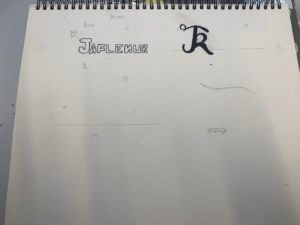
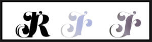
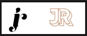
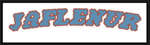
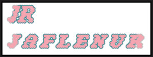
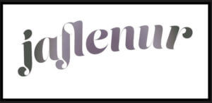
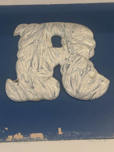
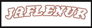
Onto my third design, I used the font ‘Narly’ in outline, and this time, I typed out my first name as I felt it would look much more nicer in this font. I really liked this design as I felt it expressed the retro style very effectively and was also simple in the same time. I had also tried it out using my initials as well and made two different versions using different colours from the colour palette.

second versions of the third design

I had also edited these designs and filled them in using the bucket tool on photoshop to test out how the design would look like when coloured in and I was satisfied with the results. I had used a colour wheel to find complementary colours to the outline of the words to fill the letters in.


For my fourth design, I took a different approach and tried to type out the letter in a curved shape. For this, I firstly used the ‘pen tool’ to draw out the line and using the move tool, shaped my line and then used the ‘type on a path tool’ to type out my first name on it. I had used the font ‘Lust Script’ for this. I was quite impressed with the results as this was something new I had tried out and for a first try, I believe I had done a good job in doing so.

Fourth design

For my fifth and last design, I took a whole different turn by designing my brand in the Bengali language, as it is my second language, and is reflective of my cultural background and ethnicity. I was quite shocked to find an Adobe font for the Bengali letters, and immediately thought of making a design using the font. First, I had typed out my first name and then I used the same process I used in my fourth design to create the branding design. It is quite simple but I do like it as a first try in terms of designing logos.

Last design

Overall, this session was very enjoyable as I was able to learn about the different steps of designing logos for brands, as well as got to try out different apps in the Adobe softwares. Although I think most, if not none, of my designs don’t reflect the 70’s retro style, I think this was a good practice for me for future projects.

Link to the PDF file of all of the designs together:

LogoType Own Branding

The Day of the Triffids

As a class, we all had to design a penguin classic book cover in Adobe InDesign and learn about the different elements that go into designing them. This was very useful as I’m a beginner in InDesign and don’t have any experience of even looking around the software. This project helped me in learning all the essential and important tools used in the software and as well as certain shortcuts we could use to make our work more fast and efficient. Overall, it was an enjoyable project that I could learn a lot from.

Based on learning the new skills from making the penguin classic book covers, we were told to create a new book cover of our own choice, and I went with another penguin classic book cover. Similar to the Great Gatsby cover, I had used a similar layout and had used the same font, Gill Sans, for all the words. However, in mine, I had also included an illustration that I had drawn separately in my iPad using the Ibis Paint X app and had saved and transferred the file as a png on my laptop. I had then laid out the png on the book cover and positioned it accurately on it. Overall, I found the whole process easy, except for making the cartouche which I struggled with a bit in terms of positioning and laying it out properly, but I believe I will eventually get the hang of it as I practice it more in the future.

Here are the links for a clear version of the two book design covers:

Penguin Classic

The day of the triffids

Eye-catching Sign boards and Letters

For Eric’s lesson on 04/10/2021, we were given the task to explore around and outside the department and take photos of any sign boards or letters that we are interested on. We had to do this based on the brief we were given which said to ‘search for lettering around the campus based on a theme of your choosing and take photos of it.’ Therefore, I based my theme on signs and lettering that are eye catching or somewhat interesting. Overall, the experience was interesting as it made me pay attention to the details in the said signs and the amount of details put in each of them so that it catches the eyes of passerbys. This was done so in these sign boards through using bold and bright colours such as red, yellow and green. The use of the different fonts based on the modernity or the vintage ness of the sign boards is also very clearly evident in these photos. Taking all the photos were fairly easy, as I walked around campus and visited the same route I take when walking to the typography departmen, however, in the middle of my walk, it started raining, resulting in some of the photos having a blurry effect on them.

Since none of my photos had an ongoing colour scheme or focused on one specific thing, I collaged some of my favourites and appropriate ones to show the photos I took while walking around the campus. While doing so, I realised most of my photos were taken in a straight frame, almost symmetrical, which I think also conveys how someone might look at these lettering from their viewpoint.

For this particular lettering, I zoomed in on one of the letters to highlight the details in the letters itself. I found it quite interesting how the letters were sticking out and not laying flat on the surface and the overall marble texture of the letters made the whole lettering look visually pleasing to look at.

What’s That Noise?

For Berta’s project, we were to chose a theme and based on it, we were asked to experiment on books, by manipulating the structure of the book, be it through disassembling the book part by part or changing the look of the whole book, in short, we were asked to just go crazy with it, as at the end of the day, this was a fun little experiment for us to learn about the different physical and material qualities of books. That being said, I chose the theme ‘noise’ as the brief about this theme really caught my interest and as I was reading the brief, I had already started to form some sort of ideas in my head about what I wanted to do with my book based on the theme. So, I started off by brainstorming my ideas and I made sure to answer the questions in the brief, which were:

  • What is this story about?
  • How can it be represented visually?
  • What concept would represent this story best?
  • How can it be adapted to the pages of a book?
  • What part of it will the design concept represent?

These questions helped me a lot to break down and arrange my ideas. Starting off with the first question, the story was about two siblings who had inherited their parents’ wealth and lived in a quiet house, until one day, they hear a noise and move to a small room. They continue to move into smaller spaces every time they hear a noise, until eventually, they escape through a window, and end up on the streets, empty-handed.

Brainstorming my ideas by linking them to the questions
Some of my first initial ideas regarding how I wanted to layout the book design

Based on that story, I wanted to design my book in a way that visualised the story in three different parts throughout the book. Therefore, in this first spread, which was at the beginning of the book, I used mainly the colours red and black; red to symbolise danger and black to symbolise the darkness the siblings were probably in as they were inside the rooms. For the left side of the spread, I had highlighted all the text using red marker, while leaving some words out that I thought related to the story, getting inspired by the works of Tom Phillips. I did the same on the other side of the spread, except on that page, I had covered up the whole text using black marker. I have also done some doodles and scribbles to visualise the concept of noise, through drawing the speech bubbles and sound effects, as well as drawing the glitch screen you would see in televisions when the signal went out, highlighting the isolation of the siblings inside the cramped rooms. Being interested in the art of stamping, I had also stamped out the word ‘help’ using letter stamps to show the desperation of the siblings to get rid of the noise. In the right corner of the spread, I had cut out shapes in a descending order, as if to show that as the siblings moved on to another room, the space kept getting smaller and smaller. Some minor details also include me fraying the edges and top of the pages by tearing them off or cutting through them using a craft knife and I have done this throughout the left side of the spread.

My first spread of the book


Close up details of the spread

Moving on to my second design, after skipping a few pages of the book, roughly in the middle of the page, I covered one of the pages with black paper and drew an ear in the middle of the page using white pen. Around the ear,  I doodled sound effects and symbols to show how the in the darkness, the siblings were on alert for any new noises.

Second page

For my last and final spread, on the last pages of the book, I craved out a huge square on the middle of one of the pages, and I continued to do so, however, due to not having enough time, I wasn’t able to dig through to make the square deep enough but overall, I was satisfied with the result. I did this so as to symbolise the window and then underneath it, I drew a road horizontally, to visualise siblings being able to escape. on the opposite side, I glued on the scraps of paper messily to show the after effects of the journey the siblings just had.

Last spread of the book
Close up of the window

Lastly, for the book cover, I kept it simple by covering the original book cover with white paper. Then, I carved out a square through the page and the book cover, to represent the window, and from the corner of the book, I scribbled in a descending order, stopping when it reached the window. Inside the window, I circled the word ‘danger’ in red to show the danger of the situation. I wrote the title ‘noise’ in capitals, using red, blue and green markers to draw on top of the letters to kind of show that the letters are glitching. Finally, I ripped cotton balls and stuck them on at the bottom, and then coloured parts of them using red sharpie for texture. Overall, I kept the drawings messy and almost childish to represent the siblings, who I assumed, were children themselves.

Book cover