
Background
This project is a part of a second year project for the students of the Department of Film, Theatre and Television (FTT). As part of their module FT2CSP, the students had to work in groups on short film projects. The projects could take the form of either short fiction, short documentary, or short live TV studio, with a duration of six minutes. As part of their project, they also needed a poster as the promotional material of their film. Out of the six different short films, the one I had chosen was ‘Killer Queen’.
About ‘Killer Queen’
‘Killer Queen’ is a queer murder mystery thriller, where the main two characters get invited to a house party. The two characters have romantic feelings towards each other and don’t realise this till they are at the party. Out of the blue, the host of the party gets murdered, and everyone is left to figure out the murderer.
Restated brief
As mentioned above, according to the student’s goals, one of the things in the brief was to create a poster design for the short films being produced for promotional purposes. However, this was the overall brief and when spoken to the students, they had also requested for a title sequence for their film as well as typeface recommendations for use within and for their film. Furthermore, as I progressed into the project, the title sequence was animated for use in the start of the film.
Based on the restated brief, my goal was to therefore design a poster reflecting the themes/genres highlighted in the short film ‘Killer Queen’. The design of the poster had to be appropriate to the genre, content and intended audience. The poster was also to be used in social media (Instagram) and if applicable, printed for the FTT Festival during Summer term.
Deliverables
After meeting the students from the FTT department who were working on ‘Killer Queen’, we opted for the following deliverables:
- Poster design for printing/social media use in PDF and any other appropriate format
- Typographic title sequence for the film title in PNG format
- Animated title sequence in MP4 format
- Open source typefaces recommendation pack, compressed in a ZIP file for easy access
Research
Moodboard
At the start of the project, the main client and the tutor teaching this module, Andrew, had provided each student working on a film with moodboards, storyboards and the scripts of each film. Using the moodboard as an initial starting point for ideation, I looked at similar posters and also took notes of what the students were perhaps expecting for their posters.


As the main genre of the film was murder mystery and also the students wanted to capture the queer element of the film, with the two main casts being females, the main things I took from my research in context of themes, setting, layout, colours, and images were the following.
Themes/setting:
- Murder mystery
- Thriller
- Romance
Setting:
- Warm lighting
- Set in the context of being in a house party
- Colourful lighting during the kissing scene
- Dark lighting for outside
- Use of white noise

Main colours:
- Red
- White
- Black
- Blue
Layout:
- Placement of text varied and was dependent of the overall design
- Full bleed images for the background of the poster design
- Poster design could be typographic/illustrative based
- Mainly two colours used in the poster
- Minimalist design approach
- Images used could be manipulated if needed.
Images:
- Any still images used would have the two main casts either facing the front or towards each other
- A knife would definitely be incorporated within the poster design to emphasise the murder mystery aspect of the film
Typography
To choose a typeface, I created a list of different typefaces, separating them in serifs, sans serif and decorative. One of the key points that the student mentioned when it came to typefaces was that it had to be open sourced, so that it is easily accessible, therefore, all the typefaces in the list were sourced from Google fonts and other websites such as DaFont. Another thing mentioned by the students was that they wanted the text to have the texture of dripping blood and due to this, all the decorative typefaces I sourced were reminiscent of the said effect.


The typeface ‘Bloody Witch’ ( highlighted in green in the list of decorative typefaces) ended up being chosen by the students and I used that as the base of all my exploration for the still title sequence.
Design development
Experimentation
Having chosen the typeface, I started exploring possible solutions for the still title sequence. As the students wanted to incorporate the knife somewhere in the poster, I attempted to do so through the title sequence.
In the following versions, I tried placing the illustration of the knife in various positions to see what works best when paired with a sans serif typeface.


Further experiments included taking the chosen typeface and pairing it with the illustrated knife and using the multiply effect on Illustrator to create contrast between the two elements.


I also tried out options where the knife wasn’t explicitly shown and experimented with white space to replicate the effect of the title being slashed by a knife.


Having explored these options, I had also attempted at also animating the title sequence as part of the experiment. I followed a tutorial on YouTube that greatly helped me with animating the title sequence to have the blood dripping effect. As a result, the students really liked the animation and decided to use it for the starting part of the film.

The final exploration was looking at combining image and type together. In the following variation, I tried replacing the letter ‘I’ in the word ‘killer’ with a knife to incorporate the knife motif on the poster. However, upon receiving feedback, the knife was changed into an illustration instead to match the weight of the typeface used. The typeface used was Abril Fatface, to match the typeface that was used in the animated title sequence for the film.


Poster sketches
Once the title sequence was finalised, I moved onto creating sketches for the poster. At this stage, as I was still waiting on the students to provide the still images for the poster, I opted for creating alternative layout options where it was only the knife being used as the main element in the poster. I experimented with the positioning and arrangement of text and images on the page to see what works best.


However, despite the students liking the initial ideas, they requested to have a poster that highlighted the main cast and therefore, using the still images they had provided, I went on to work on what was initially discussed and agreed.
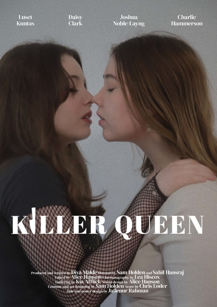
Poster
Out of all the images provided, the following ones were chosen by the group of students, and I chose the most suitable one to create the posters, which was option 4.


I manipulated the image on Photoshop in different variations. In the first variation, I added filters to darken the image to emphasise the thriller aspect of the film. Other variations included adding a block colour background to give emphasis to the main cast on the face of the poster as well as cutting through the image to replicate the slashing effect of the knife slicing through the image. Despite all of these versions working well in sending the theme of the film, the final version chosen was the one with the edited photo with added filters.


Social media
As well as creating the posters for print purposes, I had also created a social media version of the same poster but in 1080×1080 format for use in social media platforms.


Final poster

After being approved by my supervisor, this was the final poster. As the option to print it out for the FTT film festival was optional for the students, it wasn’t printed in large scale to be displayed. Instead, the students had used a portion of their crowdfunding to print out A3 versions of the posters, which were distributed amongst peers.

Reflection
Having worked with students in this project was really fun as it was a very flexible and creative job. Being able to have the creative freedom within this job was very beneficial in keeping me engaged in the work. Getting to see the behind the scenes of the film as well as the final cut of the film was very satisfying as it allowed me to understand the constraints and advantages of producing something in such a short period of time. Even though each of us involved in the poster design were working on different films, getting to talk and share resources amongst my fellow classmates was really helpful and giving each other feedback helped with improving my own work as well. Overall, it was a very enjoyable experience.