
Overview
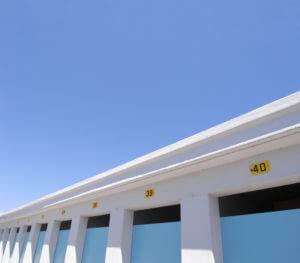
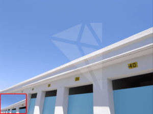
This job was hugely engaging, having the opportunity to design a book jacket for an upcoming academic book, Straightforward Statistics. We would have to create a the front, back and spines for this book, ensuring it fits the publisher’s requirements and conventions within the genre of academic books. However, this project came with its own somewhat unique challenge – the client had an image they wanted to be used on the cover, with an existing idea of how they wanted it used. The image (shown below) was taken by the client themself, who had already been told the photo’s size made it too small to use on the cover. When enlarged to the size of this cover and printing, it would appear blurry and pixelated.
The issues surrounding this image and the challenge of designing within the constraints of the clients wishes is what would make this project unique and similar to the design problems we would face when working for clients in the future. The short timeframe of this project would also prove challenging, causing us to work efficiently and remain focussed on the client’s wishes.
Outcomes
The requirement of this project was to simply create a single, finalised, print-ready pdf of the book jacket. We must also send all imagery used, with the client accepting that an illustrated or digitally painted version of his photograph may be the best compromise. It was made clear to us at this stage that, although we would create a design for the author, the publishers would be creating their own jacket design in-house, and would decide which was the most suitable. We were under no impression that, despite our best efforts, our final design may not be used. However, this opportunity was still incredibly valuable regardless, giving us experience communicating and working with real clients to create a final design to their requirements.
Initial Action
Firstly, from a design standpoint, we began creating some varied ideas to present to the client. This was primarily giving them choice, allowing us to explore different solutions and ensure the chosen path is the most suitable. Having spoken with the author, it was clear there were some requirements this design must meet; The focus was on its simple and design, making statistics look appealing and less daunting of a subject. As an introductory book aimed towards undergraduates, there was a need for it to balance its serious, academic subject matter with visual interest. The client wanted it to be ‘friendly, welcoming and untechnical’.
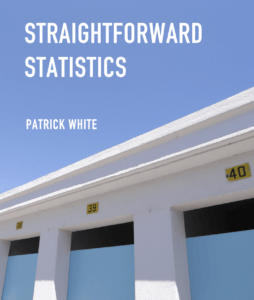
We decided to stick with the provided image, with the client expressing how they wanted their own photograph to be used – they felt distant from some previous publications designs and somewhat unhappy with the outcomes, so wanted this cover to be more personal. The client’s own mocked-up idea, shown below, showed the client’s idea of what they wanted.

Our initial designs took some time to compile –
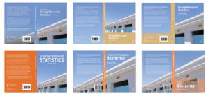
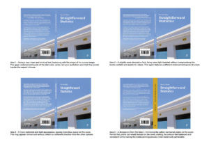
the more creative ideas felt too informal and as if the cover wasn’t taking itself or its content seriously. We took a more conservative approach moving forward, looking at existing textbooks and academic publications for inspiration. With the design seeming somewhat flat with just the blues and greys, we explored some alternative contrasting colours to help create hierarchy and develop balance. The use of a vibrant orange was suggested in a Real Job feedback meeting and worked well alongside the image. I experimented with the Canva Colour Wheel, shown on the right, using colour theory to find the most complimentary colour for the dominating blue sky in the photo. Having both created a series of designs, we reviewed them all, sending 6 of the most successful and different, shown below, to the client for feedback.
After receiving feedback, the client was fairly clear about preferring the first idea, closest to his own concept. He did approve of continuing this image onto the back cover too, making this top left concept a fairly acceptable solution. The client did, however, want different title options to choose from, deciding for himself which was the most suitable for the book. We would now be able to try some more subtle variations, being given more focus and direction from this feedback, exploring the closer details of typography, balance and structure.
Image Resizing
Before disregarding having the original photograph on the jacket, I began researching image upscaling and how viable this was. At the time, my knowledge of image upscaling was incredibly limited. I began looking at the upscaling tools in Photoshop, with some articles making bold claims about the quality of these results. My goal was to get the image to the required 300 pixels per inch, meaning that it would be high enough quality for the publishers and printers to use. I experimented with both of Photoshop’s inbuilt tools and evaluated their success. This is where the project began to change and evolve into a different challenge entirely – I began to explore enlarging images, enhancement tools and reviewing the different outcomes to get the highest quality final image.
The first of these I tried was pixel doubling, the oldest ‘image upscaling’ tool which simply duplicated pixels to enlarge an image. For example, if a user is trying to double the size of an image, each 1 x 1 pixel will then become 2 x 2. This means that, although there are more pixels, the quality will be reduced, causing the image to be blurry and unclear, shown in the image below. While this could make the image 300 pixels per inch, the image will be poor quality and deemed unsuitable by a printer.
I then began exploring Photoshop’s latest addition, Super Resizing. This uses AI to resize the image, making predictions based off of surrounding pixels on how to fill the gaps. This seemed like a much more suitable method, utilising the latest in Adobe’s algorithms and technology to upscale this image. While the comparison image below doesn’t show a significant change, the super resized image was 300ppi, compared to the originals 76ppi. This means that it now has the quality to be used by a printer (or so I thought).

Speaking to James, it was clear I had further work on the image enlargement to do – although the image was now technically big enough, the quality of the image is likely still not good enough to be printed. While this is an improvement in quality, this will need to be stepped up further before being approved. This was both encouraging and dejecting news, but I knew I would need to find and research new, cutting-edge ways of upscaling images.
Introducing Topaz Labs
Topaz Gigapixel is a relatively new company devoted to using machine learning to upscale images (much in the same way that Adobe are). The articles discussing this software were all very complimentary, with the Topaz Labs website showing an incredible upscaling ability and having some pretty lofty statements of Gigapixel’s abilities.
I began with my own tests of this software, wanting to see how effective Topaz was before investing in the software. These were extensive, trying various images to push Topaz to its limits. While there are some minor issues, such as how it recognises and upscales text, the software is clearly an incredibly astute and progressive tool. The below example shows its ability to drastically improve images of faces down to the pores, blemishes, and imperfections. Being able to increase the size by 2, 4 or 6 times was incredibly valuable, allowing the best balance of size and quality to be achieved for each image.

With Topaz doing so well at even the more challenging of examples, I began showing our resident printer Geoff the examples, getting his thoughts on the various images. Out of fairness, I showed 5 images to his – the original, Photoshop’s pixel doubling and super resizing, as well as the 4x and 6x upscaled images from Topaz. We both agreed that the Topaz x4 was the best quality image, managing to remove grain from the image to keep the lines clear and help the colours seem really vibrant. Being so impressed with the software, the department bought the full version, allowing me to upscale the image without the watermark.
Just looking at the size comparisons of the images, the smallest being the original and the larger being Topaz x6, shows how effective this tool is at enlarging images at a high quality. While the resolved 4x Topaz image was still 76ppi, I was assured that the size of this image would make up for the lower ppi, making it an appropriate choice and reasonable solution for this book jacket.
Refining the Design
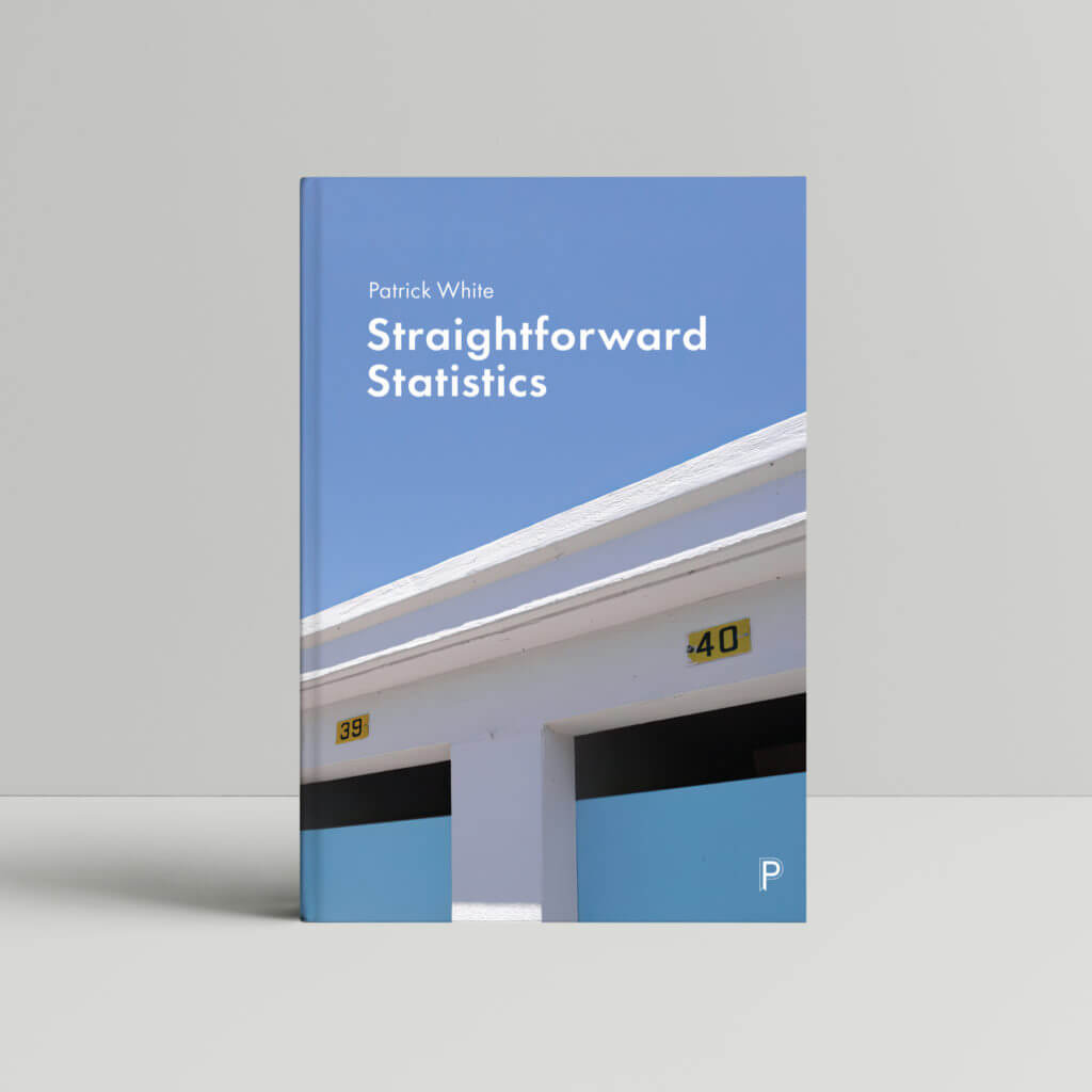
Back to the design process itself, following on from the clients feedback, our progression was more refined, looking at the closer details of the jackets design. Sticking fairly closely to this feedback, we experimented with many different typefaces and balances. However, none of these ideas had the clean, crisp balance of this first layout, with the title specifically showing this. By having the title over two lines and aligning it to the left both adhered with genre conventions of book covers and appropriately filled the blue negative space to make a visually effective and clear structure. Talking to the client about this, they agreed with our approach and was happy with this choice.
At the Real Jobs feedback meetings, it was suggested that we could try some different concepts for the spine. Again, we explored some ideas that we deemed unsuitable and dissatisfying. However, the use of black text on a yellow spine would draw more focus onto the cover’s numbers, creating a visual connection and signified importance through the repetition of these colours.
To give the client options, we sent them four distinctly different typeface options, allowing them to decide which they prefer. We briefly outlined how each one differed and what impact that might have on the book’s perception, with some being more mathematical and content-related and other being more modern and simple.
The client feedback was, again, very succinct – Idea 1 was exactly what they wanted, with a few minor tweaks to the information and content. His preference was for the blue spine, making the jacket feel like one continuous, flowing image. At this stage, it was clear we needed to make some final changes to the design, ensuring every element is as successful as possible.
Final Changes
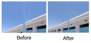
Receiving feedback from this project’s supervisor along with the client’s wishes made a really strong base for all design decisions. We began by going back to the image – now upscaled – to edit it properly. From the first Real Jobs meeting, it was made clear that the image needed some editing to fix the perspective distortion, which made the image fall into the uncanny valley, feel indescribably “off” and as if something was wrong. We had waited for the upscaling to be finished before doing this, allowing us to edit the final, resized image.
The below comparison image shows the changes made – this was predominantly fixing the perspectives of the doors, ensuring they all angled straight down instead of curving into the horizon. While a time consuming task, the final results are well worth this effort, with the image feeling much more visually pleasing and appealing through these changes.

Along with the image itself, it was also important for the front and back images to align properly. As the image was not long enough, the jackets effect is created by tiling the same image over the front and back, with the spine hiding this overlap. While this works to some degree, the numbers have to be carefully positioned (or removed) to ensure this effect of one long, continuous image is effectively achieved. The image was split into two, with the front and back covers image being edited separately. This allowed the angles and perspectives to be adjusted, making them look aligned in context, without altering how the opposite cover looked. The example below shows this in action, with the two halves coming together to create a single, convincing design.
Although this is obviously not flawless, elements such as the barcode cover large portions of the back cover, meaning that this editing is sufficient to convey the concept effectively. Also, the full jacket will likely never be viewed by a viewer, who will only see one side at a time when having the real book. However, making this visual effect fluent and well executed is still good practice, allowing the cover to appear as one continuous image.
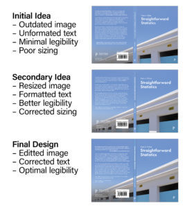
From a design point of view, the final changes were time consuming final tweaks. Finding the actual blurb text online, we were able to add this in, tweaking the typography with this in mind. The changes went down as small as optical margin alignment, ensuring that quote marks and punctuation are correctly accounted for when aligning text. While this was mostly done in small steps, gradually improving each time, the image below shows the key progression, with the changes made being clearer through this scope.
The feedback given by the project supervisor and in Real Jobs meetings really helped to shape and improve the final outcome. There were things mentioned here that I would never have considered, but really make the design feel nuanced and professional.

Reflection
Looking back at this project, it undoubtably had some unexpected challenges – the deep dive into image upscaling, testing cutting-edge software and looking into printing images wasn’t the direction I imagined this project going. However, I’ve found the whole process incredibly rewarding, teaching me new things, correcting some existing preconceptions and exposing me to entirely new software that will likely be very useful through the rest of my degree.
This process of fine tuning and nuancing the typography, layout and structure was also hugely beneficial. The opportunity to looking at such close detail into something and evaluate it’s success while working to such a close timescale has given me a better understanding of how practicing designers work, and the high standards they hold themselves to.
Regardless or not of wether our cover design gets used for the published book, this project has been hugely rewarding and has undoubtably helped my skills, both as a designer as well as when communicating with clients, printers and publishers.
