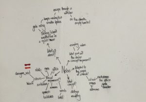
For Berta’s project, we were to chose a theme and based on it, we were asked to experiment on books, by manipulating the structure of the book, be it through disassembling the book part by part or changing the look of the whole book, in short, we were asked to just go crazy with it, as at the end of the day, this was a fun little experiment for us to learn about the different physical and material qualities of books. That being said, I chose the theme ‘noise’ as the brief about this theme really caught my interest and as I was reading the brief, I had already started to form some sort of ideas in my head about what I wanted to do with my book based on the theme. So, I started off by brainstorming my ideas and I made sure to answer the questions in the brief, which were:
- What is this story about?
- How can it be represented visually?
- What concept would represent this story best?
- How can it be adapted to the pages of a book?
- What part of it will the design concept represent?
These questions helped me a lot to break down and arrange my ideas. Starting off with the first question, the story was about two siblings who had inherited their parents’ wealth and lived in a quiet house, until one day, they hear a noise and move to a small room. They continue to move into smaller spaces every time they hear a noise, until eventually, they escape through a window, and end up on the streets, empty-handed.
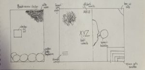
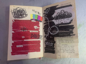
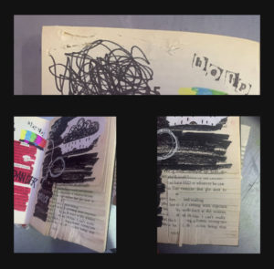
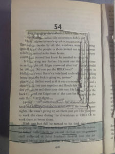
Based on that story, I wanted to design my book in a way that visualised the story in three different parts throughout the book. Therefore, in this first spread, which was at the beginning of the book, I used mainly the colours red and black; red to symbolise danger and black to symbolise the darkness the siblings were probably in as they were inside the rooms. For the left side of the spread, I had highlighted all the text using red marker, while leaving some words out that I thought related to the story, getting inspired by the works of Tom Phillips. I did the same on the other side of the spread, except on that page, I had covered up the whole text using black marker. I have also done some doodles and scribbles to visualise the concept of noise, through drawing the speech bubbles and sound effects, as well as drawing the glitch screen you would see in televisions when the signal went out, highlighting the isolation of the siblings inside the cramped rooms. Being interested in the art of stamping, I had also stamped out the word ‘help’ using letter stamps to show the desperation of the siblings to get rid of the noise. In the right corner of the spread, I had cut out shapes in a descending order, as if to show that as the siblings moved on to another room, the space kept getting smaller and smaller. Some minor details also include me fraying the edges and top of the pages by tearing them off or cutting through them using a craft knife and I have done this throughout the left side of the spread.
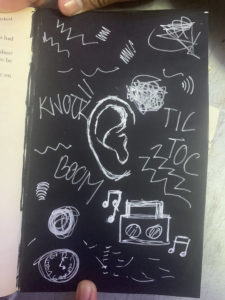
Moving on to my second design, after skipping a few pages of the book, roughly in the middle of the page, I covered one of the pages with black paper and drew an ear in the middle of the page using white pen. Around the ear, I doodled sound effects and symbols to show how the in the darkness, the siblings were on alert for any new noises.
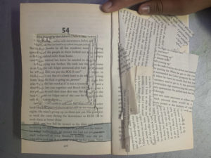
For my last and final spread, on the last pages of the book, I craved out a huge square on the middle of one of the pages, and I continued to do so, however, due to not having enough time, I wasn’t able to dig through to make the square deep enough but overall, I was satisfied with the result. I did this so as to symbolise the window and then underneath it, I drew a road horizontally, to visualise siblings being able to escape. on the opposite side, I glued on the scraps of paper messily to show the after effects of the journey the siblings just had.
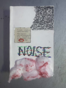
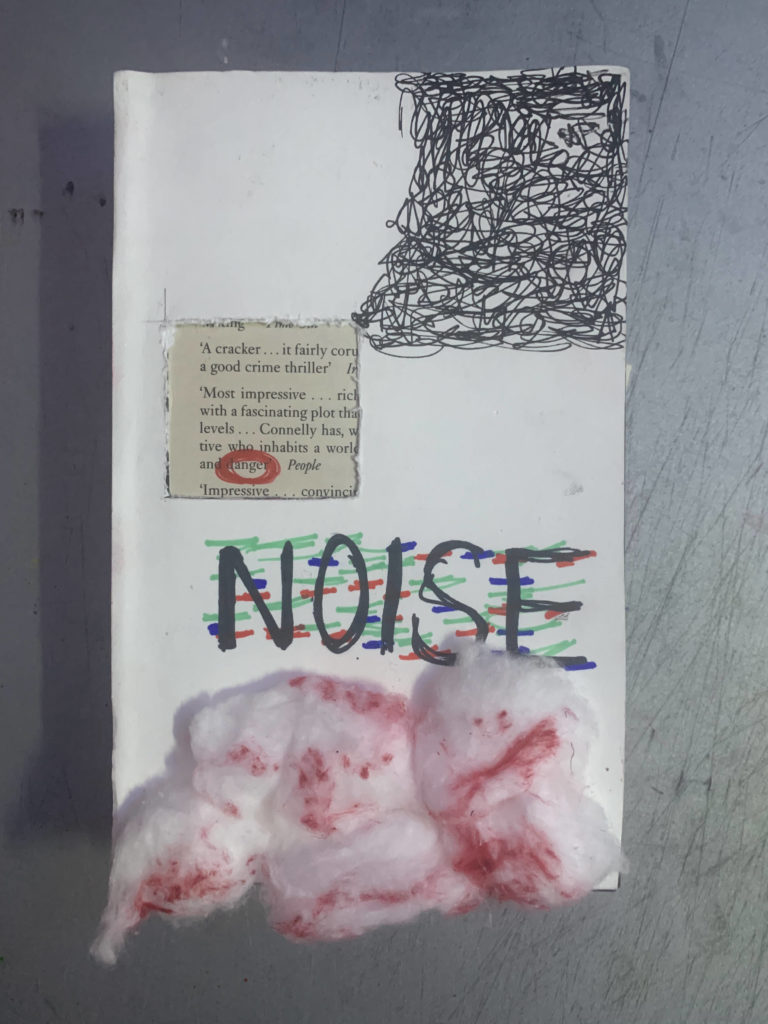
Lastly, for the book cover, I kept it simple by covering the original book cover with white paper. Then, I carved out a square through the page and the book cover, to represent the window, and from the corner of the book, I scribbled in a descending order, stopping when it reached the window. Inside the window, I circled the word ‘danger’ in red to show the danger of the situation. I wrote the title ‘noise’ in capitals, using red, blue and green markers to draw on top of the letters to kind of show that the letters are glitching. Finally, I ripped cotton balls and stuck them on at the bottom, and then coloured parts of them using red sharpie for texture. Overall, I kept the drawings messy and almost childish to represent the siblings, who I assumed, were children themselves.