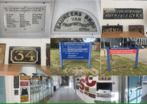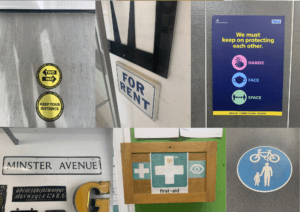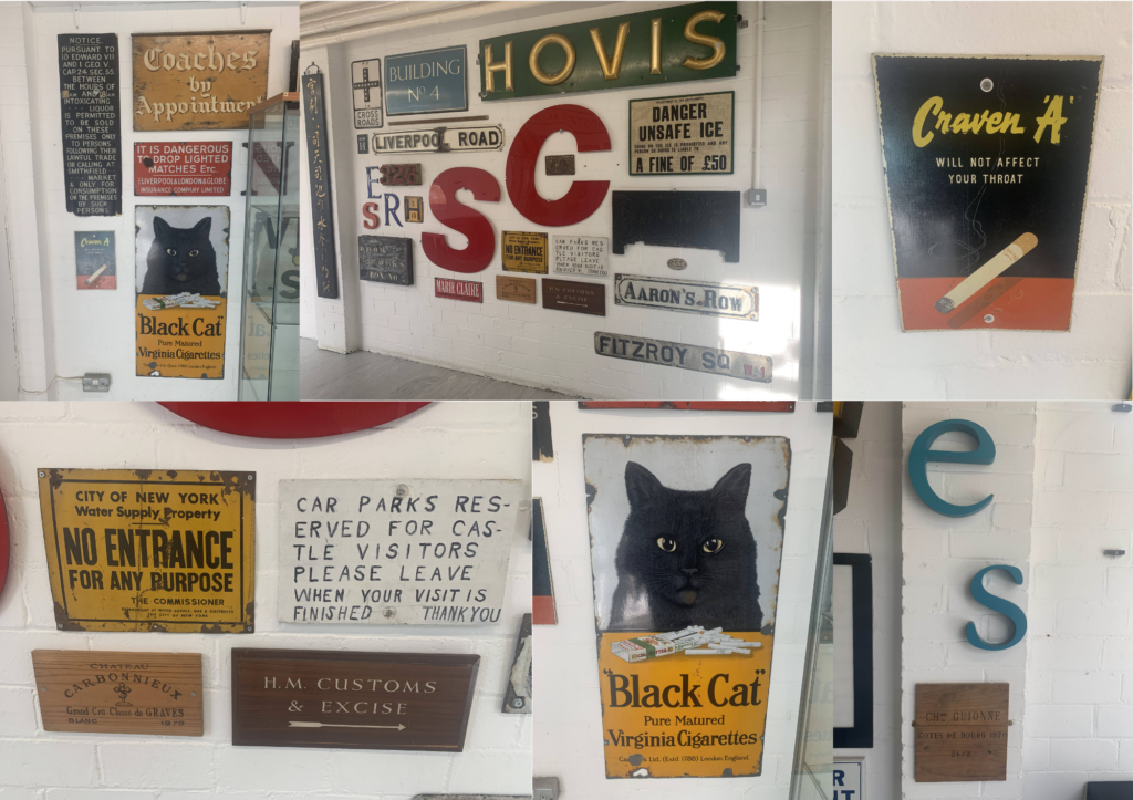
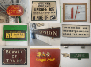
For Eric’s lesson on 04/10/2021, we were given the task to explore around and outside the department and take photos of any sign boards or letters that we are interested on. We had to do this based on the brief we were given which said to ‘search for lettering around the campus based on a theme of your choosing and take photos of it.’ Therefore, I based my theme on signs and lettering that are eye catching or somewhat interesting. Overall, the experience was interesting as it made me pay attention to the details in the said signs and the amount of details put in each of them so that it catches the eyes of passerbys. This was done so in these sign boards through using bold and bright colours such as red, yellow and green. The use of the different fonts based on the modernity or the vintage ness of the sign boards is also very clearly evident in these photos. Taking all the photos were fairly easy, as I walked around campus and visited the same route I take when walking to the typography departmen, however, in the middle of my walk, it started raining, resulting in some of the photos having a blurry effect on them.
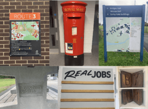
Since none of my photos had an ongoing colour scheme or focused on one specific thing, I collaged some of my favourites and appropriate ones to show the photos I took while walking around the campus. While doing so, I realised most of my photos were taken in a straight frame, almost symmetrical, which I think also conveys how someone might look at these lettering from their viewpoint.
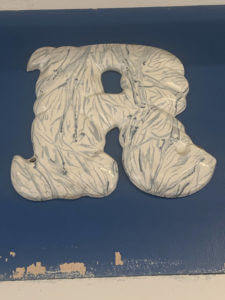

For this particular lettering, I zoomed in on one of the letters to highlight the details in the letters itself. I found it quite interesting how the letters were sticking out and not laying flat on the surface and the overall marble texture of the letters made the whole lettering look visually pleasing to look at.