Category: Lettering in the environment (Eric’s project)

Lettering in the environment

Caution

For Eric’s project we had to take images of signs or letters in our surrounding environment and come up with a theme. My chosen theme was “caution”.

I wanted to portray how signs can be used in a way to inform people of danger or important information. Different shapes and colours are used to catch the viewers attention, such as the continuous use of bright yellow shown in danger or informative signs. Some signs have further written information whereas others don’t. This may be because people are used to seeing the symbols, making it easier to get information across.

Information Signs

Instructions, Information and Warnings

Looking around the environment, I chose to obtain pictures of information signs and compare and contrast to one another to see their significance. I noticed how the signs were mainly made using the primary colours; red, blue or yellow, as well as green in regular shapes such as circles to give orders and triangles to give warnings. The text upon them were in a sans serif font in either black and white which enabled them to stand out and portray a clear message effectively to the audience.

Lettering – Signs in Public Places

Signs in Public Places

For this project, I decided to focus on signs that we all see in our day to day lives. The color combinations, the familiar Sans-Serif font, and the graphics contribute to the eye-catching design that we all recognize. While we are used to many of these signs such as “no smoking” and “fire exit” signs, a lot of them aim to protect us from not so obvious situations. But due to the similar look between all of them, we are all aware that these bright colors and conspicuous fonts are there to warn us about something. What I found most interesting was that some of these signs use all capital letters, while others don’t. I am not sure why one is used over the other for certain signs, but regardless, the bright and bold colors as well as the simple graphics cause them to stand out.


Lettering in Warnings

Lettering in Warnings

I took a lot of pictures while wandering around campus for this project, with no real focus as to the content of them while doing it, I’d mainly looked for lettering that intrigued my or caught my eye for one reason or another.

After sitting back down and looking at the images I’d taken I was drawn to the warning signs in particular, I thought it interesting how not all of these warnings will have been designed by the same person yet all follow a very similar pattern and method in their design, for example the bold text, similar fonts, use of bright contrasting combinations such as red and white or yellow and black in the colouring, they often put key words in boxes to seemingly highlight them and also the use of negative space is a very common factor amongst the lettering. Also I was intrigued by the use of similar shapes across all of them, triangles being very common and almost becoming a staple that you’d automatically connect to a warning.

Eye-catching letters

For this particular task, I didn’t choose a theme. When taking photos, I looked at the most eye-catching examples in the environment around me and then identified a piece throughout what I had. I was drawn to individual letters and how the different styles and variations of weight etc. Moreso, I found it interesting how additional signage used formation and the grid system. My favourite photo I took was of the exclamation mark with “sustain it” I liked how it used the exclamation mark to draw attention. The change in conventional format made it memorable, along with the “Rollover” logo with the incorporated hotdog in the double l.

R in the Environment


In this project I went around the Typography block and campus and payed particular attention to the letter R. Single letters are not normally something that stands out in day to day life, so I wanted to explore deeper into this. Focussing on just the ‘R’s around me, I noticed the variation in size, font, weight, texture and colour.

I organised my photos in a collage format so the wide variation of ‘R’s could be seen all at once. A collage looks busier than any other format choice which emphasises the amount of differences between the character.

Instruction signs

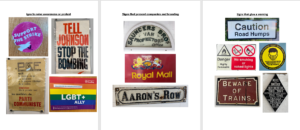
When taking pictures of the signs I started in the Typography department, and I started to take pictures of signs and posters with serifs. For example, the road sign that reads ‘MINISTER AVENUE’ has serifs on the typeface.

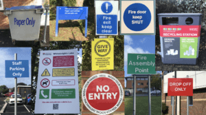
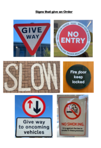
As I left the department and went outside I noticed numerous signs with information and instructions. I then found a theme of ‘instructions and informative signs’. I continued taking pictures of bold instruction signs. I organised my pictures into two categories. Instruction signs with text and instruction signs with icons. The first set shows instruction signs with text. An example of one of the sign is the blue one that reads ‘staff parking only’. The blue colour for the sign shows that this is a positive instruction sign that must be followed. Another example with the colour blue is ‘fire door keep shut’, again this sign represents that these doors must be kept closed at all times. The colour blue for these instruction/informative signs will draw attention. The sign that reads ‘drop off only’ and ‘no entry’ are in red. Red symbolises important and strong instructions. The colour red can also be seen from a very far distance making it useful to be in red to inform people on what the sign is about.

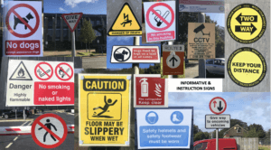
The second category I chose was instruction and informative signs with icons. One example I really liked was the yellow sign which read ‘floor may be slippery when wet’ and has an icon of a person slipping. This sign caught my eye because the sign is showing you the effect of what can happen if you walk on the wet floor. Yellow signs are simply warning signs but they are still informative as they are warning you on what could happen. Yellow also suggests danger. An instruction sign with icons which reads ‘no smoking in this building’ is a command and is telling people not to smoke. The icon with a cigarette with a red line through it makes it very clear that this must be followed, and with the sign being red it makes it stand out more. Other signs such as the ‘give way’ sign with arrows shows to allow drivers to pass by coming from the direction of the arrows and signs like ‘CCTV cameras in operation’ with a CCTV camera icon makes it noticeable that there are cameras in this building. Again this is a yellow sign suggesting the danger on what could happen if instructions are not followed.


Everyday signs


I didn’t solidify a theme for my investigation into the presentation of letters in our environment, instead I focused on signs that we see on everyday and don’t realise how the use of typography effects us.

I initially focused on the letters presented on signs that raise awareness for charities or a protest. I noticed that they mainly used sans serif fonts to be eye-catching, clear and to present their urgency for change. I then used the resources already in the typography building, looking at the old signs for businesses and compared their traditional branding identity with Serif fonts, with modern day branding. The first theme that came to my head when reading the brief was road signs, as they are some of the most important pieces of information and orders citizens are presented with, so the lettering has to be clear and simple. I found that the road signs only used sans-serif fonts to portray this and uses simplistic colours such as black, white, red and sometimes yellow to get peoples attention.

Blue Letterforms

For this brief we had to look at different letterforms around campus with a running theme. For my theme I chose colour, my chosen colour was blue.

Each of the letterforms had a different function, ranging from instructing such as the ‘paper only’ bin and the blue roundabout sign. I also looked at  different perspectives, thinking about how each sign is viewed. For example, for the pedestrian and cycle pass sign I angled the camera down and head on along with the Oreos in the vending machine. Whereas, for the big E and T on the wall in the typography department, I changed the perspective as this is how these letterforms are seen as people walk past.