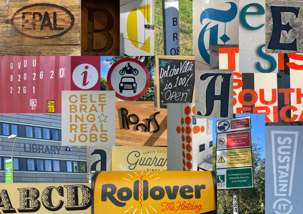
For this particular task, I didn’t choose a theme. When taking photos, I looked at the most eye-catching examples in the environment around me and then identified a piece throughout what I had. I was drawn to individual letters and how the different styles and variations of weight etc. Moreso, I found it interesting how additional signage used formation and the grid system. My favourite photo I took was of the exclamation mark with “sustain it” I liked how it used the exclamation mark to draw attention. The change in conventional format made it memorable, along with the “Rollover” logo with the incorporated hotdog in the double l.

