Retouching images

Design Ideas and Design Process

For this task, I wanted to solely remove people from images. I wanted to get a feel of home, so wanted to retouch images of Cornish beaches. The image above is the final result from St Ives (a notoriously busy holiday spot). Often, my family will hand me photos to edit so this task was useful for me as it was a highly transferrable skill that I can use in my day-to-day life. I started by gathering my royalty-free images from UnSplash here are the before pictures below.

As a whole, the design process was quite straightforward once I had my images and had watched some tutorials. The general process for each image was to use the spot blemish tool to remove people from the images. I started with the St Ives image, this was solely getting rid of the families in the image. Next, I wanted to challenge myself more with the Porthcurno image. For this image I removed the surfers, this was relatively straightforward, although one of the surfers was in an awkward position on the wave which meant playing around. After that, I adjusted the levels and curves in the image, this made the tones stand out more without overexposing the image. I then added a photo filter to tie it together. Lastly, I wanted to use these tools and try some other tools I was not as comfortable with, in particular, the burn tool. I followed the same process as the previous images, removing people, adjusting levels and curves. The Fistral Beach image had a lovely orange tone in the sky which I wanted to stand out more. I experimented with the burn tool to make it stand out more, and make the clouds more prominent. I used the burn tool with large brush size, low density, and decreased opacity. I then used the sharpen tool to make the lone surfer stand out and extenuate the horizon.


After Retouching

Software Tutorials

The main tutorials I followed were supplied which I will link at the end of this section. I found most of these tutorials useful and relevant to my task. They helped me develop my skills by using the spot blemish tool, dodge and burn tool, sharpen tool, and so on. I used some of my own knowledge to adjust levels and curves. The tutorials gave me the confidence to apply these skills within my work. The additional link below was a useful gateway to other tutorials, this gave a wider insight into retouching images, more to do with modeling i.e. removing a blemish and evening skin tone, or changing eye or hair colour. I would like to venture and try out these skills despite having a stance on retouching faces and bodies due to the harm it causes. That being said, it would be interesting to have a better understanding of the software and how to use it for other purposes.

https://helpx.adobe.com/photoshop/how-to/photo-retouching-basics.html

https://helpx.adobe.com/photoshop/how-to/crop-straighten-to-improve-composition.html

https://helpx.adobe.com/photoshop/using/retouching-repairing-images.html

https://helpx.adobe.com/photoshop/how-to/clone-stamp-remove-object.html

https://helpx.adobe.com/photoshop/using/content-aware-patch-move.html

https://www.youtube.com/watch?v=Hg1WS_yOcHMhttps://www.youtube.com/watch?v=_A5XZPnzOP0

https://helpx.adobe.com/photoshop/how-to/replace-background.html

https://helpx.adobe.com/photoshop/how-to/photoshop-sharpen-photos.html

additional:

https://www.photoshopessentials.com/photo-editing/

Design Resources and Articles

These articles and resources were useful with the wider knowledge that was included. The second link is a gateway to more articles and resources for tips etc. This was the most useful additional resource that I found. The adobe link helped me with my designs as it showed the fundamentals that I needed to get started.

https://helpx.adobe.com/photoshop/how-to/photo-editor.html

https://fstoppers.com/category/photoshop

Learning Across the Module

Across the module, I feel a lot more confident in using the software. I feel that I can confidently format text and utilise paragraph styles, which was my area of improvement in Autumn Term. Specifically, retouching images using particular tools is something I am now very confident in. I enjoyed creating the letter logo in Illustrator as this was one of the areas I missed in TY1DP1, it gave me the opportunity to edit letterforms in Illustrator which isn’t something I have tried before. I could improve on my time management skills and idea generation, however, I do feel that I have improved marginally from Autumn term.

InDesign Task – Postcards

Design Ideas

My first postcard design

For the Photoshop Task, I experimented with the use of gradients, I continued this for my postcards, to create synergy between the branding elements. For this particular design, I wanted it to have a poster feel on a smaller scale. It includes a logotype, as well as body text that includes the title and information about the podcast. I felt that this design paid off and I was able to solidify my skills on InDesign, it is probably my favourite of the three.


My second postcard design

For my second postcard design, I wanted to replicate my screensaver by using the gradient tools on InDesign. I also wanted this particular style in landscape, I thought it leant itself better this way. I felt that this didn’t challenge me as much however, I did learn how to create a grain effect.


My third postcard idea

For my third postcard design, I wanted to experiment more with type and paragraph styles. This was particularly fun and I enjoyed making swatches for my repeated text. This design was nearly my favourite because it was rather straightforward to make but also required me to use various tools.


Design Process

I started by creating three swatches and then using these to create a gradient swatch. Then I created a circle with the ellipse tool and set the fill to black. After that, I made a larger circle over the top with the fill set to the gradient swatch and then sent the larger circle to the back of the document. Then I selected object>effects>gradient feather. I set the type to radial and then adjusted the gradient stops. I then copy and pasted the gradient circles twice and moved them to to the left and right of the original circle.

This was before I had added the text and I was experimenting with the ellipse tool
This was once I added the text, creating my ‘logotype’.

Software tutorials

I found tutorials on InDesign really beneficial. I haven’t used InDesign as much as the other software so was least confident for this program. I began by watching the tutorial on Adobe which was a very brief video about creating a postcard on InDesign. One of the most useful tutorials I watched was another of Adobe’s which showed how to apply colour and effects to my postcard. The most useful tutorial was probably one I found through Pinterest when looking for inspiration. This tutorial showed how to create gradient effects. These tutorials helped me develop my general skills and confidence in using InDesign. I now feel that I can confidently implement gradients and utilise swatches on an InDesign file. Some areas I would like to improve are consistently using paragraph styles, I found for this project I forgot; whereas, in the TY1INT book design project I rarely forgot. I would also like to experiment more with the tools as there is still a lot that I haven’t used so hopefully I can watch some tutorials and follow them.


Design resources and articles

Alongside the David Pearson article and the Molly Scannell article, I also found my own. I did a lot of research on social media in particular Pinterest and Behance. I found it useful to see how others designed postcards in general or podcast branding. I also used Behance to look at general work created on InDesign to get a better feel for it. In particular, one article I looked at was for gradients, this was interesting to me for background and also seeing how it’s applied.


Great Expectations

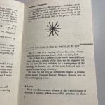
For this task, I recreated the cover of Great Expectations by Charles Dickens. I took inspiration from David Pearson’s cover of Nineteen Eighty-Four. David Pearson’s cover took themes from the book and communicated that visually through a small change/addition. Great Expectations has many themes but the predominant one is becoming a gentleman in Victorian England. I used my template from The Great Gatsby to make the bulk of my cover and then created a small top hat on Adobe Illustrator to convey the theme of gentlemen in society in the 19th Century.

The Great Gatsby

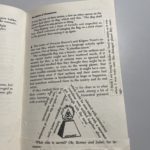
Above is my copy of the penguin classic cover. I followed the tutorial provided, it took me longer than expected as the cartouche was quite fiddly when I tried to smooth out the lines. This task helped me learn some of the fundamentals of InDesign and more about paragraph styles and hidden characters.
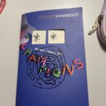
Labyrinth

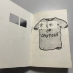
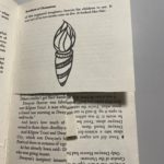
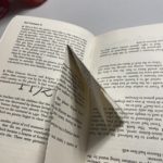
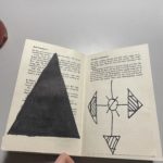
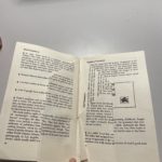
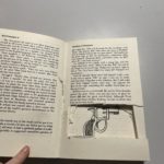
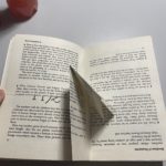
As indicated by the title, I chose the brief ‘Labyrinth.’ I started by taking literal ideas from the brief; i.e., I cut windows into the book’s front cover, so it resembled the front door of the house. I also drew a maze labyrinth on the front cover. As I got into the text, I wanted the reader to feel confused and played with the perception to convey the confusion the characters may feel. I did this initially by cutting pages, and this gave the illusion it was only one page, but it was multiple pages. Furthermore, I continued this theme by folding pages so the reader has to interact with the book to read it; this conveyed my idea of a labyrinth and choosing a path or turn. If I hadn’t run out of time, I had planned to use blank pages to unfold and essentially reach a dead end, leaving the reader to feel like the family in the book. I did, however, execute this idea by folding the pages and then gluing them down.

Eye-catching letters

For this particular task, I didn’t choose a theme. When taking photos, I looked at the most eye-catching examples in the environment around me and then identified a piece throughout what I had. I was drawn to individual letters and how the different styles and variations of weight etc. Moreso, I found it interesting how additional signage used formation and the grid system. My favourite photo I took was of the exclamation mark with “sustain it” I liked how it used the exclamation mark to draw attention. The change in conventional format made it memorable, along with the “Rollover” logo with the incorporated hotdog in the double l.