TY1SK- spring board blog post

  1. my design and process: 

For the photoshop task, I decided to choose creative images. This caught my eye as it would teach me how to alter an image in 3 ways. The process started with choosing a photo. This was an important step as I wanted a photo versatile enough so that I would have lots of options on how to alter the photo. Initially I wanted to use a flower as the contrasting colours could be used to make an interesting effect. However, most flower images had little backgrounds with not much going on. In the end I settled on a flower field that had a big sky and lots of colours and shapes. 

The first task was to combine colour and monochrome. I had so many ideas for example, I wanted to make the sky the only thing monochrome to make a nice bold contrast between the sky and the clouds. However, I didn’t think it was very powerful and didn’t really say anything. Instead, I selected most, but not all, of the field of multi coloured flowers and kept them in colour whereas everything else was turned into black and white. This gave the image power with the impression of there’s a silver lining under every dark cloud. I was very happy with the end result. 

For the next task we had to alter the image in some way. I chose to change the colour of the sky; this was hard due to the blue of the sky peeking through the trees. This inspired my next task to change the reality of the image. So, I downloaded some images of dinosaurs and made them into Png’s using photoshop. I then added them to my image giving the illusion the 2 dinosaurs are looking at the flying dinosaur. 

  1. software tutorials:

For this task I had to use many tutorials and articles to assist me in creating these images as I have little knowledge on photoshop. There were 3 main sources I used. 

Getting started with Photoshop in 10 minutes (Beginners Tutorial) 

This explained many things, for example, how to

 use and make layers. This was very important as using layers is possibly the most important tool in photoshop. Without this video this task would have taken much longer. How to Create Stunning Black & White Images in Photoshop 

This was another video I used to teach me how to use the monochrome effect. Even though it technically only taught me how to create black and white images, along the way I saw where the other effects lived and how they worked. 

  1. Design recourses and articles

Over this task I had to gather inspiration I did this via creating a mood board on BeHance. This helped me gather inspiration and adjust / improve my work as I went. An example of this is, when I was creating my black and white task I struggled to put some emotion into my image. By consulting my mood board and adding to it, I gathered an idea of what I wanted it to say. 

  1. Learning across the module

Over the course of this module I have gathered many new skills. Such as, after effects. Learning After effects was extremely hard. The videos on how to use the program were very uninformative and made me more confused. This was certainly the hardest task I had to do. However, by the end I knew how to use key parts of this program effectively. Another key part I learnt was premier pro. This was challenging as it was another program I had never used before. However, there was a lot more Resorces to teach me how to use it. By the end of the screen casting task I moderately understood the software and could use it confidently. 

blog post jess scrivener


My blog post                                                                  InDesign project blog by Jess scrivener

Design ideas and design process

My first design for the postcard project was experimental I used rectangles in different shades to make dimension and illusions. I then added the typography to the corners so it would add a frame to the design. This also made it look more even whereas before it looked wider due to the layout of the rectangles. I chose green as it is a calming colour with connotations of nature and peace. Also, it works well with white, making it stick out and complimenting the connotations of green.


In my second idea, I changed the colour scheme and layout. I changed the colour to pink/red the connotations of those are passion, anger, love, romance and danger. Obviously very different to the calming green. This will attach the attention of the audience very quickly as people pay attention to shades of red quite quickly due to warning signs being branded this colour. It is also a similar shape to a cross (x) symbolising no and stop. Not only this it makes the design appear more square and bigger than it is as the layering effect reaches out of the frame. This is balanced out by the typography levelling out the edges.

On my 3rd and final post card, I played around with the typography more. Initially, I kept my geometric theme but changed the shape to circles to create a bubble effect however I was fonder of the squares and thought the text wrapping would flatter rectangles better and appear more post card like. So, I thought about post card conventions and thought this style typography suited abstract postcards better. I used 4 different shades of pink to create the hierarchy between the colours, for example, darkest is at the front lightest

as at the back. Finally, I also chang

ed the font on this one to be more fun and abstract. The curvy, thickness creates a contrast between the sharp edges but the flat edges mean it still fits the rest of the design.


Software tutorials

For this project, I didn’t use many tutorials as I am quite confident with InDesign due to my previous experience with the software. However, I did use a few to help me spiral rows of text around my 3rd post card but I already knew how to use the type on path tool so it wasn’t too helpful. I did learn how to make the stroke colour clear this helped me remove and change borders till I was happy with them. Finally, the tutorial that helped me most showed me how to use the pen tool. I really struggled with the pen tool but I’m now getting used to using it, I found out that you can draw a shape with the pen tool and then put an image inside the shape you just made. Although this wasn’t the most helpful for this specific design, it will definitely help me in the future.

https://youtu.be/P7MIKi663ok


Design resources and articles

During this project, I used a lot of Behance. I personally love Behance it has incredible work from so many brilliant artists, designers and more. I used this website for my inspiration along with experimenting with my own ideas. For example, I saw an illustration of slime dripping down a wall and that inspired me to create my own slime inspired cover. Or for the post card project, I saw kite shapes drifting over a postcard and geometric stairs next to it this inspired me. I saw how the stairs used the shades of black to create dimensions and the way the kites overlapped using the same method and I knew I wanted to try it. All of that thrown together became my final post card.


https://www.behance.net/gallery/67718271/Livraria-Cultura-Fragmentos?tracking_source=search_projects_recommended%7Cstairs

https://www.behance.net/gallery/121674457/Apocalypse?tracking_source=search_projects_recommended%7Cstairs

Retro logo

I had a lot of fun with this project.  you can see from my mood board my inspiration, but my focus was a retro theme. by looking at many retro designs I saw a great emphasis on line work, bubble, and pop fonts, and either pastel or primary colors. these are the things I chose to incorporate into my design. this project was very fun and I learnt a lot on illustrato
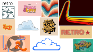
r.

Indented typography

My theme was indented (debossed) typography. It was very interesting to see how the font was printed onto the metal and the differences between type that was pressed versus the type that was chiseled into a surface. I found this task very interesting and it helped me understand and see printing on mediums differently.

Magic map of magnolia

My partner was Nathalie, she said she liked to travel mostly around Europe, she liked music (rap, alt, and indie) and she liked to dance, specifically ballet. so at first, my gift idea was a gift basket filled with a travel pillow, headphones, and 2 tickets to the ballet. But I thought that was a bit vanilla. so instead I made a magic map of magnolia a county that lives inside a scroll and when you step on it you enter the world. In the world, you can manifest anything you want in that moment eg… the ballet.