
Lettering in Warnings

I took a lot of pictures while wandering around campus for this project, with no real focus as to the content of them while doing it, I’d mainly looked for lettering that intrigued my or caught my eye for one reason or another.
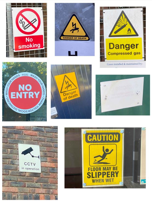
After sitting back down and looking at the images I’d taken I was drawn to the warning signs in particular, I thought it interesting how not all of these warnings will have been designed by the same person yet all follow a very similar pattern and method in their design, for example the bold text, similar fonts, use of bright contrasting combinations such as red and white or yellow and black in the colouring, they often put key words in boxes to seemingly highlight them and also the use of negative space is a very common factor amongst the lettering. Also I was intrigued by the use of similar shapes across all of them, triangles being very common and almost becoming a staple that you’d automatically connect to a warning.