Modifying Images in Photoshop

Design Ideas & Design Process

I approached this task with the goal of learning how to use more tools in the software. So, after some research, I had ideas to develop, tools to learn and skills to master.

Design 1

Figure 1 – Final edit 1

Like many others, there are countless photos I have taken that include an object or person that just ruins it, the original photo from this design being one of them. In instances like this, once you remove the item that feels like it doesn’t belong, it gives off a much more peaceful feel. So, my aim for this edit was to seamlessly remove the sign from the image.


Design 2

figure 2 – final edit 2

As someone who loves flowers, I have seen lots of different types and colours, but very rarely do I see blue ones. The fact that Photoshop has the ability to edit the colour of specific sections of images is fascinating to me, so after some research I developed the skills of how to do this.


Design 3

figure 3 – final edit 3

This idea stemmed from visiting a Mini car dealership. Their cars can be seen as if they’re driving up the walls and I wanted to replicate this in my work. To develop the idea, I selected an image of a skyscraper to give a much more dramatic feeling and to ensure this was the sole focus of the design.


Software Tutorials

Design 1

Figure 4 – Original image

Figure 5 – Close up of edit

figure 6 – retouching layer

The use of the clone stamp tool is how my design went from the original image (Figure 4) to the edited version (Figure 1). I used a portion with similar pixels as my sample area and covered the sign with duplicates. Different brush sizes really helped me achieve the result as they allowed me to be precise with my placing. With the background not being consistent, I had to take multiple sample areas to conceal the sign. This raised some challenges as this was not covered in tutorials I watched, but I solved them by using great attention to detail. I would like to develop this skill further in terms of accuracy as the tree trunk is not completely straight and there is some obvious repetition.

https://helpx.adobe.com/uk/photoshop/how-to/clone-stamp-remove-object.html


Design 2

figure 7 – original image

figure 8 – use of eyedropper in hue

figure 9 – refining the background

figure 10 – use of curves

After following tutorials, I learnt that the first step was to add a hue to certain colours using the eyedropper tool (Figure 8). Then, to erase the unwanted colour changes, I used the brush tool in black and white. As seen above, I paid close attention of the finer details of the flower outline to create a realistic result (Figure 9). Once I was happy with these refinements, I experimented with a curves layer to add some depth to the image (Figure 10). Although I was careful with editing around the flower, a skill I would like to further develop is ensuring no original colour comes through. I will experiment with different brush types as I think ones with soft edges don’t help this matter.

https://helpx.adobe.com/uk/photoshop/using/replace-colors.html


Design 3

figure 11 – original image
figure 12 – use of object selection tool

figure 13 – adding layer mask

The efficient way I did this was using the object selection tool. This selected the car and once I added a layer mask, the car had been cut out of the image. I had to research further about how to refine the cut as it was not as smooth as I had desired. After this edit, I placed it on top of the background image and that was my edit completed. Technically, this edit is not the strongest I created as the image cut is not perfect, meaning this is a skill I would like to improve on in the future.

https://petapixel.com/2020/04/08/how-to-make-photoshops-object-selection-tool-way-more-precise/


Design Resources & Articles

Design 1

After looking into lots of tutorials and articles, this one stood out to me. I came away with multiple ways to approach the task of removing a defect from an image. This really helped develop my idea generation as I knew the capabilities of the software, and therefore could select an appropriate image.

https://helpx.adobe.com/uk/photoshop/how-to/photo-retouching-basics.html


Design 2

My inspiration for this design was the idea of colour psychology. This refers to the emotions that certain colours convey. I researched into what each colour could represent but made the choice to use blue as it has connotations with calmness, an emotion also related to flowers. It is also a contrasting colour to the warmer colours like yellow and pink in the image, meaning it stands out effectively.

https://www.verywellmind.com/the-color-psychology-of-blue-2795815


Design 3

Harry Fairbairn MINI (Inverness) | Car Dealership | Arnold Clark

figure 14 – Mini car dealership in inverness, Scotland

Linked below is an article that explains some of the advertising choices behind placing MINIs on the walls of their buildings. This reading really emphasises the lengths the brand has gone to so I decided to reflect that in my work by selecting the type of building that is taller than everything, a skyscraper.

Learning Across the Module

Personally, I would say my knowledge in which software to use for certain tasks has improved tremendously, along with combining softwares for desired outputs.

  • For InDesign, the design skill I developed most was how to use grid systems for even layouts.
  • For Photoshop, my overall skill in manipulating images to look a certain way has improved, but in particular my ability to edit positioning of pixels to give off a different impression.
  • For Illustrator, I have a wider skill set thanks to this module, especially when it comes to the amount of tools I know how to use and what situations to use them in.

In regards to my quiz results, a skill I gained over the course of the module is the ability to set up documents correctly for both digital and print purposes. I still need to develop my skills in file and font formatting as I have not come across these a lot. Also, I need to further revise settings for importing and scanning images.

Exploring Tools in Illustrator

Design Ideas & Design Process

As I approached this task, I knew my main priority was to become more familiar with the software and more specifically tools in the software, whilst keeping the brief in mind. This explains my widely varied designs. After searching for inspiration I had lots of ideas that I wanted to develop, and skills I wanted to master.

Design 1

Figure 1 – Final sticker design 1

BMW, BBC, NBA, KFC. All these brands are known by a 3 letter acronym. My first idea stemmed from this concept. I chose to shorten the title of the podcast to the 3 letters as it creates a brand which is more memorable than an independent podcast. In my design I have highlighted the abbreviated title to draw attention to it, which was my aim when going through the design process.

Design 2

Figure 2 – Final Sticker design 2

Here I wanted to concentrate on developing solely text-based skills. To achieve the handwritten look I was after, I selected a calligraphic font as I feel like this portrayed my goal successfully. When researching I had seen multiple stickers with a vague silhouette of the design acting as a border/outline which inspired me to experiment with this idea, hence why there are multiple shadow layers to this design.

Design 3

figure 3 – Final sticker design 3

Typography is all about words. When said, the word itself has “type” in it, and this design reflects exactly that. A book has tens of thousands of words in it and is usually the first thing people think of when the topic of conversation is words. After watching a tutorial, I learnt how to create this book-like effect which I think conveys the theme of typography perfectly.

Software Tutorials

Design 1

Figure 4 – Using type on path tool 

For continuity, I designed a sticker based on one of my previous podcast covers where I used smart filters, the liquify tool and a clipping masking in Photoshop to create the effect of the distorted TGC. Once I had moved this to Illustrator, I drew a circle around it and used the type on path tool (Figure 4) to add the smaller text around the edge of the sticker, creating a border highlighting the abbreviation. I edited the size of the outer text so it joined as a complete circle.

Wrap Text Around A Circle with Adobe Illustrator | Beginner Tutorial

Design 2

figure 5 – using offset path and merge tool 

Figure 6 – without typographic brush strokes

figure 7 – with typographic brush strokes

To emphasize the text, I added a black shadow by duplicating the text, then I expanded, blended and merged the letters together. Additionally, I increased the stroke weight so it was a thick, bold shadow. The use of copy and paste came in handy for this design as I created multiple shadows. The blue shadow behind the white text came from duplicating it, changing the colour and using the selection tool to position it slightly down and to the right of the foremost layer. To enhance the hand-drawn effect, I added some brush stroke-looking shapes using the pen tool, incorporating bezier curves to intensify the sections of the letters that cross over another (Figure 7).

How To Create Custom Type Designs in Adobe Illustrator

Design 3

figure 8 – using free transform tool

figure 9 – using blend & anchor tools 

figure 10 – moving text position 

The free transform tool helped me achieve the opening book-like effect. Taking two copies of the word, I morphed them so they were the very outer and inner “pages” (Figure 8). Using the blend tool, I was able to fill the gaps with a desirable number of copies and then adjust the positioning using the anchor tool. I then used the gradient fill tool to give the look of them disappearing into the background, enhancing the book effect (Figure 9). After using the rotation and reflection tools to create the rest of the book, I experimented with the positioning of the remaining text (Figure 3 & Figure 10). In the end I decided upon the first option (Figure 3) because the writing isn’t completely legible in the second one.

Flip Text Effect in Adobe Illustrator | Blending, Reflect & Gradient | Graphic design

Design Resources & Articles

Design 1

figure 11 – BMw logo comparison (2020s v 1970s)

My inspiration for this design was the branding of BMW. Above is the logo from the 1970s along with the current one (Figure 11). My sticker shape reflects the main shape of both logos, a circle. The slight involvement of colour means you are drawn to it so I used this idea for my design for the extended title, as that is an important piece of information. This helped develop my work in terms of hierarchy and the order in which the viewer will see the information.

https://www.creativebloq.com/news/bmw-old-logo

Design 2

figure 12 – sticker sold on redbubble.com

The solid theme throughout this website’s stickers is the bubble-like border around the designs. It gives the illusion that the design is much more prominent than the background colour and this is a way of manipulating the viewer to look at certain information. I applied this to my own work and the results are successful in that you are really drawn to the word ‘typography’, like it is almost jumping out of the page.

https://www.redbubble.com/shop/?iaCode=all-stickers&ref=search_box

Design 3

Book designer David Pearson returns to Penguin's bestselling series, Great Ideas

figure 13 – Book cover designed by david pearson 

Earlier this term, David Pearson, a successful book designer, led one of our Baseline Shift sessions and this particular design of his stood out to me. The concept of making shapes and letters out of words really intrigued me so I wanted to build on this idea in my own way. The result of this was the idea of creating the shape of a book as part of my sticker design, as books have a strong link with typography and graphic communication.


Penguin Book Cover


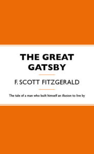
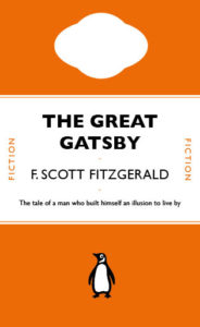
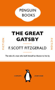
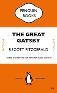
This is my recreation of the Penguin Books cover for the novel The Great Gatsby. I used Gill Sans for the text as this was already in my InDesign. I have included some progress steps to show how I got to my end result.

Penguin Book Cover 04


R in the Environment


In this project I went around the Typography block and campus and payed particular attention to the letter R. Single letters are not normally something that stands out in day to day life, so I wanted to explore deeper into this. Focussing on just the ‘R’s around me, I noticed the variation in size, font, weight, texture and colour.

I organised my photos in a collage format so the wide variation of ‘R’s could be seen all at once. A collage looks busier than any other format choice which emphasises the amount of differences between the character.

Band on Call


For this project, my partner gave me their 3 interesting facts to be:

  • Left-handed
  • Plays bass guitar
  • Works in a pub

I decided to take the fact they play bass guitar and design an ideal gift with that as my starting point. After discussion, I found out they wanted to be in a band, so I then thought, how could I give this person an opportunity to play with other musicians with the same mindset? This is where Band on Call was created.

Band on Call is an app that allows you to connect with musicians all over the globe and start playing as a band. The app comes with a projecter that shows live hollograms of the rest of the chosen musicians. You can request any instrument and interact with them as there is live time hearing, which wipes out the problem of internet lagging. An optional camera can be set up to display yourself to the other users and the system can be connected to external speakers, making the overall experience much easier.

I used my iPad Pro and Apple Pencil to produce this and whilst designing, I stuck with the contrasting cold and warm colours of blue and red so the app icon stands out in the App Store and on a home screen. The logo has been made with a basic block letter, sans serif font as the telephone in the logo is the ‘C’, so this font worked best.

I created an opening page, a menu, a page that shows during a session, and an options page within the session page.

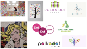
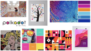
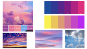
Polka Dots Logo Type Trends

For this project, I chose the theme of polka dots. I created many mood-boards, my first consisting of general polka-dot-based branding. I then went onto creating one which incorporated polka dots and bright colours as I feel like bright colours represent me well. After not getting much inspiration from these mood-boards, I took the slightly different approach of researching into clouds as I am fascinated by them because they can be interpreted differently by everyone. And as a designer, I think it is effective when branding is created, to have a hidden meaning or multiple suggestions behind it.

Using Adobe Illustrator, I drew a continuous line drawing of 3 clouds, and then sticking to my theme of polka dots I added some circles of varying colours and sizes and placed them underneath the line drawing. The colour scheme reflects the sky with tinges of purple and pink to represent a sunset.

In terms of the text, I selected a minimalistic font as I think it is appropriate for complimenting the line drawing. It isn’t too bold so that it is distracting because I didn’t want it to take the attention away from the design of the branding itself.


Staircase

For the Broken Narratives project, I chose the story ‘Staircase’. As the brief explains, a man is being referred to lower floors for priority reasons but as you get nearer the bottom of the 7 floors, the more ill the patients are. I interpreted this as the man is getting closer and closer to death as he moves down floors, until he can’t go any further and that point is when he dies.

I wanted to portray the story in the shape of the book so you feel like you’re going on a journey down the staircase with the man as you read. I cut a staircase that had 7 steps (one for each floor) in hope that it makes you feel that as you are getting lower down the staircase, you are closer to death, which is represented by darkness in this case. The roughness of the cutting represents the man’s deteriorating health. I also coloured in the sides of the steps to define them, but kept this rough as well for the same reason.

Charlie and the Chocolate Factory


This is my “messed up version” for the penguin book cover brief. I chose Charlie and the Chocolate Factory as it is a well known classic in the novel world. I selected this light blue to be the main colour of the cover because the book cover I remember seeing as a child was mainly this colour (see above). I wanted to keep the general layout the same so didn’t swap around any of the features but I did exchange the penguin for a chocolate bar outline, which reflects the storyline. I chose to use an outline for the chocolate as opposed to a filled in version as it is lighter so suited the lighter writing it was placed with well. I also changed the publisher’s name to ‘Wonka Books’ as one of the main characters in the book is Willy Wonka. Finally, I added some repeated text to the top blue rectangle. The writing contains some of the peculiar sweets Wonka has in his factory. I selected a slightly darker blue for the text as I wanted it to stand out but this way I still stuck to my colour scheme. I think doing this created depth and texture, and also a contrast with the simple, blue section at the bottom.

CCF Book Cover 04