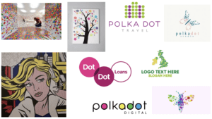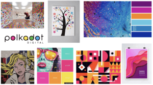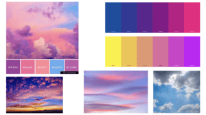
For this project, I chose the theme of polka dots. I created many mood-boards, my first consisting of general polka-dot-based branding. I then went onto creating one which incorporated polka dots and bright colours as I feel like bright colours represent me well. After not getting much inspiration from these mood-boards, I took the slightly different approach of researching into clouds as I am fascinated by them because they can be interpreted differently by everyone. And as a designer, I think it is effective when branding is created, to have a hidden meaning or multiple suggestions behind it.
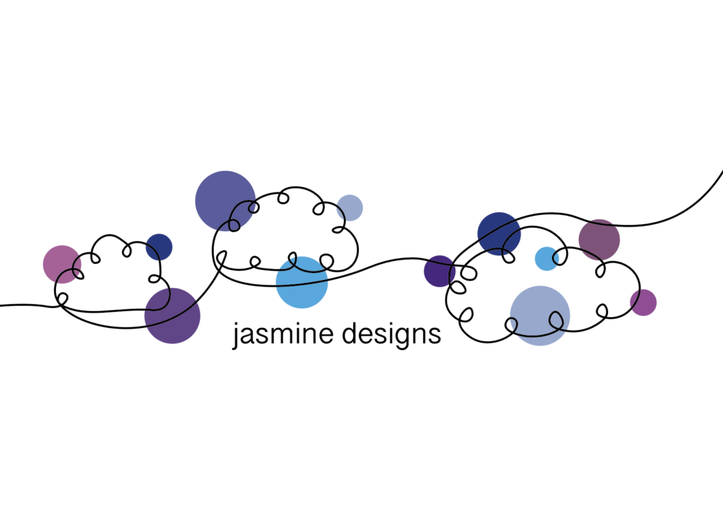
Using Adobe Illustrator, I drew a continuous line drawing of 3 clouds, and then sticking to my theme of polka dots I added some circles of varying colours and sizes and placed them underneath the line drawing. The colour scheme reflects the sky with tinges of purple and pink to represent a sunset.
In terms of the text, I selected a minimalistic font as I think it is appropriate for complimenting the line drawing. It isn’t too bold so that it is distracting because I didn’t want it to take the attention away from the design of the branding itself.