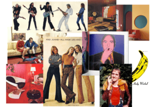
For this project I chose the theme: 70s retro. I started off with a mood board trying to capture the aesthetic of the decade. I compiled images from pop culture, such as Andy Warhol’s iconic banana graphic for the band ‘The Velvet Underground’, and added photos of things such as interior design. These images gave me a clear idea of some colours that were in at the time and, usefully, these colours complement each other well.
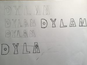
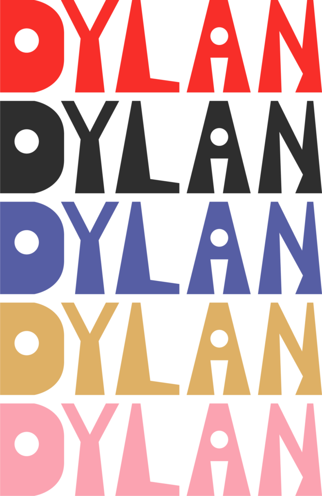
I took inspiration from the shape of flairs and invented a triangular, bottom heavy typeface. I tried to replicate the flair shape at the bottom of every stem. This led to some of the letters having a rather irregular shape to them – you can see that the space under the A’s crossbar is upside-down. I decided to refine the typeface further by experimenting with using circles as counters. This gave the font a more playful feel.
I took this concept into adobe illustrator and created a cleaner version of the typeface. I didn’t focus too much on making the shapes anatomically correct as the slight inaccuracies give the logotype character. It has an artisan look to it.

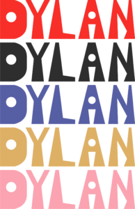
I sampled some colours from my mood board and made some coloured variations of the logotype. Bright colours were popular in the 1970s so I chose a bright red then used more muted colours that fit with this well. I think my design would also fit into the psychedelic 60s style – this was a notable influence on 70s culture.