
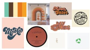
My logotype originally stemmed from the 70s retro design. I was inspired by the colour palette of earthy and dull tones so tried to imitate this into my logotype with the green and beige colours. Whilst curating my moodpboard, I liked the idea to incorporating an old record into the design and I came up with focusing the ‘brand name’ around a circle alongside using fonts that still fit into the 70s aesthetic whilst also contrasting each other. The idea to add the leaves at the bottom was to give the logotype an eco feel along with the green colours as I also feel this represents my personal beliefs and style in the image.