Author: Amy Babington

Student Centred: Education, Freedom and the Idea of Audience

Background

Neil Cocks is an English Professor for the University of Reading. He had previously published a textbook called Student Centred: Eucation Freedom and the Idea of Audience and was looking to publish a second updated version. The new version would include new chapters and changes to the previous text. Aswell as a completely new design for all pages and both the front and back cover. 

The book is a look into different essays and passages of text into methods of teaching and is a critical engagement with arguments of different views on teaching, broken into three parts. It is written in continuous prose including footnotes, quotes and inserts from other texts. 

Restated Brief

The Audience

The target audience is quite small and niche with only 20-30 copies being printed. They will be professionals, masters and PhD students specifically looking into this topic area, which the book will be recommended by Neil himself. They are presumably already highly knowledgeable into the practises of education and learning. It opposes the PGCE designs and ideas which the audience will already be aware about.

Goals

Something that was important for the client from the beginning of the project was that the design of the book had to mirror the themes throughout the book. The text itself is an argument into the strict parameters children and young adults face with the current schooling system. With that in mind, there are certain styles which were discussed to avoid to prevent a basic ‘handbook’ type feel of design. An example of this would be ‘The Routledge Education Studies Textbook’ design. The book was not meant to feel like a guide that teachers or students would just drop in and out from, rather a academic text that took a deeper more critical approach to understanding the topic.

With that, the client also wanted to show the more radical and anti-establishment approach on the cover, by having a design that goes against the grain with traditional text books about teaching. Punk revival and graffiti where just some of the original terms used to describe the feeling the client wished to infer with the front and back cover. 

Deliverables

A 300+ page second edition text book with multiple chapters, footnotes, contents, bibliography and index.

A back and front cover design that accuratly portrays the themes inside of the book.

Research and Ideation

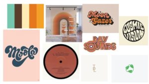
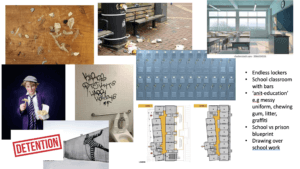
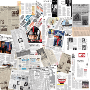
The client and I spent a lot of time going back and forth with ideas and moodboards over the whole project so that we had a really clear picture as to what he wanted out of this project. A lot of the ideation focused around the book cover, however I would use this to inform the layout of the inside pages. Figure 1 shows the orginial document the client had sent me when we started discussing where we wanted the project to go.

Figure 1: The clients moodboard on what he liked and disliked regarding academic books.

Inside Text Development

Body Text and Chapter Openers

From the extensive research and talking to my client, I knew going into the text page design roughly what kind of  outcome he was looking for. I first provided three different documents of about 10 pages each with a different treatment of chapter openers and footnotes, ranging from a more tradition (Figures 2 and 3) style to contemporary (Figures 4 and 5). We agree to land somewhere in the middle with a two column footnote approach a right aligned headings. Something that client picked out in this first round of feedback was that he liked the large number spanning 3 lines for the chapter opening.


Figure 2: Version 1 (traditional) of chapter 1 opener.
Figure 3: Version 1 (traditional) of chapter 1 text
Figure 4: Version 2 (contemporary) of chapter 1 opener
Figure 5: Version 1 (contemporary) of chapter 1 text
Figure 6: Version 1 (middle) of chapter 1 opener
Figure 7: Version 1 (middle) of chapter 1 text

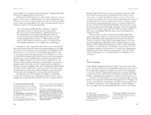
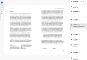
One big issue we had with this stage of development was that through every revision, there was things in the text and footnotes that needed correcting such as spelling mistakes and adding new sentences (Figure 8 shows an example of some of the changes the client wanted). One thing I would do differently would be to check that the first word document I was given with text was the final edit of the content before starting to typeset the text. It definitely prolonged the timeline of the project, as not only was myself and the client needing to re-read every section but also when a footnote was added or removed, it would shift the layout of the whole book. So I would have to go back to the beginning and adjust column sizes and other attributes to make sure all the footnotes were on the correct corresponding pages.

Figure 8: A screenshot showing the type of feedback to the client from one of the iterations of changes

Part Openers

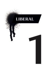
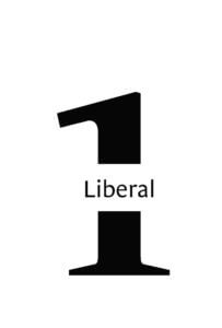
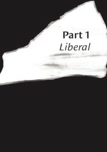
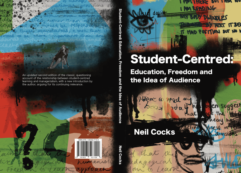
This book was split into three sections: Liberal, Radical, and Reactionary, each with their own chapters and authors. This meant that on a hierarchal level, there were lots of elements to the structure of the book that each had to have the appropriate level of prominence. To meet these needs, I gave the opening sections their own double spread.  Another requirement for these pages was that they were in black and white along with the rest of the text to keep printing costs low.

The design of the part opening pages was actually completed after the cover design was agreed upon. This was because the client and myself agreed we wanted to bring aspects that were on the front cover of the book to the inside pages. It was after the graffiti and ‘messy’ style of the front cover that I produced these 4 different approaches. As we can see, some of these were a lot explicit in the graffiti to match the cover approach than others. Immediately the client like the full black bleed style (Figure 12) as he felt this would be a nice break to the white pages. It also worked nicely carrying the black background across the entire spread to further show the different hierarchal section of the book.

Figure 9: Version 1 of the ‘Liberal’ opening section
Figure 10: Version 2 of the ‘Liberal’ opening section
Figure 11: Version 3 of the ‘Liberal’ opening section
Figure 12: Version 4 of the ‘Liberal’ opening section

Prelims and End matter

Another aspect the client wanted to include was an illustration of Charles Dickens. We were unsure where this was going to be used within the book but after sending some initial ideas on how this could be used (Figure 13) I advised the client that this would be best suited on the half-title page. This was because the illustration was a nod to the clients nickname between his colleagues, and it served little purpose as to what the book itself was about.

Figure 13: Different mockups sent to the client on how the Charles Dickens illustration could be used.
Figure 14: The original JPEG illustration of Charles Dickens (Left) next to my reworked illustration (Right)

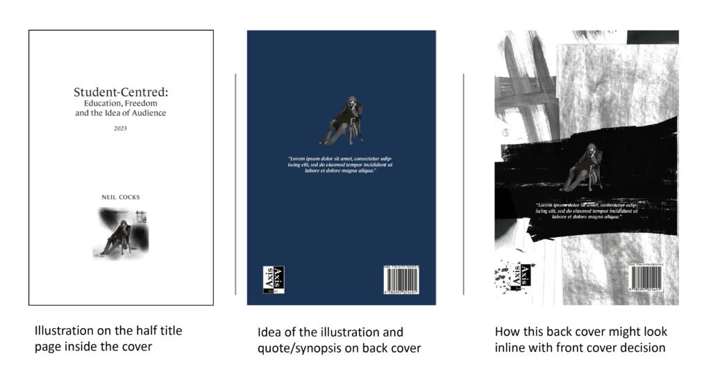
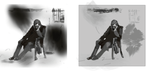
I also had to rework this illustration as the original image sent to me was a a poor quality JPEG so could not be used in printing (see Figure 14). Although a small element to change, it was a fun task for me to complete as it allowed me to develop my illustration skills whilst trying to keep the image as close to the original as possible. I sent my reworked art to the client and he was very happy with the outcome, the only thing he mentioned was that he preferred using the full image with the background instead of having just Charles Dickens himself.

Front Cover Development

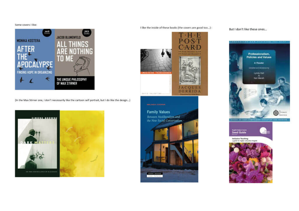
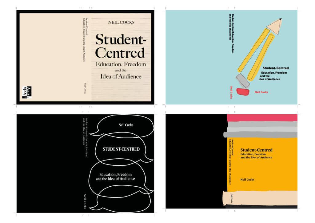
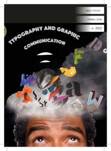
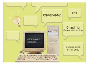
The first round of covers (Figure 15 and 16) I completed was not quite what the client was looking for and looking back at them now, I can see how they followed the conventional academic look of textbooks, using illustrations of stationary and other commonly used imagery in school, like speech bubbles. Although this was going in the wrong direction, there was some positive feedback from my client on specific elements of some covers such as the roughness of the illustration styles and the typography on the books, so I tried to focus on this and carry this forward.

Figure 15: 4 out of 7 of the different concepts of covers that I first sent to the client
Figure 16: 3 out of 7 of the different concepts of covers that I first sent to the client

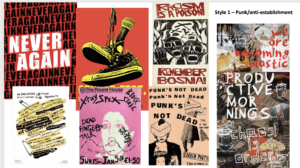
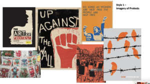
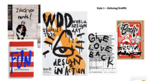
To help with moving onto the next step of the cover development, I spent a lot of time at this stage going back to square one and having detailed meetings with the client about what he was specifically after. Tis is where we moved on the idea of anti-establishment and graffiti. I then spent time crafting different moodboards (Figures 17, 18, 19 and 20) with different artistic styles and concepts which I also discussed with the client in detail. he was very happy with this direction and thought that all the images in the moodboards were very strong representations of what he wanted to portray on is cover.

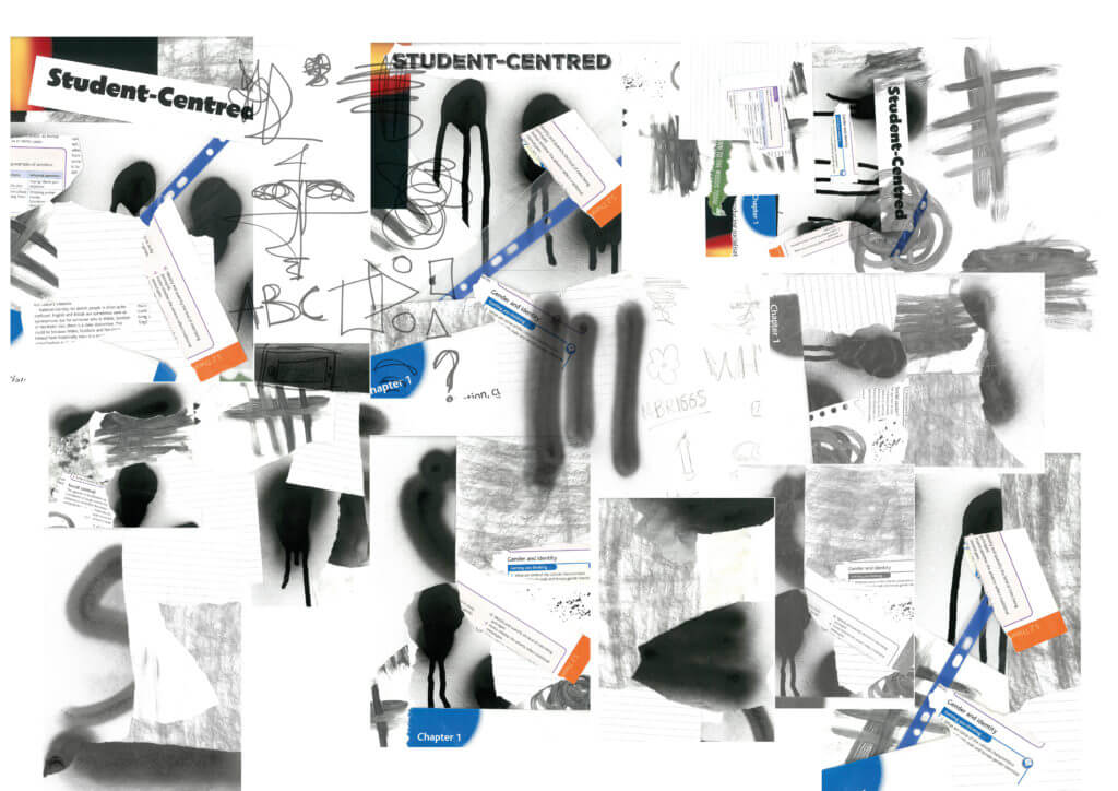
After discussing with my supervisor where to go from here, I decided to take a different approach with my covers. I started to have more fun and be experimental with what I could add to the cover. I purchased spray paint to see what types of marks I could create. I also spent a lot of time experimenting with scanning and layering different things such as ripped textbooks, pages, stationary and printed type. Figure 21 is a collage of just a small section of some of the scanning and spray painting I did during this period. I feel as though this was really showing the punk and ‘anti-school’ approach the client was after.

Figure 17: First moodboard showing a punk/ anti-establishment style approach
Figure 18: Second moodboard showing a imagery of protesting
Figure 19: Third moodboard showing a graffiti style of art
Figure 20: Fourth moodboard showing ideas of school/concepts that could fit the theme

On top of this it also incorporated a type physicality and depth of concept that the previous approach to the covers was not. With both myself and my supervisor happy with how this was developing, I took all my scans and images into photoshop to further work on the layout and balance of these ‘graffiti’ style covers, including how I can then incorporate the typography of the title into this approach. I ended up with 6 solid covers to show my client shown in Figures 22, 23 and 24.

Figure 21: A collage showing a handful of the layered scans I attempted
Figure 22: Versions 1 and 2 of the final cover concepts sent to my client
Figure 23: Versions 3 and 4 of the final cover concepts sent to my client
Figure 24: Versions 5 and 6 of the final cover concepts sent to my client

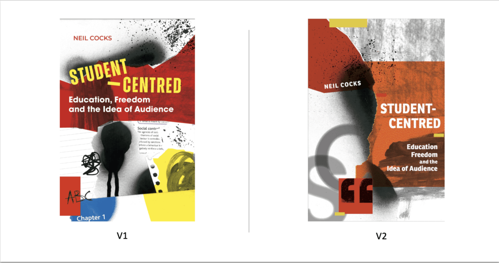
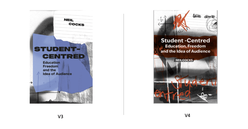
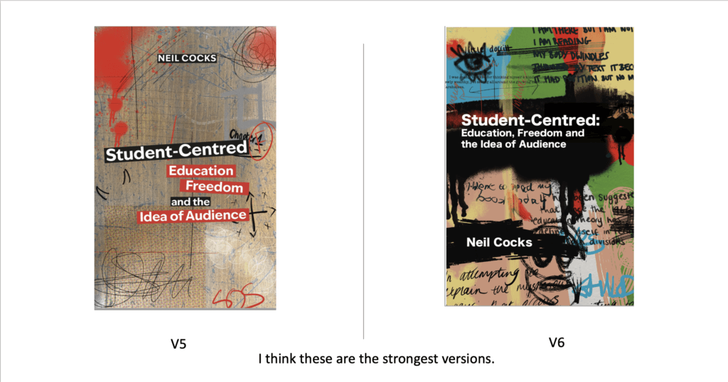
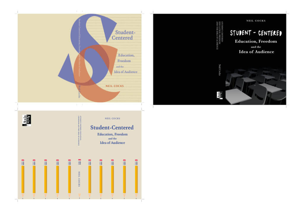
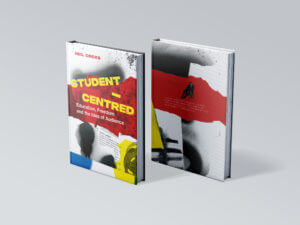
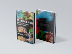
The feedback on this round of covers was really positive as he replied “These are all fantastic, Amy. My pick maybe is v1? But any of these would be fantastic – I do please choose the one you think works best. ” Since I also though V6 was also really strong we decided to go forward with both of these designs so he could see the full mock up of both with the back cover and spines.

Finally, this lead us to two final mock up versions shown in Figures 24 and 25.

The response to these two mockups was as follows:

‘Hi Amy, they both look AMAZING – it’s almost impossible to choose between them!
Is it OK if I take the weekend, show both to some trusted friends and colleagues, and come back to you with a final decision first thing Monday?
just to say – so well done on this  – these really are perfect for the book”
Personally it was amazing to hear such good feedback to the point where he could not choose between the two. After having a small set with the first round of covers, I felt like I really had developed my understanding of how to listen to the clients needs and produce something that showed off both my creative skills and communication with the client.  After getting feedback from his colleagues he decided to go with V6 of the cover.

Final Cover Design

Figure 25: The final PDF covers and spine sent to the printers

Reflection and Improvements

Upon completing the project, there are a few things I would do differently next time One of the main ones being the initial concept ideas for the cover. Although I went into detail with the client on what he wanted the cover to look like, it wasn’t until after showing initials designs that he was more confident in saying what he liked vs what he did not. To rectify this, I would come to the first few meetings with a greater variation of moodboards and cover examples to discuss so he could specifically pick out what was working concept wise and what was not.

Finally I would also communicate better with the client in terms of what I need from him at the start. The delay in getting a full edited version of the text cause the project to be pushed back a few weeks. By having the final text at the beginning would have prevented having to go back and constantly change/add new paragraphs into the already set text.

Overall I am very happy with how this project developed and the final outcome. Working on this project alone as my first real job brought many challenges however I am grateful to have worked with a client who wanted as much involvement as possible. Although the project went past the original deadline we had set, I felt as though the extra time and energy I put into crafting this book really paid off in the end.

Canvas Online Arts Magazine: Issue Three

Background

The Canvas Magazine is a student led University arts publication. The client was looking to build on the existing website to enhance reading experience, add new functionality, support more types of content, and give a fresh visual appearance. The result is a new ‘issue’ of the magazine. The third issue follows a similar layout as the previous to create a consistent feel to the magazine however applying small changes such as typefaces and colour will allow the issue to stand out as its own creation too.

The Audience

The magazine is the accumulation of art, poetry and written pieces of work from English and Art students at the University. The audience therefore is all students and staff across all departments at the University. The website is accessed online meaning people from outside the University can also read it, such as family and friends of the people who have submitted work.

Goals

  • To add a new third issue of the magazine with new content.
  • To improve functionality of the website using UX/UI design.
  • To improve/change the layout from previous issues to support new types of content such as video and image files.

Deliverables

  • A new third issue uploaded to the website.
  • The issues will contain a table of contents and approx. 30 pieces of creative writing/poems aswell as new image and video files.

Development

My first task of the project was to produce an Instagram post that would be used to promote the new issue of the magazine and to encourage the submission of new art works (shown in Figure 2). I used the main image from the title page of the website as I felt this was the most recognisable for the website. This task was relatively easy and I had to just make small adjustments, mainly to the typography, such as left aligning text and using a typeface that was consistent with the typeface used on the website.

Figure 1: Version one of the Instagram post encouraging new submissions
Figure 2: Version two of the Instagram post encouraging new submissions

When I started this project, I had very basic coding and html knowledge. This meant I have to spend some time watching tutorials and doing extra HTML practice to build on what I already knew. By doing so I was able to better build the new issue of the website and improve UX and UI aspects. One of the first things I decided to change from the previous issue was the balance of the columns throughout the issue. In the previous issues there was an even 50/50 split between the navigational column and that of the text column containing all the poetry (Figure 3). I felt as though this didn’t give accurate prominence to the pieces of art and poetry which is what the user is there to read. So I managed to code the layout so it was rather a 30/70 divide with more space given to the content of the issue (Figure 4).

Figure 3: The previous issue 2, showing the layout of the two column grid being 50% for each
Figure 4: My design for issue three showing the layout of the two column grid giving more weight to the navigational menu.

To also improve the user experience I changed the format of the navigational menu. The previous issues had all pieces of both poetry and prose in one long list for the user to click through. I instead wanted the user to be able to differentiate between the two categories so that, if for example, they first wanted to only look at pieces of poetry, they could do so. My first attempt at this was to imbed headings onto the navigational column which would divide the content into the categories (shown in Figure 5). I also produced a version whereby the I added a previous webpage that more clearly separated the three catagories which the user could click through (shown in Figure 6). After altering them slightly with my supervisor, I showed both examples to the student editors that I was working with, and the both like how version two (Figure 6) acted as a welcome page for the users when they first clicked onto the issue. This would also work with having the ‘Meet the editors and designers’ introduction which would then be separated from the rest of the submitted content for the issue. One downfall of this was that from a UX viewpoint, it meant that the user would have to click back to access different parts of the magazine instead of being able to read it fully as of before.

Figure 5: My first attempt at designing the navigation menu whereby the headings of each category where on the same page.
Figure 6: My final design of the navigational menu that introduced a new welcome page before being split into the three categories of Poetry, Prose and Art.

To develop this going forward I included not only the option to click backwards to the ‘Issue 3 Contents’ but to also click forward to the next section in the magazine when you reached the last piece (shown in figure ). This created a seamless flow through the website which would get the user from point a (being the first entry page onto the issue) through even submission to end at point be (the last piece of content of the issue) in as few clicks as possible.

Figure 7: A page from my issue three design. Circled in red are the two buttons the user can click to either navigate to the next section of the magazine or click back to the homepage.

Something else that was new in this issue was the submission of both a video and audio file of art and spoken poetry. As the site was originally built in the cargo site maker, it was relatively easy to import this files onto the website. What became difficult was designing these specific pages to follow the pattern of the other pages in the issues. For example, the video file would input onto the page as a really small thumbnail and the user did not have any control in playing or pausing the video. This was another aspect I learnt how to code as I felt it was important with it being a video of an art piece, that the user could control the video so they could watch it as many times as they wanted and also pause when they desired.

Some other small changes that happened over the course of the project was changing the typefaces used and the accent colour. This was because Issue two had introduced the colour red to differentiate pages in their design, so I wanted to carry on this pattern of each issues having their own colour and type choices.

Reflections and Improvements

The main thing I found difficult in this project was balancing the communication between multiple student editors from both the art and English departments. I found that a lot of the submissions of poetry and prose were handed in last minute which meant I had a quick turnaround time to get them uploaded onto the website and formatted properly. I also found it a challenge at the start in expanding my knowledge of coding in HTML and CSS. Even though I only had a basic understanding of this at the start I do feel as though it helped push me in learning techniques in coding I wouldn’t have otherwise. Overall, although this project had tighter constraints such as deadlines and only having small parameters to change the design of the website, it taught me new skills I would not have gained otherwise. Being pushed to publish an issue of a magazine by a certain date helped me understand the importance of time management whilst also needing to chase up people and manage the timescale as a whole group.

Skill For Design Blog Post

Design Ideas and Process

When previously using Photoshop/Indesign/Illustrator I tended to stick to what I knew producing simple and sometimes boring outcomes. I found these tasks challenging as I knew I wanted to push myself to learn new tools in the software however it was sometimes hard to not give up when something was going wrong.

Postcard 1
Screenshot 2

My first design I wanted to try using the clipping mask to create this see through text effect. I layered this onto of lots of images of newspapers as I thought this would show the themes of printing and typography talked about on the podcast (see screenshot 2). It took bit of playing around with to get the perfect balance between the background and the text so that it would still be eligible to read and meant I had to transform and crop the original photoshopped background to make this work.


Postcard 2

Before starting my second design I knew I wanted to try cutting out from different photos on photoshop.

Screenshot 1

By composing this idea with different typography and graphic design elements coming out of a head (as if this is what he is thinking about) would allow me to practice this skill multiple times. I found the smoke in this podcast cover the most challenging. I originally
started by trying to draw the smoke with different colours and blurring this together however after watching some tutorials, I found the most realistic way was to use images of clouds placed into the file (shown in screenshot 1).


postcard 3

My final design started on the inspiration of using an old computer. Originally I wanted things to be coming out of the computer almost as new tabs opening before I chose to incorporate the speech bubbles. I believe this was my least affective design as they are only basic components and mainly used skills that I had developed on my last two covers


Software Tutorials

A helpful tutorial I watched on YouTube explained how to create smoke on photoshop. I found this particular video useful as it talked through three different ways to do this, all of which I tried before deciding which one worked best for me. I chose to import an image of a cloud and use the lasso tool to clip this. I didn’t think about this way before as I wouldn’t have thought to change the levels of the image to create white smoke on a black back compared to a cloud on a blue sky. The tutorial can be found here https://www.youtube.com/watch?v=FIBXXglbYtQ&t=361s

I knew before starting the sticker tasks that illustrator was the one software that I felt the least confident in so before I began I watched different videos on the basics of illustrator, this also helped me understand the terminology such as anchor points for when I watched more specific tutorials. When I first started drawing the microphone on the postcard cover 1, I was struggling with getting the curve of the line smooth so I watched this tutorial (https://www.youtube.com/watch?v=ViKQgIDblr8) which allowed me to realise I was using the wrong anchor points for what I wanted to achieve and I could easily fix this by using the covert tool.

Design Resources and Articles

Before all of my tasks, I would start by looking on Pinterest at other podcast covers or stickers etc to give me a general starting point. This is where I first saw the concept of objects flying out of someones head like in my second podcast cover.

The website https://dribbble.com/stories/2019/08/06/30-creative-examples-of-podcast-cover-art-and-branding was also interesting to me as I could see how the use of colour affected the design. Most of the covers on here were very colourful and eye-catching which inspired me to use more varied colours when design my own such as the use of purple and yellow in my third sticker.

For my first podcast cover, the idea included a lot of emphasis on the typography of the design. I used skills I had already developed from other modules on the course as to how to efficiently alter a type face to produce the best outcome. However designing this cover showed me that there were gaps in my knowledge such as the kerning of the writing which is why I found this article useful to read. https://99designs.co.uk/blog/tips/11-kerning-tips/


What’s on in Autumn 2017? – RFT flyer

Initial Process

My first quick mock-ups of the cinema listing were all different however we can see that the first for examples very much focused on the title of the the movie (shown with the pink block). This was because my initial thought was that this is what was most important when designing the cinema listings and therefore was at the top of the hierarchy.

As my ideas developed we notice that this becomes the less prominent feature as I wanted to play around with putting the film title in different type fonts and sizes.

Cinema Listings design 1

I carried this forward when designing my final two listings as I focused on the type of user which would therefor change the hierarchy in the text. I based my designs on the premise that the user would be university students visiting the Reading Film Theatre. Because of this, I believed the date would be the most important aspect following the film title as they would plan going to see a film around their schedule. Furthermore, with there being only 1 film showing a day, I did not want to follow the usual conventions, for example a popular cinema website, whereby they would first list the film title and then the dates and times of the showings and this would not have been practical with only one showing.

Cinema listing design 2

My second design shown above, I wanted to play around with the typeface sizing of the dates to make it more eye-catching. At first I just included the large numbers however after receiving feedback from my peers that this was hard to understand, I chose to do this alongside the large months shown above to indicate that these were in fact dates. The use of putting these in the same colour also helped me achieve this idea.


Logotype trends 2022

My logotype originally stemmed from the 70s retro design. I was inspired by the colour palette of earthy and dull tones so tried to imitate this into my logotype with the green and beige colours. Whilst curating my moodpboard, I liked the idea to incorporating an old record into the design and I came up with focusing the ‘brand name’ around a circle alongside using fonts that still fit into the 70s aesthetic  whilst also contrasting each other. The idea to add the leaves at the bottom was to give the logotype an eco feel along with the green colours as I also feel this represents my personal beliefs and style in the image.