
Category: RFT film flyer (James’s project)
Formatting Cinema Listings
Design 1
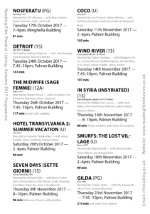
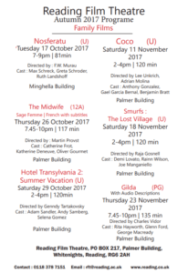
RFT Poster for a Father with two Children
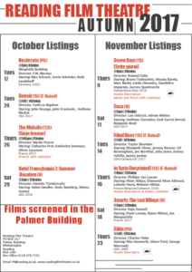
I have designed a film listing for Reading Film Theatres Autumn 2017 programme with my chosen user being a father with two children both under the age of 10. To accompany my choice of user, I have chosen a hierarchy which stands out in order of importance, in this case which is the age rating next to the title as the most significant, followed by the date, location and time along with how long the film is in bold which is another extremely important factor for this specific user. At the end of each film listing, I have incorporated the director and actors which I believe is the least significant pieces of information for this particular audience. I have used the colours red and black upon white which compliment each other well and is clear to understand, with both a serif and sans serif typefaces.
The Text Does Not Control You!!
While this task was mainly about establishing visual hierarchy, I ended up learning a lot more about how different types of information should be presented.
How to Format a Date
In the “raw text” all the dates were set out like this: Tuesday 24th October 2017. In the “Typographic style Handbook” it states “Only numbers should be used for the days, not 1st, 2nd, 3rd etc.” (Mitchell and Wightman 2017: 77). Before this task I didn’t know that dates had to be formatted without the “th” bit, so I listed serval of the different date options.
Tuesday 24 October 2017, Tue 24 Oct, 24 Oct, 24.11.207, 24/11/17
For the flyer aimed at family I chose to format the date as Tue 24 Oct, omitting the year 2017, it does say “Autumn 2017” in the title. Many families have weekly occurring events, for example every Wednesday is an extra curricular club, and so would have to work out which day the 24th is, and see if they are free next Tuesday.
For the flyer aimed at the old couple I left out the date, 24 October. With the assumption that if they really want to see this film they would make room for it rather than just wanting to fill their day.
How to Format Time
In the unformatted text there were a range of different foments for the time. Younger children struggle with reading the 24 hour time, and so I chose to use the 12 hour version, and kept the time in the 24 hours for the retired couple.
When to use an En dash
“A spaced en dash indicates spans of time” (Mitchell and Wightman 2017: 77).
How to Format Names
Names are important and so they should not be hyphenated over a line break, or having the name go over two lines. By using a “soft return” I was able to keep the list of names in the same paragraph but was able to respect the actors and keep their full name along one line.
Hierarchy
In the text there are 12 different pieces of information, listed here in alphabetical order:
Age Rating, Audi
o Descriptive, Building, Cast, Country of Origin, Date, Director, Film Title, F-Rated, Language, Time, Run Time, Year of Origin
![]() A new concept to me was brainstorming with having a user in mind, rather than just having ideas. When having a user in mind, you can make design decisions to support their needs.
A new concept to me was brainstorming with having a user in mind, rather than just having ideas. When having a user in mind, you can make design decisions to support their needs.
For the flyer aimed for families, this is how I ranked the information:
Film Title, Age rating, Date + Time + Run time, Building, Cast + Director, Year of origin + Country of origin, Audio descriptive, F rated, Language.
I grouped like information, that would be in the same paragraph style. This helped me to know how many chunks of information I had to design for.
Design Process
I found it helpful going over the printed version with a class mate, and could pick up on a lot of the silly mistakes, where the spacing or formatting is simply missed out. Printing out the flyer means I could see that the text was simply too small, and printing in italic yellow isn’t really that clear. Even now I have realised that for the 24 hour time I have typed “pm” which isn’t required. This has highlighted the importance of going over the printed copy and spotting errors, serval times.
Cinema Listings
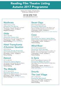
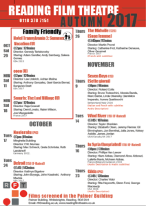
Cinema listings for Elderly People who are passionate for old Hollywood films:
I chose to design my first listing for older audiences who have a passion for certain film production because I wanted to experiment with the hierarchy of information they would look for first. My main focus was to make sure that the typography and layout is clear so that older audiences don’t have difficulty reading through it and finding what their looking for. I wanted to draw more attention on the production and origins of the individual film, so I placed where and when the film was made, the director and cast at the top of the list. In order to present a sense of clarity I used a san serif font to help the text be ‘more easier’ to read but I chose to do the title of the cinema in a traditional serif font to present a classic feel to the cinema.
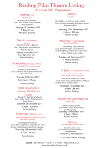
Cinema Listings for families:
For my second listing, I focused on the information that a parent with children would look for including age ratings and times of the screening. I decided to create a separate type of cinema list and put six out of the ten films on the list as families including younger children would commonly be looking for films ages U, PG or 12. As the age rating was an important part for parents to look for, I placed it next to the film title and at the same type size. The date and time of the film screening is also an important factor so families can schedule watching it around work and school. I placed the location and contact details of the cinema itself at the bottom of the list so as it created a nice parallel with the title.
RFT flyer for a Swiss Professor
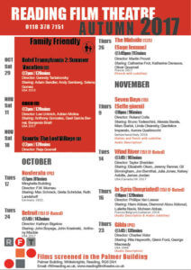
I have created a film flyer for Reading Film Theatres Autumn 2017 programme designing for a visiting professor working in Reading who is originally from Switzerland. To design accordingly with this user in mind, I have organised the order of type in a way of importance to the audience, with the title and age rating first alongside the closed captions/subtitles or audio description symbols as well as the country of where the film is based to give the user a much clearer understanding of which film would be suitable for them. Below this, I have used the date, time and location lastly followed by the cast and director which I think is of least relevance to this user.
Family Friendly
The aim for this mini project was to create two different flyer designs for the Reading Film Theatre.
To begin I sketched out some rough layout plans focusing on the different ways I could present the information given. I chose the layout that I thought displayed the information in a hierarchy where the most important information was displayed either in a larger font size of a different colour. In my two designs I had to make sure that I was considering the target audience these were
- A father with two children under 10
- A retired doctor and her husband, both of whom have a passion for old Hollywood
- A visiting professor working in Reading, but originally from Switzerland
 Before I started my design I made sure that
This was my first design. I chose to use red and black and white as these were the colours used In the Reading Film Theatres logo, also I found that these three colours are commonly associated with theatres/cinemas.
We were told to use two columns, so I decided to have one column for October listings and one for November listings. and in my second design I had one column for ‘family friendly’ listings and one for over 12s. I used black lines to separate columns of information. However, in a feedback session I had one of my peers suggested to me to remove the black lines and she thought it was a bit too much and actually looked more overcrowded and messy.
RFL 02
RFL 02
RFL 01
RFL 01
What’s on in Autumn 2017? – RFT flyer
Initial Process
My first quick mock-ups of the cinema listing were all different however we can see that the first for examples very much focused on the title of the the movie (shown with the pink block). This was because my initial thought was that this is what was most important when designing the cinema listings and therefore was at the top of the hierarchy.
As my ideas developed we notice that this becomes the less prominent feature as I wanted to play around with putting the film title in different type fonts and sizes.
I carried this forward when designing my final two listings as I focused on the type of user which would therefor change the hierarchy in the text. I based my designs on the premise that the user would be university students visiting the Reading Film Theatre. Because of this, I believed the date would be the most important aspect following the film title as they would plan going to see a film around their schedule. Furthermore, with there being only 1 film showing a day, I did not want to follow the usual conventions, for example a popular cinema website, whereby they would first list the film title and then the dates and times of the showings and this would not have been practical with only one showing.
My second design shown above, I wanted to play around with the typeface sizing of the dates to make it more eye-catching. At first I just included the large numbers however after receiving feedback from my peers that this was hard to understand, I chose to do this alongside the large months shown above to indicate that these were in fact dates. The use of putting these in the same colour also helped me achieve this idea.