Background
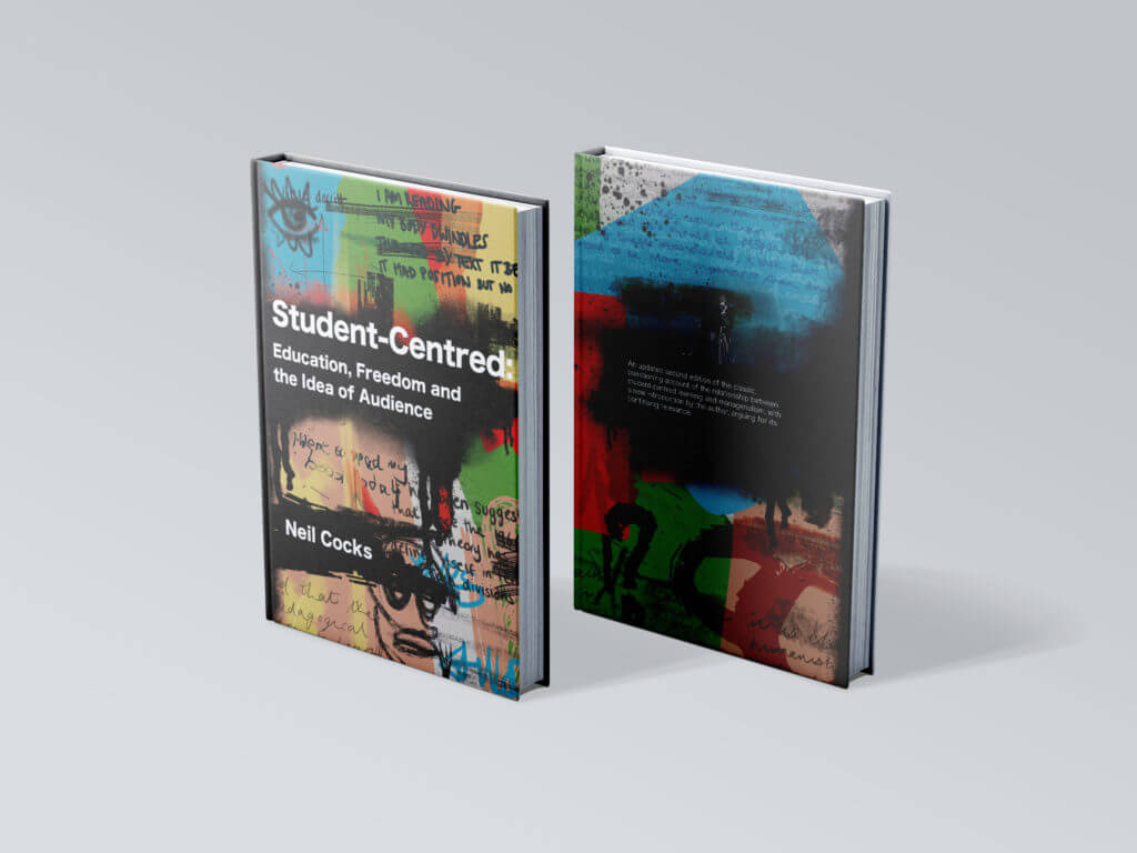
Neil Cocks is an English Professor for the University of Reading. He had previously published a textbook called Student Centred: Eucation Freedom and the Idea of Audience and was looking to publish a second updated version. The new version would include new chapters and changes to the previous text. Aswell as a completely new design for all pages and both the front and back cover.
The book is a look into different essays and passages of text into methods of teaching and is a critical engagement with arguments of different views on teaching, broken into three parts. It is written in continuous prose including footnotes, quotes and inserts from other texts.
Restated Brief
The Audience
The target audience is quite small and niche with only 20-30 copies being printed. They will be professionals, masters and PhD students specifically looking into this topic area, which the book will be recommended by Neil himself. They are presumably already highly knowledgeable into the practises of education and learning. It opposes the PGCE designs and ideas which the audience will already be aware about.
Goals
Something that was important for the client from the beginning of the project was that the design of the book had to mirror the themes throughout the book. The text itself is an argument into the strict parameters children and young adults face with the current schooling system. With that in mind, there are certain styles which were discussed to avoid to prevent a basic ‘handbook’ type feel of design. An example of this would be ‘The Routledge Education Studies Textbook’ design. The book was not meant to feel like a guide that teachers or students would just drop in and out from, rather a academic text that took a deeper more critical approach to understanding the topic.
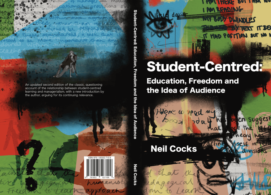
With that, the client also wanted to show the more radical and anti-establishment approach on the cover, by having a design that goes against the grain with traditional text books about teaching. Punk revival and graffiti where just some of the original terms used to describe the feeling the client wished to infer with the front and back cover.
Deliverables
A 300+ page second edition text book with multiple chapters, footnotes, contents, bibliography and index.
A back and front cover design that accuratly portrays the themes inside of the book.
Research and Ideation
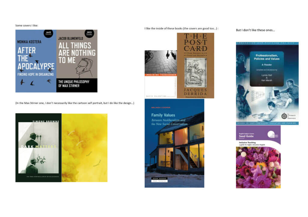
The client and I spent a lot of time going back and forth with ideas and moodboards over the whole project so that we had a really clear picture as to what he wanted out of this project. A lot of the ideation focused around the book cover, however I would use this to inform the layout of the inside pages. Figure 1 shows the orginial document the client had sent me when we started discussing where we wanted the project to go.
Inside Text Development
Body Text and Chapter Openers
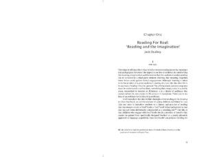
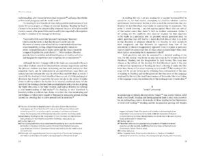
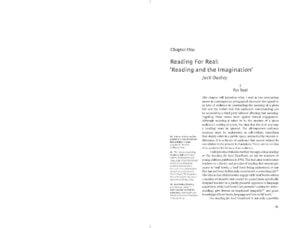
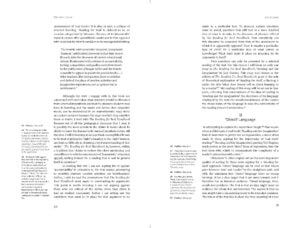
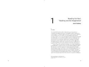
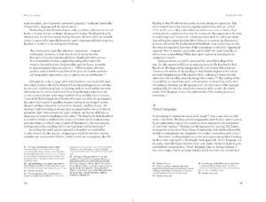
From the extensive research and talking to my client, I knew going into the text page design roughly what kind of outcome he was looking for. I first provided three different documents of about 10 pages each with a different treatment of chapter openers and footnotes, ranging from a more tradition (Figures 2 and 3) style to contemporary (Figures 4 and 5). We agree to land somewhere in the middle with a two column footnote approach a right aligned headings. Something that client picked out in this first round of feedback was that he liked the large number spanning 3 lines for the chapter opening.
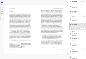
One big issue we had with this stage of development was that through every revision, there was things in the text and footnotes that needed correcting such as spelling mistakes and adding new sentences (Figure 8 shows an example of some of the changes the client wanted). One thing I would do differently would be to check that the first word document I was given with text was the final edit of the content before starting to typeset the text. It definitely prolonged the timeline of the project, as not only was myself and the client needing to re-read every section but also when a footnote was added or removed, it would shift the layout of the whole book. So I would have to go back to the beginning and adjust column sizes and other attributes to make sure all the footnotes were on the correct corresponding pages.
Part Openers
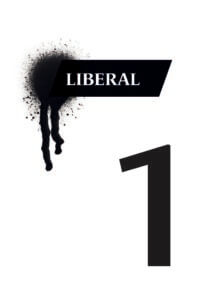
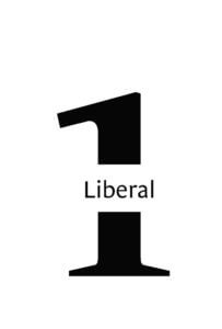
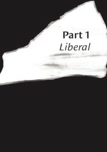
This book was split into three sections: Liberal, Radical, and Reactionary, each with their own chapters and authors. This meant that on a hierarchal level, there were lots of elements to the structure of the book that each had to have the appropriate level of prominence. To meet these needs, I gave the opening sections their own double spread. Another requirement for these pages was that they were in black and white along with the rest of the text to keep printing costs low.
The design of the part opening pages was actually completed after the cover design was agreed upon. This was because the client and myself agreed we wanted to bring aspects that were on the front cover of the book to the inside pages. It was after the graffiti and ‘messy’ style of the front cover that I produced these 4 different approaches. As we can see, some of these were a lot explicit in the graffiti to match the cover approach than others. Immediately the client like the full black bleed style (Figure 12) as he felt this would be a nice break to the white pages. It also worked nicely carrying the black background across the entire spread to further show the different hierarchal section of the book.

Prelims and End matter
Another aspect the client wanted to include was an illustration of Charles Dickens. We were unsure where this was going to be used within the book but after sending some initial ideas on how this could be used (Figure 13) I advised the client that this would be best suited on the half-title page. This was because the illustration was a nod to the clients nickname between his colleagues, and it served little purpose as to what the book itself was about.
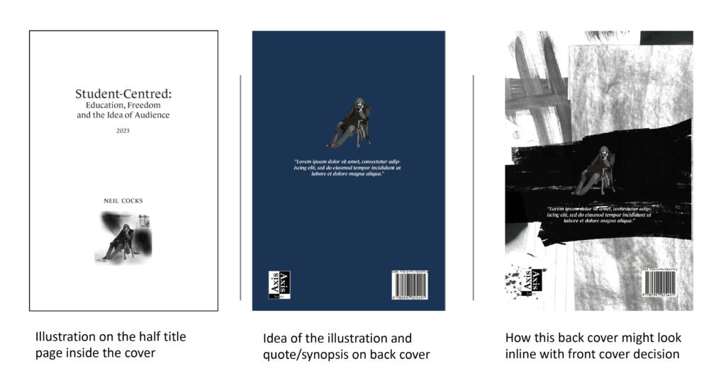
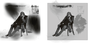
I also had to rework this illustration as the original image sent to me was a a poor quality JPEG so could not be used in printing (see Figure 14). Although a small element to change, it was a fun task for me to complete as it allowed me to develop my illustration skills whilst trying to keep the image as close to the original as possible. I sent my reworked art to the client and he was very happy with the outcome, the only thing he mentioned was that he preferred using the full image with the background instead of having just Charles Dickens himself.
Front Cover Development
The first round of covers (Figure 15 and 16) I completed was not quite what the client was looking for and looking back at them now, I can see how they followed the conventional academic look of textbooks, using illustrations of stationary and other commonly used imagery in school, like speech bubbles. Although this was going in the wrong direction, there was some positive feedback from my client on specific elements of some covers such as the roughness of the illustration styles and the typography on the books, so I tried to focus on this and carry this forward.
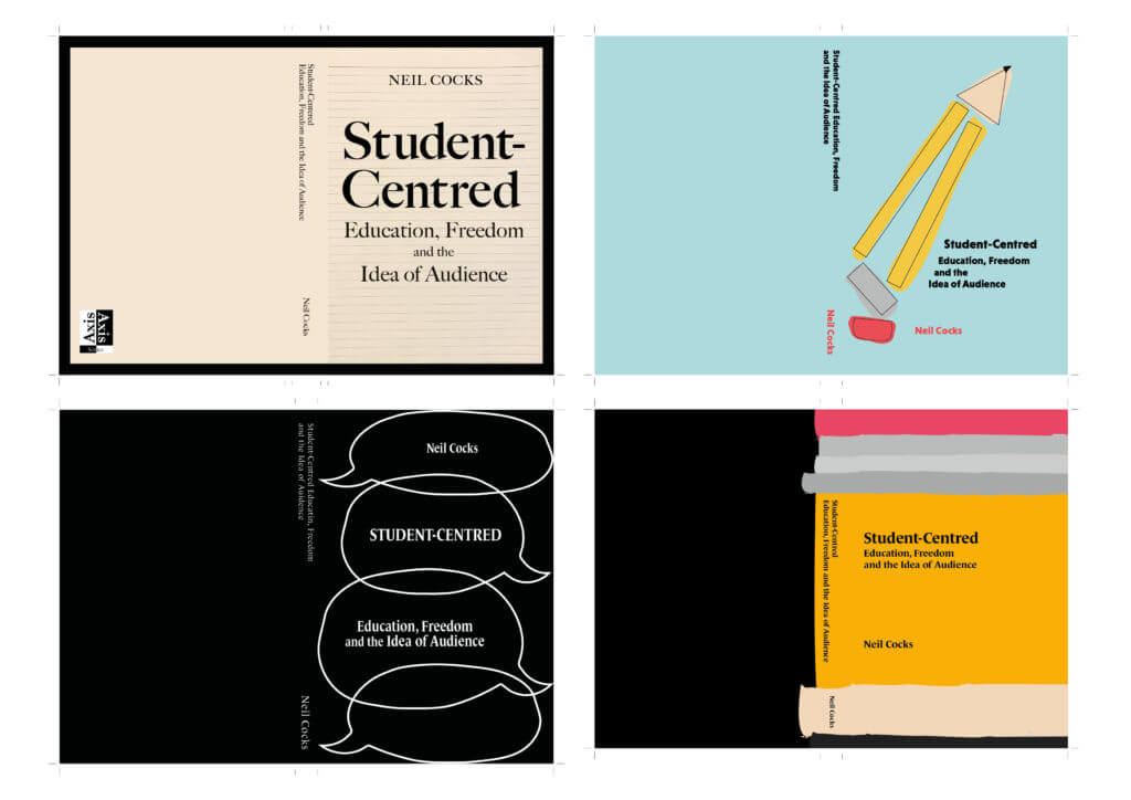
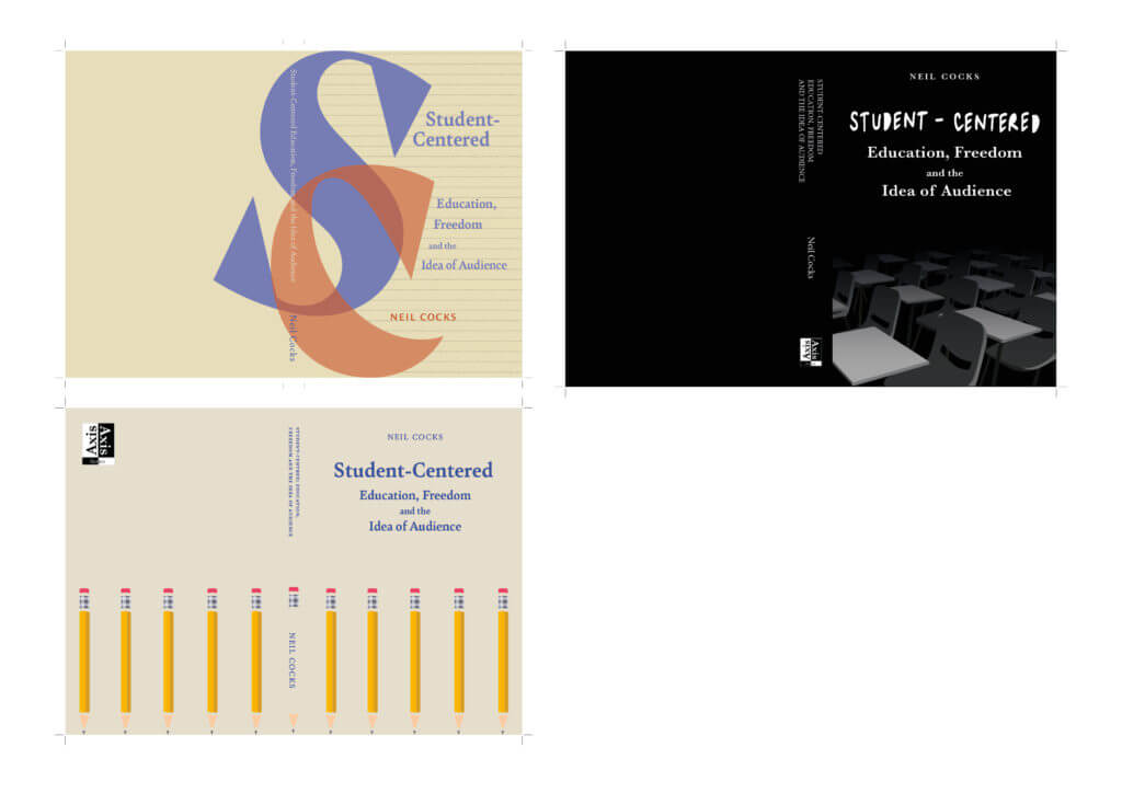
To help with moving onto the next step of the cover development, I spent a lot of time at this stage going back to square one and having detailed meetings with the client about what he was specifically after. Tis is where we moved on the idea of anti-establishment and graffiti. I then spent time crafting different moodboards (Figures 17, 18, 19 and 20) with different artistic styles and concepts which I also discussed with the client in detail. he was very happy with this direction and thought that all the images in the moodboards were very strong representations of what he wanted to portray on is cover.
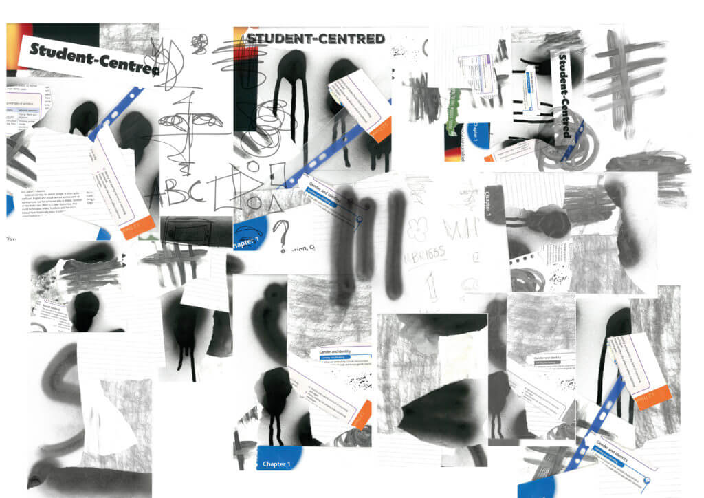
After discussing with my supervisor where to go from here, I decided to take a different approach with my covers. I started to have more fun and be experimental with what I could add to the cover. I purchased spray paint to see what types of marks I could create. I also spent a lot of time experimenting with scanning and layering different things such as ripped textbooks, pages, stationary and printed type. Figure 21 is a collage of just a small section of some of the scanning and spray painting I did during this period. I feel as though this was really showing the punk and ‘anti-school’ approach the client was after.
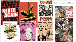
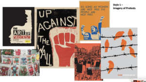
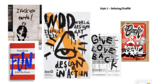
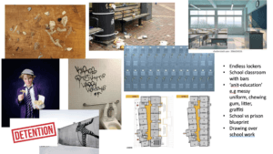
On top of this it also incorporated a type physicality and depth of concept that the previous approach to the covers was not. With both myself and my supervisor happy with how this was developing, I took all my scans and images into photoshop to further work on the layout and balance of these ‘graffiti’ style covers, including how I can then incorporate the typography of the title into this approach. I ended up with 6 solid covers to show my client shown in Figures 22, 23 and 24.
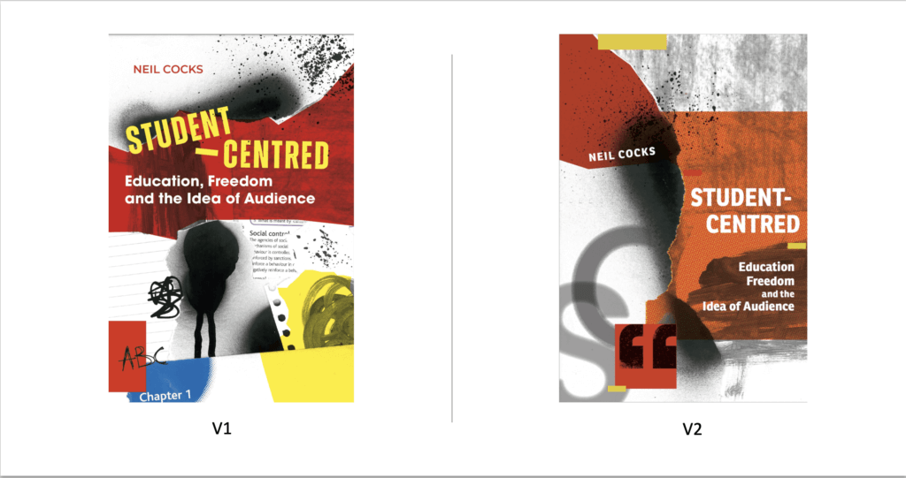
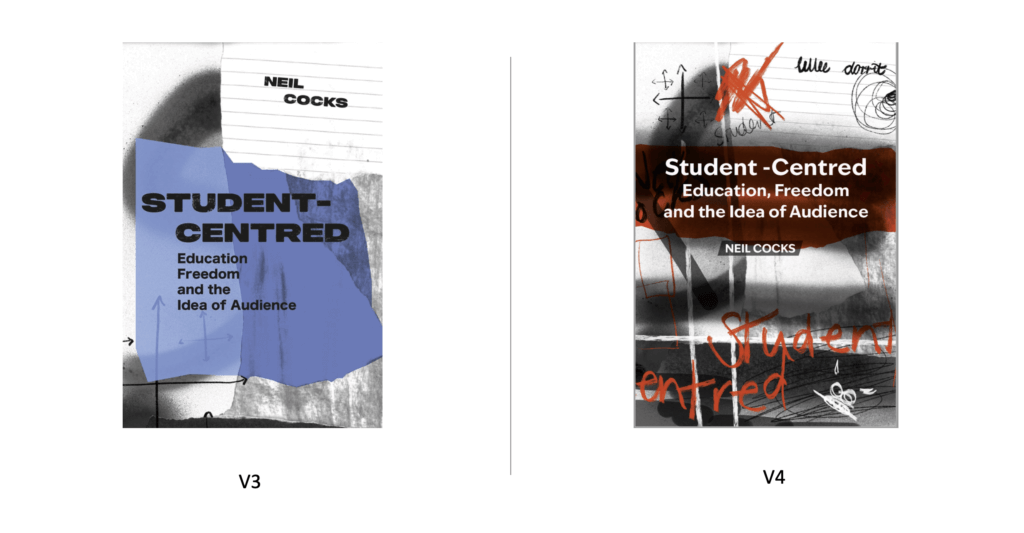
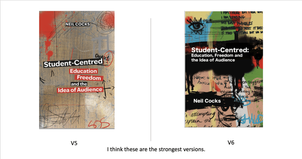
The feedback on this round of covers was really positive as he replied “These are all fantastic, Amy. My pick maybe is v1? But any of these would be fantastic – I do please choose the one you think works best. ” Since I also though V6 was also really strong we decided to go forward with both of these designs so he could see the full mock up of both with the back cover and spines.
Finally, this lead us to two final mock up versions shown in Figures 24 and 25.
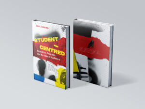
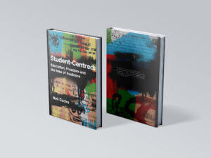
The response to these two mockups was as follows:
Final Cover Design
Reflection and Improvements
Upon completing the project, there are a few things I would do differently next time One of the main ones being the initial concept ideas for the cover. Although I went into detail with the client on what he wanted the cover to look like, it wasn’t until after showing initials designs that he was more confident in saying what he liked vs what he did not. To rectify this, I would come to the first few meetings with a greater variation of moodboards and cover examples to discuss so he could specifically pick out what was working concept wise and what was not.
Finally I would also communicate better with the client in terms of what I need from him at the start. The delay in getting a full edited version of the text cause the project to be pushed back a few weeks. By having the final text at the beginning would have prevented having to go back and constantly change/add new paragraphs into the already set text.
Overall I am very happy with how this project developed and the final outcome. Working on this project alone as my first real job brought many challenges however I am grateful to have worked with a client who wanted as much involvement as possible. Although the project went past the original deadline we had set, I felt as though the extra time and energy I put into crafting this book really paid off in the end.

