
Background
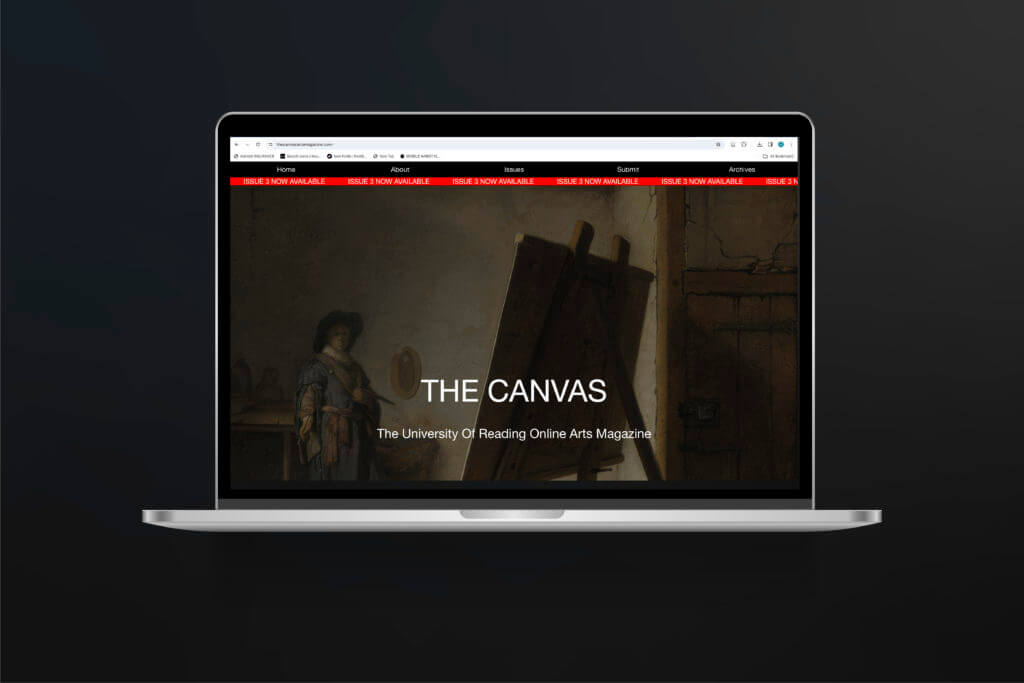
The Canvas Magazine is a student led University arts publication. The client was looking to build on the existing website to enhance reading experience, add new functionality, support more types of content, and give a fresh visual appearance. The result is a new ‘issue’ of the magazine. The third issue follows a similar layout as the previous to create a consistent feel to the magazine however applying small changes such as typefaces and colour will allow the issue to stand out as its own creation too.
The Audience
The magazine is the accumulation of art, poetry and written pieces of work from English and Art students at the University. The audience therefore is all students and staff across all departments at the University. The website is accessed online meaning people from outside the University can also read it, such as family and friends of the people who have submitted work.
Goals
- To add a new third issue of the magazine with new content.
- To improve functionality of the website using UX/UI design.
- To improve/change the layout from previous issues to support new types of content such as video and image files.
Deliverables
- A new third issue uploaded to the website.
- The issues will contain a table of contents and approx. 30 pieces of creative writing/poems aswell as new image and video files.
Development
My first task of the project was to produce an Instagram post that would be used to promote the new issue of the magazine and to encourage the submission of new art works (shown in Figure 2). I used the main image from the title page of the website as I felt this was the most recognisable for the website. This task was relatively easy and I had to just make small adjustments, mainly to the typography, such as left aligning text and using a typeface that was consistent with the typeface used on the website.


When I started this project, I had very basic coding and html knowledge. This meant I have to spend some time watching tutorials and doing extra HTML practice to build on what I already knew. By doing so I was able to better build the new issue of the website and improve UX and UI aspects. One of the first things I decided to change from the previous issue was the balance of the columns throughout the issue. In the previous issues there was an even 50/50 split between the navigational column and that of the text column containing all the poetry (Figure 3). I felt as though this didn’t give accurate prominence to the pieces of art and poetry which is what the user is there to read. So I managed to code the layout so it was rather a 30/70 divide with more space given to the content of the issue (Figure 4).


To also improve the user experience I changed the format of the navigational menu. The previous issues had all pieces of both poetry and prose in one long list for the user to click through. I instead wanted the user to be able to differentiate between the two categories so that, if for example, they first wanted to only look at pieces of poetry, they could do so. My first attempt at this was to imbed headings onto the navigational column which would divide the content into the categories (shown in Figure 5). I also produced a version whereby the I added a previous webpage that more clearly separated the three catagories which the user could click through (shown in Figure 6). After altering them slightly with my supervisor, I showed both examples to the student editors that I was working with, and the both like how version two (Figure 6) acted as a welcome page for the users when they first clicked onto the issue. This would also work with having the ‘Meet the editors and designers’ introduction which would then be separated from the rest of the submitted content for the issue. One downfall of this was that from a UX viewpoint, it meant that the user would have to click back to access different parts of the magazine instead of being able to read it fully as of before.


To develop this going forward I included not only the option to click backwards to the ‘Issue 3 Contents’ but to also click forward to the next section in the magazine when you reached the last piece (shown in figure ). This created a seamless flow through the website which would get the user from point a (being the first entry page onto the issue) through even submission to end at point be (the last piece of content of the issue) in as few clicks as possible.

Something else that was new in this issue was the submission of both a video and audio file of art and spoken poetry. As the site was originally built in the cargo site maker, it was relatively easy to import this files onto the website. What became difficult was designing these specific pages to follow the pattern of the other pages in the issues. For example, the video file would input onto the page as a really small thumbnail and the user did not have any control in playing or pausing the video. This was another aspect I learnt how to code as I felt it was important with it being a video of an art piece, that the user could control the video so they could watch it as many times as they wanted and also pause when they desired.
Some other small changes that happened over the course of the project was changing the typefaces used and the accent colour. This was because Issue two had introduced the colour red to differentiate pages in their design, so I wanted to carry on this pattern of each issues having their own colour and type choices.
Reflections and Improvements
The main thing I found difficult in this project was balancing the communication between multiple student editors from both the art and English departments. I found that a lot of the submissions of poetry and prose were handed in last minute which meant I had a quick turnaround time to get them uploaded onto the website and formatted properly. I also found it a challenge at the start in expanding my knowledge of coding in HTML and CSS. Even though I only had a basic understanding of this at the start I do feel as though it helped push me in learning techniques in coding I wouldn’t have otherwise. Overall, although this project had tighter constraints such as deadlines and only having small parameters to change the design of the website, it taught me new skills I would not have gained otherwise. Being pushed to publish an issue of a magazine by a certain date helped me understand the importance of time management whilst also needing to chase up people and manage the timescale as a whole group.