
Background
Student Community Champions is a newly managed team at the University of Reading that aim to communicate and build stronger relationships with the local communities while representing the university in local events in person and around Reading. Since the team is a newly managed team, it does not have any branding yet, which usually consists of a logo, branding guidelines, merchandise, socials, etc. This in turn develops the clients into being more recognisable at local events and provoking them to foster relationships through the idea of accountability.
Restated Brief
As the newly formed organisation wants the ability for a wide range of people to collaborate amongst each other to build a stronger community, their outputs have to appeal to people from different walks of life. Regardless of age, gender, race, or sexual orientation the outputs created need to be inclusive and represent diversity to align with their vast target audience. Our goal is to produce an array of deliverables that reflect SCC organisation morals as well as creating a sense of community in its design. The clients wanted the concept of the design to focus on collaborating with the local community as well as being be eye-catching and vibrant, with bright and vibrant colours to give a playful and fun style.
Deliverables
- Logo and branding guideline
A logo design delievered in a bundle of different assests for them to use across multiple platforms. For example, on promotional items such as leaflets and flyers and digital formats such as a website. This will be accompanied with a branding guideline showing colour and type choices. The logo does not need to directly follow university branding however it may adopt a similar design to the university logo or branding, as the client is representing the university to the community.
- T-shirt and hoodie/half-zip
A design for clothing that can be worn by people of the organisation. This should include the logo alongside an illustration based design that has a colourful and playful style. It should also contain the UOR Reading map.
- Business card designs
It should include the contact information of the Student Community Champions organisation, such as phone numbers or emails.
- Lanyard designs
This will be a template based design for the organisation to fill in relevant information for the staff. It should also contain the branding and logo of Student Community Champion.
Research and Ideation

As part of the briefing document, the clients disclosed some images in which they liked the style of which acted as the main source of our inspiration moving into the initial sketching stage. Alongside this additional help from the client, we as a group looked into various different charitable organisations that had ties in working with surrounding communities to see what we could produce as a team to differentiate SCC from competitors and make them stand out even more. We found from looking at other organisations in this field had conventions of similar symbolisms around hands and icons depicting geographical locations. Additionally, these organisations favoured neutral colours as opposed to vibrant colours creating an aesthetic commonly seen in medical organisations.
Sketches
We all started off by doing our own sketches then coming together to see which ideas stood out and which ones to take forward. Figures 2. to 5. show some of our original ideas.


We felt as though the idea of using fun shaped characters brought in the playful and colourful style that our client originally liked the idea of. We also discussed the fact that using different shaped ‘blobs’ could also represent the idea of different people in the community.
Development
Phase One
In the first stage of development we each took our own approach on how these ‘blob’ characters could be represented, we then showed these to the client who really like the puzzle idea of Concept 4 as well as the handwritten, almost graffiti style of the typography in Concept two.


Phase two
To develop this idea one of us took on the challenge of bringing the puzzle character to life. Through sketches (shown in Figure 8.) we can see how the character developed to what we showed the client. Alongside this someone was working on the typography that was previously highlighted in the first round of concepts, we wanted to show many different ways type can be used as a logo, and how this might be used on things such as the t-shirt design.

Feedback from this phase was not as positive as we would have hoped for. Firstly the clients mentioned how the puzzle character design was not a viable option because an organisation that previously worked with the university used a similar approach and it was not a concept they wanted to continue with. Furthermore after a few discussions as a group and with our supervisor, we felt as though there was a disconnect with our working in the sense that we were all completing separate tasks instead of doing them collaboratively. Finally, the clients felt like the concepts so far lacked something that could be used as a specific and static logo. At this point it felt like we had hit a bit of a brick wall as we didnt know where else to go from here but we did not want to be disheartened with the feedback as we knew this was part of the design process. Instead we met as a group and came up with an action plan on how we were going to move forward, not only in terms of the design but also how we would work more collaboratively.
Firstly we went back to the research stage and looked further into the types of logos from companies in a similar field to see if it was something they were looking for. We referenced back to our sketches and found there were some concepts we could develop together that might have been too quickly discarded the first time round. This is when the idea of links, trophies and speech bubbles started to emerge. Which then moved us on to phase three.
Phase three
Whilst there was new concepts we worked on, we also did not want to let the previous ideas go to waste. So we spent time working on how they could be changed to be usable which brought us to Figure 10. From this stage the feedback brought us 3 final concepts for us to finalise.
Concept 1- Character Diversity. They liked the playful use of colours here in this concept. Some scalability issues were raised in question to the faces used on the shapes, as well as the shapes needing work themselves to become more organic.


Concept 2- Style Lettered C. From client feedback, they wanted to see an option leaning towards more of a corporate approach where the logo is simplified and easier to recognise. This lead to a design that highlighted the letter ‘C’ for ‘champions’ being accompanied by type used within the University of Reading’s brand identity. This was an important factor brought up in conversations with the client as their logo will be positioned in close proximity with the university’s logo.


Concept 3 – Link and chain. They loved both of the ideas in this concept of using the letters ‘C’ to create a hidden ‘S’ for the abbreviation of Student Community Champions. Furthermore the idea of having the imagery of a ‘link’ which would signify them connecting to the community really stood out to them.


Phase four
Using their feedback we fixed the different designs as well as include mockups of how each logo could be used. It was important for them to see how the scalability of each logo would work so they wanted to see mockups from the size of a pen to as large as a billboard. Overall the feedback was really positive, they felt as though we had done exactly what they were trying to achieve and they were happy to sign off with concept number two, the coloured shapes forming a circle.


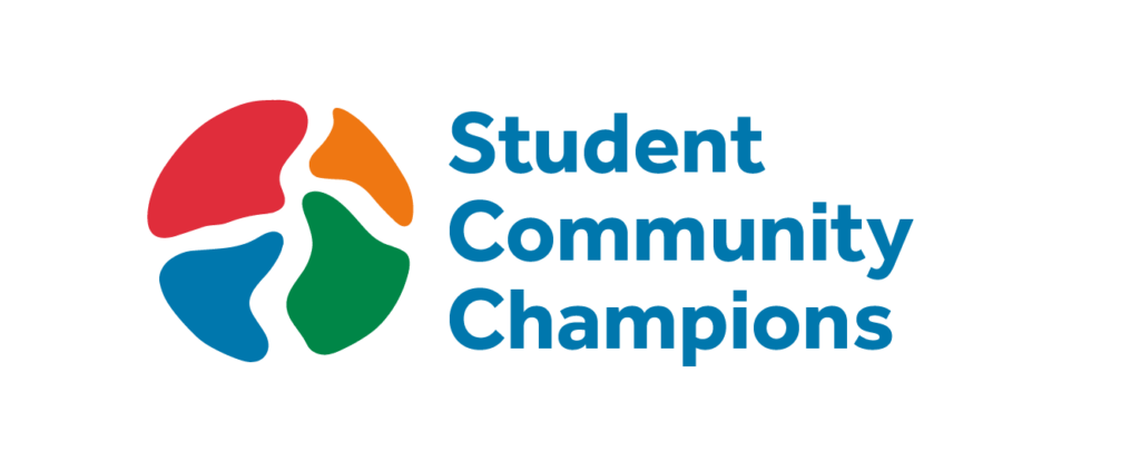
Final Logo Choice
After showing the client our concepts in phase four, concept 2 stood out to them as they felt it suited with what their organisation is trying to achieve. The different organic shapes represented the idea of diversity which is emphasised in the change of colours. These shapes also come together to form a singular circle shape which represents the idea of a diverse community coming together.

Reflection and Improvement
Due to time limitations we had, with the project coming close to the last submission date, Jack and myself both decided we would step back from this project and pass it onto Matthew. Since the final logo design had been picked, it was just the creation of the brand guidelines and T-shirt design left to complete.