
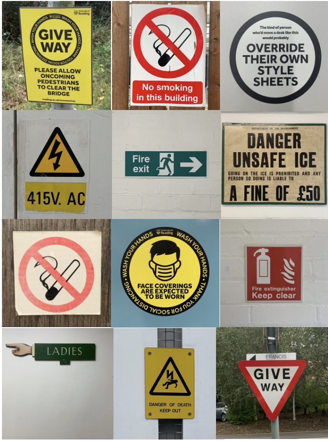
For Eric’s project we had to take images of signs or letters in our surrounding environment and come up with a theme. My chosen theme was “caution”.
I wanted to portray how signs can be used in a way to inform people of danger or important information. Different shapes and colours are used to catch the viewers attention, such as the continuous use of bright yellow shown in danger or informative signs. Some signs have further written information whereas others don’t. This may be because people are used to seeing the symbols, making it easier to get information across.