
bakbshhbncnsc


Design ideas and design process
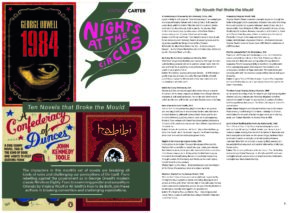
I was set the task of creating effective layouts in InDesign, to which I would create two magazine layouts and then choosing a final design that I was most satisfied with (Design 1) that I felt demonstrated the best and most effective layouts for a magazine.
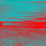
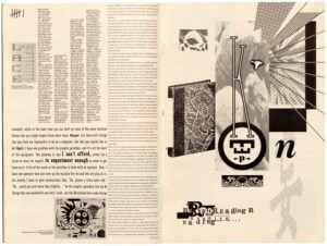
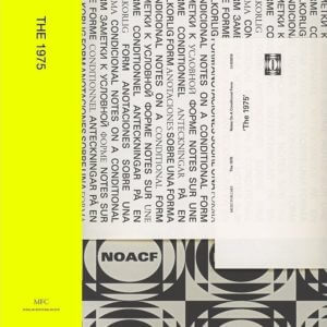
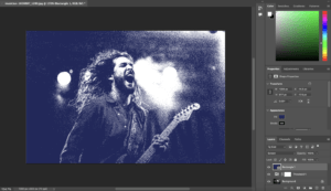
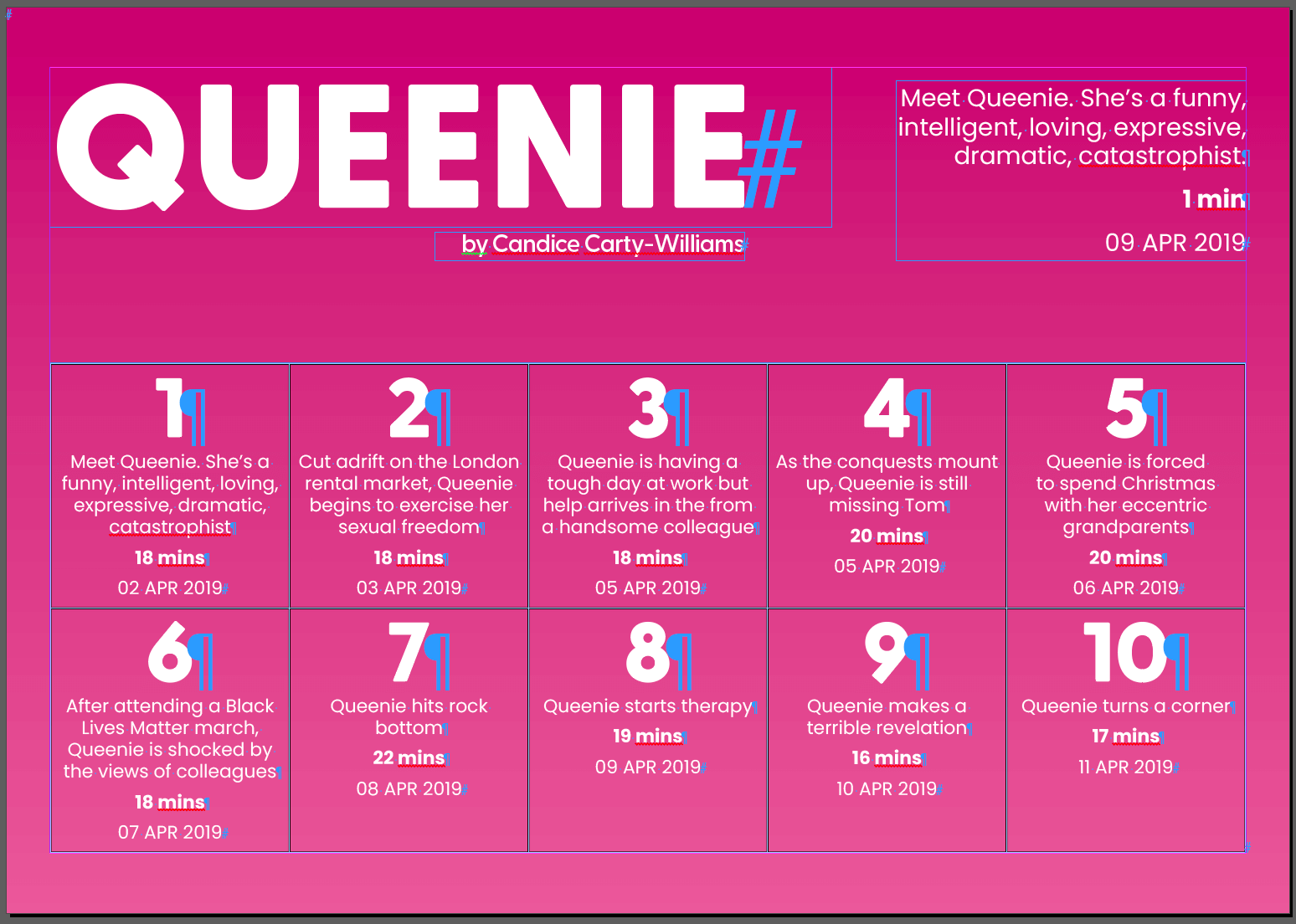
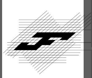
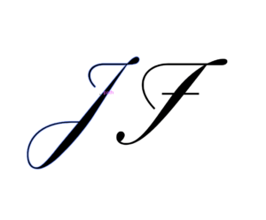
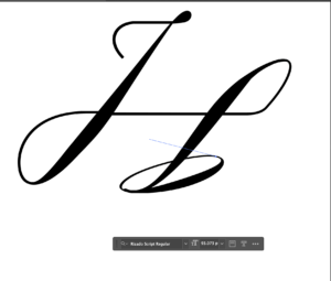
Creating this design, I had to use typefaces that I had no prior experience to using, Suisse Int’l Book and Bembo. When forming ideas and my inspiration, I used an album cover as my main inspiration for my second design, as I had a particular interest in it as I loved the colours and typefaces that it used. I also believed the idea of using aspects from an album cover design (Figure 1) was something that wasn’t in trend nor had been explored much in the design world. The topic of the magazine has no relation to the album cover, I used it simply for inspiration in my design.
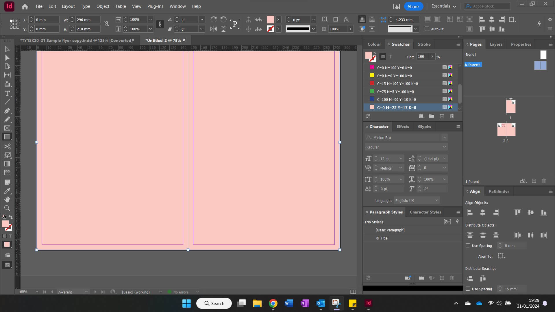
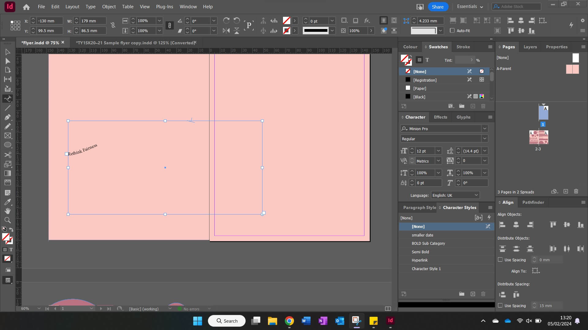
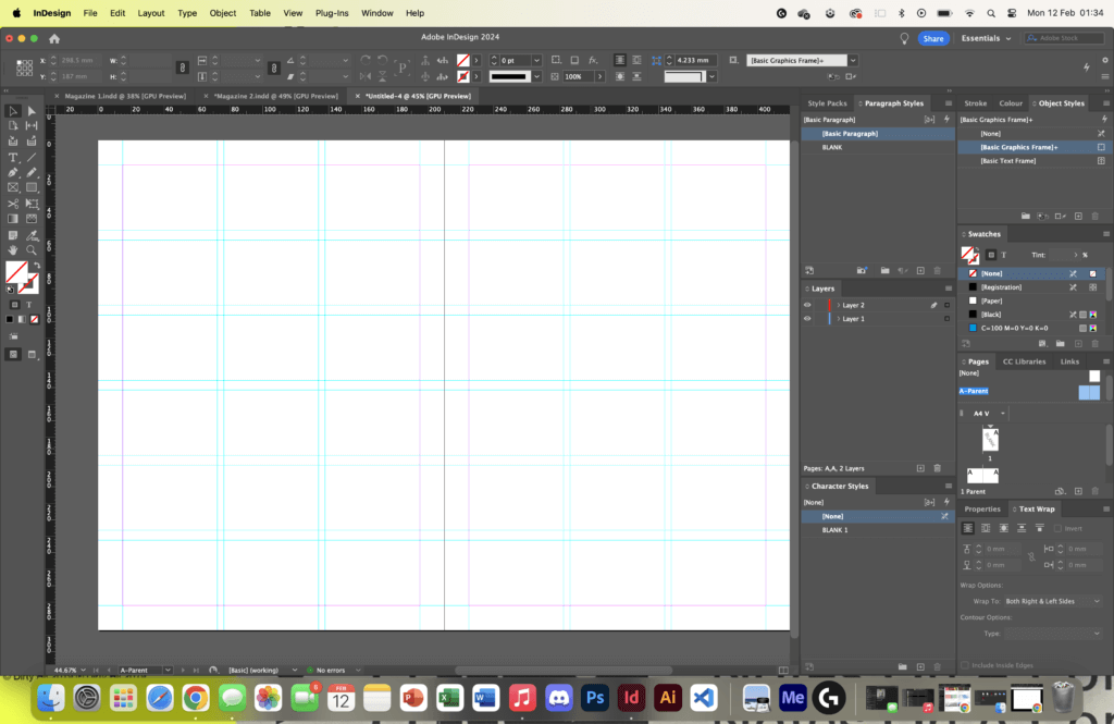
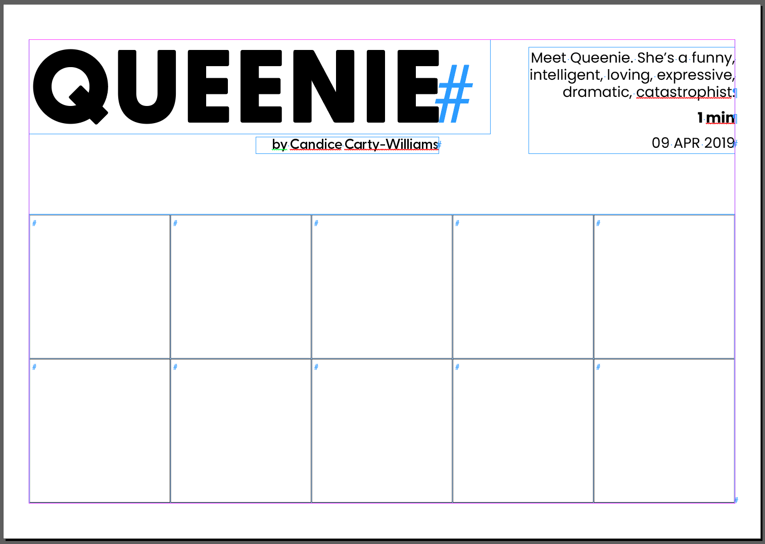
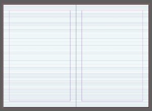
Having collated my inspiration for this design, I began by setting the grid and format for the document (Figure 2), opting to use a three column grid for this layout. In my previous experiment I used a two column grid that I thought felt too much like a book rather than a magazine (Figure 3). The three column grid allowed me to experiment with my text much more and allowed for an easier and smoother reading experience.
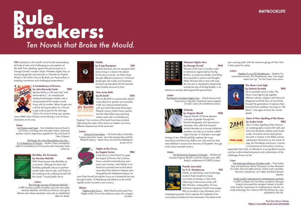
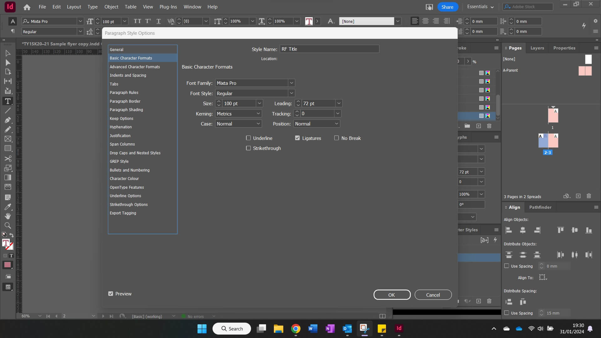
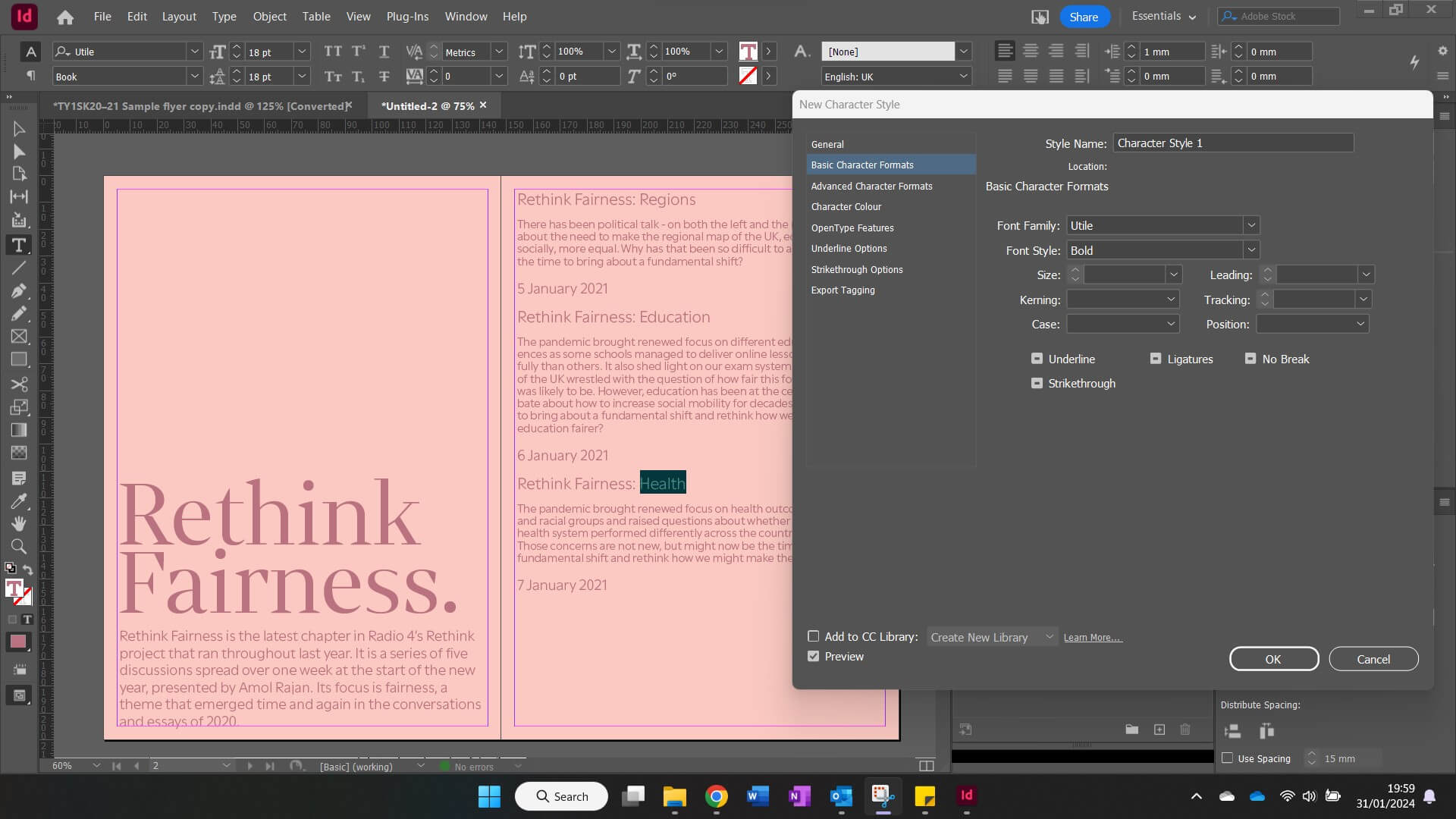
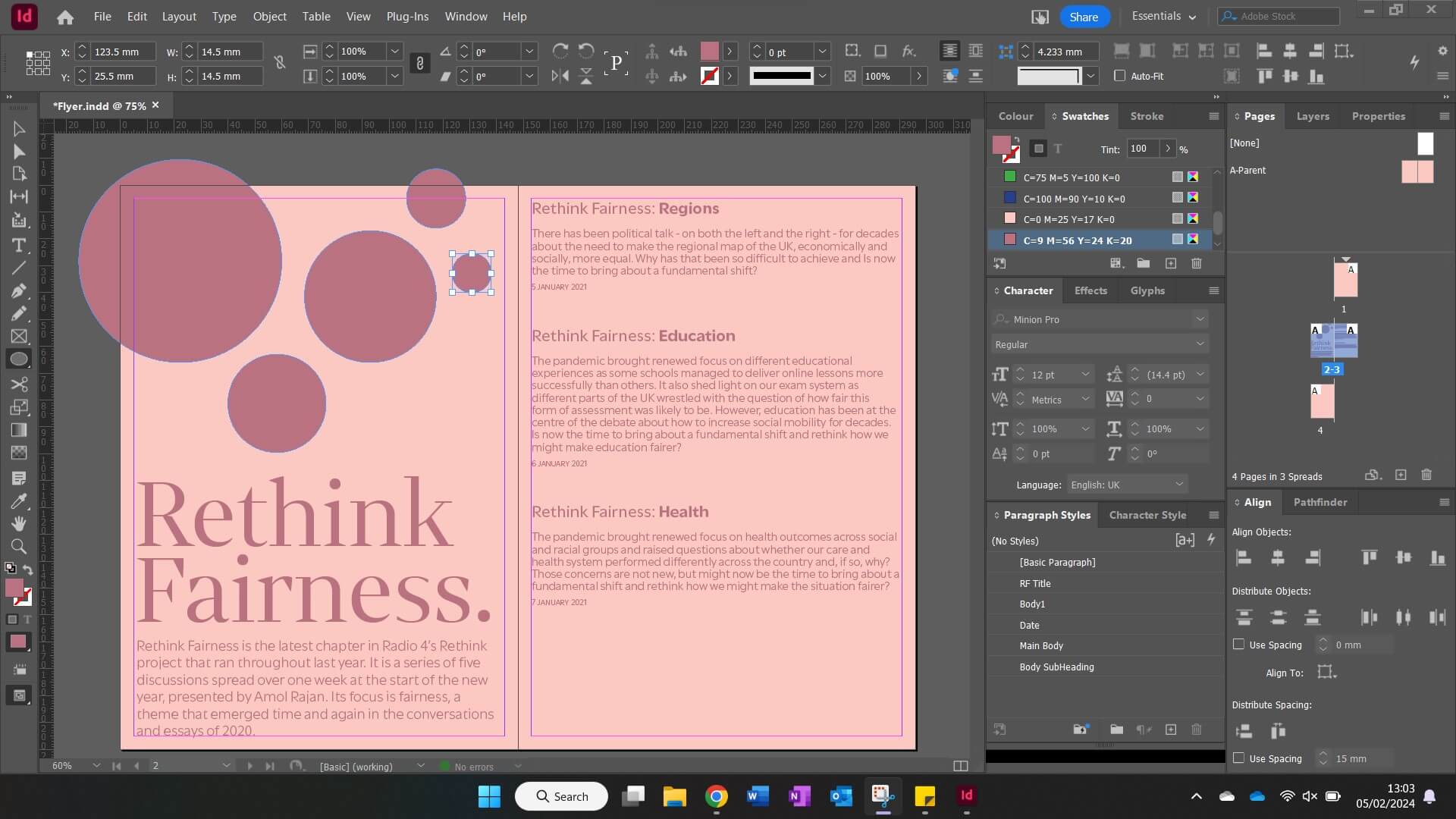
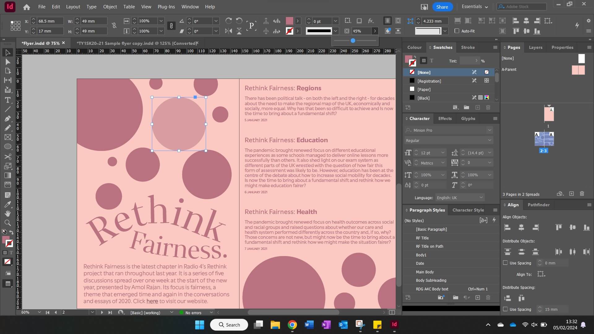
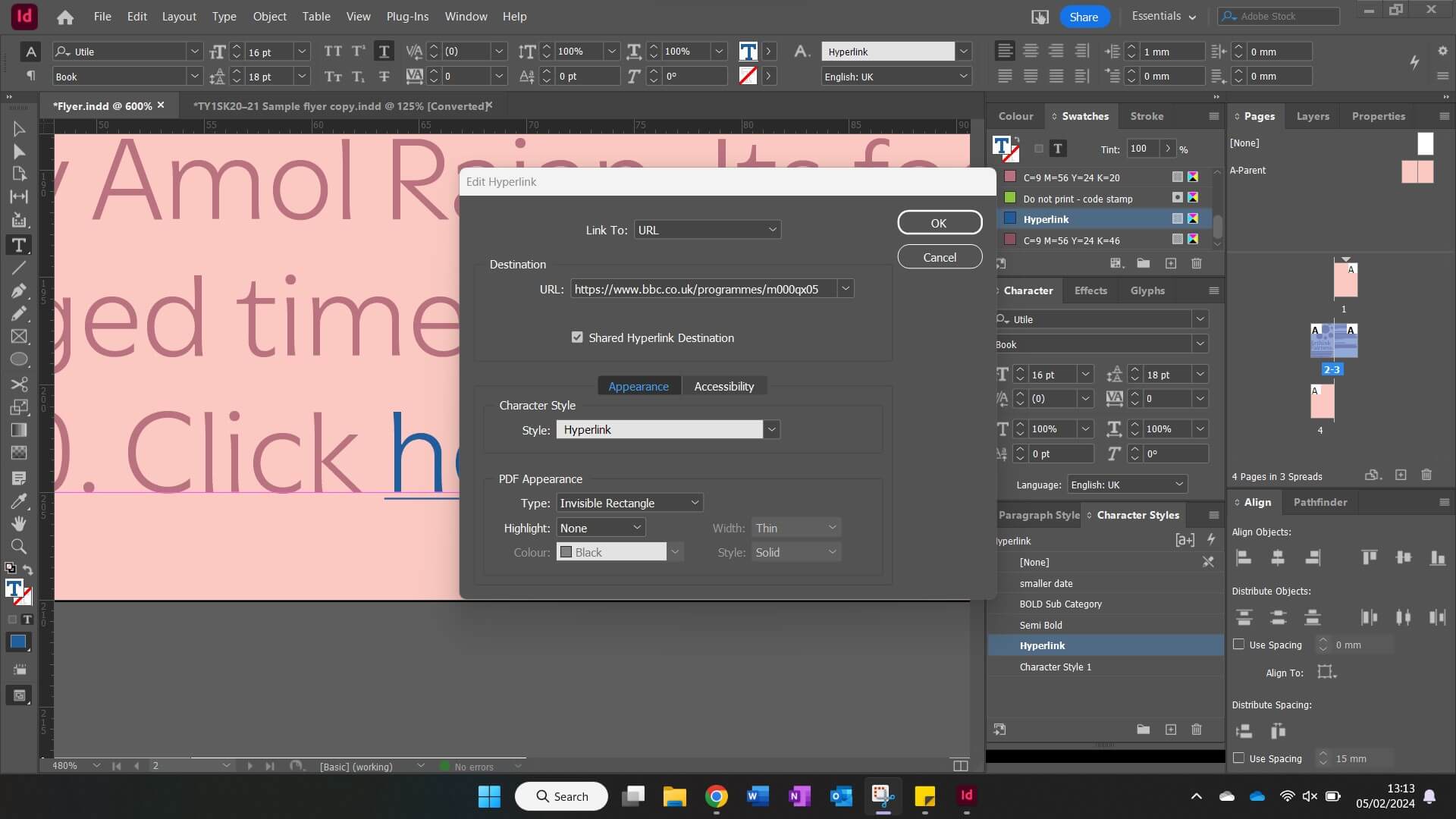
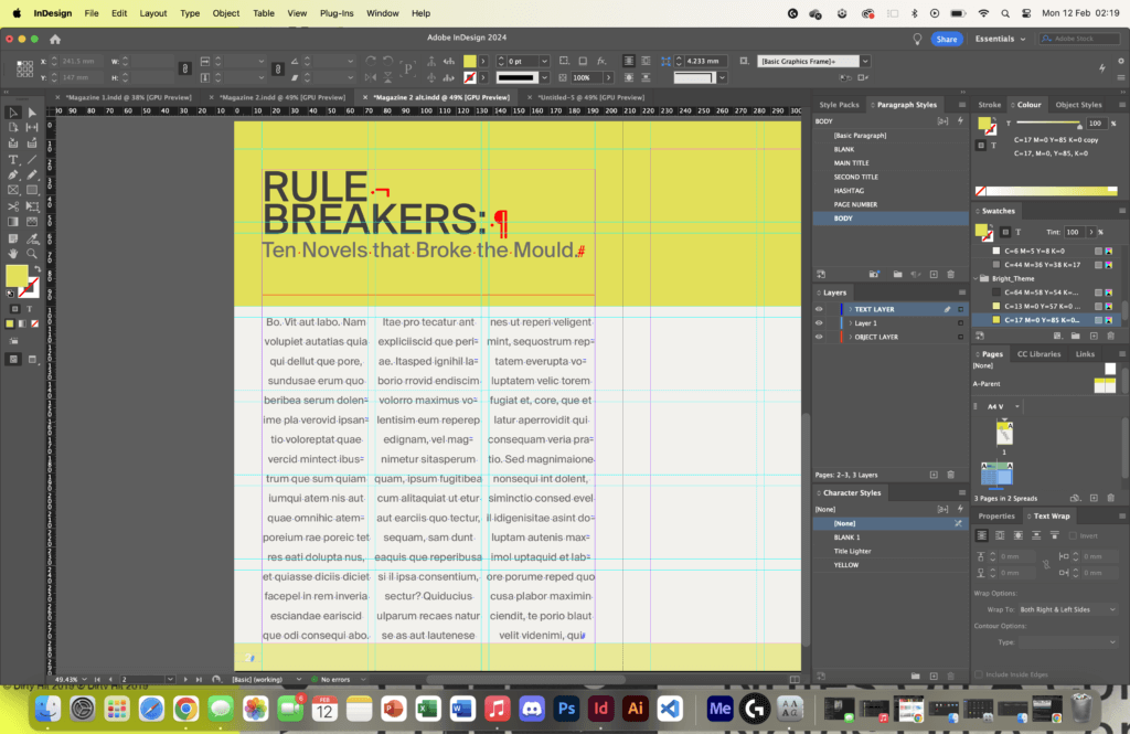
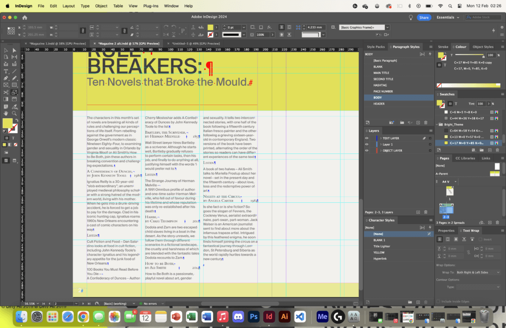
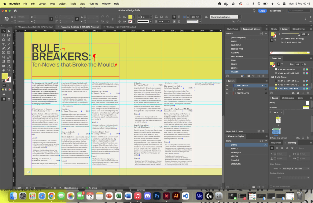
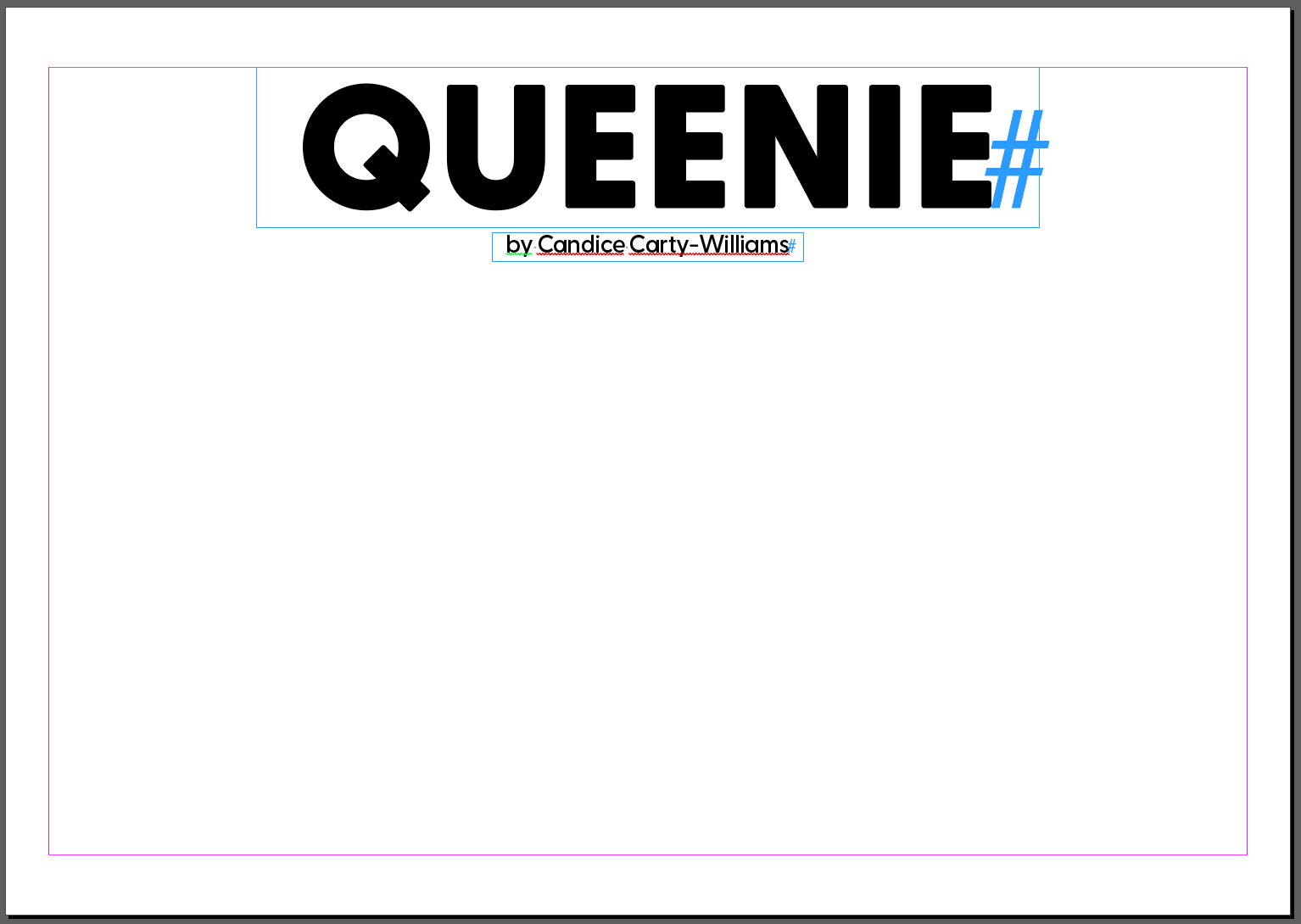
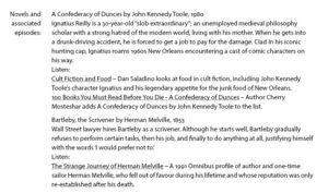
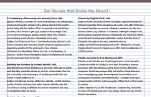
I would use my knowledge of using paragraph styles in InDesign to typeset the text appropriately (Figures 4-6). Making it easy to differentiate between a header and the body text. I would also explore creating appropriate styles for different aspects of the magazine, such as audio links and titles for the books. By the end of my design, I would finish with around nine different paragraph styles that were used for my typesetting.
Software Tutorials
As well as having inspiration for my design, I had support from many online tutorials to assist me in my work. A tutorial that I found most useful was a video that guided me on how to create a grid in InDesign. I wasn’t too familiar with the following process so I thought following a tutorial was the best route forward.
I would begin by creating a new document, exact to the standards set by the brief, turning to the ‘Layout’ tab at the top of the screen and setting a colour in the ‘Ruler Guides’ section. I would then return to the ‘Layout’ tab, then to ‘Create Guides’ where I would start setting the number of desired columns and rows, as well as the measurement of distance between these guides using a gutter. Before finalising my grid, I made sure to set the grid to align to the page.
I felt this tutorial was very beneficial to me in creating my magazine layout and solidified my knowledge and understanding of knowing how to use InDesign professionally.
Online Tutorial Used:
– https://www.youtube.com/watch?v=9A3EtUZsPZE&ab_channel=TypeTwice
Design Resources & Articles
Along with the tutorials and inspirations used when creating my design, I found other resources in my research that I found useful to creating my designs. I looked at magazine design layouts that I could find online that were effective and that I felt demonstrated what was an effective layout. These helped me to develop a better idea of what a magazine layout actually looked like, and how they were handled by a user.
I would also use Pinterest for mood boards to generate ideas. I feel its a great and effective website tool to source inspiration for designs and I have used it in previous projects. I felt it very useful here as it gave me near endless amounts of inspiration, demonstrating different techniques of formatting images for a magazine layout, as well as different styles of grids and columns which I found very useful as I struggled to come up with ideas for designing an interesting format.
Online Resources Used:
– https://www.marq.com/blog/14-magazine-layout-design-ideas-for-your-inspiration
– https://www.pinterest.co.uk/dnacreativeshoppe/magazine-page-layouts/
Learning Throughout the Module
Having now used InDesign for this task, I feel so much more confident in creating formats using grids and guides when setting up my document. This was something that I had explored in this task and I feel I can use this in my other modules, especially when creating work files for any upcoming projects. I also covered other softwares such as Illustrator and Photoshop which I feel much more comfortable using.
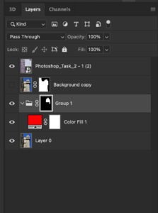
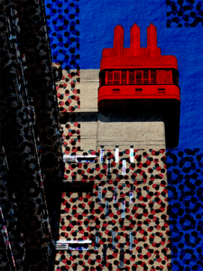
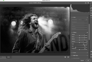
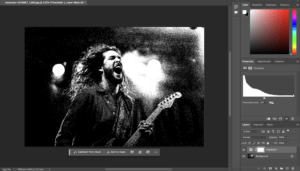
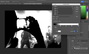
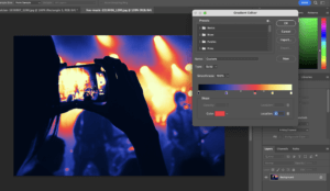
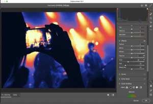
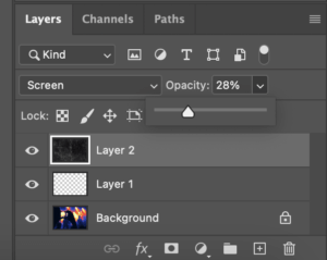
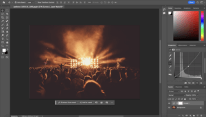
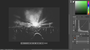
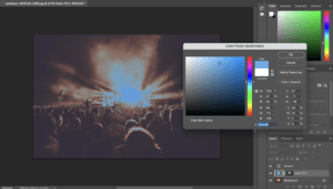
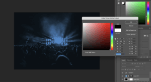
Specifically for Photoshop, I learnt how to use adjustment layers more effectively, and how they can be used to alter the colour and brightness of an image. In Photoshop I learnt also how to remove certain aspects of an image using the select tool, and then the content-aware fill. This was one of the more useful skills that I learnt across the module and feel I can apply it in my works, whether it be personal or works related to the course.
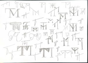
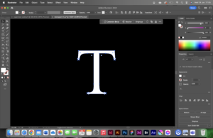
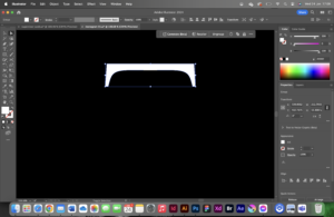
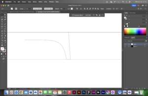
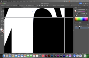
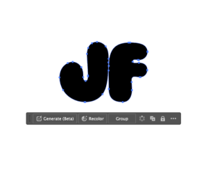
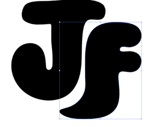
In Illustrator, I got more comfortable with using typefaces and creating an outline to alter the design to my own needs and requirements. Though this was useful, I feel I still need to develop my skills further in Illustrator as there are many skills I am unfamiliar with.


