Background
‘I am, we are…different by design’ is a zine created by students in the Department of Typography and Graphic Communication that has been going on yearly since 2017. The aim of the zine is to showcase diverse perspectives in design, film, art, and more. We undergo the processes of interviewing, planning, writing, and designing the zine. This year, Matthew Lui, Riya Vashistha, and Zaynab Farooque were in charge of creating issue 4 of the zine.
Research and Ideation
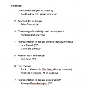
We wanted the zine to include a wide range of topics. We noticed that the previous zines were very graphic design based, not exactly catering towards the School of Arts and Communication, rather just our department. In order to avoid only targeting our department, we made sure to interview a wide range of people from different creative backgrounds. Although some interviews unfortunately fell through, we were still able to keep our zine diverse in content. Including pieces about user centred design, women in art, film reviews about cultural heritage, and more, we were able to carer towards a wider audience as opposed to just designers.
Overall design
After conducting our individual interviews and writing them up, it was time to start thinking about the design of the spreads. We agreed that it would be best if each interview/article had their own unique look. This adheres to the idea of being different by design, with the personality and topic of the interviewee’s work being shown through design. However, there were certain aspects that were kept cohesive throughout the zine, such as using the same sans serif, baseline grid, and captioning system. This allowed a sense of cohesion and unity to be present throughout, without every spread looking too similar. Making each article look different allowed us to express the subject matter through design. This can be seen through Riya’s use of vibrant colours and patterns for ‘Celebrating South Asian Identity in Design’ and Zaynab’s use of chrome blackletter type in ‘Female Cyborg Renaissance’.
Grids
Matthew created the grid for the zine. The fact that all our spreads were very visually different from each other meant that they had to be brought together by the grid system. The zine itself was A5 with 12 columns. The top margin was set to 1.3cm, the inside set to 1.6cm, the outside set to 1.2cm, and the bottom set to 2.4cm. The larger bottom margin allowed a comfortable amount of space for the page numbers along with enough thumb space for the reader to hold without covering any text.
Riya
Unpacking South Asian Identity: Interview with Esha Rajesh
Asia is not only the world’s largest continent, but also one of the most diverse with thriving cultures. As a designer from South Asia, I was particularly interested in covering the South Asian region. South Asia predominantly consists of countries such as Bhutan, Bangladesh, India, Pakistan, and Sri Lanka, with Afghanistan and Maldives often included in the region. South Asian communities have been rather underrepresented, but we are slowly seeing an emergence in recognition in the Western world.
Desigal was a magazine design project produced by a graduate student, Esha, from the Department of Typography and Graphic Communication. The independent magazine focuses on providing a flavour of fashion, beauty and entertainment, whilst celebrating diversity and inclusion amongst South Asians. One of my primary goal was to include bright colours and patterns into the design of the interview. South Asia has a rich history of vibrant coloured dyes being used as early as 4000 BCE, made from plants such as turmeric. I was interested portraying an aspect of it.
In regards with adding patterns to my design, I focused on using dots, which are an important base element that can be found in various Indian tribal art, mandalas, rangoli (an art form that focuses on creating patterns with vibrant coloured powders and sands), textiles, bindis (dotted mark/stickers placed on the forehead) and more. I also experimented with other various floral inspired backgrounds at the initial development stage, but decided to not go with them further since it didn’t feel particularly focused.
Unpacking LGBTQIA+ representation: Interview with Apinaya Ganeshalingam
The queer community has always played a vital role in the development of arts and design by encouraging diverse representation, social activism, challenging notions and more.
The Queer Agenda is an independent newspaper design produced by a graduate student, Apinaya, from the Department of Typography and Graphic Communication. The newspaper focuses on celebrating the art and queer community, alongside providing challenging perspectives and engaging articles.
In regards with design of the interview, I wanted to base it on newspaper design with various columns, paired with hints of pride theming throughout to compliment the subtle and authentic representation design approach Apinaya took with her newspaper. Hints of pastel-like pride colours can be seen in the title of the article, alongside with pull-out quotes alternating with individual pride colours.
Zaynab
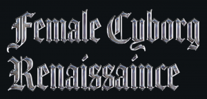
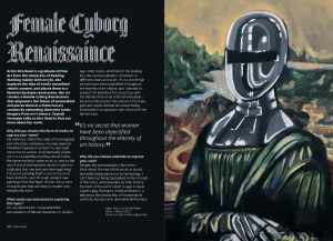
Female Cyborg Renaissance: Interview with Kira Read
Whilst looking through the art degree show’s website Mixtape I came across Kira Read’s work. She explores the idea of overly sexualised robotic women, and places them in a feminist dystopia renaissance. This was a unique concept I had not seen before, and the way she mixes the past and her idea of the future together really intrigued me.
I was aiming to incorporate the concept of merging the past and future together through type in this interview article. Taking the cyborg theme from Kira’s work, I added a chrome effect onto blackletter. I chose blackletter because of its historic connotations.
Exploring Angolan Identity: Interview with Gloria Da Silva
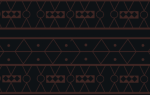
This was an interesting topic to create spreads for as I was able to explore a culture I was unfamiliar with. Taking inspiration from Gloria Da Silva’s paintings, I drew a samakaka print to use for the background. Samakaka is a vibrant Angolan print that often features the colour of the Angolan flag. It is featured in Gloria’s work, so I thought it would be a fitting addition to the spread.
I chose Agbalumo for the title, as it has been designed to represent the beauty of African languages. The use of a brush pen effect also relates to how Gloria’s main medium is paint. Using red, yellow, and yellow throughout was important as they are the colours of the Angolan flag and they appear often in her work.
Film reviews
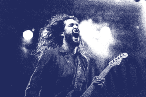
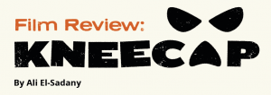
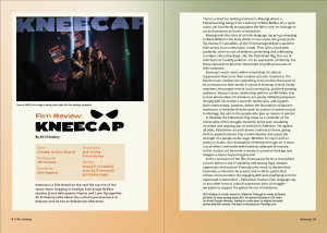
A film review website (FilmSlop) I am the graphic designer for had kindly offered to submit two reviews into the zine. One of them was Kneecap, a film about an Irish rap trio based on the real group of the same name. This film has themes of cultural preservation and identity, which was perfect for the overall theme of the zine. Since the piece talks heavily about Irish identity along with the film itself being about it too, I made a gradient with the colours of the Irish flag for the background. This made the background look more interesting, rather than just having it a solid colour from the flag. I wanted to find a typeface that was similar to Kneecap’s logo so that the title would look cohesive, and ended up using Neuzon as it has the same stamped effect as the logo.
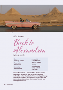
The other film review we used was for Back To Alexandria. This film is about main character Sue travelling back to Alexandria, Egypt to visit her mother on her deathbed whilst confronting her painful past. The author of this piece talks about his personal connection to Alexandria. I colour picked from the film poster to use for the background and text colour. The Arabic film poster uses a hand drawn typeface, so I wanted to find a similar Latin one to use for the zine. I ended up using Cinque Donne.
Front Cover
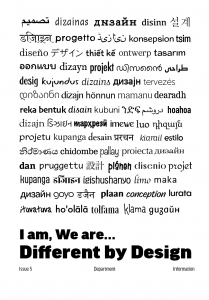
Matthew had come up with the idea of different languages on the front cover. I became in charge of developing this idea further. I wanted to include multiple different languages on the front cover, rather than just a few. This ensures that we are being as inclusive as possible, showing that design is prevalent in all cultures. Translating design into 75 different languages and using 75 different typefaces proved to be a bit tedious. Some issues I had were making each word look the same size. Different scripts and different typefaces all have different x-heights, meaning a lot of adjustment was needed throughout the typesetting process.
The initial idea was stacking the languages on top of each other with the title of the zine underneath in bold letters. I felt like this was quite boring and plain, no matter what colour combinations or special finishes were used. It also made it more obvious which words were bolder than the others, drawing attention to certain languages. It also left the back of the zine blank, which I thought was quite underwhelming.
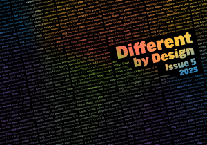
In order to solve this, I tried changing up the position of the multiple languages and turning it different ways. Using Illustrator, I created a repeated pattern out of it and put it on the cover in Photoshop. This gave the cover some visual interest in terms of composition. I took inspiration from issue 3 in how the designers seamlessly bring together the front and back cover through type. I tested out different gradients so that the team and I could see which one was the most vibrant and which we would like to incorporate into the inside cover.
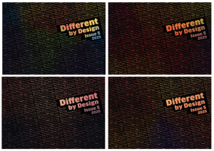
The first one ended up being chosen as the colours were vibrant in print and contained the most colours, making it especially eye catching. An unexpected issue I faced was making the blocks of text all align. I did not realise that this would be such an issue as it was a repeated pattern. This took a lot of trial and error, also considering the fact that the title had to fit in between the words comfortably.
Matthew
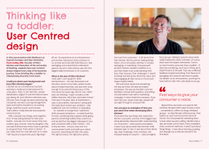
Thinking like a toddler: User Centred design with Paul Lindley OBE
It is a rare and valuable opportunity to be able to talk to major entrepreneurs, So I was grateful to have been able to interview Paul Lindley, founder of Ella’s Kitchen. I have learnt a lot about branding and business in general. For instance, how to think from the consumer’s perspective, and the importance of listening to their feedback. I have gained knowledge of the importance of having an inclusive, user-centred value in business, not just displaying it through a designed brand, but also a value that a business needs to have inside.
For the title typeface, I chose Chelsea Market Pro. This hand drawn style typeface creates a contrast with the body text, and highlights the friendly and childish nature of Ella Kitchen’s products. Adopting unique quote marks is something I did for this article and throughout all the other articles, making sure they look as if they belong with the heading typeface.
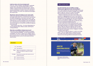
Inclusive design & User Experience design with Eden Sinclair
The most important thing I have learned through this interview is ‘design is not for me, it is for everyone’. As a designer, you must make sure your design work is accessible and usable for everyone. I have also learnt a lot from Eden, a senior user experience designer in terms of careers as a design student. For instance, we should always go out and try to get as much experience as we can.
Wanting to make this zine spread web design inspired, I used one column and aspects of a website such as buttons. I also used Degular as the heading typeface as it was chosen by Eden because of its accessible nature. Degular has a uniform stroke width and has a clear and legible design.
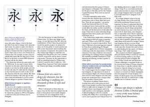
Chinese typography and type design: Interview with Xunchang Cheng
I have learned a lot about the history of Chinese Typography and type design over my conversation with Xunchang Cheng. For instance, the time and effort it takes to create a full font, due to the large number of characters it requires.
I used Alverata Irregular for the heading typeface for this section of the zine. It is similar to hand drawn Chinese characters in terms of style and shape. I adopted other unique typographical elements from that typeface to enhance the style and storytelling of this section. For instance, I have adopted large quote marks for quotation marks, which have a similar shape and look to traditional Chinese handwriting and hand carving.
Unifying the zine
I unified some of the other sections in order to make the zine coherent and make the spread look collective. For instance, In Zaynab’s entry, I have kept her style, colour, and display typeface choices and decisions for this section, whilst changing the layout to make it looks closer to other entries. For instance, the eye catching title on top, with a bold intro text.
Reflection
Working as a team and delegating tasks proved to be helpful, as we did not have to figure out who would be amending the zine according to feedback, as Matthew was in charge of this from the start. Being able to explore topics that were in our own interests was enjoyable and encouraged us to make design decisions that were relevant to the topic. For example, Zaynab chose the colours of the Angolan flag and drew a Samakaka pattern for the background. Making thematic decisions made each decision feel carefully thought about, which was appreciated by our interviewees. One thing we could have done better was creating deadlines each month, which could have sped up the process.