Spring Term 2024
An exhibition by second-year students in the Department of Typography & Graphic Communication
The work featured in this exhibition are posters designed in response to a brief inspired by Project Everyone, a United Nations Global Partner dedicated to promoting the Sustainable Development Goals (also known as the Global Goals). The work aims to inform, engage, and inspire individuals, organisations, and institutions to take meaningful action towards achieving the goals by 2030.
The task
The project to promote the Global Goals was devised and led by tutor Greg Bunbury. Each student was given the task of creating a compelling poster and supporting materials to promote one of the seventeen goals. Their work needed to incorporate graphic, typographic, or illustrative elements, and feature the ‘Halftime’ campaign hashtag #ImagineWinning, as well as project branding and a call-to-action.
The exhibition
The display of twenty-nine posters has been installed in the Department’s exhibition space, grouped under four headings: economy, equality, environment, and well-being. The exhibition was designed by second-year students, Aaron James and Olivia Moors, as part of the Department’s Real Jobs scheme. The exhibition project was supervised by tutors Sara Chapman and Geoff Wyeth with support from Department colleagues. The posters and other exhibition graphics were printed by the University’s Creative and Print Services.
The exhibition has been made possible by a generous award of funding from the University of Reading’s Arts Committee. Following its display in Typography & Graphic Communication, the exhibition will travel to the University’s library foyer where it will be installed for an additional run.
![]()
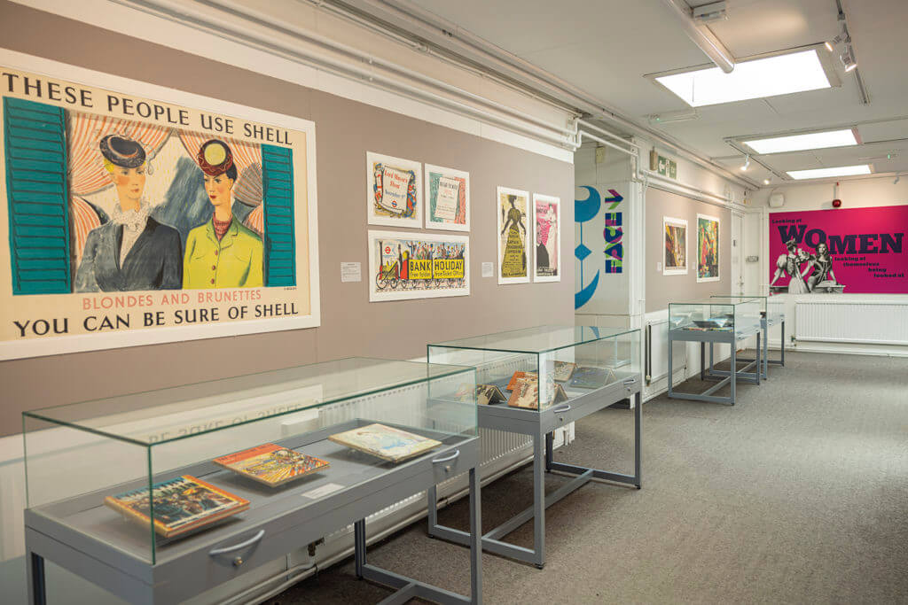
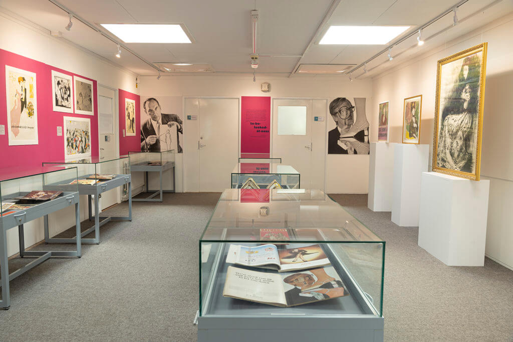
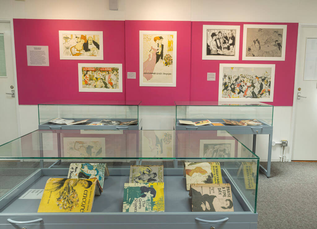
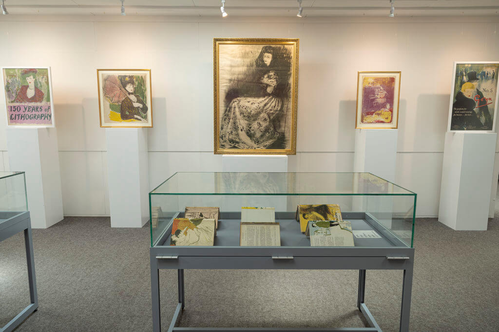
Installation