Category: Diversity & Inclusion

‘I am, We are…different by design zine’ issue 4

Real Job: Georgina Wade, Lydia Hall and Taria Khan wrote and designed the fourth issue of the Typography and Graphic Communications’ ‘I am, we are… different by design zine’. 

Background:
The ‘I am, we are, different by design’ is a zine created by students from the Department of Typography & Graphic Communication. The zine aims inspire a conversation by showcasing a diverse set of perspectives on design practice from students, alumni and design practitioners. This student-led project advocates for diversity and how to design with an inclusive mindset. We all got involved with the entire process of the zine, from planning and interviewing, to writing and designing. The opportunity to collaborate and learn from a variety of different creative perspectives we an inspiring part of the project to us. Seeing as this would be the fourth issue in the different by design, it made sense to continue the zine being A5. 

Audience:
The zine is particularly aimed at those who have an interest in the creative field and would like to be educated in how to become an inclusive designer. The main audience would be those associated with the Typography and Graphic Communication department, such as fellow students and tutors but also prospective students.   

Figure 1: We planned out the pages to craeate visual rhythm and visual difference.

Research:
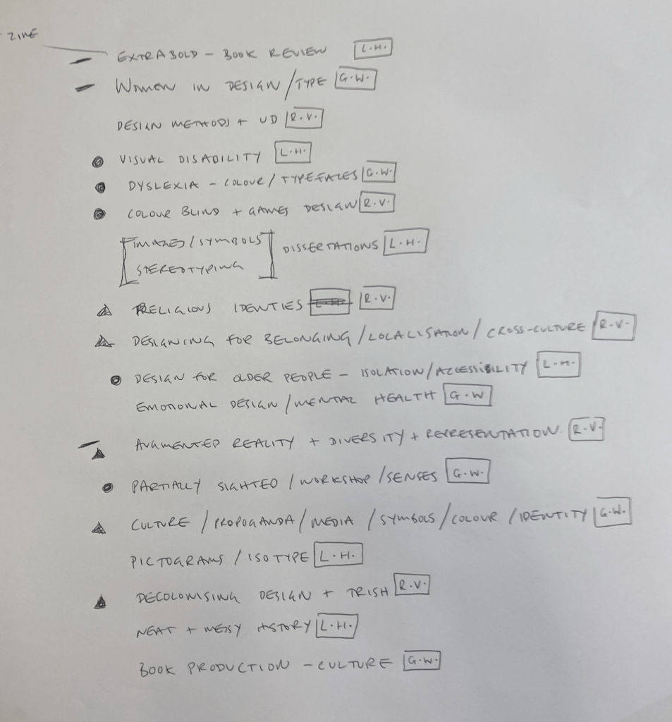
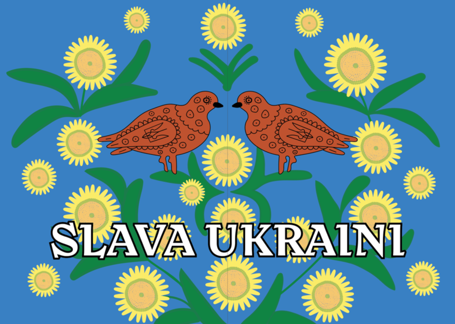
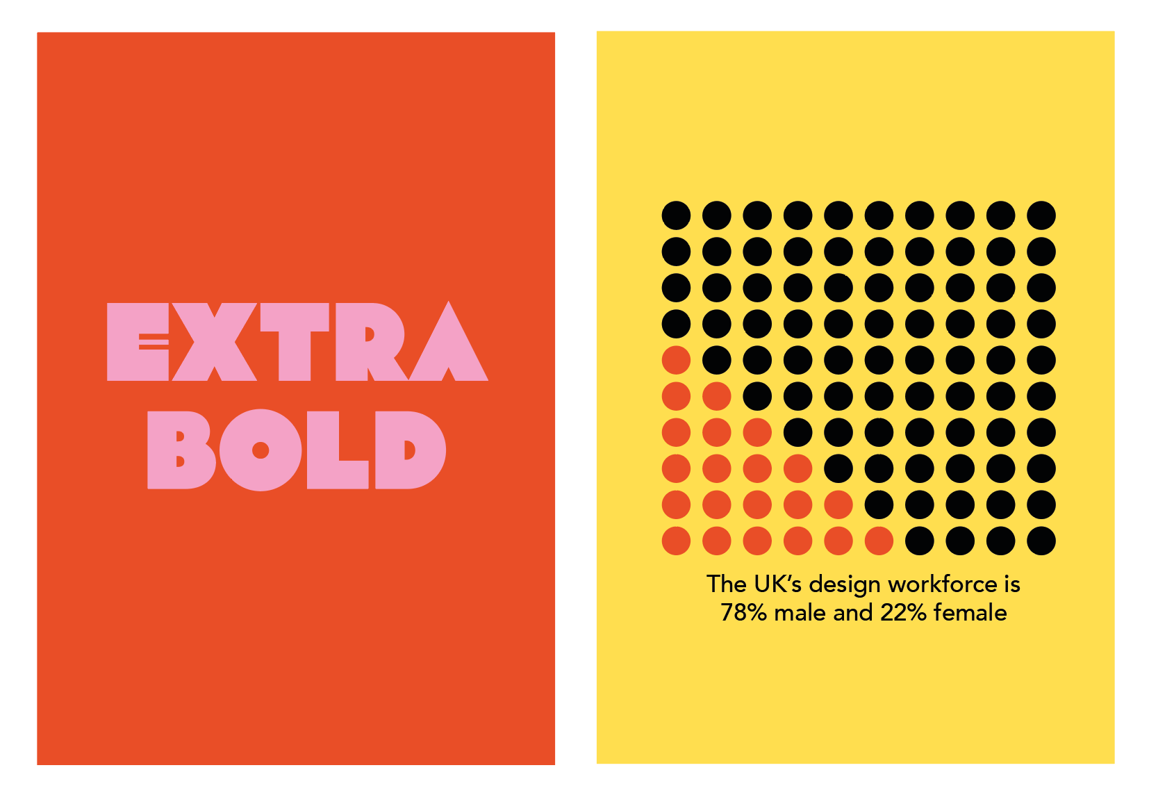
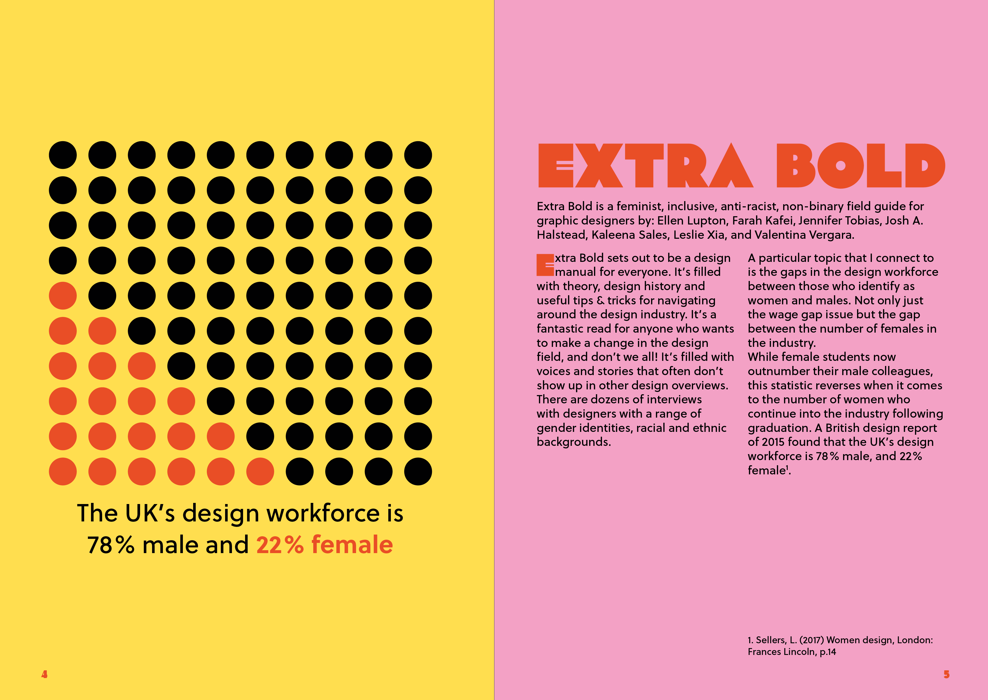
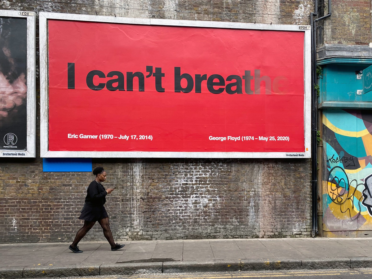
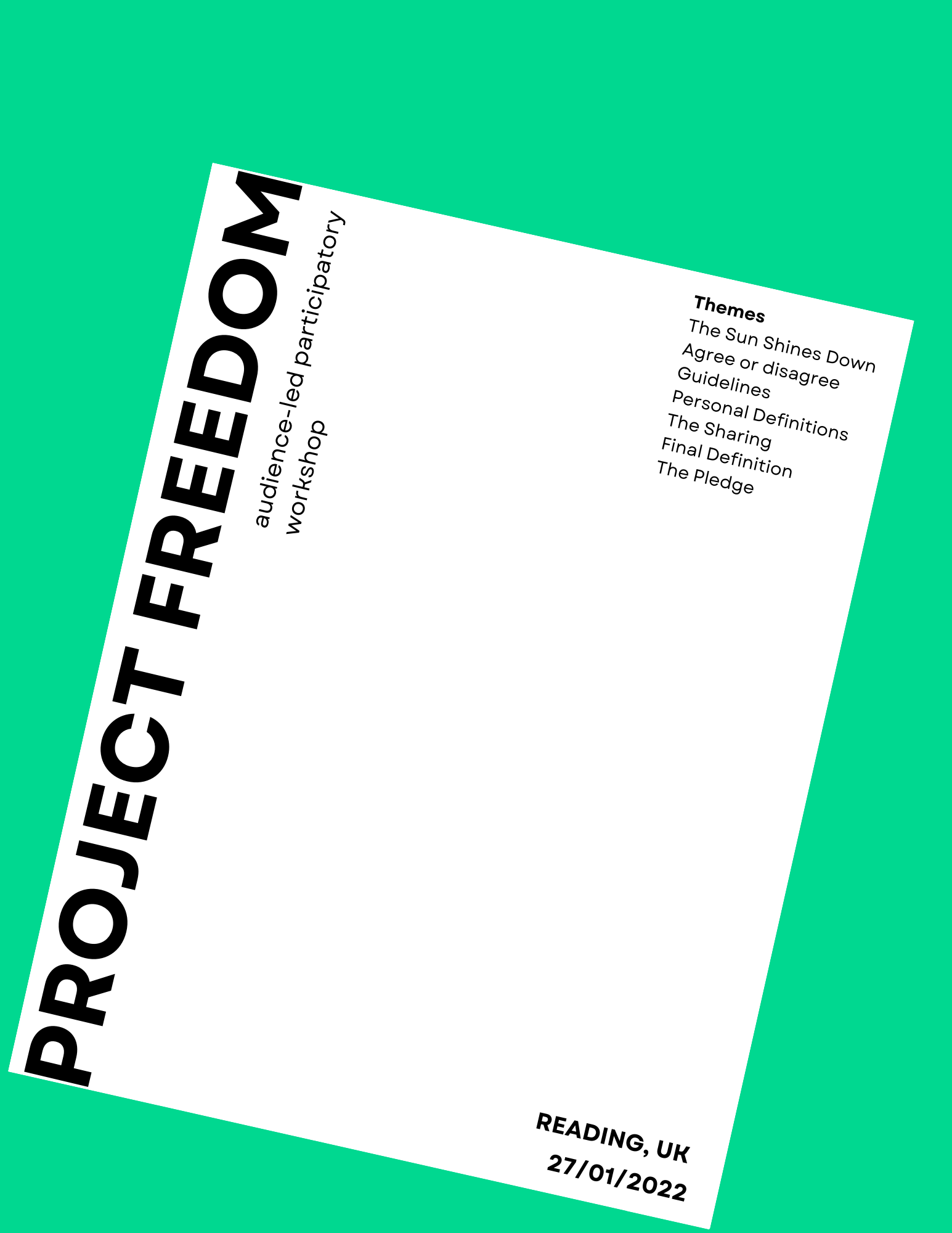
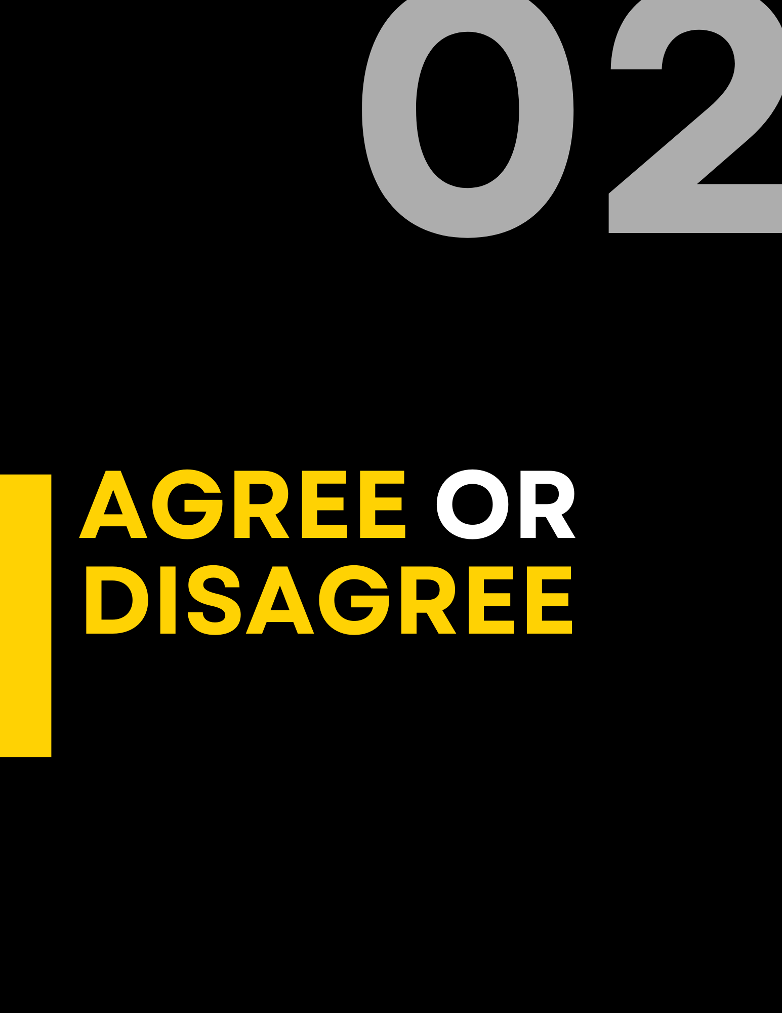
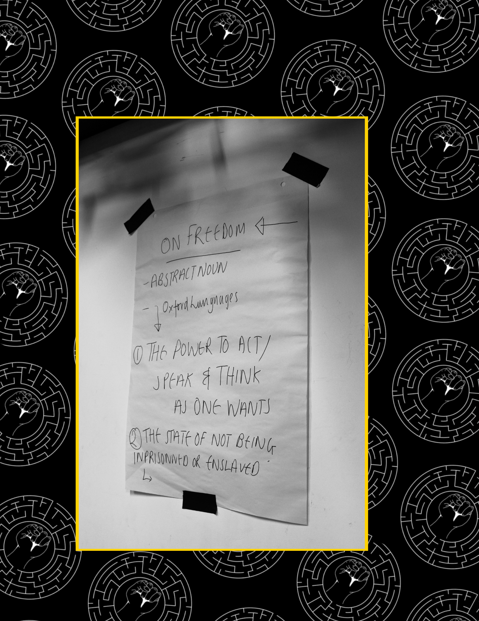
The first task was to come up with topics that would suit the next issue of the zine. Coming up with the content proved to be a lengthy process, therefore as a team we brainstormed a variety of different topics we could potentially include within the zine. We created a mind map and came up with a few articles which we were very interested. We wanted to ensure our topic choices were diverse, yet still focused on diversity and inclusion. Initially, we looked at a variety of popular and current topics happening across the world, including the BLM movement or the Russo-Ukraini war. Additionally, we began looking at wider topics such as mental health, focusing on post pandemic mental health and the effects caused by the pandemic. Alongside our diverse range of topics, we wanted to showcase different artists and designers. Whilst also looking at a range of popular and current diversity topics happening across the world, we also wanted to include topics that were personal to us. 

Figure 2: We planned out the pages, and assigned the articles

Interviews:
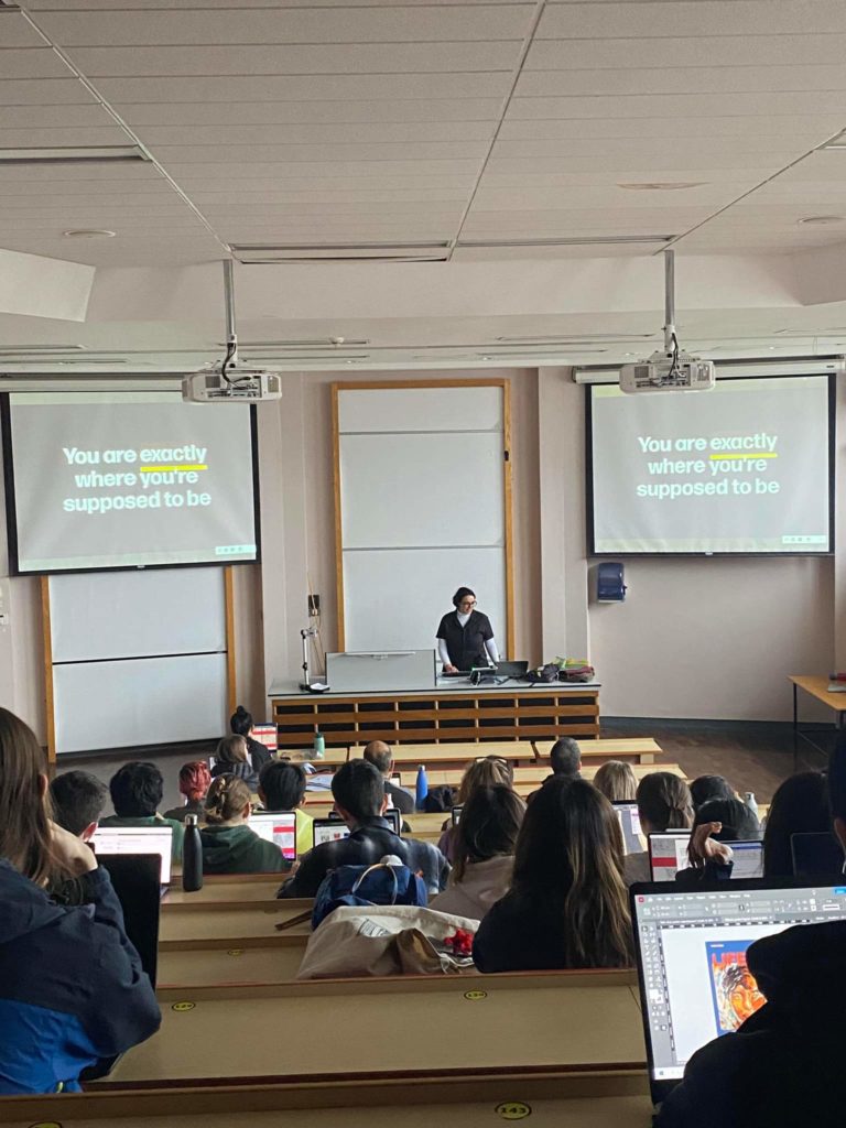
The first interview stage involved looking for a range of designers which specific interests to our zine topics about diversity and inclusion. As a group, we were each assigned one interview topic each to follow up and research. Since all our interviews featured our interviewees work, it was important to have the ethics approved before conducting our interviews. Our initial contact with our interviewees was conducted over email, enabling us to arrange our interviews online through emails or zoom calls. Our interviewing process allowed us to develop our own professional skills due to the professional nature that comes with conducting interviews. As well as giving us first-hand insight into diversity and inclusion about our chosen topics.  

After collecting all our interview content, we then set about writing up our articles. All our interviewees had provided us with a wealth of information to work with, especially the Sky interview with Aanand and the ‘Design Can’ interview with Sabine. Copy writing the information to fit the zine proved challenging to us to ensure all out topics fit into the zine. By copywriting the information down it enabled us to consider our audience more and how they might engage with the zine’s content. 

Copy Writing:
After one member of the team left, we had three people, we all spent the entire summer and autumn term collecting data for articles. For all the articles we read appropriate books, articles and other online resources to help us understand what we wanted to show to our readers.  

Designing:
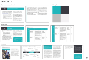
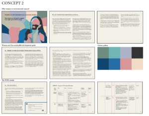
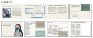
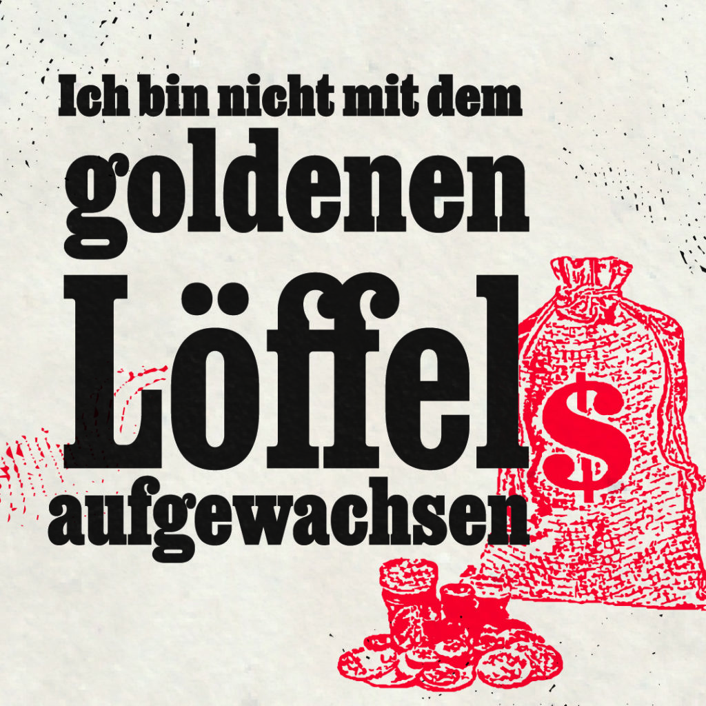
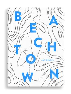
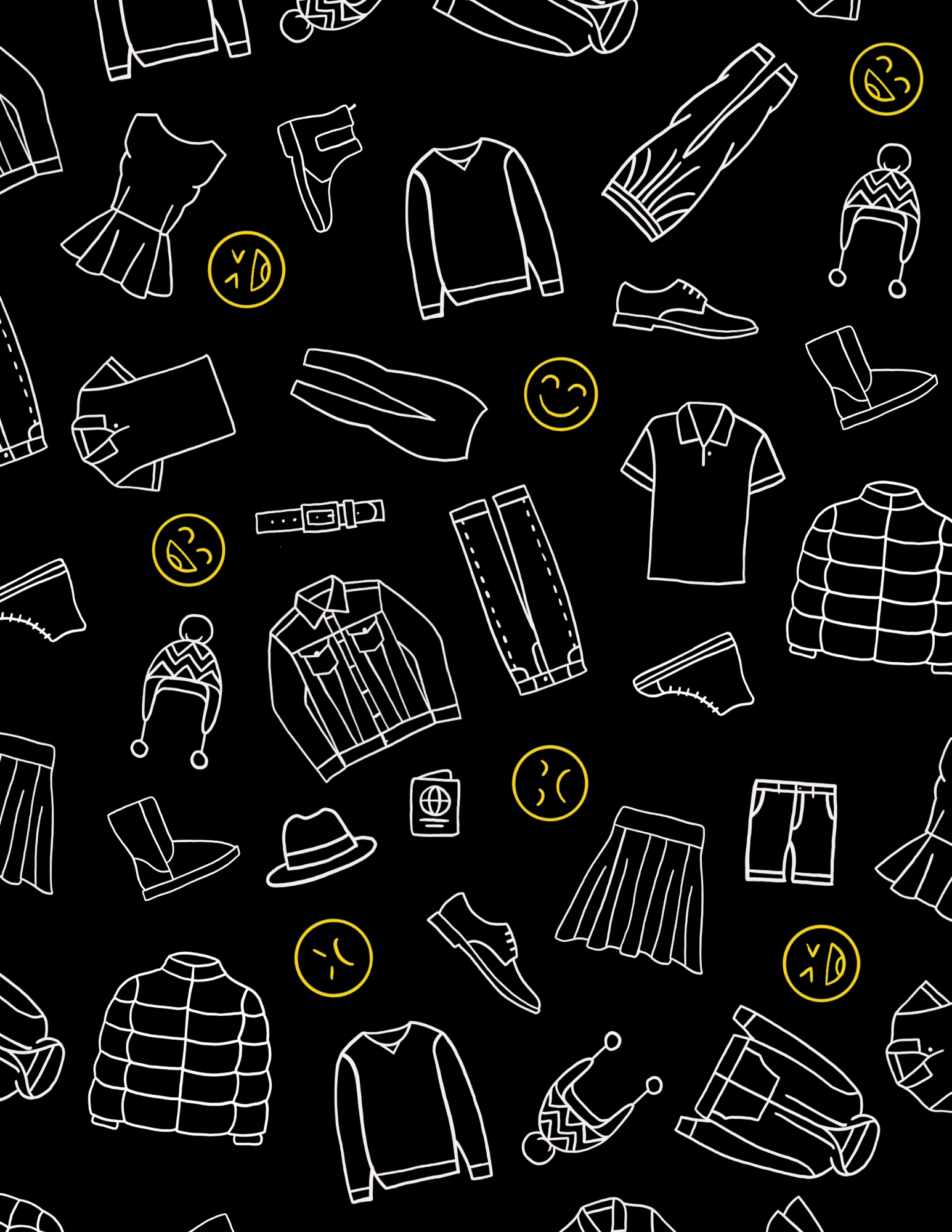
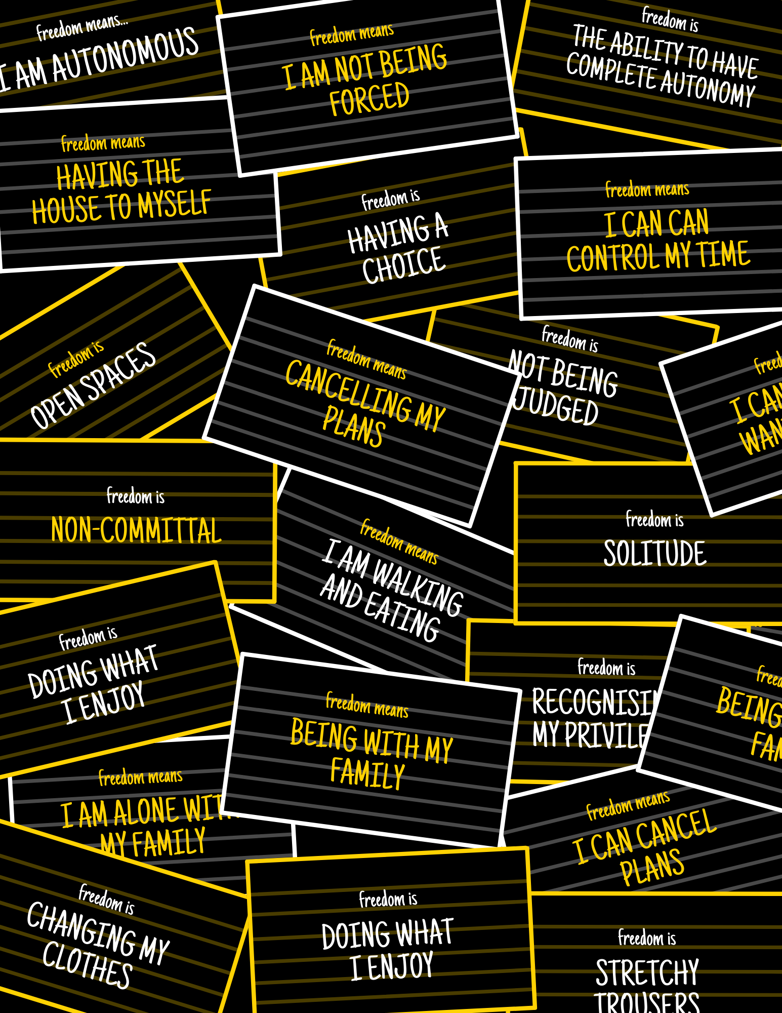
We started our design development stages by looking at the previous zines, focusing on the individual styles within each of the zines. This enabled us to get a better understanding of how we might create the potential style and layout of our zine. We eventually decided that each article would have its own personality, which each related to the subject of the article, whilst still also being consistent to the rest of the zine. By ensuring that each article had its own theme, it enabled us to demonstrate a diverse range of article designs throughout the zine. Additionally, this also enabled us to experiment with a range of different design methods, such as designing with an inclusive mindset through colour blindness, as well as culturally through Pakistani truck art and Urdu. 

Typography:
Our choice of main text typeface was Halyard, as it was already being used in the latest issue to help created a sense of branding amongst the ‘Different by Design’ zines. By using existing paragraph styles from the suggested zine layout, it helped create the typography consistent throughout the zine. Each article then had a heading typeface which was related to the content, this allowed each article to have it’s own personality.  

Grid:
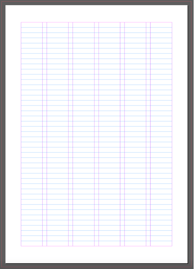
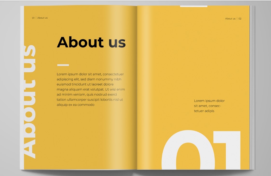
Lydia provided the group with a grid layout, that was to be used for all the articles. Since the design of our articles were all different, it was essential that our page layout was consistent. One challenge that we faced was caused by the nature of our topics, it was important that our page layout didn’t appear rigid. Our grid system was an A5 page, that consisted of 6 columns with a 10pt gutter. The left and right margins were set as the default (36pts), with the top and bottom margins set to 39.638pts and baseline grid set at 12pts. By having these column widths, it enabled us to have more flexibility with image size and column width for each of our articles. 
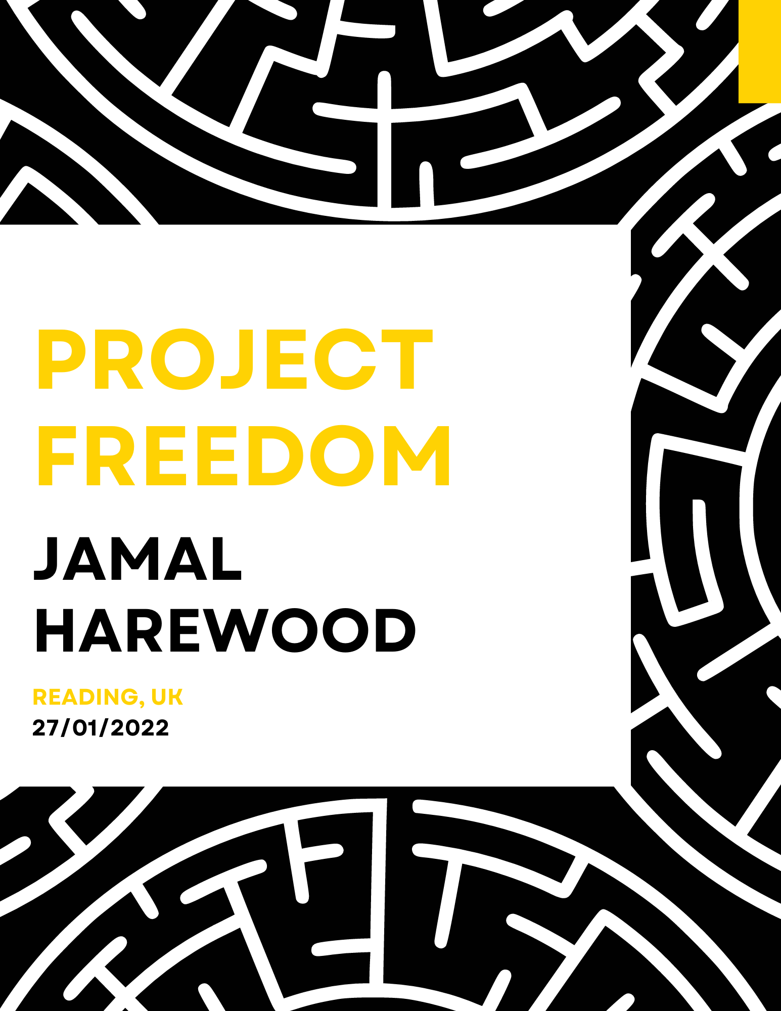
Figure 3: The 6-column grid which underlies all of the pages

Interview sticker: 
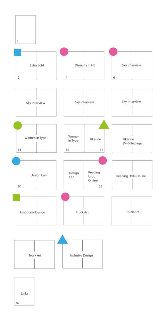
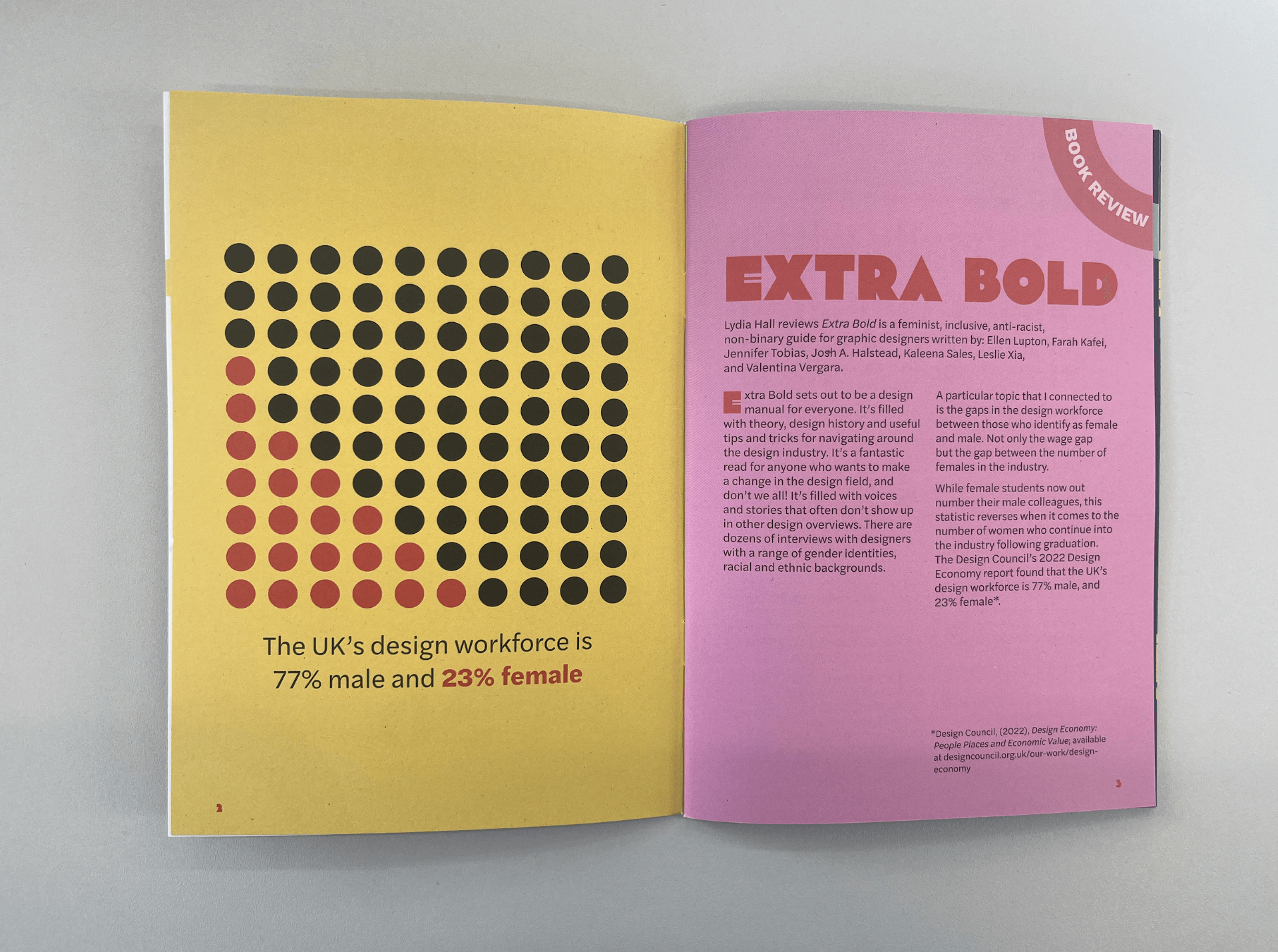
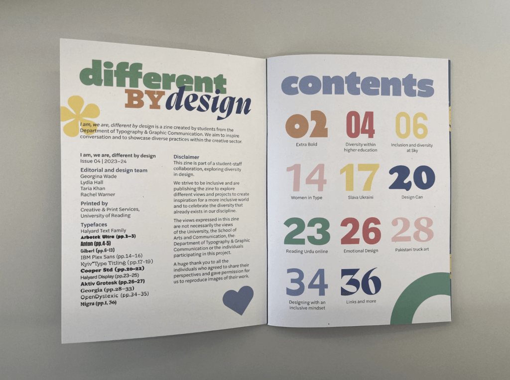
To help differentiate the interviews and book reviews from our other articles, we created different coloured stickers at the top right-hand corner of the zine to help the reader find each of the interviews easily. The interview stickers are blue, and the book review stickers are pink.  
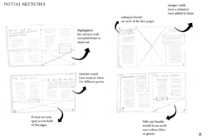
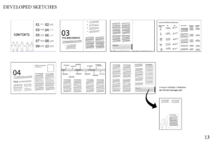
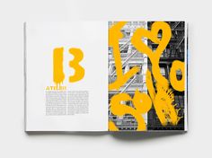
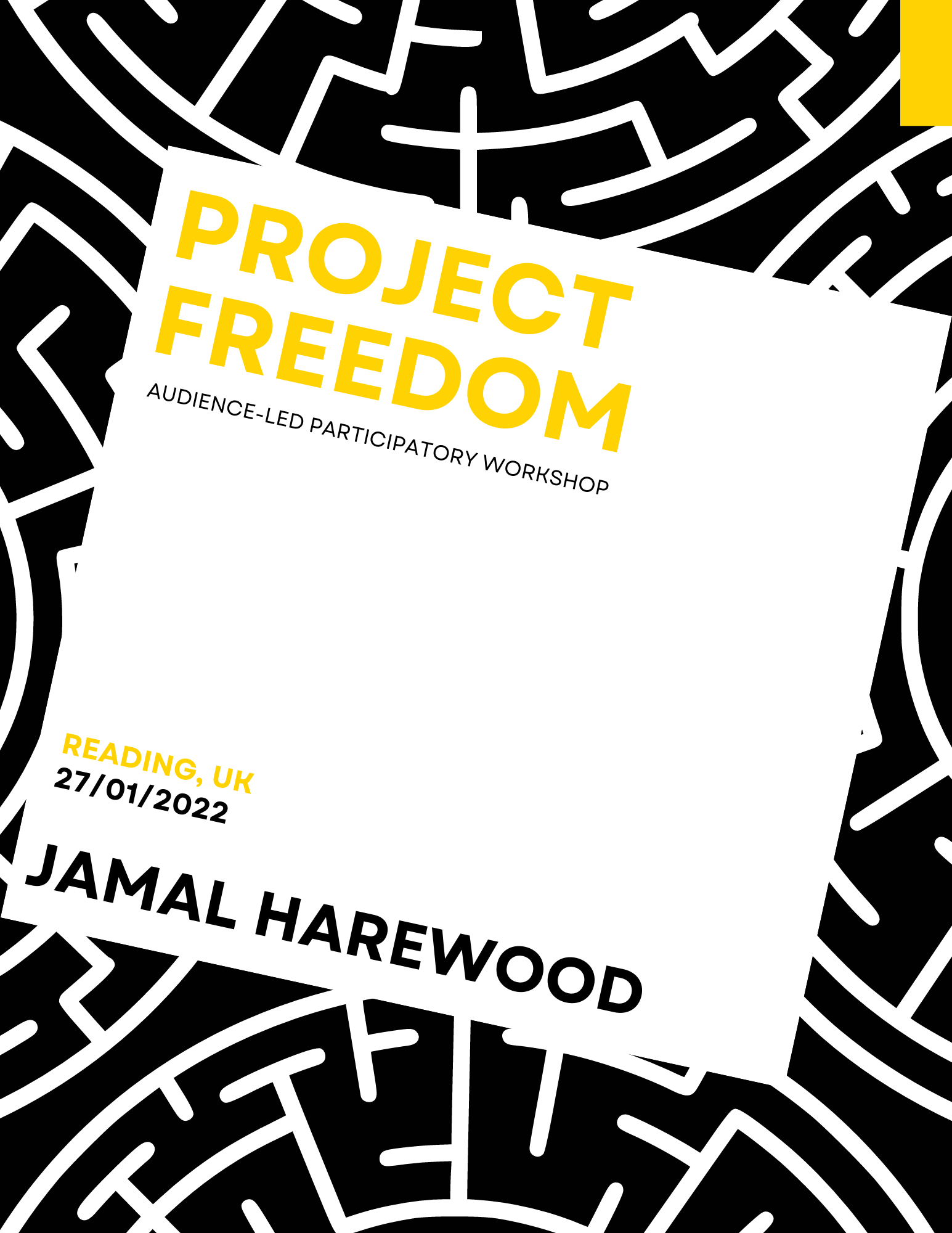
Example 1
Below are some of the developed spreads, from the first version to the final product. 
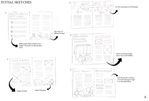
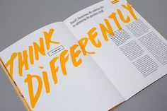
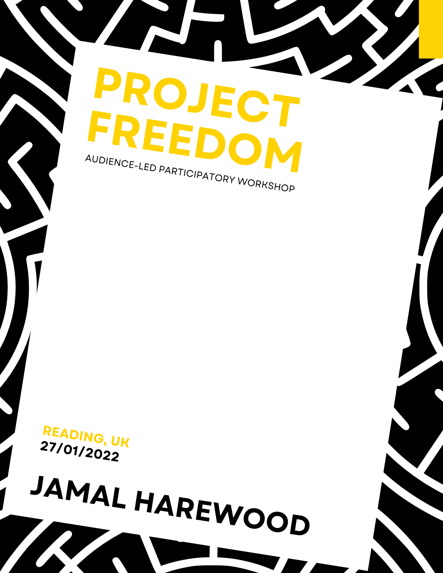
Figure 4: Page development
Figure 5: Page development
Figure 6: Page development

Example 2
Below are some of the developed spreads, from the second version to the final product. 

Figure 7: Page development
Figure 8: Page development
Figure 9: Printed spread of ‘Extra Bold’

Production: 

The specifications of the zine: 

  • A5 portrait booklet 
  • 36pp text prints 4/4 on Edixion 120gsm 
  • 4pp cover prints 4/4 on Edixion 250gsm 
  • Saddle stitched 
  • 1000 copies 

After Rachel and Eric had approved the zine, we created the press ready pdfs and sent them off to print. Geoff, our in-house print technician, was incredibly helpful in this stage of the project and suggested to make a few minor changes, such as changing the photos from RGB to CYMK. We were really excited to receive his email saying that the printed zines had arrived, there’s nothing quite seeing the printed object which we had written and designed!   

Reflection: 

Taria:
We felt like if the zine had some kind of branding which would make it consistent to all the past and future zines. For example, we had troubles with the typeface if we had consistent branding it would limit the errors. 

George:
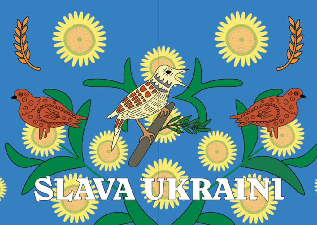
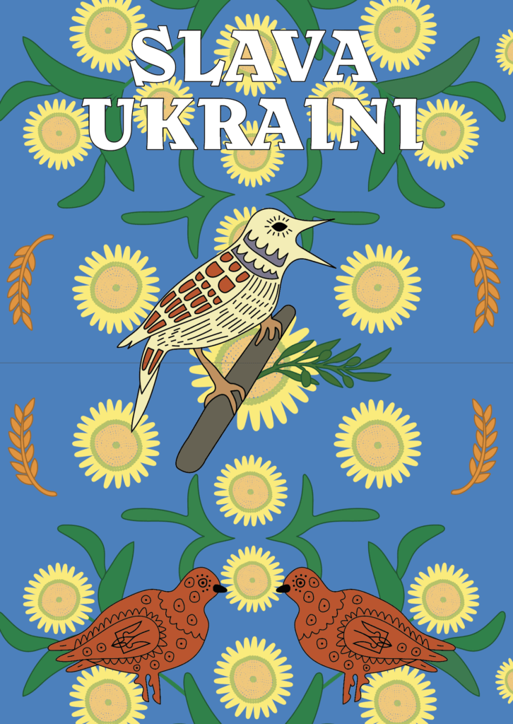
Being part of this team helped me build on my communication and teamwork skills, enabling me to learn how to become more responsive and learn about methods such as ethics approval, which will be useful for the dissertation module. Having more freedom to choose and explore our own topics of interest for this zine was something I really enjoyed, as this is a unique opportunity on this course therefore it helped me to stay more focused and involved in the project. The challenges I faced were mainly focused on the Russo-Ukrainian poster, as this is something very personal to me therefore, something I really wanted to perfect.  

Lydia:
I really enjoyed being on a wonderful team of designers and collaborating with my peers. With a zine about diversity and inclusion it makes sense to have a team of people with different backgrounds and experiences. This project was different to others in the sense that there wasn’t really a hard deadline, while this was good in some aspects, I did struggle to motivate myself and to move the project forward. I have learnt that creating those deadlines for myself and the rest of the team will help to keep the project going.  

Figure 10: Contents page

Connectedness reports

What are the Connectedness reports?

A set of three reports summarising past conferences taking place at Manchester University that will be given out at the June 2023 conference, Connectivity and Inclusivity in HEIs – A solution-based approach. The first report focuses on creativity and inclusivity in higher education and women in environmental science, followed by a smaller booklet that summarises key outcomes from the Women in Science report.

The Creativity and Inclusivity in Higher Education report showcases engaging and accessible resources which convey the methods, processes, and outcomes to key audiences and stakeholders. While also addressing the need for equality, diversity, inclusion, and accessibility (EDIA) initiatives to recognise lived experiences as essential to knowledge sharing and to directly inform practice.

The Women in Environmental Science report focuses on the way that the climate crisis will impact women, how we can bring women together with diverse backgrounds, lived experiences, ethnicities, and disciplines, to promote inclusiveness, widen participation and foster discussion, help to inspire women to engage with their environment and environmental sciences. Focusing on the key themes of Women’s rights and issues that comes with this, climate change, sustainability, leadership, community, relationships, and communication.

Brief

The brief was to create three reports that would be printed and handed out at the next conference, we also had to create interactive PDFs for each report that would be showcased on the website. While also combining elements from the different stakeholders, Manchester University, and the co-brand Engaging Environments.

Our goal was to create an interactive and engaging set of reports containing a strong super-graphic and illustrations throughout to capture the reader’s attention as the content was very text-heavy. The super-graphic we created needed to represent ‘connectedness’ as it was used throughout the documents, tying them together visually.

Deliverables:
Design x3 documents that will be hosted as PDFs with a limited print run.
Deliverables:
PDFs and limited print runs of:
• Women in Environmental Science report (A4)
• Women in Environmental Science Toolkit (A5 Booklet)
• Creativity and Inclusive in Higher Education report (A4)
• Super-graphic

Branding

For the branding of the reports, we needed to use both Manchester University and Engaging Sciences branding. We were given guidelines from both brands which showed us the appropriate usage of logos and typography.

Audience

Looking into the audience and stakeholders was an important part of the process of coming up with a visual identity. Looking at past events from Manchester University which was provided by a video from our client allowed us to create a list of potential users for each report:

Women in Environmental Science

  • Women working in or with an interest in environmental sciences.
  • Equality, Diversity, Inclusivity & Accessibility (EDIA) practitioners
  • Higher education professionals
  • Policymakers in environmental science
  • Students
  • Early career researchers

Creativity and Inclusivity in Higher Education

  • EDIA practitioners
  • Academics staff
  • Students
  • Researchers from the UoM comprising diverse ages, ethnicities, and career stages.
  • Friends and community partners of UoM
  • Communities and participants from all parts of the UK

After researching and speaking with our client we came up with a list to cater our work to the specific audience. The client was very open with what he wanted the design to be but put emphasis on using bright colours whilst avoiding gender stereotypes. The client also wanted bold and assertive graphics throughout as opposed to illustrations that could be seen as passive. Our main goal was to create a design is visually appealing, assessable, clear headings, navigation and easily understood data.

Finding a creative direction

After understanding the content of the reports and the target audience we began creating some mood boards and investigated some existing reports. Showing our client our mood boards allowed us to make sure we were heading in the right direction while also being able to ensure the client was on board with our aesthetic approach before designing.

Mood board
Mood board

Design development

As we had a lot of creative control over this project, we began with some initial sketches based on the mood boards. Overall, the client was excited about these initial ideas but commented how they wanted the front covers to focus less on science and more on hearing different people’s voices while showcasing diversity.

Initial sketches
Initial sketches
Front cover sketches

We then went on to develop some front cover sketches based on the client’s feedback by incorporating different women and avoiding science or gender stereotypes.

Developed sketches
Developed sketches

Feedback from our supervisor, we decided it would be better for the pages to be landscape as the content was text-heavy and contained multiple graphs and tables. After further feedback, our client liked concept three as it included a vibrant colour palette and the text in four columns made it legible.

Concept 1
Concept 2
Concept 3

Super-graphic

Our client wanted a logo/super-graphic that would be used to tie all three reports together. The three examples shown were given to us for inspiration, and we then began to create some sketches focusing on “connectiveness and community linking to the natural world element. Nature and ecology”. After speaking to both our client and supervisor, we decided to take a different approach and create something a bit simpler that could be spread across each of the pages as well as shown on the front covers.

Super-graphic sketches

The final super-graphic shows connectedness through two circles overlapping each other, this also helps add visual interest and break up the text-heavy pages.

Final supergraphic
Supergraphic in use

Women in Environmental Science Report (WIES)

For the WiES report, we wanted to use bright colours and powerful illustrations that would be relevant and helpful alongside the text. Finding an illustration style was something we found quite difficult at first due to the content being very text-heavy there would therefore be lots of illustrations throughout. To help with this we came up with another mood board to help with some visual directions.

These two images show two different illustration styles that we experimented with showing the use of block colours and female empowerment.

Illustration style 1
Illustration style 2

Here are the illustration styles that we implemented throughout the reports. Showcasing women in different relevant elements of the report. We decided on this style as it is simplistic and easy to replicate in many forms while still being visually interesting.

The inside pages consisted of us using different colours for each of the different sections. This worked well in separating each section and carries through in the titles and super-graphics of each page. Through making this report we worked hard in creating visual interest in each page through different illustrations and images. We aimed to keep the pages different and not too text-heavy as this would bore the reader. This visual interest was upheld using speech bubbles are boxes to emphasise the standout information in the report.

A challenge that we faced was coming up with a way to show clear information in a table.  Below shows an initial table where we used different shades and lines to separate the information. However, this wasn’t a viable option as it is difficult to read with the line width being too small and not engaging for the reader. In the end, we had to think of a new way to display this information and decided to scrap the table idea and take the information out into its own sections. As you can see this way of displaying information works a lot better as the reader can take a glance and understand the text through the strong visual hierarchy that has been used.

Table development
Final table layout

Creativity and Inclusivity in Higher Education Report (C&I)

The client wanted us to focus this report more on nature and humans connecting with the environment. To do so we used blue, green and earth tones for the different sections as well as incorporating illustrations of trees, water, and rivers throughout. Although the two reports have different themes and content, we kept the same structure and illustration style as the WIES report.

C&I page examples

Lessons from Women in Environmental Science (The WiES toolkit)

This report is a summary of the main WiES report but follows a different structure of an A5 landscape booklet. As this report is a summary it has a lot less text but still contains elements of visual interest with a clear structure.

WiES toolkit page examples

Front covers

For the front covers we wanted them to reflect the content inside while also appealing to the reader. We began experimenting with different front covers the first being using an image that spread across the whole page and the other being more of an illustrative approach.

Front cover experiments

However, we decided that both of these didn’t fit and also didn’t give the reader an insight into what the report was about. The final cover designs that we came up with use typography and illustrations in a fun and engaging way that makes it clear what each report is about and follows the design inside.

Reflection

Feedback from are client was very positive. “Both of you worked extremely well on the Real Jobs project for Engaging Environments and our partner University of Manchester earlier in 2023. You absorbed a lot of complex information contained within the reports and on our calls regarding the project to produce designed outputs that were of a really high standard and reflected the themes of the work. Our partner was extremely happy with the reports, to the extent that they would like to produce a final report on Pt 3 of the C&I workshop in the same style, and the materials were also very well-received by the intended audiences at the event where these were shared.

You also worked to very tight deadlines, which was impressive given the size and scale of the reports that needed to be produced, and the commitment you showed to the projects throughout was very much appreciated.

I wouldn’t have any negative comments, I thought you both did a great job.”

Overall, this project has taught us many things with the main thing being time management and prioritisation. As it was such a big project with just over two months to complete three printed reports and three interactive PDF’s we needed to be realistic with what we could achieve in this time frame and didn’t have months of planning and sketching time like other projects would traditionally have. We were able to split the project up well to showcase both of our strengths while also allowing us to stay efficient in work production.

After this project we can both say that we have gained a lot more experience in editorial design as well as interacting with a client. We worked on our project management skills making sure the reports were ready for the event. We learnt to take on board feedback from both our clients and supervisors and create different revisions based on our feedback. Worked with branding guidelines, making sure that all the logos were placed correctly and maintained brand consistency. We learnt to address design challenges creatively and find solutions that met our client’s objectives.

Where to find the reports

All three reports can be found on Manchester University’s website under the WiES sections.

Reports used at confrence

https://www.meri.manchester.ac.uk/wies/research/resources/


Universal Voices: Singing Communities eBook

Background

Universal Voices is a free community choir for children aged 7-12 at the Institute of Education (IoE), run by Dr Rebecca Berkley and a volunteer student team. Singing Communities is a project funded by the UoR Communities fund. It is an inter-generational song sharing project, where the children in Universal Voices ask an elder member of their family (grandma, granddad, aunt, uncle, friend) to teach them a chant, singing game or song that they knew when they were children. Through this community, Rebecca aims to highlight the different cultural backgrounds of the students. Through the eBook, she aims to also disseminate it  to the local primary schools, to allow them to teach their students and also spread multicultural values to the students. Therefore, our aim as desginers, were to create an eBook that would allow users to both learn and engage in various cultures through the joy of music.

Restated Brief

As mentioned previously, based on the client’s goals, our brief was to create an eBook that celebrated the different cultures through songs collected by the children through their family members, with both front and back covers. This meant creating an identity that was playful and innocent, to reflect the contribution of the children, but at the same time informational, to reflect the educational value of the songs. All three of these elements needed to be balanced as Rebecca had mentioned that she aimed to distribute and use the eBook as an educational material for teachers to use, therefore, we had to make sure that it would be accessible and easy to navigate and understand.

The client had also requested us to design the eBook on Canva, with them also kindly providing us with the Pro version of this website to use during the designing of the eBook. This was so that it would allow them to make changes or add more songs in the eBook in the future. This was a new challenge for both me and my partner, Zainab, as we have never used this app before for editorial design, but nonetheless, was excited to start on this, as this meant that it will allow us with new skills and experience.

Furthermore, after further discussion, we had also agreed to refine their existing logo to allow them to have better formats of the logo for their future use as well as improve the clarity and quality of the logo.

Deliverables

After the initial meeting with Rebecca, and going over multiple options, we opted for an eBook that would be interactive, where each song will contain:

  • Supporting music score
  • Embedded video and audio links
  • Lyrics, along with phonetic pronunciation and translation (if applicable)
  • Description about the origin of the song.

For the book covers, the client’s vision was to make an inclusive and interesting cover but was open to discussion with us and therefore we were given the creative freedom to work on this.

For the logos, we agreed that we will provide the client with two sets of files, containing the appropriate file format, depending on whether it would be used in printing or on screens. The formats decided were:

  • EPS, PDF, and TIFF files for print use
  • SVG, PNG, and JPEG files for screen use

Research

When discussing the work with the client, she had mentioned that she was inspired by Nordic Sounds, an online e-book containing ‘pedagogical collection of traditional music, dance, songs, games, rhymes and lullabies from the Nordic countries: Denmark, Faroe Islands, Finland, Greenland, Iceland, Norway and Sweden’ (taken from the description used in the website) and although the website uses illustrations to support the songs, for this project, the client had decided not to include any illustrations as all the songs are from different cultures and would have no correlation between each other.

Moodboard

To help with developing our ideas and visualising the theme we aimed to design, we also collated a series of moodboard to help with this. Each moodboard contained ideas and pictures of a singular theme and using each of them helped us during the design process.

Moodbooard to visual the general ‘feeling’ of the eBook
Moodboard for typefaces, colour and shapes
Moodboard for cover design


Colour palette

The client requested that we somehow incorporate the colour palette used by the Nordic Sounds website onto the eBook and therefore we tried doing that through taking the colours from their wordmark logo in the home page. However, she wanted them in pastel tones as they believed that the colours used in the Nordic Sounds website are quite bright. The choir consisted of children who are really young so therefore she wanted pastel colours to be used to make it soft and easy to read, instead of it being distracting with the bright, bold colours. They had also asked us to use a light beige colour for the background as this was what they use for their backgrounds in presentations.

Colour palette derived from the Nordic Sounds wordmark logo

Typefaces

For typefaces, we mainly went for the theme of childness and innocence, and therefore, focused on typefaces that resembled children’s writing or overall appeared handwritten. At the same time, we tried choosing typefaces that were legible and had a range of different weights for flexibility, however this was limited, as we had to choose from the list of typefaces available at Canva only and most typefaces had limited weights or had none at all.

List of typefaces explored


After going through a range of typefaces and showing it both our supervisor and our client, we decided on Children One for the headings, and Childos Arabic for the body text. The different weights within Childos Arabic allowed us to create hierarchy within the body copy and also separate the song lyrics from the translation and phonetics. As some of the songs had lyrics in its native language, we had to find typefaces similar to Childos Arabic to accommodate. The combination of Children One and Childos Arabic worked well, as Children One highlighted the childlike appearance of the book and also reflected the contents of the book with its uneven letters, and it was well balanced by Childos Arabic, a Sans Serif, with its roundedness and flaired descenders.

Chosen typefaces

Kids’ drawings

Since the children of Universal Voices were involved in the collecting and recording of the songs, we also wanted to reflect that on the eBook visually, and therefore we decided to do this on the front and back covers of the eBook. In order to do this, we paid a visit to the children during one of their rehearsals, where we got to talk to them about what they love and think about Universal Voices.

First time visiting Universal Voices
Example of one of the slides presented during the visit to the Universal Voices rehearsal


After gaining some insight from the children themselves, we had also prepared an activity for them which involved them drawing out what they had told us regarding Universal Voices. This proved to be very productive, both for us and the kids, as this kept them engaged and also allowed us to have a good collection of drawings to select from when making the covers.

Example 1 of some of the children’s drawing
Example 2 of some of the children’s drawing


Design process

Sketches

To start off, with the advice of our supervisor, we sketched out layout ideas, focusing on clear and concise layout, as the goal was to make the pages be as much easy to navigate as possible and some of the layouts, we considered were having text on one side with all the images based elements to be the other side and vice versa. We also sketched out layouts where we made use of separating the content into top and bottom halves.

Layout sketch 1
Layout sketch 2
Layout sketch 3
Layout sketch 4
Layout sketch 5
Layout sketch 6

Initial layout

In our initial layouts, we wireframed some quick layouts to show to our supervisor and after getting feedback on how to create better layouts, as we had initially lacked the creativity in our design ideas, we went back on track and started using colour and different combinations of typefaces to create layouts, allowing us to better understand what worked well.

Some of the layout ideas we tried out involved colour coding each section of the spread, or by blocking each section in colours, as well as having a coloured background and playing around with placements of the score sheets and the video and audio links.

Layout idea 1
Layout idea 2
Layout idea 3
Layout idea 4
Layout idea 5

Reflecting the song’s origins

To make the eBook more educational and make it engaging for the readers, we brought up to implement another way kids can learn more about the origin of the song with a more visual approach, instead of only having a written section at the bottom of each page. Therefore, we suggested to add the flag of the country that the specific song originated for. In one of our suggested layout designs, the client had really loved the idea of the pages having a coloured border, which reflected the colours of the representative flag and therefore, to keep them consistent, we added those borders onto the prelim pages of the eBook as well, but instead used a combination of two colours from the main colour palette.

Example 1
Example 2
Example 3

Refining logo

Since the logo only required refinement, the only thing done was redrawing the main element of the logo and vectorise it in illustrator. The original logo was used as a reference to redraw and for the typeface used on the logo, Futura was used as it resembled the closed to the original. The logo was drawn in three different colours: black, white, and red, with red being the brand colour, as the children in Universal voices wear a red t-shirt while performing in events and we wanted to reflect that on their logo as well.

Original logo
Refined logo (in black)
Refined logo (in white with red background)
Refined logo (in red)

Covers

As previously mentioned, we wanted to reflect the kid’s contribution to the making of the eBook and decided to do so through the covers. Having collected their drawings during the visit to one of their rehearsals, all of them were scanned and using both Canva and photoshop, the covers were made. Using Canva, I added in the selected drawings and created a collage. I specifically chose drawings that reflected very clearly what Universal Voices meant to the kids, as well as using hand drawn lettering done by one of the children as the title of the eBook, to highlight the innocence and enjoyment of the children and also reflect what the eBook was about. A crumpled paper texture effect was added onto the background of the covers to once again, reflect the childish nature of the eBook.

Front cover
Back cover

Final product

Combining different elements from each layout idea, we made our final design where each section was colour coded, and it was specifically emphasised for the video and audio links where the colour coding stayed consistent throughout the pages and this was useful as it allowed users to know which link referred to the audio or video as some songs only contained either one of them.

It was a great success, as we managed to deliver the eBook to the client on time. we also had the opportunity to present our work on the launch day of the eBook in front of all the kids and their families.

“At the launch of the e-book in November 2023, Jaf and Zainab came and presented to the audience explaining the work that they had done. Their presentation was clear and interesting, and they both spoke very well.”

– Rebecca Berkley, Artistic Director of Universal Voices

Attending the launch event of the Universal Voices eBook


Furthermore, the client was very impressed with our work and loved the use of borders in the book and keeping a clear layout as mentioned below:

“They communicated regularly with me presenting draught ideas for the layouts for each page and the overall design of the book. They were very good at taking my ideas and turning them into reality. I was particularly impressed at how careful they were to make sure that their rendering of my ideas matched my vision. They were always cheerful, helpful, accurate and delivered on time. They made several suggestions about the layout which also improved the content of the book. Their communications were always professional and they delivered the product to the agreed timeframes. When we had to make an adaptation to the deadlines or the content, they were always very helpful in accommodating that. The overall design of the book was delightful. They created a visual style for the book which had a primary school feel to it, using bright colours and a clear layout. They matched the borders of each page to the colours of the national flag of the language of each song, which was a lovely detail in the design.”

– Rebecca Berkley, Artistic Director of Universal Voices

Self-reflection

Having the children involved within the designing of the book was a very lovely experience, as I got to see their creativity and apply that onto my own as well, and seeing their lovely work really inspired me to work on this eBook more efficiently. Knowing that the children liked the cover of the eBook was very heart-warming to me and made my experience working on this eBook very valuable.

“Jaflenur and Zainab came and worked with the children in Universal Voices to create artwork for the front and back covers of the book. They asked the children to draw pictures and write sentences about what the choir meant to them, and then copied the children’s art work and made a collage for the front and back covers. The children really loved seeing their art work in the e-Book. It was particularly popular with the children, because every child could see their artwork in the book and it made the book very special to the children. I have found working with both of them fantastic. Their credit to their department, and a really good example of what a great programme Real Jobs is.”

– Rebecca Berkley, Artistic Director of Universal Voices

Geri Reid: Creating design systems

In week 3 of Spring term, we were joined by design systems and accessibility consultant Geri Reid. Geri divulged information about life not always going the way you expect and the journey she took to be where she is today. Geri’s path is relatable to young people and the struggles that they face, with a positive outcome.


Early life

Geri comfortably shared her experience of parental expectations and the struggle with undiagnosed OCD, leading to her dropping out of school and getting a tattoo. She then chose to travel around the world, flicking between random jobs, with the feeling of being lost and struggling with the sense of being left behind due to everyone around her graduating and getting jobs, while she still worked on understanding what she wanted to do. The Internet came about and had Geri hooked; to this day, it “still feels like magic” to be able to code HTML and create a whole web site. Geri then felt ready to take on Uni and received a BA at UAL, learning how to code and design before working an entry-level coding job. She found success through someone taking a chance on her, and she likes to do the same for undergrads today. She proceeded to work in the UX/UI design field, and reflected with positivity that the job she has today wasn’t even invented until she reached her 40s. Things we study today didn’t exist when she began her education.

‘The job you end up enjoying probably hasn’t been invented yet’ – Geri Reid  

Design systems

A design system is a collection of reusable elements, guided by a clear set of standards, that can be assembled to make stuff.

Massimo Vignelli was famous for his redesign of NYC subway signage, a design system he created to aid people through their everyday journeys. Up until mid-1960s, subway signage was unclear and disorganised; signage was overcrowded and overlapping. Vignelli used rational shapes, which are the result of deep cultural sensitivity, with shapes and colours to create an understanding of direction. The work of Vignelli indeed shows a timeless validity housed in its pragmatic, rational, and visually forceful nature.


the1970 New York City Transit Authority Graphics Standards Manual ...

‘Standards Manual’ –  by Massimo Vignelli 


When Geri worked at large companies like Lloyds Bank, she noticed that the headers were never the same size or placement, which made it look like a scam website due to a lack of consistency. Design systems work when you break the designs into small, reusable chunks. This works for all aspects of design, not just UX/UI. An important thing to note is that when you break down the design, each element becomes known as an ‘Atom’; they are smaller components that create larger products. Brad Frost had the idea of atomic design, and to find out more, Geri suggested buying his book, Atomic Design. It stems from the metaphor of small atoms forming into molecules and then organisms to create templates, pages, or products. With further research, it has become known to us as designers that there is a layer before atoms, called design tokens, the foundation of a system: colour, typography, grid, and spacing.


The Atomic design process using instagram example steps.


When working on your design system, you will begin with your brand colours and create a design system ramp, a great website to use that was suggested during the talk by Geri is Leonardo (leonardocolor.io). Good colour contrast is essential for accessibility, this is beneficial to the 2.2 billion people worldwide with forms of visual impairments are able to read the content. Colour Contrast Checker will give you an instant pass or fail result for how well your contrast is working with your background. A useful way of scaling your typefaces for websites comes from free websites such as Typescale – Create stunning typography, generate CSS, and find inspiration. Another website that will be useful to you as a designer is Gridlover it is another free tool that Geri loves to use to help her split up the CSS and show her the underlying grid. A system that Geri helped design and shape herself is the NewsKit design system, made from code libraries to help create news formats for companies like TheSun, etc. NewsKit provides information on how to structure and utilise visual appearance to create fluidity and enables agile project management scheduling for designers, giving them objectives to complete, similar to Padlet for students.


Digital accessibility

It is all about removing barriers that prevent interaction with or access to websites, digital tools, and technologies by people with disabilities. Disabilities are not always visible and can be situational or temporary, for example, a broken arm or being outside with light glare. Geri expresses the importance of being thoughtful with your design. Web Content Accessibility Guidelines (WCAG): Understanding WCAG 2.2 – Service Manual – GOV.UK (www.gov.uk). The four main principles of WCAG  are Perceivable, Operable, Understandable and Robust. Being excluded is like a punch in the gut, and leaving people out does not meet accessibility standards. Ability bias is unintentional and typically typically because we base our designs around ourselves and people we know. You will make mistakes and won’t make a perfectly accessible product the first time around, but this is how, as designers, we learn and improve. Be messy and experiment; before having a system, test and test and test again. Geri personally takes the approach of creating whole screens before breaking things down into her atoms and molecules, especially as some elements are reusable.

‘ You can apply a system to any sort of design’ – Geri Reid.

Below are examples of websites and books Geri shared that are very good at helping you understand and implement accessibility:


geri@gerireid.com

@gerireid


Conclusion

Geri’s talk was relatable and extremely valuable for students of all years, particularly for UX/UI projects. Her presentation was informative, covering her journey, design systems, and accessibility in design. She shared her wisdom and supplied lots of free websites that will be valuable to projects across students studies, and they spoke of wanting to watch the recording again as it was so informative. Geri ended her presentation by saying, ‘Everything you design and build leaves a legacy. Make yours a good one.’


‘Excellent and highly informative. Truly riveting.’  – Part 1 student 

‘Amazing speaker, and relevant to our practice across design disciplines.’  –  Department Lecturer

Greg Bunbury: Ethical design

In Week 8 of Autumn Term, we were joined by Greg Bunbury a Graphic designer and consultant, as well as a sessional lecturer here at Reading. In this session, Greg spoke of real-life experiences, gave the students interactive elements throughout his presentation and really engaged with why ethical design is so crucial to today’s industry.


What is ethical design? 

Greg began by approaching the students with the trolley problem. This warmed them into understanding the most drastic form of moral principle. Greg states that as designers we do not always see the consequences of our ethical choices. Things get complex, and that is why Ethical design is so important.

Ethical design is all about respect – using a broad approach to design products/services or experiences that priorities moral principles/values. Ethical design is not just about something looking good or doing its job–  it must also contributes positively to society. Ethics is considered a route to advocacy and activism but in itself it is a different construct. Ethics can lead to advocacy and activism but that isn’t what ethics is. Most humans have a moral compass allowing them to be respectful and honest. However, this doesn’t stop them from being ignorant when it comes to understanding world issues to allow for ethical progression.

‘Design is about intention not delivery’ – Greg Bunbury

A good guide to follow is the ethical pyramid which represents respect beginning with human rights, leading to human efforts, and onto human experiences. Greg says that ‘ethics is not politics. It is moral human behaviour, a study of right and wrong.’


What is design?
A screenshot from Greg’s presentation explaining what design is.

Why is Ethical design Important?

Unethical design causes harm. Unethical design affects people in many different ways: physically, through financial strain, sleep deprivation, or the taking of personal data. People can feel betrayed by design, and can be affected emotionally and financially. Exclusion by design can be extremely debilitating for some people. For example, making a building inaccessible to wheelchair users by excluding ramps and lifts and disabled toilets is cruel. Design can also be ageist, biased, racist, employee greenwashing, or generally conceal rather than reveal truths.

Dark patterns are a seriously unethical way of mistreating humans basic rights, issues such as hidden costs, opting into handing over data to use their sites, roach motel, forced continuity and covert spam. Design should be clear and ethical and this is the key to great design.

I-can't-breathe-george-floyd-brixton-brotherhood-media-greg-bunbury
‘ I can’t breathe’ billboard designed by Greg Bunbury.

How can you bring ethics into your design work?

  1. Learn what you think – there’s nothing worse than having an opinion but no understanding of why you hold this opinion. People challenge and question you in life and you need to be prepared with why you think what you think.

2. Learn to ask powerful questions – question the suppliers you chose, the printers, your advisors, the images that you choose.

3. Learn to say ‘no’ – If something isn’t right or ethical say ‘no’, avoid dark patterns and choose a better path.

‘WHY?’ is such a strong question to ask yourself and others it challenges us to understand our choices and the choices of others. So next time you go to say ‘yes’ to something think about why your saying yes in a deeper perspective.

Never lose sight of your purpose and values in design.

Conclusion

Greg offered an extremely insightful talk that every student learned from. He made it clear how important being ethical in your design work is and the success to being more ethical. He covered a wide range of topics within his presentation such as the trolley problem is unrealistic and you will not necessarily see the effect that your design has on people but questioning why will be key to being as moral as you can be. Design is so much more than being creative it is about portraying a message, being inclusive and making it user friendly. Greg’s work and words are truly empowering and his passion and honesty in his journey and experience is inspiring to young designers searching for their place in design.


‘ I really liked how Greg highlighted and warned people of the potential mistreatment of freelance designers so that students can be more wary when handling clients should they choose to be freelancers, issues such as no credit of the work or even denying the work you created and not paying etc.’  – Part 2 student 

‘Seeing the emotional side of design and also seeing Greg’s work was amazing’ – Part 2 student

‘Greg’s insight into ethical design should be mentioned much more along this course’ – Part 3 Student 


Design for change project + Sky Creative

In their third year, our undergraduate students have the opportunity to complete a ‘Design for change’ project. The project aims to give a space for exploring how design can contribute to social change. Past projects include:

  • Say something – an anti-sexual harassment campaign
  • A hidden disabilities learning kit – designed to build a more considerate atmosphere for those living with hidden disabilities through awareness within schools
  • A non-profit initiative called ‘Wear Conscious’ – a social media campaign for change in consumer behaviour and the fast fashion industry

This year, Aanand Tank (a graduate of the Typography & Graphic Communication department) and Shraddha Depala, from Sky Creative, joined the teaching team to inspire students through their experience working on Sky campaigns including Black History Month and Pride turns 50.

The students were also invited to visit Sky Creative, shadow a Diversity & Inclusion meeting with Aanand and Shraddha, and experience a tour of the campus and design studios.

A person pointing towards a screen with the text 'The brief: Self initiated brief to share the experiences and raise awareness of the triumphs that our LGBTQ+ community within Sky have experienced'

Sol Kawage: Design perspectives

In week 3 of Spring term, we were joined by information designer and Reading graduate, Sol Kawage. Her love of typography and passion towards informing students about the beauty of designing for a purpose was inspiring for students.

Sol Kawage’s design for a postcard and social media graphic for Tennesee Blend, advertising a theatre production

‘I liked the incorporations of her own struggles with ADHD and how it has taken her on this journey’ – Part 2 student

Being an information designer, Sol said she loves investing her humanity into her work. Earlier in her career she believed her biggest weakness was her ADHD, but she learned over time that because of this she has an advantage by having a different perspective than most designers. By viewing weaknesses as advantages, students were taught that there is nothing holding students back when designing for their projects. Sol reminded students how lucky they were to be studying at the university and how students should make the most out of the course, as it will bring many beneficial opportunities for their future careers.

Sol made students aware that every student is exactly where they’re supposed to be by studying at Reading.

‘The plan will not be right when the time comes to execute it. It is the activity of planning that prepares us for whatever transpires.’ – Sol Kawage

Collaborative information design including work by Sol and Josefina http://Dearhowto.uauage.org

Conclusion

Sol showed students that even if one doesn’t feel confident in their abilities or skills to execute something towards a project, any problem can be overcome and be seen as positive. Her inspiring words were very relevant for all students to hear as they progress with their work for modules.

‘I liked hearing how you use real life problems when designing, for example using the ski goggles will affect how the colours come across. It’s not something you would think to consider normally.’ – Part 2 student

‘The presenter’s honesty and the personal tone of the talk. So much fun!’ – Staff

Jamal Harewood: Project Freedom

Background

Jamal Harewood is an activist who sets out to share his vision of race and identity through workshops around England. He is currently undergoing a freedom workshop that seeks to redefine the term ‘freedom’ by discussing each individual in the workshop—participants brought in different perspectives and Fresh insight onto specific topics free from any judgement and authenticity.

On the 27th of January, Jamal Harewood led an audience-based workshop, ‘Project Freedom’, in Minghella Studios theatre Reading university. It comprises a diverse number of students that seek to redefine freedom on their terms. The workshop was a playful experience where participants were encouraged to discuss and share their views and opposition to different themes and activities. Each individual created a new definition of freedom and a pledge to follow through. Overall, the workshop brought a collective of ideas together.

The premise of this real job is to document the workshop and create deliverables that would suit Jamal’s brand and idea. He wanted to write about the unique experience of this temporary community and show the discussions and interpretations of each individual.

Restated brief

GOALS

After we document our client’s workshop ‘Project freedom’ and his interactions with the audience, we are tasked to create a booklet and UX blog post that include the wide range of diverse experiences and definitions of freedom from the participants. The audience is the focal point of the workshop, so it is important to make the deliverables as personal as possible, not only showing their ideas but their performances and behaviour.

Our Brief main goal is to offer attendees an opportunity to revisit their experiences in Jamal’s workshop. They would be able to look through the deliverables and find quotes and thought that they said at the workshop. Although we would only be able to document one workshop, Jamal would like to carry out this project in other workshops, thereby using this deliverable as a template for future workshops and making a profit from the booklet independently.

 DELIVERABLES

  1. Booklet.
  2. Booklet template. Amendable Canva template for client’s upcoming workshops
  3. Blog post prototype.

Research and ideation

One of the primary branding guidelines Jamal gave us was to involve the colour black. Initially, he wanted the book page to be black but having an all-black book would not be legible with some research and inspiration, we were able to find what works for Jamals.

For inspiration, Jannah and I started looking at different design idea platforms such as Pinterest and Behance. We looked at different layouts and formats of presenting texts and theme pages. We found some booklets that integrated box shapes into the body text while acting as a filler; This helped because the body text of the booklet isn’t heavy, so it was important to find a way to show the text without the book looking empty.

We understood that for this deliverable to be genuinely successful, we needed to have colours that would resonate with Jamal and his brand. When researching, the colour yellow with black caught our eyes the most. The cheerful and eye-catching hues of yellows are balanced by the more sober and sophisticated shades of black. Black and yellow branding worked well as these two colours were balanced and contrasted.

We set out to not only look for design inspirations but a colour scheme for Jamal to use across the different workshops. The colours you use in your branding and design are more than just a matter of aesthetics. Is your brand exclusive, accessible, friendly, cheerful, or mysterious? Your choice of colours reflects what your brand stands for and what customers associate with it. Understanding Jamal and the type of brand he wants to represent was one of the primary key points noted when choosing inspirations online.

Due to the nature of this project, we had to find a way for Jamal to distinguish his booklets across different workshops. We thought of the idea of using colours to differentiate but keeping the layout and the design of the booklet the same would be helpful for Jamal to design his booklet without the need for designers. So when users see the different branding colours, they would be able to associate the colour with the various workshops.

Design Development

Jamal Harewood gave us complete creative control however, he wanted the primary colour for his deliverables to be black. This was because his brand identity is black with a maze and fist logo showing his connection to the BLM movement. He wanted his brand identity to be applied to his printed booklet and blog post for a consistent brand identity. We explored different colour palettes that will complement the key colours (black and white) the client has requested to be used throughout each deliverable.

Front cover

This was my first draft for the book cover. The layout was nice and exciting, but it had a stern look and did not fit Jamal’s brand. However, the design had a sophisticated look similar to a journal, which contrasted Jamal’sbrand for the booklet is meant to be playful and inviting. The structures are shown in different colours to give Jamal an idea of how we would represent his various workshops. The coloured box represents a door revealing the theme; it helps viewers know what to expect when coming to the workshop.

For the second book cover design, I played around with making the cover as friendly and as inviting as possible. However, it was typographically right. The title of the book, being vertical, was not legible, and there were too many different text formats that did not complement each other. This resulted in a lack of proper hierarchy in the text and could confuse users.

Jannah’sdesigns were interesting as they also played around with the vertical and diagonal layout for the text, but the background felt like something was missing. Jannah’ssecond draft also had the issue of being sophisticated and not fitting Jamal’spersonality or the playfulness of the workshop.

To move further, we decided to combine the best elements of our designs into one to create Jamal’s book cover. However, nothing on the book cover represented Jamal or his brand apart from his name. I suggested using the maze design and adding it to the book cover’s background, which worked well to show Jamal’s brand. I explored different layouts and formats for the maze design.

As we move further into the book cover development, Jamal told us he preferred the white background with the black maze line. we agreed with him because it was neater and more visually appealing when combined with the other book cover element


We took out the theme title from the front page because we did not want to give much away to viewers when looking at the cover. The final book page works because there is a clear visual hierarchy. Jamal likes the book cover format because it is clear and playful while complementing his brand.

Inside Pages

Jamal did not want to include photos of the participants, so we had to find a way to represent the theme or show the activities in the workshop. This part of the project was split into two, with Jannah designing the booklet’s illustrations and Theme page and I handling the Book text layout and photomontage. This idea was because we wanted each design element to have a consistent design style.

Book Illustration


The illustrations represent the themes; they have a youthful look as the target audience is young adults. They have the same line length as the maze design because we wanted to follow through with consistency. Adding this illustration gives the book more volume and makes the book pages more attractive. The illustration has a symbolic meaning as it represents the different activities in the workshop.

Theme Page

When designing the theme page, we added time and text however, this element did not work because it made the theme page complicated and was not necessary. Separating each piece on the theme page made the book bulky and showed each element on its own.

We used the image above as the final design because of the apparent visual hierarchy. The use of yellow and white shows visual hierarchy and highlights the critical word in the text. The illustration represents the theme and is connected to the next page with a yellow box. We found the connecting shape helpful in linking the two pages together.

Photo Gallery

The photo montage gave the book a personal touch and helped viewers understand what happened in the workshop. Participants can see their writing and help push further the idea that this workshop was audience led.

Body Text

The body text wasn’t heavy, so it was essential not to make each body text page look empty or isolated. With this idea, each booklet element is highlighted, and the text stands out on its own, with the text box adding vibrance and giving the book format a consistent look to the theme and number page.

What is Freedom?

Eric Garner "I Can't Breathe" Tribute Typography Poster - Greg Bunbury Graphic Designer for Social Impact
I cant Breath Poster by Eric Garner

Jamal Harewood is an activist and supports the BLM. This idealogy was implemented in the Freedom posters designed on the last page of the booklet.  The freedom poster is designed similarly to the BLM ‘I can’t breathe’ poster by Eric Garner. This would help viewers identify Jamal’s support and appreciation for design in BLM.

Maze Collage

During our first meeting with Jamal, he stated he wanted to develop a brand mark from the client’s logo and translate this onto the opening and closing pages of the booklet. The maze design is a collage of Jamal logo design; there are two different maze designs, one that is used on the front cover and the other that is used on the inside pages. The front cover maze design lets the viewer know that this booklet is under Jamal’s brand.

The maze collage acts as a filler, for the booklet introduction and ending. it also helps us go further in the branding technique than just the front book cover. it is presented diagonally with five logo designs in a row. Jamal liked this layout because the logo design was not big and the layout was much more dynamic compared to the other maze designs.

 Website

Participants who are not able to visit the workshop would be able to look at the blog post. The blog post is designed in cohesion with a booklet layout for clients to implement onto their website. It was designed on Adobe XD with Jannah overseeing the design. The blog post design has the same design elements as the booklet, so few developments or changes were made. We did look at the consistency of spacing and how viewers would navigate through the blog post.

One of my favourite design elements on the blog is the maze background with the black box. it follows the format and layout of the front cover, which is helpful in consistent branding.

Final stages

The main goal of this project was for Jamal to be able to print and redesign this booklet on his own. We informed him about printing in the department and the process of printing at home. Informing him of the cons and Pros, Jamal decided to print at home after much analysis as it is more cost-effective and personal.

Since we were designing on canvas, we learned how to create and show bleed and crop marks on the canvas. Though it was slightly more straightforward, it was not as customizable as doing it on InDesign.

The printing aspect of this project allowed us to look at flaws that we overlooked while designing on canvas, such as alignment issues, spacing issues, etc. however, such cases were few. The printing of the project was successful because the booklet looked relatively similar on the screen to the print, with the colours complementing each other, the font size being readable, and the illustrations looking presentable.

Reflection

As this project progressed, I understood how vital group work is when both partners play through their strengths. As time went on, it became clear to me that working with a partner who has a different design style yet similar mindset as you is helpful. We explored different styles and illustrations while barely having conflicts because we communicated effectively and ensured that everyone’s opinions were valid as we went through the project.

Overall, the design process of this booklet was enjoyable as we made sure to include Jamal at every step after our supervisor had approved it. Each design element was explained to Jamal and why such detail works with his booklet, and if he wanted any changes, it was noted and implemented immediately. However, such changes were few because he trusted our designs and believed we understood him as a person and knew what kind of designs he wanted.

Mock up of Project Freedom Booklet
Mock Up of Jamal Harewood Project Freedom booklet

Meggan Van Harten: Beauty of inclusivity

In the first week of Baseline shift Spring term, we were joined by Co-founder of Design De Plume, Meggan Van Harten. In this session, Meggan explained her focus on inclusive design and presenting indigenous culture using design as a voice to educate society.

To support Native American schools, John Hopkins University produced a COVID-19 safety toolkit. Design De Plume designed for the toolkit that included infographics and other information, like how to use a self-testing kit. https://deplume.ca/johns-hopkins-university

Representation through design

Design De Plume is invested in authentic indigenous artwork and the culture surrounding it. Working with indigenous audiences and informing people on more than 600 First Nations who speak 50 languages are Design De Plume’s main intentions when designing. The company strives to ensure inclusion, accessibility, diversity and equity in all design projects, and they are proud of being different with their design intentions. From illustrations to web design, the company honours the indigenous groups of Canada and their voices through consultation and how they can present their culture. Inclusive design can help students in approaching a new spectrum of ideas for existing projects. Meggan believes it is necessary to consider all audiences because ‘good design goes beyond what you can see.’

‘Good design is accessible.’ – Meggan Van Harten

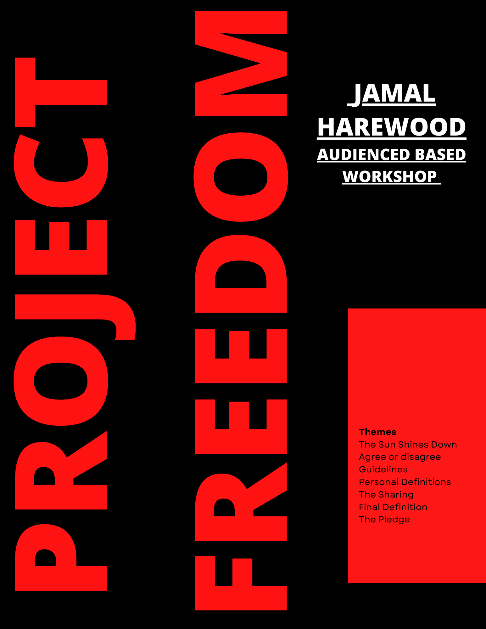
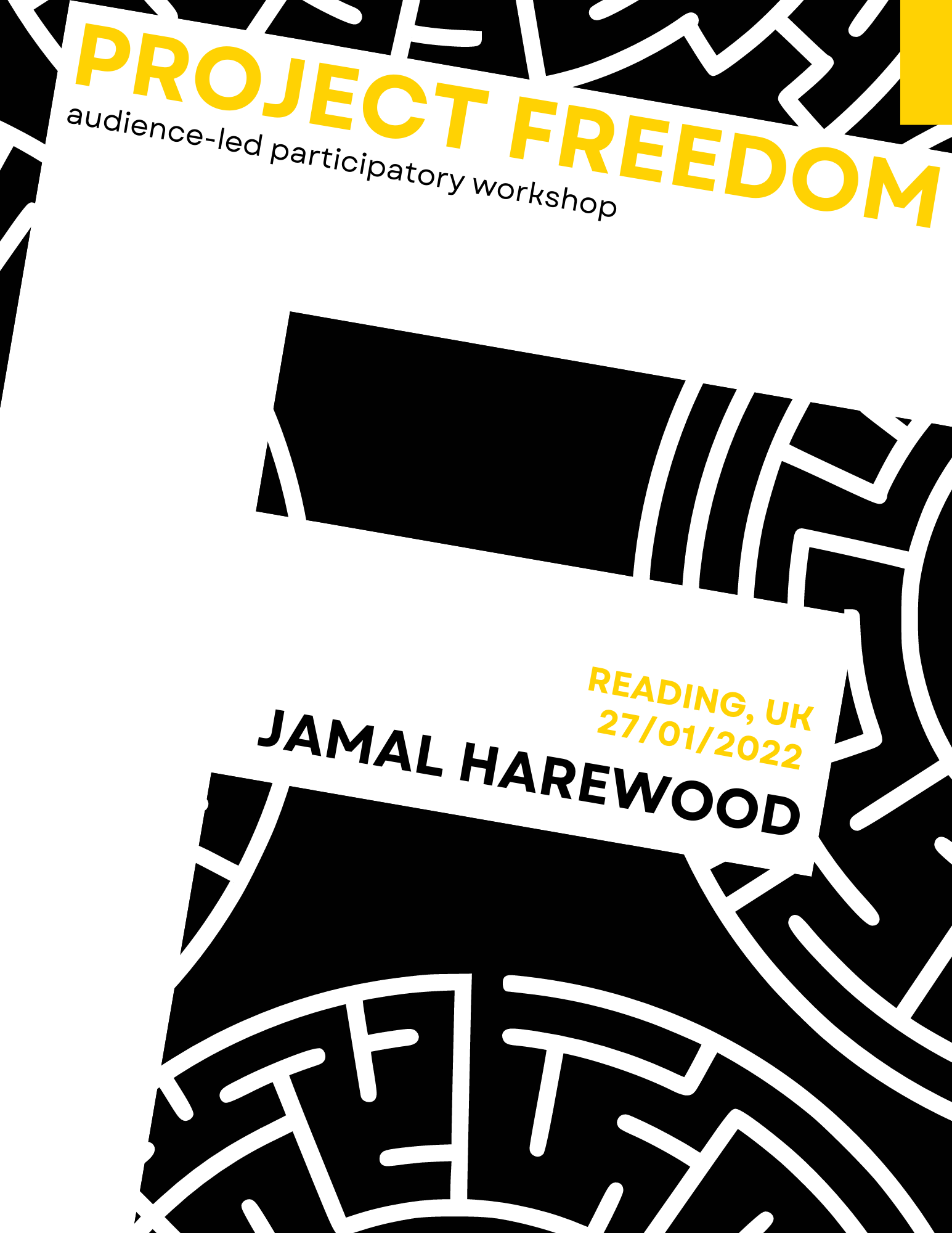
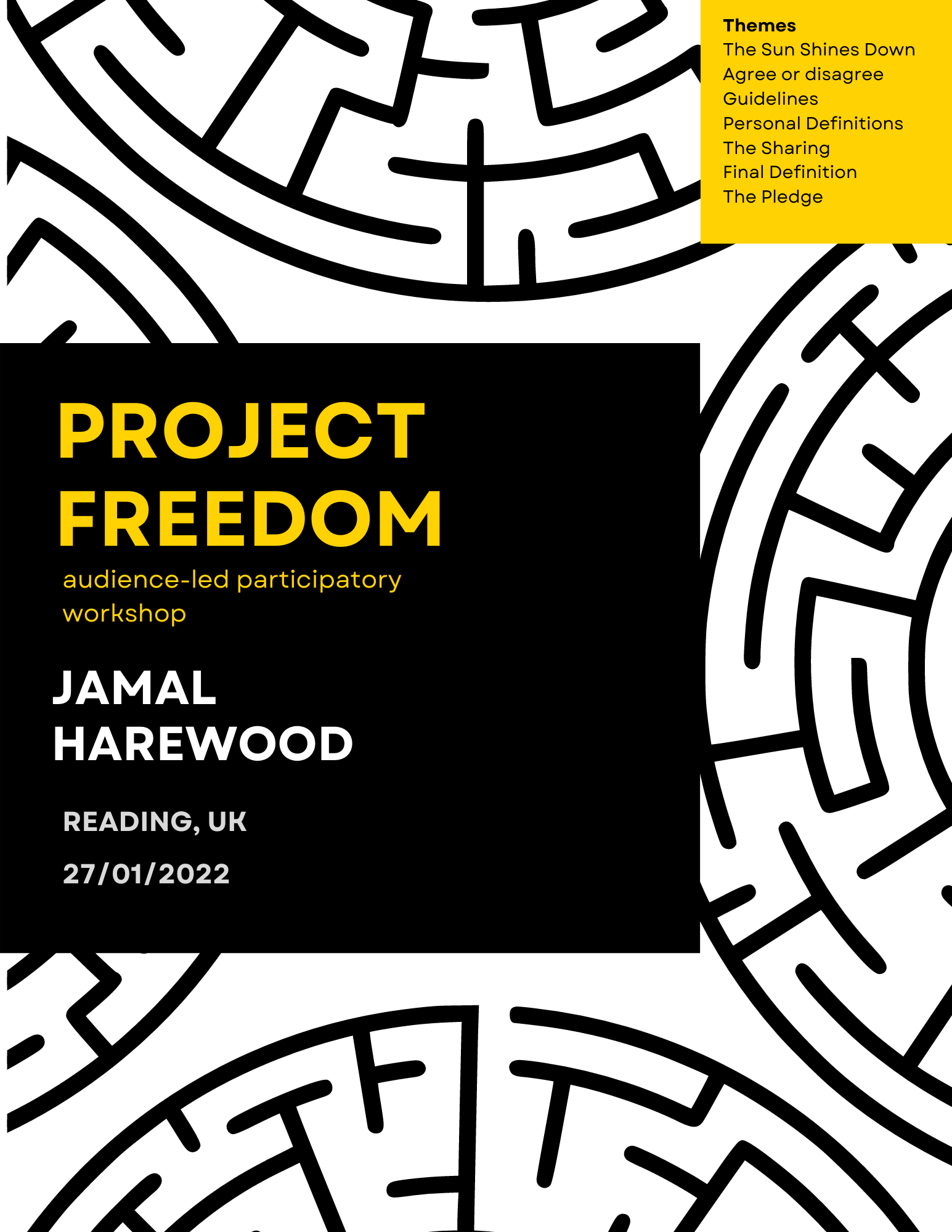
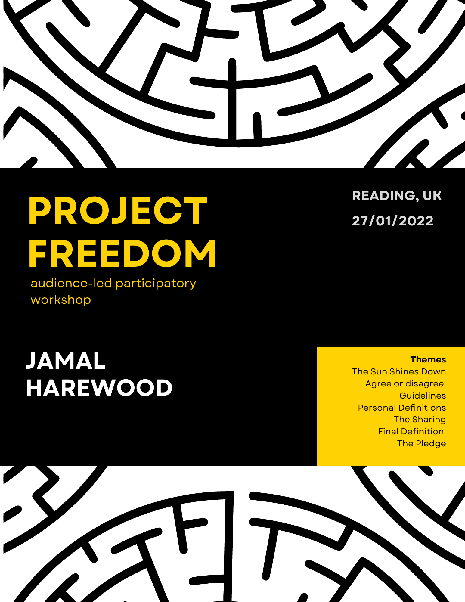
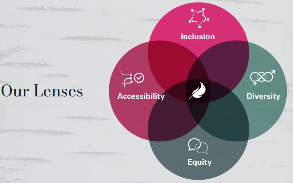
Design De Plume use four lenses that show the four main focuses when collaborating with their clients

‘When you design with inclusivity in mind, the results can be beautiful.’ – Meggan Van Harten

Conclusion

Meggan’s perspective into the importance of diversity and how designing for such unique audiences takes an approach that is usually overlooked was inspiring. This presentation taught students how to develop their work into being more inclusive with all audiences in mind.

‘Nice to hear from designers who aren’t British, hearing about different cultural perspectives on design.’ – Part 2 student 

‘Considering inclusivity throughout her presentation and design thinking for her work is an interesting perspective when it comes to designing for clients.’ – Part 2 student   

‘I valued her idea of inclusivity, the way she introduced herself in an inclusive way to help potentially non sighted people understand her appearance.’ – Part 1 student