
Background
Universal Voices is a free community choir for children aged 7-12 at the Institute of Education (IoE), run by Dr Rebecca Berkley and a volunteer student team. Singing Communities is a project funded by the UoR Communities fund. It is an inter-generational song sharing project, where the children in Universal Voices ask an elder member of their family (grandma, granddad, aunt, uncle, friend) to teach them a chant, singing game or song that they knew when they were children. Through this community, Rebecca aims to highlight the different cultural backgrounds of the students. Through the eBook, she aims to also disseminate it to the local primary schools, to allow them to teach their students and also spread multicultural values to the students. Therefore, our aim as desginers, were to create an eBook that would allow users to both learn and engage in various cultures through the joy of music.
Restated Brief
As mentioned previously, based on the client’s goals, our brief was to create an eBook that celebrated the different cultures through songs collected by the children through their family members, with both front and back covers. This meant creating an identity that was playful and innocent, to reflect the contribution of the children, but at the same time informational, to reflect the educational value of the songs. All three of these elements needed to be balanced as Rebecca had mentioned that she aimed to distribute and use the eBook as an educational material for teachers to use, therefore, we had to make sure that it would be accessible and easy to navigate and understand.
The client had also requested us to design the eBook on Canva, with them also kindly providing us with the Pro version of this website to use during the designing of the eBook. This was so that it would allow them to make changes or add more songs in the eBook in the future. This was a new challenge for both me and my partner, Zainab, as we have never used this app before for editorial design, but nonetheless, was excited to start on this, as this meant that it will allow us with new skills and experience.
Furthermore, after further discussion, we had also agreed to refine their existing logo to allow them to have better formats of the logo for their future use as well as improve the clarity and quality of the logo.
Deliverables
After the initial meeting with Rebecca, and going over multiple options, we opted for an eBook that would be interactive, where each song will contain:
- Supporting music score
- Embedded video and audio links
- Lyrics, along with phonetic pronunciation and translation (if applicable)
- Description about the origin of the song.
For the book covers, the client’s vision was to make an inclusive and interesting cover but was open to discussion with us and therefore we were given the creative freedom to work on this.
For the logos, we agreed that we will provide the client with two sets of files, containing the appropriate file format, depending on whether it would be used in printing or on screens. The formats decided were:
- EPS, PDF, and TIFF files for print use
- SVG, PNG, and JPEG files for screen use
Research
When discussing the work with the client, she had mentioned that she was inspired by Nordic Sounds, an online e-book containing ‘pedagogical collection of traditional music, dance, songs, games, rhymes and lullabies from the Nordic countries: Denmark, Faroe Islands, Finland, Greenland, Iceland, Norway and Sweden’ (taken from the description used in the website) and although the website uses illustrations to support the songs, for this project, the client had decided not to include any illustrations as all the songs are from different cultures and would have no correlation between each other.
Moodboard
To help with developing our ideas and visualising the theme we aimed to design, we also collated a series of moodboard to help with this. Each moodboard contained ideas and pictures of a singular theme and using each of them helped us during the design process.


Colour palette
The client requested that we somehow incorporate the colour palette used by the Nordic Sounds website onto the eBook and therefore we tried doing that through taking the colours from their wordmark logo in the home page. However, she wanted them in pastel tones as they believed that the colours used in the Nordic Sounds website are quite bright. The choir consisted of children who are really young so therefore she wanted pastel colours to be used to make it soft and easy to read, instead of it being distracting with the bright, bold colours. They had also asked us to use a light beige colour for the background as this was what they use for their backgrounds in presentations.

Typefaces
For typefaces, we mainly went for the theme of childness and innocence, and therefore, focused on typefaces that resembled children’s writing or overall appeared handwritten. At the same time, we tried choosing typefaces that were legible and had a range of different weights for flexibility, however this was limited, as we had to choose from the list of typefaces available at Canva only and most typefaces had limited weights or had none at all.

After going through a range of typefaces and showing it both our supervisor and our client, we decided on Children One for the headings, and Childos Arabic for the body text. The different weights within Childos Arabic allowed us to create hierarchy within the body copy and also separate the song lyrics from the translation and phonetics. As some of the songs had lyrics in its native language, we had to find typefaces similar to Childos Arabic to accommodate. The combination of Children One and Childos Arabic worked well, as Children One highlighted the childlike appearance of the book and also reflected the contents of the book with its uneven letters, and it was well balanced by Childos Arabic, a Sans Serif, with its roundedness and flaired descenders.

Kids’ drawings
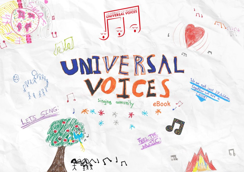
Since the children of Universal Voices were involved in the collecting and recording of the songs, we also wanted to reflect that on the eBook visually, and therefore we decided to do this on the front and back covers of the eBook. In order to do this, we paid a visit to the children during one of their rehearsals, where we got to talk to them about what they love and think about Universal Voices.


After gaining some insight from the children themselves, we had also prepared an activity for them which involved them drawing out what they had told us regarding Universal Voices. This proved to be very productive, both for us and the kids, as this kept them engaged and also allowed us to have a good collection of drawings to select from when making the covers.


Design process
Sketches
To start off, with the advice of our supervisor, we sketched out layout ideas, focusing on clear and concise layout, as the goal was to make the pages be as much easy to navigate as possible and some of the layouts, we considered were having text on one side with all the images based elements to be the other side and vice versa. We also sketched out layouts where we made use of separating the content into top and bottom halves.


Initial layout
In our initial layouts, we wireframed some quick layouts to show to our supervisor and after getting feedback on how to create better layouts, as we had initially lacked the creativity in our design ideas, we went back on track and started using colour and different combinations of typefaces to create layouts, allowing us to better understand what worked well.
Some of the layout ideas we tried out involved colour coding each section of the spread, or by blocking each section in colours, as well as having a coloured background and playing around with placements of the score sheets and the video and audio links.


Reflecting the song’s origins
To make the eBook more educational and make it engaging for the readers, we brought up to implement another way kids can learn more about the origin of the song with a more visual approach, instead of only having a written section at the bottom of each page. Therefore, we suggested to add the flag of the country that the specific song originated for. In one of our suggested layout designs, the client had really loved the idea of the pages having a coloured border, which reflected the colours of the representative flag and therefore, to keep them consistent, we added those borders onto the prelim pages of the eBook as well, but instead used a combination of two colours from the main colour palette.


Refining logo
Since the logo only required refinement, the only thing done was redrawing the main element of the logo and vectorise it in illustrator. The original logo was used as a reference to redraw and for the typeface used on the logo, Futura was used as it resembled the closed to the original. The logo was drawn in three different colours: black, white, and red, with red being the brand colour, as the children in Universal voices wear a red t-shirt while performing in events and we wanted to reflect that on their logo as well.
Covers
As previously mentioned, we wanted to reflect the kid’s contribution to the making of the eBook and decided to do so through the covers. Having collected their drawings during the visit to one of their rehearsals, all of them were scanned and using both Canva and photoshop, the covers were made. Using Canva, I added in the selected drawings and created a collage. I specifically chose drawings that reflected very clearly what Universal Voices meant to the kids, as well as using hand drawn lettering done by one of the children as the title of the eBook, to highlight the innocence and enjoyment of the children and also reflect what the eBook was about. A crumpled paper texture effect was added onto the background of the covers to once again, reflect the childish nature of the eBook.


Final product
Combining different elements from each layout idea, we made our final design where each section was colour coded, and it was specifically emphasised for the video and audio links where the colour coding stayed consistent throughout the pages and this was useful as it allowed users to know which link referred to the audio or video as some songs only contained either one of them.
It was a great success, as we managed to deliver the eBook to the client on time. we also had the opportunity to present our work on the launch day of the eBook in front of all the kids and their families.
“At the launch of the e-book in November 2023, Jaf and Zainab came and presented to the audience explaining the work that they had done. Their presentation was clear and interesting, and they both spoke very well.”
– Rebecca Berkley, Artistic Director of Universal Voices

Furthermore, the client was very impressed with our work and loved the use of borders in the book and keeping a clear layout as mentioned below:
“They communicated regularly with me presenting draught ideas for the layouts for each page and the overall design of the book. They were very good at taking my ideas and turning them into reality. I was particularly impressed at how careful they were to make sure that their rendering of my ideas matched my vision. They were always cheerful, helpful, accurate and delivered on time. They made several suggestions about the layout which also improved the content of the book. Their communications were always professional and they delivered the product to the agreed timeframes. When we had to make an adaptation to the deadlines or the content, they were always very helpful in accommodating that. The overall design of the book was delightful. They created a visual style for the book which had a primary school feel to it, using bright colours and a clear layout. They matched the borders of each page to the colours of the national flag of the language of each song, which was a lovely detail in the design.”
– Rebecca Berkley, Artistic Director of Universal Voices
Self-reflection
Having the children involved within the designing of the book was a very lovely experience, as I got to see their creativity and apply that onto my own as well, and seeing their lovely work really inspired me to work on this eBook more efficiently. Knowing that the children liked the cover of the eBook was very heart-warming to me and made my experience working on this eBook very valuable.
“Jaflenur and Zainab came and worked with the children in Universal Voices to create artwork for the front and back covers of the book. They asked the children to draw pictures and write sentences about what the choir meant to them, and then copied the children’s art work and made a collage for the front and back covers. The children really loved seeing their art work in the e-Book. It was particularly popular with the children, because every child could see their artwork in the book and it made the book very special to the children. I have found working with both of them fantastic. Their credit to their department, and a really good example of what a great programme Real Jobs is.”
– Rebecca Berkley, Artistic Director of Universal Voices