

Student-led guides to university is a collaboration of guides with Reading Student Union (RSU) containing personalised advice and guidance to underrepresented and marginalised new students. This is so all students regardless of background or circumstance can feel supported, represented, and empowered during welcome week. Each guide is written by students and designed by students. This ensures the provided insights, diverse viewpoints, and understanding of campus life is more accessible to new students as they feel like they have been understood, creating a sense of community and connection.
Brief
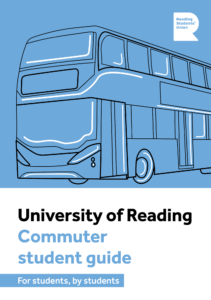
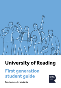
We were tasked with creating two guides: Commuter Students’ Guide to University and First-Generation Guide to University. The goal was to create a coherent visual design across the two deliverables that also had the ability to expand for future editions. The guides need to provide an engaging way to relay key tips and contact information to students. We were provided with the copy, images, QR code and RSU branding but our clients gave us to have lots of freedom with the design of the booklets.
Deliverables
- 2 print-ready, a5 multi-page guides for commuter and first-generation students
- 2 interactive PDF, a5 multi-page guides for commuter and first-generation students
Branding
In terms of aligning our design with current branding, we had a relative amount of freedom as the clients wanted to push the idea that the guide was made by students, and therefore steering the design away from the University’s branding helped us achieve this. We were directed away from using the University branding, colours, and recognisable climate stripes. However, we did have to include the Reading Student Union logo.
Audience
We identified our target audience to be new undergraduate and postgraduate students. This meant we had an advantage when designing as we were once the intended audience. We kept in mind that these guides were specifically aimed towards commuting and first-generation students, however we decided that it would be appropriate to design for all types of students so everyone could consume it easily. Understanding our audience was important in portraying an appropriate visual route so we carried out a range of document research aimed at students.
Research and ideation
When approaching this project, we decided it would be beneficial to research existing university guides. Although there were no existing ones that explicitly pushed the idea of being created by students, this process was still useful to recognise the norms of student guides, as well as highlighting areas of improvement so we could compete in the current market successfully. The main things we found out that we wanted to take forward were that coloured backgrounds are a useful tool in visually dividing sections, images can help to make the guide engaging, and icons are helpful in giving a quick overview of what is to come. We also researched varying forms of editorial design so we could understand how different layouts work for portraying different types of content.


Creative direction
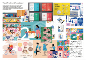
After understanding the content of the guides, the target audience and investigating some existing guides, we began creating mood boards. We discussed ideas and showed the mood boards to our clients to make sure we were heading in the right direction whilst also ensuring the clients were on board with our visual approach. From this, we learnt they were not keen on the corporate style and wanted a more fun and approachable feel with lots of bright colours. The images we were provided with by the clients gave a corporate feel which we needed to steer away from. Therefore, we decided upon an illustration route to ensure our guide would stand out and was known that it was made by students, demonstrated in the fun illustration style.
Design development
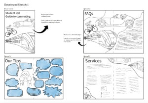
After understanding the visual route, we needed to take, we created some initial sketches for the inside pages and front covers. Our clients gave us the feedback that they wanted a more fun and approachable design.

We then moved on to develop more sketches which took a more fun and colourful approach. The ideas that were liked the most by our clients and supervisor were concept two but with the line drawing style of concept one. These designs showcase university in a fun and inviting light making new students feel welcomed and accepted by the different communities.
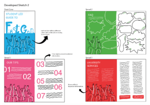
These are the further developed sketches for both the commuter and first-generation guides. We developed them further by looking into different illustration styles and deciding which ones worked best for these guides. One comment from our clients was that the green could span across the whole page so that the speech bubbles weren’t cut in half. This meant we changed our half colour approach throughout. An element that we struggled with was coming up with a way to make the university services page more exciting and less text heavy. A solution to this was to include icons as well as relevant illustrations to the different points talked about.


Colour and typography
We experimented with typography looking at clear typefaces that would work well with the style of guides. We decided on using the typeface that the university use, Effra. This typeface works as it is very legible, versatile, and most importantly is accessible with clear letterforms and balanced spacing, making it easy for all students to read.
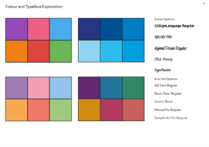
Picking the colour pallet was difficult as we wanted to have a different colour for each of the sections. We decided that a bright colour pallet worked best and found 6 colours that both contrasted and complimented each other.

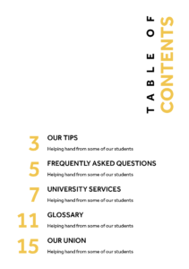
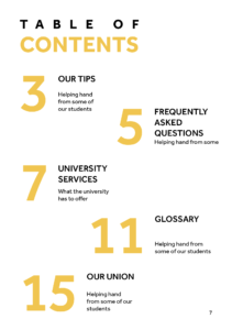
Content page
We did lots of experiments in order to come up with an interesting and easy way to use the contents page. We ended up using the colours from each of the sections to make navigating the document easier. This content page works well as it gives the reader an insight of what is to come whilst sticking to the theme of our guides.

Our tips
This section’s main goal was to clearly differentiate the five tips. Using big numbers and highlighting the topics of each tip was a successful way in doing this. Changing the colour of the text halfway through proved to be distracting and broke up the flow of reading so we removed the colour from behind the writing. We decided the short introduction provided by the clients would work better as an additional tip so we changed this, which once again enhanced the reading experience as it gave the spread a better flow. A general change we applied to the whole guide was making the section titles sentence case so they were less harsh. Another change that was made throughout was the illustration style. This developed into a more interesting style that had varying line weights and the highlights were less prominent.


Frequently asked questions
For this section we wanted to separate each question with speech bubbles. We at first kept it simple by having the question and answer inside the speech bubble. Then we were asked to include some images that related to each question. However, after showing this to our client and supervisor we decided that pictures were not appropriate in this guide as we were limited to the student union’s image bank which weren’t relevant to these guides and looked too much like stock images. To ensure we had some visual interest for each question, we continued down the illustration route, creating a relevant illustration for each question. This broke the section up nicely, gives context to each question and tied in with the theme of illustrations throughout the rest of the guide.


University services
This section brought some challenges as it included a lot of important copy which did not allow for experimental design as it needed to be quickly and easily understood by the reader. Some tools we used as a way of bringing visual interest to the pages were colour, illustrations, icons and typographic hierarchy. We created icons to represent “website”, “email” and “phone” as this emphasises the information rather than the descriptive words. Once we moved away from the half colour spreads, we drew this landscape illustration to break up the text so it did not look so heavy. We knew this orientation of illustration would work because the guides were being bound by staples so it could open out flat.


Glossary
Once again, this section is very text heavy so we had to ensure we created a design that would make it easy to read and highlight that there is loads of help available, avoiding creating an overwhelming scenario for the new students. We started off by using a rule to divide each definition, but this was deemed as too harsh. We then adapted our design to reflect a dictionary which was effective as it helped with navigation of the section, but it created too much white space and made the glossary too long. To develop it further, we stripped it back to just typography but used space and typographic differentiation to create an interesting but accessible design.


Union
The union page was a page that was introduced later in the project. We created and illustration of a band playing at the student union as well as the outside of the union building. As each guide had different amounts of copy for this section, we adjusted to this by moving the band illustration down to allow for some more room.


Cover
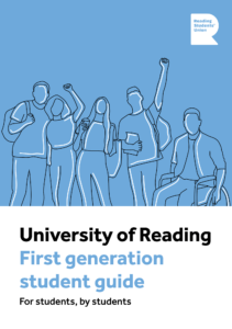
Our approach to the covers was to reflect what could be seen on the inside, illustrations and coloured pages. We went through many iterations in order to find a suitable combination of elements that sat nicely together on the page, as well as act as a tool in attracting people to pick up and read the guide. We introduced this blue colour as it is bright, fresh and positive which is a nice message to put across to new students. The illustrations had to represent the overall theme of each guide, first-generation students being relatively difficult to sum up but we decided that an image of students together and supporting each other was the appropriate message to put across.
We experimented with the placement of the blue block with the illustration on top and were advised to ensure there was a white section on the cover where the text could sit as we have kept typography on white backgrounds as a general rule. There was a stage in the process of designing the covers where we proposed the tagline of ‘for students, by students’. We thought this would be a useful way of emphasising the fact that these new students will be getting first-hand advice from current students. Our clients and supervisor were very fond of this tagline and we were suggested to create a sticker motif. However, after experimentation this did not work with our design as apart from the illustrations, we do not have any rounded graphic elements within the guides. The last major change we made was changing the text from all caps to sentence case. This made a huge difference in how approachable the guide felt as before it could have been portrayed as harsh, especially as the title was seen in a heavy weight of the typeface.
The RSU was requested to be added to the covers much later on in the project. This further solidified our choice of where to have the blue section as generally, logos are found in the top right corner of documents.
As for the back covers, we chose to reflect the design from the front cover, just with illustrations that appeared as those you were looking at the ones used on the front covers from the back.
Interactive pdf
As part of our brief, we needed to make interactive pdfs for each guide that will be hosted on the university website. To adapt our design to this function, we made buttons for the top right corners taking you back to the content, enhancing navigation throughout the document. We also made sure that all the links were clickable making it easier for our users to get the help they need.

Our own reflection
Overall, this project has taught me many things, number one being how to interact and communicate with our clients on a weekly basis. We learnt to address design challenges creatively and find solutions that met our client’s objectives. To meet our deadlines, we needed to have good time management skills sticking to our schedules. After completing this project, I feel more confident working on real briefs and look forward to working on more. – Daisy
I have learnt and improved on lots of skills throughout this project which I will be able to take forward and build on in future projects. We learnt to collaborate effectively by identifying each other’s strengths ad using them to our advantage to efficiently create these guides. This job brought about my first experience dealing with clients, but it was a very positive one as we worked well with them due to frequent contact and honesty from both clients and designers. Another skill I have had the opportunity to improve is file management and how to present work in a professional manner to the clients. We did this by creating annotated documents of our work so when we couldn’t show them a printed prototype of the guides and verbally go through the reasonings behind design decisions, the clients could understand the justification and edits we made in order to give us relevant feedback. Additionally, regarding file management, we had a shared folder that contained everything we created and needed for the project which ensured for a coherent experience when designing collaboratively. It helped that us as designers were often communicating with one another as well. One thing we could have improved on was proofreading the copy. Although we were assured that this had been done, we ultimately should have read through it thoroughly ourselves to ensure no mistakes were made. – Jasmine
The feedback we received was positive from both our clients. “We quickly built a friendly working relationship with you that enabled us all to synergise well as a team. I was very satisfied with the level of communication and the quality of the product. You were always both highly professional. Jasmine, you impressed us with your client management skills and struck a diplomatic balance between incorporating our suggestions and pushing back on them where necessary – I appreciated that. Daisy, you impressed us with your illustration and design talent, lending a unique hand-drawn style that enhanced the aesthetic and appeal of the design.”- Matt