Category: Baseline shift

Valentina D’elifippo: Information design

To wrap up Baseline Shift for 2026, we were very pleased to welcome infographic and visual data designer Valentina D’Efilippo. Working across areas within illustration, UX education and data, Valentina’s discipline is hard to fit just into a singular category. Within the session, she reflected on how she came to understand the language of data, giving it a voice and translating that into visual stories, rather than seeing data as charts or spreadsheets.


Finding a creative voice

Valentina began by explaining the challenge of defining her own practice, which many designers can also relate to. Explaining how her career has never fitted neatly into a one route. She opened up about the struggle to balance parenthood with allowing her career to develop in different directions.

One comment that predominantly stood out was describing design as her ‘superpower’, joking that she’s not saving lives but it’s the power of communication and connecting with people. This approach led her into such a varied career, having co-authored and illustrated books while also creating business intelligence tools for campaigns and apps. Despite how different these products are, they are all connected by her interest in effectively communicating information in the most meaningful way.
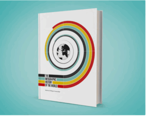
The Infographic History of the World, co-authored by Valentina D’Efilippo.


Data as a creative material

Early in the talk, Valentina interacted with the audience asking what comes to mind when they hear the word ‘data’. Replies included numbers, categories, analysis and spreadsheets which are all correct, but these were all surface level answers.

Valentina wanted the audience to shift their thinking into something beyond this. Rather than starting with datasets, she often begins with curiosity, asking questions about the world and using data as a way to uncover hidden meanings.

This idea ran throughout the session, that the aim is not about creating another infographic but about transforming information into a design that helps someone understand something they might overlook.


Poppy Field
Poppy Field, visualising data from 250 global conflicts.

One of the most recognised projects of Valentina’s is Poppy Field. This project looked into reviewing the data on 250 world conflicts that explore factors like cost, time, and location.

The main question for Valentina was how to map out this data effectively for it to be visually producing a message. Initially, Valentina experimented with various traditional mapping techniques, but quickly came to realise that presenting numbers alone wasn’t enough. The aim for her was to make people stop and think about what those numbers represented.

This led her onto the poppy, a recognised symbol of remembrance. Each poppy represents a different conflict, with the length of the stem showing its duration and the size of the flower representing the number of lives lost. What started with a collection of overwhelming statistics then suddenly got transformed into something much more human. Not only is this design showcasing the scale of how many lives were lost but how different conflicts overlapped and continued across the world.

The response from the project prompted worldwide conversations and thousands of people to explore the original data and contribute to discussions around conflict and remembrance. The work has since travelled internationally and been acquired into the permanent collection of the Museum of Ethnology in Vienna.


Designing for understanding

Valentina described one of her most challenging projects was the redesign of infographics in Britannica’s Encyclopedia Infographica, where Valentina worked to make scientific information accessible for younger readers.

Figuring out that measurements would mean so little to a child, she started replacing statistics with relatable experiences, comparisons they can picture. Small animals were compared with bananas, giant trees were measured with how many children it could take to surround the base. Translating the data into these examples shows that making information easier to understand doesn’t always mean simplicity. Sometimes it can be finding a more relatable route.
Encyclopedia Infographica, making scientific data accessible for younger audiences.


Design for change

Projects that explored wider social issues were discussed, including an immersive visualisation of how Londoners moved around the city alongside case numbers, deaths and vaccinations. Valentina’s aim within this project wasn’t just to showcase statistics, she described the project as ‘a collective memory’ for the people of London who experienced the effects of lockdowns, restrictions and vaccines.
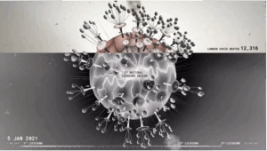
COVID-19 data visualisation mapping London’s experience throughout the pandemic

Using data to question world issues became such a strong interest for Valentina, that she continued to look into recent research of gender bias in healthcare and AI.  The interest has been built since her university thesis where gender bias was so prominent. She is now looking into inequalities with medical research and what occurs when these existing biases are used to develop new technologies for datasets.


Finding your own voice

Closing the session, Valentina encouraged students to design for understanding and empathy, rather than aesthetics. She explained that every project starts with a question, allowing research and collaboration to shape the final outcome. She also challenged the pressure to adhere to a recognisable style too early in a career, arguing that a personal voice emerges naturally through curiosity and experimentation.  Instead of asking “What should I make?”, she encouraged students to ask, “What do I want to understand?”


Advice for young designers

  • Let curiosity guide your creative process.
  • Think of data as a record of human experience rather than numbers on a page.
  • Embrace not knowing everything.


– Written and edited by Sam Buxton
James Dunford: Wayfinding design

Baseline Shift welcomed James Dunford from Applied Information Group, a studio specialising in wayfinding and information design. James is a graduate from the University of Reading (both and UG and PG level) and has been at Applied for over 16 years. In his talk, he took us through his journey since being a graduate, the projects that have shaped his career as well as the realities in a wayfinding job.


What is wayfinding?

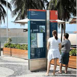
James began the talk by explaining that way finding is much more more than designing signs. Wayfinding is described as considering how people read, understand and navigate a space, using strong sensory and visual cues to make the user’s journey as clear as possible. For the audience, he broke this idea down into three crucial questions: Where am I? Where do I need to go? What happens next? The aim for a successful way finding system is for these questions to be answered without excessive thought from the user, making the most complex spaces easier to navigate.

Pedestrian wayfinding system, Rio de Janeiro.


Designing wayfinding systems?


At Applied Information Group, they engage in a wide range of projects spanning museums, airports, parks, universities and public spaces internationally. Their work travels far beyond singular signs and maps – they prioritise how one information system includes many different elements working together. All of these projects James and his team have created have succeeded from understanding how people use and move through different spaces.

One of the most interesting parts of James’ work is the scale and time it can take to complete these projects, with many projects often taking years. This being the case, all design work needs to be accessible beyond all current trends and remain clear and understandable over time. At the centre of James’s work lie many problems needing to be solved, revolving around key questions like: “where is the initial struggle in an environment?” and “how can we find the clearest way to guide people through it?”.

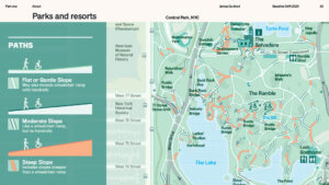
Central Park map showing accessible routes by path gradient.


Understanding human behaviour 

James explained that before designing anything, the studio considers how people move through environments and where confusion occurs. The  team have to consider where these points occur and recur, as well as factors such as language, accessibility mobility and even how someone feels within this situation. Gathering this key information starts from observing how people naturally move through a space and where hesitation is present.

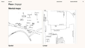
One method that was mentioned by James was mental mapping. This is technique that gets people to physically draw an environment from memory so it can raise any specific landmarks that are naturally prominent in peoples mind but also, this can showcase any areas that are harder to remember. This initial research stage its crucial to directly informing the design decisions that follow.

Applied Information Group use spatial maps to understand how people visualise their environment


Designing for accessibility and clarity

Within wayfinding systems, accessibility and inclusivity one of the two most important factors. How efficiently people can understand information stems from colour, contrast, hierarchy and placement. A clear example James gave was ‘why are tigers orange?’.  He explained that although the colour orange is bright to humans, it is not as visible to tigers’ prey, therefore in the tigers can take advantage of their adversaries’ accessibility issues . James’s message related to colour perception and how it can vary with different users, reinforcing the importance of testing the designs for different accessibility factors such as colour blindness or visibility.

James Dunford introducing Applied Information Group’s approach to designing wayfinding systems.


Museum of Fine Arts, Houston

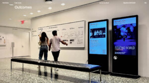
One of the main case studies James shared was the Museum of Fine Arts in Houston. Overtime the museum had expanded for new buildings, extensions and entrances making the environment very difficult to navigate. Applied Information Group were asked to rethink how visitors moved through both interior and exterior spaces, taking into consideration arrival points, floor maps and exterior signage.

A key part of this design process was the amount of testing that occurred with having the designs perform in the actual environment. The aim was to see what feedback visitors and staff were willing to give on the in person designs and what still needed improving. Interestingly, this led visitors to discover areas of the museum they hadn’t previously known existed.

Orientation map and digital information displays at the Museum of Fine Arts, Houston.


Reflections and advice

Evolving technology is known to scare upcoming young designers, so James wanted to reflect on changes within the industry and the importance of maintaining strong core design skills. ‘A good idea with a bad explanation can still fail’ is a message James wanted students to grasp when we come to presentations and communicating our design choices.

James’s talk showed that thoughtful design can improve everyday experiences in both subtle and significant ways. From museums to hospitals, wayfinding design can enhance the way people to interact with the world around them, without even realising it.


Advice for young designers

  • Stay curious and keep learning.
  • Focus on solving the problem.
  • Be open to feedback.
  • Design with accessibility in mind.
  • Be patient with the process.


– Written by Matthew Banks

– Edited by Sam Buxton
Reading Alumni: Multidisciplinary design

This week we welcomed back four Reading, Graphic Communication alumni to share their experiences of life after university, offering students insight into the many different pathways a creative career can take. From freelance branding and theatre campaigns to international consultancy work, the talks highlighted the importance of adaptability and trusting your own creative direction.


Emily Collard: 

Balancing roles

Our first speaker, Emily Collard, spoke about balancing her full-time role at Whistlejacket Studio alongside running her own freelance business, Collard Design Studio. Emily explained that her freelance career began almost accidentally after posting work online during her first year at Reading as a way to improve her Adobe skills and document her progress. This eventually led to freelance clients, brand collaborations and creative partnerships. It was an excellent reminder to pursue your interests and put yourself out there alongside your studies.

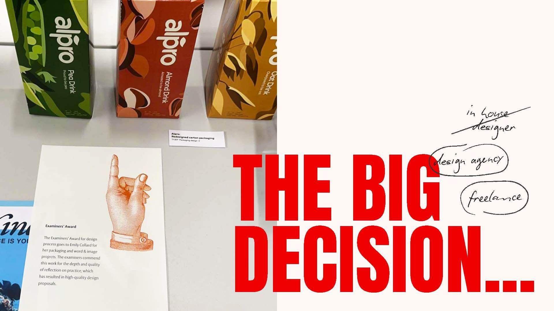
A visual representing Emily’s crossroads after the degree show deciding which path to go down and choosing both design agency and freelance.


Agency role

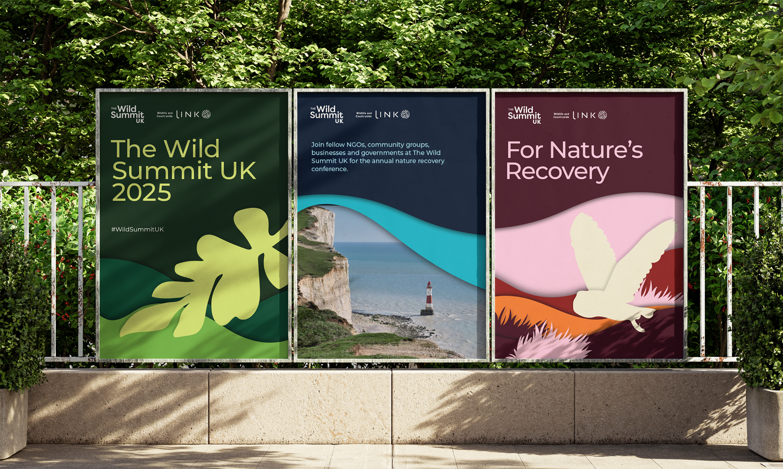
After graduating, Emily decided that in addition to continuing with her freelance journey, she also wanted the stability of agency life. Emily explained that through her role at Whistlejacket Studio, she’s able to work within a team, enjoying the collaboration and connection that comes with this. With agency work comes larger clients and companies, which can often feel more serious and corporate. Emily shared a few of her recent projects, one of which was The Wild Summit UK, an event encouraging conversation around the importance of wildlife conservation and preservation.

Emily’s work for Wild Summit UK with the agency, Whistlejacket Studio


Freelance role

Through the freelance side of her career, Emily explained that smaller businesses often come to her for design work that allows her to experiment more creatively. With freelancing also comes the back-end side of design, including client communication and creating design briefs. Freelancing has also allowed Emily to explore areas of design less present in her agency role, such as packaging design, which she worked on while rebranding Glofre Skin’s identity and product packaging.

Emily’s work for Glofre Skin while working as a freelancer under Collard Design Studio.


Matt Perks

Freelance opportunities

Next, we welcomed Matt Perks, who shared his journey from university projects and freelance work into the world of theatre and entertainment campaigns. Matt made the most of his time at Reading by taking on freelance work alongside his studies, eventually attracting American clients and balancing university work during the day with freelance projects in the evenings.

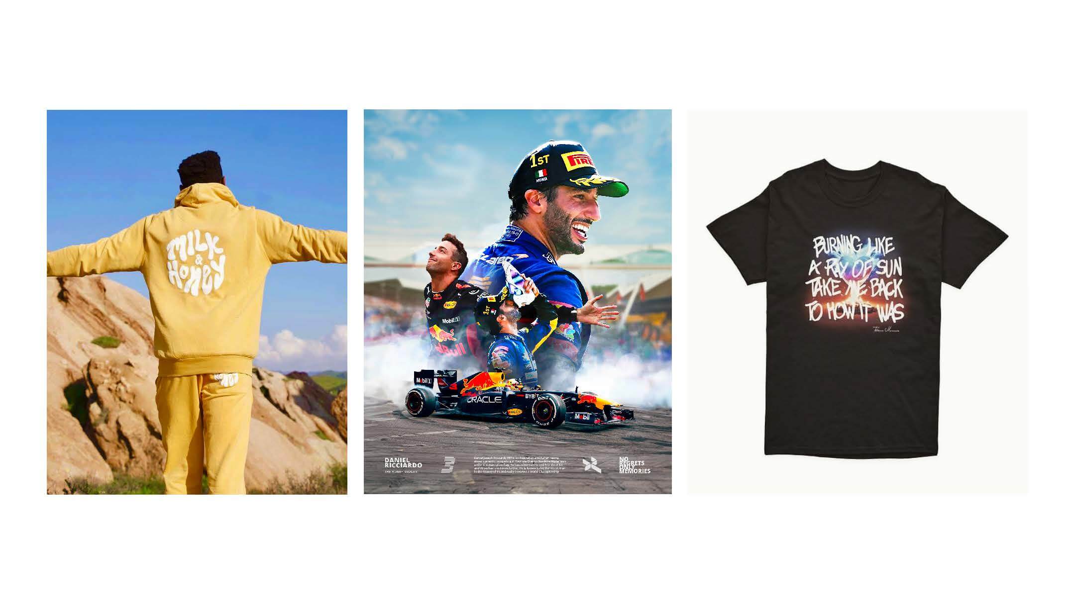
Example work from some of Matt’s freelance opportunities alongside his final year studies


Enjoying the process

After applying for Sky Creative’s year-long graduate scheme, Matt began to expect rejection due to the lengthy process and huge number of applicants. However, by relaxing into the experience and enjoying the process, he ultimately secured the role out of more than 400 applicants. Working across several teams, Matt spent much of his time creating campaign concepts for crime documentaries, developing and pitching ideas to Directors and Marketing teams before deciding he wanted to pursue a more creatively demanding environment.

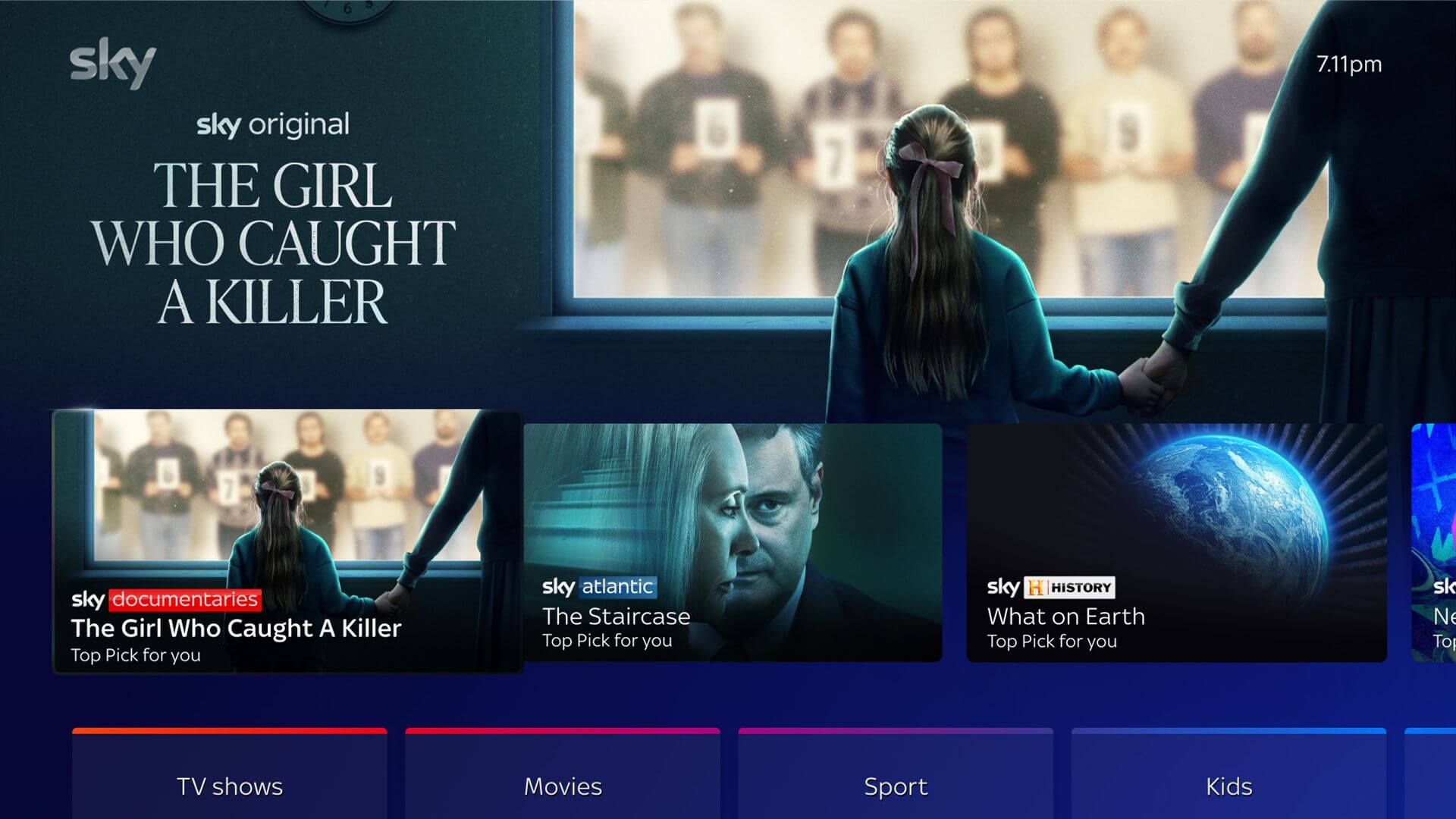
Matt’s work on Key Art campaign concepts for crime documentaries


Shifting paths

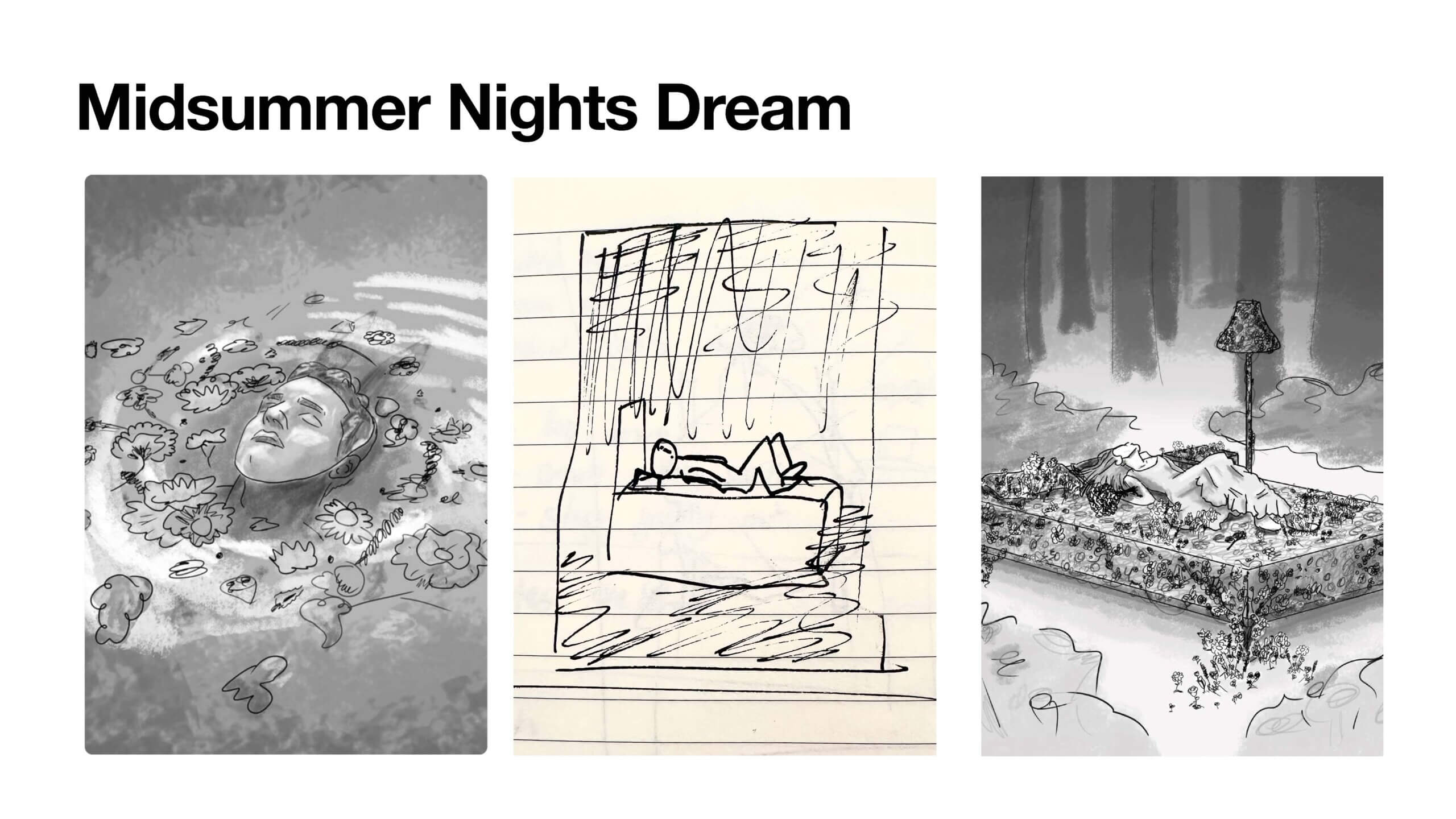
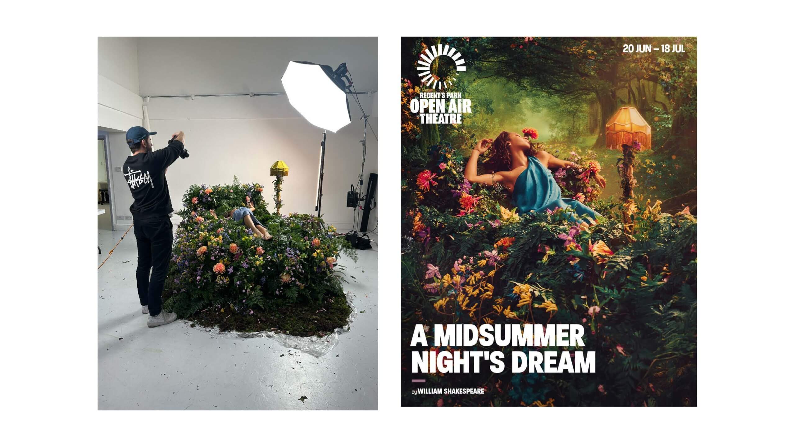
Inspired by the theatre posters he regularly saw across the Underground, Matt pursued an opportunity at Feast Creative, where he now works on campaigns for theatre and live entertainment. Walking students through projects such as A Midsummer Night’s Dream, Matt explained the journey from initial sketch to final artwork, highlighting how much he enjoys being deeply involved in the creative process and constantly learning new skills. It was refreshing for students to hear that when Matt expressed a skill gap in sketching, Feast supported him by funding a concept sketching short course.

Initial concept sketches for a theatre poster for Midsummer Night’s Dream
Final shoot and theatre poster for Midsummer Night’s Dream


Claire Hodgson

Exploring roles

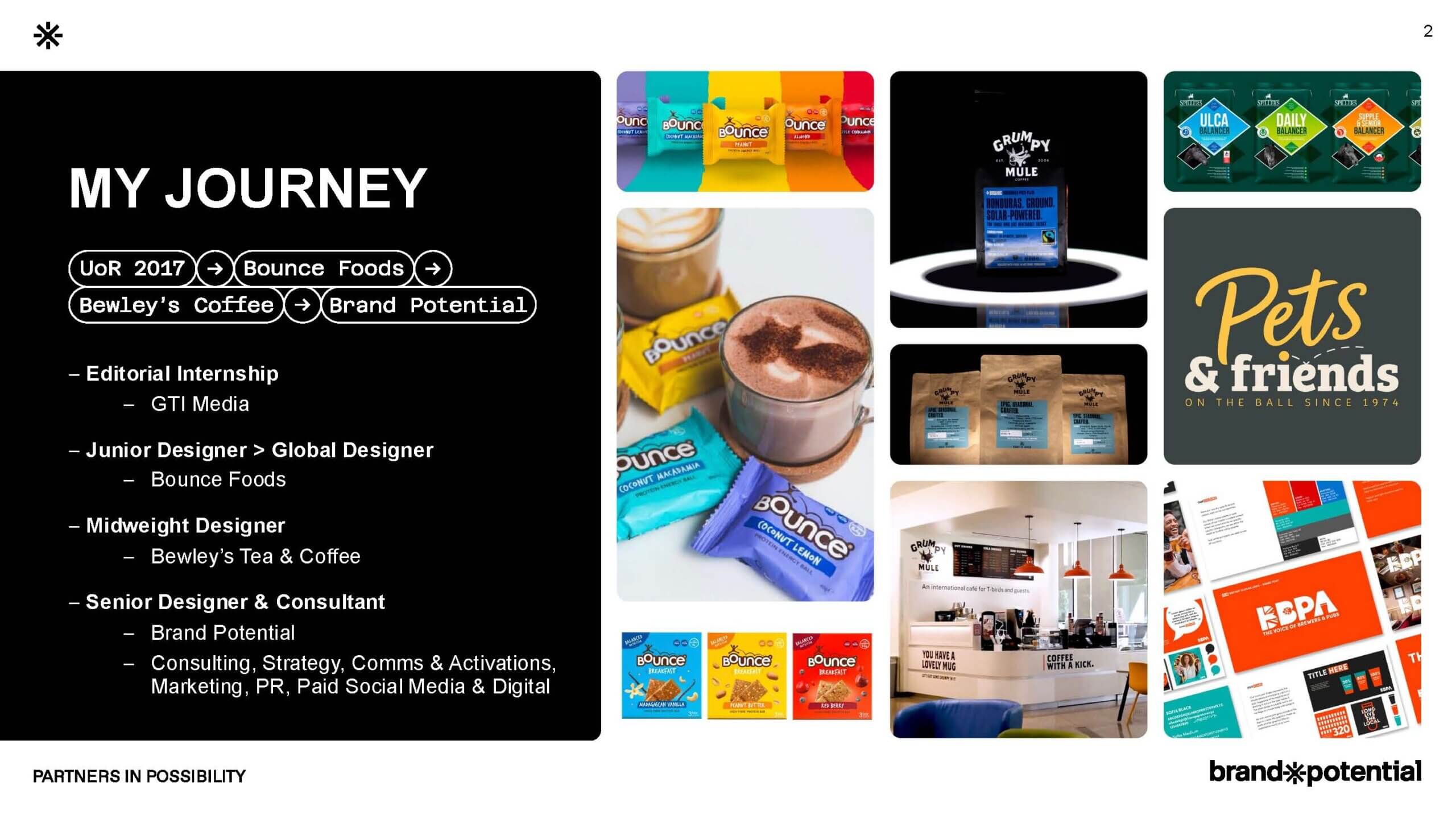
Our third speaker, Claire Hodgson, shared insights into working across both in-house and agency branding roles before becoming Senior Brand Designer and Consultant at Brand Potential. After graduating from Reading, Claire believed she would move into editorial design. However, after completing an internship in this area, she quickly realised this was not the path for her. Instead, she landed a role as a junior designer at Bounce Foods, working across packaging, events and campaigns. Claire valued her time there, learning “how to communicate on a magnitude of levels, not just visually”. After progressing into an in-house midweight designer role at Bewley’s Tea & Coffee, where she worked across packaging and environmental design, Claire eventually moved into her current position at Brand Potential. Here, she not only designs for brands but also supports them through strategy consultation and identity building.

Claire’s slide on her career path, detailing her journey from internship, to in-house roles, to her current agency role


In-house vs. agency

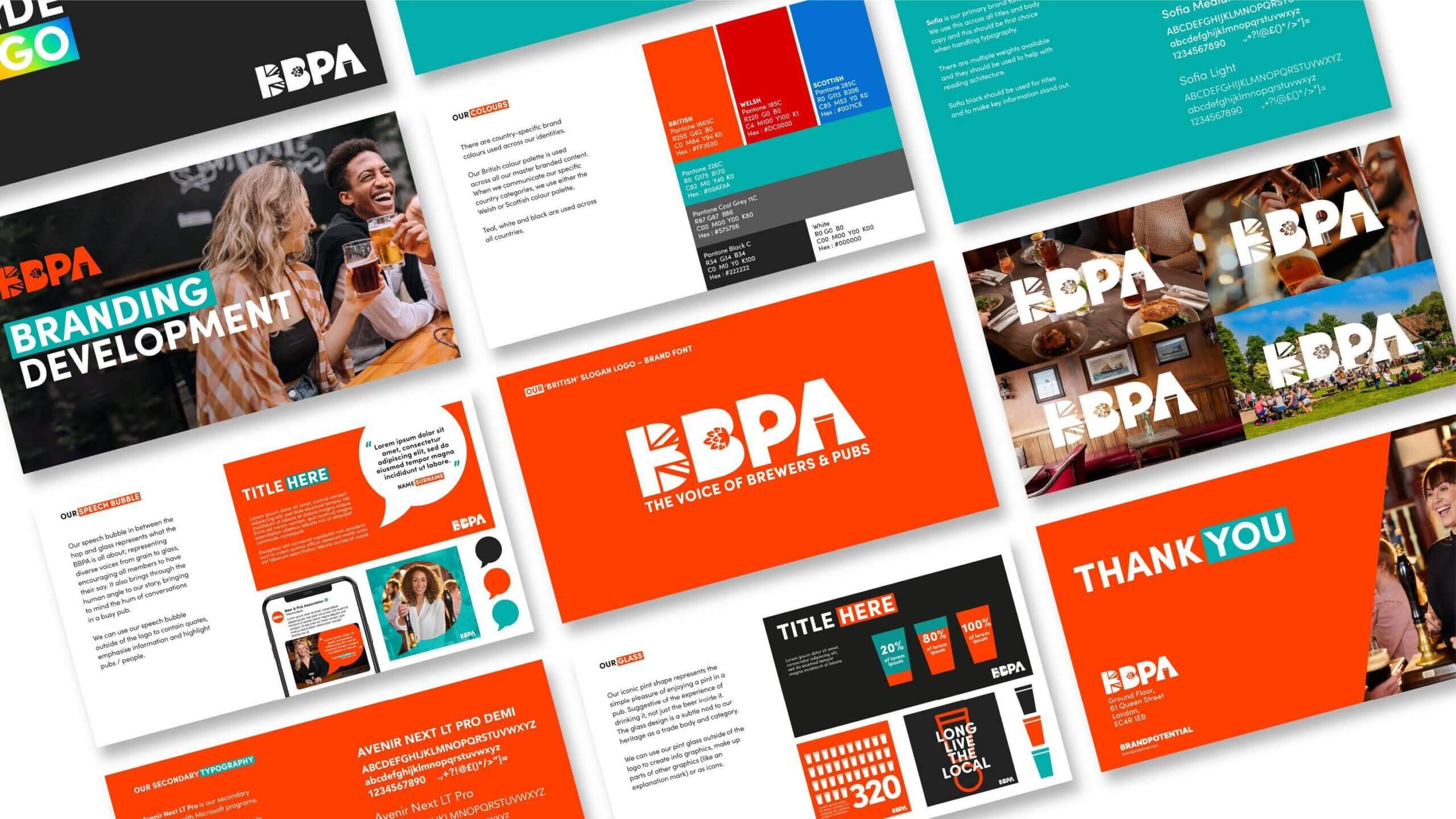
Claire compared in-house and agency roles, explaining that neither is ‘better’ than the other, but simply different. In-house roles often see designers become “brand guardians”, working deeply within a single brand and understanding how its departments, touchpoints and audiences operate together. Agency work, on the other hand, involves becoming familiar with a wide variety of industries, setting brand rules and systems while handing over some of the wider responsibilities that may fall to in-house teams.

Claire’s work on BBPA while in her agency position at Brand Potential


Branding both clients and yourself

Students were also shown several projects Claire has worked on during her time at Brand Potential, including developing a sub-brand for OGX and creating a new range of hair care products. Alongside speaking about branding for clients, Claire also encouraged students to think about branding themselves by learning how to position themselves professionally, understanding “why you design”, and recognising the value of their own skills and creative identity.

Claire’s work on BBPA while in her agency position at Brand Potential


Hanorah Murphy

Graduate scheme

Finally, we were joined by Hanorah Murphy, who spoke about her experience within Sky’s Creative graduate scheme and the transition from university into the professional world. Similarly to Matt, Hanorah secured a place on Sky’s graduate scheme during her final year at Reading. However, her pathway evolved over time, moving from the graduate scheme into a six-month contract as an eCommerce Designer within NOW, where she worked on redesigning the platform, before progressing into her current role as a Digital Designer within NOW customer service. Hanorah reassured students that careers are rarely linear, sharing that she applied for more than 100 roles at various stages of her journey so far.

Hanorah’s work with Sky Sports during her time at the Sky Creative Graduate scheme


Beyond the role

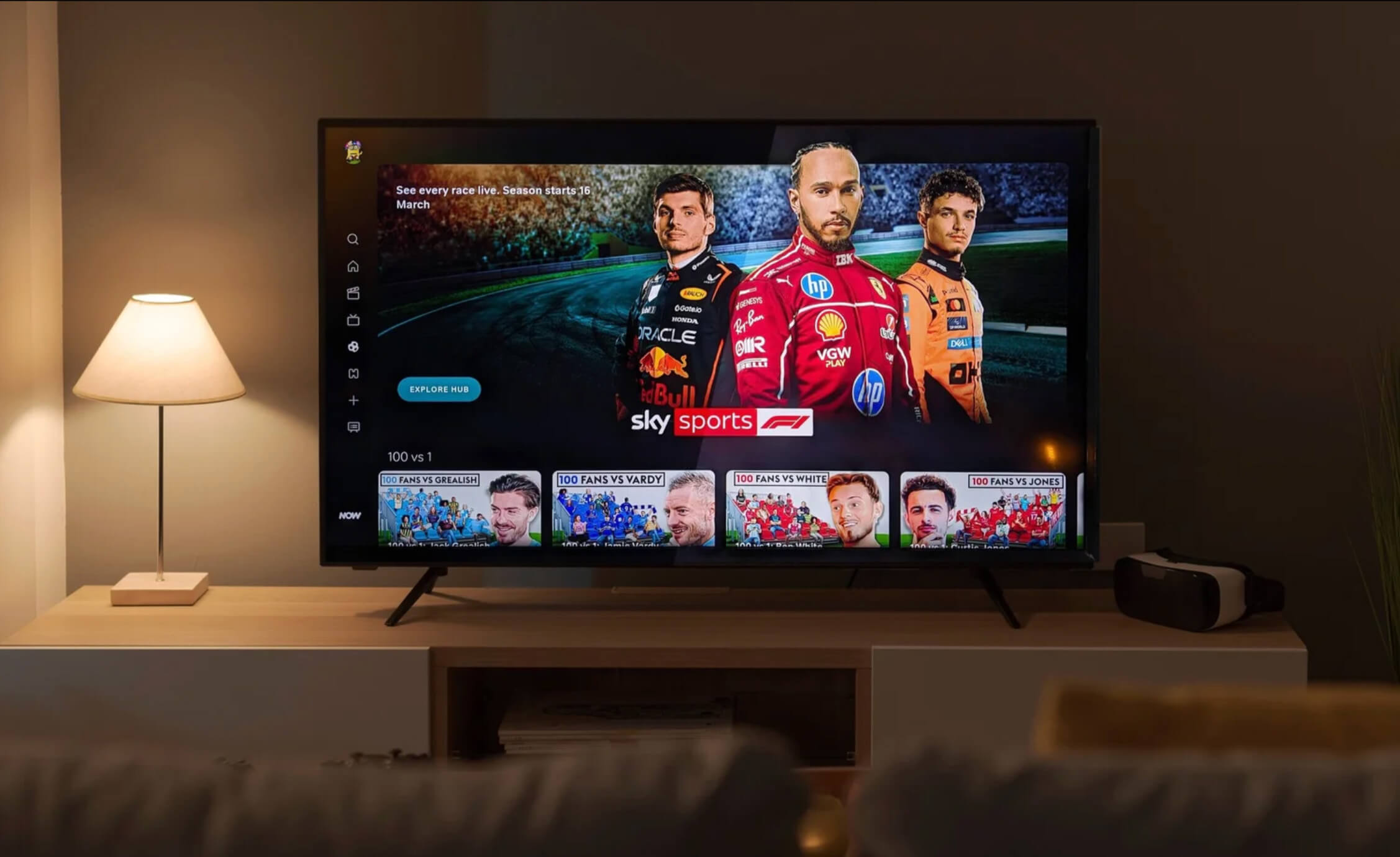
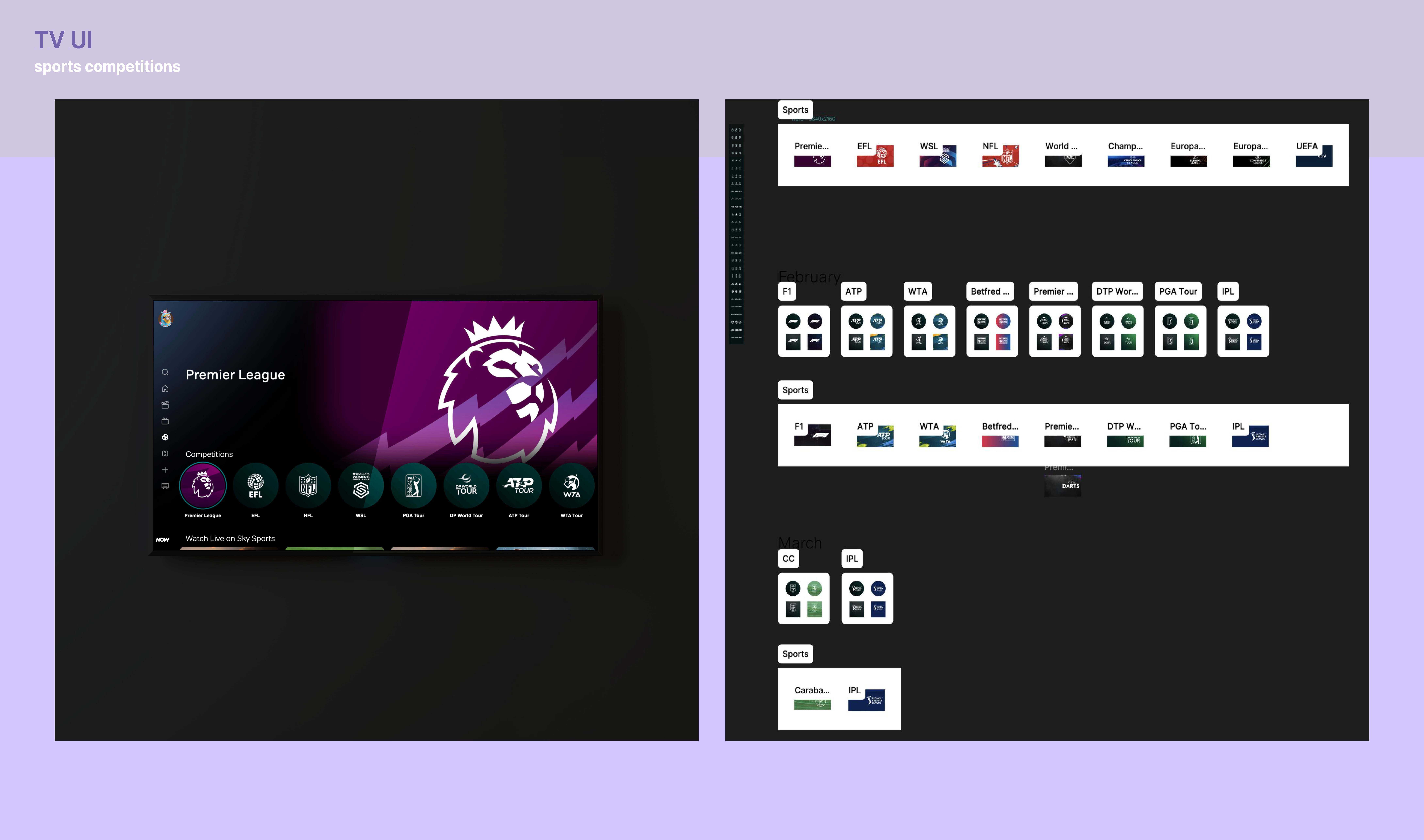
Hanorah also shared advice on securing graduate roles, encouraging students to prepare their CVs and portfolios early, make use of networking opportunities, and explore platforms such as Creative Access. During her time at Sky, she was able to rotate across departments by actively reaching out and exploring areas that interested her most. Students were also shown examples of her work redesigning elements of NOW’s streaming platform, where she discussed designing at scale and how the structure of Figma files can directly impact the final user interface. Hanorah rounded off her talk by reflecting on the work culture at Sky, highlighting the importance of the people you work alongside and the experiences you gain beyond the design work itself.

Hanorah’s slide displaying the finished UI of a NOW interface on the left, and the Figma design system on the right


Advice for young designers

  • Passion projects are valuable. Self-initiated work can help you develop your creative style, experiment freely, and even shape your future career direction.
  • Agency and freelance work offer very different experiences, and balancing both can help you grow creatively and professionally.
  • Don’t be afraid to enjoy the process. Matt explained that letting go of the pressure during interviews actually helped him perform better and be himself.
  • Creative careers rarely follow a straight path, and staying open to opportunities can lead to unexpected and rewarding roles.
  • Neither agency nor in-house roles are “better”, both offer different experiences and valuable opportunities for growth.
  • Learn how to position yourself professionally by understanding your strengths, your values, and importantly, “why you design”.
  • Start earlier than you think! Especially when it comes to grad schemes. A lot of them close before you’ve even finished university.
  • Progress isn’t always linear. A contract or a sideways move can actually be a bridge, not a setback. Don’t feel like you can’t apply for a role just because you don’t tick every box


Written and edited by Tommy Molnar

Paul Barnes: Type design

This week’s Baseline Shift session welcomed type designer and Commercial Type co-founder Paul Barnes back to the University of Reading, more than three decades after graduating from the course himself. Paul reflected on his path from studying hand lettering and letterpress printing at Reading to becoming one of the most influential contemporary type designers working today, creating typeface identities for major clients including The Guardian, Givenchy, The National Trust, Rapha and the V&A.


Early influences

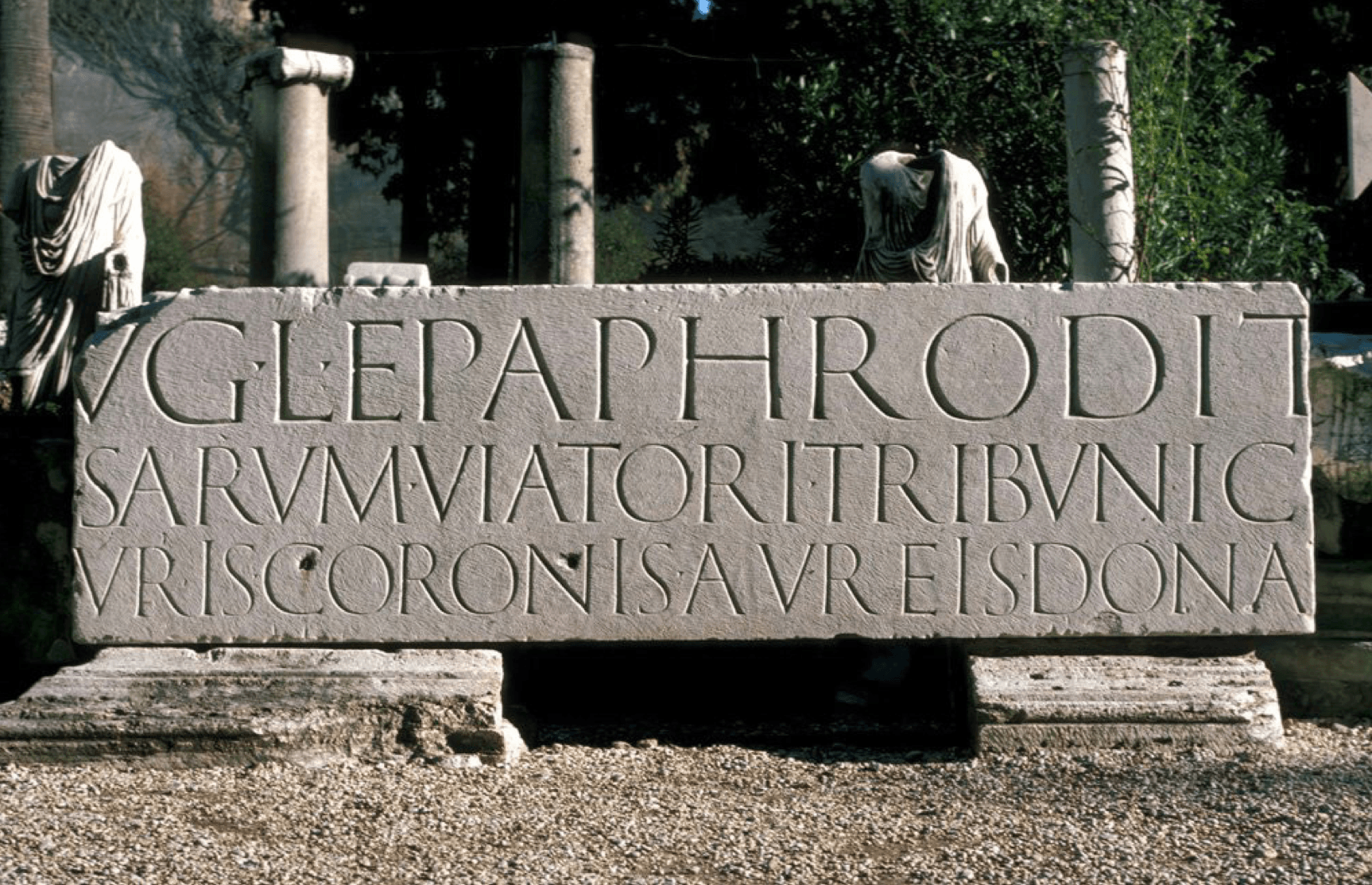
Paul’s love for typography stemmed from physically constructing layouts and lettering by hand back before digital workflows became standard. Studying at Reading, much of the course consisted of letterpress printing and creating artwork manually which Paul describes as being something he enjoyed thoroughly, explaining how there is real precision involved in these production techniques that can feel quite lost within workflows today. Lectures by Michael Twyman on the history of typography and trips to study the classical inscriptions in Rome were just a handful of memories Paul reflects on that continue to shape his work today.

Classical inscription from one of Paul's student trips to Rome
Classical inscription from one of Paul’s student trips to Rome


Typographic systems

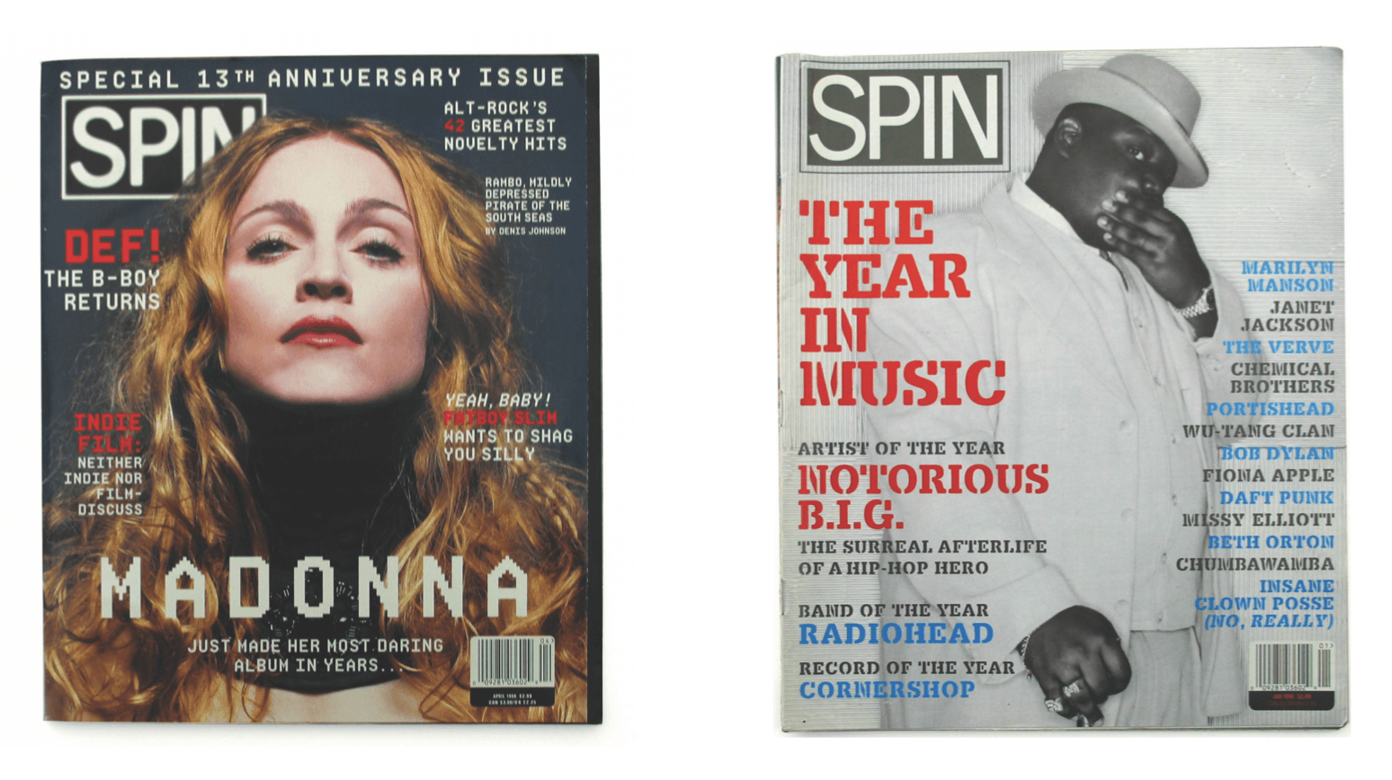
As a graduate, Paul started in the editorial and magazine design sector at a company called Spin that he later became the art director of. The constant cycle of experimentation with text, layout, image every month was an exciting environment for him to be in. However, within magazine design, the typographic systems were the main area that interested him rather than the overall art direction. Experimentation with software such as Fontographer, allowed him to create personalised headlines and adapt existing typefaces, developing an interest in consistency and structure within typography.

Example issues of Spin magazine that Paul worked on


Creation of Commercial Type

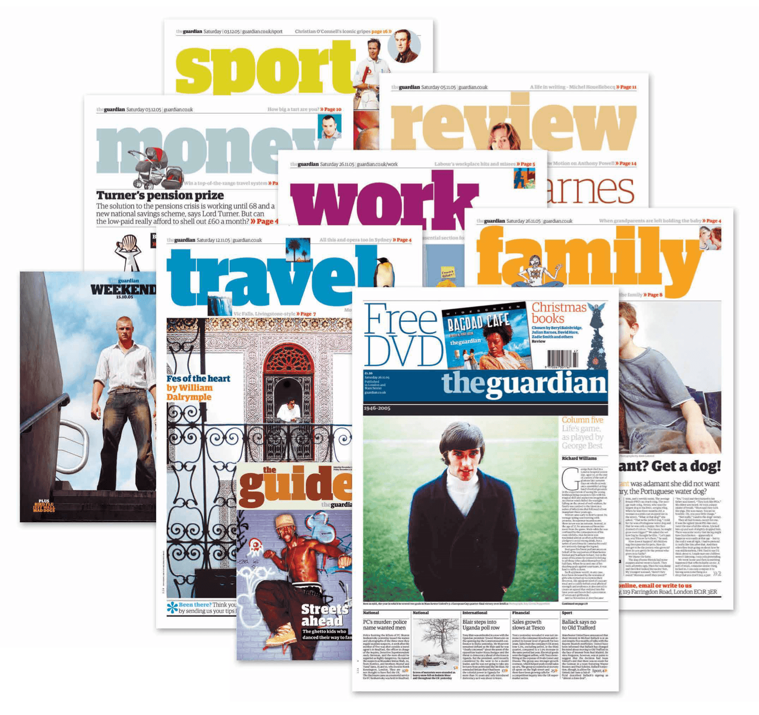
One of Paul’s earliest defining moments was his work on The Guardian redesign in the early 2000s. Working with Christian Schwartz, together they developed the typeface Guardian Egyptian, a custom slab serif family created during the newspaper’s transition to the Berliner format. The typeface gave a distinctive visual identity that showcases the move from fine serif styles and bold headline typography that remains so recognisable today.

Upon completing the project, both Paul and Christian knew that ownership of the typeface would return to them after the Guardian’s exclusivity period ended. So instead of keeping it as a one-off commission, they decided to treat this as a starting point for creating Commercial Type. The aim in creating their own company was to balance both commissioned projects with a growing retail library of typefaces, allowing the pair to work across commercial branding systems and more experimental typographic projects.

Paul and Christian Schwarz's typeface used in the redesign of The Guardian
Paul and Christian Schwarz’s typeface used in the redesign of The Guardian


Historical typography

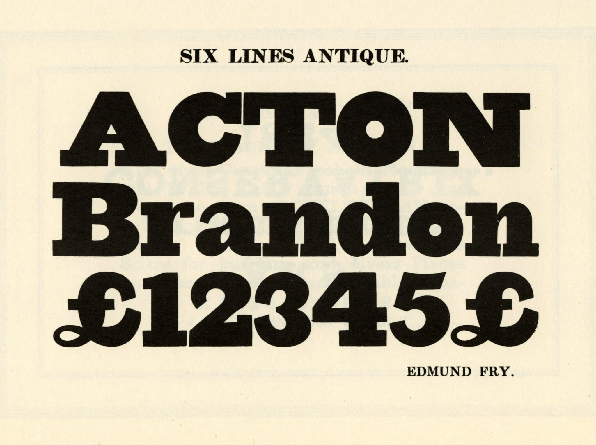
Throughout the talk, Paul kept coming back to the fascination of nineteenth-century typography that included old playbills, specimen books and printing archives which was the first moment where typography started to become expressive with weights and size as the printing techniques evolved. Commercial Classics was an element Paul spoke about, a section that focused on reviving the forgotten nineteenth-century typefaces that disappeared over time. Paul’s intention with these forgotten typefaces is not to reproduce the historical forms, but to create a balance between research and interpretation, starting from incomplete alphabets or collections found in archives like the St Bride Library in London.

Example specimen of nineteenth-century typeface used as inspiration for a contemporary remake – Fry Six Line Antique, as shown Specimen of Modern Types, 1828, Facsimile


Variable fonts and The V&A

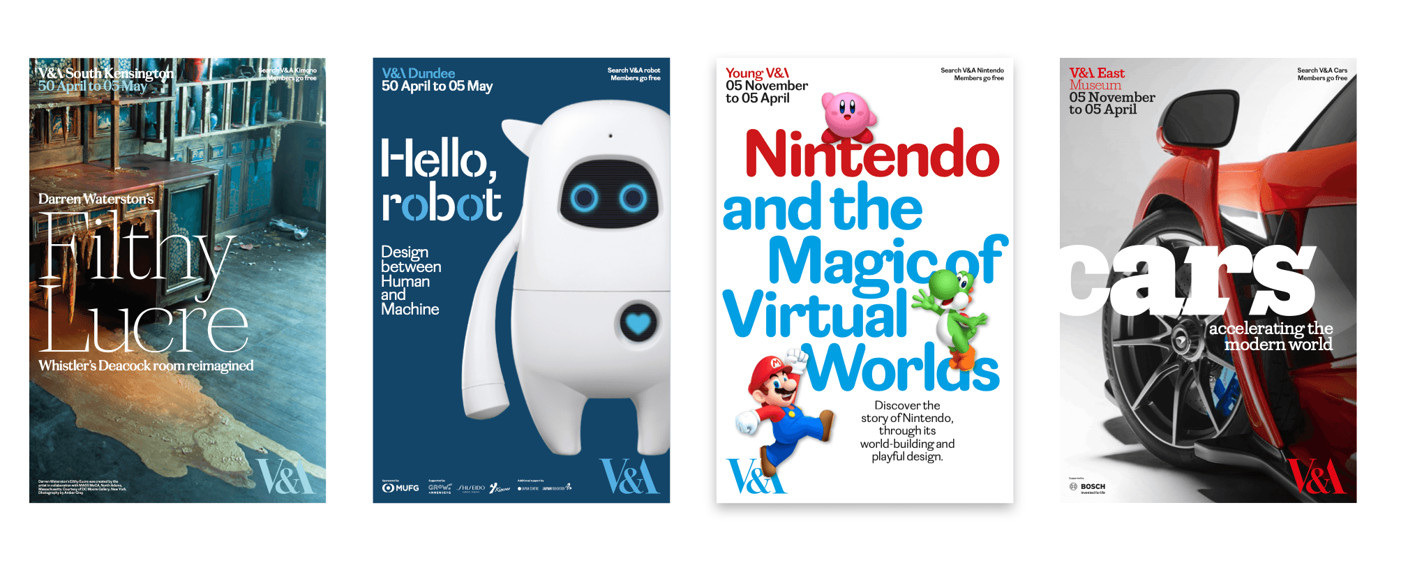
During the pandemic, Paul was asked to lead the redevelopment of the V&A’s typographic identity, prompting him to explore variable fonts and how they could create consistency across the museum’s network of locations. The typeface Spiller was created as a system featuring variations of the same typographic structure to represent each venue. Designed with variable widths and contrast options, Spiller was able to adapt across applications such as signage, advertising, and gallery interpretation while maintaining a consistent identity. Paul’s aim was to combine contemporary digital technology with historical references, creating a nineteenth-century typeface while keeping the form appropriate for readability in exhibition spaces.

Commercial Type's variable typeface pitched for the rebrand of The V&A
Commercial Type’s variable typeface pitched for the rebrand of The V&A


Designing for cycling culture

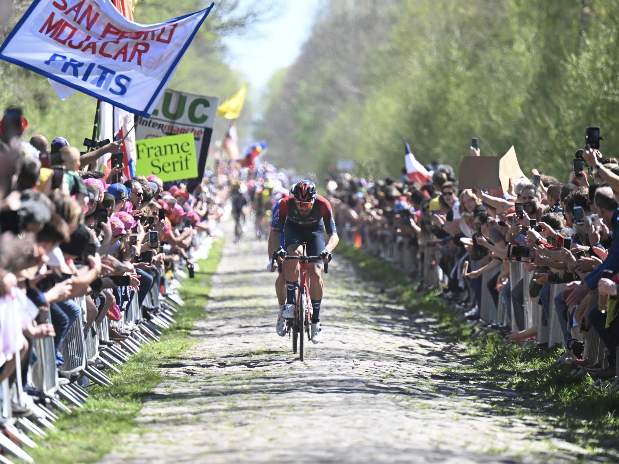
Another branding project Paul worked on was for Rapha, the high-fashion cycling brand. He was initially brought in to simplify the typography across the company’s visual identity. Due to licensing issues with existing typefaces, a new custom typeface called Frame was developed. Based on historical Caslon features, Frame incorporated a larger x-height and sharper detailing to improve readability across the brand’s platforms. Paul explained how even small typographic adjustments can significantly affect how a typeface performs across digital layouts.

The project later expanded into a wider promotional campaign, with large-scale signage used to promote the new typefaces around major cycling races across Europe. Reflecting on the campaign, Paul joked that “you need to promote the promotion”, highlighting how typography within branding systems must also function effectively in public spaces.

Commercial Type advertising typefaces at cycling events


Jan Tschichold exhibition

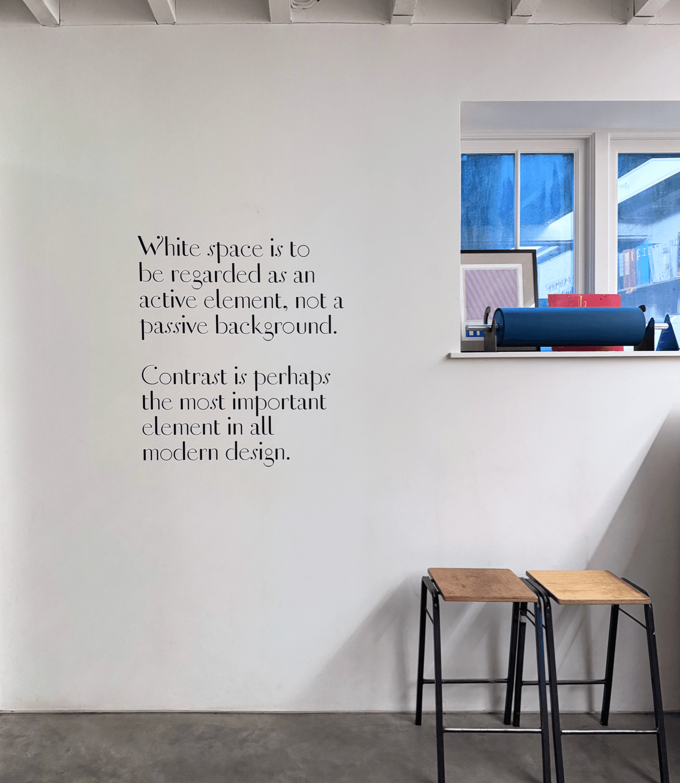
Towards the end of the session, Paul described how, while studying at Reading, he became fascinated by Jan Tschichold’s approach to lettering, layout, and clarity. Over time, he built up an extensive personal collection of Tschichold’s publications. This interest later developed into an exhibition created with fellow Reading graduate Fraser Muggeridge, showcasing Tschichold’s typography and archival material. For the project, they digitised historical lettering and recreated posters using traditional letterpress techniques. Many of Tschichold’s unfinished designs and typographic experiments had never been fully developed, so Paul used this opportunity to extend and reinterpret the work using contemporary technology.

Jan Tschichold exhibition hosted by Paul and Fraser Muggeridge


Advice for young designers

  • Continue to explore different areas of design rather than specialising too early
  • Build relationships and stay connected with people throughout your career as opportunities often develop over time
  • Focus on consistency and attention to detail
  • Be open to different ways of working and continue adapting as technology and design industries evolve


– Written by Sam Buxton
– Edited by Tommy Molnar

Sammy Rudkin: Motion design

Sharing his journey this week was the incredible Sammy Rudkin, Graphic Designer for the internationally successful content creation group, Sidemen. Sammy delivered an inspiring talk on his impressive career journey so far, speaking honestly about what to expect from the industry, being transparent about income at every stage of his career, and offering valuable advice on how to stand out as a designer.


An early start

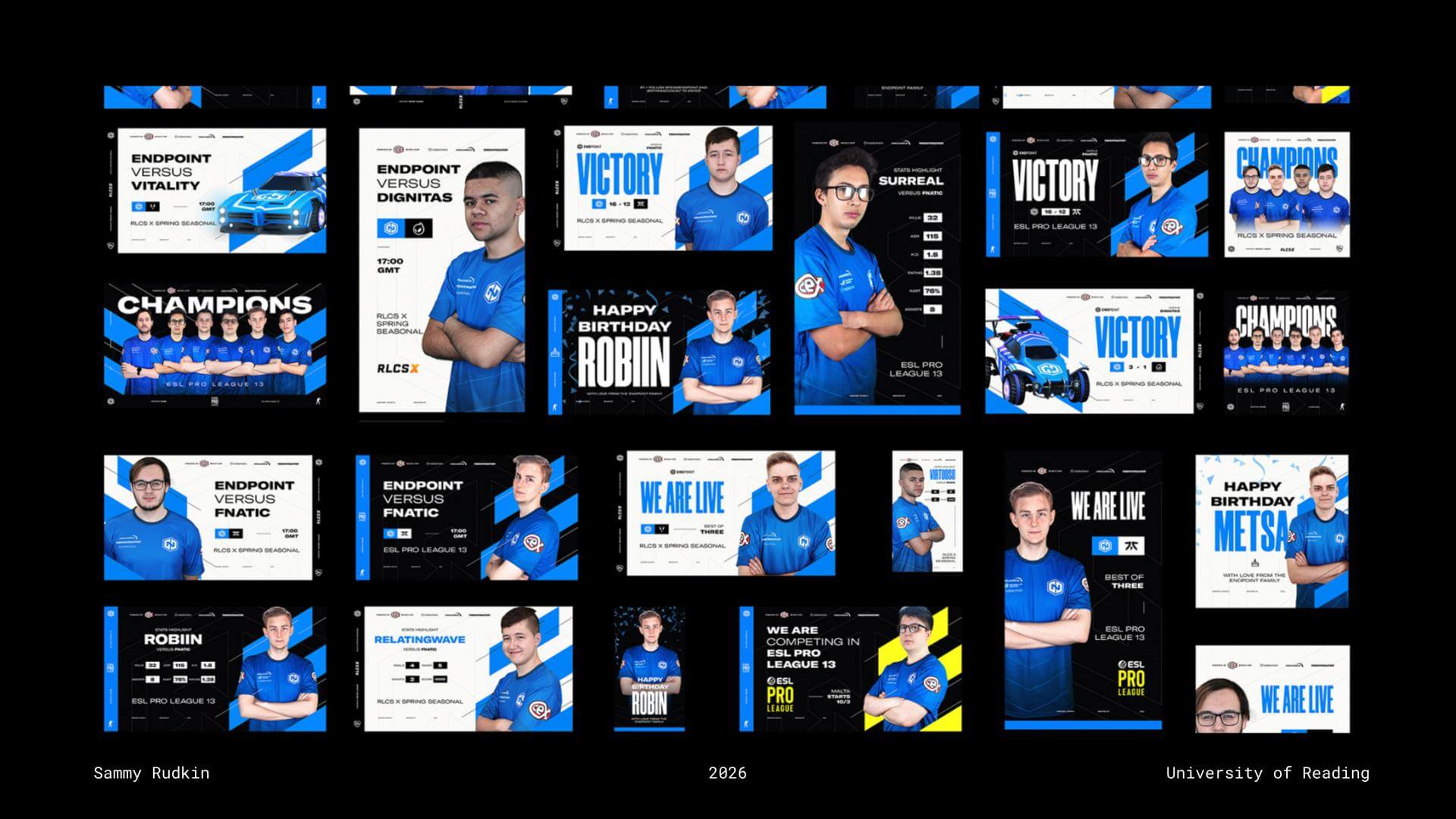
Sammy’s interest in design began at an early age. From as young as ten years old, he developed many of his practical skills through YouTube tutorials, perhaps why he now believes that “YouTube is the best website in the world.” Experimenting with small VFX and motion graphics for YouTube intros helped Sammy continually refine his software skills. At 15, he offered to create a graphic for a colleague at his part-time job in a local pub, who later went on to establish an esports team. That opportunity snowballed into Sammy becoming involved in much of the early design work for competitive esports organisation Endpoint. Sammy used this stage of his journey to remind students to “just make stuff all the time,” explaining that you never know where personal projects and experimentation may lead.

Sammy's work for competitive esports organisation Endpoint
Sammy’s work for competitive esports organisation Endpoint


Side hustles

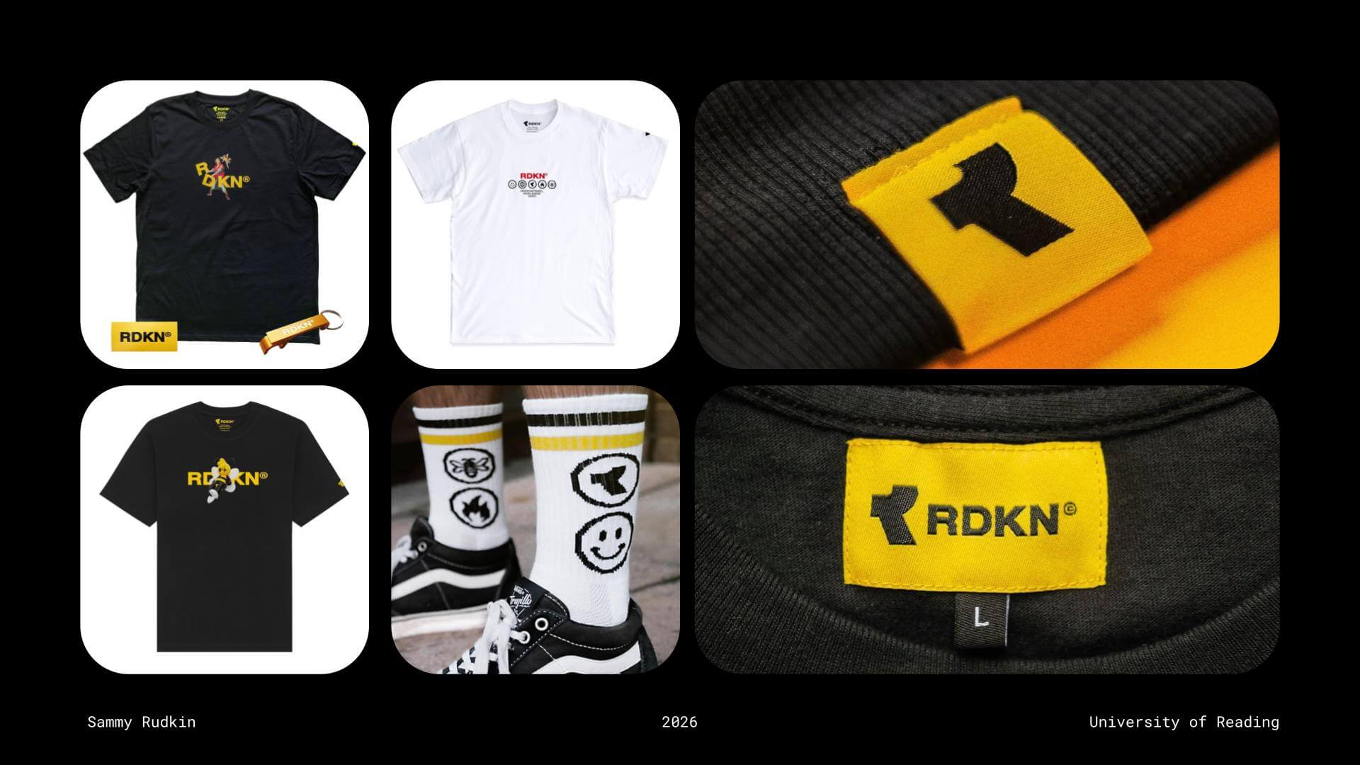
Alongside his graphic design work for Endpoint, Sammy also advocated for taking on side hustles. His side project of choice was launching his own clothing brand, which he sold within his personal circle and generated impressive revenue from at just 16 years old. A few years later, Sammy began studying Graphic Communication and Illustration at Loughborough University. When Covid forced teaching online during the first two years of his degree, Sammy found himself completing coursework ahead of deadlines, leaving him with valuable free time to further develop his software skills. During this period, his focus shifted towards 3D software, beginning with Cinema 4D. Reflecting on this time, Sammy reminded students that “Uni is the only time where you’ll have three years to just learn stuff, so make the most of that time.”

Sammy's own clothing brand, RDKN
Sammy’s own clothing brand, RDKN


Having something to show

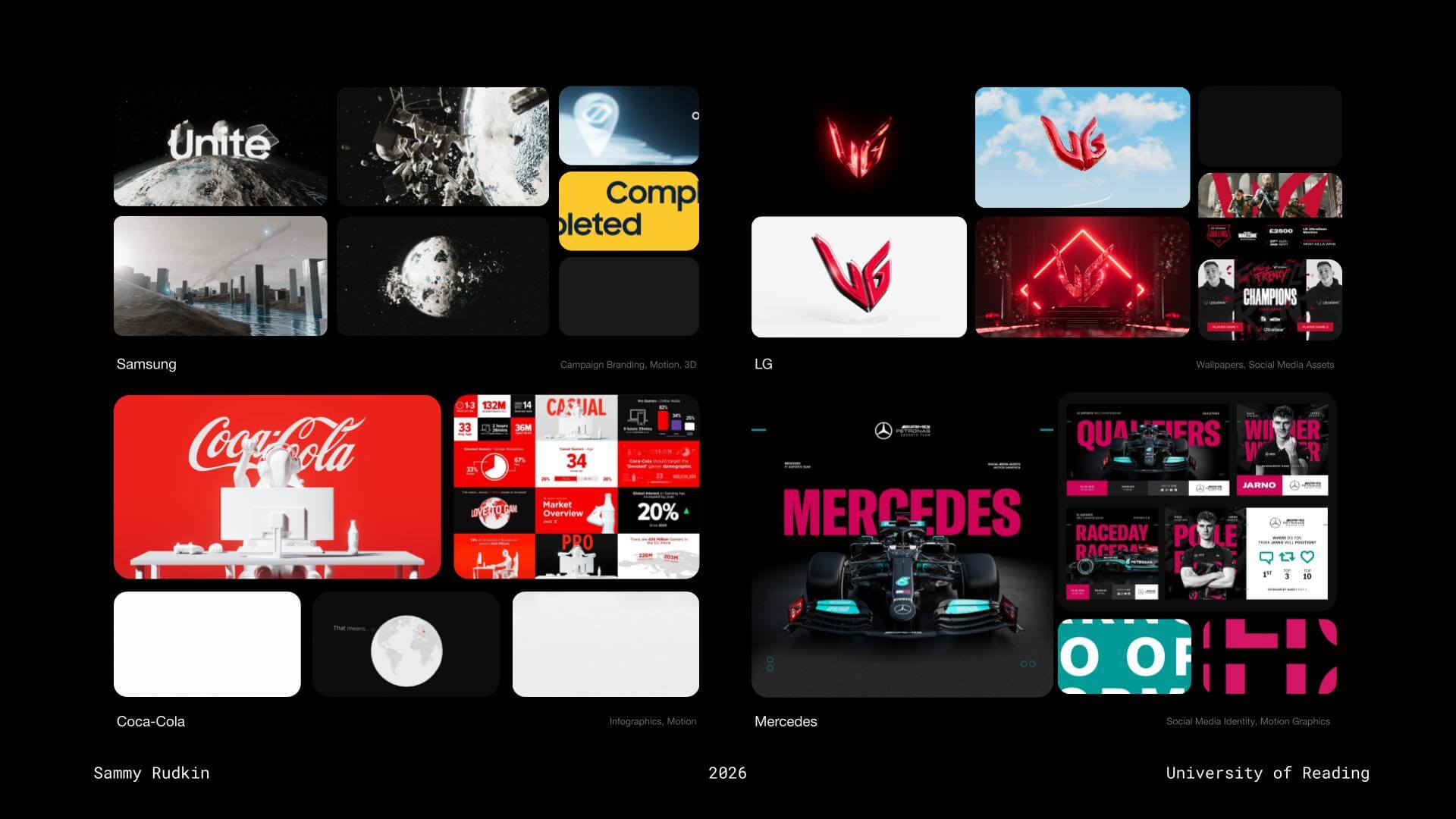
By building an Adobe Portfolio featuring work created during his time at Loughborough alongside projects completed for Endpoint, Sammy was able to begin applying for placement opportunities. After sending more than 50 emails, he secured a placement year position at gaming-focused marketing agency Kairos Group (now NewGen). During his time there, Sammy worked with several globally recognised brands, significantly strengthening both his CV and portfolio. Projects included designing wallpapers for Coca-Cola and creating social media templates for Mercedes. Looking back, Sammy reflected on how the esports experience that began from creating a small motion graphic “for fun” ultimately helped him secure his placement year, and later kickstart his design career.

Work done throughout Sammy's placement year with Kairos Group
Work done throughout Sammy’s placement year with Kairos Group


Make your work work for you

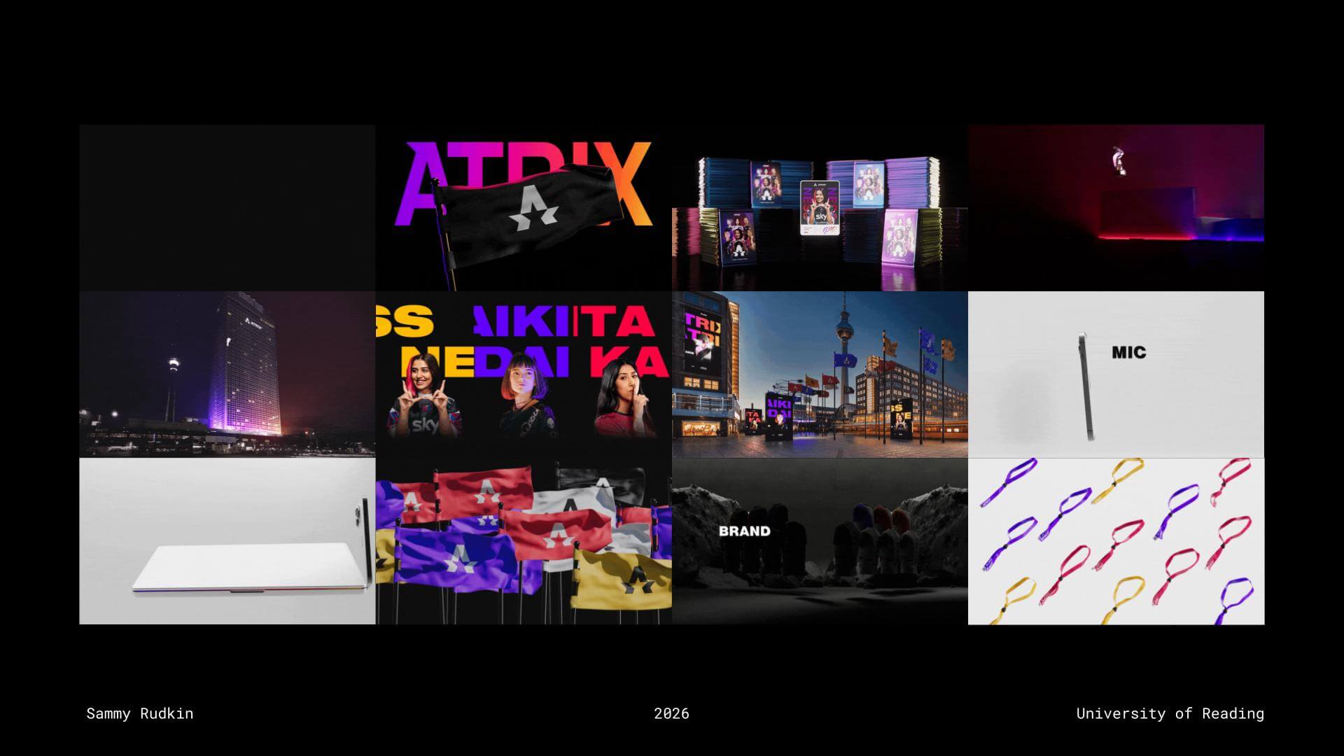
Sammy encouraged students to make the most of final-year coursework by creating projects that would strengthen their portfolios and push them creatively, rather than simply designing for grades. He followed this philosophy himself, producing visually striking final-year projects with a strong emphasis on motion design, helping his portfolio stand out amongst the competition. Alongside university work, Sammy also entered competitions such as D&AD, where he won a Yellow Pencil for his motion work on the IMAX brief. He later submitted his final-year branding project, Atrix, to the Adobe Digital Edge Awards, winning a cash prize for the project’s impressive visuals. These achievements eventually led to him being invited to speak at Adobe MAX while still studying at university, an incredible feat.

Sammy's final year project, Atrix
Sammy’s final year project, Atrix


Sidemen

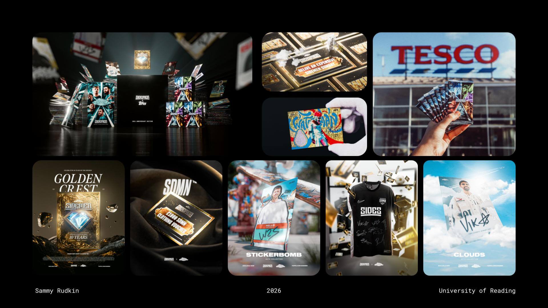
Following graduation, Sammy began searching for career opportunities. Inspired by the journey of a Loughborough alumnus, he reached out to ask about his career path and whether any opportunities might be available. Although no immediate role emerged, the connection remembered Sammy’s work and later contacted him to join the Sidemen project. Sammy emphasised that the best way to build opportunities is to “make yourself known to people.” His early work with Sidemen involved creating social assets and card designs for collaborations such as Sidemen x Topps, alongside graphics for podcast intros and transitions.

Early work done for Sidemen


Owning projects

Despite only graduating a few years prior, Sammy has progressed at incredible pace, taking on more responsibility within his role. He gained full ownership of the 2025 Charity football match for Sidemen, which is something that he feels only comes with working inhouse, suggesting that a designer is unlikely to gain full ownership within an agency (and to keep this in mind when looking at what career path you want to pursue). For this project, Sammy designed with fan engagement in mind as the Charity match’s aim was to push social media reach as much as possible across several platforms. He more recently had the opportunity to take similar authority over Netflix’s hugely successful Sidemen series, ‘Inside’. Sammy elevated the visuals in this project to another level, proving that continuously honing your craft, saying yes to opportunities, and getting involved in ambitious projects will always be reflected in the quality of your work.

Visual for Netflix's 'Inside', a series starring the Sidemen
Visual for Netflix’s ‘Inside’, a series starring the Sidemen


AI’s role in design

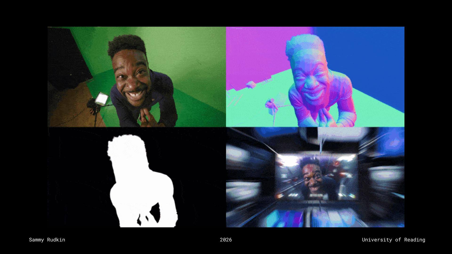
Sammy spoke openly about AI’s place within the creative industry, encouraging students to view AI as a tool rather than a replacement for designers. Using examples from his recent work on Inside, he demonstrated how AI-integrated software such as Beeble could assist his workflow by analysing green screen footage and estimating object contours and camera proximity through bump and depth maps. Rather than feeling threatened by AI, Sammy encouraged students to stay informed about emerging technologies and learn how to integrate them into their workflows. While AI can support efficiency, the industry still values human creativity, originality, and practical design skills.

Example of Sammy using AI integrated software within his work for Sidemen


Advice for young designers

  • Constantly create, starting with personal projects because your portfolio is crucial
  • Uni is the last time you have this much spare time so use it to learn as many disciplines and pieces of software as possible
  • Be sure to prioritise a work life balance
  • Make yourself valuable by finding out what skills the industry is asking for in your field – gain those skills
  • Don’t work for free… unless:
    • It’s a personal project
    • For a friend/in exchange for something
    • It’s short and too good to turn down


– Written and edited by Tommy Molnar

Kieron Lewis: Editorial design

This week’s Baseline Shift session welcomed editorial designer Kieron Lewis, who shared an honest journey through design, failure, and finding purpose. Rather than focusing only on polished outcomes, he spoke openly about setbacks and uncertainty, offering a more realistic perspective on building a creative career. Kieron also reflected on growing up in Brixton, explaining how its strong sense of community and cultural diversity continues to influence his work.


Finding the right path

Kieron began by reflecting on his early creative journey. Initially studying video game design, animation, and life drawing, he quickly realised that this path wasn’t right for him. This moment of realisation, although difficult, became a defining step in his career. It led him to pivot towards graphic design at the University of Winchester, where he began to explore branding and editorial design more seriously.

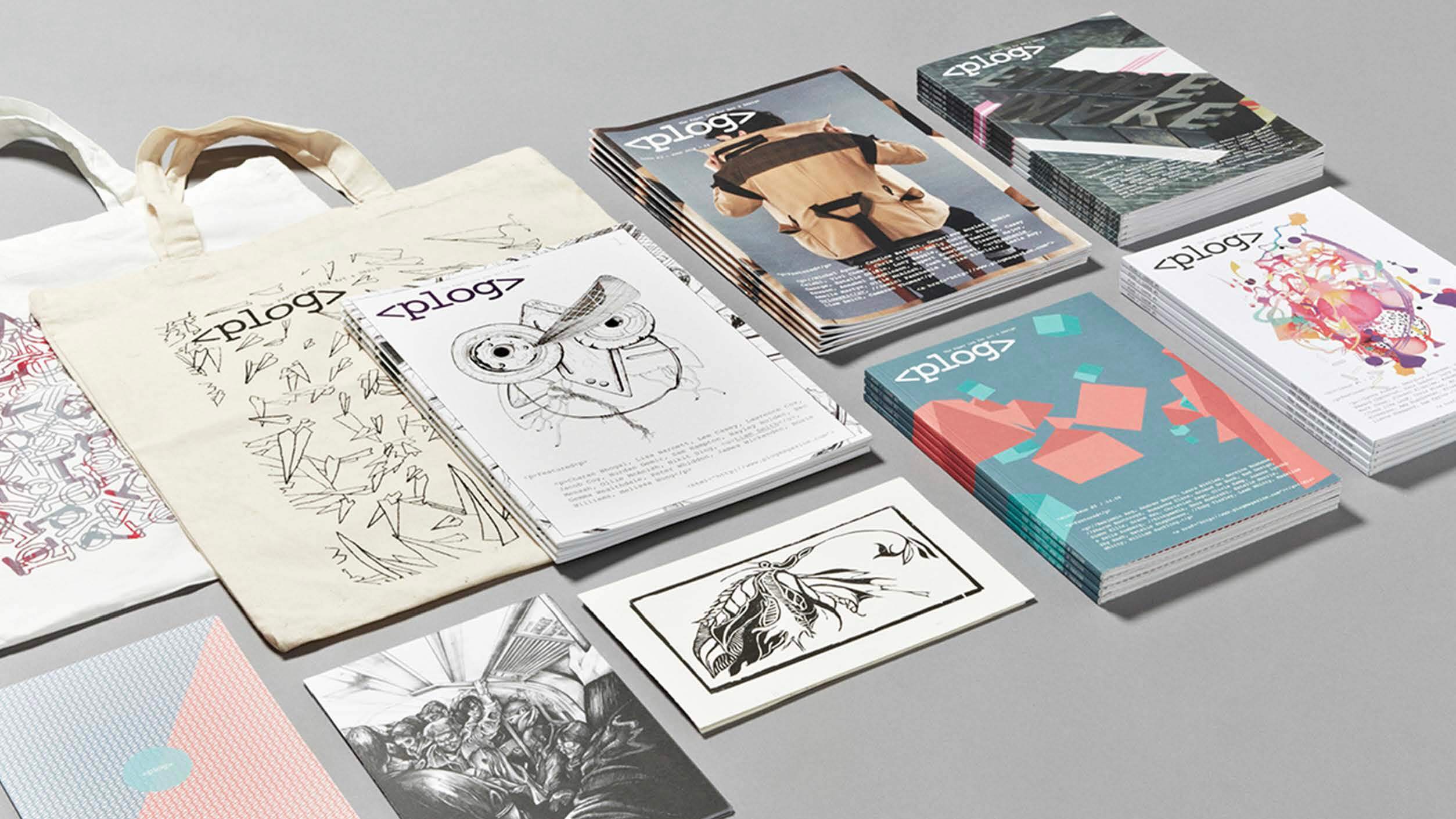
During his time at university, he co-founded Plog Magazine, a publication focused on documenting student experiences and creative work. What began as a small, self-initiated project grew significantly, eventually receiving university funding to produce further issues. This experience demonstrated the value of taking initiative and building something independently, rather than waiting for opportunities to appear.

The magazine also allowed Kieron to explore print as a medium for storytelling, understanding how editorial design can capture voices and document experiences, while also creating a sense of community. It set the foundation for the type of work he would go on to pursue later in his career.

Plog Magazine
Plog Magazine


TEDx Euston

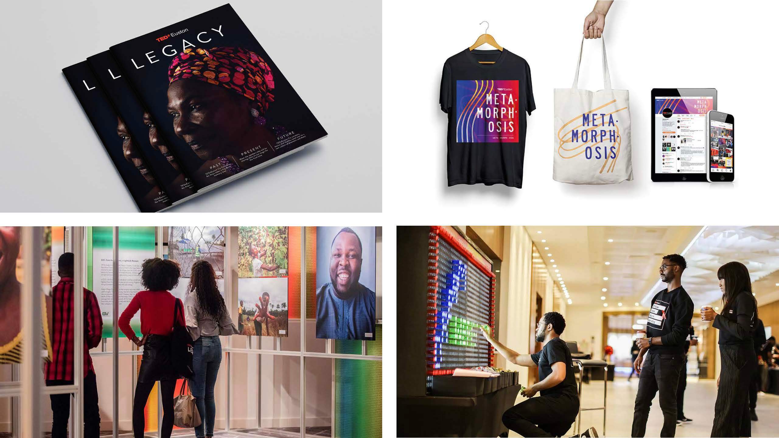
After graduating, Kieron started his career in advertising but quickly realised it wasn’t the right fit, and after several months, he was let go. This prompted a shift towards voluntary work, joining TEDx Euston as a designer. Working on an event centred around African leadership and global conversations, he was surrounded by creatives who shared similar values and motivations. The work felt meaningful, and the collaborative environment helped rebuild his confidence and creative energy.

His time working with TEDx Euston became a key turning point, both creatively and personally. Alongside developing his confidence and collaboration skills, he worked on a range of outputs, including Legacy, a publication that brought together years of speakers, ideas, and conversations from the event. The project acted as a reflection of the community behind it, while also marking an important step in shaping his direction as an editorial designer.

Kieron’s work with TEDx Euston, including Legacy publication


Freelance and meaningful work

After building up his portfolio and stepping away from volunteer work, Kieron secured his first role in editorial design. This position gave him valuable experience working on publications and leading client meetings. However, after being made redundant, he was pushed to reassess his direction once again.

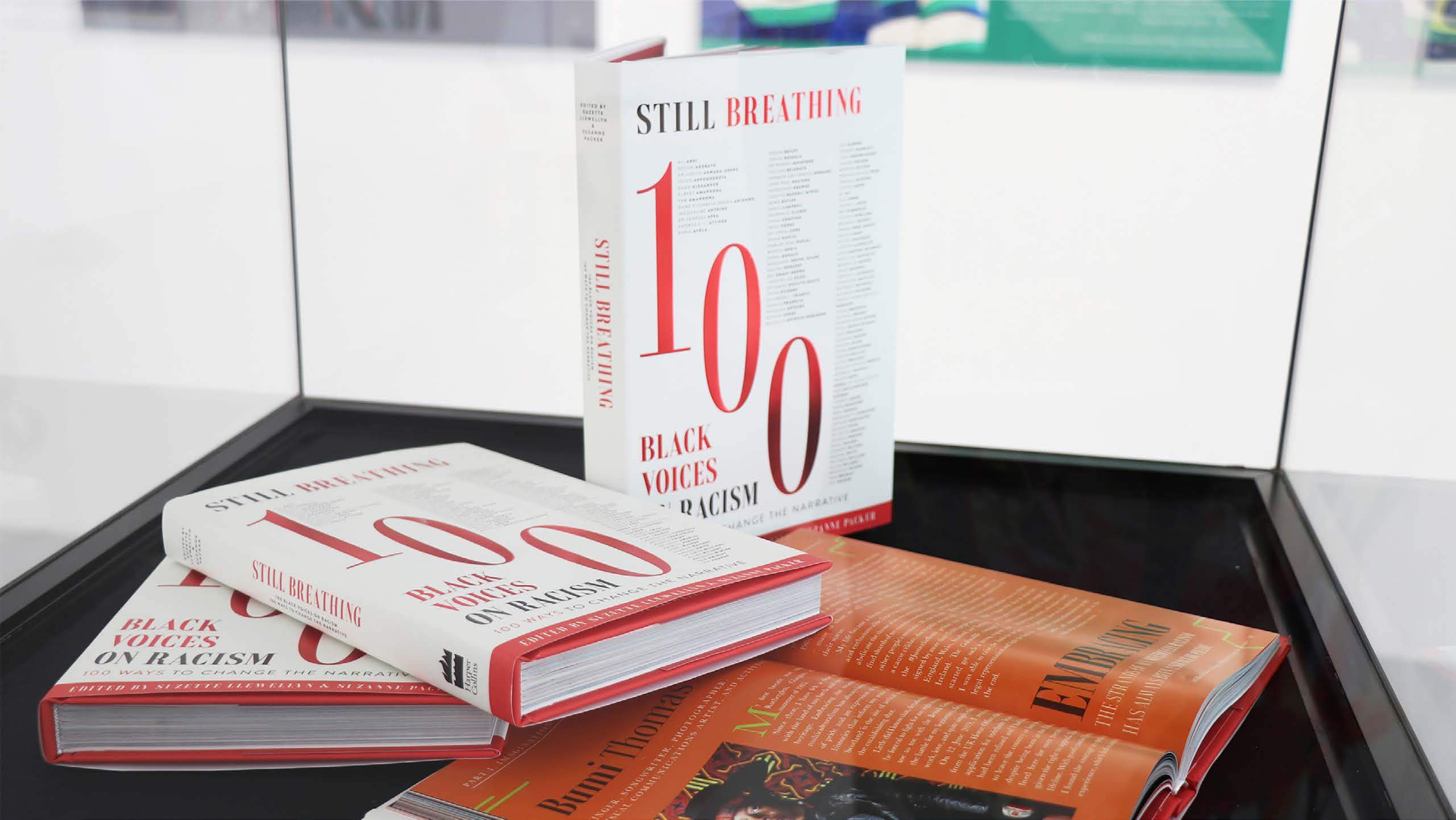
Moving to freelance meant he could focus on projects more closely aligned with his values and interests. This change allowed him to take on more meaningful and self-directed work. One of his most impactful projects, Still Breathing, was a 300-page publication created in response to the murder of George Floyd. The book features contributions from 100 individuals, each sharing personal experiences, reflections, and responses to racism in their chosen field

Still Breathing: 100 Black Voices on Racism—100 Ways to Change the Narrative

What made the project particularly powerful was its approach to design. Each contributor was given space to express their voice individually, resulting in a wide range of visual styles and perspectives. At the same time, the overall design maintained a sense of unity, using typography to express different emotional tones.

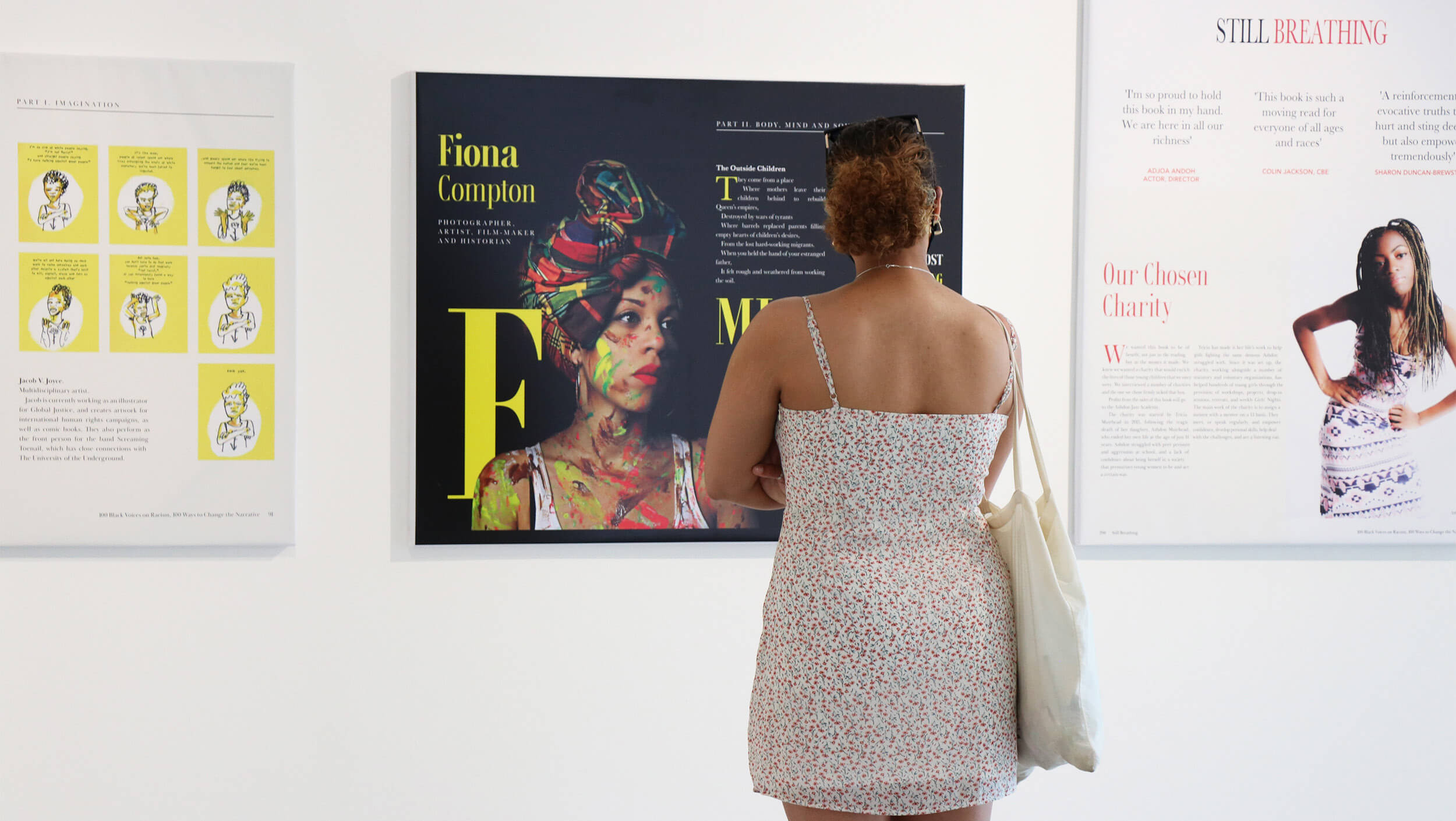
The book extended beyond its physical form, with exhibitions across London, displaying selected spreads. These exhibitions invited public interaction and encouraged conversation around difficult and often uncomfortable topics. The project showed how editorial design can be more than just something visual, creating space for conversation and deeper engagement.

Still Breathing Page spreads shown within London exhibition


Creative opportunities

Kieron also spoke about his work with Adobe Live, which began when Adobe reached out to him to take part in a three-hour livestream. Initially unsure if the message was even real, he later found himself designing live on stream, sharing his process with an online audience in real time.

After the success of the session, Adobe invited him back in a hosting role. This shifted the experience from designing under pressure to leading conversations with other creatives, and over time became a consistent part of his practice. Alongside online sessions, he expanded his collaboration into in-person events, including work with organisations like D&AD.

Kieron’s expanded collaboration into person events with D&AD

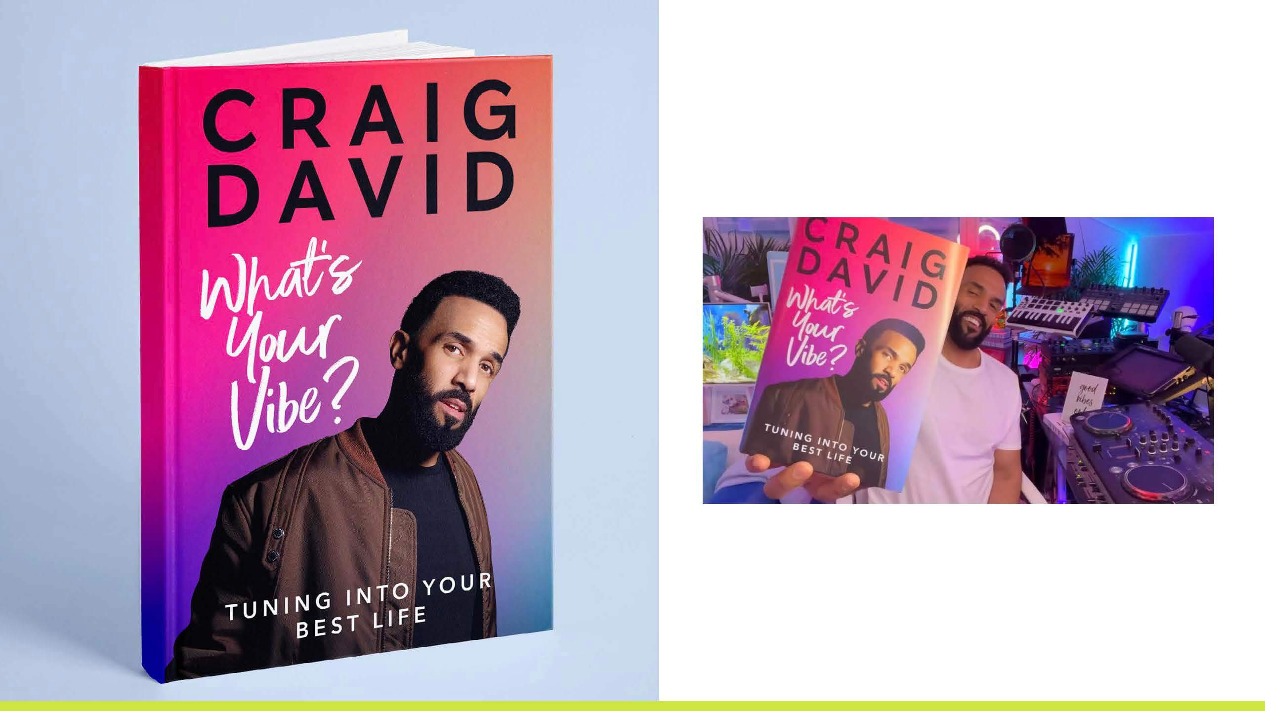
Alongside building his reputation through projects like this, Kieron was approached by HarperCollins to design a book cover for Craig David. This project offered a contrasting perspective on design, highlighting the realities of client work. Producing 40–50 design variations, with only a small number being shortlisted, demonstrated the level of iteration required in professional practice.

It also reinforced the importance of understanding the client’s perspective. While designers may have personal preferences, the outcome ultimately depends on the client’s vision and learning to navigate that balance is key to building strong working relationships.

Kieron’s book cover for Craig David, a valuable piece of work shows how much effort goes into one design


Collaboration, scale, and craft

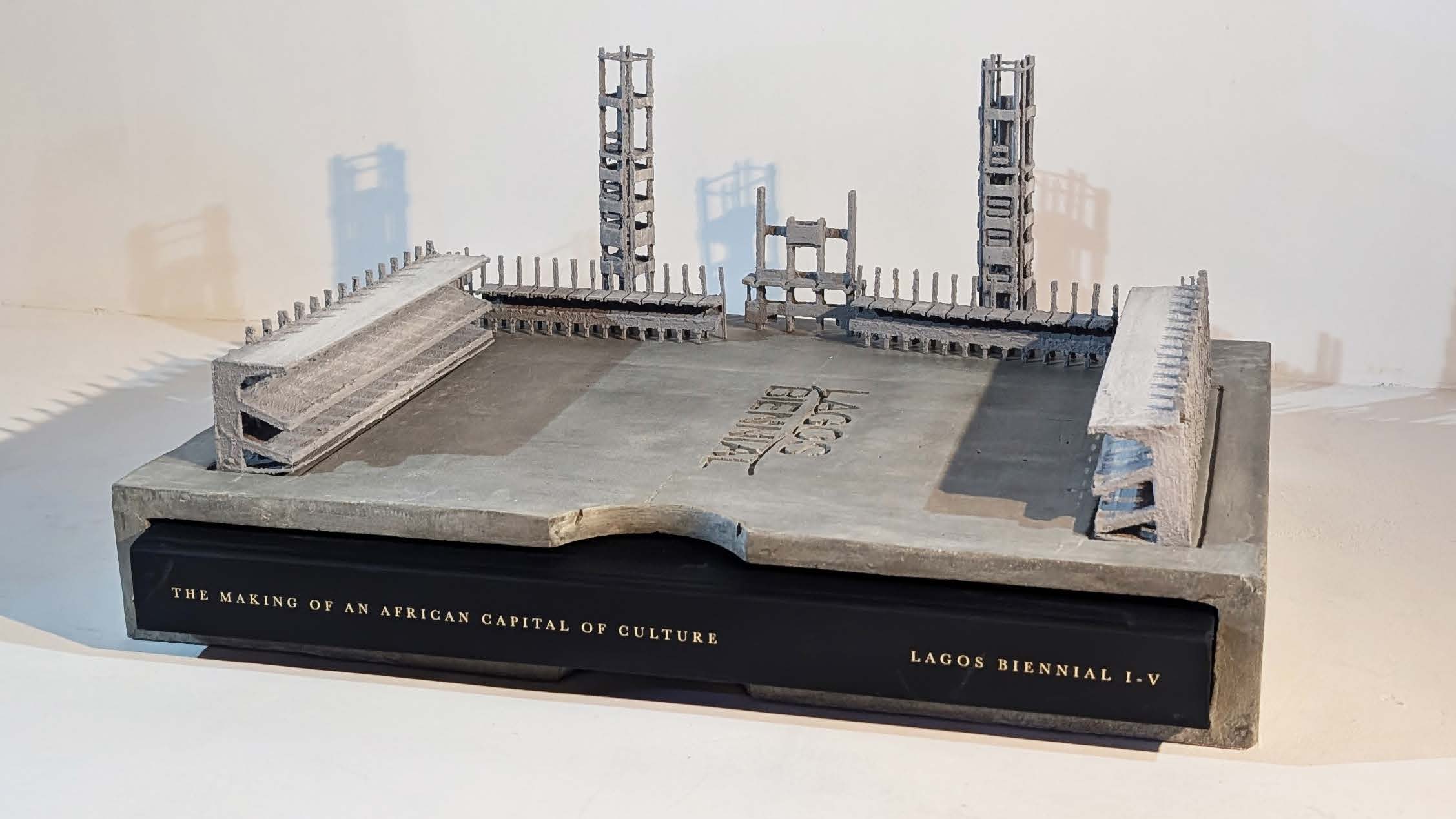
One of Kieron’s most recent projects, Lagos Biennial, represents editorial design at a much larger and more ambitious scale. The project took the form of a 456-page hardback publication, enclosed within a 7kg concrete sculptural case, immediately positioning it as more than just a book. At 336 × 494mm in size, the physical presence of the piece reinforces the idea of “large-scale” design, both conceptually and materially, bringing together the work of 161 contemporary Nigerian artists into a single, carefully crafted outcome.

Lagos Biennial book encased within 7kg concrete bookcase

The project took over two years to complete and involved close collaboration across an international team. Managing such a large volume of content required strong design judgement, alongside a clear and consistent approach to organising and handling material throughout the process.

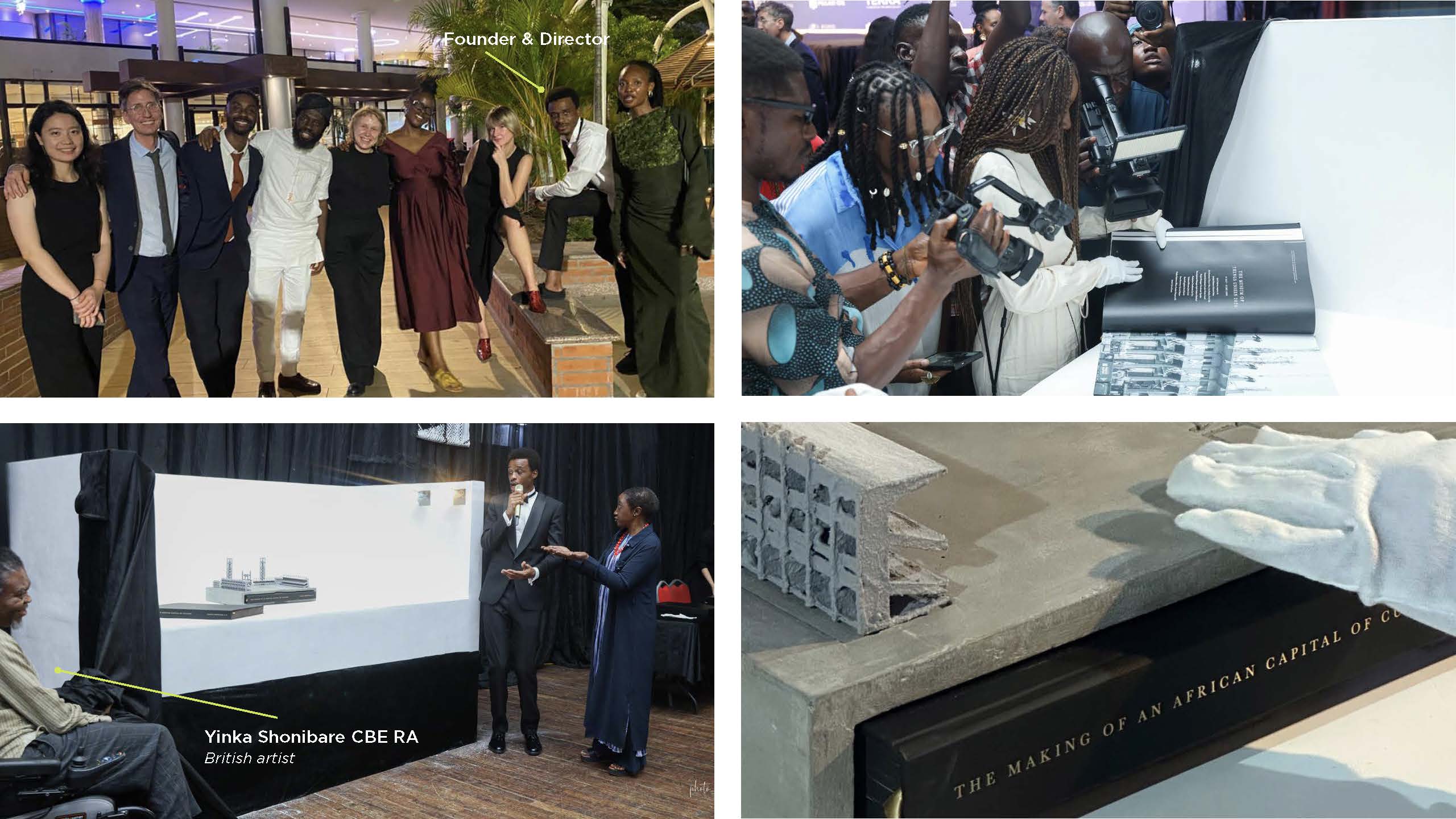
The project also extended beyond the design process itself. Kieron was flown out to Lagos for the book launch, where the publication was presented within the same cultural context it documents. Seeing the work exist physically, both as a publication and as a sculptural object, marked a full-circle moment in the project. It reinforced the idea that editorial design is not just about creating pages, but about shaping how work is experienced, shared, and remembered. Lagos Biennial stands out for giving artists visibility while capturing a unique cultural moment.

Lagos Biennial work in progress and parts of the team that made things happen.


Advice for young designers

  • Start small, think big
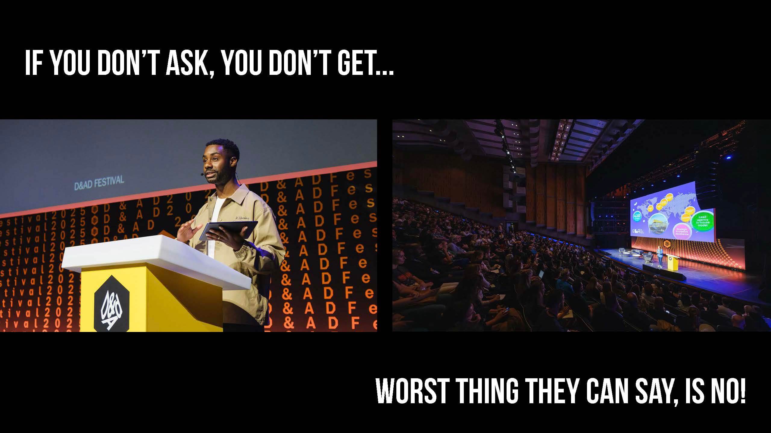
  • If you don’t ask, you don’t get.
  • Document and organise everything, capture ideas, sketches, and process; keep files clear and easy to navigate.
  • Take risks and embrace failure, learn from setbacks, and grow through experience.
  • Work with purpose and collaborate, choose projects that matter and build your network through teamwork.
  • Explore beyond the screen, seeing things physically, visit inspiring spaces, and engage with the world of design


– Written by Matthew Banks

– Edited by Tommy Molnar

Albert Parker: UX/UI and Brand design (the blur)

For our third session of Baseline Shift this year, we introduced Albert Parker, UX/UI designer, and Brand Lead at Flipside Group, a creative digital agency known for combining strategy with forward-thinking design working with clients like Papa Johns, Coca-Cola, Covent Garden, and NHS England.


The journey into industry

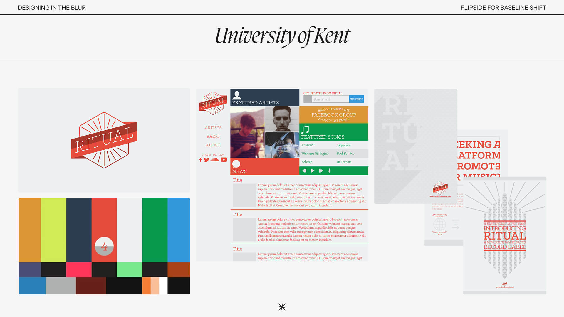
Albert’s path into the design world began at the University of Kent, where he studied Multimedia Technology and Design, a course that blended coding, digital media and design. Even then, he felt pulled between disciplines, experimenting with a range of different projects to discover where he fit. One of these projects was a record label he built with friends, complete with website, events and visual identity. Looking back, he laughs at the aesthetics, but the project revealed something more important – a fascination with how brand and digital connect emotionally, not just visually. This felt particularly relatable to the student audience, as it allows us to reframe the way we look at our early work. Rather than dismissing projects for their rough edges, Albert’s story reminds us to recognise the intention and find value in the meaning behind the choices made.

A placement year at Warner Bros. became Albert’s first real glimpse into the design industry, creating clothing graphics, digital assets and campaign materials which taught him structure, working under pressure, and importantly the experience taught him how to communicate between teams. With the Typography & Graphic Communication course at Reading encouraging teamwork throughout every year of study, it is reassuring to hear that this follows into industry and is a necessary skill to master. This placement year gave Albert the confidence to step into design as a career, leaving with him the knowledge that “even small details matter when you’re part of something bigger”, and with a newfound appreciation for office basement cinemas.

Albert's record label, 'Ritual', set up while he was at University
Albert’s record label, ‘Ritual’, set up while he was at University


In-house work

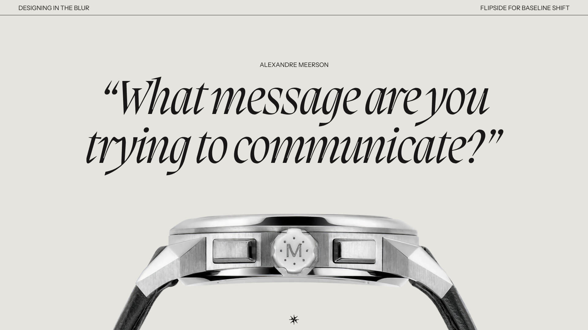
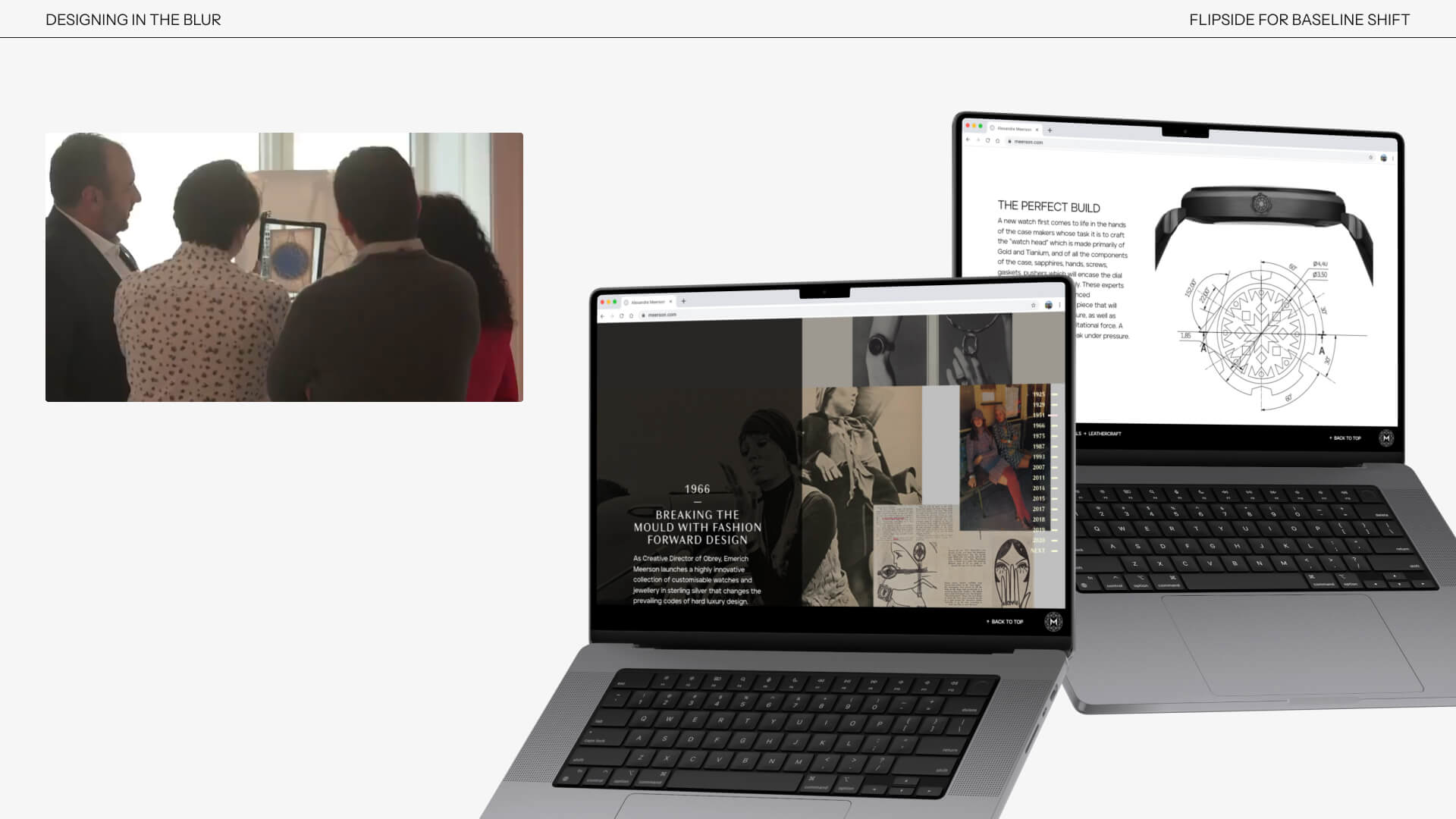
After graduating, Albert joined luxury watch brand Alexander Meerson, an experience he describes as one of his steepest learning curves. Under the guidance of a creative director who prioritised intention over decoration, Albert was consistently asked the question that many students are familiar with from their tutors – “what message are you trying to communicate?”. As the brand grew, so did Albert’s responsibilities. He shaped campaigns, and evolved the identity, as well as creating experiences such as the Designer in Residence series, which invited watch collectors into the process, making the experience for the consumer (or user) feel collaborative and personal. It’s a great reminder that design does not end at an interface but supports the user’s journey and experience from start to finish.

A visual representing his time working in-house at luxury watch designer Alexandre Meerson


The impact of the pandemic

The pandemic was a key turning point for both the company and Albert as a designer. With physical experiences impossible, Albert had the task of replicating the intimacy of luxury retail into a digital environment. He had to consider “not just how a brand looks, but how it behaves and responds”, and it was here, somewhere between branding and digital design, that Albert recognised the blur. Environmental factors continued to make an impact on Albert’s identity as a designer, as when asked to photograph and document client stories in Florida, he was invited to take the controls of a private two-seater plane, flying over the Florida coastline. Travelling became part of his career, absorbing different cultures, contexts, moods and environments, and Albert encouraged this by telling the students, “when you see more, you notice more, and when you notice more, you design with more clarity.”

Digital design including a website and AR experience designed for Alexandre Meerson


Freelancing and co-founding

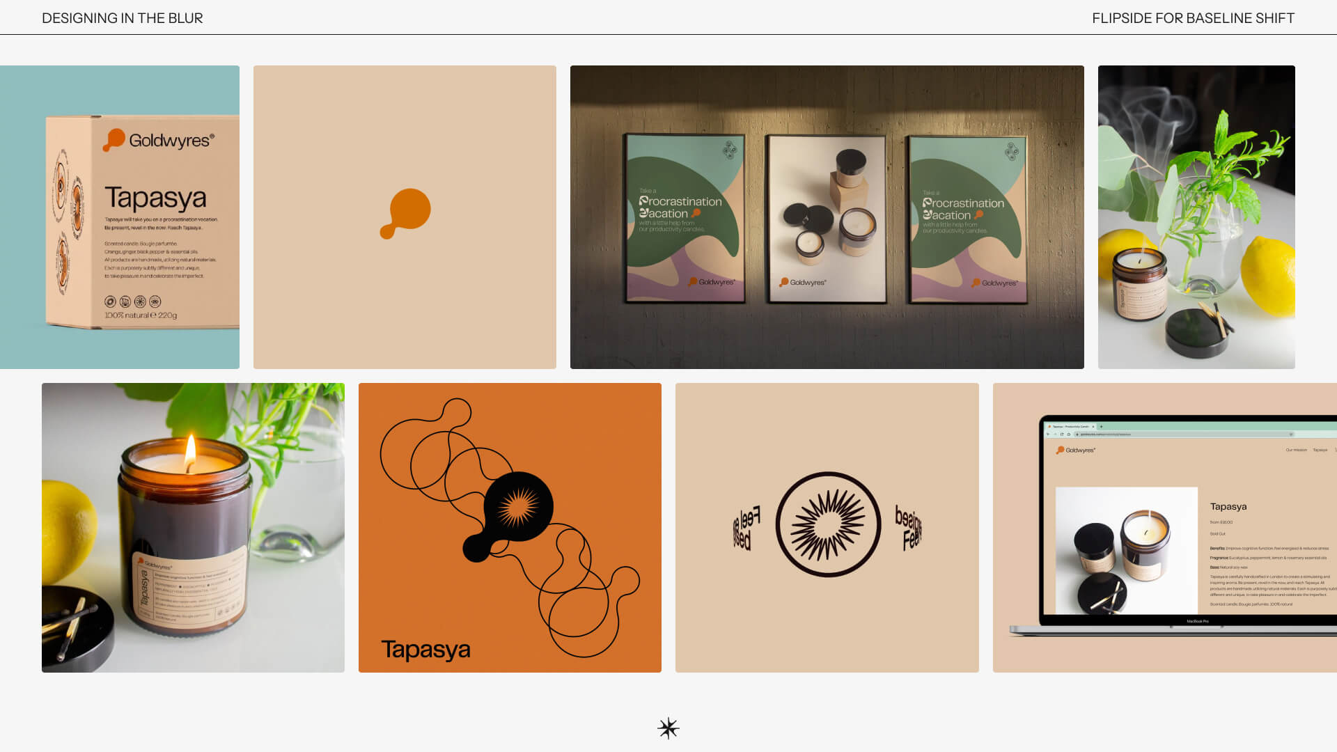
After several years in-house, Albert turned to freelancing to broaden his horizons. He worked across branding and digital projects, shaping identities for clients including the US-based beauty brand Beaut-Lab, drawing inspiration from the Fluxus art movement and Surrey Hills Coffee, where he built a graphic system from the walking routes their mobile coffee service travelled around. It was great to get an insight into Albert’s thought process behind these designs and, importantly, why they were right for the client. A highlight of this period was co-founding Goldwyres, a ‘productivity candle brand’ rooted in essential oils that improve concentration and function. The process required Albert to apply every aspect of his design thinking, from strategy to packaging to storytelling. Freelancing revealed the joy of experimentation and the value of self-initiated work, but it also reminded Albert how much he missed teams, collaboration and shared momentum. This realisation led him to the next chapter.

Albert's very own productivity candle brand, GoldWyres
Albert’s very own productivity candle brand, GoldWyres


Flipside and the blur

Joining Flipside Group, a digital-first creative agency, Albert stepped into a space where brand and UX sit side by side, a space where he can design “in the blur”. Albert, and the rest of the Flipside team “think of a brand not as a logo or a campaign, but as a living system”. Now Brand Lead, he collaborates daily with strategists, UX designers and developers in a fast-paced, and highly rewarding environment. Albert walked us through Flipside’s process, one that treats brand and digital not as separate stages but as one continuous conversation. A takeaway from this process was that ‘iteration’, the final 10% of the project, takes 90% of the effort, and this is where the line between good and great is crossed.

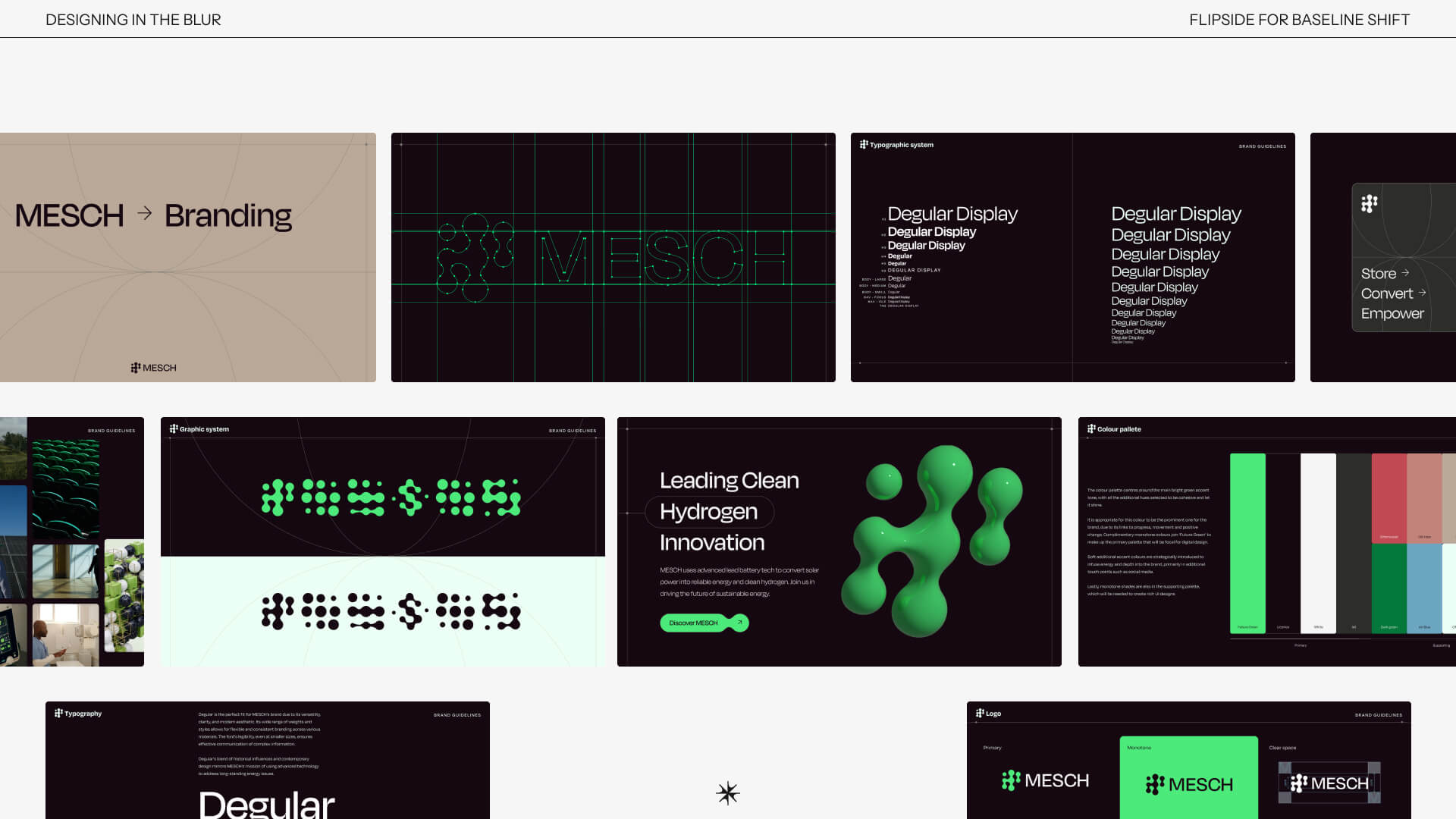
An example of this approach is Mesch, an energy startup delivering sustainable power to off-grid hospitals in Africa. Albert grounded the identity in clarity and scientific structure, avoiding sustainability clichés. Inspired by hydrogen bonding, the modular system carried through typography, colour, animation and content. Digitally, he prioritised low-energy design principles, from dark mode to restrained layouts, aligning the product with the brand’s environmental purpose. This was a perfect demonstration of “the blur” that Albert references throughout his talk, and something that will no doubt stay with students moving forward.

Digital and brand design for Mesch, that Albert has worked on while at Flipside


Ever-evolving tools

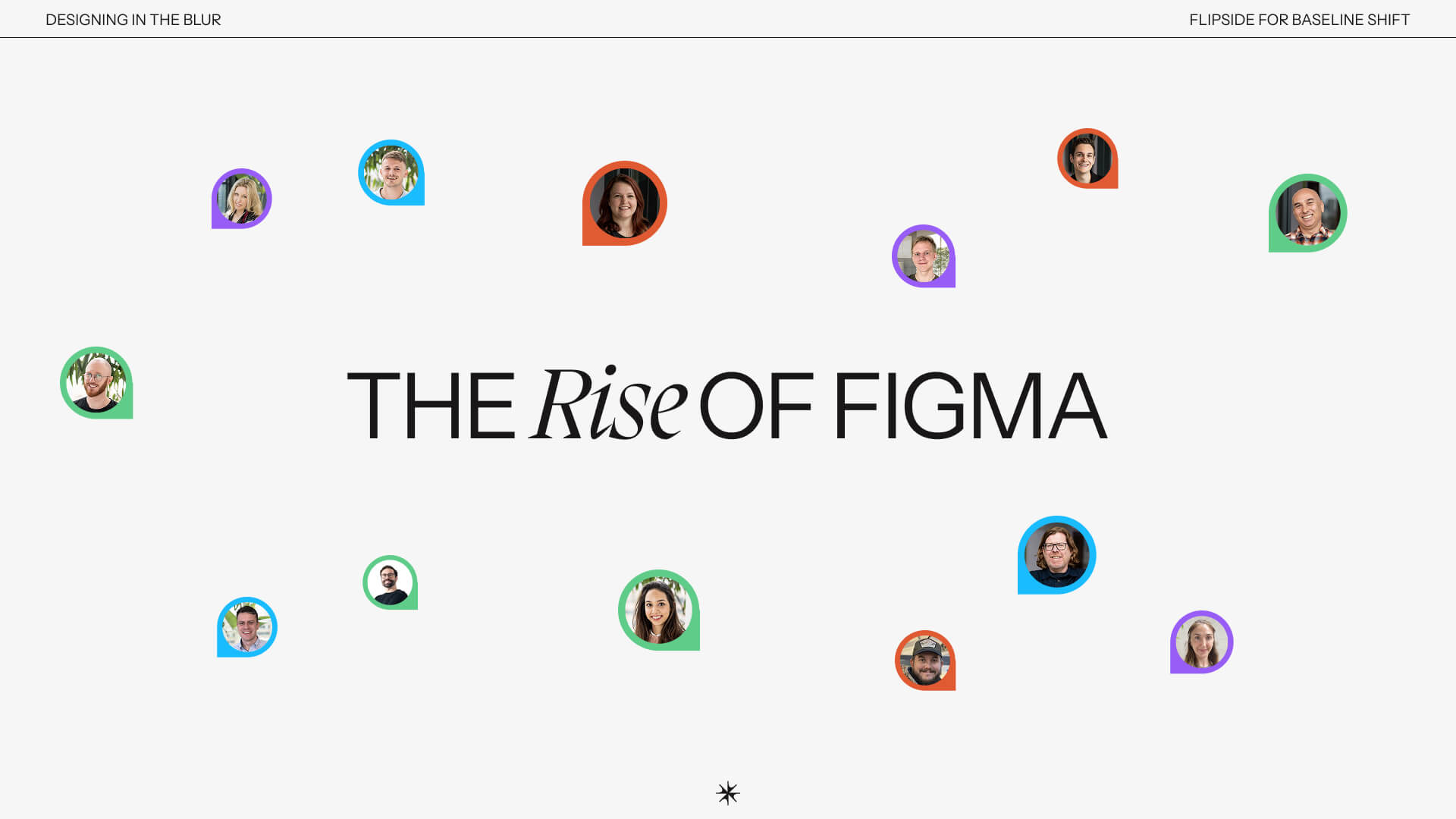
Albert reflected on how tools like Figma have revolutionised the design process, from static PDFs and endless email chains to real-time shared thinking. Everything at Flipside now lives in Figma: workshops, slides, prototyping, animation and even Albert’s own portfolio site. While this collaboration is powerful, a note from Albert was to protect your “quiet space” for exploration, before every idea becomes a group edit. Then came the topic that is on everyone’s mind – AI. Albert approaches it with curiosity but caution, outlining three patterns designers must watch out for: Firstly, “the temptation to overproduce” – more outputs doesn’t always mean better thinking. Secondly, “the great sameness” – AI trained on existing visuals risks a loss of originality, and finally, “the productivity paradox” – more tools can mean less time to think.

For Albert, AI should support, not replace. True creativity comes from human judgment, not the speed of generation. Flipside never uses AI for storytelling or conceptual thinking, “it always has to start with people” and “it always has to serve a purpose”. Albert closed his talk by reminding students that their value lies not in tools, but in how they think. Curiosity, empathy and clarity are the cornerstones of meaningful design, especially within “the blur”.

A visual showing the collaborative nature of both Figma and Flipside


Advice for young designers

  • Brand and digital are no longer separate, great design lives in the overlap so embrace the blur!
  • Strong design begins with clarity, purpose and understanding, not decoration.
  • Early work matters for the ideas behind it, even if the execution isn’t perfect, so stay curious and experimental.
  • Collaboration drives better thinking.
  • Your value is how you think, skills evolve, tools change, however, human judgment, empathy and clarity remain the core of great design.
  • Albert’s three guiding principles of great design are: appropriate, distinctive, and simple


– Written and edited by Tommy Molnar

Carolyne Hill: Identity design

This week we were joined by Carolyne Hill, who shared her honest and inspiring journey through the design industry, all the way from her A levels to her position now as identity designer, creative director and founder of ChillCreate.


Creative journey

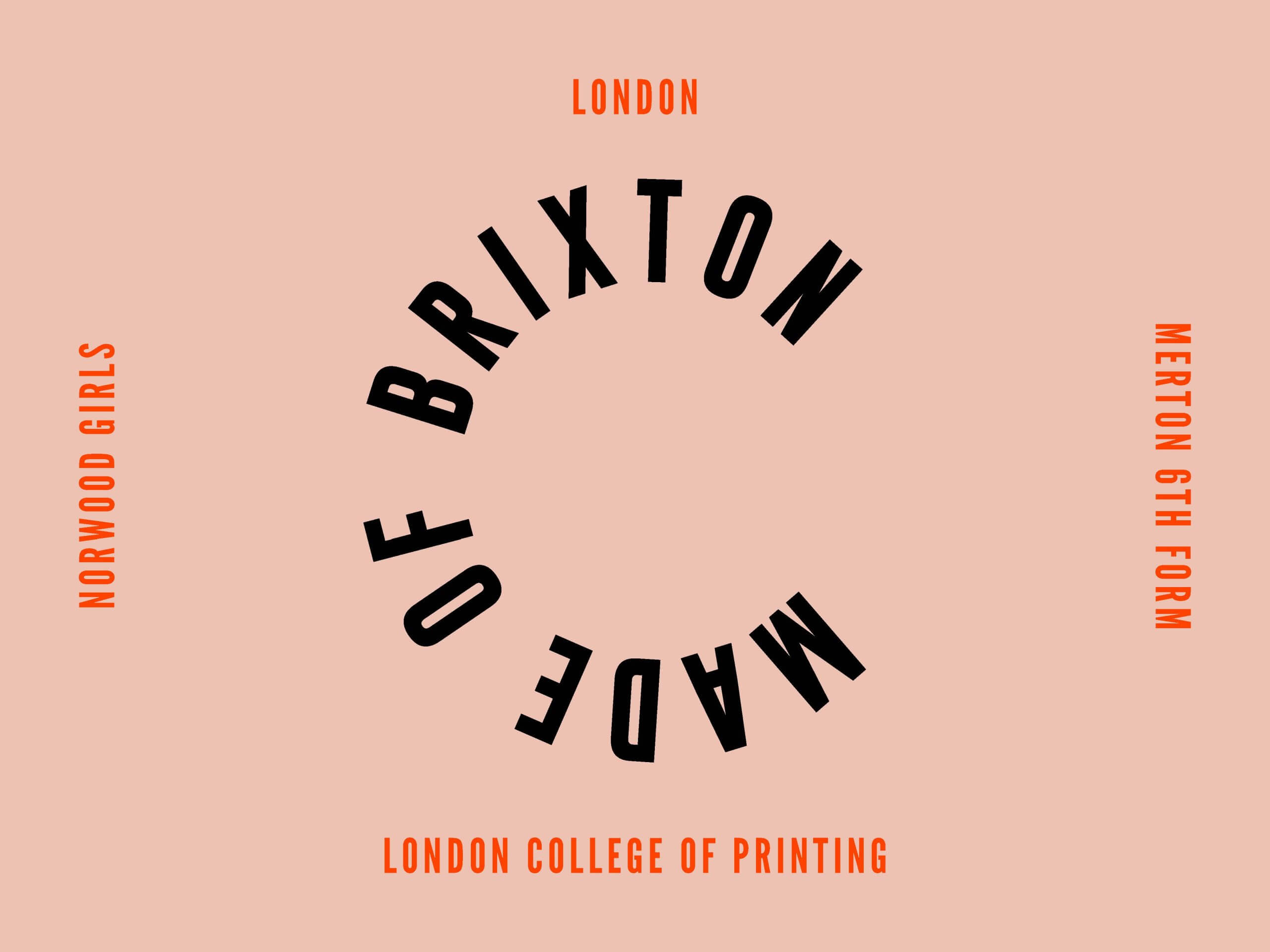
Being “made of Brixton”, Carolyne was brought up surrounded by culture and endless creativity – she credits Brixton as her influence for her passions, for the things she’s interested in, and importantly for the things she wants to design and create. While completing her A levels, Carolyne didn’t receive much encouragement to follow her creativity. After expressing an interest in fine art and fashion, Carolyne was met with “don’t do that, you’ll be a starving artist”. Despite this pushback, her interest in people, problem solving, discussions, and debates, set her up nicely for her career in designing for people, and designing for good.

Carolyne’s experience of getting her first job began after seeing a Craigslist ad, knocking on their studio door, being met with laughter as the ad was about five years out of date, and subsequently being invited in. Carolyne left that studio with an internship, showing that sometimes relying on the power of human interaction gets results. The internship saw her designing retail displays and Christmas decorations for department stores, which was the foundation of Carolyne’s career in the creative world, and this acted as a leg up to getting her first design job.

Made of Brixton visual


Learning by doing

One of her first responsibilities as a Graphic Designer was designing Tesco car-park signage, and while Carolyne described this as an unglamorous task, she had a lot of fun as the job allowed her to travel across the country. This environment was fast-paced, and very hands on, learning how to do most things on the job. Carolyne gave students a useful tip, that when you don’t know what you’re doing, “find somebody who does”.

After that first job, Carolyne went travelling, realising the importance of expanding your environment and expanding the network of people around you. She highlights the importance of making use of the network you already have – your cohort, your peers, and your friends. She even noted that in many of the jobs she entered, there were people from her network, and importantly noted ‘that’s your first in’.

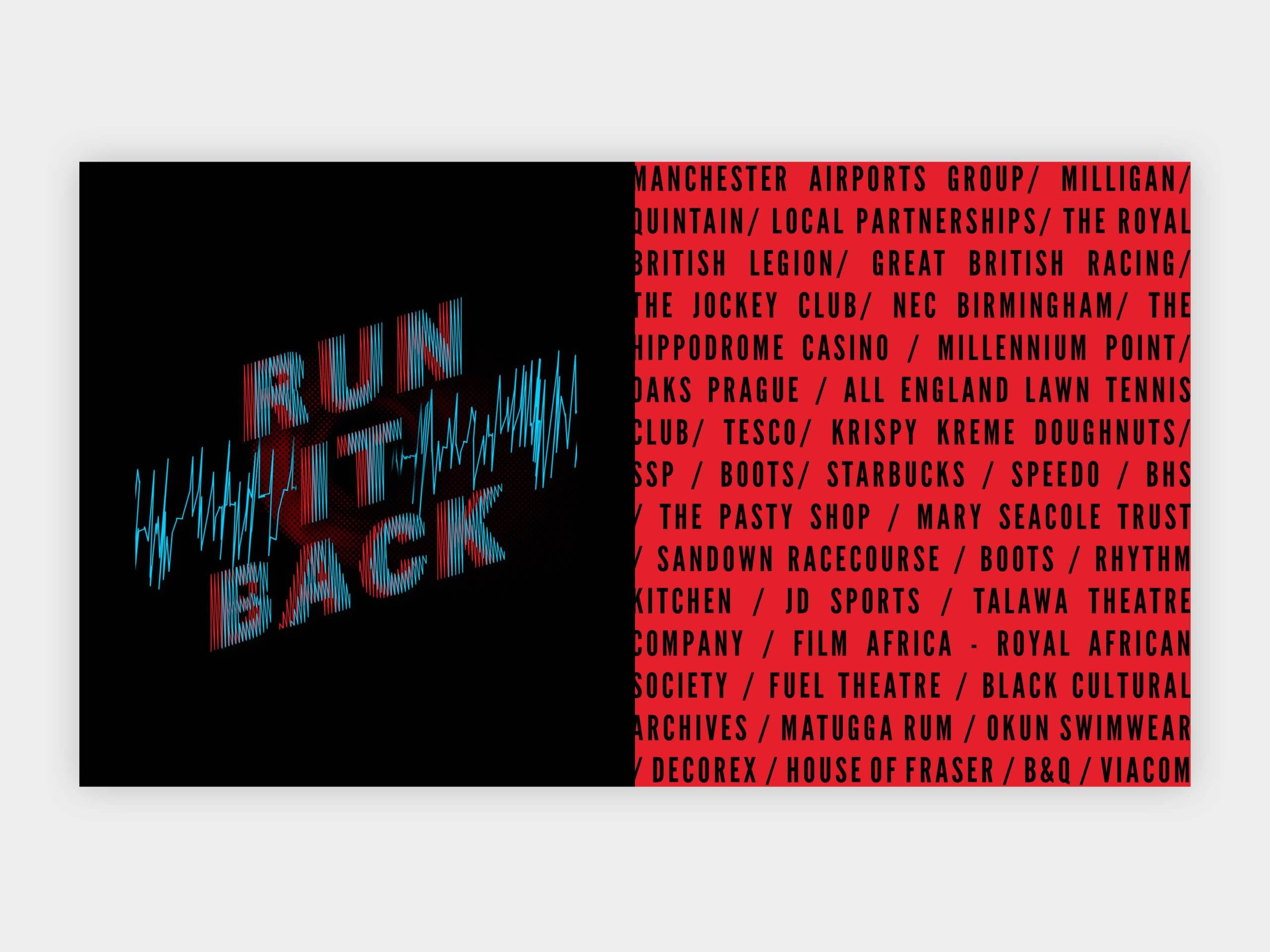
Carolyne’s next job was working for a design agency where she designed for a wide array of clients, from the Royal British Legion, to Wimbledon, to Krispy Kreme. While some were great, some didn’t sit right with who Carolyne is and what she believes in, and while this upset her, it was also the trigger that made her think “what’s next”. While working for this agency, Carolyne always made sure to do things for herself, like poetry readings, club fliers and organising events, constantly building her network. When Carolyne had finally had enough of the ‘corporate work’, her mentor, Jon Daniels’s advice was ‘just go and do it, Kaz, you can do it’.

List of some of the clients Carolyne worked with while at the agency


Finding your spark

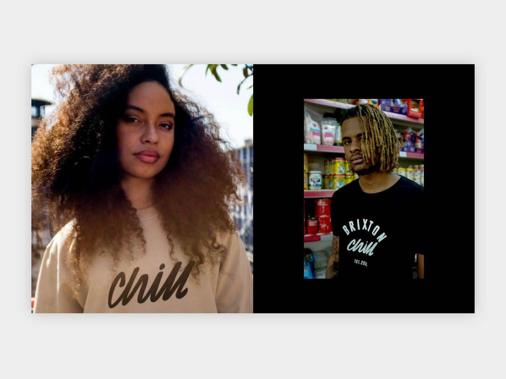
After feeling like she had drifted from her roots, and lost touch with what brings her joy, Carolyne created ChillCreate – her personal brand, and childhood ambition combining fashion, identity and positivity. Carolyne was proud of not only doing something that she wanted to do, but also something she was told was ‘not for her’. While she did enjoy fashion, Carolyne soon realised that what she truly cared about was sustainability and the “people aspects to life”. Carolyne found that she wanted to meet other designers, other women, other people that were a bit more like her.

ChillCreate as a fashion brand


Brixton House

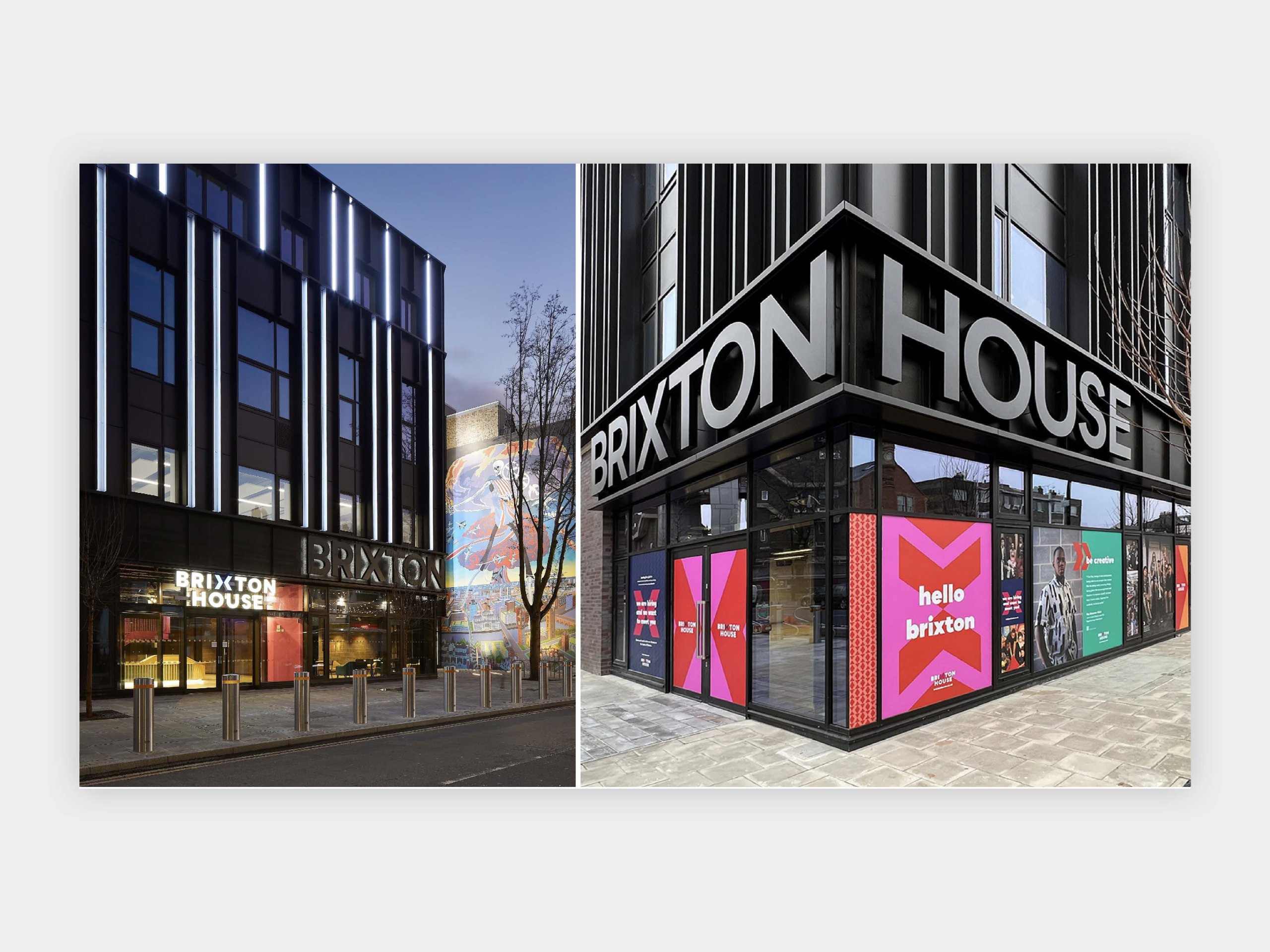
One of the first major projects Carolyne took on after establishing ChillCreate was the identity for the theatre, Brixton House, an opportunity that felt especially meaningful given her roots. Knowing how deeply the area shaped her, Carolyne approached the pitch not only as a designer but as someone who understood the community the theatre serves. She joined forces with two collaborators to form a small but powerful team, creating a bold and energetic proposal that spoke to Brixton’s spirit. Carolyne highlighted that “you need a good team to pull off a good big project”.

Winning the project marked a turning point; it was the moment she realised she could hold her own competing for large-scale work. Working closely with architects and the theatre’s leadership, she helped influence decisions far beyond the logo, shifting interiors, injecting colour, and pushing for a more vibrant expression of the building’s identity. Today, Brixton House remains one of her closest clients, referring to herself as “a brand guardian of sorts”.

Brixton House's brand identity on display
Brixton House’s brand identity on display


The World Reimagined

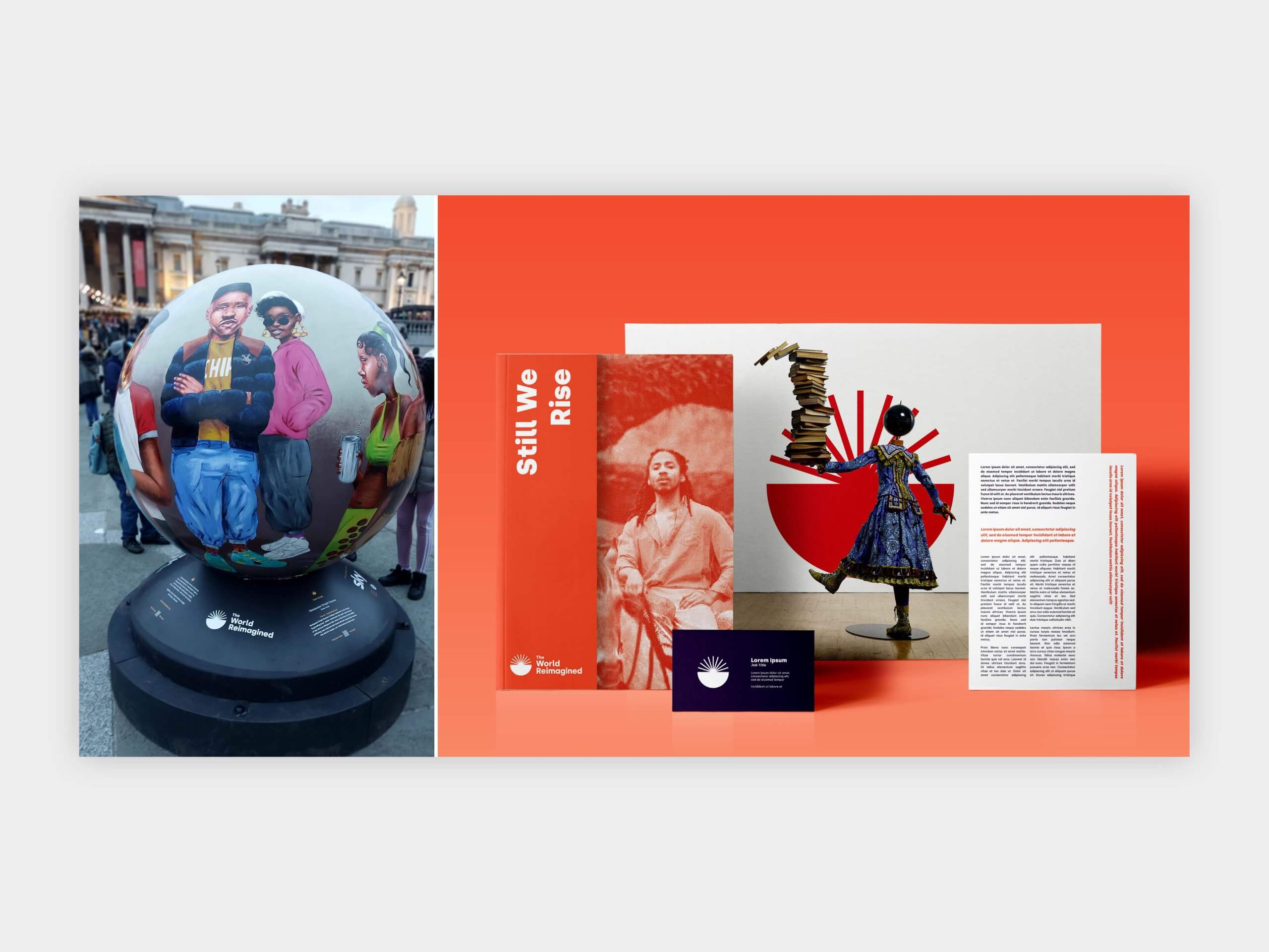
Following Brixton House, Carolyne pitched for another ambitious commission, The World Reimagined, a UK-wide public art and education project exploring Britain’s relationship with transatlantic histories. The brief came through a trusted connection, highlighting again how networks and conversations often open unexpected doors. Although the project was complex and difficult to grasp at first, the creative concept evolved from a desire to express learning, connection, and shared narratives.

Working with a strategist, Carolyne developed an identity centred on a globe-like form that symbolised strands of knowledge coming together. What made the pitch successful wasn’t only the visual strength, but the way the idea carried meaning, with the symbol described as a shared vessel for understanding. In Carolyne’s words, “it was a wonderful project to work on… it went round the whole of the UK”, with some of the globes even landing here on University of Reading’s campus.

The World Reimagined's brand identity on display
The World Reimagined’s brand identity on display

Africa Fashion

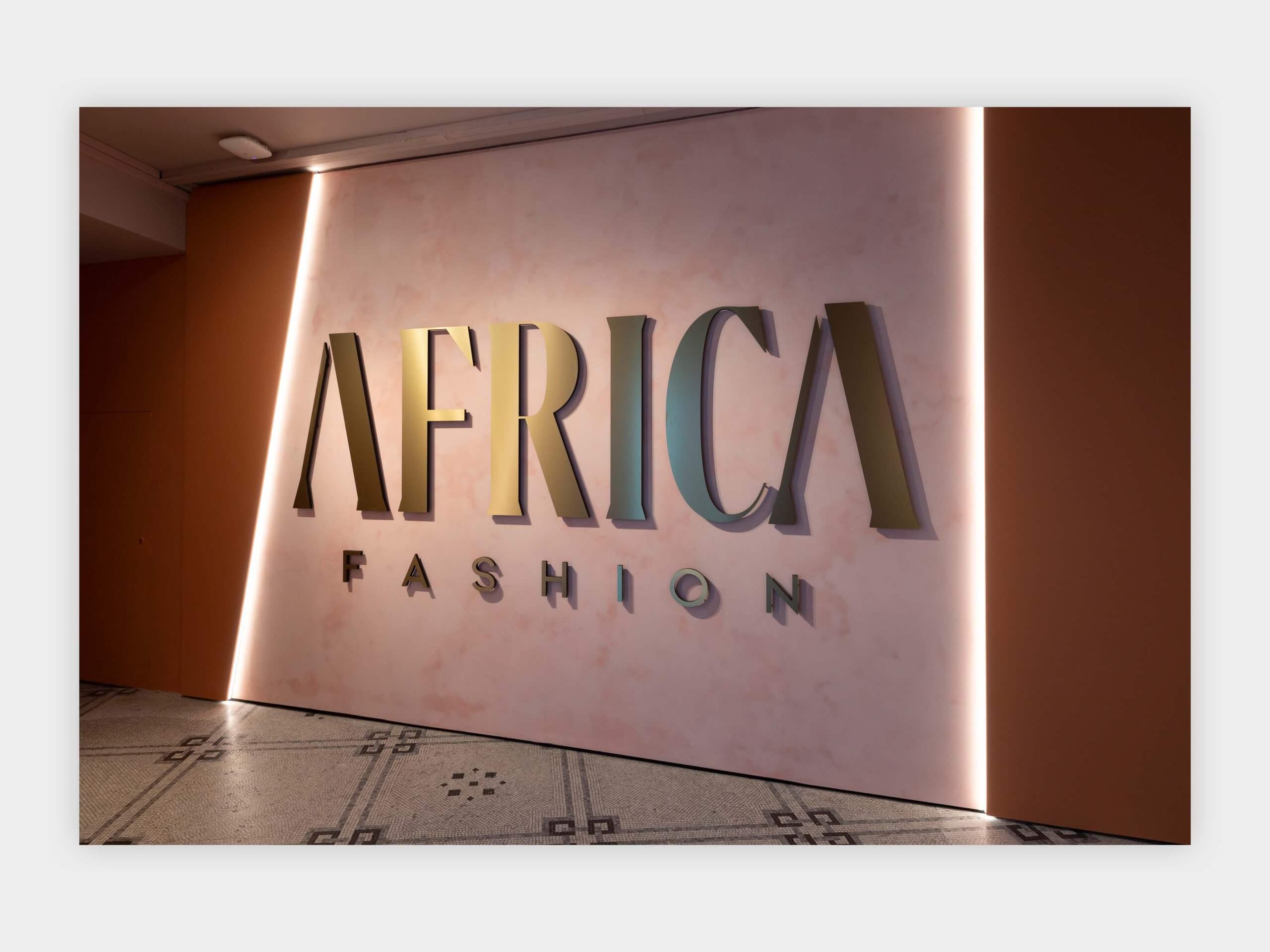
Carolyne’s work on the V&A’s Africa Fashion exhibition marked a significant moment in her career, bringing together her love of design, culture and storytelling. Collaborating with a young Black-owned architecture practice, Carolyne created “an identity which wasn’t cliché,” as she “didn’t want to trivialise it or make it seem lesser than”. This is an important takeaway for students on designing respectfully and considerately. The team drew inspiration from architectural forms and traditional entryways, developing a system of arches and bold structures that honoured the artistry behind the garments and objects on display. For Carolyne, the project reaffirmed how design can elevate narratives that deserve greater visibility, while also showing how research, sensitivity and collaboration can transform an exhibition into a powerful cultural statement.

V&A Africa Fashion exhibition's brand identity on display
V&A Africa Fashion exhibition’s brand identity on display


The Missing Thread

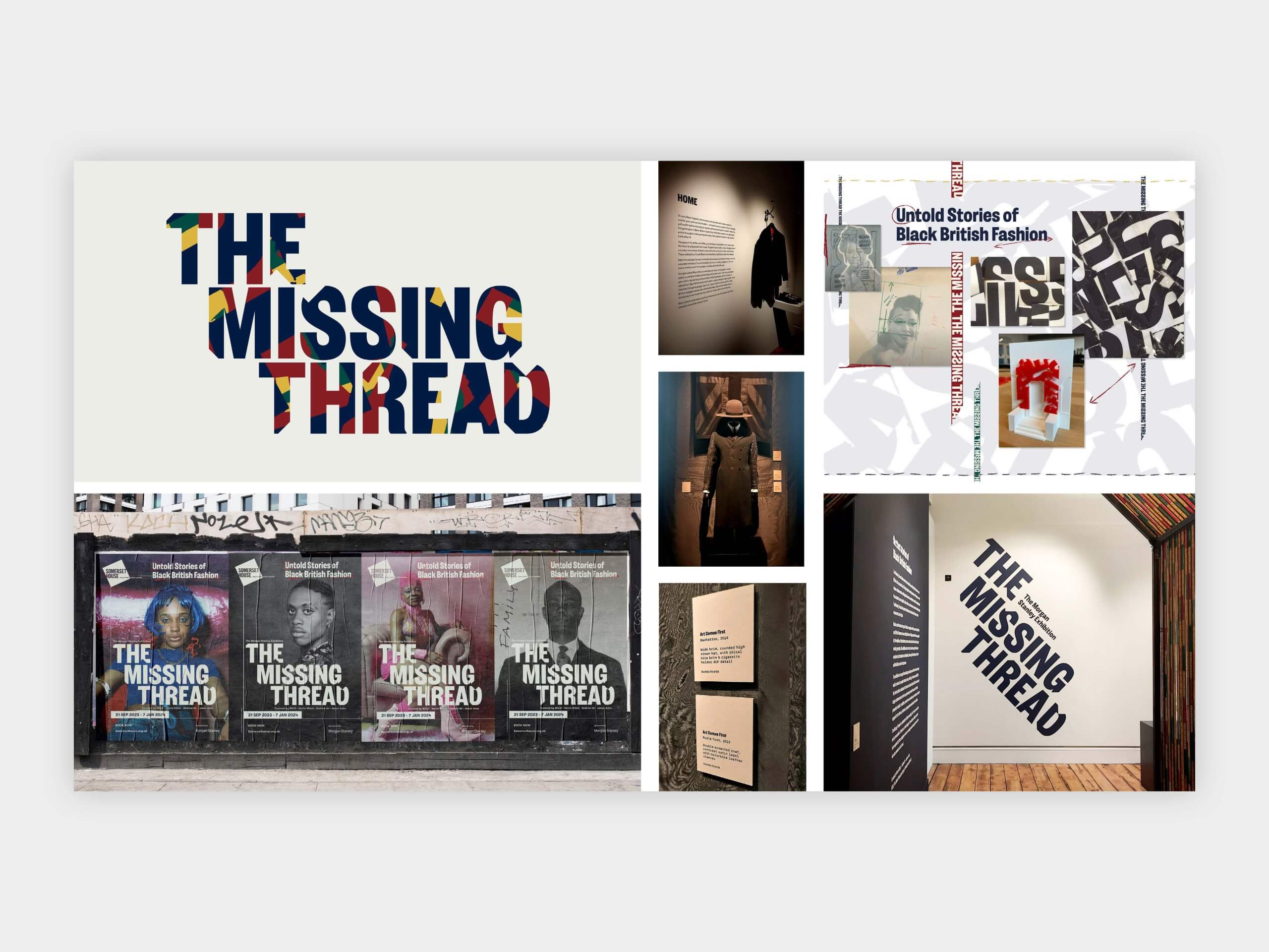
Carolyne’s exhibition work allows her to combine her graphic design experience with her long-standing interest in social history. The Missing Thread at Somerset House, which examined Black contribution to British fashion, pushed her to work collaboratively with curators, architects and young designers. The project challenged her team to visually “disrupt” traditional formats, and one of the defining elements emerged unexpectedly from an intern’s experimental, almost throwaway sketch. For Carolyne, it became a reminder that “all ideas are valid”, and that open creative dialogue is essential.

The Missing Thread exhibition's brand identity on display
The Missing Thread exhibition’s brand identity on display


Thank you Carolyne, for sharing such an honest and uplifting look into building a career shaped by passion and curiosity.


Advice for young designers

  • All ideas matter
  • Design a life you love
  • You can always reflect on where you are and think about what’s next
  • Design a life, not just a portfolio
  • Prioritise what aligns with your values
  • Design for Chiropractors and Osteopaths, your back will thank you!
  • “Ask for the brand guidelines… ask to see what was done before. When you know what was done before, you understand the standard you have to respond to.”


– Written by Sam Buxton
– Edited by Tommy Molnar

Kate Dawkins: Projection design

To kick off this year’s Baseline Shift sessions we welcomed Kate Dawkins, founder of Kate Dawkins Studio, who shared her fascinating experiences with projection design, speaking about her journey as a graphic design student into her role now.


A designer’s journey

Growing up in a deeply creative household with a father who built furniture and a mother who had a ‘dab hand at making beanbag frogs’, Kate was always drawn to creative fields, in particular the arts, wanting to become a famous ballet dancer. From Helvetica curtains, to drawing with a spirograph, Kate from a young age was curious about patterns, formations and colour. Starting out as a graphic design student, her world then was full of typography, grids and composition, with a strong focus on ‘clarity, order and storytelling on a page’. Her degree was very much about learning the rules about graphic design. She then went on to undertake a master’s degree at Central St Martin’s in visual communication which was an exciting time for creative expression and pushing the boundaries, particularly regarding music and emerging technologies.

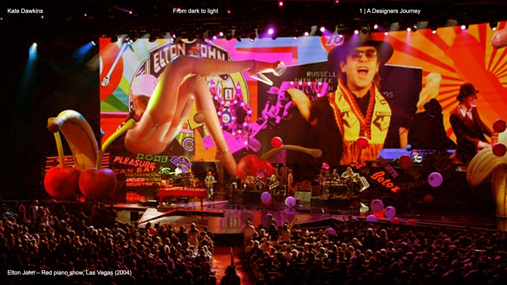
‘Curiosity pulled me forward’; there was a real question on what happens when design moves and this is where she began to look at the role of the viewer. This curiosity took Kate into the realm of moving graphics in the form of title sequences, broadcast graphics, commercials and music videos. This is where she would create club visuals for ‘Sound of the Asian underground’ and, more notably, where she would be scouted by American photographer David LaChappelle on her take for Elton John’s ‘Are you ready for love’, finding herself working on a massive live production creating the pop art visuals for Elton John’s Las Vegas show in 2004.
Elton John stage visuals


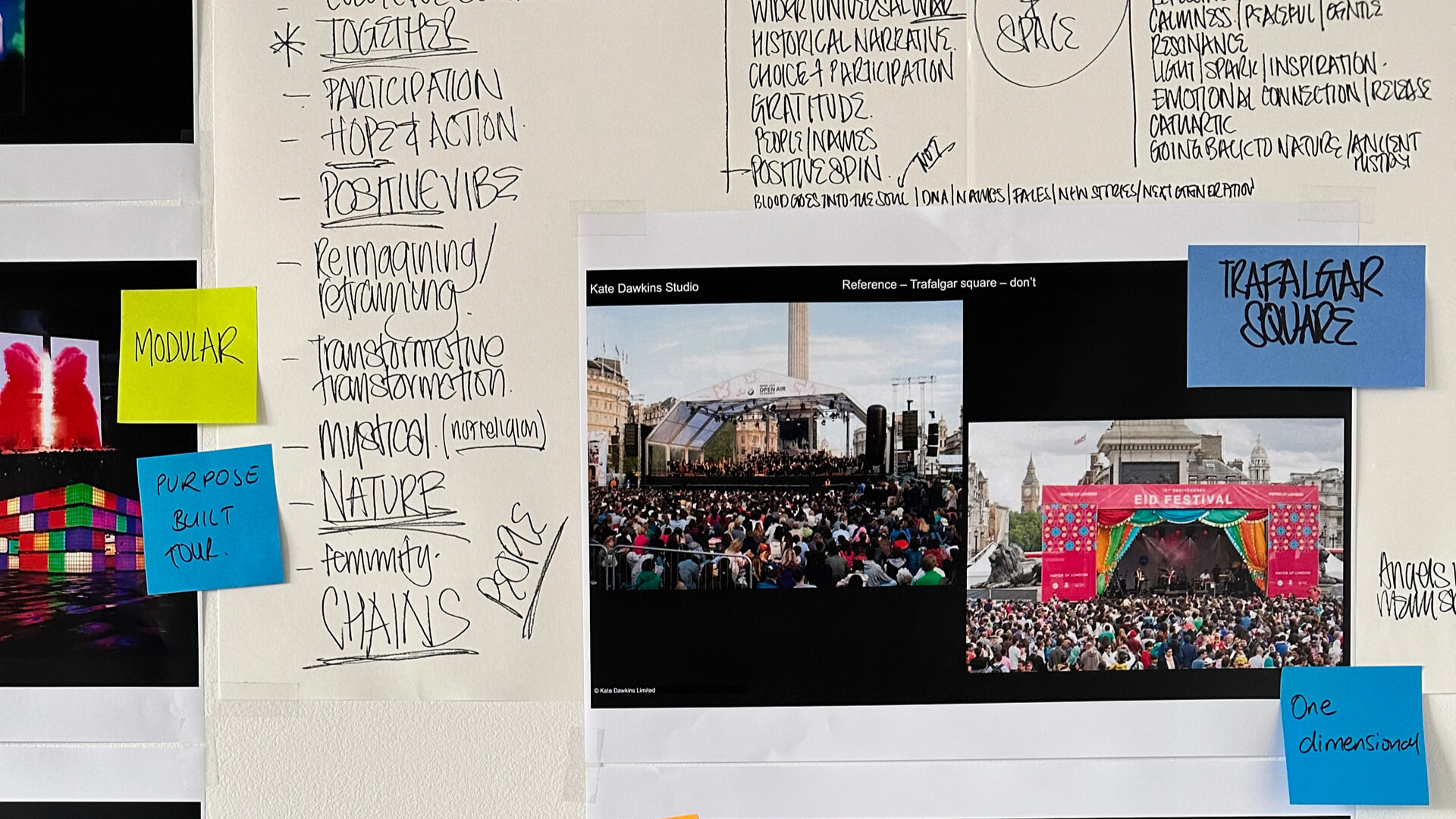
Designing for live events

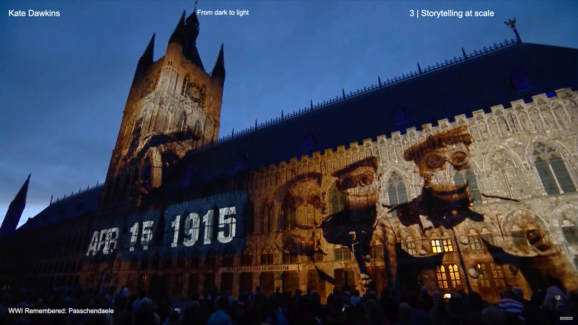
Kate proposed factors to consider when designing for live audiences. She expressed you could be designing for 80,000 people in a stadium or one at home sat watching tv, acknowledging people experience live events in different ways; but how do you reach them all? She highlighted 3 key components, the first being instant impact, which is all about creating bold visuals anyone can grasp in seconds. The second was emotional resonance, what emotions do you want to evoke from the audience in that moment? And the last was deeper meaning, looking at symbolism and detail that lingers afterwards. An example of this was her project for remembering WWI Passchendaele. This was the first building projection Kate undertook for the commemoration of the 100 years since the Battle of Passchendaele. Here they created a giant typographic poem by Siegfried Sassoon projected onto the building, breaking up into layers to hit these three components of design.

Projection for Passchendaele


Storytelling at scale

‘At scale storytelling is what carries you from first sketch to the live show’. Kate begins with research and listening to the client, as well as gaining context for the project, the background and history. Moving on to expressing this visually, Kate looks at concepts and storyboarding, crucially through initial sketches. The next stage looks at rehearsal and refinement – depending on how technology is acting up on the day requires the need for onsite technical changes right up to delivery. Something impactful Kate mentioned was ‘One chance, no do overs’ – even reading this quote gives that sense of adrenaline rush when you have one chance to get it right on the day!

Kate's concept storyboarding
Kate’s concept storyboarding


A glance at a case study

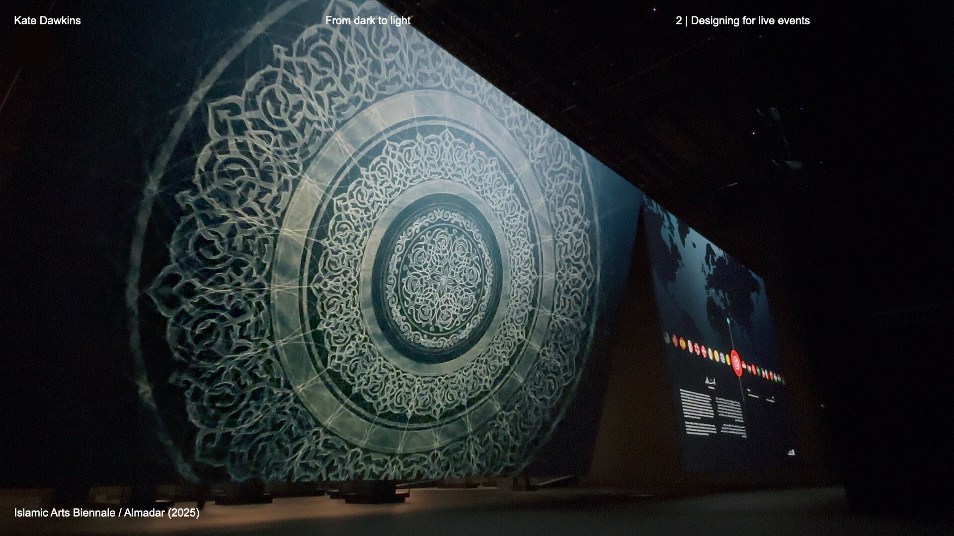
One of the many inspiring case studies Kate walked us through was her involvement in the ‘Islamic Arts Biennale’. Here Kate mentions it’s not only the audience you’re designing for in the seat, but the cultural and architectural impact of a space. Starting with a complete blank canvas, an old airport terminal, Kate worked together with architects to design the space. The task was to ‘create an abstract introductory film that set the emotional tone – communicating both the heavenly and earthly aspects of the exhibition’. This was combined with studying and portraying centuries worth of history through the artifacts, looking at how to portray their identity through materials and textures. This translated into a piece of moving images, achieving an exhibition that felt ‘contemporary and timeless’, as well as encompassing the emotional journey of the audience.

Exhibition for Islamic Arts Biennale/Almadar


The power of people

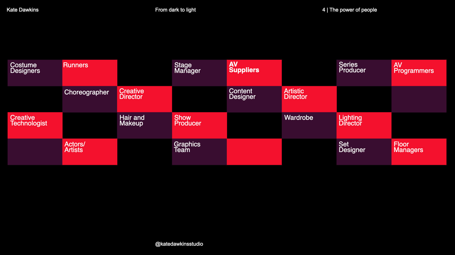
Collaboration is something Kate valued to be most important when it comes to any project. Although her team in the studio is made up of only two people, it takes a lot to get a live production up and running, requiring involvement from producers, editors, runners, choreographers etc. Kate expresses the role of design here is to ‘lead, listen and bring clarity out of complexity’ because live events cannot be conducted alone.

List of job roles involved in the collaborative process


Technology with purpose

Technology serves a crucial purpose, with tools being an important part of the process.

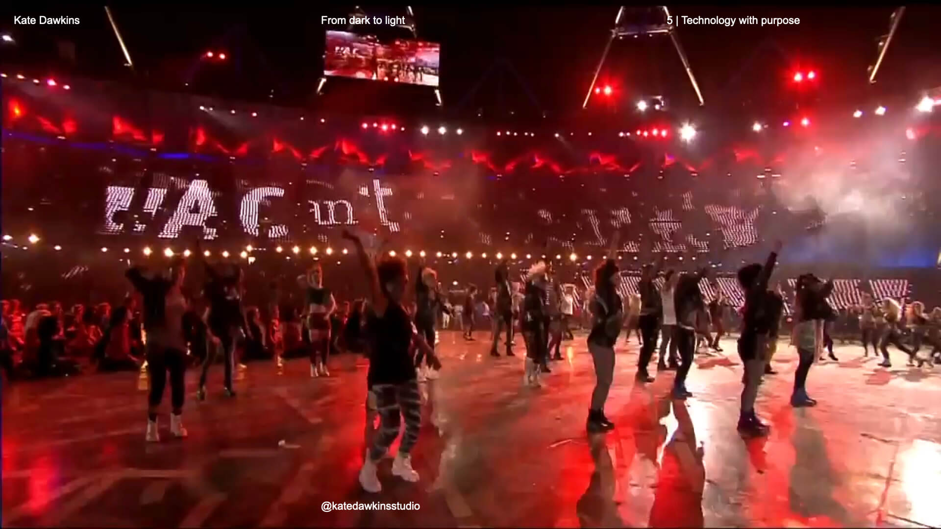
The beginning of Kate’s career used predominantly analogue techniques, with even the Elton John music video being created in this way. Kate mentions computers can feel quite soulless and highlights the need to keep tactile elements – she ensures that there are always materials to experiment with that can be found around her studio. Kate used this in a live event for the 2012 Olympics, where she tore up fanzines and abandoned digital outputs for a Sex Pistols piece. Something that resonated with students was We go to a lot of effort to make things that most people won’t even see, but I’ll know and that’s important’

Sex Pistols piece in 2012 Olympics


Thank you, Kate, for an inspiring talk into this world of live event design!


Advice for young designers

  • Start small, think big
  • Learn to love the dark – lean into enjoying what the project could be
  • Build skills across disciplines
  • Collaboration is everything, best work happens together
  • Design for emotion, not just aesthetics
  • Protect your curiosity


– Written by Amirah Yasin

– Edited by Tommy Molnar

Gavin Strange: Motion Design

For our penultimate Baseline Shift session of the year, we were joined by the talented Gavin Strange, Director and Designer for Bristol’s Aardman, and “a passion project pursuer under the alias, JamFactory”.


Creative journey

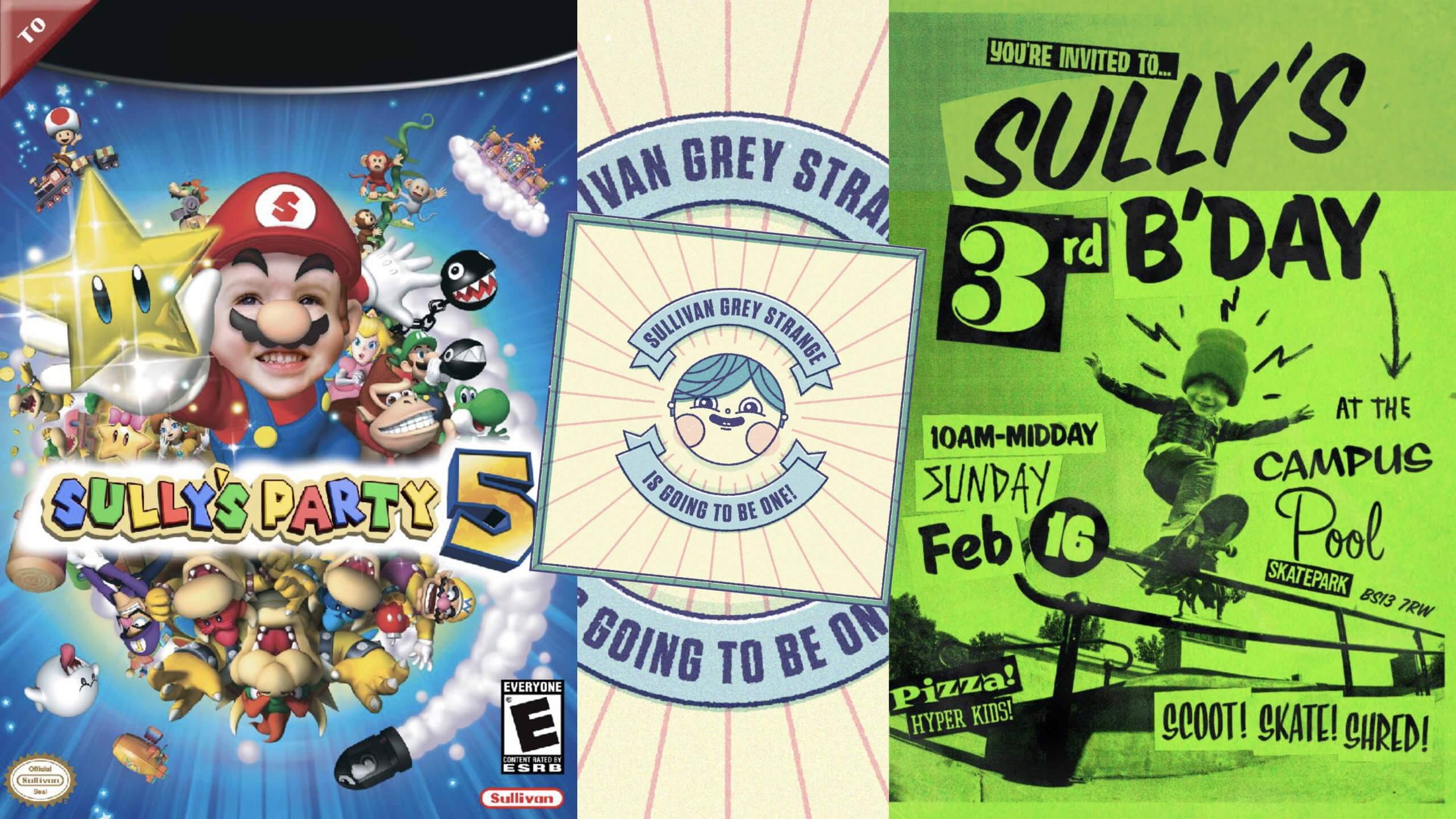
Gavin began by emphasising how important moving to Bristol 20 years ago was in his journey as a young creative, explaining how rich in art and culture the city is. Alongside Bristol being a pertinent source of inspiration, Gavin also highlighted how important his children are for keeping him motivated and creatively-engaged. Producing fantastically vibrant invites for their birthday parties and even creating them their own Duplo pinball machine, Gavin stresses that “the more you do, the easier it is to stay creative” even if it’s “for the sake of it”.

Playful family projects


Aardman

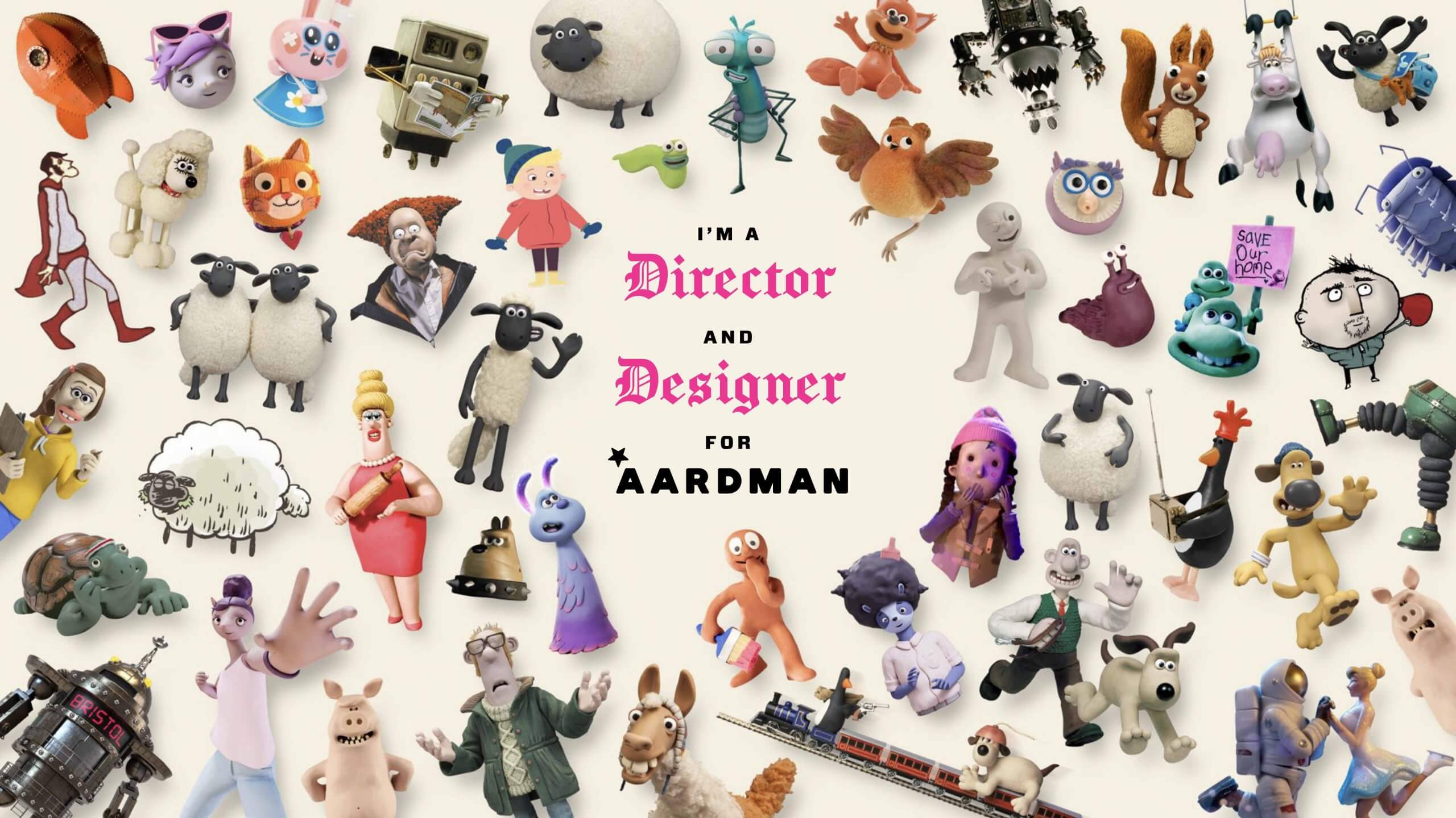
Aardman is a Bristol-based, stop-frame animation specialist studio that most notably animates productions such as Shaun the Sheep, Wallace and Gromit and Chicken Run. Gavin first joined the studio as a Senior Digital Designer while continuing to make passion project films and motion graphics under the alias, JamFactory. Eventually, Gavin’s love for filmmaking bled into his work at Aardman, leading to him officially becoming Director and Designer for the studio. Gavin resonates with the human-natured ethos of Aardman, finding value in working with other humans, opting for “human intelligence” as opposed to “the two letters” (referring to AI).

Showcase of characters animated by Aardman


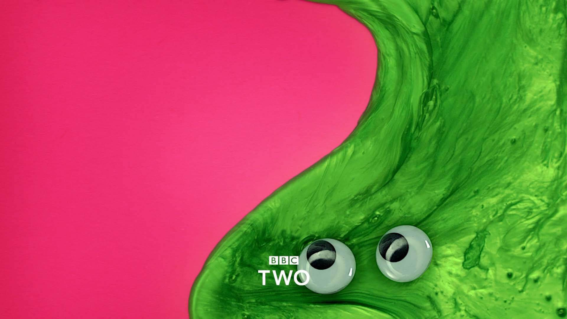
Gavin articulated how much he enjoys the variety that comes with working for Aardman, for example, in one project he might be making a “stop-frame, live-action, motion-graphic, rap video, title sequence” for the OFFF Festival in Barcelona, and in another, he’s working with “real-life slime and magnetically-puppeteered eyeballs” to produce programme transition cards for BBC Two. The dual role Gavin has at Aardman means that when he’s not directing, he’s designing, for instance, making motion graphics animation scenes featuring Wallce and Gromit’s smart gnome character ‘Norbot’ for their 2024 Christmas special, hiding jokes and gags in segments of the scenes. This way of working is great for Gavin as it allows him to contribute to both creative outlets.

BBC Two slime programme transition card


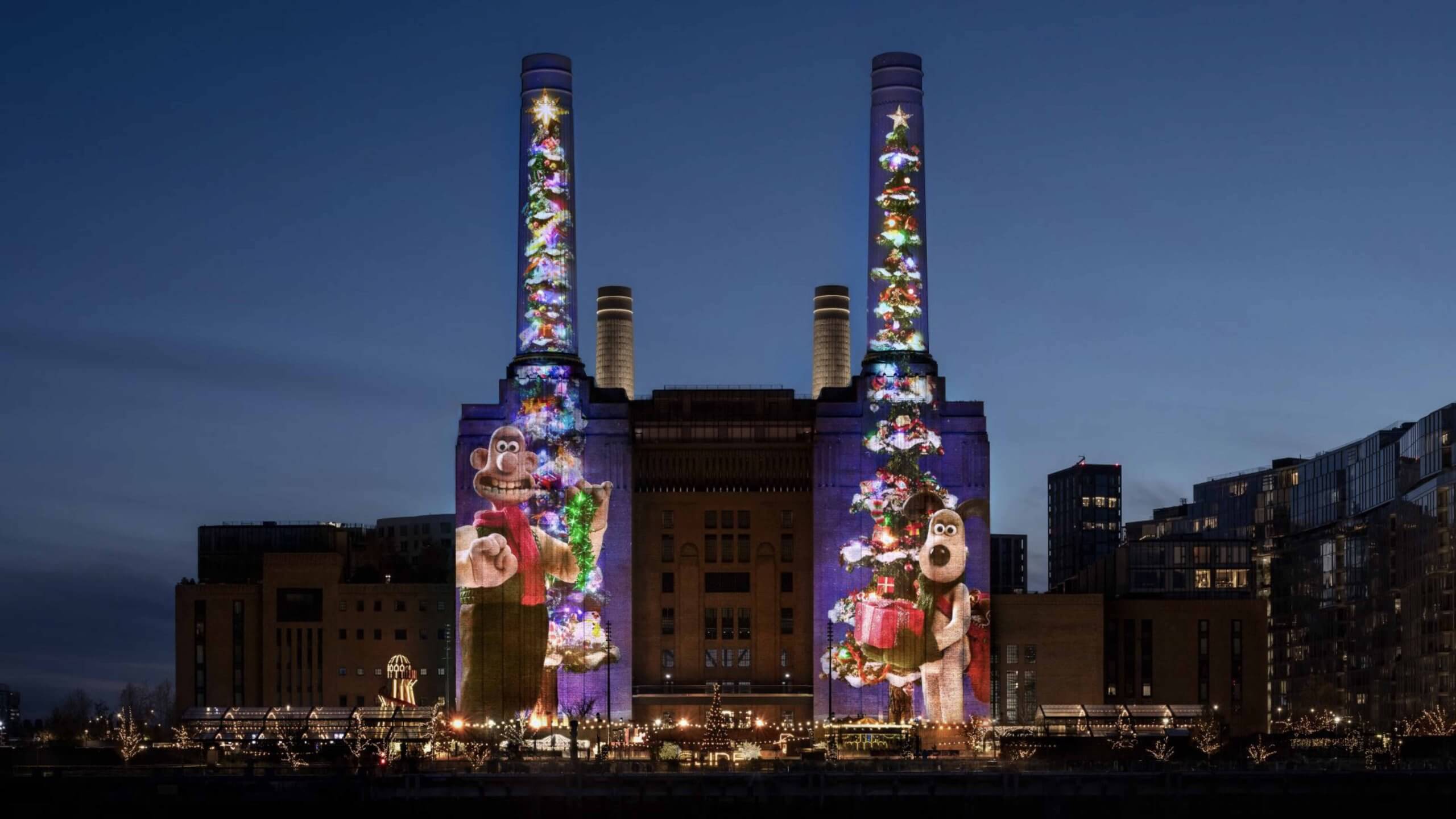
Working at Aardman also means the scale of the brief can be large, specifically as large as Battersea Power Station, where Gavin and his team projected animations of Wallace and Gromit for a project titled ‘Wallace and Gromit, shot on iPhone‘ onto the front of the building. The animation was entirely shot on an iPhone 16 Pro Max and was in collaboration with Apple. The projection was a whopping 101 metres tall and was shown every night of December 2024. Gavin related all of these projects back to his philosophy of “never knowing where things will take you” and “keeping your tools sharp”, stating that while we all have responsibilities during the day, as creatives, we should allow these responsibilities to spawn seeds of ideas to expand upon at night – which is precisely what Gavin has done for the past 25 years with JamFactory.

'Wallace and Gromit, shot on iPhone'
‘Wallace and Gromit, shot on iPhone’


Passion projects

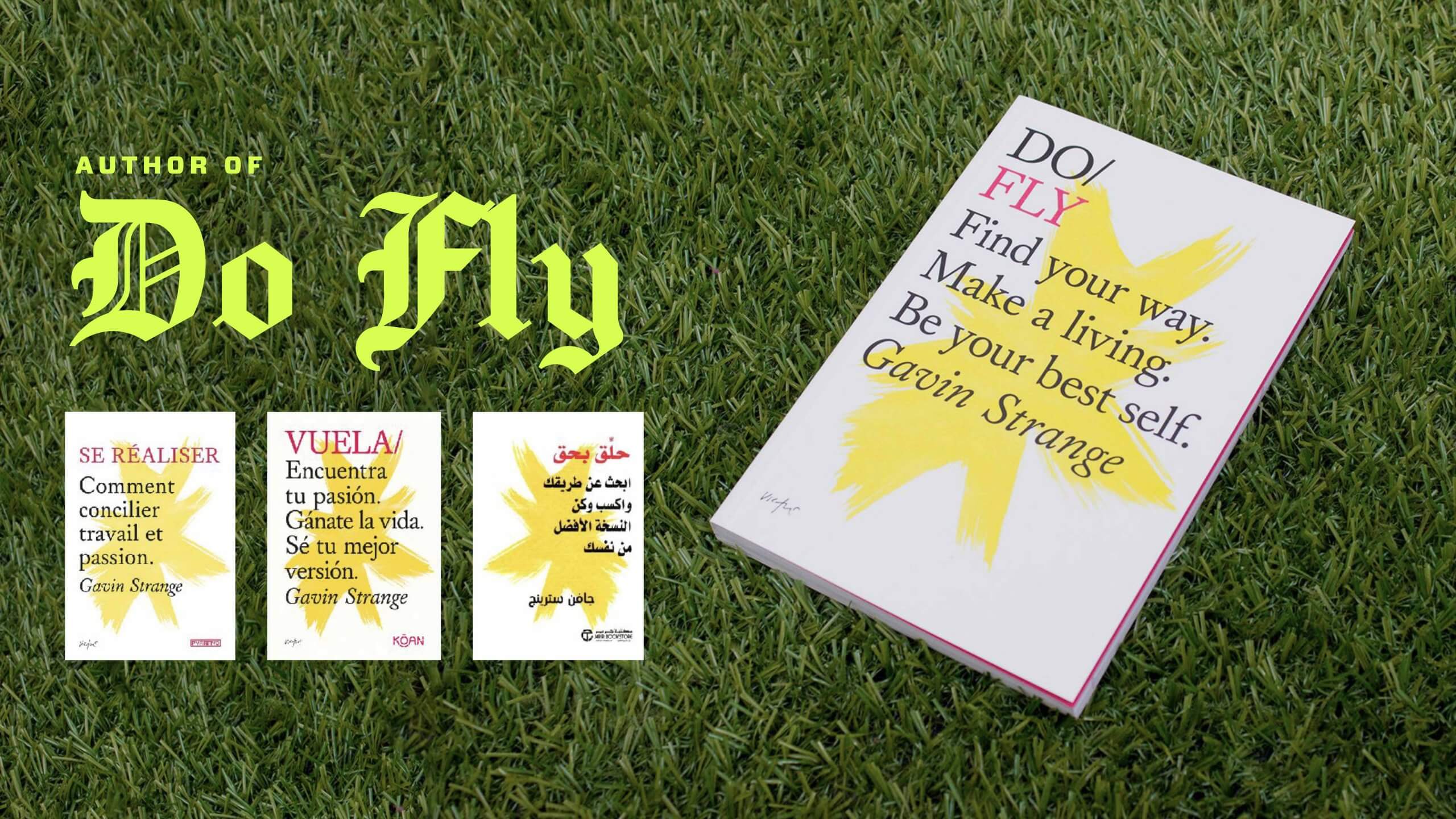
Outside of animating and designing, Gavin also has a vibrant passion for combining MIDI audio signals from his retro gaming gear into real-time visuals. Most recently, Gavin created a title-sequence for his friend in Dusseldorf, Germany and performed a “silly musical interlude” live at the event. Gavin mentioned that before pushing himself to expose his passion projects to an audience, he “was so preoccupied with worrying about what others were thinking, [he] was stopping [him]self from pushing forward”. Gavin has even written a motivational book ‘Do Fly‘ – something his English teacher would ‘never ever deem as being part of the plan’. This anecdote of believing in your own ability and pushing yourself to do the unexpected, is something that resonated with many of the students listening.

Gavin's motivational book 'Do Fly'
Gavin’s motivational book ‘Do Fly’


Creating your own space

Gavin emphasised the importance of carving out and creating your own space as a creative to make things happen both physically and digitally. He offered students the valuable advice; “you won’t stand out unless you’ve told someone what you’re capable of”, and while it is important to display your primary skills (those that you’re most capable at), it is equally important to showcase your secondary and tertiary skills. Gavin highlighted his maximalist outlook of presenting work; advising that we choose a method of presenting that represents us as designers. Students were left with one last piece of advice; “if I find my voice, then my audience will find me”.


Key takeaways

  • Don’t wait to be asked.
  • Seek creative satisfaction wherever you can get it.
  • Less thinkering, more tinkering.
  • Be productive, not precious.
  • Make portfolio full of work you want to be hired for.
  • Always keep your tools sharp.


– Written by Oscar Dudley