
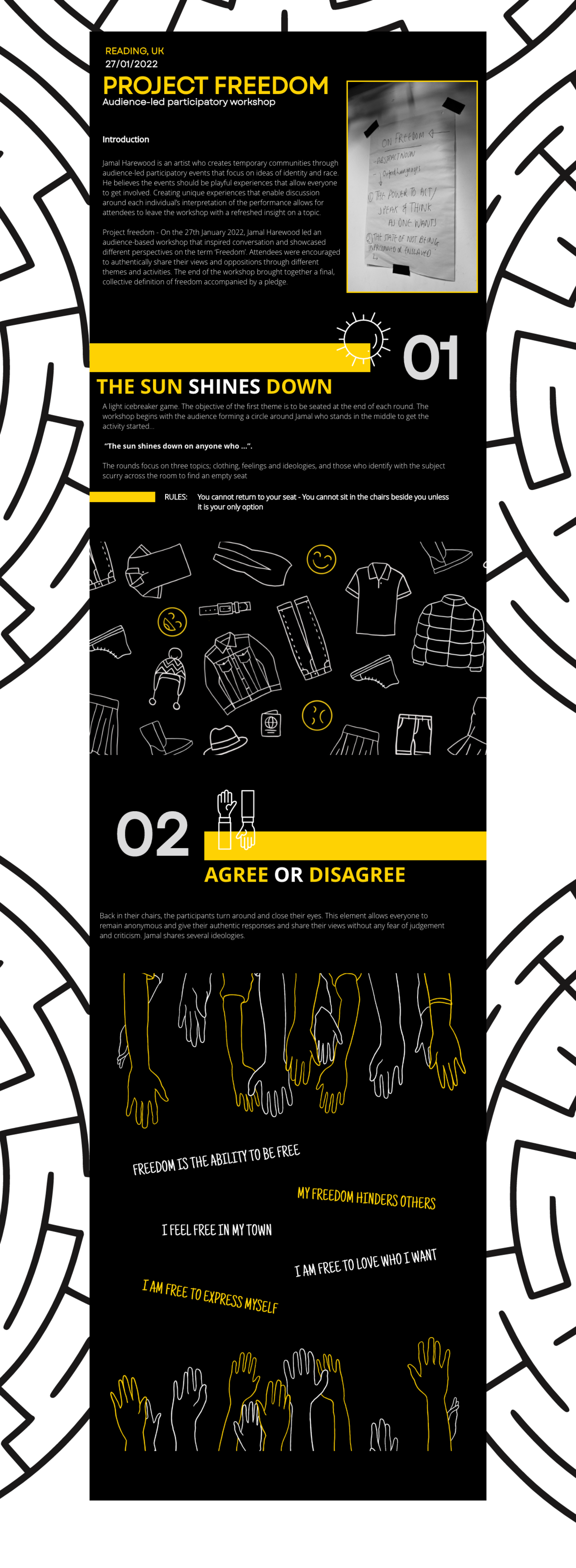
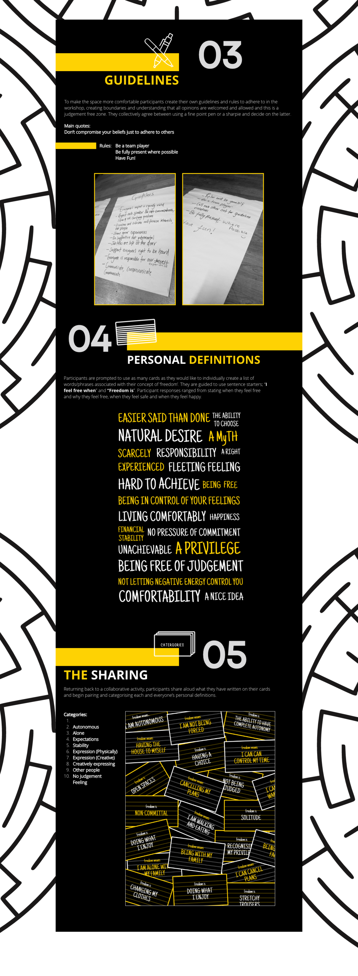
Background
Jamal Harewood is an activist who sets out to share his vision of race and identity through workshops around England. He is currently undergoing a freedom workshop that seeks to redefine the term ‘freedom’ by discussing each individual in the workshop—participants brought in different perspectives and Fresh insight onto specific topics free from any judgement and authenticity.
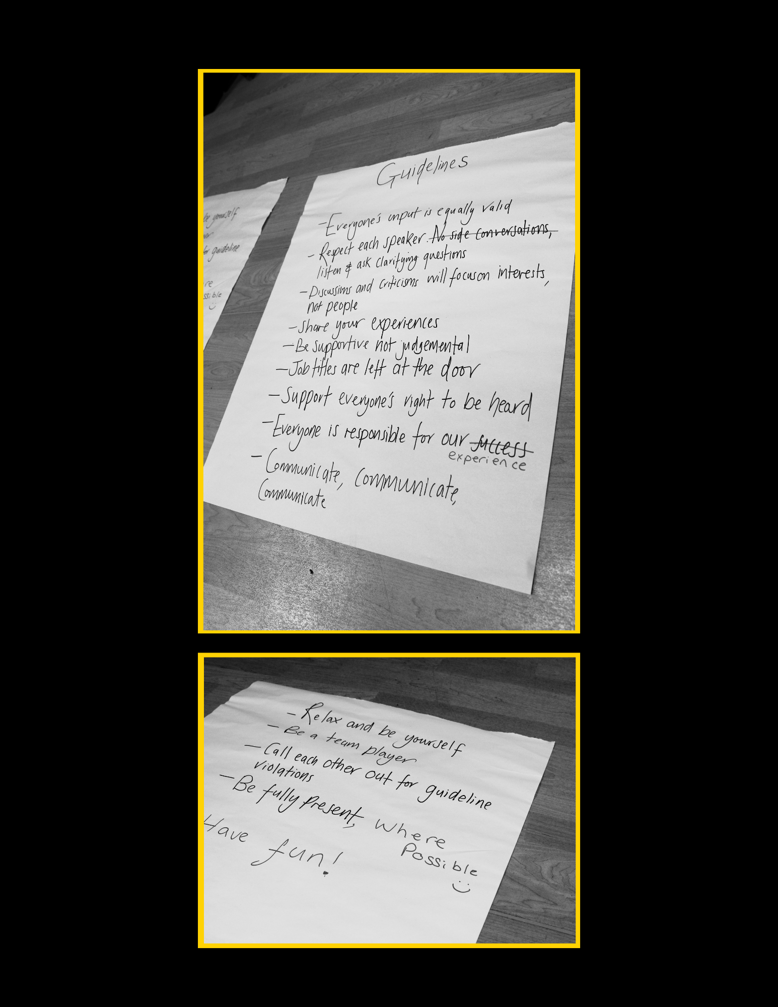
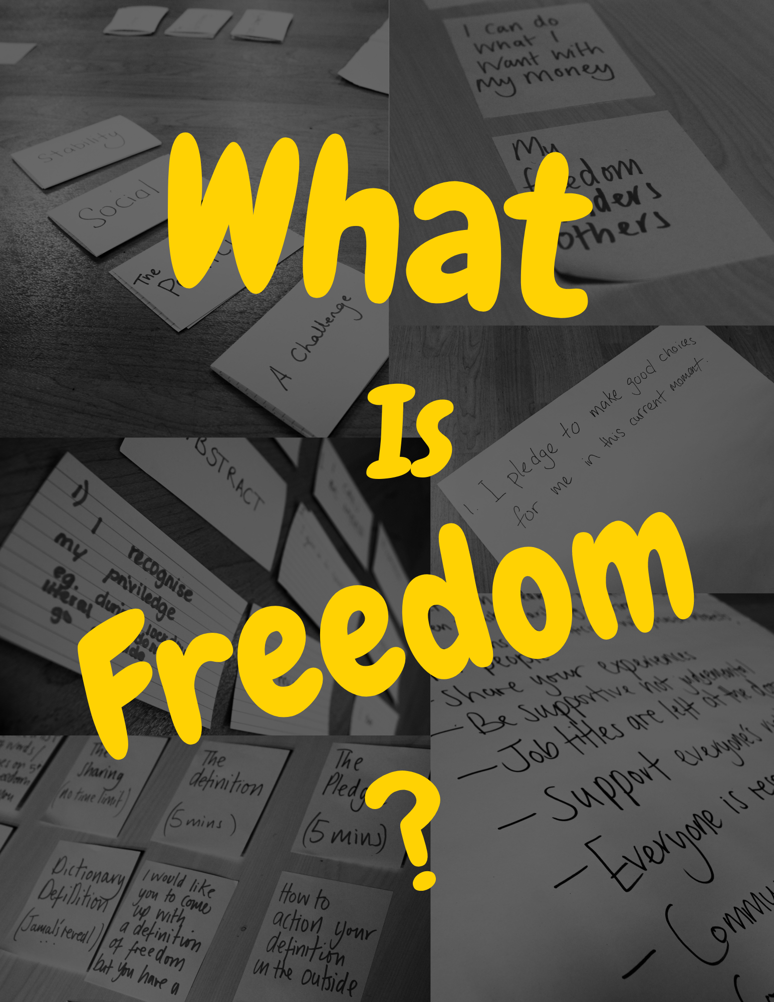
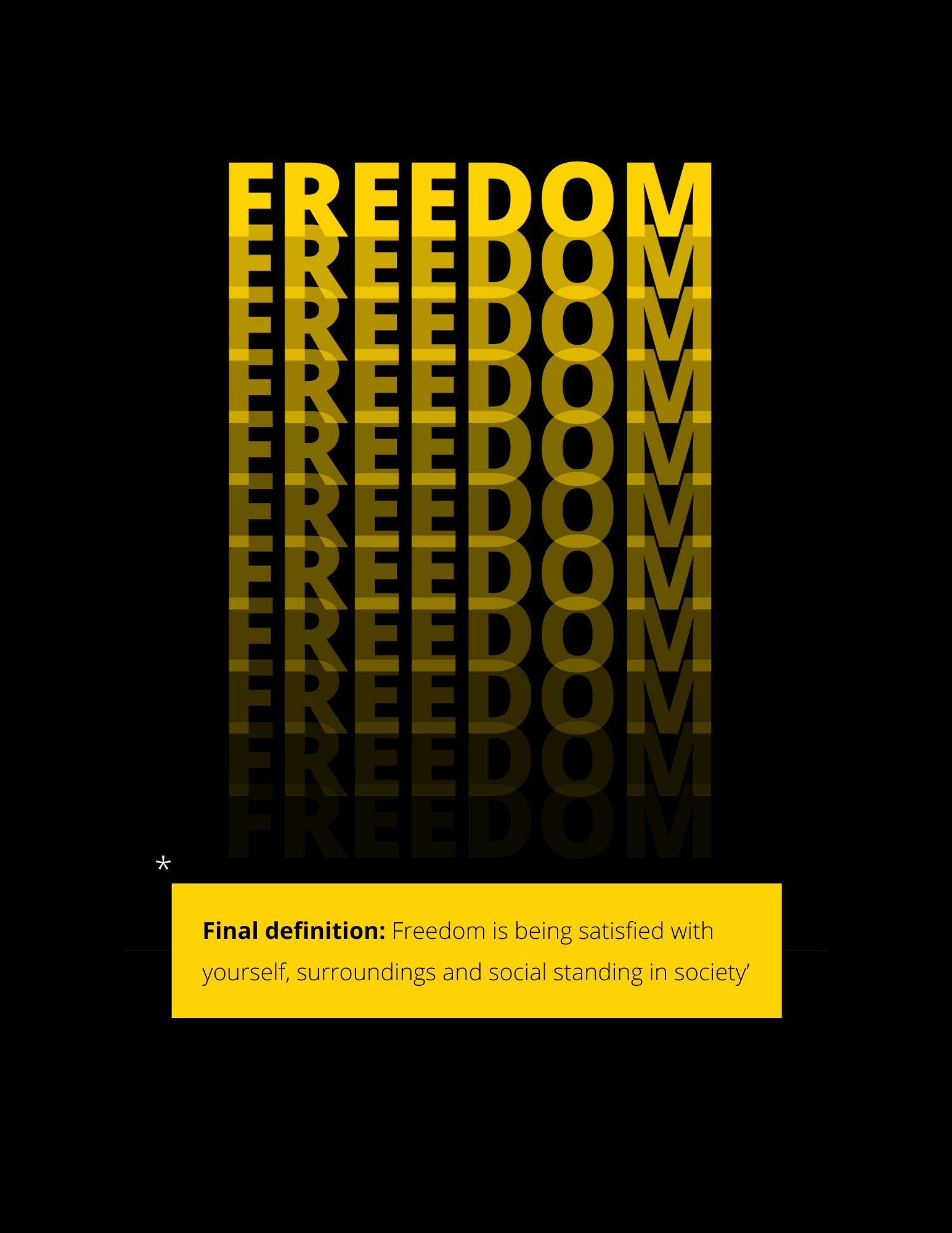
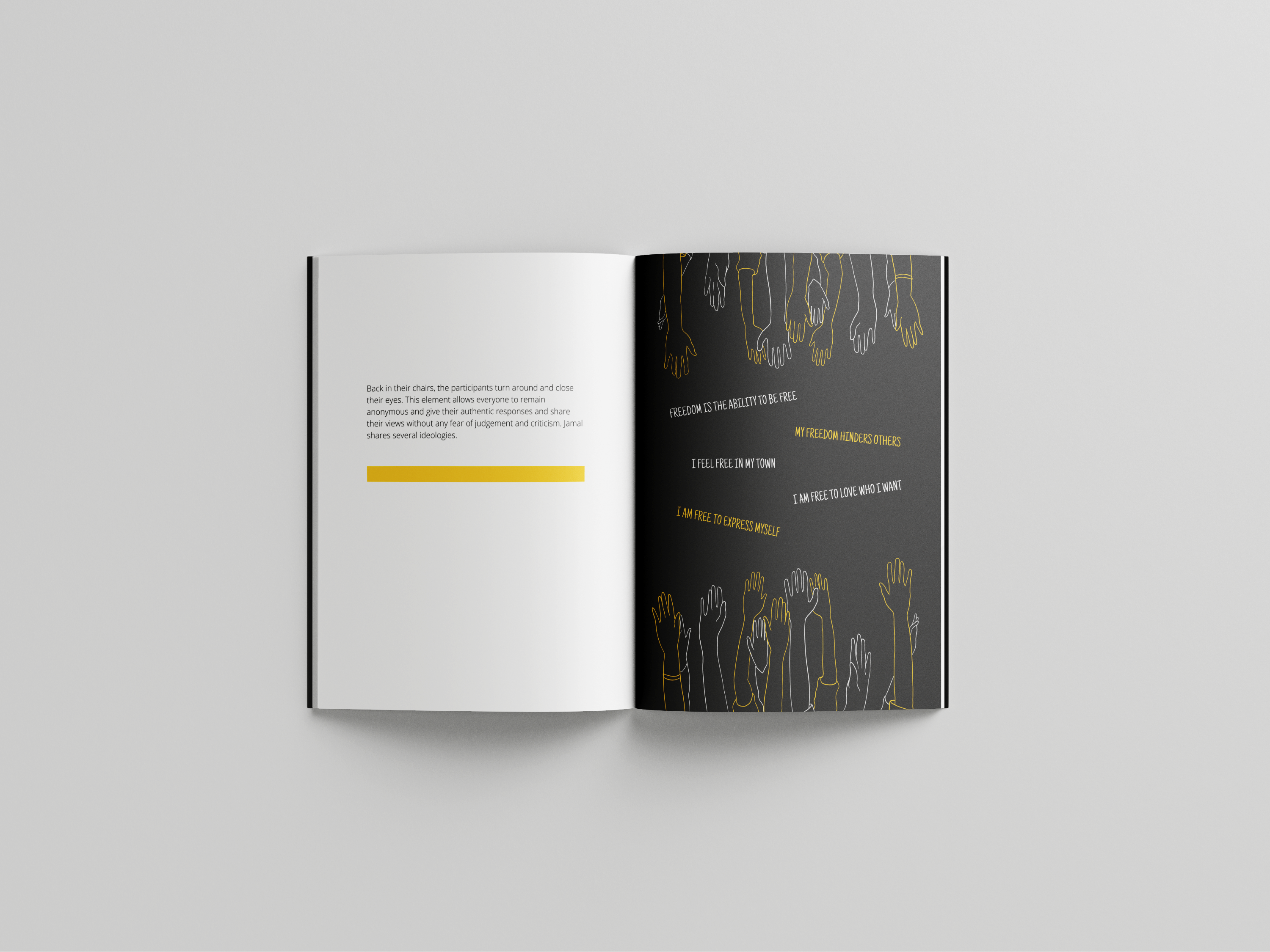
On the 27th of January, Jamal Harewood led an audience-based workshop, ‘Project Freedom’, in Minghella Studios theatre Reading university. It comprises a diverse number of students that seek to redefine freedom on their terms. The workshop was a playful experience where participants were encouraged to discuss and share their views and opposition to different themes and activities. Each individual created a new definition of freedom and a pledge to follow through. Overall, the workshop brought a collective of ideas together.
The premise of this real job is to document the workshop and create deliverables that would suit Jamal’s brand and idea. He wanted to write about the unique experience of this temporary community and show the discussions and interpretations of each individual.
Restated brief
GOALS
After we document our client’s workshop ‘Project freedom’ and his interactions with the audience, we are tasked to create a booklet and UX blog post that include the wide range of diverse experiences and definitions of freedom from the participants. The audience is the focal point of the workshop, so it is important to make the deliverables as personal as possible, not only showing their ideas but their performances and behaviour.
Our Brief main goal is to offer attendees an opportunity to revisit their experiences in Jamal’s workshop. They would be able to look through the deliverables and find quotes and thought that they said at the workshop. Although we would only be able to document one workshop, Jamal would like to carry out this project in other workshops, thereby using this deliverable as a template for future workshops and making a profit from the booklet independently.
DELIVERABLES
- Booklet.
- Booklet template. Amendable Canva template for client’s upcoming workshops
- Blog post prototype.
Research and ideation
One of the primary branding guidelines Jamal gave us was to involve the colour black. Initially, he wanted the book page to be black but having an all-black book would not be legible with some research and inspiration, we were able to find what works for Jamals.
For inspiration, Jannah and I started looking at different design idea platforms such as Pinterest and Behance. We looked at different layouts and formats of presenting texts and theme pages. We found some booklets that integrated box shapes into the body text while acting as a filler; This helped because the body text of the booklet isn’t heavy, so it was important to find a way to show the text without the book looking empty.

We understood that for this deliverable to be genuinely successful, we needed to have colours that would resonate with Jamal and his brand. When researching, the colour yellow with black caught our eyes the most. The cheerful and eye-catching hues of yellows are balanced by the more sober and sophisticated shades of black. Black and yellow branding worked well as these two colours were balanced and contrasted.
We set out to not only look for design inspirations but a colour scheme for Jamal to use across the different workshops. The colours you use in your branding and design are more than just a matter of aesthetics. Is your brand exclusive, accessible, friendly, cheerful, or mysterious? Your choice of colours reflects what your brand stands for and what customers associate with it. Understanding Jamal and the type of brand he wants to represent was one of the primary key points noted when choosing inspirations online.
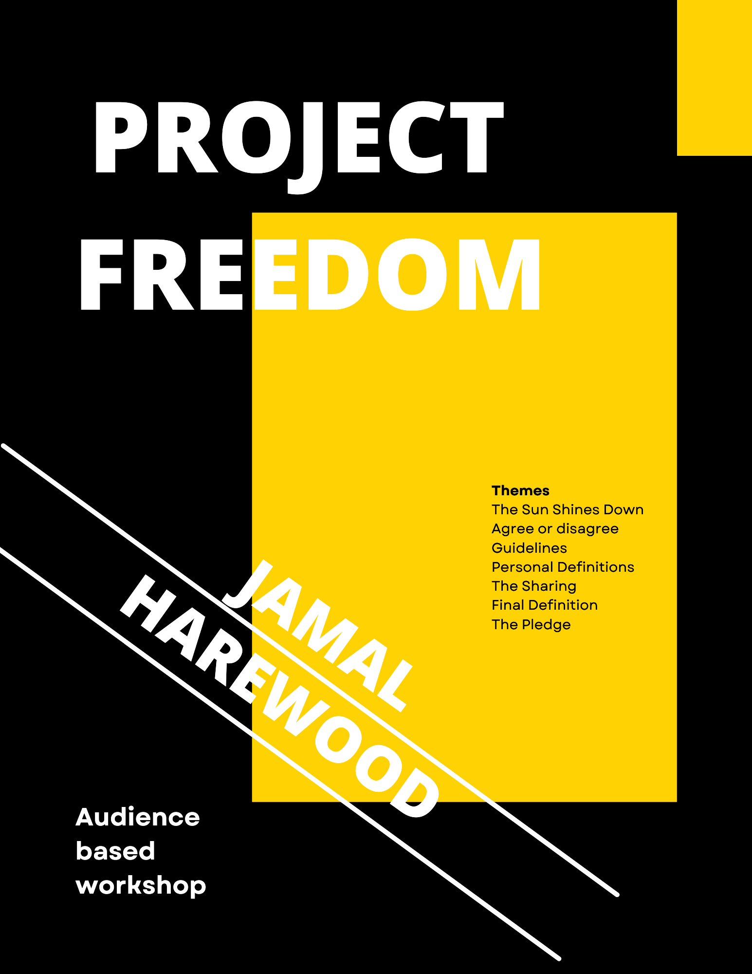
Due to the nature of this project, we had to find a way for Jamal to distinguish his booklets across different workshops. We thought of the idea of using colours to differentiate but keeping the layout and the design of the booklet the same would be helpful for Jamal to design his booklet without the need for designers. So when users see the different branding colours, they would be able to associate the colour with the various workshops.
Design Development
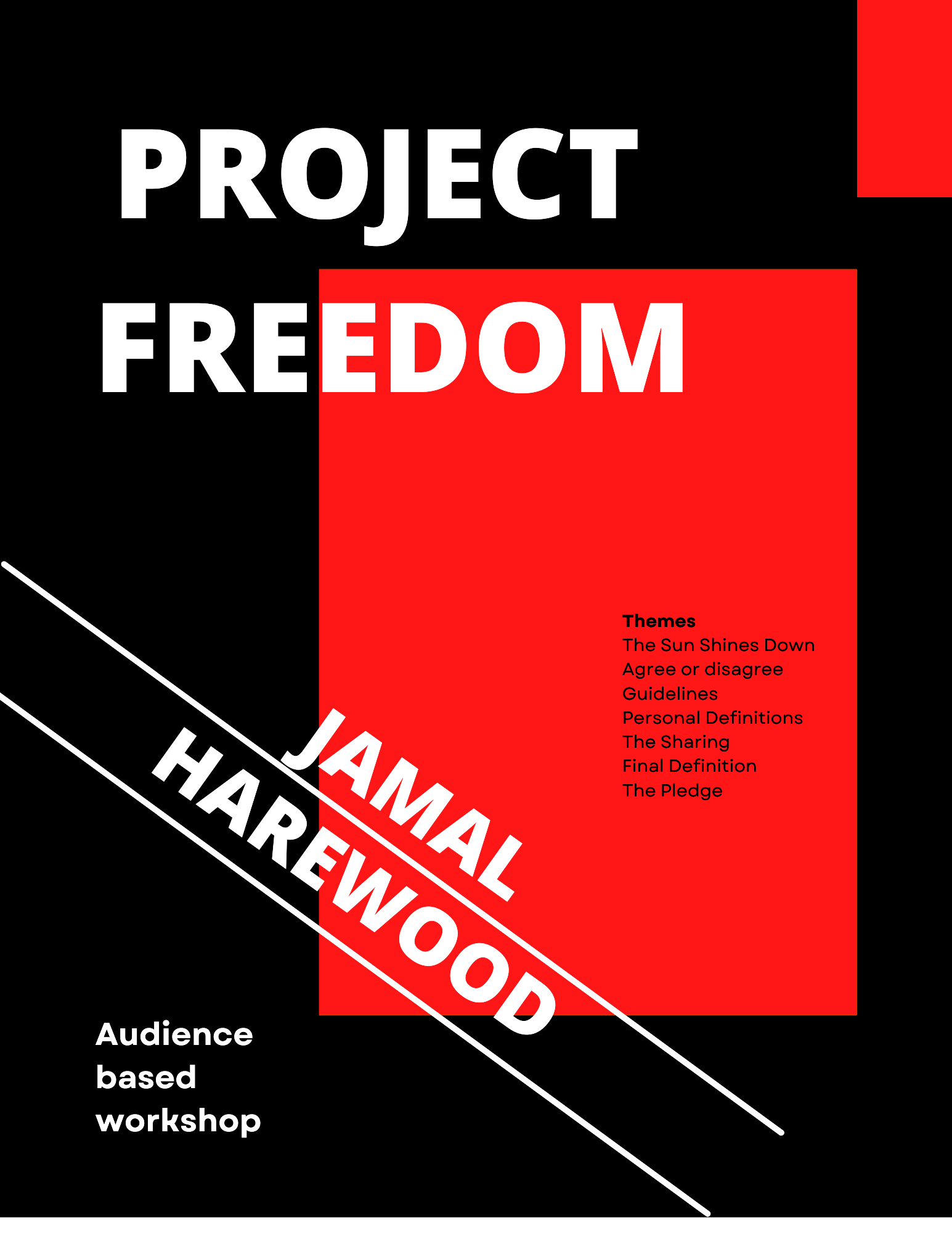
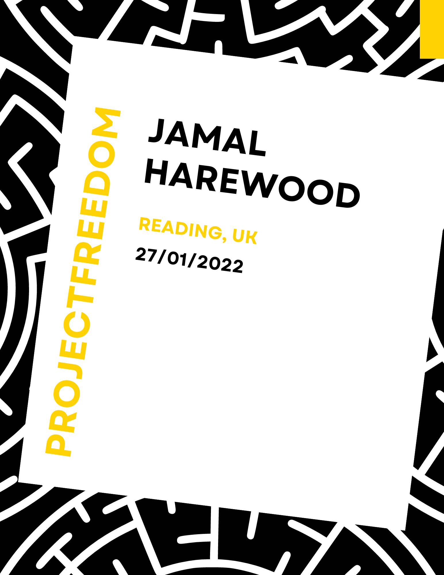
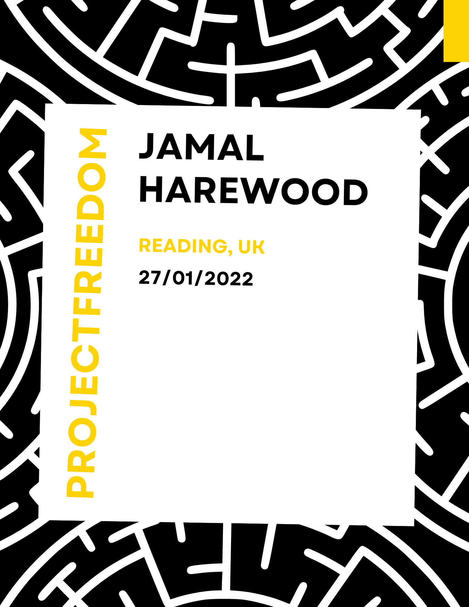
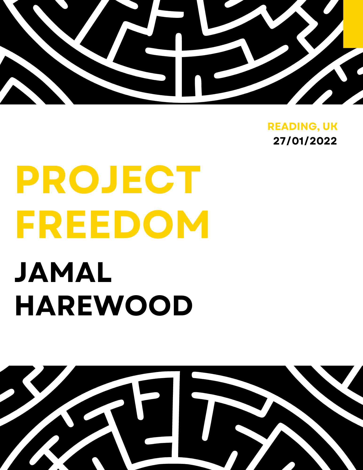
Jamal Harewood gave us complete creative control however, he wanted the primary colour for his deliverables to be black. This was because his brand identity is black with a maze and fist logo showing his connection to the BLM movement. He wanted his brand identity to be applied to his printed booklet and blog post for a consistent brand identity. We explored different colour palettes that will complement the key colours (black and white) the client has requested to be used throughout each deliverable.
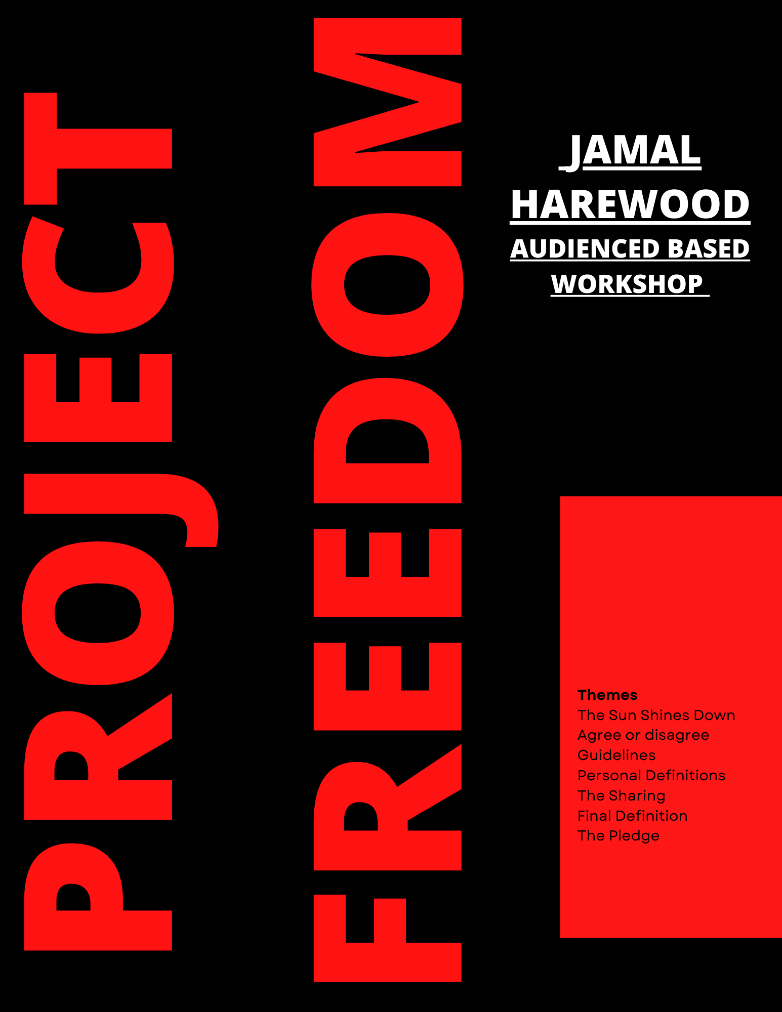
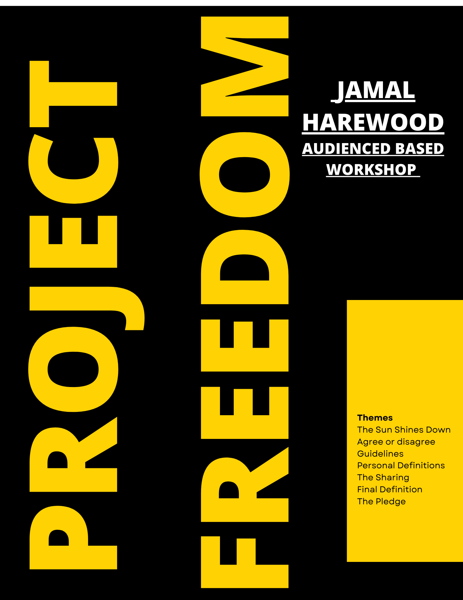
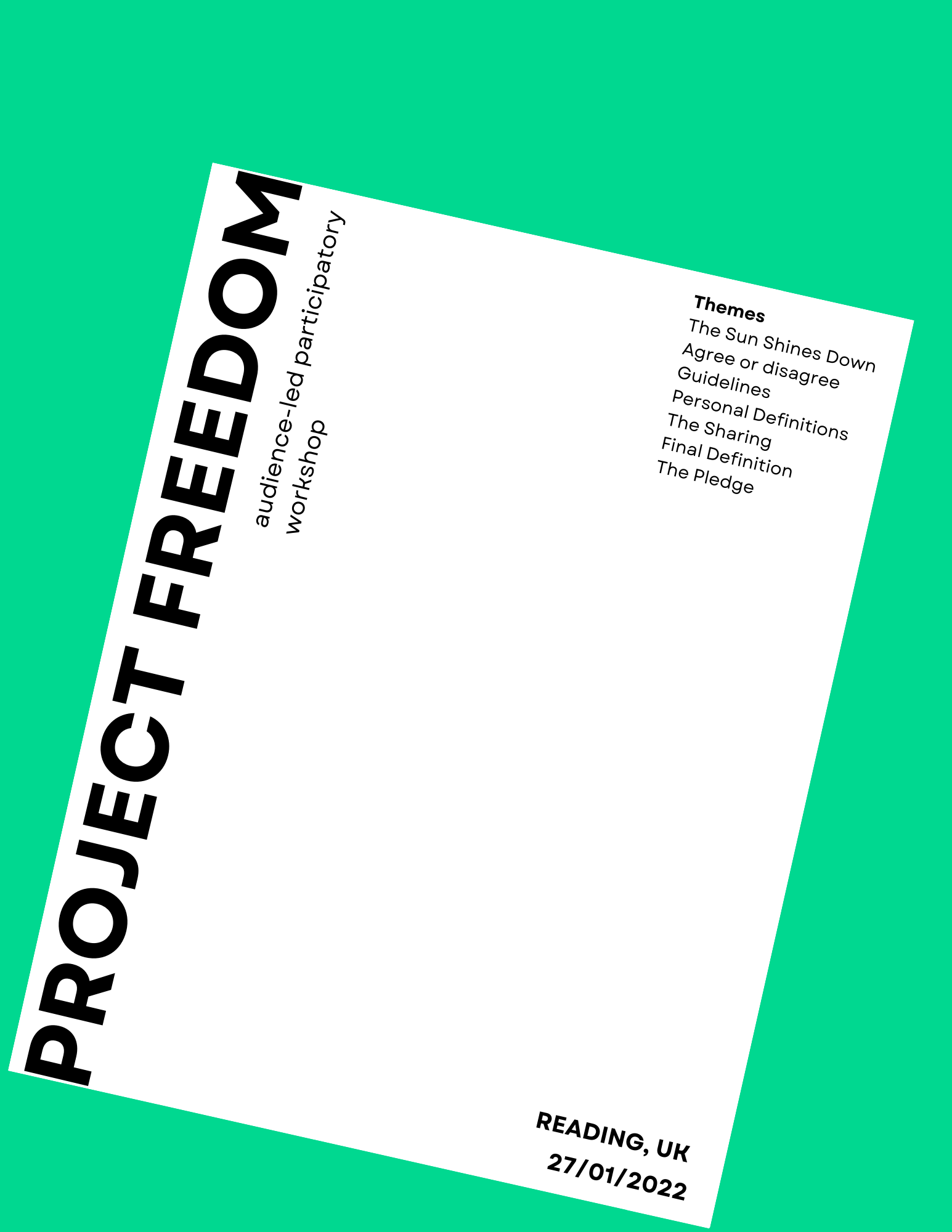
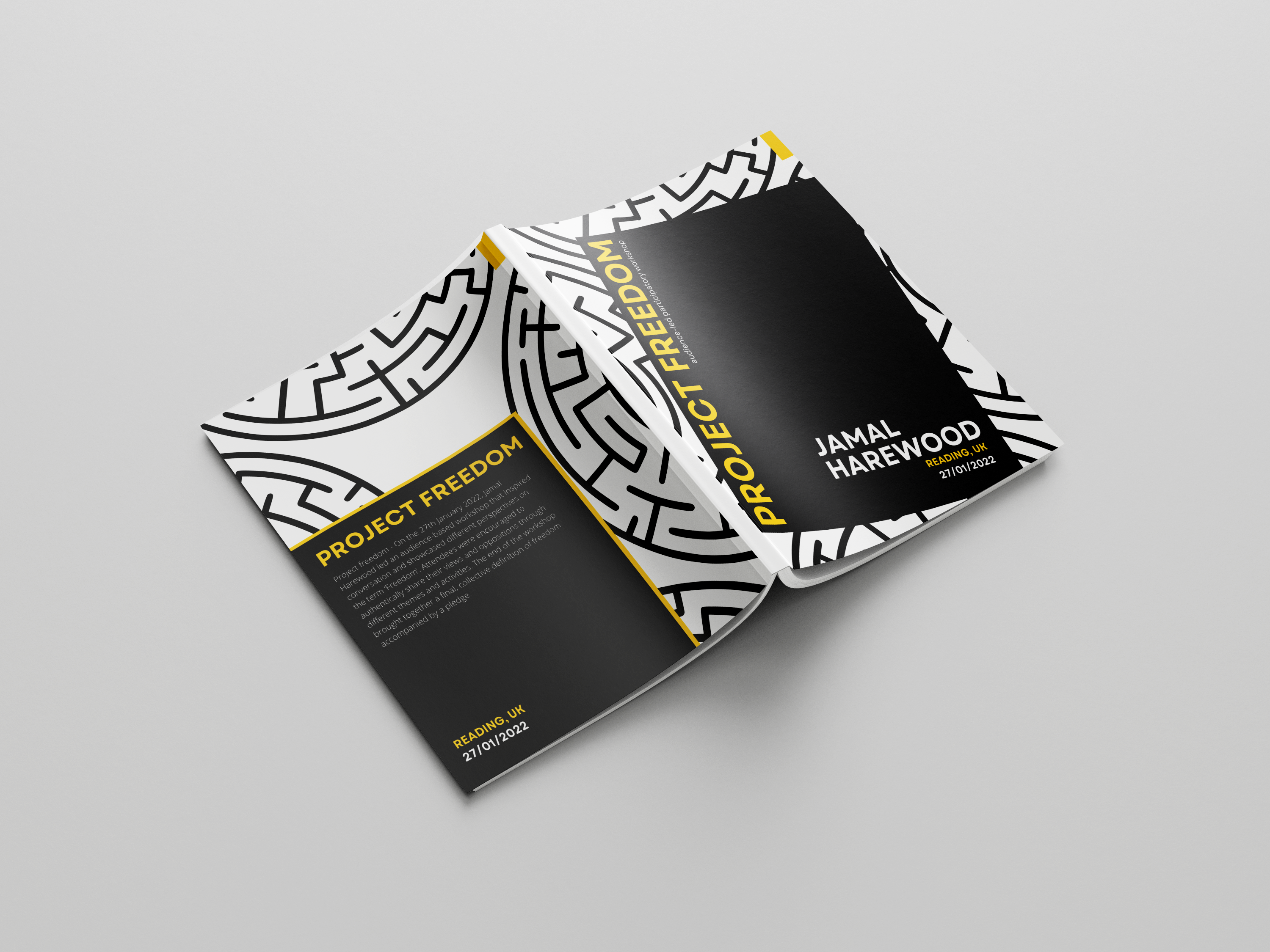
Front cover

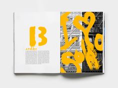
This was my first draft for the book cover. The layout was nice and exciting, but it had a stern look and did not fit Jamal’s brand. However, the design had a sophisticated look similar to a journal, which contrasted Jamal’sbrand for the booklet is meant to be playful and inviting. The structures are shown in different colours to give Jamal an idea of how we would represent his various workshops. The coloured box represents a door revealing the theme; it helps viewers know what to expect when coming to the workshop.
For the second book cover design, I played around with making the cover as friendly and as inviting as possible. However, it was typographically right. The title of the book, being vertical, was not legible, and there were too many different text formats that did not complement each other. This resulted in a lack of proper hierarchy in the text and could confuse users.
Jannah’sdesigns were interesting as they also played around with the vertical and diagonal layout for the text, but the background felt like something was missing. Jannah’ssecond draft also had the issue of being sophisticated and not fitting Jamal’spersonality or the playfulness of the workshop.
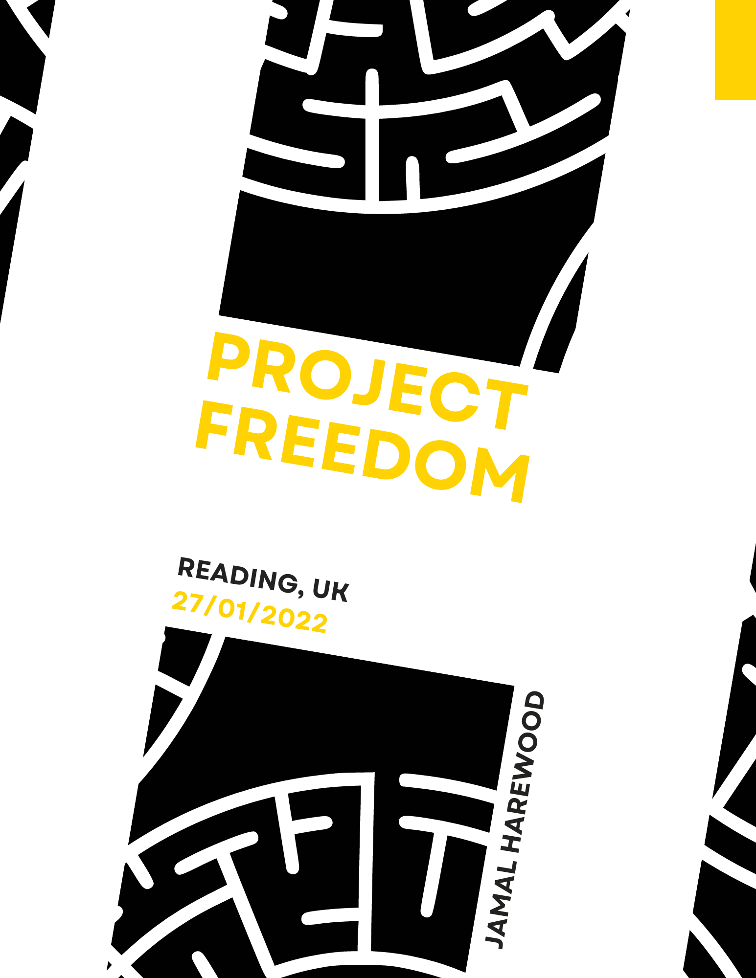
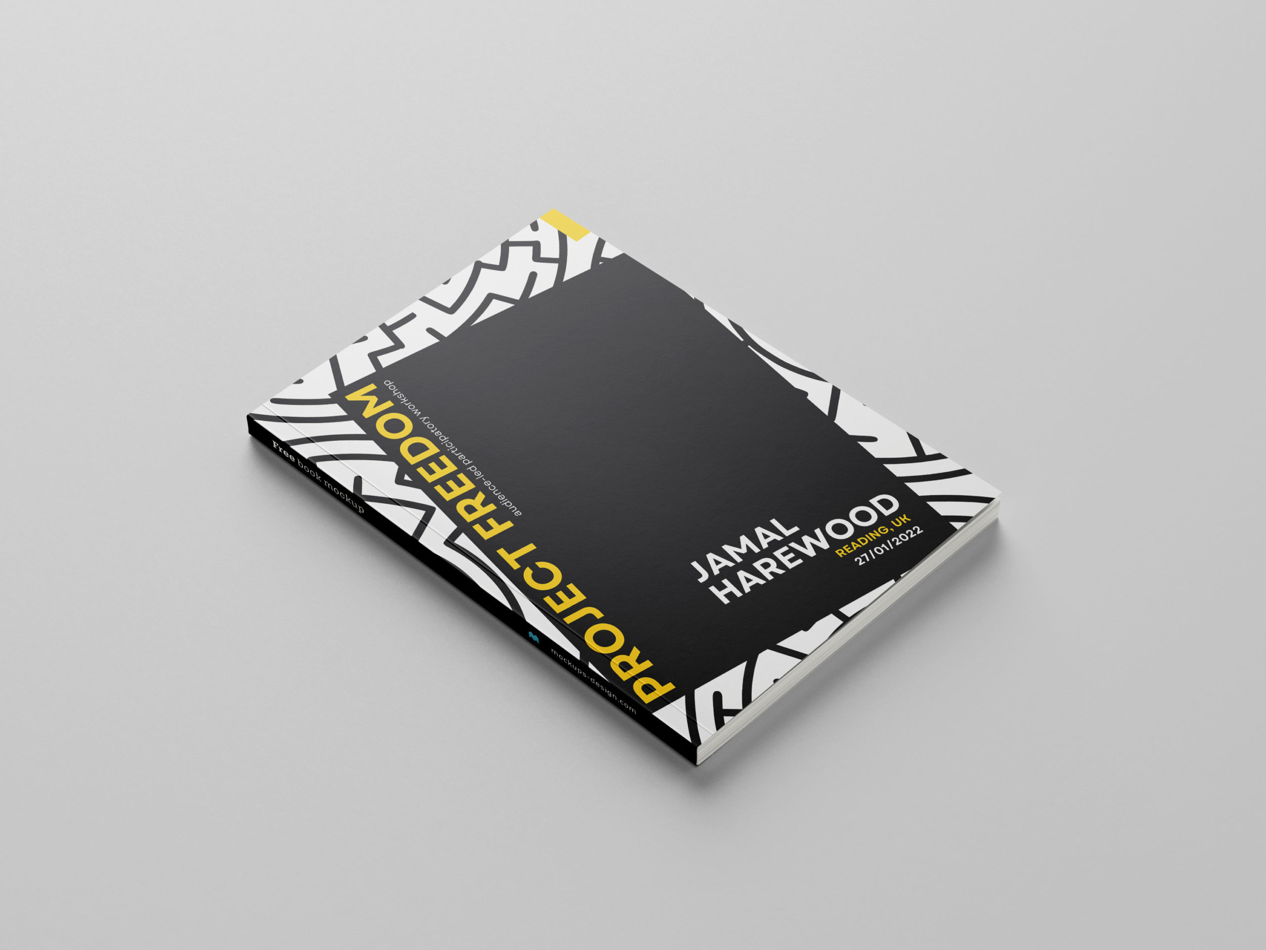
To move further, we decided to combine the best elements of our designs into one to create Jamal’s book cover. However, nothing on the book cover represented Jamal or his brand apart from his name. I suggested using the maze design and adding it to the book cover’s background, which worked well to show Jamal’s brand. I explored different layouts and formats for the maze design.
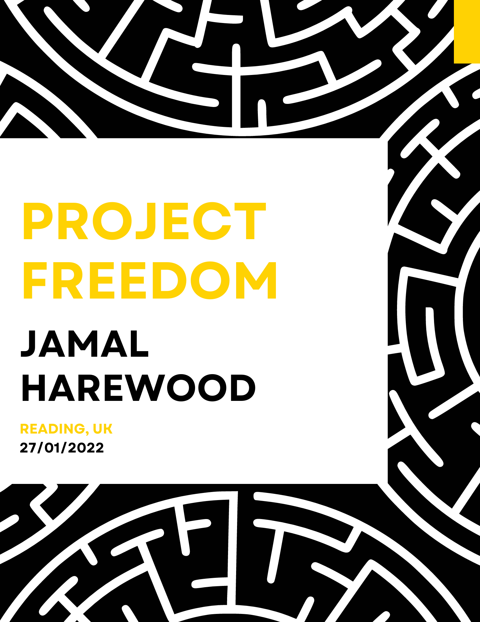

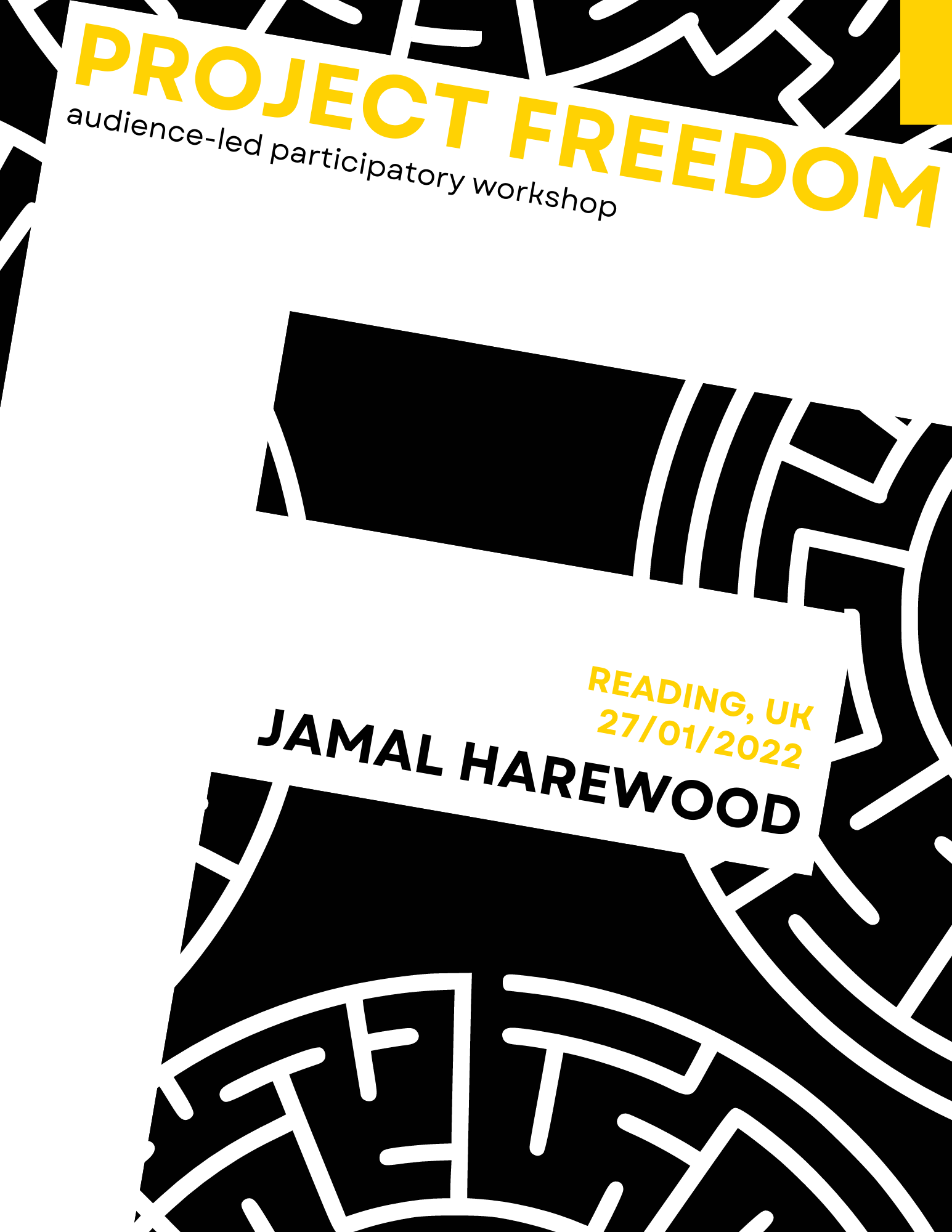
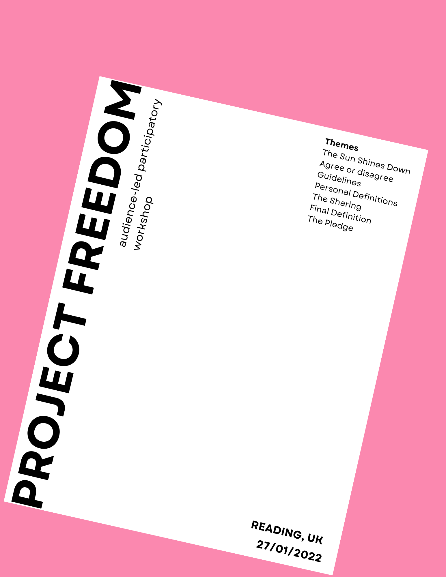
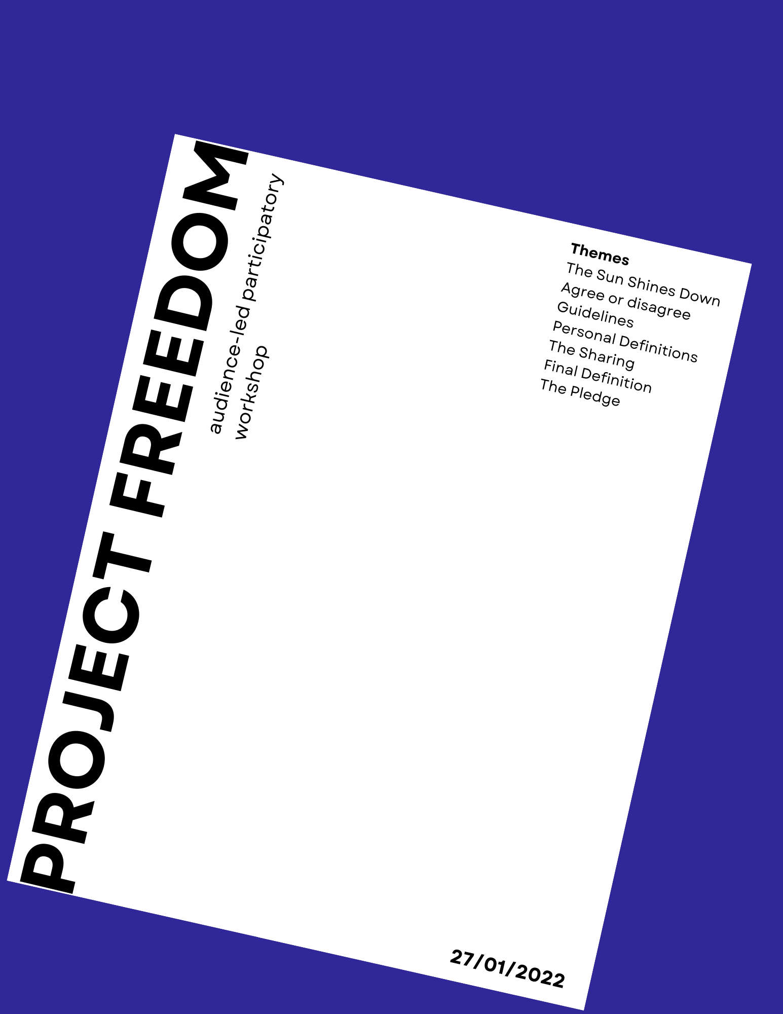
As we move further into the book cover development, Jamal told us he preferred the white background with the black maze line. we agreed with him because it was neater and more visually appealing when combined with the other book cover element
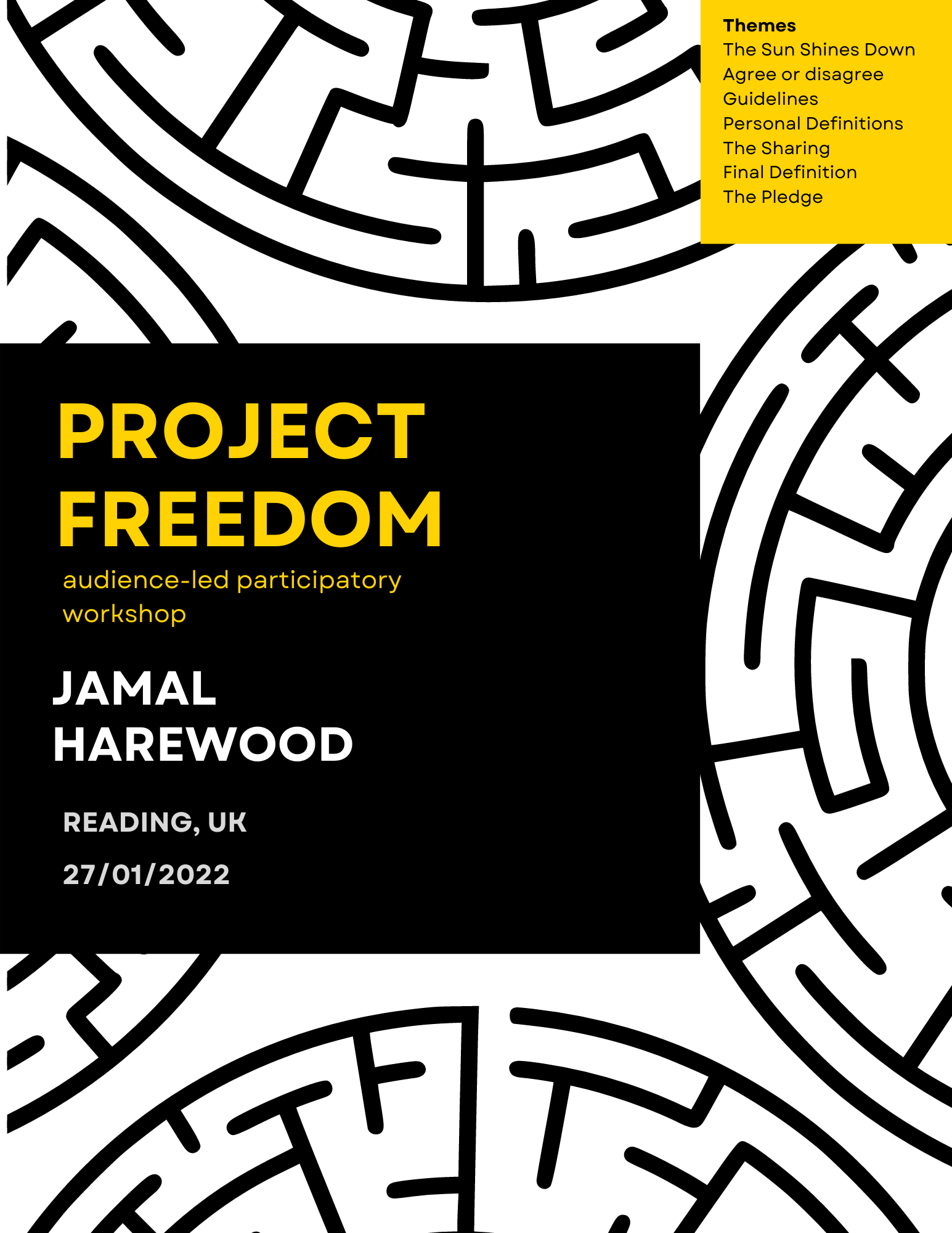
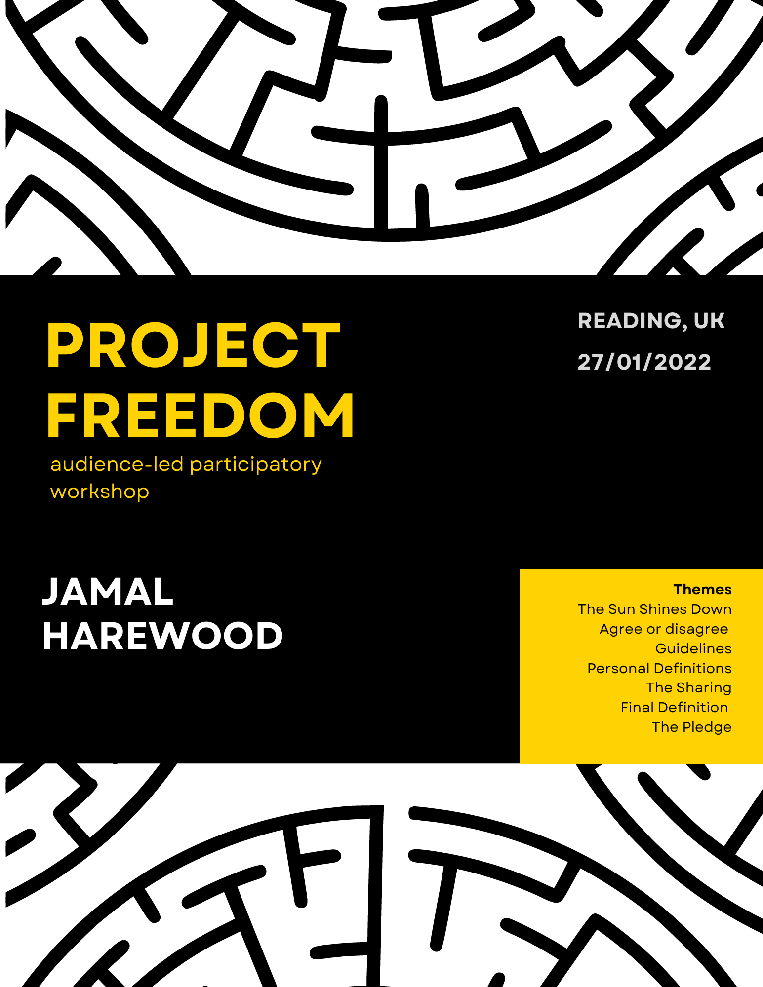
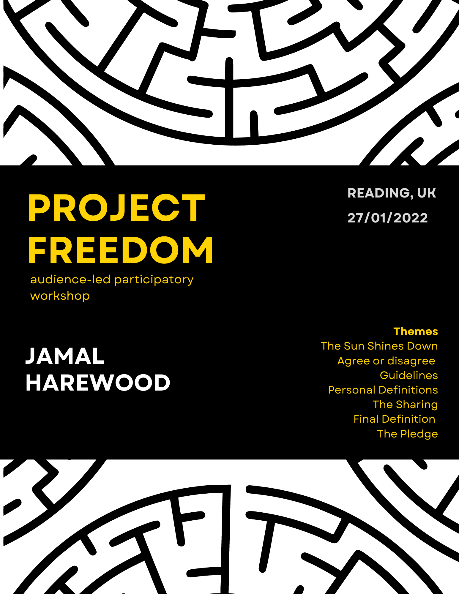
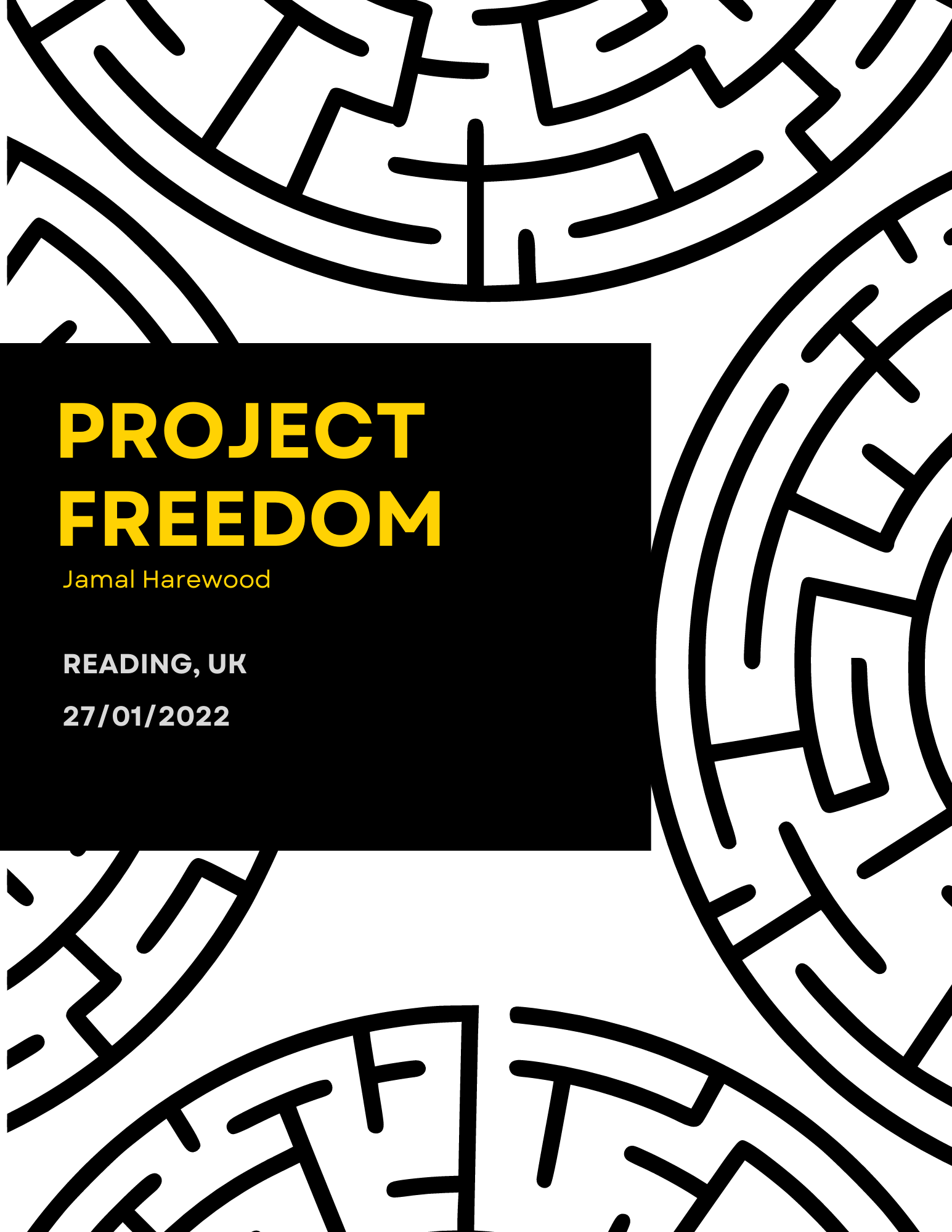
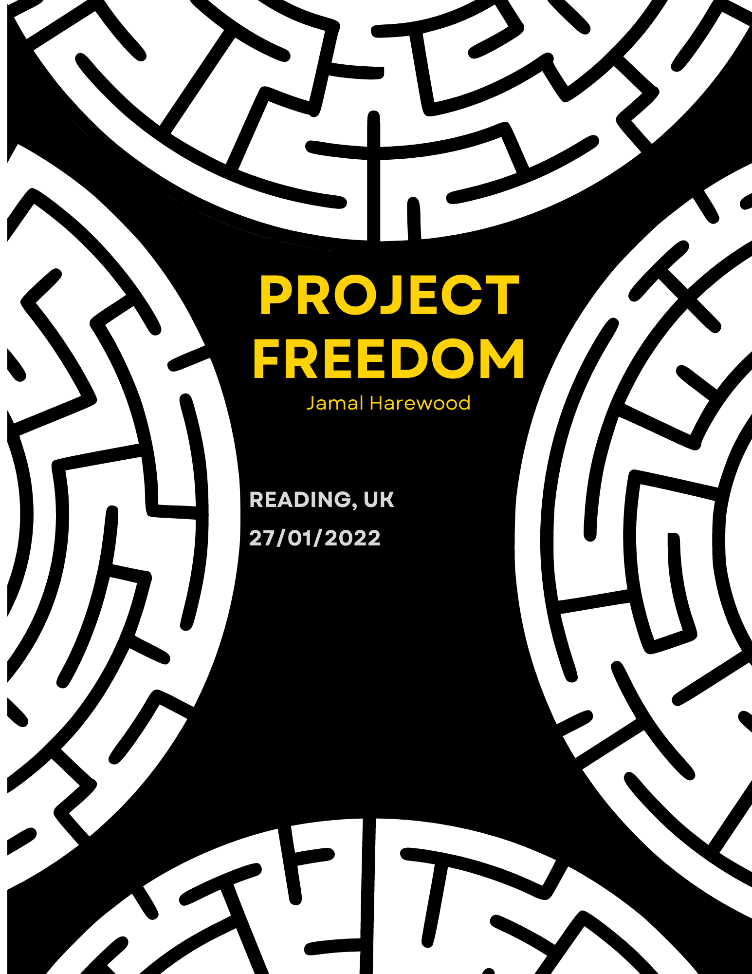
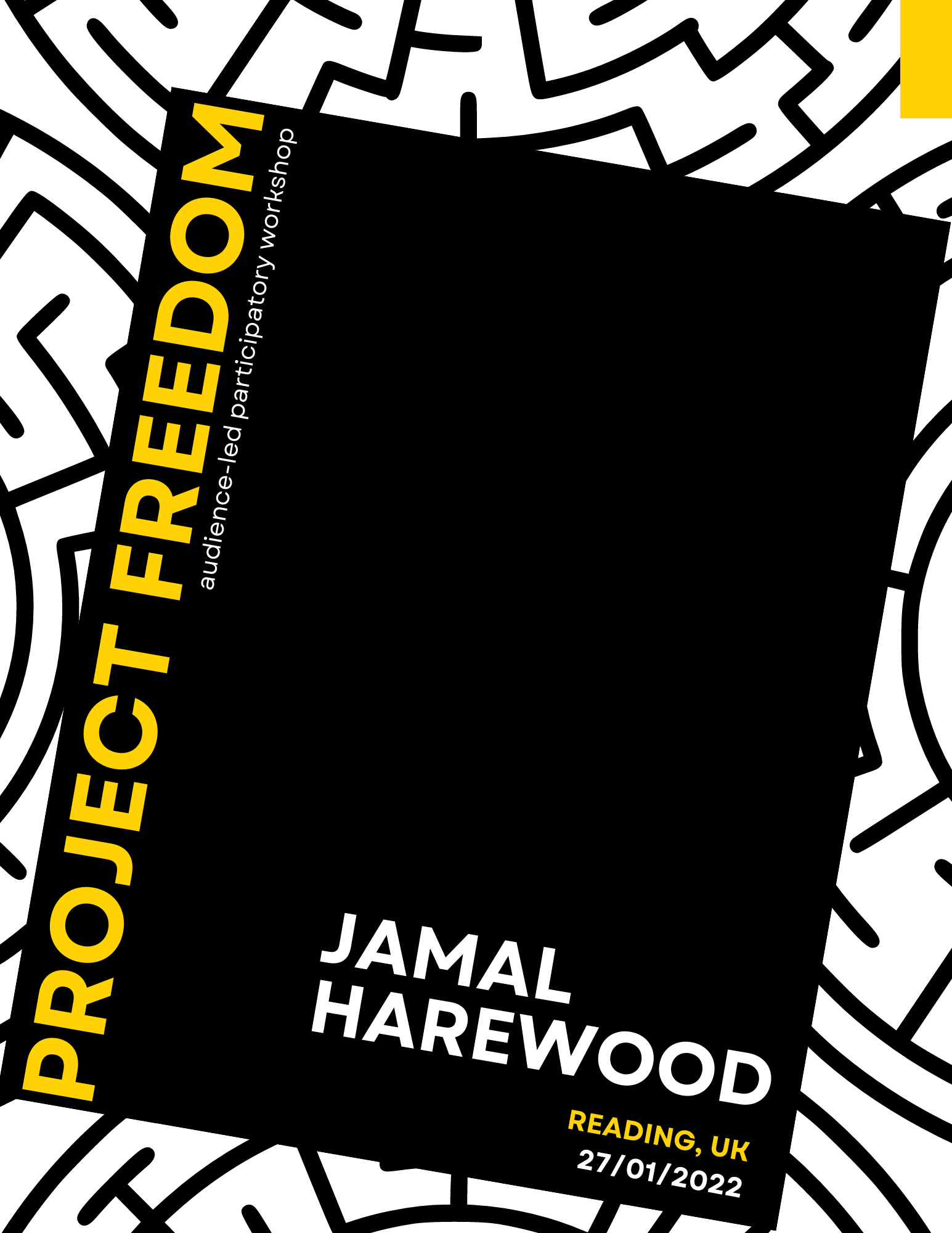

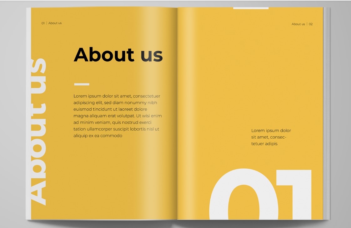
We took out the theme title from the front page because we did not want to give much away to viewers when looking at the cover. The final book page works because there is a clear visual hierarchy. Jamal likes the book cover format because it is clear and playful while complementing his brand.
Inside Pages
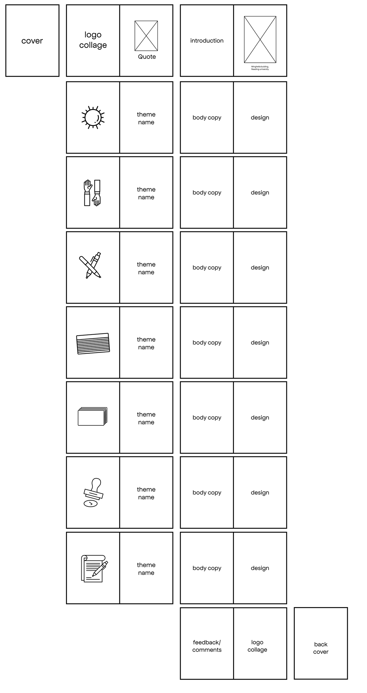
Jamal did not want to include photos of the participants, so we had to find a way to represent the theme or show the activities in the workshop. This part of the project was split into two, with Jannah designing the booklet’s illustrations and Theme page and I handling the Book text layout and photomontage. This idea was because we wanted each design element to have a consistent design style.
Book Illustration
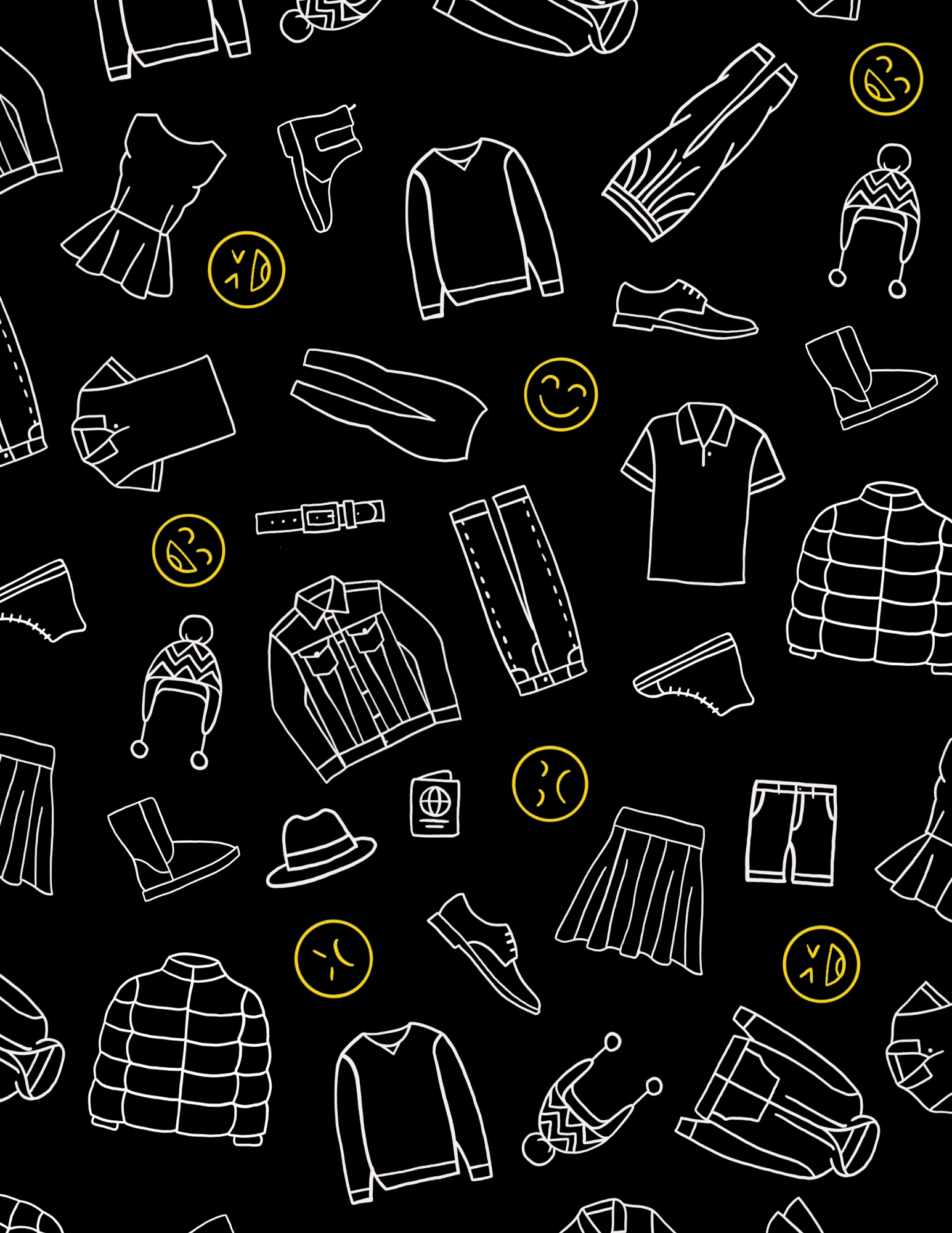
The illustrations represent the themes; they have a youthful look as the target audience is young adults. They have the same line length as the maze design because we wanted to follow through with consistency. Adding this illustration gives the book more volume and makes the book pages more attractive. The illustration has a symbolic meaning as it represents the different activities in the workshop.
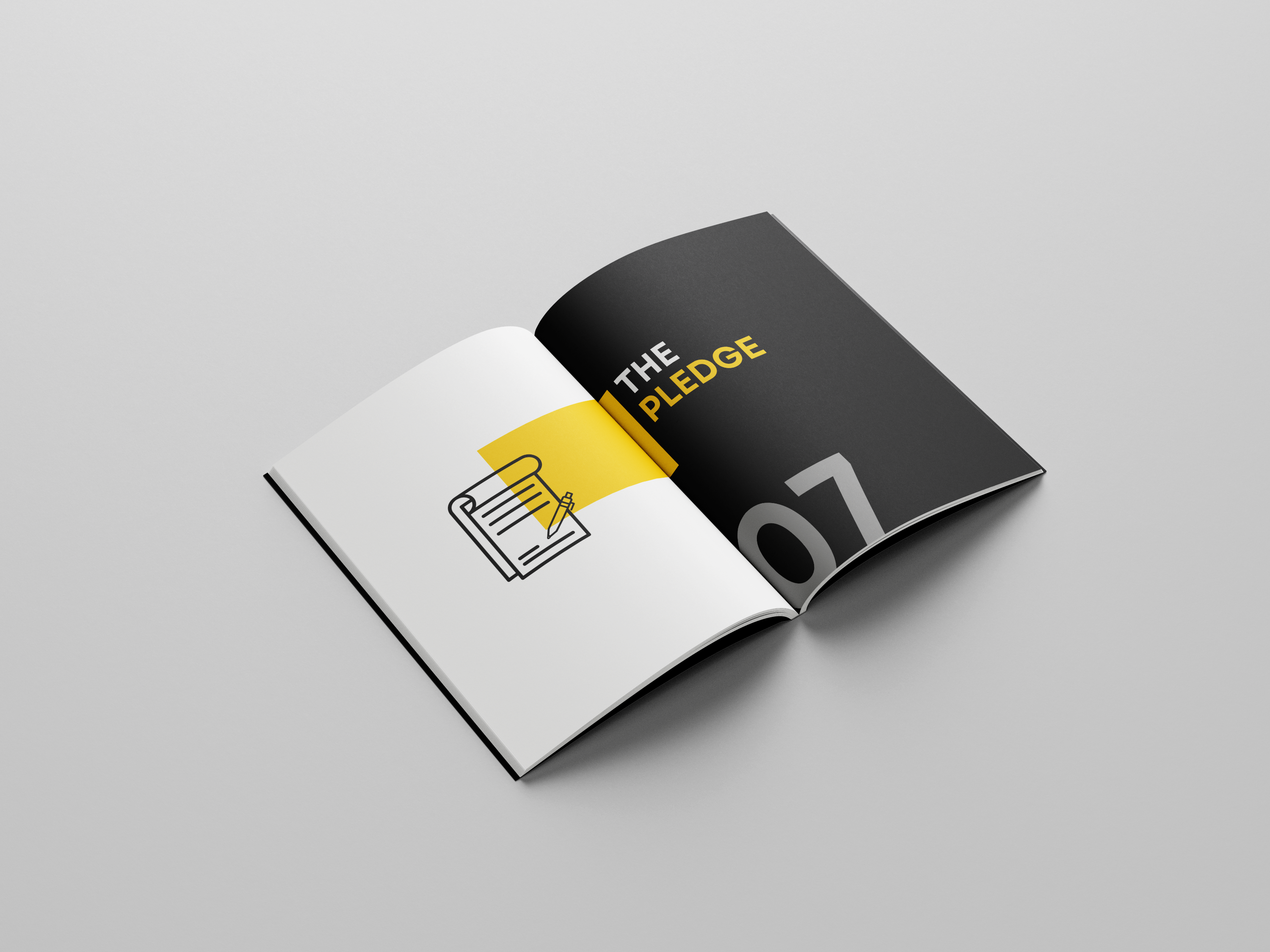
Theme Page

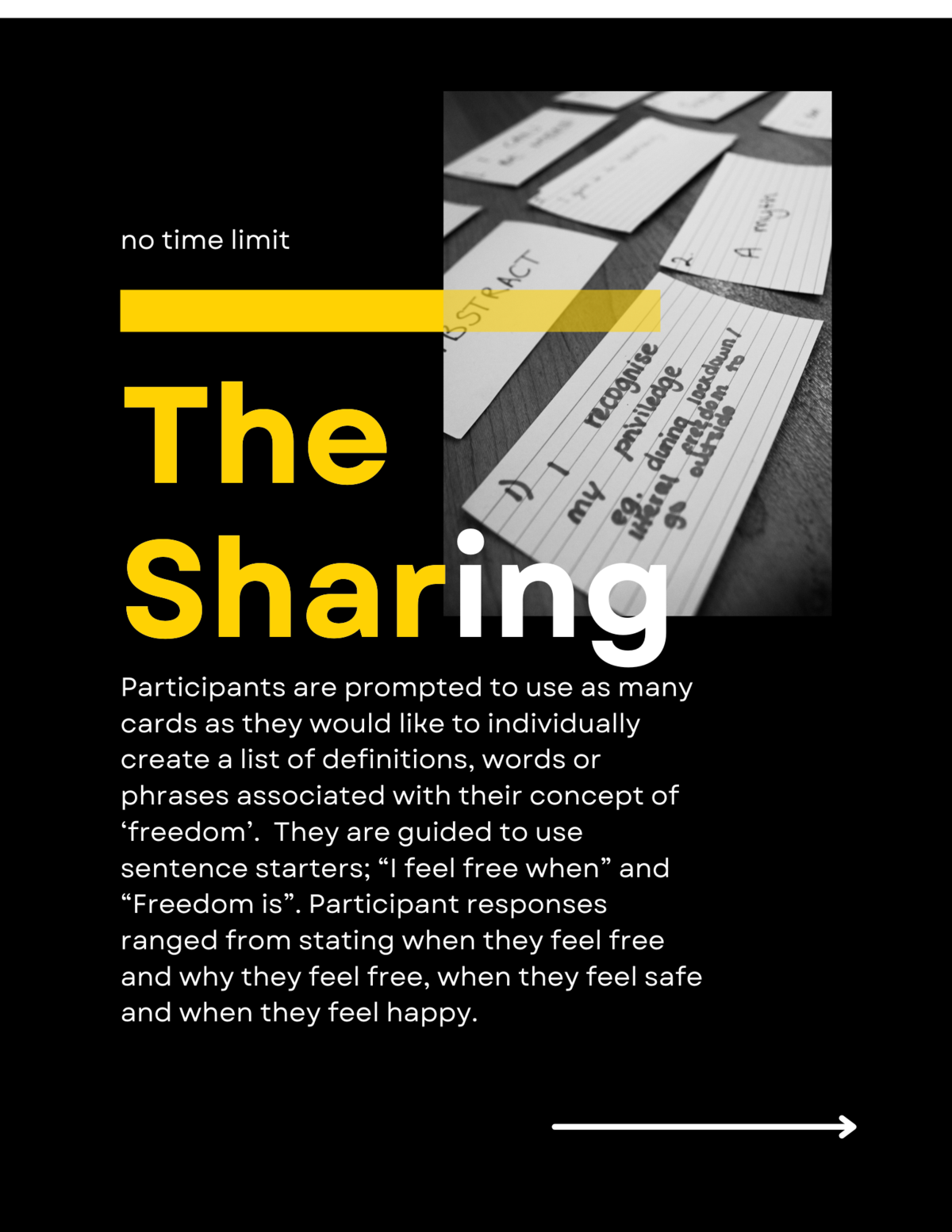
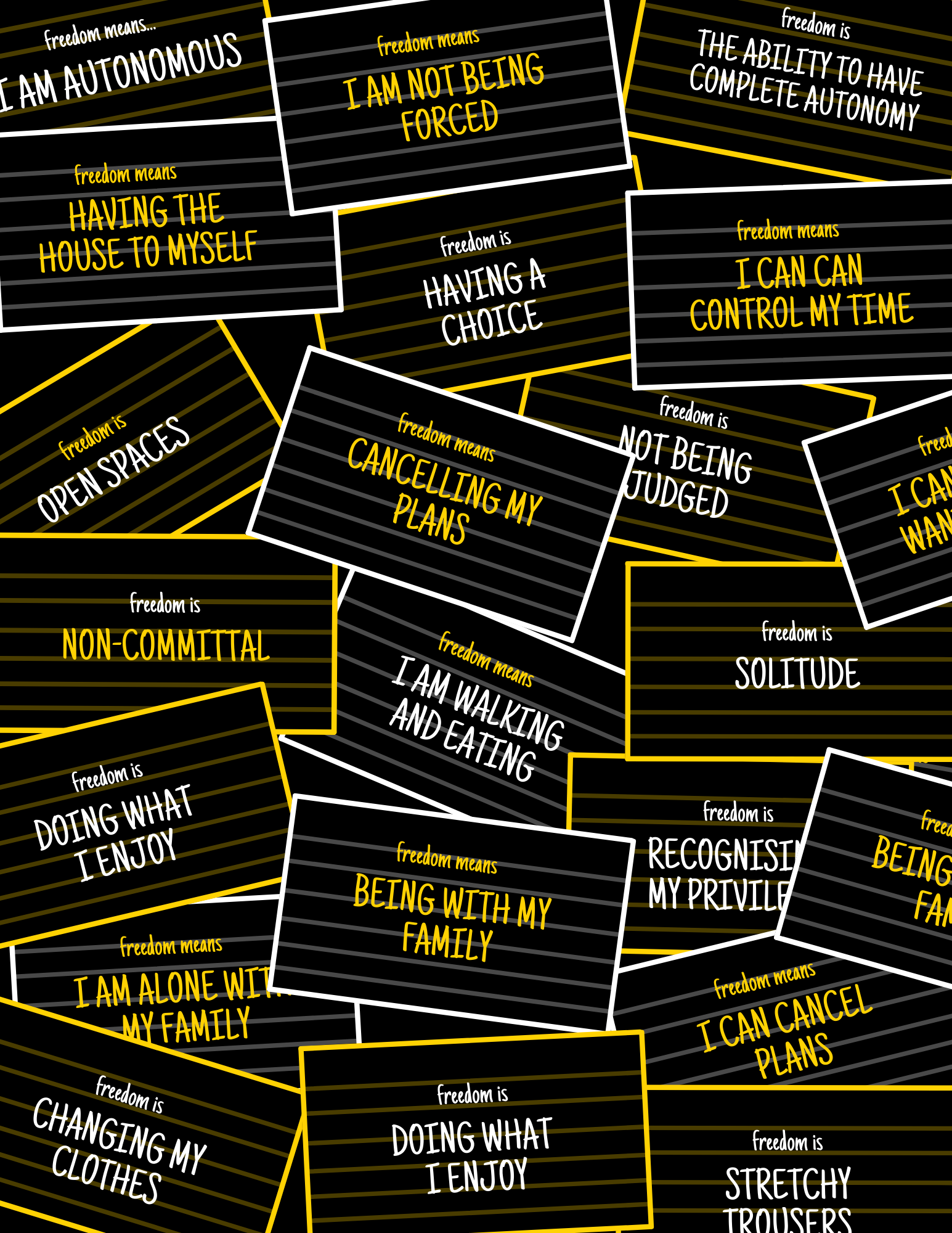
When designing the theme page, we added time and text however, this element did not work because it made the theme page complicated and was not necessary. Separating each piece on the theme page made the book bulky and showed each element on its own.
We used the image above as the final design because of the apparent visual hierarchy. The use of yellow and white shows visual hierarchy and highlights the critical word in the text. The illustration represents the theme and is connected to the next page with a yellow box. We found the connecting shape helpful in linking the two pages together.
Photo Gallery
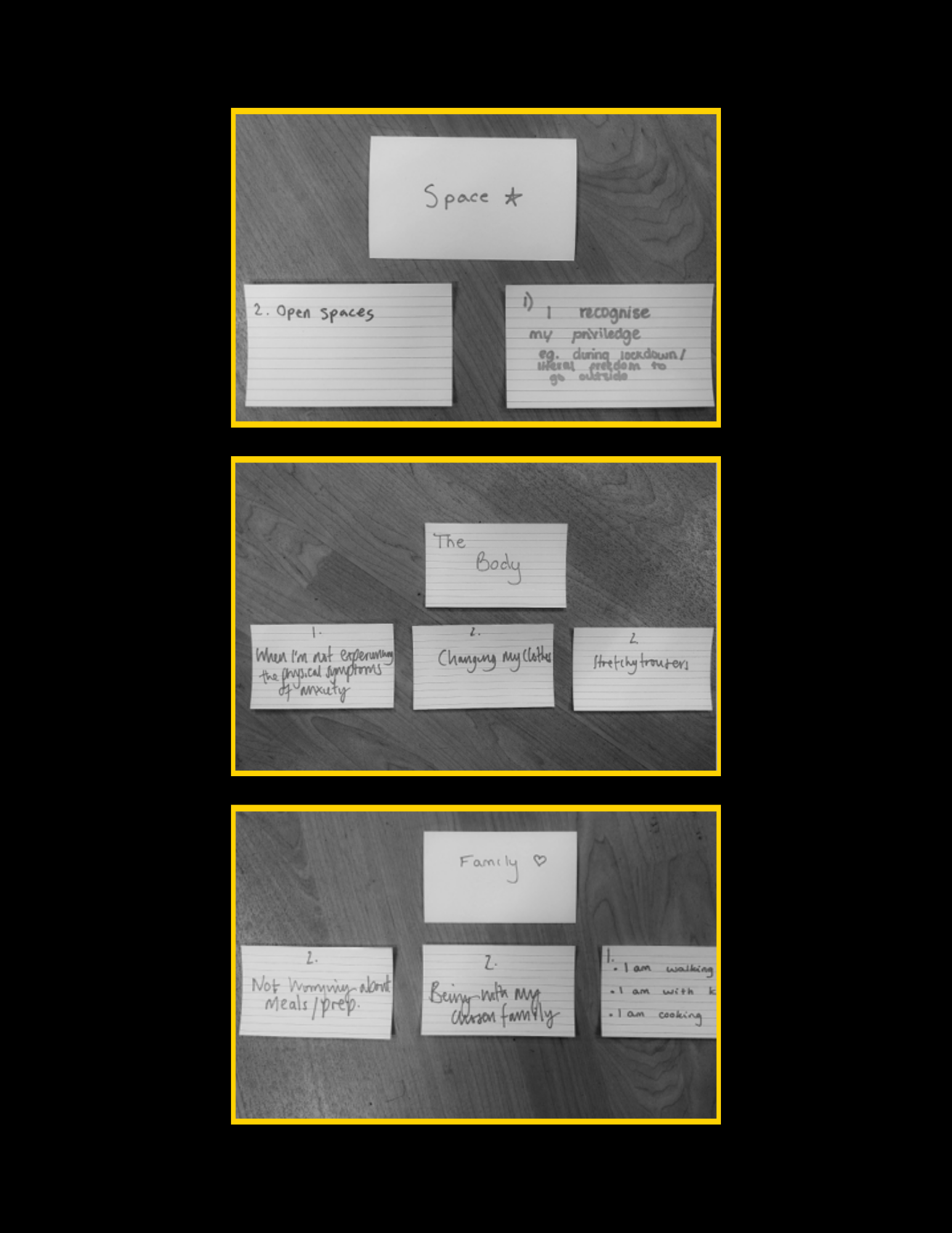
The photo montage gave the book a personal touch and helped viewers understand what happened in the workshop. Participants can see their writing and help push further the idea that this workshop was audience led.
Body Text
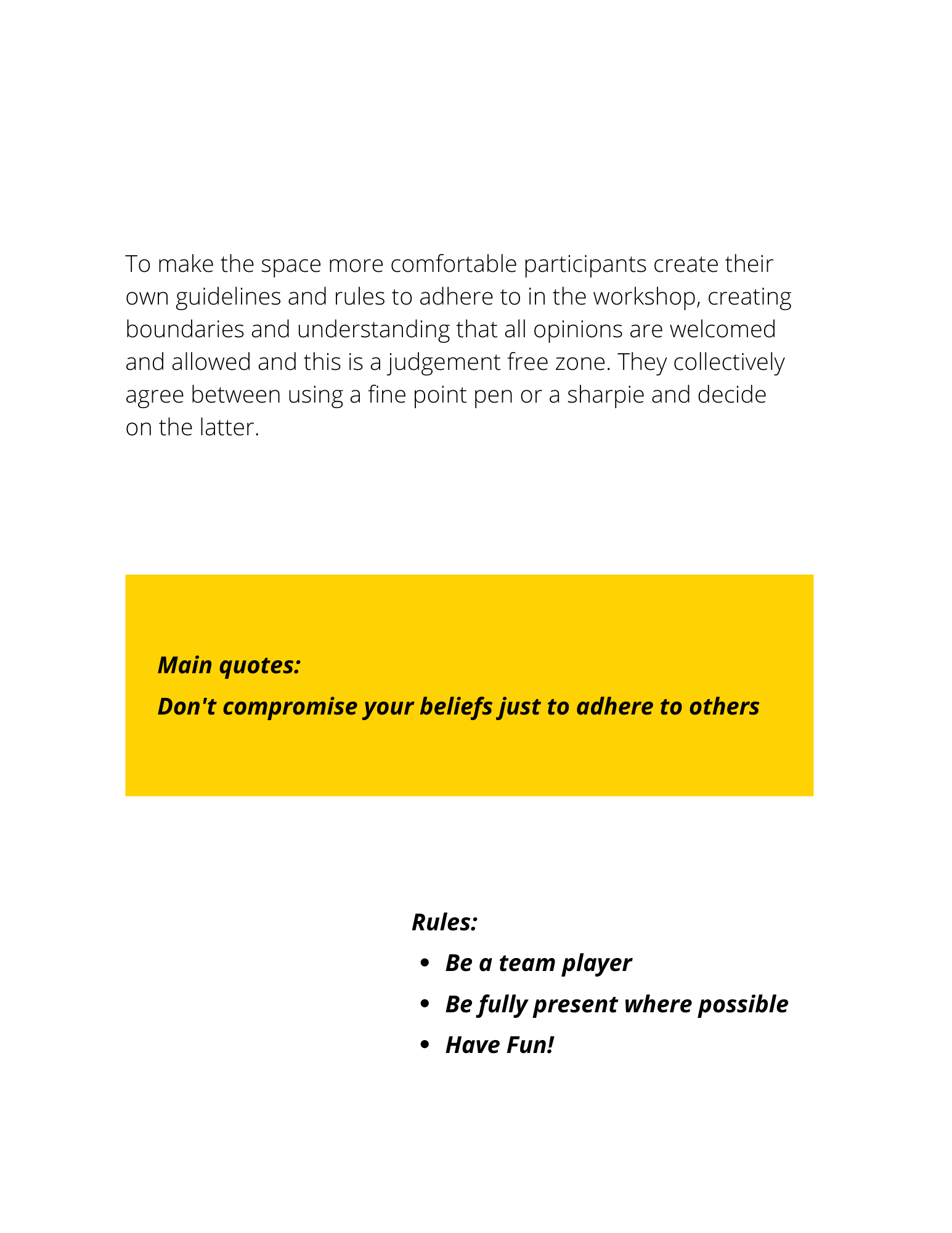
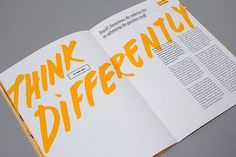
The body text wasn’t heavy, so it was essential not to make each body text page look empty or isolated. With this idea, each booklet element is highlighted, and the text stands out on its own, with the text box adding vibrance and giving the book format a consistent look to the theme and number page.
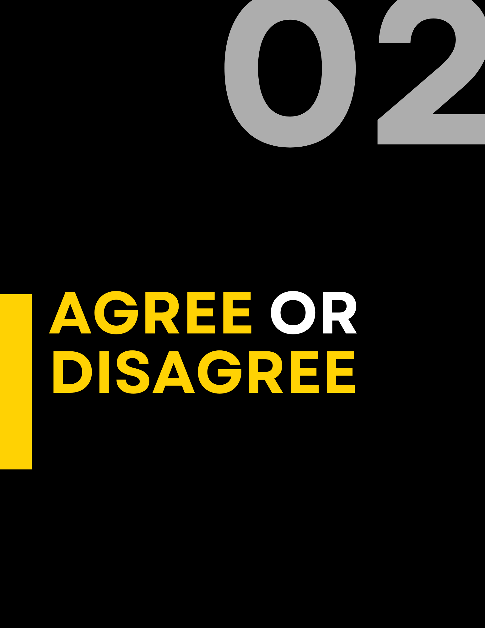
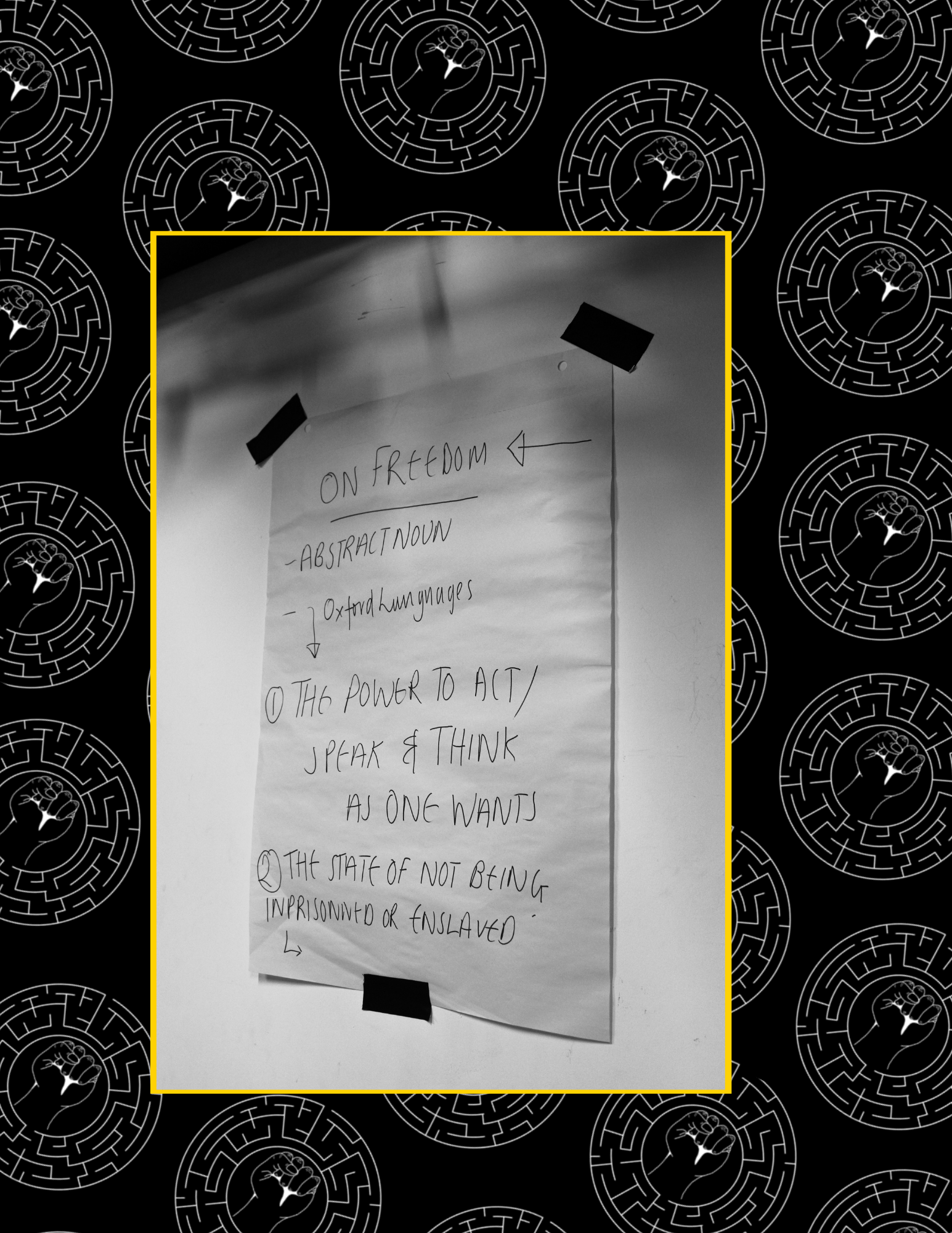
What is Freedom?
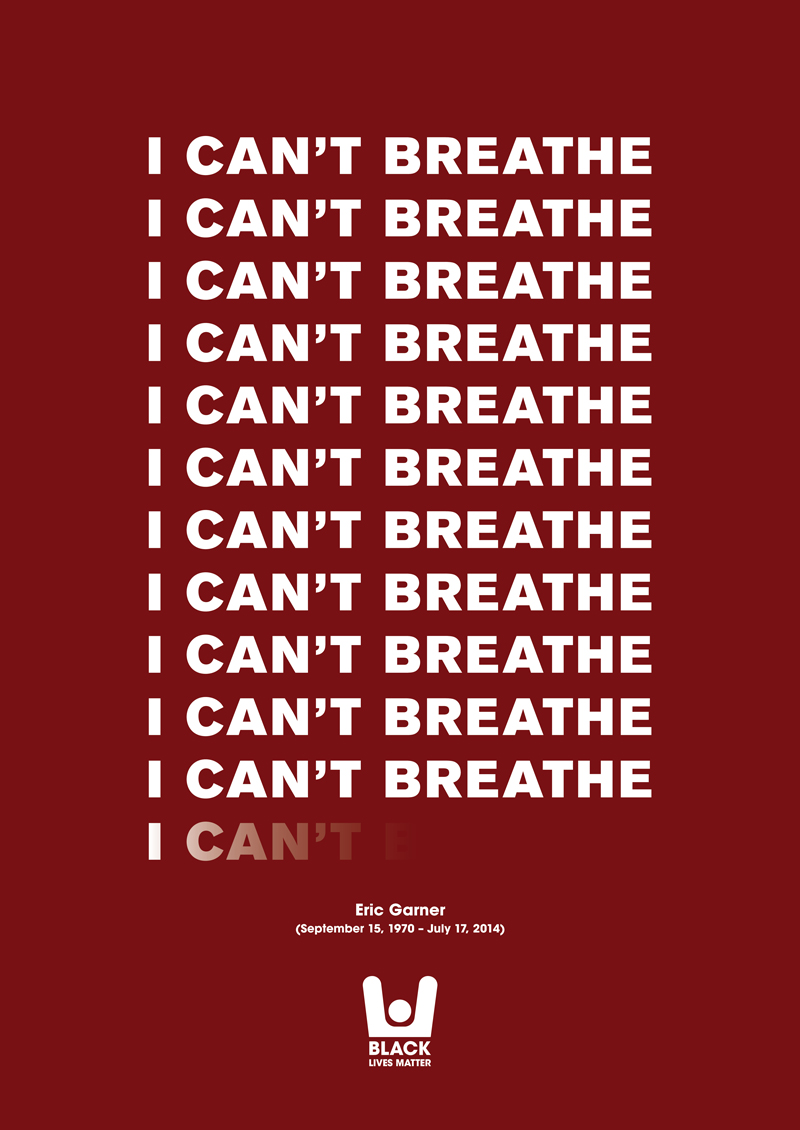
Jamal Harewood is an activist and supports the BLM. This idealogy was implemented in the Freedom posters designed on the last page of the booklet. The freedom poster is designed similarly to the BLM ‘I can’t breathe’ poster by Eric Garner. This would help viewers identify Jamal’s support and appreciation for design in BLM.
Maze Collage
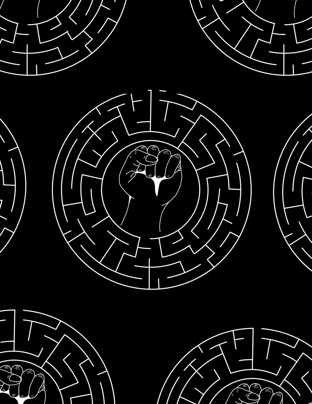
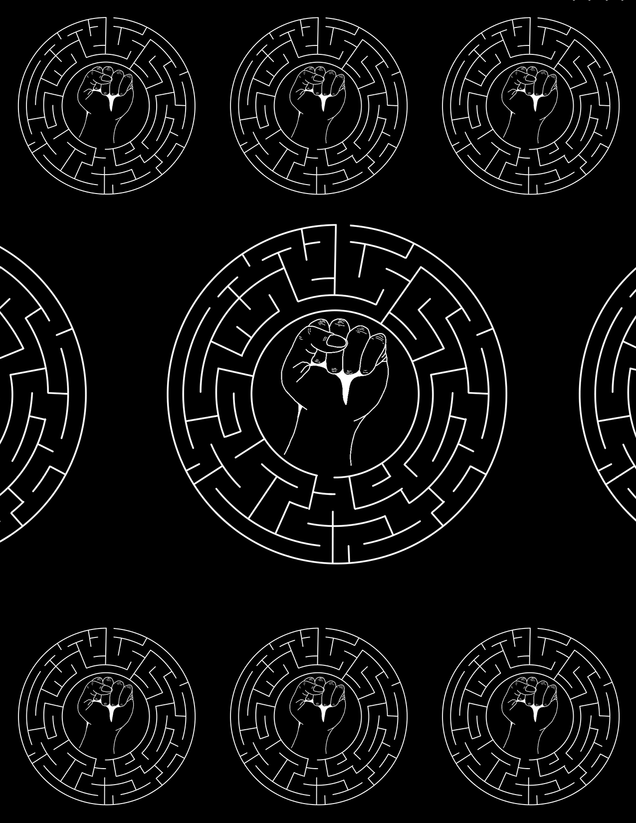
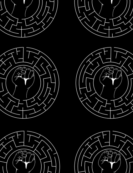
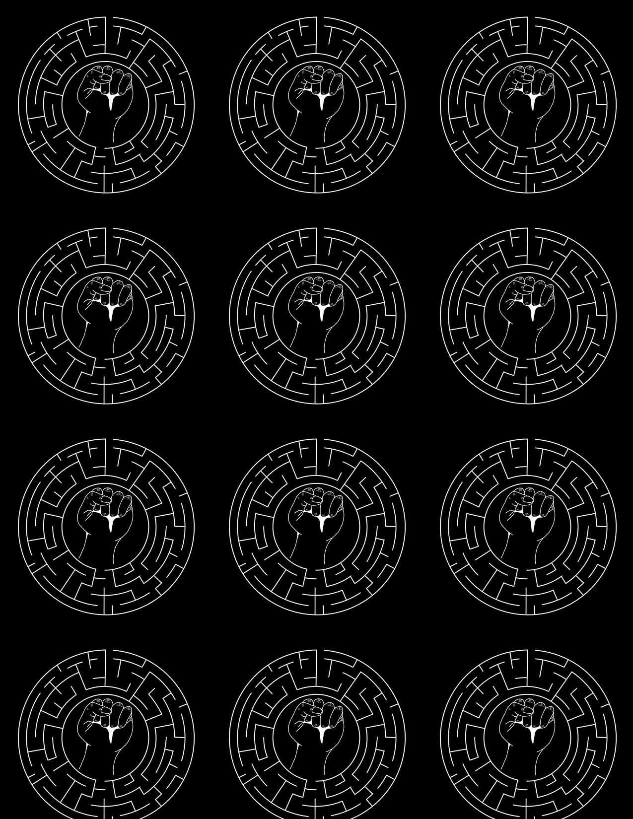
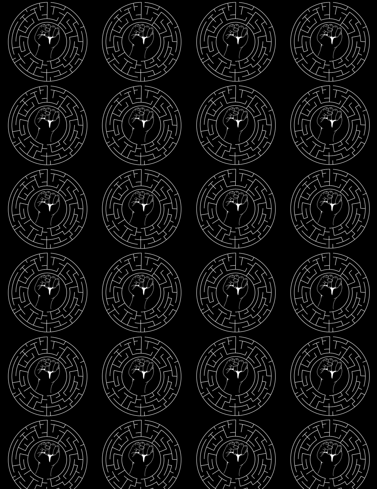
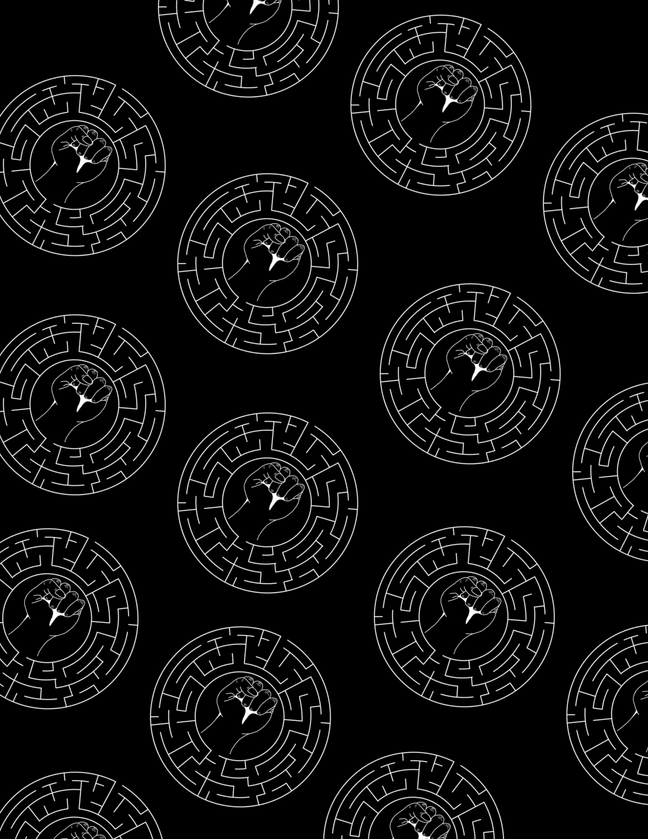

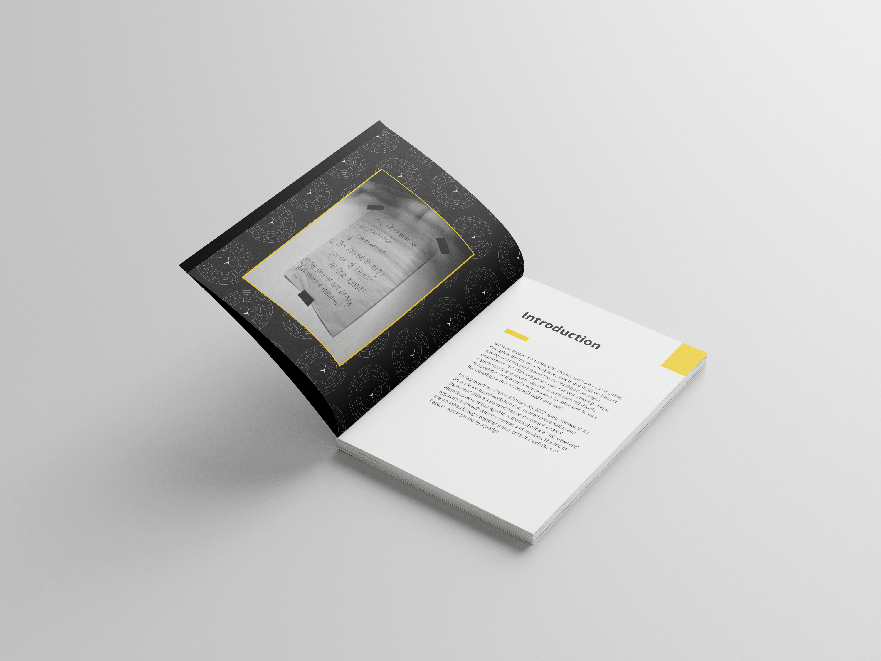
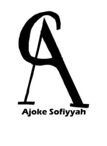
During our first meeting with Jamal, he stated he wanted to develop a brand mark from the client’s logo and translate this onto the opening and closing pages of the booklet. The maze design is a collage of Jamal logo design; there are two different maze designs, one that is used on the front cover and the other that is used on the inside pages. The front cover maze design lets the viewer know that this booklet is under Jamal’s brand.
The maze collage acts as a filler, for the booklet introduction and ending. it also helps us go further in the branding technique than just the front book cover. it is presented diagonally with five logo designs in a row. Jamal liked this layout because the logo design was not big and the layout was much more dynamic compared to the other maze designs.
Website

Participants who are not able to visit the workshop would be able to look at the blog post. The blog post is designed in cohesion with a booklet layout for clients to implement onto their website. It was designed on Adobe XD with Jannah overseeing the design. The blog post design has the same design elements as the booklet, so few developments or changes were made. We did look at the consistency of spacing and how viewers would navigate through the blog post.
One of my favourite design elements on the blog is the maze background with the black box. it follows the format and layout of the front cover, which is helpful in consistent branding.
Final stages
The main goal of this project was for Jamal to be able to print and redesign this booklet on his own. We informed him about printing in the department and the process of printing at home. Informing him of the cons and Pros, Jamal decided to print at home after much analysis as it is more cost-effective and personal.
Since we were designing on canvas, we learned how to create and show bleed and crop marks on the canvas. Though it was slightly more straightforward, it was not as customizable as doing it on InDesign.
The printing aspect of this project allowed us to look at flaws that we overlooked while designing on canvas, such as alignment issues, spacing issues, etc. however, such cases were few. The printing of the project was successful because the booklet looked relatively similar on the screen to the print, with the colours complementing each other, the font size being readable, and the illustrations looking presentable.
Reflection
As this project progressed, I understood how vital group work is when both partners play through their strengths. As time went on, it became clear to me that working with a partner who has a different design style yet similar mindset as you is helpful. We explored different styles and illustrations while barely having conflicts because we communicated effectively and ensured that everyone’s opinions were valid as we went through the project.
Overall, the design process of this booklet was enjoyable as we made sure to include Jamal at every step after our supervisor had approved it. Each design element was explained to Jamal and why such detail works with his booklet, and if he wanted any changes, it was noted and implemented immediately. However, such changes were few because he trusted our designs and believed we understood him as a person and knew what kind of designs he wanted.
 The project is to design a present for a classmate based on their interest and see how we can develop it with random words.


 When first given this project I want on the site Pinterest an image-sharing app to look at images related to Covid 19 at first no results where shown cause the website did not want to risk false info about covid 19 sharing on their platform.
 Another important thing I like about this Illustration is cause it is funny and allows the viewer to learn about covid but still escape the harsh realities of this pandemic.
 The images are different from those of the usual yellow signs that grab the attention of viewers and remind them to wear a mask. The illustrations are not people friendly and stricter on their information.


 For Sara project Impactful images, we were asked to design two images based on a topic given to us. One of the images should be direct and the other indirect towards the topic. The second image should be less subtle but still allow readers to be able to identify the theme of the topic.

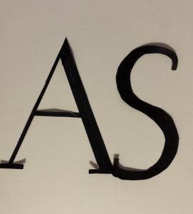
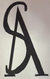
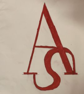
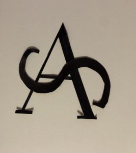
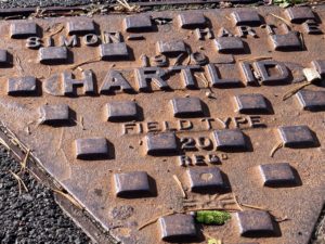 windy day on Monday and our task for the day was to take pictures of letterings that fascinated us around the campus. After exploring the campus and taking pictures for 2 hours we were then asked to organise the images whatever way we like.
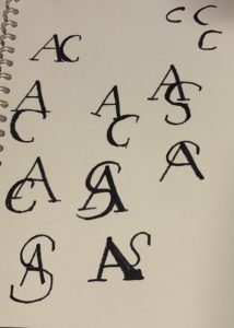
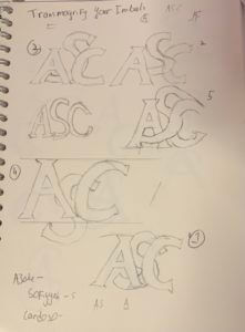 ram serif but later advised by Kim that 2 letters would be better and faster.
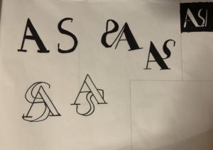
 Final Work
