Category: Transmogrify: your initials (Kim’s project)

Transmogrify: your initials

I can’t tell where “d” ends and “D” begins

This project involved reducing my initials to basic geometric shapes or silhouettes and merging them in different ways. My initials are the same letter, so I used both capital and lowercase to gain some variation between round and sharp edges. In my final transmogrification, I used watercolour as a medium to emphasise the theme of fluidity.

A useful time-saving technique that I will take from this task was cutting out my initials to trial different combinations of positions and letter casing without needing to draw them out.

TK

TK


To transfer our iniatals into a monogram logo I have used Futura font. I had to draw my letters separately and then I have ligature the letters to make a logo. I have  made some potential designs which I could use. Then I have chosen the designs which I wanted to explore further. After my final design I wanted to colour it in two different colours.

Monograms – Illustrator design task

So far Kim’s project was one of my favourites as it allowed me to explore something that I’ve been putting my free time into – Illustration design. Although the task asked us to design a monogram using our initials, it felt a lot more personal and therefore really allowed me to express the way I work and approach tasks.

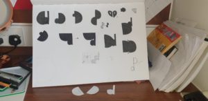
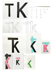
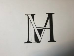
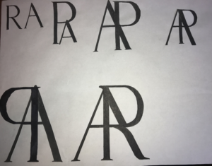
As mentioned previously, the aim of this task was to create a monogram – a combination of two letters, using either Garmond or Futura typefaces. I personally chose Futura, as I am more attracted to the ‘orderly’ aspect of sans-serif typefaces.  Initially, I started sketching out some ideas on my iPad, however, I then decided to go back a step and start designing on paper. Personally, I found this a lot more helpful as I noticed that I was generating more ideas while working on physical paper. After generating some sketches in pen etc, I then decided to go back to working digitally. As we were designing monograms (logos for our initials essentially) I decided to use Adobe Illustrator for this task. I first began recreating some of the sketches I have done previously to see what works best alongside the Futura typeface. The first ideas were quite simple and straightforward, a either one or both letters were upright and looked like two letters put together (literally). It wasn’t until I started looking at more abstract versions of my monogram, I began designing monograms that 
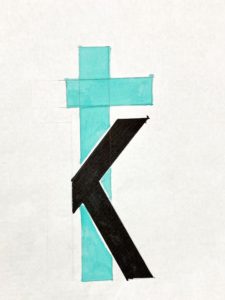
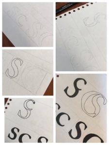
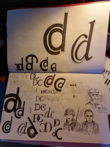
had some interest to them. The 2nd photograph on this page presents the design development process based on one of the more abstract ideas I have created previously. First I started by rearranging the orientation of these letters, seeing what works and what doesn’t, and then once I was satisfied with the result, I began rotating the monogram in order to see if it looks different/more effective when looked at from a different perspective. My hypothesis was quite right, presenting the monogram at a slight angle made it look more stylised, almost lik
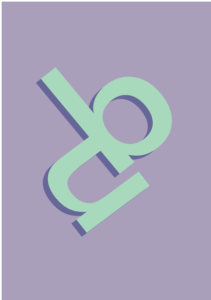
e a logo.

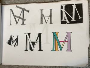
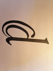
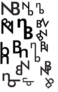
Lastly, I added some colour and drop shadow to the monogram I liked the most. I chose mint green as the primary colour and then matched it with a purple tone that I chose using the colour guide tool in Illustrator. Besides the overall look of this monogram and its colours, I personally like how the letters complement each other, without masking what they are; both ‘n’ and ‘b’ are completely readable but have a more abstract aesthetic to it then.

Transmogrification of my initials

Creating a monogram

Kim’s project

In today’s brief, our task was simple: to create a graphic representation of our initials. I began by sketching out some initial ideas using the Garamond font, as I liked the serifs that this typeface contained. I brainstormed some ways of how I could combine my initials ‘M’ and ‘H’. These two letters have similar forms, so I tested out different ways of intertwining them in an interesting way. I found that drawing the ‘M’ and ‘H’ separately and then photocopying them in different sizes allowed me to quickly experiment by cutting them out and rotating and shifting the letters to find a monogram that worked, before sticking them onto my page as a series of experiments. This was an efficient and effective way to work for me and produced quick results, rather than sketching out the letters each time to come up with a different design.

After having chosen the compositions that I liked best, I decided to develop my ideas further with use of colour. One idea I tried was inverting the white background and black letterform to create black negative space and a white monogram. I liked the finished look of this, and then proceeded to try a combination of  black and white negative space, switching between the two in different sections of the letterform. I tried this with coloured pens as well, which i liked, but not as much as the black and white one. So, to finish, I drew out the black and white version in a slightly bigger size to produce a final, neat piece.

I really enjoyed this task and the way it encouraged me to think about design in simple letterforms, I effectively developed and created my own glyph based on my two initials which I thought was really fun and creative!

My name and finding ways to shape it

Creating a monogram. Today we took the time to experiment with making a monogram out of our initials, my initials being S and C, meant I did at times find it difficult to draw, and keep as clean cut at possible, however the curves in both letters meant I had a wide range of experimentation to do fitting the letters with each other. I started by just sketching the letters themselves and becoming familiar with their shapes. I drew them as both lower case and upper case. I then did a load of rough sketches on a piece of paper on how they could fit into one symbol and decided on two designs to make a final clean copy of.

I chose two designs, and each one containing where the S or C was large (being the letter that had the hierarchy in the design). The first design has a capital S, with a lowercase c in the top of it, I liked this design for its simplicity, and at first glace it almost looks like a normal S. The second design was a large C with the S fitted inside of it, I think this design was my favourite, just for how well the two letters fitted together, and I feel like it would be a good logo for a company to do with water (just as it looks like a drop of water in the centre). I manipulated the S slightly to make it fit better, and cut off part of its tail, but overall was quite happy with the outcome.

Lastly I experimented with a bit of colour using an app on my phone, just to see how they would look with different colour choices, but I still personally prefer the black and white.

Pairing ‘m’ and ‘b’

For this brief I wanted to experiment with different ways my two initials could be joined together to create a monogram. This was an interesting task as I felt as though it forced me to look closely at the specific details of letter forms. I wanted to keep my design simple and I wanted the letters still to be legible despite the brief stating that it was fine if they weren’t. I felt as though if I joined the letters in a way that made them no longer legible then the monogram would lose meaning. I developed my idea by playing around with colour and sizing of the two letters, this resulted in a few different outcomes that I was pleased with.

Sketches for Initals

My job was easy

My initials, R and A are really similar in terms of shape, so I think I had an easier time with this brief than most. That doesn’t mean it was that straightforward though.  Because of their similar shape, when I tried to blend the characters together it tended to look a lot more like A and P rather than A and R. I found that the solution was to morph one of the legs of the A into one of the legs of the R by making it curve off at each end. T think this has worked pretty well as it should look a lot more like A and R in the final image than it does in the process photos. This has taught me that even when a brief appears to be easy, there will still be graphical problem solving that requires creative thinking.

DC

For Kim’s Project we were tasked with creating a logo like symbol that merged our first initial and last initial. I experimented around a lot to create many number of variations however in the end I decided to go with the lower case d inside the upper case C. I then played with the style of the glyph giving it serifs and adding an italic angle to it. I really liked the final outcome even if it does resemble the @ symbol.

CH monogram

In today’s class we were provided with two fonts, Garamond and Futura. Using one of these fonts, we had to use our initials to create a monogram.

I sketched out my initials, CH, and then photocopied them at different sizes, playing around with the scale. I mixed the two initials to see which shapes I could create with them. I found that I was getting lost in my own ideas, making the initials blend in such way that I could not tell they were a C & H anymore. I wanted my monogram to be a clean and clear presentation of my initials, and that is why I chose the final design that can be seen below (the last three drawings on the page).

I thought it would be fun to add some colour to my design. I chose green because it is a calm colour that is associated with nature and good-luck. It is fresh and cool, and to me it holds the idea of hope and new life.

Yellow is a happy colour. It is fun and youthful, and adds energy, just like the sun .