Author: TariaKhan

TK

TK


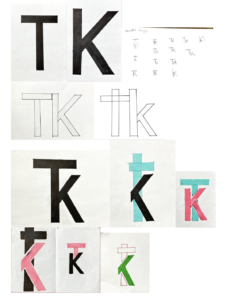
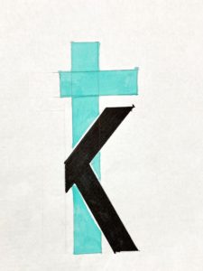
To transfer our iniatals into a monogram logo I have used Futura font. I had to draw my letters separately and then I have ligature the letters to make a logo. I have  made some potential designs which I could use. Then I have chosen the designs which I wanted to explore further. After my final design I wanted to colour it in two different colours.

Money

My word was Money so I was thinking about making something which represents money and the current situation of  (Covid-19 ). My first page  I had  a bank and then I have  made  money floats outside which then connects to toilet roll.  For my second Illustration I have created a wight scale which shows that toilets rolls are more important now then money.

something was there…

OBSESSION

obssetion

 I choose obsession , the story was about a girl who was sitting alone in the library when she hears a voice and she gets scared. she sees a shadow of a mouse and then she looks under the furniture and rips out all the books and she finds nothing. After reading the story I had decided to create at least 5 pages to show each stage the library, the girl sitting on the table scared , the mouse and the a last page where she goes crazy when she  finds nothing. I have used sharpies and fine pens to create illustrations.

Attention and caution

   typefaces around campus

This was my presentation which I did for Eric’s project, I have taken some pictures around the campus of typefaces. which looked really different from each other and how by changing the colour of something changes the hole meaning. Especially some of the signs calling for attention and caution such as the yellow danger sign.

I have colour coded the pictures into similar colours such was blue , green and yellow. One of my slide was about the lettering to the metal. However the metal on each picture is different than the other. The metal on the library looked like steel whereas the metal on manhole is diffrent maybe more stronger I guess.