
The word I was given for this task was ‘Government’. To represent it, I chose to draw the Houses of Parliament as I felt they were a visual icon of the government in Britain. As the central buildings for the government in England, I felt this portrayed a strong message. To show opposition to Government. I chose the issue of climate change and the key figure Greta Thunberg. I turned half of the building into money with Gretas face on it. I then wrote the words ‘Any change?’ This was to question whether the government had actually made changes about climate change or whether they were still more concerned about money as changing to climate saving solutions can be expensive. I then used a Gif maker from the App Store to blend my two images.
Category: Impactful images (Sara’s project)
Images
Social Media
The noun I was given was social media. I had a few ideas for this word which can be seen below in my brain storm.

I started my taking photos so I would be using primary photos instead of secondary . I then opened my photos in photoshop and developed them within the software. Resulting in these two images.
I went for this concert people as the image is more than less the same with change one element; the control. I found that my other ideas changed more than one element, therefore may not of been best suited for this brief.


I went for the concept of representing social media through someone liking posts on there. (to make it more clear by adding in the logos in the background). To another view that social media is toxic and controlling us. As the hand stretches to like the photo, whilst being with strained by the charging cable connected to the phone.
Fragile Happiness
For Sara’s project, I was given the word “happiness”. The first thing that popped into my head was the classic smiley emoticon. After trying to explore other ideas I chose to go with the emoticon as emoticons nowadays are like a universal language, it’s almost guaranteed that my theme would be understood.
For my altered version of my original image, I chose to have cracks and pieces broken away from the smiley face revealing small hints of a sad, monochrome face. The cracks and fragments missing from the face were to show how fragile happiness can be and that sometimes even someone who looks like they couldn’t get any happier, are still pretending to smile. I chose to strip away the colour from the face behind the smiling mask as happiness is often associated with bright colours, particularly yellow. I felt that taking away that bright colour helped to increase the contrast between the two faces, therefore making it easier to differentiate between the two.
If I were to do this again I would have liked to use adobe software to use the original emoticon and then edit it digitally.
London – Olympic Underground
The task that I was set was ‘ London’, I actually decided to show this word and this location by showing the simplistic universal logo of the Olympics along with the culmination of the underground logo. Within the first few images or designs that I made were inspired and created with the logo of the Underground with the colours of the Olympic rings implemented into the lettering with this. The final image that I made was a mixture of the Olympic rings and the underground lines coming out of the rings themselves. I feel as these two images and logos are very recognisable, and quite relatable to London as the city of London hosted the Olympics in 2012. Previously the city hosted the games in 1908, 1948, and now 8years ago 2012.


Love/abuse
In this project we were told pick a contrasting topic with the word provided and create a poster this displays this contrast e.g. in a gif format.
I was given the topic of love. I felt as though the term ‘abuse’ was contrasting to this topic. In my final product, I included figures of a newly wed couple as i felt this represented an act of ‘love’. In order to contrast this and refer back to my contrasting tem topic of abuse, I included subtle give away signs that a relationship is abusive.
On the second slide of the gif, in contrast to the happy figures of the couple, I added dark bruises on the womans arms, shoulders and chest. Looking closer, i included a blue tear on the face of the figure too represent the emotional side of abuse. Further down the poster, i dropped red paint to symbolise blood.
Christ or the Antichrist?
For todays brief, we were given a word to respond to. Mine was ‘Religion’, and with this I had to create an image or composition that clearly represented the word. I started. by drawing a spider diagram, writing down any words or ideas that related to religion to see what I could use as a subject. I liked the idea of using a crucifix as my subject as its shape is quite graphically symbolic and well known. I wasn’t sure on the tone I wanted to convey so I started writing down different questions, theories and ideas that people commonly had with religion. I liked the idea that god might not be this perfect image that he’s portrayed to be, and could actually be something sinister. I had this result after questioning why such tragedies happen in the world and why an all powerful being such as god would let them happen. I started questioning if he truly is god or the devil. I wanted to take this idea and inject it into the second image, which is supposed to change the tone of the first by adding an element.
Firstly I started photographing a crucifix that I borrowed. I used this as it was a large enough ornament that also had Jesus on it, making the first image represent the religion christianity, and the pain and suffering Jesus endured. I decided that the most universally understood message of the opposite of god was by turning the cross upside down, I felt that this would be a good way to show how God may in fact act more like the Antichrist. I pinned the cross to my dorms notice board, allowing the cross to be upright, and still have shadows falling down in the correct direction. I knew that I couldn’t just flip the image as the shadows wouldn’t be in the right direction, so I photographed the second image with its bottom sellotaped to the board so it wouldn’t fall forwards. I then uploaded the images to photoshop. I wanted to erase the pins and the sellotape, just to show the cross, which I did through using the clone tool in marked off areas via the section tool. I felt that this symbol and idea of God was very old fashioned so I wanted to replicate that feel. I increased the contrast and turned the images black and white to create an old illustration effect, whilst cleaning up the background. I didn’t want to overcrowd the images so I left them on white backgrounds and liked how the negative space became apart of the cross, suggesting purity. I thought that I could show resentment to the idea of God being the Antichrist through some sort of relic effect, as if someone had scratched and abused it in spite after reading it in a book. I found pngs of scratch marks by pens on paper and selected the outlines and and pasted it onto of the second image, putting the blend option as divide, which broke up the marks and made them distorted and more authentic. I decided to target the face and the script on the cross to emphasise a rejection of the identity and ideals of christianity.
![]()
![]()
Money
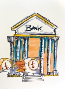
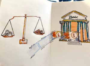
My word was Money so I was thinking about making something which represents money and the current situation of (Covid-19 ). My first page I had a bank and then I have made money floats outside which then connects to toilet roll. For my second Illustration I have created a wight scale which shows that toilets rolls are more important now then money.
Pregnancy making waves


How Changes the world for a Woman after Pregnancy?
Woman getting to a confused world after pregnancy. Dealing with different prospects due to salary and opportunities for advancement, facing discrimination and disadvantages.
Are they still a family
 For Sara project Impactful images, we were asked to design two images based on a topic given to us. One of the images should be direct and the other indirect towards the topic. The second image should be less subtle but still allow readers to be able to identify the theme of the topic.
I did a mind map of family and I decided to explore pregnancy, as that is what brings the next generation of a family. However, I used pregnancy to represent a mother who dies from childbirth and now the father is left to deal with the trauma and raise two sobbing kids.

For family my original images show a typical family, a father 2 children and a pregnant wife, to go deeper into the topic of family my theme pregnancy and how it brings joy to those around, however, there are some people in this world suffering from a pregnancy that does not bring life but takes it.
The uses of black in the second image is to show mourning and loss of a family member, I made the mother and the child emotionless to show that they have gone from this world and no longer with their family.
The title ‘Are they still a family?’ is to ask viewers if this mourning family can still be a happy family even though they have lost what brings them joy.
Moreover, I enjoyed this topic cause is similar to that of storytelling, which I have interest in but with images. I would love a similar topic in the future but with more time to develop and explore my ideas.
Education system

In this session presented by Sara Chapman, we explored designs and art that convey a deeper meaning. Looking at artists such as Banksy, we discussed how his work has dual meaning and presents emotion and thought provoking imagery. We were all assigned a word to focus on conveying our own message for and my word was ‘education’. I had several ideas and took time to create a spider diagram to get all of them on paper and consider which ones were the best. I decided to convey how in school we are taught a lot of information that many of us don’t and wont ever use but are made to learn as they are obligatory topics. I used topics such as algebra and physics equations which can be handy but not for all and show how once we grow up, we realise we haven’t been taught some of the most important and vital pieces of information that we need as adults.
To represent the decline in understanding life and topics, I used only primary colours in the first image. Not only does it have that stereotypical school life feel but when it changes to the the second image, it accentuates the hopelessness we begin to feel as we grow up. The colours change to grey and dismal tones. I also only used my own handwriting in the first image to convey that sense of innocence and typical school taught handwriting. I then contrast it in the second image by using bold and capitalised font to show the harsh reality of our life changes and us not being given the education to keep up with it. To complete this concept, I decided to do it digitally as I felt it would convey my ideas better due to the solid colouring. I used Adobe Draw for the entire process.

