Author: Sam Garrett

‘Blenny’ revised

Resources for research and inspiration

I started researching different monogram logos that can typically be seen in fashion design brands. I found that a common way to join the forms are through overlapping them, often creating something not initially legible, thus becoming an odd form for a logo. The monograms also utilise common characteristics found in the typeface. For example, the DC logo can utilise the ‘C’ by vertically flipping it to suggest it’s also a ‘D’. Having this in mind I decided to sketch out some initial ideas in Futura. I printed out my initials in the same size but in ‘Medium’, ‘Bold’ and ‘Condensed medium’ and cut them out. This was to give me a range of weights to experiment with as well as allow me to stencil them for accuracy. I found this was a good way to generate ideas as I could physically manipulate the type, often causing accidents leading to new ideas to try. It also helped me get a fairly close resemblance to the typeface which was helpful for alignment in my sketches. After several sketches I redrew some of my favourites to get a sense of which ones looked legible and suitable when filled in, as sketch outlines give a fall sense of space.

I chose the second Test sketch (see second image above) to develop into a monogram. this was because the ‘S’ and ‘G’ fit together so that they share a satisfying elongated curve. The distance between the two forms also generates a lot of negative space above the ‘G’ in addition to its open style counter, making it look spacious. I also liked how the bar of the ‘G’ looks like an arrow hen rotated. In my next steps I intended to experiment more with fonts in this chosen design layout.

Links for Research

  • https://www.stickpng.com/img/icons-logos-emojis/iconic-brands/chanel-logo
  • https://en.logodownload.org/dc-shoes-logo/
  • https://www.kindpng.com/imgv/Jimiwh_cnn-logo-black-cnn-logo-white-png-transparent/
  • https://www.pinterest.co.uk/pin/748019819350032840
  • https://en.wikipedia.org/wiki/File:Michael_Kors_(brand)_logo.svg
  • https://logos-download.com/11091-ea-sports-logo-download.html
  • https://pngimg.com/image/33948
  • https://1000logos.net/giorgio-armani-logo/


Design ideas and design process

After sketching some designs, I started to recreate them in illustrator. I started by creating a grid of 5X5 but found I couldn’t maintain this for the taller Futura medium. Regardless I continued and began scaling the type and playing around with positioning of the elements. Once I settled on this I ‘created outlines’ of both of them and then used the ‘Combine’ setting in pathfinder to join them. I experimented with trying make the curve more satisfying through using the new anchor points handlebars to adjust the curvature to be more smooth I also experimented with removing and adjusting elements to create a more abstract monogram, similar to those I found in my research. Due to the ‘Pragmatica Bold’ variant having more variation in weight, they didn’t intercept with the same width. Instead, I tried to accentuate the sharpness of its joint and felt like this was a nice twist, leading me to do the same with the bar of the ‘G’, making it look more like an arrow.

I found That these first two designs were too similar in construction so I decided to experiment with using a heavier typeface that could offer a more condensed feel. As a result, I chose ‘Blenny’. I constructed the monogram in a similar layout but found that I could manipulate where the negative space fills the design to create more personality in the design. I started manipulating the spin and strokes in the type where they break off into terminals to be sharper. I also created a new stroke to follow the outline of the ‘S’ to make the design more legible. I think the new stroke styles make the type look slicker and create a nice contrast between stroke and terminal.

After finalising my designs, I attempted to animate them as rotating 3D logos in After Affects. Unfortunately, the tutorial I used required a lot of RAM to process the file. As a result, I had to resort to using the ‘extrude and bevel’ tool in illustrator instead as a mock up style. I think this doesn’t work but felt it necessary to try anyway. This also led me to find another way to create some physical aspect in the design, so I tried adding different textures as overlays. I think these don’t work either and find that my original intention of the animation would have worked best


Software Tutorials

After finalising my designs, I attempted to animate them as rotating 3D logos in After Affects. Unfortunately, the tutorial I used required a lot of RAM to process the file. As a result, I had to resort to using the ‘extrude and bevel’ tool in illustrator instead as a mock up style. I used the box tool to position the front face of my design and experimented with the extrude depth to try and maintain some depth without the detail being filled of colour. I found for the slender designs this worked, due to more negative space to define the extrude element, whereas for the ‘Blenny’ design this didn’t work well due to the lack of negative space in the middle. Regardless I explored using ‘Diffuse shading’ and picking a darker tone of front surface colour as well as directing the lighting to suggest a 3D design. This also led me to find another way to create some physical aspect in the design, so I tried adding different textures as overlays. I carried this process out by finding a royalty free texture of a crusted wall and overlayed it on the design, selected them both and created a mask. This showed the image inside the design, allowing me to then experiment with opacity and blend settings. I found that this texture looked too extreme and would have benefited to being a 3D render. Below are the links that showed me how to use these features


Links for tutorials


The Type Manifesto

Resources For research and Inspiration

Before responding to the task, I decided that I would extend my theme of modern pictograms in my work. Previously, I used images taken from health and safety signage but wanted to vectorise them for manipulation with type, whilst maintaining its aesthetic. I returned to the original sign I found the graphics on, as well as the deisgns I had created from previous tasks, for a reference of how they should look. I uploaded the images to the document and lowered their opacity, allowing me to trace them but still view them for a reference

I researched sticker designs to see how the boarders fit around their subject. Considering I will use pictograms and type, I decided to research how sticker boarders fit around both these.When intricate or sharp corners are used, they generally have simplified boarders, creating a breathable and softer background. I thought rounder boarders, used with geometric subjects, would contradict ideals that modernist designs stood for, as it looked lazy and sluggish. However, I thought it important to have a generous boarder to reinforce the corners when pealed. I decided that I would strive for straight edges for uniformity in the designs original structure but combine rounded elements when necessary. In addition I wanted to avoid basic forms for the stickers boarder, aiming for a combination of straight and curved edges, rather than conforming to generic shapes as the overall sticker shape.

I noticed my research examples used a lot of colours, primarily soft pastel like colours. Rather than overwhelm the viewer with bright colours, the forms serve this, leaving the colour to convey tone. I think I’ll experiment with Black and red, two typical modernist colours which will be in line with my pictogram designs. I think I would have liked to explore colours more, using them more as elements of shade and tone for depth in the design.


Design Ideas

For my first idea, I experimented with taking the pictogram and making them look like they were talking around a microphone. I felt it looked week so decided to explore more with the microphone I created using the pen tool. I wanted to include my podcast name’s initals within the microphone, leading to become a monogram which I felt was quite bold. I felt the stand looked week so I removed it, making the mic the main body. I thought I could include the title as a subtitle to the podcast. Since the microphone was full with the monogram, I decided to include it in the exterior, resembling sound waves like the layers of colour I added in the mic.


For my third Idea I experimented with people talking around the microphone more. Instead I used different pictograms. I experimented with how they sat together, I made their bodies resemble text boxes by making the armpit and shoulders more angular. I also experimented with their positioning, finding that ordering them in descending size helped lead the eye towards the microphone. The sticker formed a triangle, inspiring me to add a play button for the background, as it had connotations with the podcast. I needed the background to contrast so I used red colours (in line with modernist ideals). I found it still looked flat, so I added a smaller dark red triangle to give it depth. In addition I distorted it to look a bit more playful and 3D.


My second Idea was my favourite idea. I explored the pictograms through only using two, making it feel sleek. I experimented again with using the intials of the podcast within the graphics, finding out that I could actually use the type to form the body parts. I found that the T could form the armpit and the M could form the armpit and waste, whilst creating a more feminine design. I went with this and experimented with making the type sit in different locations, trying to maintain consistancing in form with both of them, leading me to go back with the pen tool and select several anchors, dragging them in to make them skinnier.


Design Process


Software Tutorials

I decided to research how to use the pen tool on Illustrator. With this research under my belt, I wanted to use it efficiently and decided to learn the shortcuts for the following tools: Add anchor point (+); Minus anchor point (-); Anchor point (shift, C); Pen tool (P); selection (V) and direct selection (A). These shortcuts allowed me to manipulate the paths and shapes more efficiently. I found it helpful as I learnt how to creat curves within a line, rather than having to use the shape tool. Initially I would use too many anchor points, but gradually became more confident. I learned that you could use guides to draw the handlebars out and create symmetric curves. I found using the shortcuts easier for moving anchor points around, as before I would accidently move handlebars. In addition I also learnt that I could draw the paths with no fill and a contrasting colour stroke to help trace my images. I also found it useful to lower the opacity of the image I wanted to trace to still have a reference.

The video I watched can be found below:


In addition, the shape tool and pathfinder helped me. Initially I experimented with overlapping shapes and combining them with the pathfinder tool. This was helpful to an extent, I later returned to my designs and recreated them to be one path, via the pen tool. Regardless I still used the shape tool. I found Holding down shift and scaling spheres helped me create heads more efficiently than the pen tool.I think I also would like to improve my skills with the pathfinder tool, making my shapes also include more variation in form.

The videos I watched can be found below:


I experimented with creating outlines to represent sound from the podcast in my first design. I didn’t want to over crowd the design, so I experimented with adding a subtitle along the exterior of the microphone. I had to learn how to set type to a path to do so, and used the outer line of the design to do so. I think this is one of the techniques I want to develop. Instead of using it almost as ornamentation, I would like to experiment with making an intricate design just using this tool.

The video I watched can be found below:


‘Hesion’ sounds like a good tequila

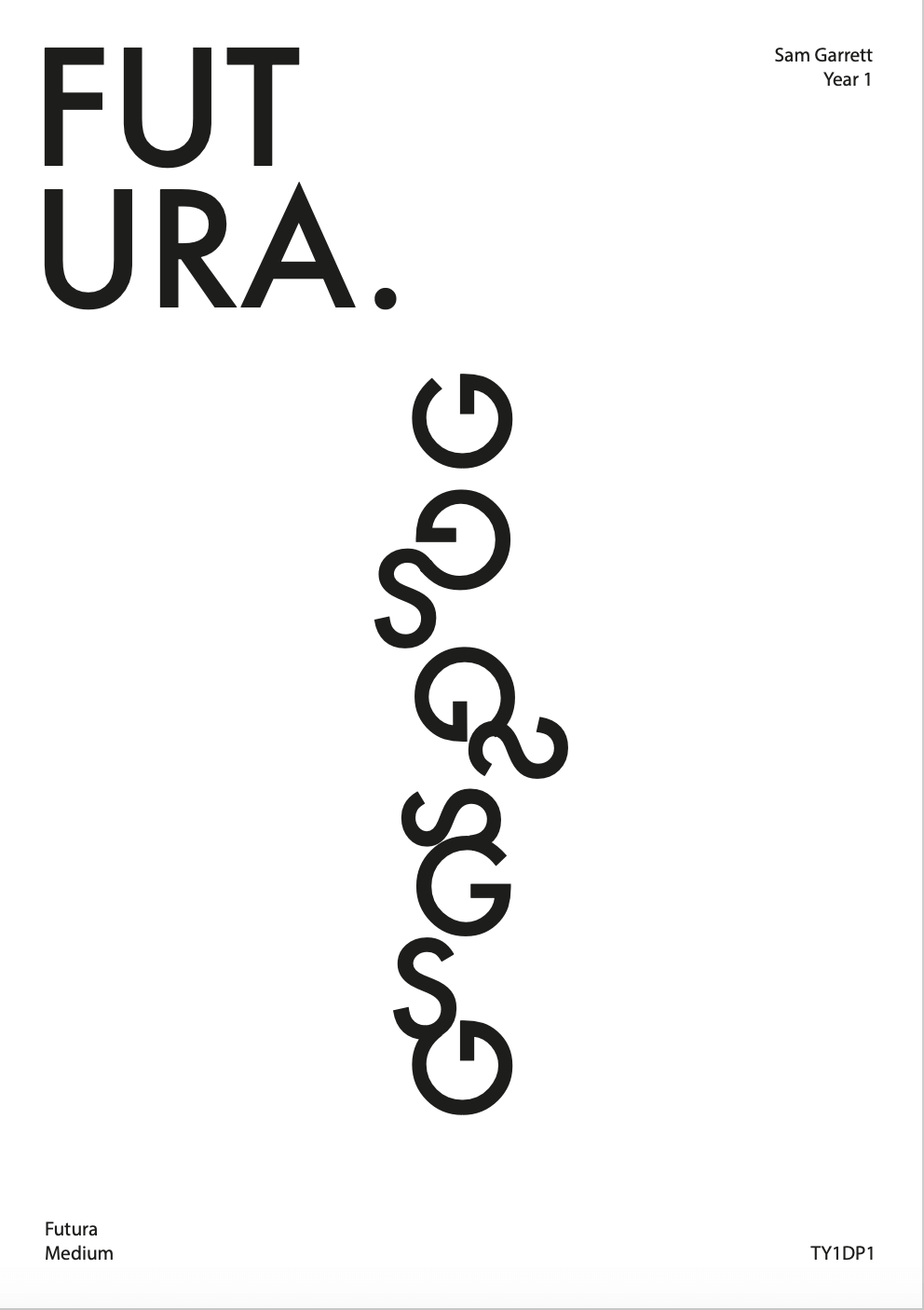
For Gerry’s project we were given several examples of sans-serif and serif type. The type had been deconstructed, only leaving small parts of the letters anatomy such as the stem with a spur. The remnants were left to serve as a reference point of how the letters might modulate in weight and structure. The letters had originally spelled out a word and the task for today was to experiment with different ways to render the forms.

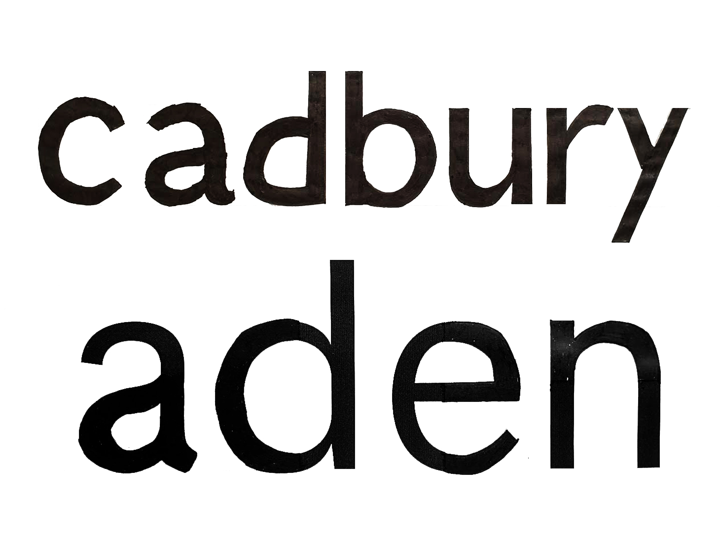
For task one I picked the rendition of ‘Aden’ in the sans-serif face. The word had its letters deconstructed, forcing me to analyse its remaining anatomy as reference points to then draw the complete letters. I found this particular hard, I found I kept having to change the weight modulation in letters such as ‘a’ and ‘d’ due to their bowls. I thought that I had finally got the weights right but after filling them in I could see how they were still too thick and oddly shaped. I was also too generous with where shoulders and bowls would join the spines, whereas they should have been much thinner.

For task two I analysed the word ‘Hesion’ that was rendered in a sans-serif typeface. We had to analyse its characteristics before attempting to sketch out the word ‘Cadbury’. Cadbury was chosen as it has enough contrast in its letters forms, allowing us to recreate almost all similar anatomy that would be inspired for other letters across the alphabet in that face. I decided to draw out the baseline and x height on a sheet of layout paper, allowing me to overlay my work with the example word. I would then try and incorporate some elements of letters into similar ones, helping me get more of a reference. for example I recycled the shoulder of the n to recreate the same modulation that I think would occur in the ‘u’ and ‘r’ of the face. I also tried reconstructing the bowl of the ‘a’ by using the thicker and broader part of the spine in the ‘s’. I feel like my result wasn’t too bad and was similar to the actual rendition. I noticed that the bowl of the ‘d’ was actually higher than the bowl of the ‘b’ instead of the other way round like I previously thought.

Pre ‘Coroni’ 2017 listings

Reading Film brochure2Final

We were given film listings from 2017 and were given the task to present our own film brochures with this information. the list of information wasn’t written properly and contained several errors. for example a lot of them didn’t all include the run time. With this in mind I started sampling bits of information and re-writing it all to read in an order that could more coherent, allowing me to reorganise things more easily if need be. I was aware that there was a lot of information for a single listing which would be difficult to put into an a5 document whilst maintain legibility. I decided to then shorten the information taking liberties like shortening dates and only including start times of the movies. I noticed that for each listing it mentioned the month and year, something that I felt was too repetitive. I didn’t want my design to do this so i started sketching layouts, allowing me to distinguish the listings by month. I also wanted to distinguish that the movies were either adult or family friendly. I settled on the idea of having two columns, the left being adult movies and the right being family friendly movies. I then thought I could distinguish them into two halfs, the top being listings in October and the lower being ones in November. I knew I needed the listings to line up so I went back and adapted them to share the same amount of lines,  creating uniformity in my design

I then started experimenting with using the face Gill Sans Nova. I chose this for its variety in fonts and its reliability for short headings, as it was originally designed as a displace face. the Nova style also allows me to use much thinner weights for the main listings. Instead of incorporating lots of colour I decided to reserve it, only using it for the for information that might get lost in the structure of the document. I then had to rely on weight variation so I used a bold for the title, semi bold for the subtitle and medium for the rest of the listing. I wanted to make the listing into two halves again, the top being the most important information and the bottom being more contextual. I did this by significantly lowering the point size of the second half in the medium font, allowing it to still feel breathable. I thought that it needed more contrast for some key words such as ‘directed by’ and ‘staring’ so I lowered the point size and increased the font to a semi bold, giving it a subtle change in weight.


Analysis

I feel like the design went fairly well but struggled to add the contact information at the bottom. I had to decrease the size and up the font weight as well as slightly increasing tracking  to suggest a similar size. I still feel it looks too small and a clumsy effort to include it at the bottom. I also know that the RFT logo that I made to fit the design doesn’t solve my alignment issue. The last block should be where all the text is aligned on the right hand side yet it’s not as I felt that increasing the column margin to space it towards it would look disconnected. I also think that the use of colour for the icons worked well as they would have been overlooked if not used, yet I think its a shame the rest of the design is in black and white. Having said this I don’t think that using more colour would have made the distinction between itself and the black type any more effective, as more colour used decreases its impact as suggested by Tschichold


‘Bookception’. Like Inception but not as big of a budget…

For todays brief, we were asked to find an unwanted book to manipulate. We were then given a sample of different blurbs that we had to choose from. With the blurbs we had to identify interesting features in it, so that we could manipulate our books to visually interpret them. I decided to go with the theme of ‘Loop’. its blurb depicted a man getting sucked into a book to witness a murder. I started to highlight interesting words, so I could see what I could recreate from the blurb. I decided that I wanted to play with the man originally getting sucked into the book, and the victim reading a book before he’s murdered. I realised that they are both reading books which I could use to link them. I had researched some examples of artists manipulating books and found ‘A Passage’ by Buzz Spector (1994). I liked how he had ripped each page out, creating a ragged and warp line for each page. The pages also descend in hight, creating  a landscape in the book. I thought I could create this effect but cut out a ragged whole in each page, so it would create a portal like effect. I decided to respond with this idea as it suggested whoever picks up the book, takes on the role as the man (in the blurb) who gets sucked into the story, to watch the murder take place, they would then get sucked into the victims book, taking them back to the initial stage, thus creating a loop. I did this by sketching out a distorted shape on the first page, slipping the cutting matt under it and then cutting it out. I then slipped then next page onto of the matt so I could use the first cut out as a template for cutting the second page. for each page I used the one prior as a template, slowly cutting smaller and smaller shapes to create a sloped effect. I also played around with distorting the shapes more by weaving in and around the previous cut out, creating a wave like effect which looks like a portal.

Christ or the Antichrist?

For todays brief, we were given a word to respond to. Mine was ‘Religion’, and with this I had to create an image or composition that clearly represented the word. I started. by drawing a spider diagram, writing down any words or ideas that related to religion to see what I could use as a subject. I liked the idea of using a crucifix as my subject as its shape is quite graphically symbolic and well known. I wasn’t sure on the tone I wanted to convey so I started writing down different questions, theories and ideas that people commonly had with religion. I liked the idea that god might not be this perfect image that he’s portrayed to be, and could actually be something sinister. I had this result after questioning why such tragedies happen in the world and why an all powerful being such as god would let them happen. I started questioning if he truly is god or the devil. I wanted to take this idea and inject it into the second image, which is supposed to change the tone of the first by adding an element.

Firstly I started photographing a crucifix that I borrowed. I used this as it was a large enough ornament that also had Jesus on it, making the first image represent the religion christianity, and the pain and suffering Jesus endured. I decided that the most universally understood message of the opposite of god was by turning the cross upside down, I felt that this would be a good way to show how God may in fact act more like the Antichrist. I pinned the cross to my dorms notice board, allowing the cross to be upright, and still have shadows falling down in the correct direction. I knew that I couldn’t just flip the image as the shadows wouldn’t be in the right direction, so I photographed the second image with its bottom sellotaped to the board so it wouldn’t fall forwards. I then uploaded the images to photoshop. I wanted to erase the pins and the sellotape, just to show the cross, which I did through using the clone tool in marked off areas via the section tool. I felt that this symbol and idea of God was very old fashioned so I wanted to replicate that feel. I increased the contrast and turned the images black and white to create an old illustration effect, whilst cleaning up the background. I didn’t want to overcrowd the images so I left them on white backgrounds and liked how the negative space became apart of the cross, suggesting purity. I thought that I could show resentment to the idea of God being the Antichrist through some sort of relic effect, as if someone had scratched and abused it in spite after reading it in a book. I found pngs of scratch marks by pens on paper and selected the outlines and and pasted it onto of the second image, putting the blend option as divide, which broke up the marks and made them distorted and more authentic. I decided to target the face and the script on the cross to emphasise a rejection of the identity and ideals of christianity.

‘Caroni’

Today for Emma’s project, I researched all the different types of Covid 19 signage. I wanted to get a diverse range of material from different areas from all over the world so I decided to use the hashtag #covid19signs. this would source all the covid 19 signs from the perspective of the civilians and the companies/ businesses. this showed the signs as people interacted with them, for example the picture would be of a sign on a door from the perspective of someone who would interact with it in that given example. It also showed the different examples of mock-ups that businesses used for promoting safe signage in their businesses. i also encountered the different examples of NHS signage. Instead of focussing on the rules and advice, i also wanted to look for the supportive signs towards NHS workers and see if i could see a trend. I noticed that the typical signage that informed people of the rules used bold outlines or solid pictograms as well as sans serif type all on a bright yellow or dark yellow to head urgent  warnings. the consistency in geometric weight in type and graphics accompanied with the high contrast background lends itself to a more serious tone in message. its clear to see that the NHS signs that thank workers take an opposite approach to stand out from the boring consistency in  signage. Instead of using sans serif type that conveys efficiency, they hand draw their text in a curvaceous and forgiving  inconsistent style, showing  imperfections to convey that a person drew this, making the message feel genuine. for colour pallets they also use a softer blue  for the backgrounds to symbolise the NHS and typically incorporate a rainbow to symbolise hope. The colours are also typically coloured in by hand for the previous reason and i think it is a nice distinction from the overwhelmingly bright yellow from official signs as the subtle colours are easier to digest and helps create a relaxed and warm tone to the message. Consumers of covid19 signs have adapted to the pandemic, making the official signage less efficient in standing out and conveying the importance of their message as they all blend into together in a persons given day. The different approach to the NHS signage helps stand out as people aren’t conveying such relaxed tones in the the recent average signage. Despite typically being drawn by a 9 yr old with their parents, its arguable that they are more effective in attracting the common eye in the open environment in some cases.

Alfred as Godzilla

For todays session we were tasked with making an ‘ideal gift’ for one of our group members. we started the group discussion with three interesting facts about ourselves. the person I chose to focus on responding to liked to travel, painted custom shoes for clients and also owns a bearded dragon. I started by drawing out initial sketches to these three ideas, mainly focussing on the lizard for the subject. I started by drawing sketches that combined all three elements. as the session progressed, we had to pick three words at random. mine had been ‘drink’, ‘Monster’ and ‘post office’. In the end stages of my sketches I decided to finalise my best sketch that was influenced by the word ‘monster’. I decided to respond to this word by making a Godzilla poster using the lizards picture. I got a couple of images of the lizard from the team member and played around with framing within the sketches. once I chose my final one I finalised it in photoshop. I did this by erasing the background of the lizards image through a combination of the section and eraser tool. unfortunately the picture was low quality so I had to resort to using both. I then experimented with increasing the exposure and contrast to create more contrast in shadows as well as soften the edges of the lizard. I then turned it to black and white and added a red circle behind the image and setting the blend option to darken which created a spotlight effect. the circle also represents Japan which is one of the scenes of some of the Godzilla films, also linking back to my team members hobby of traveling. I decided to finalise the image by adding some png logos of the recent film ‘Godzilla, king of the monsters’ to make the message more clear.

Alfred as Godzilla Poster

PULP FICTION

Penguin Book cover2.2

Penguin Book cover3.3

In todays session I learnt how to recreate the format of the iconic Penguin Classic book series. I recreated The Great Gatsby by F. Scott Fitzgerald. I learnt how to manipulate the type of the cover as one element, experimenting with leading, type size, font and paragraph rules to replicate the aesthetic of the original copy. along the way I picked up on how to create Pantone swatches from classic covers and use them within shapes for the design.

This came into effect when I had to adapt my remakes format into a new cover. I chose Pulp Fiction as Tarantino is one of my favourite directors. The format allowed me to change the name and subtitles whilst maintaining the same proportions. I decided to use a slightly dull yellow to represent the colour scheme in the movie title. I also imported elements such as the 10c sign and the silhouette of Mia and Vince dancing from one of the iconic scenes, which can be linked to the quotes I used from Vince in the last line of the sub-title. As a call back to the scene where Vince accidentally shoots Marvin, I decided to incorporate blood in the foreground and background by sandwiching them in-between the colour block layers. I adjusted the opacity in the foreground to show the characters trying to cover it up with Jimmie’s bed sheets.

The links above are of my original copy and my Pulp Fiction adaptation