I found this practical task very insightful as I gained a greater understanding in the different aspects and features revolving around typefaces. What I found most useful was understanding why features where designed in a certain way to make it less challenging for audiences to read.
The session was split into two activities, firstly we had half of a font in which we had to draw what we thought the other half would look like and the last activity was drawing missing letters using the features from examples above. I had to really take into consideration curves, Line thicknesses and the lengths for both ascenders and descenders.
Following the Thursday interactive session from Gerry Leonidas, I have come to recognise and acknowledge the details in typography as well as overall design.
The session had us draw letters of a particular typeface that was only in small parts that were pre-drawn; and from that reference we had to draw the rest of what remained of the text. I believed this exercise was to test our knowledge of not just typefaces, but to see if we could guess the following style through little information.
The picture on the right of the page illustrates an example of my drawn work that shows how I continued with the pre-drawn typeface. Compared to the original, it was fairly accurate, however the “a” and “e” required more curvature, after being given 4 words, the task moved onto doing more without a starting reference on what we had to draw. Very similar to the first example I had drawn, they were mostly accurate other than the curvature of the lines on certain letters. In future projects, I will need to improve my skills of refining and recognising fine details, especially when it is related to text or fonts. These drawing skills will help reintroduce me into sketching for future assignments as well as improving my confidence in refinement.
To conclude, the session helped me understand the foundations of what future analysis of designs/typefaces will require. Additionally, as I have not drawn for a while, it was always helpful to regain my confidence into drawing more again.
My attempt at the task, filling the missing gaps to complete the letter-forms.
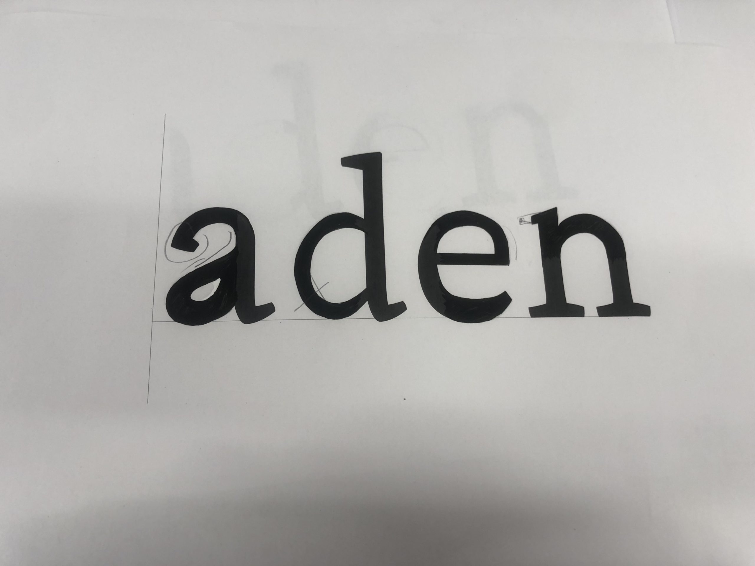
In the first of two tasks, I was given 4 letters in the font ‘Skolar’ with large portions missing, with me needing to fill in these spaces as accurately as possible. While initially sounding easy, I was surprised at the complexity and difficulty of this task.
I began with the ‘n’, which was missing the top curved portion, as I thought this would be the best starting place to ease myself into the task. I used a 6B to begin sketching a skeleton of the shape before switching to a 2B to define the outlines. While I think this was one of the closest letters to the original, the sizing was still off, making it taller than the actual Skolar lowercase ‘n’.
I then moved on to the ‘e’; I struggled on this one more, not knowing if a serif was present or not. From the remaining parts of the other letters, I could see some of the different possible serifs. However, after trying them and deciding they looked misplaced and visually off-putting, I resulted in a slightly tapered but curved edge. While the right choice for this font, my choice to make the letter closed instead of a more open sweeping stroke makes my letter look visibly different from the real font.
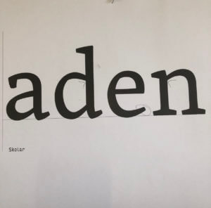
The authentic Skolar font, which I was trying to replicate. I used this image as a comparison following the completion of the task.
Although going in apprehensively, the ‘d’ was not as challenging as expected. By giving the sketching process time, I was able to slowly build onto the base skeleton lines to create a structure that somewhat matched the given portions of the letters. Upon reflection, the real font is more angular than mine, with the bowl joining onto the stem in a sharper manner. Despite this, I think that the curvature and slight descending nature on the bowl are accurate to the original, making this look like a reasonably close recreation.
The ‘a’, in my opinion, is the furthest from Skolar. In my addition to the given portion of the letter, I did not add the angled stress found in the original. The serif is similarly absent from this, making it noticeably different. I failed to capture the angled nature of the bowl, instead of creating a rounded curve with much less stress. However, with the given part of the letters, there was no real way of me inferring the angle or stress of the font. This task showed me the intricacies of type, helping me to spot subtle ques and motifs that run through the letters while allowing me to apply my sketching and drawing skills to a practical task.
Task 2 – Replicating Entire Letters
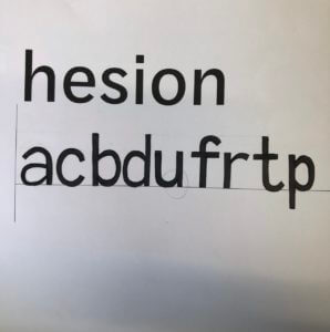
A close shot of the task. The 6 given letters are seen above, with my continuation of this alphabet photographed below.
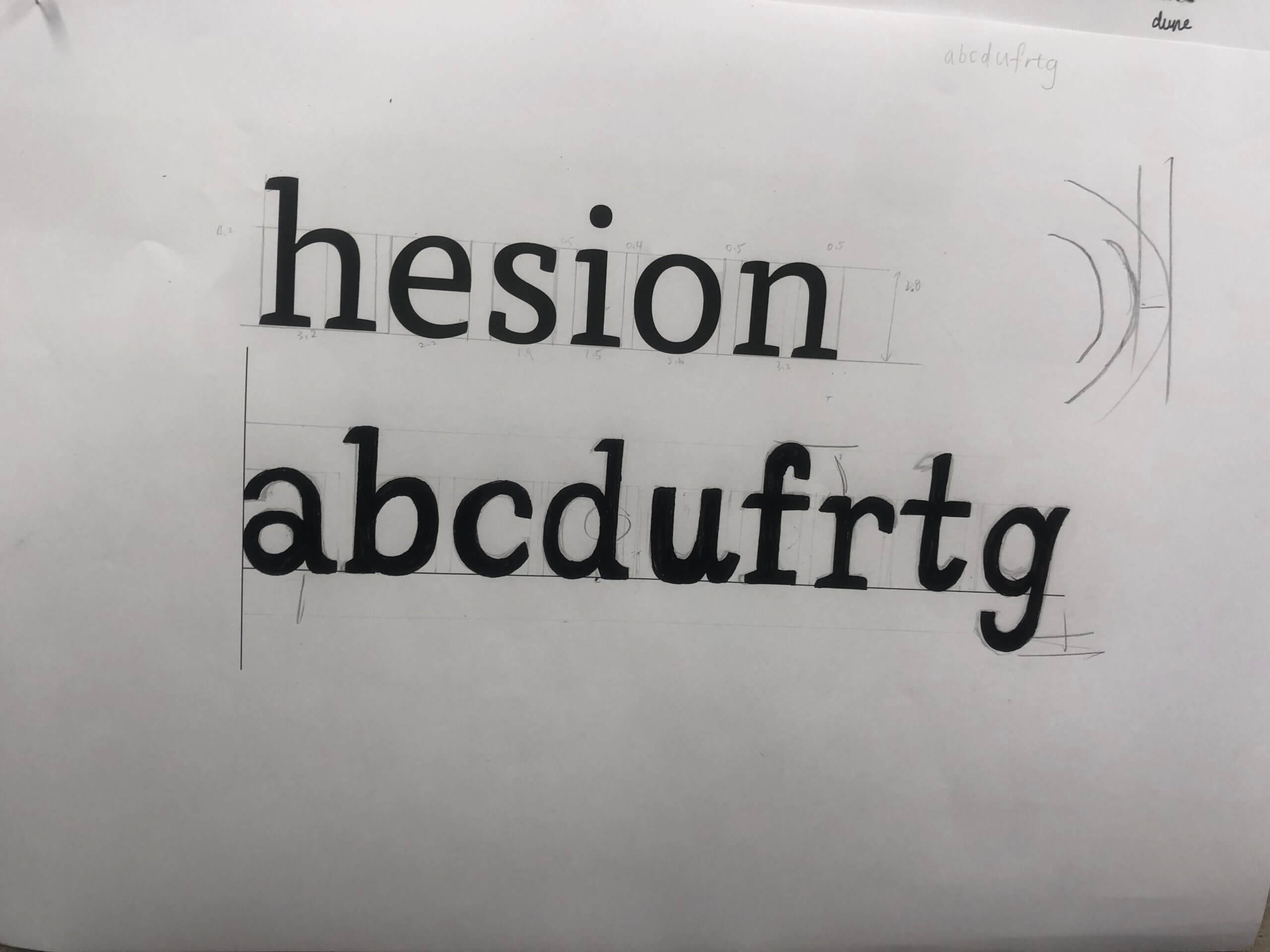
The second task was more challenging still; here, we were given six letters within a particular font and had to continue writing other letters of the alphabet, attempting to replicate the font. Now without the assisting portion of the letters, many more of the choices made were based on the other letters and existing knowledge of typography.
Beginning with the letter ‘a’, I presumed this would be a double story letter from the smooth, open strokes and chunky serifs. Looking back at this now, I think that the bowl of the ‘a’ descends too far below the baseline. While the counter is reasonably proportioned for the vertical stress of the letter, it is also apparent that the aperture of the overhanging stroke is too small, making the letter seem closed off. This does not follow the open nature of the example letters, forcing me to not include a serif and making it appear further from the typeface. However, in comparison to the FF Tisa Standard font I was attempting to replicate, I was not too far away from the real letter.
Following this, I then created a lower case ‘c’. The curvature became a challenge here, requiring a smooth curve and a definite decision on the inclusion of a serif. After looking at other letters, specifically the lower case ‘e’, I decided not to include any serifs, keeping the letter more visually simple. While the real letter does have a serif on the upper end of the stroke, I think that my choice was somewhat informed. With both serifs, the glyph looked out of place alongside the other letters, causing me to remove both serifs. The stress and proportional weighting of the lettering was good, but this task has helped me understand where my weak points are and where to continue independent research into typography and lettering.
Finally, with my remaining time, I drew out a lower case ‘b’. Here, I went the opposite direction, adding an upper and lower serif to the design. Although this is present on the lower case ‘d’, the ‘b’ in FF Tisa Standard only features an upper serif. The angled exit stoke of the curved bowl, stressed proportional weighting and slight descending curve are all accurate to the real font. However, the bowl is more squared off in the authentic typeface, with my recreation being too rounded by comparison.
Although these tasks were not flawless by any means, I think the lessons I have learned from completing them have been incredibly valuable. I looked at letterforms to a very minute depth, allowing me to make judgments and observations on minute aspects of the font. I have also been made aware of areas to improve, which I will pursue and try to actively improve within my studies and free time.
I found this task was surprisingly difficult compared to how I had assumed it would be after reading the brief. I had thought that I had quite a precise hand for drawing and sketching, but the reality of the project showed me that I was not as detail orientated as I’d thought. There were details within the letters which I did not observe until they were pointed out to me.
The first task was to fill in the gaps of letter parts of the typeface ‘Skolar’. I feel that I achieved the same style across the majority of areas but on seeing the original font afterwards could see that my ‘a’ was quite far off and some areas are a different weight than to the original.
We then were tasked to replicate what we thought the letters of a different font with letters that we’d not seen would look like. I found the rounded parts of the letters the most challenging, but focussed on creating a balanced weight across the letters. I, again, found the ‘a’ the most challenging shape to achieve but found evidence from the letters we were given to create the shapes across the other letters.
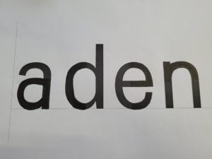
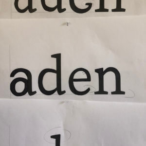
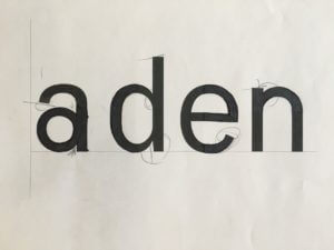
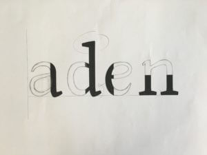
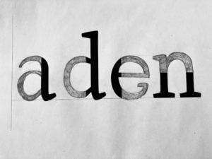
For the first task of filling in missing part in the word ‘aden’, I was able to learn that individual letter have difference structure and characteristic. For example, different features include stroke contrast, x height and many other aspects varies to specialise a typeface. While sketching the word ‘aden’ in serif font, I have messed up with the aperture and serif in lowercase ‘a’, which I thought it would be better if I emphasis in the negative spaces by the next task.
Task 2
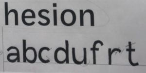
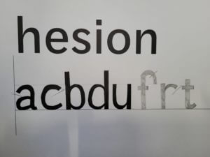
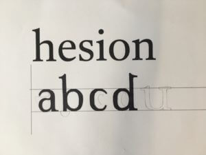
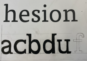
In the second task , we were told to write random letters ‘abcdufrtg’ in given font . It is more challenging to me, as I was using a brush pen rather than a calligraphy, which affect the stability in strokes. It is also important to further determine in each letter’s spacing as well as characteristic in structure and shape.
Reflection
By reflecting my sketching in letters, I can improve by paying attention in contrasting stroke, and accurate proportion to the serif. While sketching out and guessing the type shape, Gerry suggested us to recall how we write letters while we was a child. As designs may mimicking natural handwriting within typeface, such as the letter ‘u’ with serif in the ending. In these tasks, I realised that it is a complicated and long process to design a typeface. It was an useful practice for me to understand what typography elements a typeface designer need to determine and reserach while designing a typeface.
In this task I had to complete the missing half of 4 letterforms — all of the same typeface. I made several mistakes that made the features of the letterforms inconsistent: the apertures on the ‘e’ and ‘a’ do not match in size. The gaps between the bowls and stems of the ‘d’ and ‘a’, and the gaps between the shoulder and stem of the ‘n’ do not match either. From the weight of the existing parts of the letters I came to the conclusion that the typeface has little contrast between thicks and thins. After seeing the actual typeface I realised that I should have added some more contrast where the shoulder and stem of the ‘n’ connect as this can be seen where the bowl of the ‘d’ joins its stem.
The secondary font left a lot more room for mistakes as seriffed typefaces are a lot more diverse in style. It’s hard to make out some specific elements of a typeface with little information given, for example: there’s no way to tell that the ‘a’ should have a terminal. An error that I shouldn’t have made was making the serif on the ‘n’ too small. The serif on the ‘d’ should have made this obvious.
Task 2
The secondary task presented six full letters to use as references. Seeing the whole letterforms made it a lot easier to predict the characteristics of the typeface. However, having to draw entirely new letters from scratch presented a new challenge of its own. The letters I drew came out looking too square, to avoid this I should have focused on the shape of the letterform as a whole rather than focusing too much on drawing the parts of the letter bit by bit. An important thing that I learnt from this task was that the serifs on the ascenders on b’s and d’s always face left (I made the mistake of making the serif on the ‘d’ face right which looks odd, especially compared to the b). In my opinion having serifs that both face the same direction helps the flow of reading.
Being given half the typeface, I had to draw the other halves of the letters to what I expected them to look like, taking into consideration, the curves, thickness and the sizes of the ascender and descender as well as the overhang of certain letters for the word to be visually aligned.
On the second task, being given certain letters of a particular typeface, I then designed other letters in the style of this such as a, c, b, d, u and f, following the form of the existing letters and how they curve varying in thicknesses and size. I have also learnt how letters work to be visually aligned, with the use of over hangs and ascenders, however the letters could be shaped slightly better, to provide a more accurate reflection, especially the serifs on the upper side of the U, I have learnt how they only form on one side, rather than across the stroke.
For this exercise I recieved a few letters and had to guess what the other letetrs would look like. I enjoyed this task as the task before helped me determine what features each typeface has.
I was able to see the features and what type of serifs or sans-serifs I needed. This task allowed me to make judgements and measure up accordingly to then draw out my own letters using the FF Tisa Pro typeface.
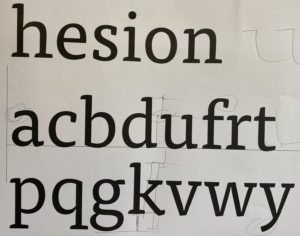
Extrapolate means to “extend the application of (a method or conclusion) to an unknown situation by assuming that existing trends will continue or similar methods will be applicable”.
This is exactly what we were tasked to do, by looking at the letters and using the clues to work out what the other letters would look like. In this example the serif on the ascender of the “d” would be similar to that on the “n”. The letters “a”, “e” and “n” should all be the similar sort of height, reaching to just above the x-height.
From this close inspection at the letter forms, I learnt that no “e” has a serif. The counter of both the “e” and “a” should roughly be the same space. This is to create balance and harmon within the typeface.
I found designing the rest of the letters, from the given letters, quite a bit harder than completing the letter form. How narrow or wide should the letter be? Where do the serifs go? What style should they be?
My letters are too thin, with not enough contrast between the thick and thin strokes. They are also too narrow, compare the “a” to the “e”.
From the exercise I learnt many things, I am happy enough to leave this to the type designer! But it made me more aware of the features, when blown up. Letters are usually only a few millimetres high, so the characteristics are so small to be noticed. When reading I hardly pay any attention to the typeface and the anatomy of the letters, but after spending a few hours really paying attention you notice these tiny difference in the characters.


 From this close inspection at the letter forms, I learnt that no “e” has a serif. The counter of both the “e” and “a” should roughly be the same space. This is to create balance and harmon within the typeface.
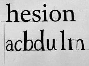 I found designing the rest of the letters, from the given letters, quite a bit harder than completing the letter form. How narrow or wide should the letter be? Where do the serifs go? What style should they be?