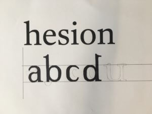
Task 1
In this task I had to complete the missing half of 4 letterforms — all of the same typeface. I made several mistakes that made the features of the letterforms inconsistent: the apertures on the ‘e’ and ‘a’ do not match in size. The gaps between the bowls and stems of the ‘d’ and ‘a’, and the gaps between the shoulder and stem of the ‘n’ do not match either. From the weight of the existing parts of the letters I came to the conclusion that the typeface has little contrast between thicks and thins. After seeing the actual typeface I realised that I should have added some more contrast where the shoulder and stem of the ‘n’ connect as this can be seen where the bowl of the ‘d’ joins its stem.
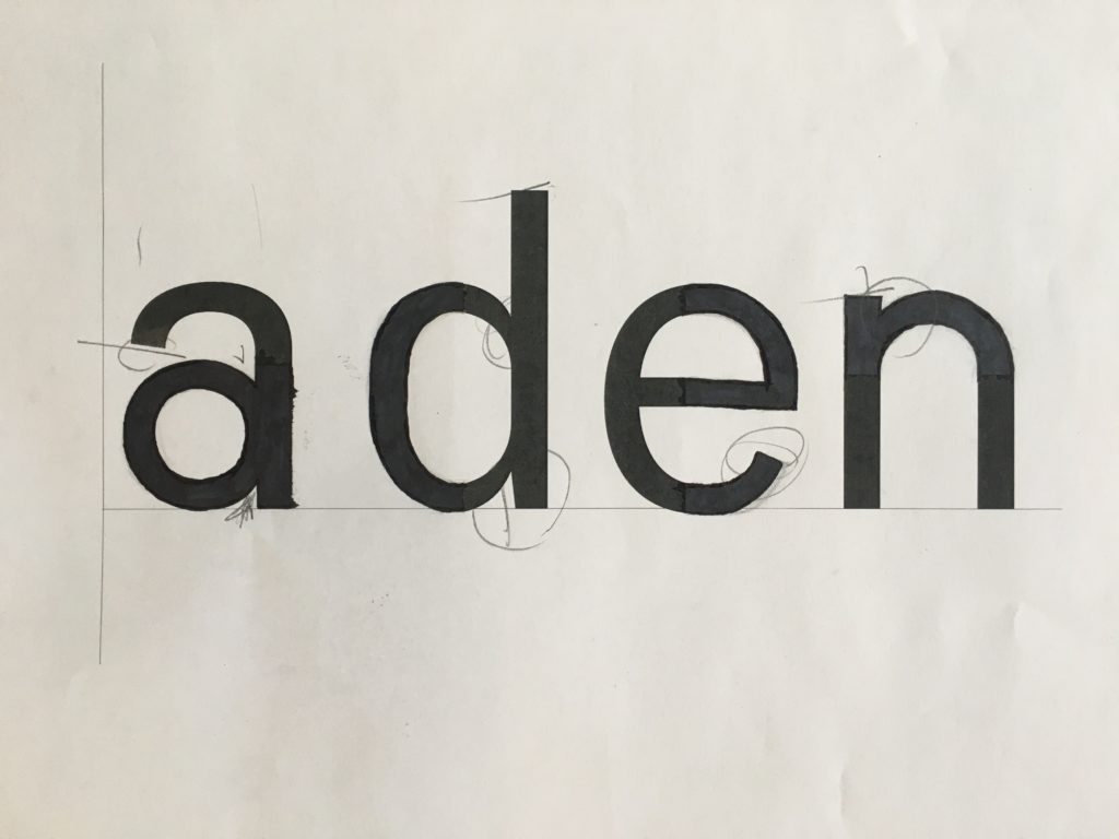
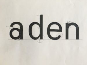
The secondary font left a lot more room for mistakes as seriffed typefaces are a lot more diverse in style. It’s hard to make out some specific elements of a typeface with little information given, for example: there’s no way to tell that the ‘a’ should have a terminal. An error that I shouldn’t have made was making the serif on the ‘n’ too small. The serif on the ‘d’ should have made this obvious.
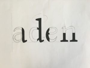
Task 2
The secondary task presented six full letters to use as references. Seeing the whole letterforms made it a lot easier to predict the characteristics of the typeface. However, having to draw entirely new letters from scratch presented a new challenge of its own. The letters I drew came out looking too square, to avoid this I should have focused on the shape of the letterform as a whole rather than focusing too much on drawing the parts of the letter bit by bit. An important thing that I learnt from this task was that the serifs on the ascenders on b’s and d’s always face left (I made the mistake of making the serif on the ‘d’ face right which looks odd, especially compared to the b). In my opinion having serifs that both face the same direction helps the flow of reading.