Author: Yasmin Clark

True Food Organics Logo

Overview

True Food Organics, originally named True Food Co-operative, is a zero-waste, organic food and grocery store based in Emmer Green, Reading. It is run by volunteers from the local community and they have been encouraging others to choose a more sustainable lifestyle since 1999. With their decision to rename their store they decided it was time for a complete rebrand to bring their store more up to date. 

Deliverables

A logo that is scalable so that it can be used in numerous places including:

  • A storefront
  • Tote bags
  • Website
  • Receipts

Design Process

Client meeting:

To start our process, we met with our clients to introduce ourselves and get to know them better so we could figure out what they were looking for.
The clients wanted a logo that was:

  • Circular as they felt this represented the sense of community in their store
  • A 70s/80s themed colour pallet 
  • Illustrative
  • Sense of homegrown food

Research:

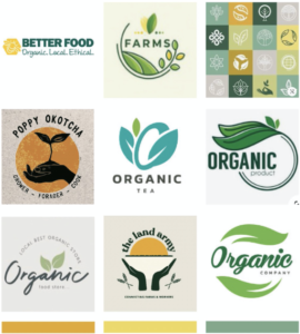
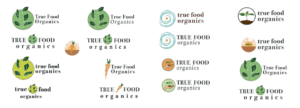
We began our research by searching for existing organic branding, particularly in a circular shape as requested by the client. This was to help guide our ideation and ensure we were creating a logo that stood out. Most of the existing branding contains a leaf which is very typical in representing organic brands and is also what was in the client’s existing branding. Because of this, we wanted to ensure that we came up with concepts that did not include a leaf as we wanted to find a new and memorable way to represent organic brands. However, we also understood that it is a very recognisable symbol, so it should still be explored. We put a small mood board together that also included a potential colour pallet for their brand. We sent this over to the client when we sent our restated brief to make sure we understood exactly what they were looking for. Once the mood board and restated brief had been approved by the client, we started the design process.

Initial sketches:

To start, we created some simple designs by hand and on illustrator that incorporated the brand name and some imagery. We split this so that Yasmin was looking at trying to find a new and inventive way to use leaves in the logo and Hannah experimented with other elements such as hands and other fresh produce. After feedback from the other teams who attend the Real Jobs meetings and our supervisor for this project, we were advised to experiment more and develop our ideas to a near-finished stage before sending our ideas over to the client.

Developments:

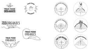
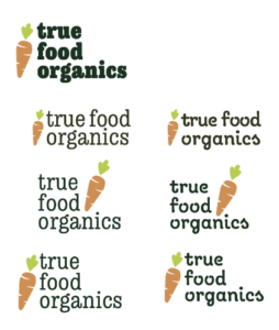
First, we developed the ideas we initially came up with so that colours had been applied and text had been set. The feedback from our supervisor was that some of the ideas were more like illustrations than a logo so we went back and simplified them so they were more like icons. We also ensured each illustration had text along with it. We experimented with the layout and hierarchy of the text and how they could work in relation to the illustrations. We were initially unsure if the ‘organics’ part of the company name was on the same hierarchy or lower on the hierarchy as ‘True Food’ as you can see from our experiments below. It was later decided that it was best to keep them on the same level in the typographic hierarchy. Our supervisor liked the carrot design and the leaf design but we were advised to experiment with simplifying them. She also asked us to experiment with a couple of new ideas as she felt we were not quite there yet with a solution. These experiments can be seen below. The carrot again was a strong contender and we liked the bold serif typeface that we had found but it was decided that the illustration style and typeface did not match. So we were now tasked with finding a way to of making them have the same aesthetic. The collection of hand-drawn illustrations in an ‘o’ shape was also well-liked since the sketchy style helped get across the idea of organic and homegrown that the store represented. It also had the circular shape the client was looking for.

Further exploration:

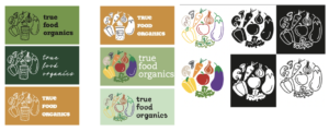
There were 3 concepts we decided could be suitable logos for our clients from the previous experiments. The first was a bold, 2D carrot illustration. [fig.  We thought this would be a great option for clients to see that was a little bit different to what the other logos look like and shows the client another direction they could go in. We were undecided on whether the carrot should be leaning against the text or sitting upright. Since both worked well, we thought it would be best to present both to our supervisor and client. The 2 circular concepts we went with were a solid ‘o’ shape made up of illustrations of vegetables and an ‘o’ shape made up of fresh produce but also symbols that represented the store sold such as shampoo, toothpaste and the classic recycle symbol. For the solid ‘o’ shape we experimented with a range of illustration styles including simple outlines and solid 2D shapes.

Final logo concept:

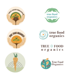
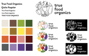
After developing our designs and with feedback from our supervisor, we decided on the hand-drawn vegetable logo with the typeface Giulia. We settled on this font as we felt the handwritten style it had, fit well with all of the hand-drawn illustration styles we had produced.  To send to the client, we produced a large colour pallet as many colours were used in the vegetables and this gave the client a wide range of choices. As well as the 2 illustration styles, we showed the client the logo in black and white as well as colour so they could get a sense of what a single colour could look like as well as multicoloured.

Reflection:

As this was the first time either of us had been tasked with creating a logo and completing a Real Job, we felt that our outcome was effective and fitted the brief the client gave us. However, once we sent it to the client, their feedback was that, although it did fit their brief, they were unhappy with it and did not feel involved in the design process enough. This was unfortunate for both sides. Miscommunication between ourselves and our supervisor on what was appropriate to share with the client is what lead to this outcome. Although we did try to keep in contact with the client to reassure them that we were working on the project and that we were waiting on approvals but it is clear we should have done this much more often. We apologised to the client and then put together a PDF showing our whole design process to see if they were interested in picking up an earlier concept. We also tried to reassure them that this was not intended to be the final design and changes and feedback were expected to be made. There was unfortunately no response. While this was not the outcome we wanted as we both felt we worked very hard on this project, it has taught us a lot about working with clients. Next time we will ensure we have a range of ideas to send to a client and keep them involved in all design stages. Although there was a real sense of disappointment, it has created a motivation for us to learn from this experience and try again.

Diving deeper into the world of photoshop

­­­­­­­­­Design ideas and design process:

For this design, I used my own photograph that I took whilst in New York. I chose this image as it was of high quality, and the composition was interesting. I also chose this because the background didn’t have too many buildings in it so I knew it wouldn’t be too complicated to isolate as this was my first time using the software. I first used the selection tool to select the sky and parts of the background that I wanted to remove, adjusting the size of the tool in order to get my selection as accurate as possible. I then used inverse selection to select the buildings and everything else that was in the foreground of the image so that I could make that selection a clipping mask therefore removing the background. I then fixed some details further on the clipping mask layer with the paintbrush tool using black to take away and white to add back some of the image, again adjusting the size of the paintbrush as and when I needed to. I then went back in with the clone stamp tool to get rid of some of the thin wires that were running across the buildings, as I had removed them along with the sky in the background. The results of this removal can be seen in figure 2.

Figure 1. New York image with the background removed
Figure 2. cables and telephone lines over the buildings, removed

Once I felt I had accurately cut out the background I then went on to place the new background image into the file. I used ‘place embedded’ to do this. I scaled the new background image to half the size and duplicated it so one was on top of the other shown in figure 3. This then allowed me to merge the 2 images into one layer so that I could then use the clone stamp tool to blend them together. Once I had blended the background images, I then moved the layer below the original photograph, leaving that as the new sky for my New York image.

I chose to edit the foreground image as, in real life, if the sky was really that colour you would see pinks and blues in the reflection of the buildings. I first increased the contrast which you can see in figure 5. I then adjusted the colour balance. I left the mid-tones as they were, added more blue and cyan to the shadows and then added more magenta and red to the highlights of the image. This can be seen in the feature image at the top of the post.

Figure 3. The background image prior to blending
Figure 4. The blended background image
Figure 5. Image with adjusted contrast

For my second design, I removed the background of the original image using a layer mask and then placed the 3 butterflies I wanted on to the image. They originally had a white background, so I selected the butterfly using the object selection tool and then made it a mask layer. I then scaled and rotated the butterflies to sit on or around the baby. Next, I placed an image of grass in the file in a new layer making sure it was the very bottom layer. I then edited the contrast and blending effect of the grass so that it fits in well with the rest of the image. Finally, I added drop shadows to both the babies and the butterflies. This is because the original image of the baby had light coming in from the right and so I wanted this to be reflected in the rest of the image, making sure it was consistent and didn’t look like multiple images put together.

Figure 6. Design 2

For my third and final design, I kept it quite simple. I duplicated the image layer and on the new layer selected the parrot and branch to make it into a layer mask. I did this so that I could get the paint splatters close and packed together near the parrot without it going over the parrot itself. I then placed paint splatters using the brush tool around the right-hand edge of the parrot taking colour swatches from within the parrot.

Figure 7. Design 3


Software tutorials:

https://helpx.adobe.com/photoshop/how-to/composite-photo.html This was a given resource. As photoshop was still a fairly new software to me, it was necessary to teach myself exactly what a composite image is and see how I could potentially go about making one myself. I felt it was important to understand this before beginning my ideation for the edits so that I could start this task in the right direction and with a full understanding of what it was that I was creating.

https://www.youtube.com/watch?v=NnjOEcfK52E This again was a given resource that was particularly useful for the New York edit. From the beginning of the creation of this edit, I knew I wanted to remove the background of the image, but I wasn’t sure how to go about it. This taught me, not only how to remove the background, but to remove the background with as much accuracy as I could. It did this as it showed me how I could remove part of a selection by holding down the option key as well as how to use black and white with the brush tool on a mask layer.

https://helpx.adobe.com/photoshop/how-to/clone-stamp-remove-object.html I used this tutorial for a task in a previous week. However, I re-watched it to refresh my memory as I knew the clone stamp tool could help blend the 2 sky images together, as well as fix the reflection issues I had in the New York edit.

I think I have largely improved my photoshops skills from completing this task and using the tutorials to aid me. Although there is always more to learn and so to continue growing my skill set, I will use photoshop when I feel it is appropriate with my projects in other modules. I will carry on with experimentations and if I see an interesting image, I will be sure to be inquisitive in terms of how it was produced and even try to recreate it myself with the help of some adobe and YouTube tutorials.

Resources for research and inspiration:

https://www.thrillist.com/entertainment/nation/the-avengers-battle-of-new-york-joss-whedon

For my edit of New York, I got inspiration from the brief as it suggested to replace the background of an image and straight away I knew I wanted to do this to a city scene so it looked like a scene from a supernatural movie that uses special effects, such as Avengers. This was helpful to look at for the New York edit as it is what made me consider editing the image in the foreground with the buildings as I noticed the reflection of the green and blue light from the sky in the buildings. I think this really helped to tie my image together rather than look like two images layered on top of one another.

Going forward, it would be interesting to explore beauty photo editing in photoshop. I think learning the tools and techniques used for beauty editing will give a new perspective to offer to the conversation about whether it’s ethically right to be editing beauty photos at all, especially when it comes to advertising and beauty products.


Stuart Little

This week in our technical session we were learning some of the essential basics we needed to use Adobe InDesign. To do this we had to create an exact copy of the cover of The Great Gatsby. Throughout this process, I learnt how to appropriately use tracking and the ‘space before’ feature as well as how to great separate paragraphs within one textbox. These are key skills that we needed to learn as they can enhance are designs and perhaps even speed up our design process. For example, the ‘space before’ feature allows for much more control over the space between lines of text compared to just pressing the return key. This also means that no matter what text is inputted into that paragraph, the spacing will always be how it was originally intended to be, making the design easily adaptable. The image below is my copy of The Great Gatsby cover

We were then asked to use our copy of The Great Gatsby cover as a template for a new book cover for our choice of book, movie poem etc. I chose Stuart Little. I decided that every time the word ‘little’ appeared it would be in 8pt text and everything else would be in the same size as the original template. My reason for this is because ‘Stuart Little’ is about a mouse living in the human world so most things around him are much larger than him and so I wanted this to be reflected on the book cover. I also changed the typeface of the title into one that was more like a script font as this is a children’s book and I felt gill sans was too harsh and not playful enough.

Fragile Happiness

For Sara’s project, I was given the word “happiness”. The first thing that popped into my head was the classic smiley emoticon. After trying to explore other ideas I chose to go with the emoticon as emoticons nowadays are like a universal language, it’s almost guaranteed that my theme would be understood.

For my altered version of my original image, I chose to have cracks and pieces broken away from the smiley face revealing small hints of a sad, monochrome face. The cracks and fragments missing from the face were to show how fragile happiness can be and that sometimes even someone who looks like they couldn’t get any happier, are still pretending to smile. I chose to strip away the colour from the face behind the smiling mask as happiness is often associated with bright colours, particularly yellow. I felt that taking away that bright colour helped to increase the contrast between the two faces, therefore making it easier to differentiate between the two.

If I were to do this again I would have liked to use adobe software to use the original emoticon and then edit it digitally.

Wear a mask to stop the spread

Our task for this project was to collect a wide range of communications relating to COVID-19. During this project, I learnt how to improve my searches on the internet to get the best and widest variety of results as I did the majority of my research online. I had discovered that the majority of the government official and NHS posters and signs were all in blue and white or yellow and black. The reason for this is most likely due to the NHS colours being blue and white and yellow and black signs used to stand out as they were usually associated with warning and poisonous signs. However, the issue is that they no longer stand out. I have found that we, as the consumers, have become accustomed to these warning signs now. They no longer grab our attention because we see them around so often.

In Los Angeles (L.A ) the mayor introduced an initiative called the L. A mask print project. They ask designers and artists from across L.A. to produce posters, like the one above on the left by Camilla Lonis at Studio Number One, they are then made available to be downloaded for free by local businesses and residents so that they can be put on display. I think these more creative and colourful posters work better as they’re much more noticeable than the government standard ones that we have now become accustomed to. Adding a face that’s not just a basic outline perhaps will make the message feel a lot more personal rather than robotic. If it feels more personal people are more likely to want to make a change and ultimately that’s what the creates of these posters want. they want people to make the decision for themselves to wear a mask, and usually, if it’s encouraged rather than enforced, you’ll get a better response, although this isn’t always the case.

I think it’s clear that the Losin poster is for a particular audience. People in L. A are known for there glamourous lifestyle, they also have a rather large art scene and so to grab the attention of the creative inclined, you need to put up posters and signs that are just as, if not more, creative and bold as they are. Whereas the Government official and NHS ones are for national use, therefore, need to be more neutral so to appeal to everyone. As the UK is also very multicultural and we have people from all over the world the signs need to be clear and concise on what they want from the public so everyone understands no matter their language. The decorative posters can sometimes have messages that are vague or have a double meaning.

Paint by numbers

For Kim’s project, we were partnered up with someone from our class and we had to tell each other three interesting facts about ourselves. From that, we then had to come up with an ideal gift for our partner. My partner’s facts about herself were that she plays the piano and loves photography and painting. We then had to pick 3 numbers from 1-210 and these matched up with random words on a list that Kim gave us. My 3 words were, necklace, cup and feather. We had to use these words to help us come up with more ideas for our ideal gift, here were some of my initial ideas.

I ended up going with one of the original ideas that I came up for my final design which you can see at the top of the page. This was a paint by numbers grand piano with cameras fitted on the inside of the piano facing outwards to capture the reactions of her audience. On reflection I think I could have also developed one of my other ideas which was a desk with a small keyboard built into the front of it, a paintbrush put fitted in the desk, a mini easel fitted on top and a lockable camera storage box also fitted on the inside (sketch in the bottom left corner)

Simplicity is Key

For Berta’s session today the brief was to bring forward the visual dimensions of the story. The story I chose was titled “obsession”.

I first experimented with ripping, crunching, cutting and glueing pages to create this double page spread below.

From this experimentation I liked the effect of the highlighted words so I took this further to create the double page spread you can see at the top of the page. For the left hand side I chose to isolate just one word that was in the middle of the body of text. This represented the womans solitude and calmness at the beginning of the book. For the second page I chose to isolate a number of words that were scattered all around the text, all the words I chose had negative meanings or connotations. The scattered yet isolated aesthetic helped to portray the womans thoughts which were no longer in focus and kept flicking between the book she was reading and the fear of what was going on behind her. In the end I liked the simplicity of my final design and I think it got across exactly what I wanted it to.

A learning curve

Our brief for this project was to create a graphic representation of our initials using either Futura or Garamond. To start with I simply brainstormed and sketched out a few ideas in both fonts. I chose to continue my exploration with the Futura font for the rest of the task as I felt that my initials were much clearer this way when attempting to merge them. I was struggling to find combinations and solutions due to my first initial, Y, being so angular and my second initial, C being the exact opposite. To combat this I drew and cut out the letters to experiment with them physically. This helped me massively as I could now visualise what my monogram could look like a lot easier, therefore allowing me to be more creative and push my experimentation further.

For my final design, I chose to combine two of my ideas, as you can see in the image above. Once I had finalised the structure of the design I then had a little extra time to experiment with colour. I chose to do black and purple for my first attempt with colour but found it was a little too dark and so didn’t stand out as much as I would have liked. For my second attempt, I chose light blue and orange. I went with light blue as it is the colour often associated with the city that I am from and seeing as it was my initials I thought this fit quite nicely. I chose orange purely for aesthetic reasons, as it made the monogram stand out just that little bit more.

Noticing what those would usually consider to be trivial

When we were first set the task to photograph lettering in the environment I didn’t think it would be too much of a challenge. It wasn’t until I was around 30 photos into my shoot that I realised a lot of the lettering I had captured were all very similar. This made me have to think a little bit deeper into the task and how I was approaching it. A lot of what I had photographed in the beginning was part of the universities branding and signage so of course there was going to be a lot of repetition as many companies, including the university, stick to the same fonts across all there branding to keep it all connected and flowing well. Therefore, I had to start looking for the signs that weren’t so obvious. In the end, some of my favourite images of lettering that I captured I had found were stuck to the back of signs, welded on to lap posts and hidden in the far corners of the university campus.

The second part of our task was to organise our images into groups. I chose to split my photos into what their purpose was and the three groups I ended up with were; information, warn and advertise. Once I had organised my photos and presented them on PowerPoint (seen below), I soon realised that I had unintentionally also organised two of the categories into categories of colour. If I were to attempt this task again I would edit all my photos to be in black and white to take away the influence of the colours used and focus solely on the lettering alone.