
This week in our technical session we were learning some of the essential basics we needed to use Adobe InDesign. To do this we had to create an exact copy of the cover of The Great Gatsby. Throughout this process, I learnt how to appropriately use tracking and the ‘space before’ feature as well as how to great separate paragraphs within one textbox. These are key skills that we needed to learn as they can enhance are designs and perhaps even speed up our design process. For example, the ‘space before’ feature allows for much more control over the space between lines of text compared to just pressing the return key. This also means that no matter what text is inputted into that paragraph, the spacing will always be how it was originally intended to be, making the design easily adaptable. The image below is my copy of The Great Gatsby cover

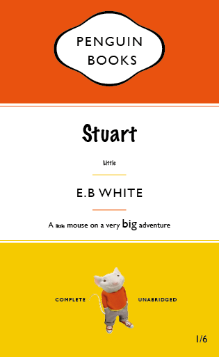
We were then asked to use our copy of The Great Gatsby cover as a template for a new book cover for our choice of book, movie poem etc. I chose Stuart Little. I decided that every time the word ‘little’ appeared it would be in 8pt text and everything else would be in the same size as the original template. My reason for this is because ‘Stuart Little’ is about a mouse living in the human world so most things around him are much larger than him and so I wanted this to be reflected on the book cover. I also changed the typeface of the title into one that was more like a script font as this is a children’s book and I felt gill sans was too harsh and not playful enough.