For Berta’s session today the brief was to bring forward the visual dimensions of the story. The story I chose was titled “obsession”.
I first experimented with ripping, crunching, cutting and glueing pages to create this double page spread below.
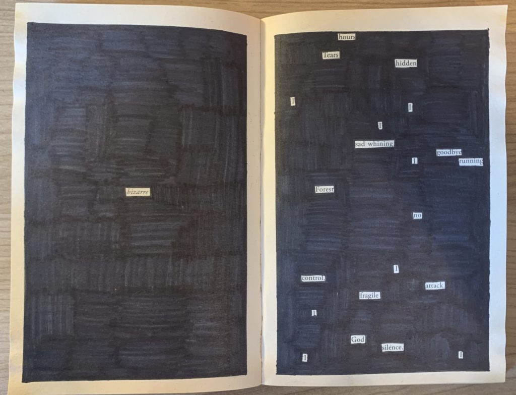
From this experimentation I liked the effect of the highlighted words so I took this further to create the double page spread you can see at the top of the page. For the left hand side I chose to isolate just one word that was in the middle of the body of text. This represented the womans solitude and calmness at the beginning of the book. For the second page I chose to isolate a number of words that were scattered all around the text, all the words I chose had negative meanings or connotations. The scattered yet isolated aesthetic helped to portray the womans thoughts which were no longer in focus and kept flicking between the book she was reading and the fear of what was going on behind her. In the end I liked the simplicity of my final design and I think it got across exactly what I wanted it to.