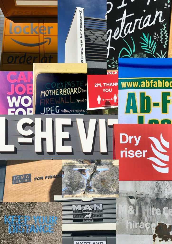
For this project we were asked to capture images of typography across campus and then compile them in some kind of system. I chose to compile these images in a hierarchy from top to bottom in terms of which bits of type I was most attracted to at first glance. Once i had the final compilation of images I found it really interesting to see strong differences between the top and bottom images. The type that I found most appealing tended to be more colourful with bold large letters that made the words legible. I also thought it was interesting to see that certain typography that I placed very low on the list was sometimes portraying an important message such as social distancing. It was strange to see such an important message presented so badly through type.
This task reinforced to me how crucial typography is in portraying certain messages within our environment.

