
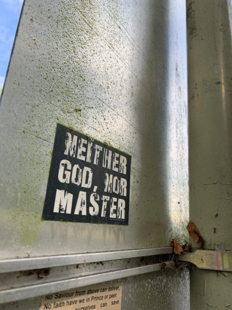
When we were first set the task to photograph lettering in the environment I didn’t think it would be too much of a challenge. It wasn’t until I was around 30 photos into my shoot that I realised a lot of the lettering I had captured were all very similar. This made me have to think a little bit deeper into the task and how I was approaching it. A lot of what I had photographed in the beginning was part of the universities branding and signage so of course there was going to be a lot of repetition as many companies, including the university, stick to the same fonts across all there branding to keep it all connected and flowing well. Therefore, I had to start looking for the signs that weren’t so obvious. In the end, some of my favourite images of lettering that I captured I had found were stuck to the back of signs, welded on to lap posts and hidden in the far corners of the university campus.
The second part of our task was to organise our images into groups. I chose to split my photos into what their purpose was and the three groups I ended up with were; information, warn and advertise. Once I had organised my photos and presented them on PowerPoint (seen below), I soon realised that I had unintentionally also organised two of the categories into categories of colour. If I were to attempt this task again I would edit all my photos to be in black and white to take away the influence of the colours used and focus solely on the lettering alone.
