Author: JannahHolder

Project Freedom – Real Time text for a theatre performance

Overview & Goals

The supplied brief was to document a live theatre performance by Jamal Harewood, an artist who creates audience-led participatory events that focus on ideas of identity and race. Our client outlined how important it is to him, to hold performances that are playful yet allow for a unique experience that promotes discussion from each individual. Jamal communicated that he wanted our documentation of his upcoming workshop to be translated into a piece of design that encapsulated the entirety of the experience. 

Goals

In our initial meeting, we supported our client in selecting an appropriate media for the documentation. Ajoke and myself, suggested an a5 booklet that would be designed using a design service accessible to Jamal. This was an important element as the client wished to be able to document each workshop commencing over the course of the year.

  • Offer attendees an opportunity to revisit their experience at a later date and remember their pledge made at the end of the workshop
  • Create a way for the client to document future workshops independently which in turn creates a source of revenue

Objectives 

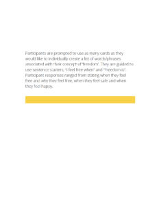
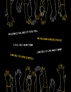
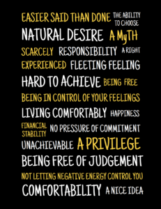
To document the upcoming workshop and gather a diverse range of audience definitions of the term ‘Freedom’ which will be relative to each of their personal experiences (e.g: Education, Secuality, Religion)

Deliverables

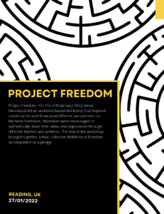
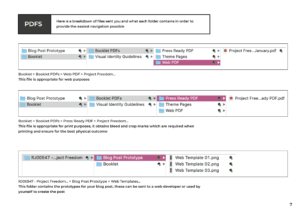
  1. An A5 Booklet. Submitted to client as a PRESS READY PDF documenting 27th January workshop 
  2. Booklet Template. Amendable Canva template for upcoming workshops
  3. Blog Prototype. Designed in cohesion with booklet layout for client to implement onto their website  

Research and Ideation

Prior to the documentation or ideation process, thorough research on our client was completed in order to understand his ideologies and background. This would allow us to understand Harewood to the best of our ability which in turn, allowed for us to showcase his identity within the deliverables. After conducting the necessary research, we attended the workshop and created a manuscript based on all verbal communications and physical activities witnessed in the room. Due to the fast paced nature of the workshop, we had to collate and organise your notes ready to share with our client for approval. This text would then be ready to be translated into body text for the booklet. 

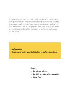
After the approval stage, we began ideation of the booklet aesthetics. It was important to acknowledge the overall ambience the booklet provided to the reader as it was necessary to represent both the workshop as well as the clients identity. Together, we brainstormed various ideas that considered the cover as well as the contents pages. Due to the complexity of the workshop which included different themes for various amounts of time, we decided to visually represent the experience by dividing the booklet up by theme.  This would allow attendees to relive the experience and non-attendees to gather an understanding of the ambience. To create a clear, mutual understanding between ourselves and the client, a sketch of the booklet layout was created and proposed to the client.

Figure 01: Booklet Layout Proposal


Development 

Colour

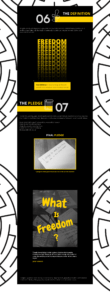
This colour palette was provided to be used for the upcoming booklets documenting future workshops. As discussed with our supervisor, using a colour palette allows for a cohesive set of booklets. Additionally, these colours will be used on the corresponding blogpost as demonstrated in the prototype.

Figure 02: Colour Palette

Typography

Figure 03: Typography (Headings)


Figure 04: Typography (Body Text)


Booklet

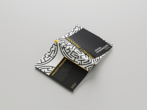
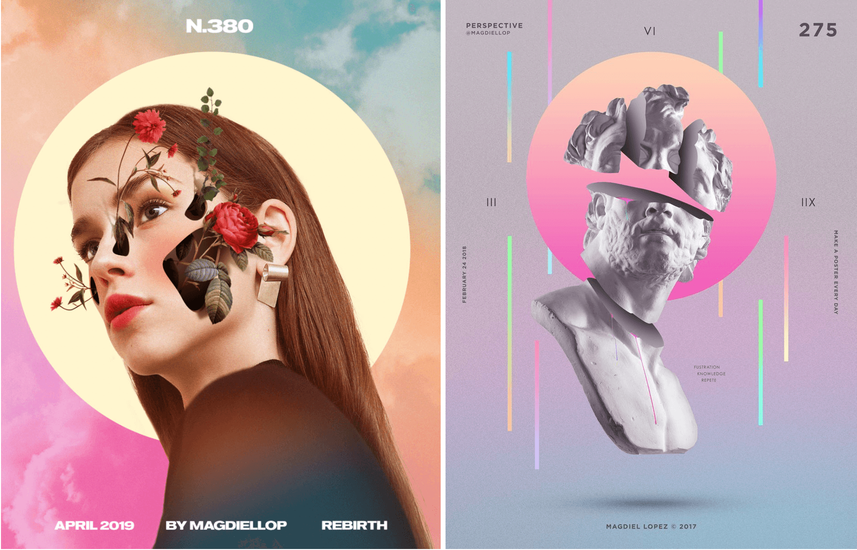
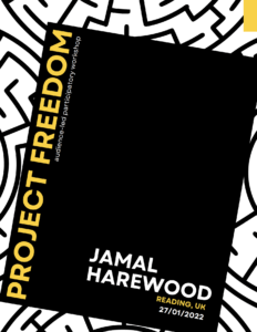
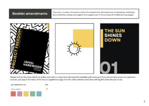
Cover – Collectively working on the cover, we derived a range of concepts which we narrowed down to two contenders with the feedback provided by our supervisor. Selecting the covers that obtained the best elements allowed us to pinpoint elements we both believe compliment the cover well and combine them to create a single cover proposal. In order to present the client with multiple options, from the single cover, we experimented with a variety of compositions which handled the typography and visual elements in differing manners. In presenting this to the client, we used the feedback to further combine compositional choices from each proposal and solidify this into one. Over the course of several weeks, we perfected the cover to the clients desire which hosted the colour palette and typography that would be implemented within the core of the booklet.

Figure 05: Booklet Cover Concept
Figure 06: Booklet Cover Concept

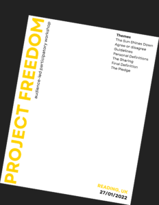
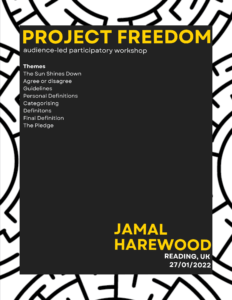
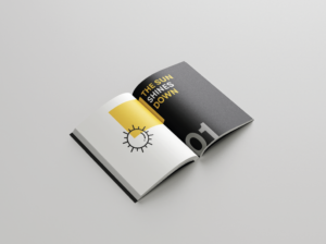
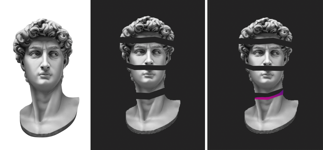
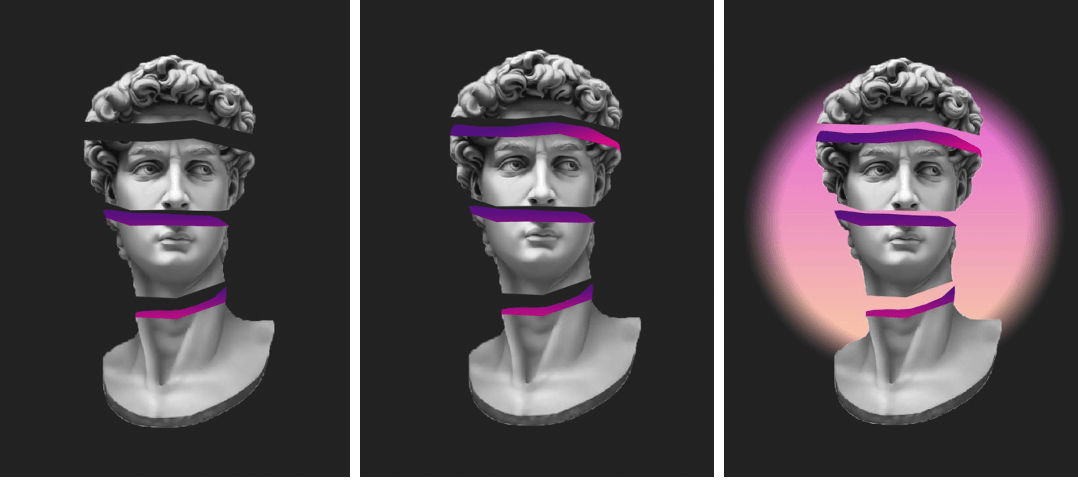
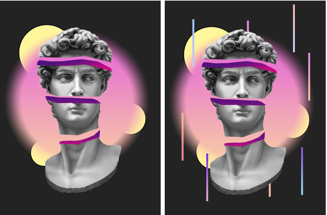
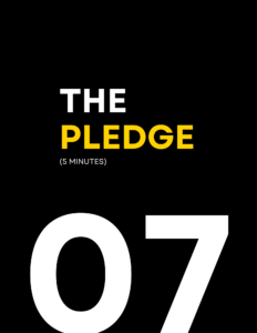
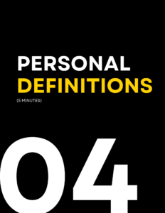
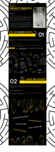
Theme Introductory Pages – As previously discussed, the seven themes from the workshop were a key element to be used to create clear narrative within the booklet. Therefore, the idea of pictograms to introduce and represent each theme was implemented and created using Adobe Illustrator. Sketching ideas for the pictograms allowed us to ensure we had a cohesive set before illustrating them digitally. The cohesiveness was further ensured by using the same point size for the lines. To enhance the clear introduction of each theme, we derived concept for theme introductory pages. The recto page hosts the theme name, number and decorative element using the approved colour palette.

Figure 07: Theme Introductory Concept


Figure 08: Theme Introductory Concept


Figure 09: Final Theme Introductory Page


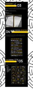
Body Text – In designing the body text pages, the main goal was to link the decorative elements plotted throughout the booklet into these particular pages. An additional goal was to use immersive language in order to engage the reader in order to further reflect the ambience of the workshop. Using advice from our supervisor, experimentation of placement allowed us to consider various layouts that compliment each theme. Within each theme, the placement of the body text differed in order to separate an create an experience for each theme.

Figure 10: Typography (Body Text Pages)
Figure 11: Typography (Body Text Pages)


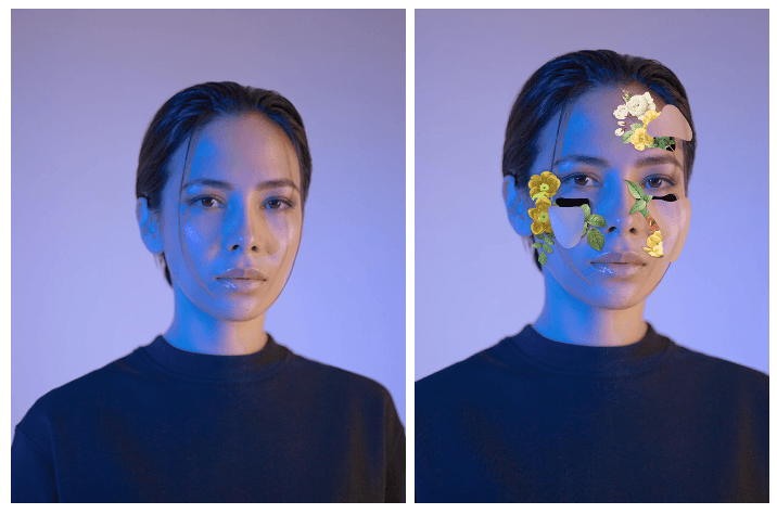
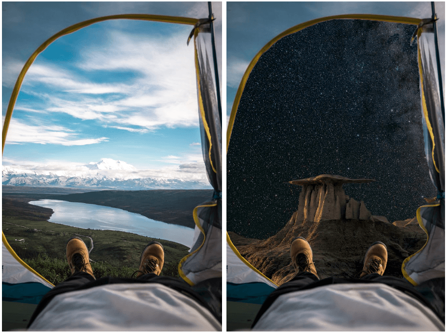
Theme Design Pages – To conclude yet compliment the experience of each theme, visual representations of each activity of the workshop were created either in an illustrative or photographic manner. During our ideation phase, brainstorming multiple ideas for each theme allowed us to select the best concept for example:

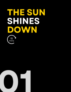
Theme 1: The sun shines down on anyone who? – the activity required attendees to use the aforementioned line followed by an item of clothing, feeling or ideology, therefore, illustrations of these three areas were used to conclude this theme.

Figure 12: Theme Page – The Sun Shines Down on anyone who (Illustrative)


Figure 13: Theme Page – Agree or Disagree (Illustrative)


Figure 14: Theme Page – Personal Definitions (Typographic)

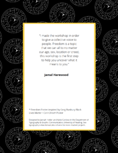
Conclusive Page – During our time spent working with the client, we were able to learn a lot about his personality and the passion he had for this project. Therefore, we wished to implement an ending page to the booklet with a quote directly from Jamal Harewood. This allowed the reinforcement of the sense of identity relevant throughout this book which was further enhanced through the background brand pattern derived from Jamal’s logo.

Figure 15: Maze pattern derived from clients logo
Figure 16: Conclusive Page

Cover Finalisation – In discussing the finalisation of the booklet, our supervisor advised us to bring the element of Jamal’s logo, onto the front cover as it had become a consistent element located throughout the booklet. This gave the opportunity for the cover to communicate the duality of the workshop as well as the clients identity. We found in the finalisation of the booklet that Canva was difficult to navigate in terms of saving a PDF with crop and bleed. When we did succeed in exporting the PDF with the print set up, we found the bleed was inconsistent which meant we had to quite a bit of refinement. This was something that we could have avoided by making sure we had a full understanding of how Canva works in the print aspect and having to use certain settings to control the bleed.

Figure 17: Final Booklet Cover
Figure 18: Final Booklet Back Cover

Web Prototype

Our client outlined to us that he would like a digitised version of the booklet that will be accessible via his website. With this understanding, we had a conversation with our supervisor who recommended we create a prototype rather than working directly with his website. This was due to a variety of factors; the site was in maintenance and the logistics of us going into the back end of the website. With this advice and once the booklet was finalised, I created the web prototype using Adobe XD. This stage was a simple process in terms of directly referencing the booklet using all of the now made illustrations, photography and confirmed typography, however a challenging area was the formation. During the booklet design process, we were constantly considerate of the layout and construction as this influenced the tone and perception of the booklet. We wanted to ensure the same tone was presented by the prototype despite having a very different user experience. I began by creating components to ensure consistency in the implementation of the typography due to the various areas of text such as the theme numbers and headings. We created a sense of rhythm and flow in the booklet therefore, I constructed the prototype to use the same attribute by having a pattern to connect one theme to the next.

Prior to sharing the development with the client, we discussed various areas with our supervisor who recommended the adjustment of certain areas to ensure a cleaner presentation of the blog for easier consumption by the reader. Once completed, we were able to present the progress to our client who was very content with the final blog and felt it truly reflected the booklet.

Figure 19: Web Prototype
Figure 20: Web Prototype
Figure 21: Web Prototype


Visual Guidelines

Throughout the process of creating the deliverables, we were mindful of our client being a non-designer who wishes to be able to amend the booklet for the documentation of future workshops. The consideration of this began right at the beginning when we decided to use Canva as it was the most non-designer friendly software available to our client. Our supervisor suggested we further the support we were giving the client in this area by supplying him with a visual guidelines document. This would allow the client to gain a full understand of the deliverables and how to use them. In the document, I discussed the branding side of the booklet and prototype by providing HEX values of the colour palette alongside the fonts we used and how they were implemented (for example, Garet was used for for headings, open sans for body text). Furthermore, the guidelines document provides instruction on how to amend the Canva template for future workshops including changing the design pages, colours and text.

Figure 22: Visual Guidelines. Page 2
Figure 23: Visual Guidelines. Page 5
Figure 24: Visual Guidelines. Page 7

Conclusion

This Real Job has been a great opportunity to develop skills in a wide variety of softwares and applications including; Canva, Adobe XD, Illustrator and Procreate. There were many areas of design to be explored which made the experience fun and an introduction to a lot of new areas of design. Throughout our experience and communications with our client, he shared how we were able to bring all of his ideas to life and go above his expectations. He further explained, despite having vague ideas in certain areas, we were able to capture what he was trying to communicate and produce visuals for ideas he had no visual ideas for.  Due to the nature of Canva, the print exporting tools did not allow us to create a PDF with the ideal colour settings. Canva unfortunately did not let me export the booklet using Forga colour and could not be converted using Adobe Acrobat tools so I have relayed this to the client to be mindful of during the print process. In future situations where I may be positioned in a similar circumstance, I will consider other softwares.

In reflection, this job took longer than expected which I believe was due to the knowledge we had on the client not having a deadline for the deliverables. We take full responsibility for the long time period to solidify the deliverables and despite creating our own schedule, we sometimes took longer to finish certain roles and responsibilities. This would be due to many factors such as underestimating the longevity of a design or an increase of workload. For the future, I would ensure a stricter approach to the schedule is adhered to and to be considerate of how long some designs take compared to others. I look forward to potentially being able to work with the client in the future on his upcoming endeavours in performing thought-provoking, audience-led workshops.


Exploring The Creation of Surrealism Through Photoshop

Design Ideas and Design Process

For the photoshop creative images task, we had the option to pick our own theme, whereby I chose the topic of surrealism. In my first design, I focused on demonstrating the ability to create a design that appears to be altered from reality. The design is focused on the illusion of being able to see into the subject’s head, which is accentuated with flowers and leaves sprouting from the cut outs. The design process heavily explored layering, depth and shadow. For my second design, I followed the objective to create an image where the background has been altered from the original. I used a photograph of a tent and replaced the opening with an image of the galaxy to reinforce the surrealist theme. I explored using the lasso tool in this design to remove the preferred area and challenged myself with the concept of the subject being outdoors.

Design outcome 1
Design outcome 2

In my favourite and final design, in response to the objective to create an image that combines black, white and colour, I created a design where I was able to experiment with depth and perspective. I used a stock image of a rendered statue and used the lasso tool to copy and paste each section onto separate layers to allow me to move them with full control. I then used the same tool on new layers to create the inside broken area to the statue. This was a challenging process as I had to experiment with creating the right depth and perspective however I was able to create the desired effect. With the new layers, I used the gradient tool to create colour for the image. Once I was happy with the composition, I wanted to challenge myself further to incorporate more colour in order to compliment the overall outcome. On a separate layer, I created a range of circles and lines with the shape tool and again the gradient tool in reversed colours, I then proceeded to use the smart filter tool and blurred the edges to create a blended effect.

Design Process and Outcome 3


Design Process and Outcome 3

Software tutorials

Across the planning and design process of the task, I utilised a range of software tutorials to support the development of my ideas. Based on my plan, I had a sense of which tools I would require in order to complete the design. I made use of a wide variety of materials such as articles, videos and tutorials. A range of provided resources were used across the designs, beginning with a YouTube tutorial entailing ‘editing in a non-destructive way’. Watching this video helped me construct my designs in a manner that made the surrealism theme not appear obviously edited but interesting to look at. In addition to this, I used another provided resource, in which being a video tutorial explaining how to use the lasso tool to accurately select image areas which was helpful in retaining control of my cut outs in all three designs.

I further gained knowledge from other resources I found which focused more specifically on my designs including a YouTube video detailing the recreation of Magdiel Lopez designs. I was able to learn which tools were best to use for my designs and how to appropriately apply them. After watching the video, I was able to splice content and create realistic 3D effects without relying on a 3D tool which allowed more flexibility. The tutorial further helped me with the usage of colour and gradation. I also used a website called Digital Arts Online which offered a range of article tutorials which helped with all of my final designs in terms of layering, colour and composition. From this photoshop task, I have been able to learn new skills and identify areas where I would like to advance them and obtain new ones. Across my research, I have identified my interest in surrealism, and I would like to explore complex designs which require more layers and closer inspection to detail.

  • There Is One Statue – Photoshop CC 2019 https://www.youtube.com/watch?v=Fau0NEatvOc&t=445s
  • https://www.digitalartsonline.co.uk/features/illustration/best-photoshop-tutorials/#2

Resources for research and inspiration

Before beginning the task, I devised a plan for all three designs to enable me to pre-identify research and inspiration I would need in order to for fill the design process. Upon researching different artwork on surrealism, I came across digital artist Magdiel Lopez, who I am already familiar with due to previously being inspired by him in another project. I found this task would be a great opportunity to use the newly found skills I have obtained to challenge myself to create outcomes emulating his collections. I was inspired by his portfolio due to the inclusion of colour, layering, composition and of course surrealism. I found all three of my final designs inspired by his work, most particularly my statue design. It was a good opportunity to challenge myself with experimental layouts and backgrounds.

In addition to my artist research, I also referred to Pinterest as a general ground of inspiration due to the wide array of posts available. The most influential search was “surrealism digital art photoshop” where I was able to note down the common attributes of different artists work and what makes their work surreal. I found the commonalities included the use of bright colours, therefore I made sure for this to be a strong element in my final designs. Another commonality was the general aura of the designs being unnatural but engaging. Observing these characteristics was beneficial in helping me develop my design ideas as it allowed me to step out of my comfort zone and try pushing my designs further at times where I would usually finish them. I had not really explored backgrounds and how they can influence the main object/attribute of the design so this experimental process was an insight into how they can transform the final piece so this has become a topic I would like to explore in the future.

Magdiel Lopez
  • https://www.magdiellopez.com/
  • Pinterest.co.uk


Minding the gap is a tricky task

This session for design practice was taught by Gerry and was a very technical session where he explored different typefaces and analysed their individual properties. I thoroughly enjoyed being taught the effectiveness of how we should hold our pencil and the techniques that to use which can improve our sketching. For the morning exercise we had a look at the word ‘hesion’ which had been presented in three fonts and try guess what the letters would look like in the word ‘Cadbury’. I chose one font and tried analysing the way it goes thin in some areas as well as where it is thick or bold. My attempt was a little bit off from the correct version but from Gerry’s feedback I could see where I had gone wrong. I also learnt how to be a bit more precise when using fine liner pens. For the afternoon exercise we did a similar task however we were given some bits of the word ‘aden’ and we had to fill in the rest of the areas in the way we thought was correct. I found this time I had completed the take well but messed up some of the thin and thickness.

Reading Film Theatre Flyer

The Reading Film Theatre flyer task was a challenging but enjoyable one. As I’m quite new to Indesign compared to other Adobe softwares, I struggled a little bit in being able to make things the way I wanted them to be. However it was a perfect opportunity to implement what James taught us in one of recent sessions, which was using paragraph styles which made the process quicker than it would’ve been without the use of them. For this task I had various ideas on how I wanted to format it however along the way and across different drafts I found myself tweaking and changing things. I found that alignment was one of the things that I was concerned about the most as I found the flyer was more visually appealing and the information was articulated better when it was organised in that form.

During the feedback session, I was told to improve on trying to see if I could make it easier to read as they said there was too much typographic difference because the colour was hard to read. So for my improvement I decided to select a darker colour which was still engaging but softer on the eyes. I decided to pick a dark red as I liked how in class it was mentioned that it gave of the cinema feeling that you’d want to promote. Another point of feedback was that I could’ve chosen black for the dates to make them stand out more. However for the brief we could only have two colours so I decided to create that visual flare I would alternate between the red and grey colour.

For someone who loves to travel

For Kim’s Project on Thursday we got into groups and learnt some interesting/unusual facts about each other. I learnt that my partner loved to travel. I decided to brainstorm and research ideal gifts that would be perfect for a frequent traveller to have and utilise. As seen in my sketches, I played around with mostly items you can take with you as you travel such as a backpack, a scrapbook, a sleep mask and more. I then looked at incorporating the second task into my designs which was to find a word from the random word list and see how I can add it into my designs. My first word was aeroplane and I experimented with how it would look and how I could make it fit in. I decided that the best design was the passport holder as I felt I could incorporate a lot into it and it was the best ideal gift out of the ones I had thought about.

Sketching out my passport holder, I decided to draw a simple icon of an airplane which is of course fitting the theme. I decided to look at the second and third random words in which being compass and money. I included the navigations of the compass; north, east, south and west around the airplane in an order to visually mimic the layout of a compass. I then decided I could include the random word money by also illustrating things that can go in the holder along with the passport, which was bank cards and loyalty cards. I also added pound signs to further accentuate the use of the word money.

UK Government vs Australian Government

These two Covid-19 awareness posters communicate similar messages but use graphic language in different ways in order to present the information. The HM Government/NHS and Australian Government use graphic language to highlight that washing hands is a huge part of protecting ourselves and others from Coronavirus.

Both posters obtain similar audiences in which being the citizens of their Country. Whilst one being for the United Kingdom and the other Australia, they use similar approaches to convey the same message. Whilst the UK poster initially comes off as simplistic in comparison to the Australian one due to the lack of colour background, it makes up for it in a detailed set of pictograms which provide a thorough step by step process of correct hand-washing. This has been made easily identifiable with the use of numbering and green enclosing circles, allowing the pivotal message can be sent across to the audience effectively.

In comparison to the HM Government posters, the Australian awareness poster convey the message with less imagery and more text. The one simplistic image depicts hand-washing and although they just use one in comparison to the NHS six step process, the topic is still conveyed quickly. The audience know it’s about hand-washing due to the pictogram as well as by the accompanying title “GOOD HYGIENE IS IN YOUR HANDS’ in bold san-serif text allowing it to be easily legible.

However, to know the process of hand-washing the audience would have to actually read the writing which is seen comparatively small to the title. The informative text also isn’t detailed either which doesn’t exactly explain what good hand-washing is, only that it needs to be done and you should use soap and water for 20 seconds.

Due to this different approach the UK government/NHS’ poster convey their message better. Along with the step by step process, highlighting how to wash your hands thoroughly, they use text to further explain some key information. They include the 20 second rule along with extra precautionary steps on how to turn the tap off safely. This ultimately allows them to take the audience from A-Z without too much reading. Both posters do successfully present an eye-catching appeal with san-serif, allowing an easy read, with bold text where appropriate. They both nicely include a general message in their own box and bubble that we’re protecting ourselves and others and we can stop the spread through a collective effort.


Coraline Penguin cover transformation


In Fridays integrated design technical session, we focused on the Adobe software ‘InDesign’ and practised recreating a conventional penguin book cover. We looked at the The Great Gatsby by F.Scott Fitzgerald. I learnt some very important skills which I hadn’t discovered before, for example using only one text box and creating complex shapes with tools I didn’t realise were available in InDesign. For the follow up task of creating a distorted cover with an ironic twist to it, I decided to base mine on the novel Coraline by Neil Gaiman. The novel follows the narrative of a young girl who finds a portal to a world similar to that of our own but the people in the other dimension have button eyes. The buttons are a heavy theme throughout the book as well as in the movie. So I decided to swap the penguin for the button. I decided to set the main colour as blue to represent the main characters hair colour and general aura of the novel.


Education system

In this session presented by Sara Chapman, we explored designs and art that convey a deeper meaning. Looking at artists such as Banksy, we discussed how his work has dual meaning and presents emotion and thought provoking imagery. We were all assigned a word to focus on conveying our own message for and my word was ‘education’. I had several ideas and took time to create a spider diagram to get all of them on paper and consider which ones were the best. I decided to convey how in school we are taught a lot of information that many of us don’t and wont ever use but are made to learn as they are obligatory topics. I used topics such as algebra and physics equations which can be handy but not for all and show how once we grow up, we realise we haven’t been taught some of the most important and vital pieces of information that we need as adults.

To represent the decline in understanding life and topics, I used only primary colours in the first image. Not only does it have that stereotypical school life feel but when it changes to the the second image, it accentuates the hopelessness we begin to feel as  we grow up. The  colours change to grey and dismal tones. I also only used my own handwriting in the first image to convey that sense of innocence and typical school taught handwriting. I then contrast it in the second image by using bold and capitalised font to show the harsh reality of our life changes and us not being given the education to keep up with it. To complete this concept, I decided to do it digitally as I felt it would convey my ideas better due to the solid colouring.  I used Adobe Draw for the entire process.

The maze beyond the gaze

In todays project presented by Berta Ferrer and Kim Marshall, we explored concepts of what a book is and what makes a book? Whether it be how it looks, the content it withholds or another aspect. We discussed how it doesn’t have to abide by the traditional format that we are used to seeing in our everyday lives. Through exploring various artists such as  Tom Philips and Alberto Hanadez, we were given an insight, which provided us with some inspiration, on how to transform our books narrative from ordinary words on paper, into a visual  narrative.  Alberto Hanadez for example, displayed the novella, Jekyll and Hyde’s narrative by dividing the core pages in to two, visually representing the split identity of the main character.

I decided to explore the theme of ‘Labyrinth’ by sketching ideas on how to represent the narrative of a family moving into an ordinary house and how they uncover it isn’t what it seems. I played with the idea of making the cover into an actual house, which I did through using a craft knife to shape a roof and windows, along with a physically operating door. I decided to incorporate the physically operated door and gaps in the cover to allow the audience to take a peak into the house and see it isn’t that of a normal one. When the door is opened, you are met with a pop up speech bubble which comes from the back of the book, displaying that the family is right at the back, beginning their journey through this maze and calling out for help. To display the idea that through every door they enter, the rooms change, I created layers of pages which get deeper and smaller, displaying a never-ending affect.