
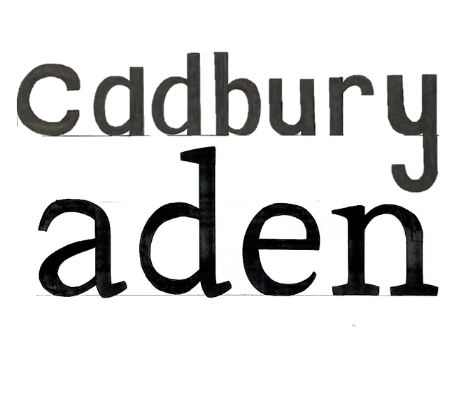
This session for design practice was taught by Gerry and was a very technical session where he explored different typefaces and analysed their individual properties. I thoroughly enjoyed being taught the effectiveness of how we should hold our pencil and the techniques that to use which can improve our sketching. For the morning exercise we had a look at the word ‘hesion’ which had been presented in three fonts and try guess what the letters would look like in the word ‘Cadbury’. I chose one font and tried analysing the way it goes thin in some areas as well as where it is thick or bold. My attempt was a little bit off from the correct version but from Gerry’s feedback I could see where I had gone wrong. I also learnt how to be a bit more precise when using fine liner pens. For the afternoon exercise we did a similar task however we were given some bits of the word ‘aden’ and we had to fill in the rest of the areas in the way we thought was correct. I found this time I had completed the take well but messed up some of the thin and thickness.

