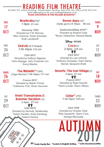
The Reading Film Theatre flyer task was a challenging but enjoyable one. As I’m quite new to Indesign compared to other Adobe softwares, I struggled a little bit in being able to make things the way I wanted them to be. However it was a perfect opportunity to implement what James taught us in one of recent sessions, which was using paragraph styles which made the process quicker than it would’ve been without the use of them. For this task I had various ideas on how I wanted to format it however along the way and across different drafts I found myself tweaking and changing things. I found that alignment was one of the things that I was concerned about the most as I found the flyer was more visually appealing and the information was articulated better when it was organised in that form.
During the feedback session, I was told to improve on trying to see if I could make it easier to read as they said there was too much typographic difference because the colour was hard to read. So for my improvement I decided to select a darker colour which was still engaging but softer on the eyes. I decided to pick a dark red as I liked how in class it was mentioned that it gave of the cinema feeling that you’d want to promote. Another point of feedback was that I could’ve chosen black for the dates to make them stand out more. However for the brief we could only have two colours so I decided to create that visual flare I would alternate between the red and grey colour.


