
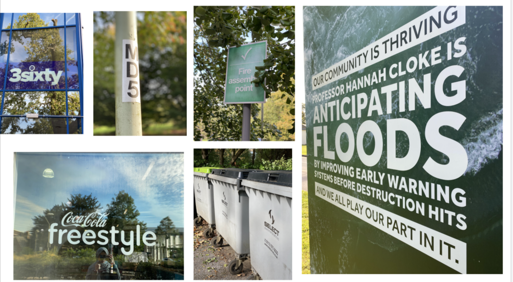
typefaces around campus
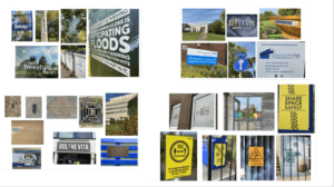
This was my presentation which I did for Eric’s project, I have taken some pictures around the campus of typefaces. which looked really different from each other and how by changing the colour of something changes the hole meaning. Especially some of the signs calling for attention and caution such as the yellow danger sign.
I have colour coded the pictures into similar colours such was blue , green and yellow. One of my slide was about the lettering to the metal. However the metal on each picture is different than the other. The metal on the library looked like steel whereas the metal on manhole is diffrent maybe more stronger I guess.