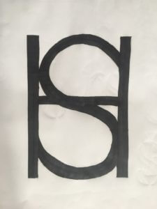
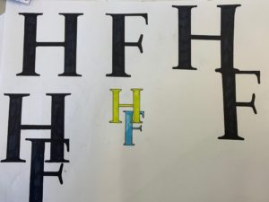
In Kim’s project we experimented with the initials of our names and created a monogram with both of the letters combined, the final outcome is in the featured image and image above.
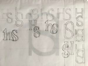
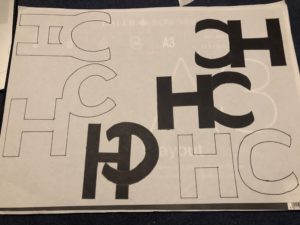
First i brainstormed ideas, i copied the letters H, S in the different fonts: Futura and Garamond. I drew both of the initials in lowercase and uppercase mixing them together. I used pens, pencils, markers, a ruler, a rubber and layout paper to create these brief designs.
I really liked the bottom right design and the one on top of it. I liked how the main strokes of the H were extended down to match the S, However i chose the one above as i like how the letters blended together better.
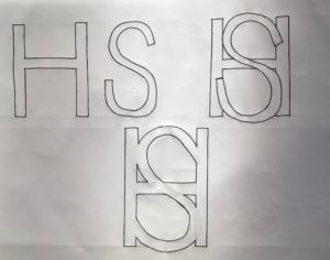
Here i drew the process of how the initials merged to make a monogram.
Too improve i would create these designs online so they would have a more polished finish and also so i could experiment with colour.
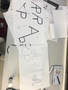
Using the Futura typeface, both medium and bold, I experimented with how the 2 letters – A and P could be incorporated together as a single unit, motif or symbol. I began by merging the letters next to each other, however it seemed that it could easily be misread as a letter R. Therefore, I explored flipping one of the letters upside down, leading to my 7th and final design solution, where the cross bar of the A merges into the the counter of the P. This creates an interesting ‘impossible staircase’ type aesthetic. I would like to further explore with colour .
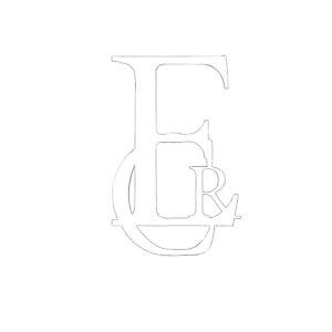
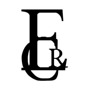
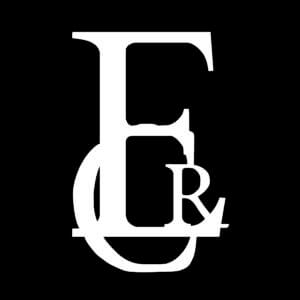
Todays task was to create a monogram using our own initials. I experimented with both Garamond and Futura. I drew them separately, as well as combining both fonts together. After joining both letters up, I began to experiment how they would appear on top of each other. I liked the idea of this as when you squint your eyes you can see both letters (the lower case ‘e’ and the upper case ‘R’) It almost looks like a symbol.
My final idea consists of the capitalised print using the Garamond font. Out of everything I done on the paper, I specifically liked how the Garamond font looks like a brand logo. I intended to join both letters up originally, however afterwards, I tried a different style. In the final idea, the ‘R’ is not fully shown, nevertheless you can still distinguish that it is the letter ‘R’.
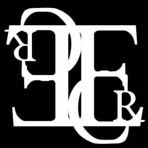
For Kim’s project, I created a monogram of my initials in the Garamond font. I experimented with layering and played with the different interactions between the letter forms. I initially came up with this design:
I decided to experiment further and explore flipping the letter forms. This almost removed the readable quality of the letters and created more of a visual image.
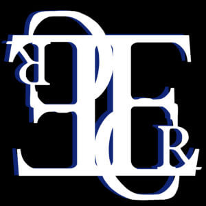
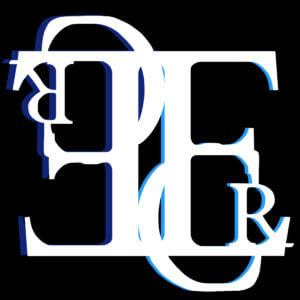
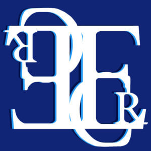
Finally I wanted to include colour and add some depth to my piece. I decided to add a drop shadow as this would also incorporate the dimension I wanted.
The two-tone drop shadow also adds an almost ‘trippy’ element to my outcome, further distorting the letter forms and creating an eye-catching image. However, I decided that the black background was too harsh in contrast to the white. I changed this to blue, which created a more monochromatic outcome. Overall, this made a more cohesive image. To illustrate the journey that I undertook during this project, I created a short video almost like a digital flip book, with my images in order.
In todays session, we used our initials to create a monogram, experimenting with Futura and Garamond. After experimenting with both, I felt that my initials worked best in the Garamond font. I began to play around with different variations of the letter together. Alongside this, I researched brands that have used a monogram logo and how and where it has worked successfully. I came across the Dior monogram logo that has recently proven to be very popular. I was inspired by this to layer ,y letters over each other. I thought this looked a little dull so I began experimenting with colours.
For my final idea, I mixed in my two experimentations to create a monogram print. I really liked how this turned out and how the colours worked with each other. Next time, I would play around with the positioning of the letters a bit more to ensure they were legible.
Our names are a huge part of our identity, especially when we don’t come across others with the same name, like myself. This in turn means people’s initials are part of their identity. Whilst creating a monogram of my own initials I wanted to be able to reflect my personality within this. The monogram is something that represents me, something that identifies me in the same way a brand has a logo. The following is the journey I undertook during my ‘monomorphis’.
Initial ideas
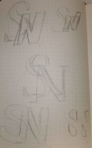
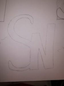
Like any designer I started my process with some initial thumbnails to capture the essence of my ideas, shown on the left. Part of this also meant I looked at different versions of the fonts we were allowed to utilise (Futura and Garamond). Garamond is a very elegant yet formal type face in my opinion with it’s serifs more curved and softened, whereas Futura is a more bold, simplistic, potentially even boring typeface. I like to think of myself as a more diverse personality so I decided to go with the S being in the sleek more angular typeface (Garamond) while doing the N in a more simplistic fashion (Futura).
Boxed in counters: S – Adobe Garamond Pro Bold, N – Futura PT Cond Bold Oblique
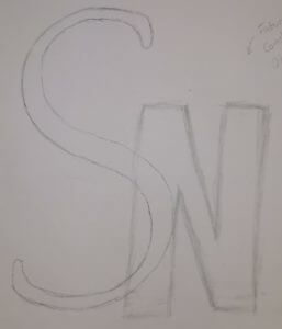
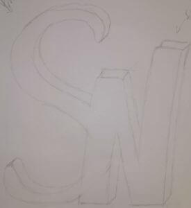
Having decided which of my initial ideas I preferred I started the process of crating those initial sketches into what it would look like. An example of this is visible on the right hand side.
S – Garamond, N – Futura PT Cond Bold Oblique
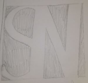
In order to reach the best possible monogram I did this with the majority of my initial sketches. This also meant I could better see what worked and what I needed to improve on, e.g. the Garamond S on the right is lost in the design as it doesn’t carry enough weight. Thus making me recreate it with a heavier version of Garamond.
S – Adobe Garamond Pro Bold, N – Futura PT Cond Bold Oblique
I found once I corrected the design that it still looked too standard, it didn’t really convey my personality yet. So I started playing around with the letter forms some more. This can be seen on the right where some of the N has been stretched higher than the rest, thus creating a more dynamic and interesting design.
3D effect
Whilst I wasn’t unhappy with my design by this stage I still thought that it could be improved upon, become more than it is. So I kept playing about with it, eventually I layered it and created a sort of 3D effect (shown on the left).
By this time I was starting to run out of ideas of how I could continue this ideas development. However I was still drawn to one of my initial designs which displayed the counters rather than the letters themselves, creating a longer lasting impression. I then decided to combine the two designs, taking the last step in this journey to create my monogram.
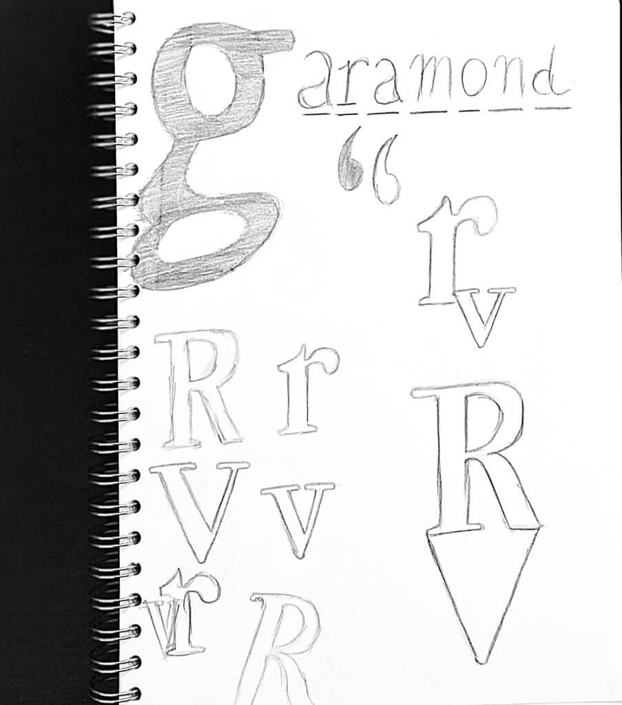
In today’s session with Kim, our task was to create a process of transmogrifying our initials. We had the choice of two fonts: Futura or Garamond.
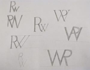
I began with Futura as I felt it would be easier to practise sketching out my initial ideas. However, I found that with the letters “R” and “W”, the characteristic of the R got lost in the ‘W’, and ended up looking like a ‘P’ – see examples below.
rough sketches and ideas
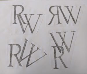
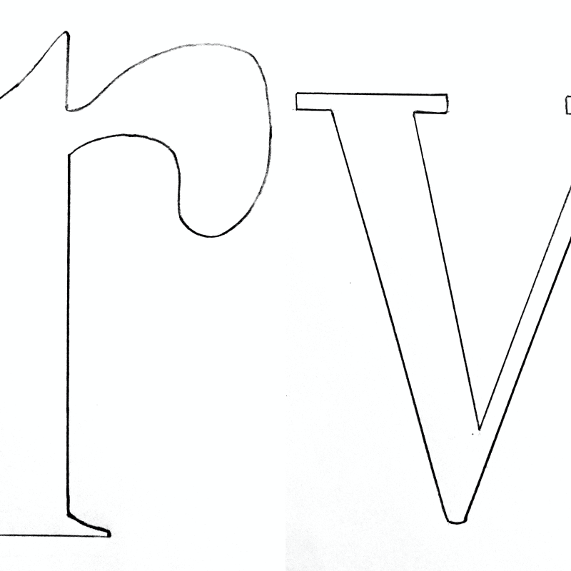
I then began experimenting with Garamond and found that the serif’s made it easier for the individual letters to be identified when merged together. I focused on creating stencils of my initials to replicate the font before experimenting with them and tracing them on layout paper in different ways.
I found this task interesting yet challenging mainly due to the letters I was working with. I struggled to find a way to find a process of transmogrifying my initials due to the curve of the capital ‘R’ and the angles of the ‘W’.
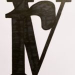
I did, however, create a series of initials layed out in different ways. I then took my favourite outcome into Adobe Illustrator digitalised it in there.
final outcomes
If I were to do this task again, I’d like to play around with different letters and different fonts. However it has taught me to look at things from a different perspective and pay more attention to detail.
During the briefing of this mini brief, we were all asked to experiment with our own initials and transform them into a monogram.
Then, a question struck me. Why do we always tend to write monograms with uppercase letters? Many brand/companies prefer uppercase more than lowercase in their identity.
Is it due to our approach to grammar? Perhaps it’s the history? Or it just looks ‘nice?’
Lowercase ‘stencil’
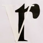
Keeping this as the core idea to my project, I began to draw out my initials (R and V) with lowercase letters, referencing the ever so popular Garamond typeface. Sure, it did seem very strange when I was sketching, almost inaccurate, but it also made me realise how deeply this concept resides within us. Subconsciously, our approach to grammar has enabled our minds to form this complex layer of psychology that instantly ‘corrects’ our approach to lowercase lettering, making it seem/feel ‘wrong’ if it’s(lowercase lettering) on its own (i.e no uppercase).
Experimenting with overlapping letteringDeveloping ‘overlapping’ experiment with contrast
Along the journey of experimentation, I accidentally discovered the beautiful contrast that black and white offers, especially in lettering. This was also something that caught my eye, therefore I started to build the core of my project around the basis of ‘contrast.’
After much confusion, on terms of layout and placement of the letters, I looked back at my initial sketches and found an idea that I liked the best, because it had the potential to fulfil both of my main focuses.
My final design idea
This piece above, embodies the usage of lowercase lettering in monograms, yet also provides a beautiful balance of contrast between black and white. It’s simple and elegant at the same time.
After all, it’s enjoyable to break the norms that can sometimes bind us.
The brief for this project required us to make and develop a representation of our initials, whilst using either the fonts Futura or Garamond. However, we did have the option to use both of these fonts simultaneously. For the start of this mini-project, I decided to draw a spread of sketches and brainstormed ideas to develop further. The whole purpose of this project was to create a monogram for the initials of our names. I personally chose the Futura font, as it is quite geometric compared to Garamond. This means that it would have been even more precise when I create the monograms with it.
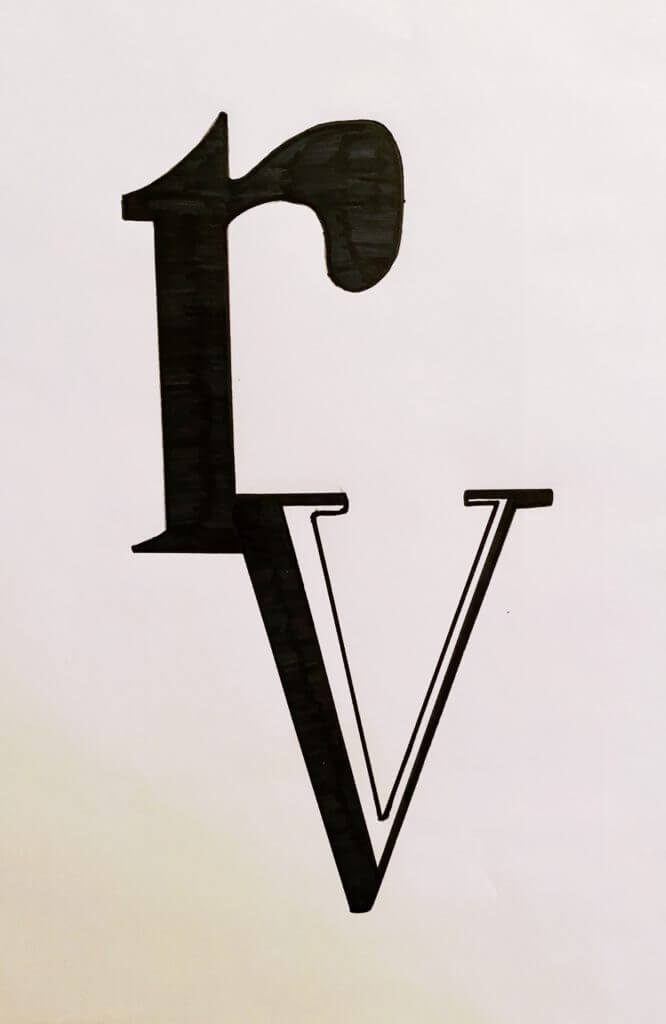
The main attraction with Futura for me, and why I chose it as a font is that it is one of the most geometric and linear. This means that it doesn’t have as many serifs as other fonts and as Garamond, therefore making it easier to create the monogram and was a lot more practical to produce my final design which was what the brief asked of us. I also took a lot of inspiration from certain brands that utilise and implement Futura into their Company names and logos. A few including; Gillette, Calvin Klein, Asda, etc. From looking at these fonts used by these companies, I gathered that they use very different weights and use either: ‘Medium’, ‘Bold’, and ‘Heavy’ for example. By doing this they ensure their logos and names are not stale and have variations and slight changes in the personality of the font.
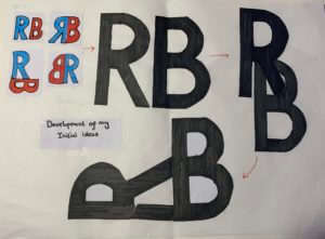
Development of initial ideas
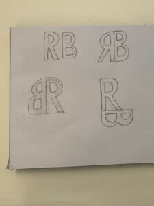
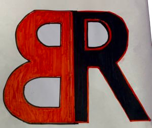
For the final design for this project, I tried to look at the future with a new perspective. By this I mean I used each of the individual letters to combine them both, for the initial designs I decided to look at the initials in an abstract way by putting the ‘R’ into the ‘B’. This then created a lot of options for me to flip and use different structures of the initials. I finally went for two colours, black and red which I did actually use for the first four initial ideas as well.