
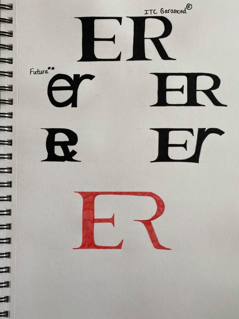
Todays task was to create a monogram using our own initials. I experimented with both Garamond and Futura. I drew them separately, as well as combining both fonts together. After joining both letters up, I began to experiment how they would appear on top of each other. I liked the idea of this as when you squint your eyes you can see both letters (the lower case ‘e’ and the upper case ‘R’) It almost looks like a symbol.
My final idea consists of the capitalised print using the Garamond font. Out of everything I done on the paper, I specifically liked how the Garamond font looks like a brand logo. I intended to join both letters up originally, however afterwards, I tried a different style. In the final idea, the ‘R’ is not fully shown, nevertheless you can still distinguish that it is the letter ‘R’.